What is Czech Cubist Decorative Arts?
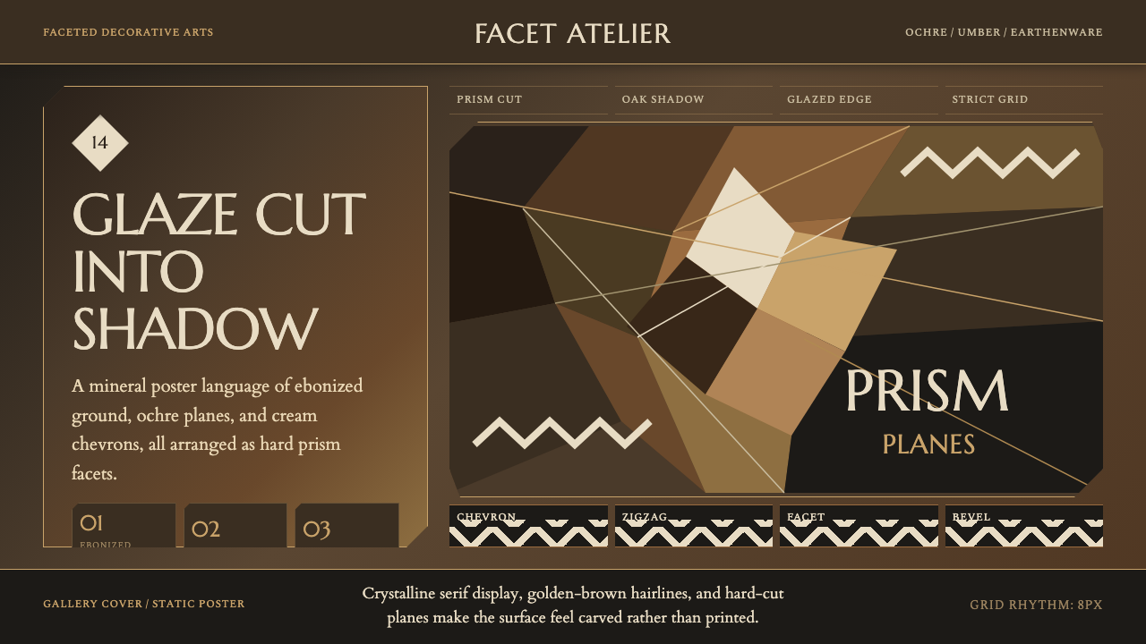
Czech Cubism is the one branch of the Cubist family that broke out of painting entirely and colonized real objects and buildings — for a few intense years before the First World War, Prague was the only city on earth where Cubism became architecture.
Czech Cubist Decorative Arts in brief
Czech Cubism refers to a body of architecture, furniture, ceramics, and graphic design produced in Prague between roughly 1910 and 1914, and revived in a softer form after 1918. It is the only sustained attempt anywhere to apply Cubist faceting — the fractured, multi-angled planes that Picasso and Braque had confined to paint on canvas — to three-dimensional, functional objects: chairs whose backs break into oblique facets, cabinets whose fronts read like cut gemstones, teapots and vases glazed in earthy tones and folded into crystalline points, and, most remarkably, entire building facades carved into faceted stone and stucco.
The idea behind it was not decorative. Prague's young architects believed that flat surfaces were passive and that matter itself contained a kind of latent dynamism which could only be released by breaking a surface into oblique, prism-like planes. A flat wall or a flat chair back, in this reading, was inert; a faceted one was alive, catching and throwing light differently as a viewer moved past it. The style borrowed the vocabulary of painterly Cubism but reasoned about it structurally, almost geologically — as if furniture and buildings were crystals still forming.
The register this design system draws from is the darker, pre-war one: a deep, near-black ground of ebonized oak, warm ochre and umber glazes on earthenware, and cream used sparingly in zigzag or chevron accents. Surfaces are cut rather than printed — the geometry reads as carved, faceted, and tactile, with glaze pooling differently across each angled plane so the same color looks lighter or darker depending on which facet catches the light. It is a heavier, more materially serious cousin of the brighter, flag-colored 'National Style' that followed it after independence in 1918.
Where does Czech Cubist Decorative Arts come from?
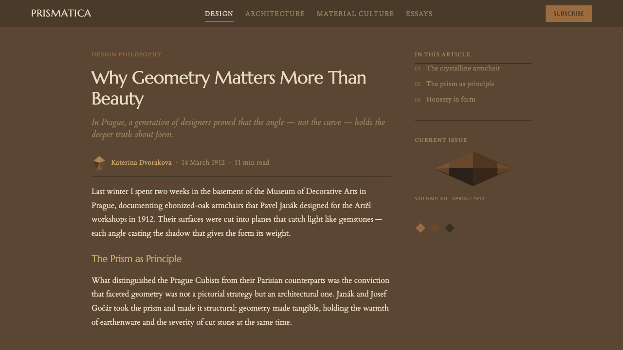
The movement grew out of a generational split inside Prague's art establishment. In 1911, a group of young architects, sculptors, and painters broke away from the Mánes Union of Fine Arts — the city's dominant artists' association — to form the Group of Plastic Artists (Skupina výtvarných umělců), publishing their own journal, Umělecký měsíčník (Art Monthly). Its core members included the architects Josef Gočár, Pavel Janák, and Josef Chochol, the architect and stage designer Vlastislav Hofman, the sculptor Otto Gutfreund, and painters including Emil Filla and Antonín Procházka.
The theoretical case for the style was made by Pavel Janák in a 1911 essay published in Umělecký měsíčník titled 'Hranol a pyramida' ('The Prism and the Pyramid'). Janák argued against the flat, rationalist plane favored by contemporary Viennese modernism, on the grounds that it suppressed the inner structural energy of a material. His solution was to break every surface — wall, chair back, vase — into oblique crystalline facets, a formal argument that drew loosely on the geometry of natural crystals and on a reading of Gothic and Baroque architecture as historically 'dynamic' Czech traditions, in implicit contrast to the imported rationalism of Vienna.
Architecture carried the idea furthest. Josef Gočár's House at the Black Madonna, built in 1911–12 on Prague's Celetná street as a department store, remains the style's best-known building: its stone facade is folded into shallow angled planes that catch light differently through the day, and its interior once housed a fully cubist café. Josef Chochol built a set of cubist apartment buildings and villas below Vyšehrad castle in the same years, with facades that fold outward like faceted crystal rather than sitting flat against the street. Meanwhile Artěl, a Prague applied-arts cooperative founded in 1908 and loosely modeled on Vienna's Wiener Werkstätte, took up the cubist idiom around 1911–12 and carried it into everyday objects — ceramics, glass, toys, and furniture — sold to a Prague public eager for a design language that felt distinctly, newly Czech rather than borrowed from Vienna or Paris.
The First World War interrupted the movement, and when Czechoslovakia became independent in 1918 the style itself changed character. The sharp, dark-glazed facets of the pre-war years softened into rounded arches and drum shapes in a variant historians call Rondocubism or the 'National Style,' typically rendered in red and white in reference to the new state's colors — visible in Gočár's Legiobanka building of the early 1920s. That celebratory, patriotic phase is a different register from the one this design system draws on; here, the reference point is the earlier, darker pre-war vocabulary of ebonized wood and ochre glaze, before independence turned the style toward the tricolor.
What defines the Czech Cubist Decorative Arts look?
Faceted Geometry
Every surface is treated as a set of oblique planes rather than a single flat one — a chair back, a vase body, or a building facade is cut into angled facets the way a gemstone is cut, so no two adjoining surfaces catch light identically. The facets are structural, not applied: ornament is replaced by the shape of the object itself.
Color and Glaze
The ground is a deep, near-black tone achieved historically through ebonized oak, paired with warm ochre and umber glazes on ceramic and stone surfaces. Cream appears only as a sparing accent, usually in a zigzag or chevron. The palette reads as earthen and mineral rather than bright — closer to stained wood and fired clay than to printed ink.
Chevron and Zigzag Accent
Where the style needs a secondary mark, it reaches for a zigzag or chevron rather than a curve or a straight border — an angular accent that echoes the faceted geometry at a smaller scale, typically in the palette's lightest tone against the dark ground.
Furniture Silhouette
Case furniture — cabinets, desks, chair backs — is built from canted, non-parallel planes rather than square corners. A cabinet front might slope forward at its base and recede at its crown; a chair back might fracture into three or four separate angled facets instead of one curved or flat splat.
Material Depth and Tactility
Because the geometry is carved or molded rather than printed, surfaces have real depth — light and shadow shift across facets as a viewer's position changes. Glaze pools more thickly in the recesses between facets, so a single ochre glaze can read as several different tones depending on the angle.
Architectural Facade Treatment
At building scale, the same faceting logic is applied to stone and plaster: bay windows, cornices, and wall surfaces are folded into shallow angled planes rather than left flat, giving even a conventional street facade a crystalline, restless quality.
Structural Restraint
Despite its intensity, the style avoids surface pattern for its own sake — every facet is presented as a structural or material fact, not a printed motif. There is no floral ornament, no scrollwork, and color is used to model the geometry rather than to decorate a flat ground.

Who shaped Czech Cubist Decorative Arts?
Gočár was the architect who gave Czech Cubism its best-known building, the House at the Black Madonna (1911–12) in Prague, whose faceted stone facade and cubist café interior remain the style's most visited surviving example. After Czechoslovak independence he became a leading architect of the softer, patriotic Rondocubist phase, notably the Legiobanka building, before moving on to interwar Functionalism.
Janák supplied the movement's theory. His 1911 essay 'The Prism and the Pyramid,' published in the journal Umělecký měsíčník, argued that flat surfaces suppressed the structural energy in a material and called for architecture and furniture to be broken into crystalline, oblique facets — the argument that gave the entire movement its formal logic.
Founded in Prague in 1908 as an applied-arts cooperative loosely modeled on Vienna's Wiener Werkstätte, Artěl adopted the cubist idiom around 1911–12 and carried it into ceramics, glass, toys, and furniture — the channel through which cubist faceting reached ordinary domestic objects rather than remaining confined to a handful of landmark buildings.
Chochol was the architect most responsible for cubist Prague at the scale of housing: his apartment buildings and villas built below Vyšehrad castle in the early 1910s fold their facades into faceted planes, applying the movement's crystalline logic to the ordinary act of building a city block rather than a single showpiece.
An architect, stage designer, and graphic artist, Hofman was a founding member of the Group of Plastic Artists and extended cubist faceting into stage sets, ceramics, and funerary architecture, including a well-documented cubist cemetery gate — evidence of how far the style's logic was pushed beyond conventional building types.
How do you use Czech Cubist Decorative Arts today?
Czech Cubist decorative arts is a demanding style to apply well, because its logic is sculptural rather than flat — it was built for objects and facades with real depth, not for a printed page. Successful applications lean into that: the visual system works when angled, faceted shapes do real compositional work, not just sit as a decorative border.
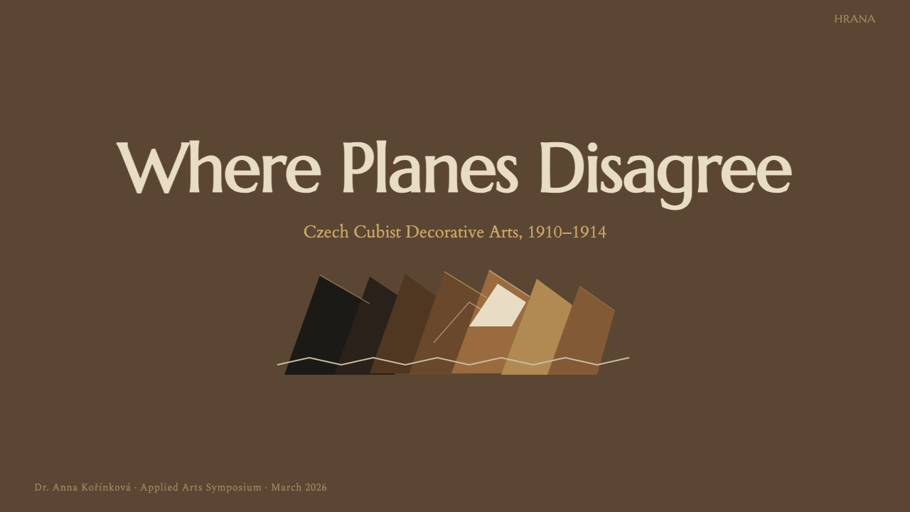
On presentation slides, the style is strongest on cover and section-break pages, where a large faceted shape — rendered as overlapping angled planes in the ochre-and-umber palette — can anchor a corner or bleed off an edge, with the title set in restrained, high-contrast type against the dark ground. Content slides should use the faceting sparingly, as a single accent shape or divider rather than a full-bleed texture; a data slide can render bars or segments as faceted blocks rather than flat rectangles, letting each segment carry a slightly different tone the way glaze pools differently across a ceramic facet.
For web interfaces, the palette and geometry suit contexts that want to feel crafted and substantial rather than fast and light — premium editorial products, cultural and museum sites, or dashboards for goods with real material weight. A dark, near-black ground with ochre accents on cards or active states reads as considered rather than somber, provided the faceted motif stays confined to a handful of deliberate accents — a card corner, a section divider, an icon — rather than covering every surface, which would fight the density of body text and controls.
In editorial and marketing work, the style rewards restraint and scale: a single large faceted graphic as a section opener or hero image does more work than the same motif repeated at small size throughout a layout. Pull quotes and section markers can borrow the chevron accent as a structural device — a small angular mark instead of a straight rule — while body copy stays plain and legible, letting the faceted geometry remain the exception rather than the wallpaper.
The most common mistake is treating Czech Cubism as a texture — tiling small triangular facets across a background the way one might apply a decorative pattern. The historical style never worked that way: facets were sized to the object, large enough to read as structural cuts rather than a printed motif. A second common error is reaching for bright, saturated color; the authentic palette is earthen and glazed, closer to stained wood and fired clay than to printed ink, and pairing it with the brighter red-and-white of the later, patriotic 'National Style' phase mixes two historically distinct registers that were never meant to appear together.
Czech Cubist Decorative Arts — FAQ
Is Czech Cubism the same as the Cubism of Picasso and Braque?
They share a name and a formal starting point but not a medium. Picasso and Braque's Cubism was a painting movement that fractured represented objects into overlapping flat planes on a canvas. Czech Cubism, centered in Prague between about 1910 and 1914, took that fractured-plane vocabulary and applied it to real three-dimensional objects and buildings — something the French and Spanish originators never attempted. It is best understood as a distinct, Prague-specific movement that borrowed Cubism's visual grammar and gave it a structural, almost architectural theory of its own.
Why did Cubism become architecture only in Prague, and nowhere else?
Prague's young architects were unusually receptive to Cubist painting exhibited there in the years before 1911, but the deeper reason was cultural: after centuries under Habsburg and Viennese cultural dominance, Czech designers were actively searching for a modern style that could read as distinctly national rather than imported. Pavel Janák's crystalline-facet theory gave them a formal system that felt genuinely new and unconnected to Vienna's rationalist modernism, and a small, tightly connected circle of architects, sculptors, and craft cooperatives had both the theoretical conviction and the commissions to build it at real scale — a combination that never quite recurred elsewhere.
What's the difference between this style and Rondocubism, or the 'National Style'?
They are sequential phases of the same lineage. The pre-war style — the one this design system is drawn from — is dark, angular, and earthen: ebonized wood, ochre and umber glaze, sharp crystalline facets. After Czechoslovak independence in 1918, the vocabulary softened into Rondocubism, using rounded arches and drum forms rendered mostly in red and white to celebrate the new state. The later phase is brighter, rounder, and explicitly patriotic; the earlier phase is darker, sharper, and more materially serious. The two should not be mixed.
Does this style work with a light background, or does it need to stay dark?
The register this system draws on is historically a dark one, and that darkness is doing real work — it is what makes the ochre and umber glazes read as rich and material rather than flat. A light-ground adaptation is possible but changes the character substantially: the faceted geometry needs enough tonal contrast between adjoining planes to still read as carved rather than printed, which is harder to achieve convincingly on white than on a dark ebonized ground.
What kinds of products or brands does this style suit, and where does it struggle?
It suits anything that wants to signal craft, permanence, and material seriousness — museum and cultural institutions, premium goods, architecture and design practices, heritage brands. It struggles in contexts that need to feel fast, casual, or friendly — consumer apps aimed at a broad, young audience, anything requiring dense functional UI at small scale, or brands whose whole proposition is lightness and ease, since the style's dark ground and carved geometry read as deliberate and weighty rather than quick.
Related design styles
 Romanian Folk VioletSevere and rich at once. Near-black homespun wool lit by amethyst-plum and br…
 Basotho Seanamarena BlanketRank made visible. Cobalt wool, gold maize diamonds, and chestnut borders rea…
 Kyrgyz Shyrdak Felt RugCut felt becomes structure. Vermilion-indigo mirror blocks stitch positive to…
 Russian ConstructivismRevolution red, slashed across black and white. Diagonal sans-serif, photomon…
 Streamline Moderne (1930s)Optimism made aerodynamic. Cream ground, chrome ovals, and cherry stripes dri…
 Bauhaus WeimarForm follows revolution. Primary red-blue-yellow on cream, hard shadows, no o…