What is Romanian Folk Violet?
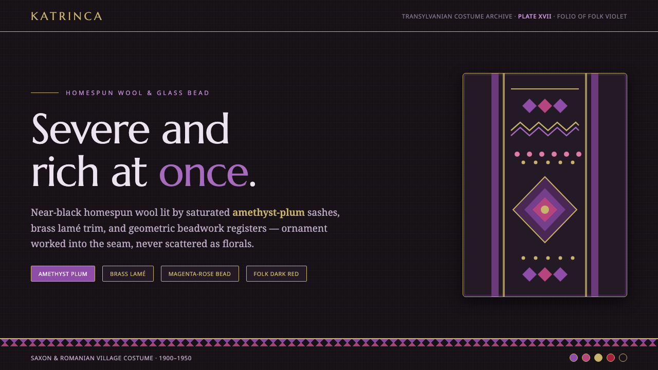
Romanian Folk Violet is severe and rich at once: near-black homespun wool grounds lit by amethyst-plum color, brass trim, and geometric beadwork that catches the light.
Romanian Folk Violet in brief
Romanian Folk Violet draws on the early-to-mid twentieth-century costume of Transylvanian Saxon and Romanian villages. Its visual foundation is dark homespun wool, the black katrinca apron, and a somber field of black and deep red. Against that darkness, amethyst-violet becomes highly charged: plum wool sashes, violet thread, and glass beadwork appear not as decoration scattered across a surface, but as concentrated areas of light and richness.
The system translates this rural craft vocabulary into interface language. Backgrounds behave like dense woven cloth; panels feel like pieces of dark material edged with violet or brass; horizontal bands take the place of geometric beadwork. The result is not rustic softness. It is a disciplined, ceremonial style in which contrast, material suggestion, and repeated geometry carry the identity.
Romanian Folk Violet works through restraint. Near-black establishes gravity, amethyst-plum supplies the saturated accent, and brass introduces a controlled glint rather than broad brightness. Deep red can remain close to the ground as a secondary warmth. Florals, scattered ornaments, and generic folk motifs weaken the system; its character comes from the tension between severe dark fields and carefully organized bands of color.
Where does Romanian Folk Violet come from?
The source tradition belongs to rural Transylvania and Romania in the early-to-mid twentieth century, particularly the costume cultures of Transylvanian Saxon and Romanian village communities. The period matters because the style is grounded in clothing as made, worn, and assembled: homespun wool, woven aprons, sashes, thread, and beadwork. Its authority comes from a complete material vocabulary rather than from a single ornamental emblem.
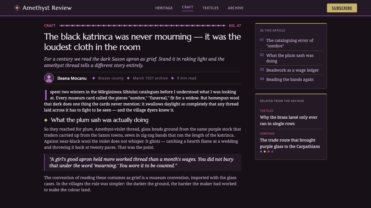
Darkness is the first organizing fact. Black wool and the black katrinca apron create a dense ground, while deep red keeps the costume language from becoming visually empty. Saturated violet then appears as a deliberate interruption: a plum sash, amethyst thread, or glass beads catching light against the surrounding cloth. The contrast is severe, but the handmade materials keep it from feeling sterile.
The craft roles named in this tradition are collective rather than celebrity-driven. Village seamstresses of Transylvanian Saxon costume represent the construction of the garment; Romanian bead-workers represent the patient placement of luminous detail; Katrinca apron weavers represent the patterned textile surface. Together, these practices explain why the style feels structured from the inside out: its visual order is carried by making.
As a contemporary design system, Romanian Folk Violet preserves those relationships without pretending that a screen is a garment. The interface borrows the dark ground, the narrow vocabulary of saturated accents, the brass-like edge, and the geometric band. What survives is the hierarchy of material cues: cloth as field, trim as boundary, beads as points of light, and repeated geometry as the carrier of pattern.
What defines the Romanian Folk Violet look?
Near-Black Ground
The foundation is almost black rather than bright black: dense, wool-like, and capable of carrying both violet and brass without losing its gravity. Deep red may sit near the ground as a restrained secondary note. Large light fields should be rare, because the style depends on darkness making every accent visible.
Amethyst-Plum Accent
Violet is the saturated voice of the system. It should feel like plum wool, amethyst thread, or a bead catching light: rich, concentrated, and tactile rather than fluorescent. Use it to establish primary actions, important bands, selected states, and moments of ceremonial emphasis.
Brass-Like Trim
Brass supplies a narrow, warm glint against the dark field. It behaves best as edging, a rule, a bead-like highlight, or a small marking that clarifies a boundary. Broad metallic treatment turns the style ornamental; restrained trim keeps it closer to woven costume and hand-applied detail.
Geometric Beadwork Bands
Pattern appears in organized horizontal bands rather than scattered motifs. Repeated geometric marks can separate sections, frame a title, signal a selected state, or run across a panel like a woven border. The band should read as a structural register first and ornament second.
Panel Construction
Components should feel assembled from dark textile panels: broad fields, clear edges, and deliberate seams between neighboring areas. Violet or brass edging can distinguish an active panel from a quiet one. Soft, floating cards are less appropriate than grounded blocks with visible boundaries.
Ceremonial Contrast
The visual mood comes from controlled contrast, not from constant brightness. Near-black gives the interface authority; violet marks significance; brass catches attention at the edge. Text hierarchy should remain calm and legible so that the saturated accents retain their rarity and symbolic force.
Who shaped Romanian Folk Violet?
These seamstresses represent the garment-making intelligence behind the style: dark homespun wool becomes a structured costume rather than an anonymous black surface. In the design system, their role suggests that every panel, edge, and joining line should feel constructed, purposeful, and materially grounded.
Romanian bead-workers represent the concentrated shimmer of the tradition. Their named role becomes a digital principle: luminous detail should be placed with patience and intention, using geometric beadwork as a precise signal rather than filling every available surface with decoration.
Katrinca apron weavers anchor the system in patterned textile construction. Their contribution is expressed through the black apron ground, repeated bands, and the sense that pattern belongs to a surface with an edge. In interface work, this favors bounded sections and horizontal registers over isolated decorative icons.
How do you use Romanian Folk Violet today?
Romanian Folk Violet is most successful when treated as a hierarchy of materials. Begin with the near-black ground, introduce amethyst-plum where importance needs to be felt, and reserve brass-like trim for boundaries or moments of light. Let geometry organize information, and let the dark field remain visible. The style should feel made and assembled, not merely recolored.
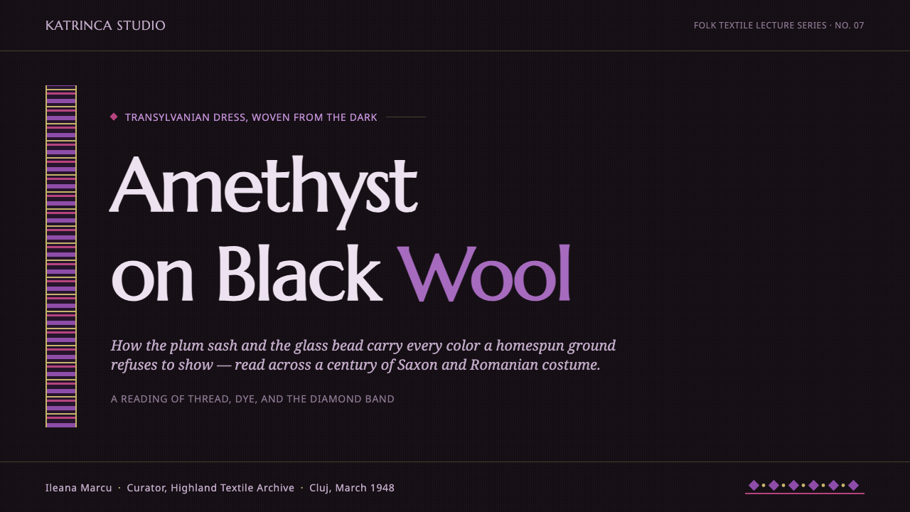
For presentation slides, the cover can use a broad near-black field with a strong violet title block and a restrained brass or beadwork band acting as a visual threshold. Content slides should rely on grounded panels, calm text, and repeated horizontal registers to separate sections. Data slides can turn bars, labels, or key figures into a geometric banded composition; the data must remain legible, while violet marks significance and brass provides selective emphasis.
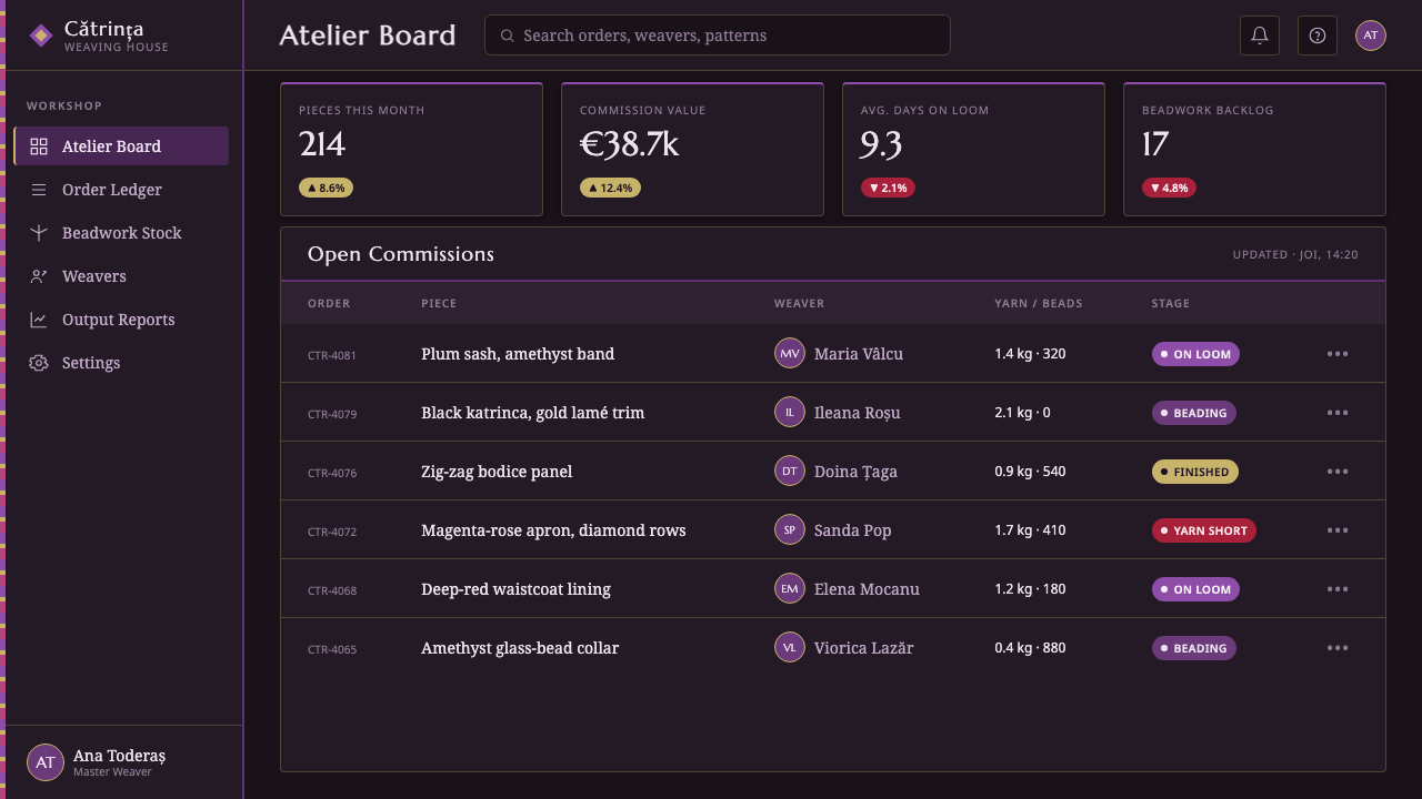
For web interfaces, the style suits dashboards and pricing pages that need authority, focus, and a memorable visual identity. Use near-black for the main field, dark panels for grouped information, violet for active navigation and primary actions, and brass for borders or compact status cues. Pricing tiers can be differentiated through panel edging and banded headers rather than competing bright fills. Dense information should be broken into constructed blocks so the interface feels ordered rather than heavy.
For editorial and marketing work, Romanian Folk Violet supports a dramatic, tactile reading experience. Articles can place a quiet text column inside a dark field, with section openings introduced by a geometric beadwork band and pull quotes edged in violet. Marketing pages can use the contrast between near-black panels and amethyst-plum moments to create ceremony, while brass trim gives product names, calls to action, or key transitions a crafted finish. Imagery should support the material mood instead of introducing unrelated decorative motifs.
The common mistake is treating folk reference as permission to scatter ornaments everywhere. Random flowers, excessive metallic decoration, multiple competing accent colors, or soft luxury effects detach the system from its source. Another mistake is making every surface equally dark and equally saturated, which removes hierarchy. Keep the ground severe, concentrate violet, use brass sparingly, and make every geometric band perform a structural or communicative role.
Romanian Folk Violet — FAQ
Is Romanian Folk Violet meant to reproduce a historical costume exactly?
No. It draws on early-to-mid twentieth-century Transylvanian Saxon and Romanian village costume, then translates its relationships into interface language. The goal is to preserve the dark wool ground, saturated violet, brass-like trim, and geometric banding as a coherent system, not to imitate a garment literally.
Why is the palette so dark?
Dark homespun wool and the black katrinca apron are central to the source material, so near-black is not an arbitrary mood choice. It creates the field against which amethyst-plum and brass become visible. If the ground becomes broadly light, the style loses the severe richness that defines it.
How should the geometric beadwork bands be used in an interface?
Use them as organized registers: section markers, panel edges, selected-state indicators, title frames, or repeated separators. They should clarify structure before they provide ornament. A band that has no role in grouping, directing, or emphasizing information is probably unnecessary.
Can Romanian Folk Violet be used for a warm or playful product?
It can, but its default values are gravity, richness, craft, and ceremony. A product that depends on airy brightness or casual cheer may fight the system's near-black ground and concentrated contrast. It is strongest when the product can benefit from a sense of depth, authority, tactile making, or carefully reserved ornament.
Related design styles
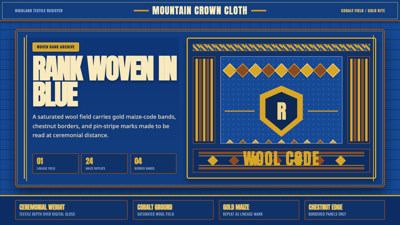 Basotho Seanamarena BlanketRank made visible. Cobalt wool, gold maize diamonds, and chestnut borders rea…
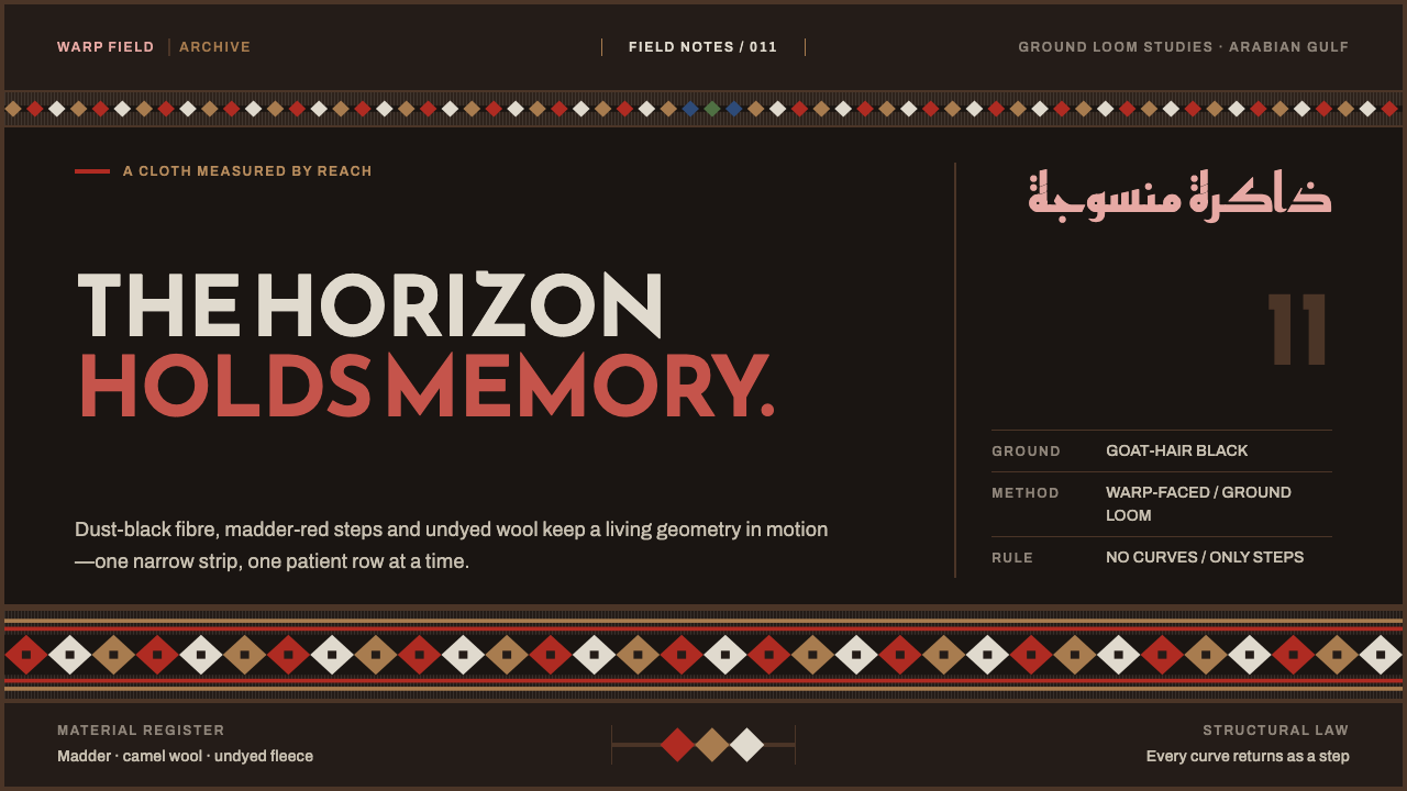 Emirati Sadu WeavingMemory runs in bands. Madder steps cross dusty goat-hair black with no curve…
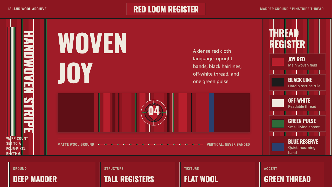 Estonian Kihnu Island SkirtJoy is woven vertical. Madder red ground, Oswald stripes, black and green pin…
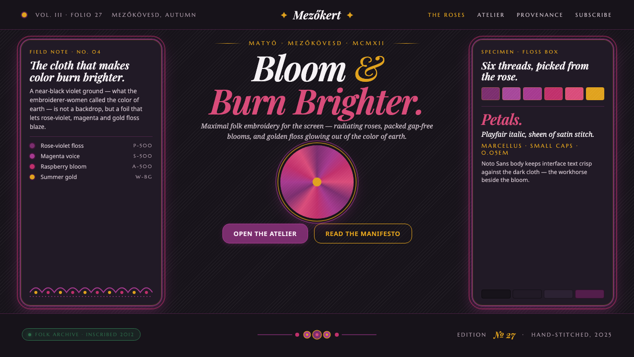 Hungarian Matyó VioletFolk embroidery, maximal. Rose-violet and gold blooms blaze gap-free on near-…
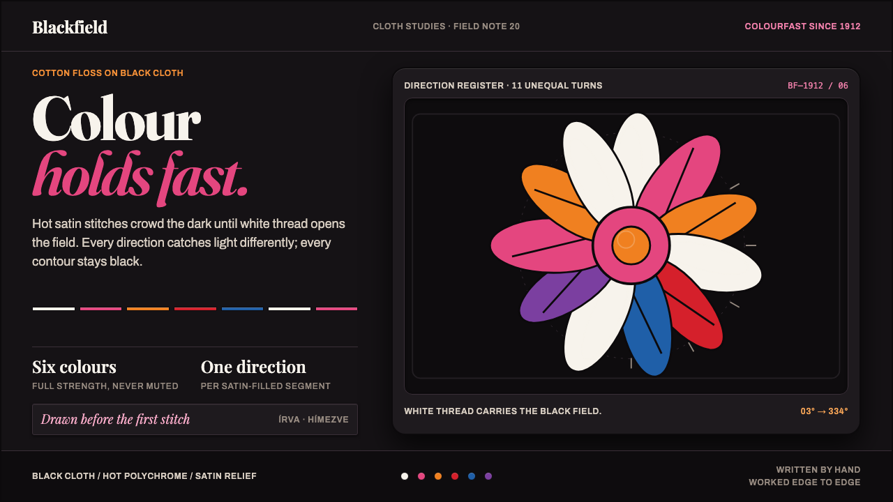 Kalocsa EmbroideryColour burns against black. White thread and hot satin segments pack the fiel…
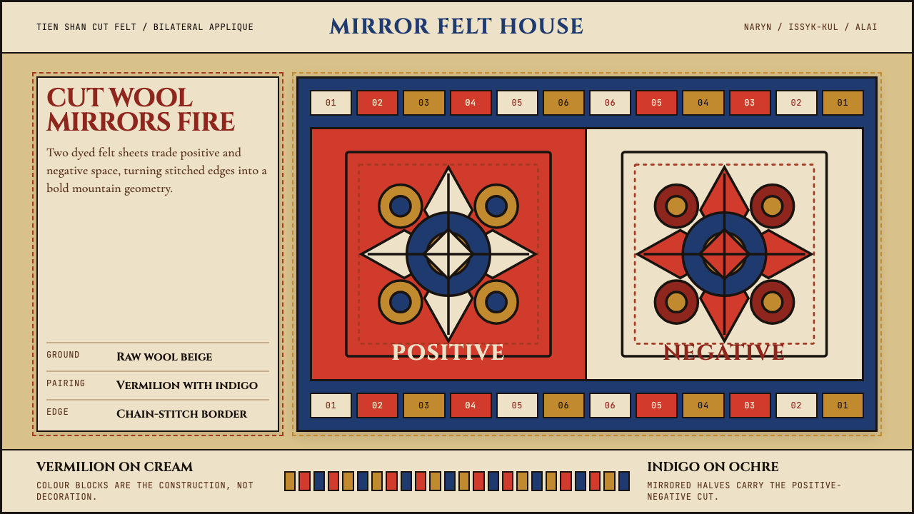 Kyrgyz Shyrdak Felt RugCut felt becomes structure. Vermilion-indigo mirror blocks stitch positive to…