What is Plečnik's Ljubljana?
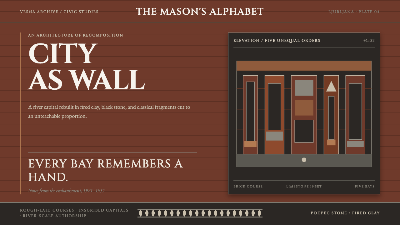
Jože Plečnik treated a whole city as one commission and built it by hand, in rough brick and stone, with classical orders quoted but never obeyed, and this style carries that heavy, handmade monumentality into dark interfaces.
Plečnik's Ljubljana in brief
Plečnik's Ljubljana is a design style drawn from the work of Jože Plečnik, an architect who treated the whole of Ljubljana as a single commission. Between the wars he re-laid the embankments of the Ljubljanica, threw three bridges where one had stood, colonnaded the market and raised the National and University Library out of rough clay brick studded with grey Podpeč limestone and salvaged Roman fragments. The reference record dates the Ljubljana works from 1921 to 1957, with the library built between 1936 and 1941.
What makes this a design language rather than a list of buildings is the way Plečnik handles the classical orders. Column, urn, pyramid and baluster are all quoted, but never as a textbook would have them. Each is re-cut by hand into a private alphabet and then applied at the scale of a river. The proportions refuse to be neat, the joins show the labour, and the result feels laid and carved by hands rather than specified from a catalogue.
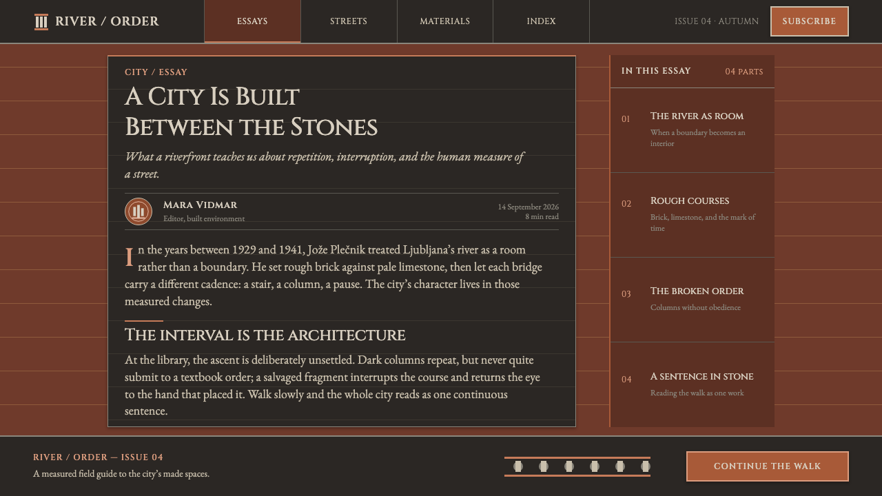
The design system carries that logic into a dark theme: a masonry ground, headings in inscribed Roman capitals, bays that repeat across the page, and proportions that deliberately do not obey. It is rough, heavy and handmade in feeling, and it is explicitly not the clean, glassy dark interface of a typical product. It argues that darkness can be a material, fired clay and stone, and not only a colour scheme.
Where does Plečnik's Ljubljana come from?
The reference record names three currents behind the style: Wagnerschule classicism, interwar Central European modernism and national-romantic monumentality. Otto Wagner appears among the key figures, and the first current takes its name from his school, which points to Wagner's school as the source of the classical vocabulary Plečnik worked with. Plečnik took that discipline and bent it. The result is classical in its vocabulary and idiosyncratic in its grammar, and it sits uneasily between the labels that critics have tried to attach to it.
Between the wars Ljubljana became his commission. The embankments of the Ljubljanica were re-laid. Three bridges were thrown where one had stood. The market was given colonnades. The works, as the record dates them, run from 1921 to 1957, more than three decades of continuous attention to a single city. That scale matters for the design system. The repeated bay, the quoted order and the carved detail are not one-off monuments but a consistent vocabulary applied from the water's edge to the library door.
The National and University Library, built between 1936 and 1941, is the clearest statement of that vocabulary. Its walls are rough clay brick in a deep red-orange, studded with grey Podpeč limestone and salvaged Roman fragments, so that local stone and ancient pieces are pressed into the surface like found objects. Inside, the entrance stair is lined with thirty-two columns of a near-black, glossy Tuscan type. The effect is a heavy, handmade interior inside a heavy, handmade shell. The stone comes from Podpeč, which the record names as the quarry.
France Tomažič and Edo Mihevc are the other two names in the record, placed in the circle of the Ljubljana works. National-romantic monumentality names the impulse behind the whole undertaking: to make a city's own materials, fragments and craft carry the weight of a capital. That impulse is why the buildings never look generic. A river embankment, a market and a library are each given the dignity of a monument, and each is made by a visible hand.
What defines the Plečnik's Ljubljana look?
Masonry Ground
The dark ground reads as brick and stone rather than as an absence of light. It is warm, with an undertone of fired red-orange clay, and it is matte and slightly rough. Surfaces feel thick; panels and bands sit on it like courses laid on a wall. This is a dark theme with mass, and the mass is what carries it.
Fired-Clay Courses
Layout is arranged in horizontal courses, like brick laid in rows. Bands of content stack with firm, slightly uneven rhythm, and the bonding between them is felt rather than hidden. Tiny irregularities are allowed to show, because the surface is supposed to read as laid by a hand.
Inscribed Roman Capitals
Headings are set in Roman capitals that feel inscribed rather than typed: carved, serious and spaced with the patience of a stone-cutter. They announce a section the way a lettered lintel announces a building. Capitals belong to headings and labels only; running text needs a readable face of its own.
Stone and Fragment Inlay
Grey limestone and salvaged Roman fragments are pressed into the brick surface of the library. On the page, a pale or grey element is set into the dark courses like a found object: an inset panel, a stone-coloured label, a salvaged-looking detail. Insertions should look placed, not generated, and each should feel like it came from somewhere else.
Repeating Bays
Columns, colonnades and bridges give the system its rhythm of repetition. Content is divided into bays that recur across the page, like the openings of a market arcade. The repetition is steady, but each bay is allowed its own small variation, so the arcade never feels mechanical.
Disobedient Proportions
The classical orders are quoted but re-cut by hand, so their proportions never match the textbook. The system does the same: intervals are slightly unequal, scales are pushed a little past what a strict modular system would allow, and the result feels more human than correct. This is the characteristic that most separates the style from neat classicism.
Near-Black Polished Columns
The library stair is lined with near-black, glossy Tuscan columns inside a matte masonry shell. That pairing is a useful model for accents: a small number of deeper, shinier elements set against rough surfaces, so that polish reads as an event rather than as the default finish of the page.
Who shaped Plečnik's Ljubljana?
Plečnik is the architect who treated Ljubljana as one commission, re-laying the Ljubljanica embankments, building three bridges where there had been one, colonnading the market and raising the National and University Library. The record dates his Ljubljana works from 1921 to 1957. His habit of quoting the classical orders and re-cutting them into a private alphabet is the single most imitable idea in the style, and the hardest to imitate well.
Wagner appears among the key figures, and Wagnerschule classicism is the first of the three currents the record gives for the style. His name marks the lineage behind Plečnik's classical vocabulary. For a designer it is a reminder that the apparent roughness of Plečnik's work rests on training: the bending of the orders only works because the orders are known.
These are the other two key figures named in the record, placed in the circle of the Ljubljana works. The record does not credit either with a particular building in this style, so the names are best read as pointers for further research into the people around Plečnik. They are a useful reminder that a city made by hand is made by many hands.
Built between 1936 and 1941, the library is the style in its most complete form: rough red-orange clay brick studded with grey Podpeč limestone and salvaged Roman fragments, with thirty-two near-black columns in the entrance stair. If you want to see the system as a single image, it is the place to start. A page that wants to feel like this building should be heavy, warm, uneven and dignified.
How do you use Plečnik's Ljubljana today?
Plečnik's Ljubljana suits dark interfaces that need weight, craft and a sense of institution. It is a good fit for libraries, archives, museums and cultural organisations, for publishers and bookshops, and for wine, spirits and hospitality brands that want to feel built rather than designed. It demands patience: the style only works when the surfaces are allowed to be thick and the details are allowed to be uneven.
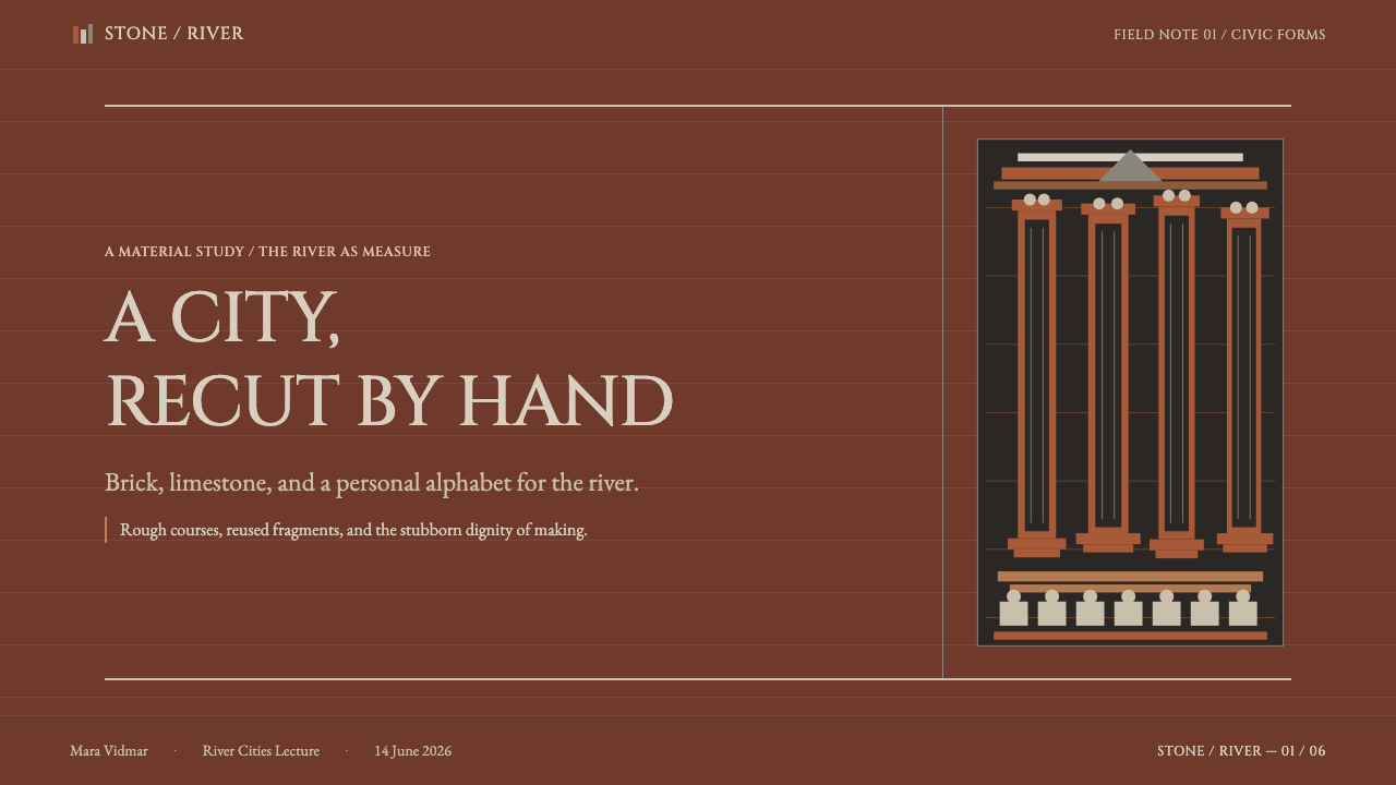
For presentation slides, a cover works best as a masonry-dark field with the title in inscribed Roman capitals, set low and left, and one pale stone-coloured inset like a salvaged fragment. Content slides can be divided into bays, so that three or four ideas stand like the openings of an arcade. Data slides take well to columns: draw bars as pillars of unequal height and let the unevenness be read as honest data rather than as a flaw to be tidied.
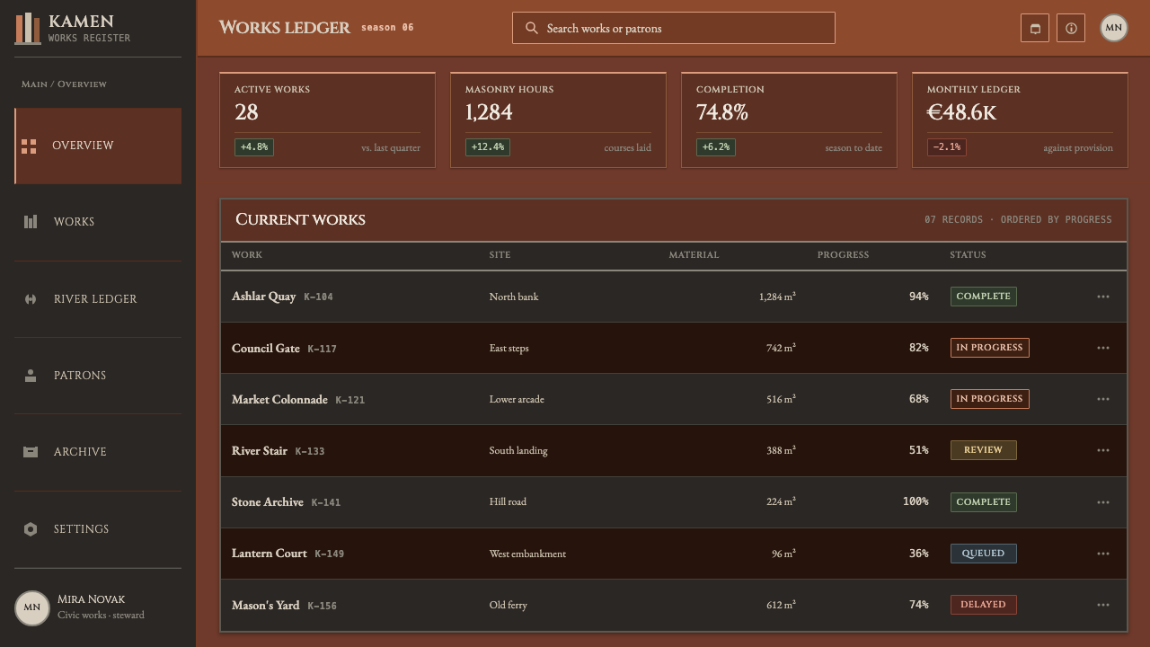
On the web, the style is suited to archives, catalogues, cultural sites and editorial products. Navigation can be a row of capitals under a thick course of masonry. Cards become bays with a firm top edge and a heavy lower margin, and pricing tiers can be set as a colonnade. For dense dashboards, restrict the style to the frame and headings and keep the data regions calm; the roughness belongs to the structure, not to the numbers. Always keep running text in a readable face with generous contrast.
For editorial and marketing work, the style supports long-form cultural writing, institutional histories, exhibition material and heritage storytelling. Photography should favour brick, stone, arcades and hands at work, in warm, low light. Capitals suit headings and short labels only. Copy should be specific about materials and places: the name of the quarry, the course of the river, the year of the building. Specificity is the style's moral register.
The most common mistake is to tidy it up. If proportions are made perfectly modular, corners are polished and surfaces are made glassy, the page becomes a standard dark UI with a brick-coloured background. Other frequent errors are laying a repeated brick-texture image behind everything as wallpaper, setting running text in all capitals, using literal clip-art columns and urns as decoration, and lightening the masonry to pastel until it loses its weight. Quote the orders by structure and rhythm, not by pasting their pictures, and keep the whole thing heavy.
Plečnik's Ljubljana — FAQ
Who was Jože Plečnik?
Plečnik was an architect who treated the whole of Ljubljana as a single commission. Between the wars he re-laid the Ljubljanica embankments, built three bridges where there had been one, colonnaded the market and raised the National and University Library. The reference record dates his Ljubljana works from 1921 to 1957.
Why do the proportions refuse to be neat?
Because Plečnik quotes the classical orders but re-cuts them by hand, so column, urn, pyramid and baluster become a private alphabet and not a textbook. The system keeps that in its layouts: intervals are slightly unequal and scales are pushed a little past strict modular logic, so the page feels made by hand.
Is this just a dark mode with a brick texture?
No. A brick texture applied over an ordinary dark layout misses the point. The style lives in its structure: horizontal courses, repeating bays, inlaid pale fragments, inscribed capitals and deliberately imperfect proportions. Remove those and what remains is a generic dark theme in a brown tint, however good the texture.
Are the Roman capitals essential?
They are the voice of the headings, and they carry the sense of inscription that connects the page to stone. Without them the style loses much of its character. They should be limited to headings and short labels, and running text should sit in its own readable face so the dark page stays easy to read.
Does it work for data-heavy interfaces?
Only partly. The style is heavy and handmade, which suits frames, headings and navigation, but dense numbers need calm. A good approach is to apply the masonry, bays and capitals to the structure of the screen and keep the data regions quieter, with generous contrast and regular spacing, so the roughness never gets in the way of reading.
Related design styles
 Romanian Folk VioletSevere and rich at once. Near-black homespun wool lit by amethyst-plum and br…
 Basotho Seanamarena BlanketRank made visible. Cobalt wool, gold maize diamonds, and chestnut borders rea…
 Estonian Kihnu Island SkirtJoy is woven vertical. Madder red ground, Oswald stripes, black and green pin…
 Andean ChulloOrnament carries a code. Cochineal red stacks strict stitch bands with bead-w…
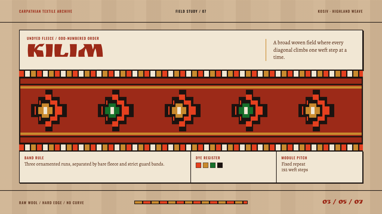 Hutsul KilimGeometry is the craft. Hot red stepped rhombs repeat across raw fleece bands.
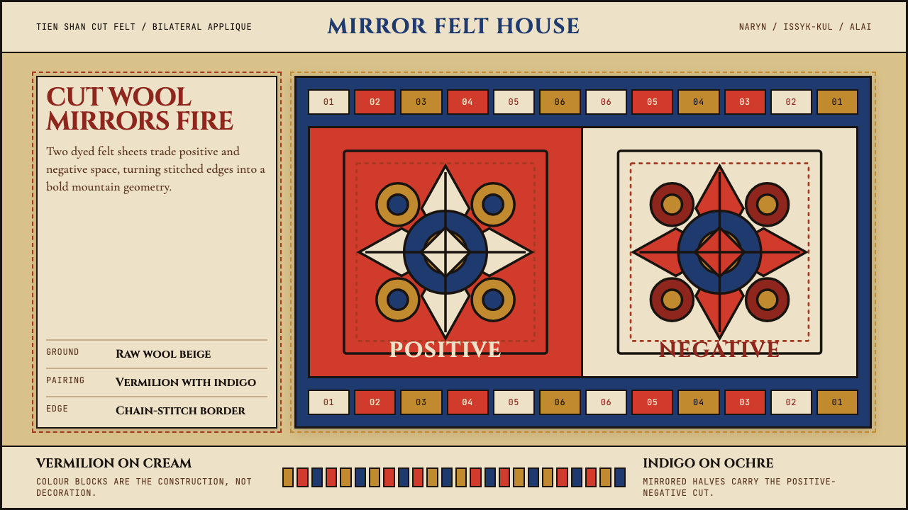 Kyrgyz Shyrdak Felt RugCut felt becomes structure. Vermilion-indigo mirror blocks stitch positive to…