What is Estonian Kihnu Island Skirt?
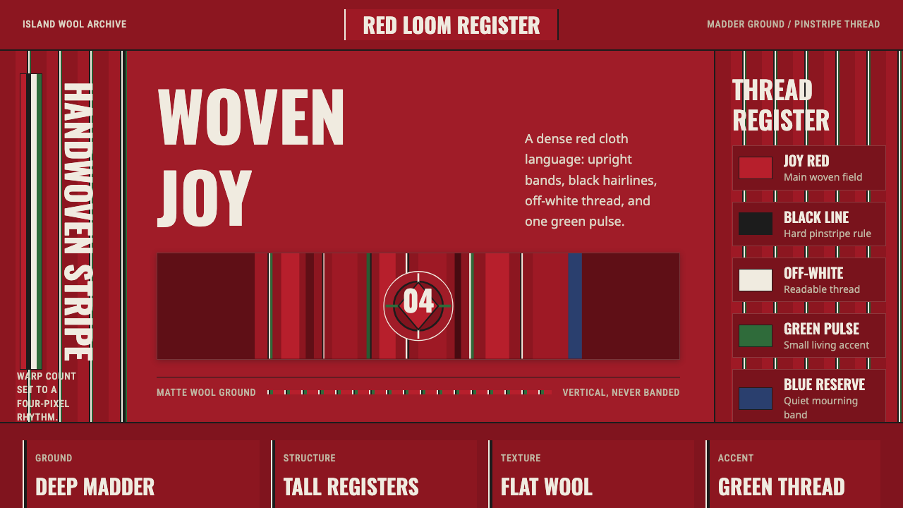
On Kihnu Island, joy is woven vertically: deep red wool, disciplined stripes, and fine dark, pale, and green threads turn a living garment into a language of belonging.
Estonian Kihnu Island Skirt in brief
The Kihnu kört is a handwoven wool skirt from Kihnu Island in Estonia’s Gulf of Riga. Its surface is organized by dense vertical red stripes, interrupted and articulated by fine pinstripes of black, off-white, and green. Rather than placing ornament on top of a garment, the kört builds its visual identity directly into the cloth. Pattern, material, and structure arrive together through weaving, giving the skirt an unusually unified appearance.
Red is both the dominant visual force and a carrier of social meaning. The deep madder-cochineal tone signifies youth and joy, while mourning skirts withdraw red in favor of black and dark-blue bands. As grief fades, red and purple are gradually woven back into the garment. The palette therefore does more than establish beauty or recognition: it makes emotional transition visible, allowing clothing to register changing states without abandoning the shared striped language.
As a design system, the kört is dark, warm, matte, and strongly directional. Tall stripe registers create continuity from waist to hem, while the fine contrasting threads keep the red field from becoming visually uniform. The wool absorbs light rather than reflecting it sharply, so the effect is substantial and tactile instead of polished. Although the pattern is emphatic, its power comes from repetition, proportion, and material depth rather than applied decoration.
Where does Estonian Kihnu Island Skirt come from?
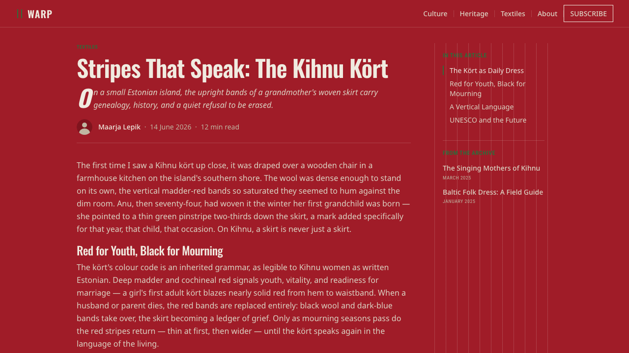
The kört belongs to the folk-costume tradition of Kihnu Island, a small Estonian island in the Gulf of Riga. Its origin is described as pre-1900, yet it is not a style preserved only through historical reconstruction. It remains part of a living cultural practice in which traditional clothing continues to be worn. That continuity is essential to understanding the skirt: the kört is simultaneously a practical wool garment, a recognizable island emblem, and a surface through which communal meanings are carried.
Kihnu women weavers are the central makers and transmitters of the tradition. The skirt’s identity depends on handwoven wool and on the disciplined arrangement of dense red vertical stripes with narrow black, off-white, and green accents. Because the pattern is woven rather than printed or attached, knowledge of the visual system is inseparable from knowledge of making. The repeated bands may be read as graphic structure, but they are also evidence of practiced labor and of a tradition sustained through continued production.
The emotional vocabulary of the skirt developed within this living dress culture. Deep madder-cochineal red is associated with youth and joy, while mourning changes the cloth’s chromatic balance: red recedes and black and dark blue become prominent. Red and purple return gradually as grief lessens. This progression gives the kört a temporal dimension. A skirt does not merely indicate a fixed category; through color, it can participate in a passage from mourning toward renewed social and emotional brightness.
The Kihnu cultural space was inscribed on UNESCO’s list in 2008, acknowledging a tradition that includes the island’s still-practiced folk culture. The listing did not transform the kört into a museum artifact; its significance lies precisely in continued use. Kihnu Virve stands among the named figures associated with this cultural world, while generations of women weavers remain its collective authors. Together, public recognition and everyday wearing demonstrate how a local textile language can remain culturally specific without becoming visually static.
What defines the Estonian Kihnu Island Skirt look?
Madder-Red Ground
The defining field is a deep, warm madder-cochineal red associated with youth and joy. It should feel embedded in wool rather than laid over a neutral surface. The red is substantial and earthy, never glossy or artificially radiant. In a composition, it acts as atmosphere and structure at once: a surrounding warmth from which darker, paler, and greener threads emerge.
Vertical Stripe Registers
Tall vertical stripes provide the primary rhythm. Their density makes the surface feel continuous, yet small shifts between broader red passages and fine contrasting lines prevent mechanical sameness. The direction is upright and extending, lending even a static layout a sense of fall and continuity. Horizontal interruption should remain secondary because the kört’s identity is carried by its vertical flow.
Pinthread Accents
Black, off-white, and green appear as narrow thread accents within the red sequence. Their role is not to compete for large areas but to sharpen rhythm, separate adjacent bands, and reward close viewing. Black supplies gravity, off-white introduces a restrained glint of contrast, and green adds a cool living note. Together they make the cloth intricate without making it ornate.
Matte Wool Texture
The surface should retain the visual behavior of wool: soft in reflection, dense in body, and slightly irregular rather than digitally immaculate. Light is absorbed and dispersed across the threads, so depth comes from material presence and layered color, not from shiny highlights or atmospheric effects. This matte quality keeps the strong red palette grounded and prevents the pattern from becoming loud or synthetic.
Mourning Transformation
The visual system includes an expressive dark mode rooted in mourning practice. Red is removed, while black and dark-blue bands take control; as grief fades, red and purple return gradually. This is not merely an alternate palette but a meaningful progression. Designers drawing from the tradition should preserve that distinction and avoid treating the mourning colors as an arbitrary fashionable variation.
Woven Repetition
Repetition is the source of cohesion, but the result should not resemble a generic striped backdrop. The pattern feels made because broad and fine elements work together, and because each accent remains visibly related to the surrounding red field. Effective repetition is persistent without being sterile. It suggests accumulated threads and sustained handwork rather than a decorative motif duplicated without consequence.
Living Cultural Use
The style cannot be separated from the fact that the kört is still worn. Its authority comes from use, not from nostalgic simulation. Contemporary applications should therefore emphasize durability, legibility, and coherent pattern behavior instead of presenting the textile as exotic surface decoration. The strongest interpretation acknowledges a living island identity and allows the woven logic to organize information.

Who shaped Estonian Kihnu Island Skirt?
Kihnu women weavers are the collective makers, bearers, and continuers of the kört tradition. Through handwoven wool, they maintain the dense vertical stripe system and its fine black, off-white, and green accents. Their role extends beyond producing recognizable cloth: the weaving carries distinctions between joy and mourning, allowing cultural knowledge to remain present through garments that continue to be made and worn.
Kihnu Virve is a named figure associated with the island’s cultural tradition. Within an account centered on collective women’s work rather than individual design authorship, her presence gives the living culture a recognizable human point of reference. She belongs to the same cultural space in which the kört remains an everyday emblem rather than an anonymous historical pattern detached from island life.
The Kihnu cultural space, inscribed on UNESCO’s list in 2008, is the communal setting that gives the skirt its meaning. It connects weaving, wearing, island identity, and social expression. Recognizing the cultural space as a formative presence prevents the kört from being reduced to a palette or stripe sample: the garment belongs to a continuing network of practice, memory, and everyday participation.
How do you use Estonian Kihnu Island Skirt today?
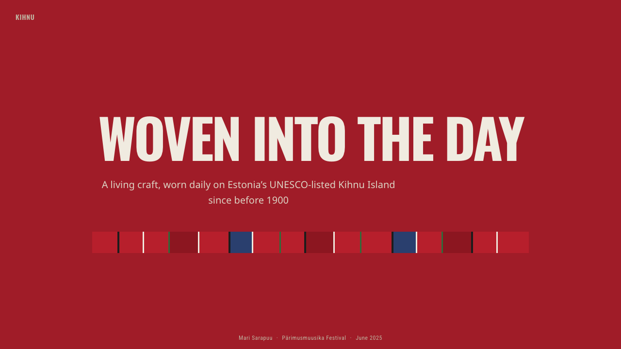
For presentation slides, the Kihnu system is strongest when the cover behaves like an enlarged section of woven cloth. A deep warm-red field can carry tall stripe registers along one side or across the full composition, while the title occupies a calmer interval between bands. Content pages should retain the vertical logic more sparingly: a narrow striped margin, a pinthread-like rule, or a sequence of warm and dark columns can establish identity without reducing reading space. The type should feel narrow, upright, and direct, echoing the elongated pattern without pretending to be textile.
Data slides benefit from treating stripes as ordered categories rather than decorative bars. Vertical charts naturally align with the skirt’s direction, while black, off-white, and green accents can distinguish selected series against a dominant red structure. The hierarchy must remain clear: broad areas communicate the primary finding, and fine thread colors identify exceptions, comparisons, or annotations. Avoid filling every chart element with competing stripes, since the result will obscure both the information and the woven rhythm.
For web interfaces, the style suits dashboards, archives, cultural collections, and pricing pages that can support a dark, warm visual atmosphere. Use the red field as a framing environment, then place readable content in restrained dark or pale panels. Vertical rules can organize navigation, tables, plan comparisons, and status groups. Fine green accents are effective for active or affirmative states, while off-white creates calm reading surfaces. Interaction should remain solid and tactile, avoiding polished effects that contradict the matte character of wool.
Editorial and marketing applications should foreground the story of a living garment rather than using folk pattern as atmosphere alone. An article can place long text in quiet columns beside cropped stripe fields, with captions and metadata aligned like narrow woven threads. Campaign pages can alternate dense patterned passages with open red or dark areas, allowing moments of intensity and rest. When discussing Kihnu culture directly, explain the emotional role of red and the mourning transformation so the visual language retains its meaning.
The most common mistake is to treat the kört as generic festive striping. Enlarging every color equally, adding shine, or mixing horizontal and vertical bands indiscriminately removes the hierarchy that makes the cloth distinctive. Another error is using black and dark blue merely because they feel dramatic, without acknowledging their connection to mourning. A responsible adaptation leads with vertical red structure, uses black, off-white, and green as fine accents, preserves matte material character, and distinguishes cultural reference from superficial pattern borrowing.
Estonian Kihnu Island Skirt — FAQ
Is the Kihnu kört a historical costume or a living garment?
It is both historically rooted and living. The tradition predates 1900, but the skirt is not known only through archives or reconstruction. Traditional dress continues to be worn on Kihnu Island, and the cultural space was inscribed on UNESCO’s list in 2008. Its continued use is central to its meaning: the pattern belongs to an active community rather than to a closed historical period.
Why is red so important in the kört?
Deep madder-cochineal red signifies youth and joy and supplies the skirt’s dominant visual ground. Its importance becomes especially clear through absence: mourning skirts remove red in favor of black and dark-blue bands. As grief fades, red and purple are gradually restored. Red therefore acts as emotional language, not merely as a memorable brand color or decorative preference.
Can the stripe pattern be used horizontally?
Horizontal elements can appear as secondary structure, but a horizontal-first composition loses the kört’s defining character. The skirt is recognized through dense vertical red stripes and fine upright accents, whose direction reflects the fall of the garment. In contemporary layouts, horizontal rules may support sections or reading order, yet the dominant movement should remain vertical if the work intends to reference the Kihnu textile specifically.
Does a Kihnu-inspired design need to imitate wool literally?
No. The goal is to preserve material behavior, not to apply a photographic wool texture everywhere. Colors should feel absorbed rather than glossy, edges may carry restrained human irregularity, and depth should come from layered bands and fine accents. A clean digital interface can still express the textile’s character if it remains matte, substantial, and disciplined in its repetition.
How can designers reference the kört respectfully?
Begin with context. Identify the pattern as part of Kihnu Island’s living folk-costume tradition, recognize Kihnu women weavers as its collective makers, and explain the emotional meanings attached to red and mourning colors when they are relevant. Visually, work from the woven logic of vertical structure, fine thread accents, and matte wool rather than copying a stripe sample as anonymous decoration. Attribution and formal understanding should accompany each other.
Related design styles
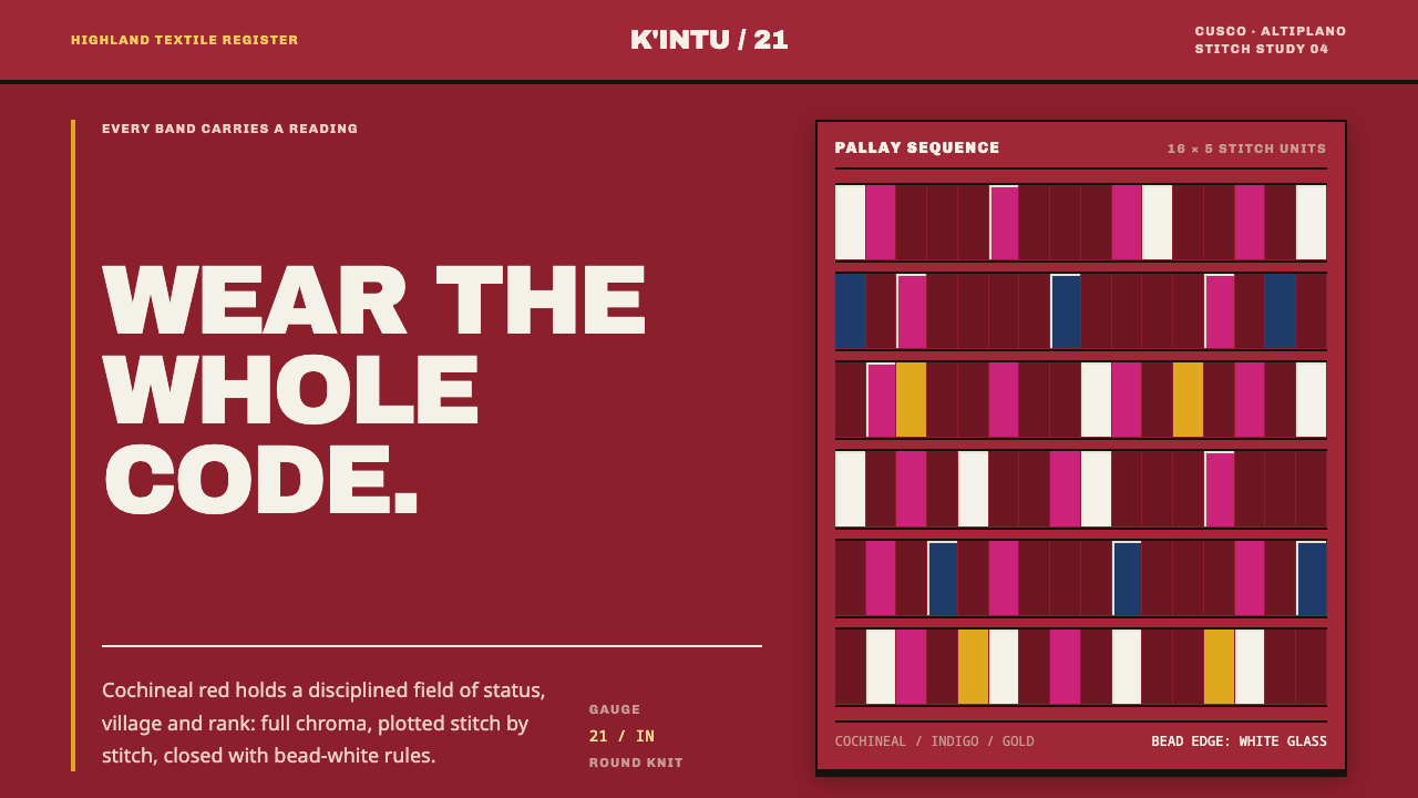 Andean ChulloOrnament carries a code. Cochineal red stacks strict stitch bands with bead-w…
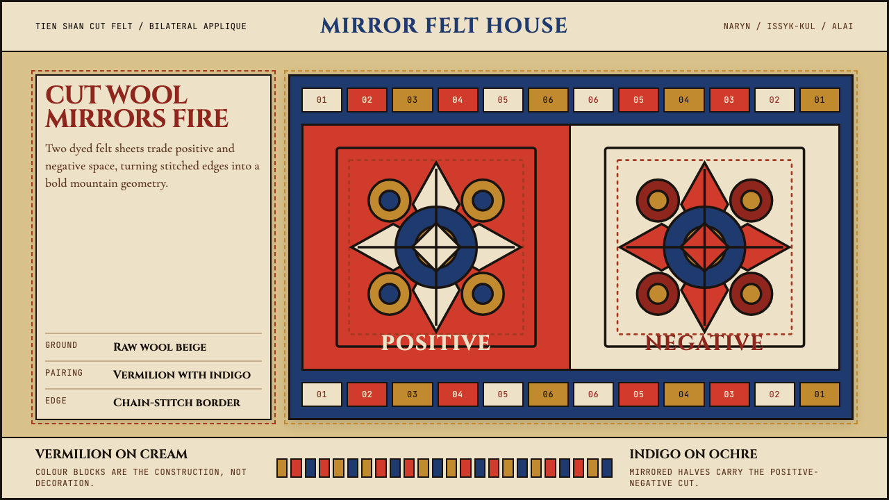 Kyrgyz Shyrdak Felt RugCut felt becomes structure. Vermilion-indigo mirror blocks stitch positive to…
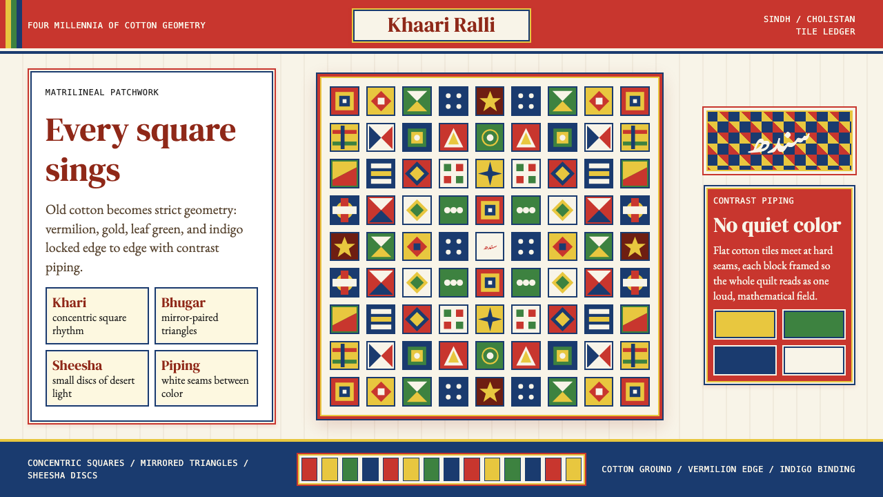 Sindhi Ralli QuiltSings in squares. Vermilion, gold, green, and indigo lock into piped tile rhy…
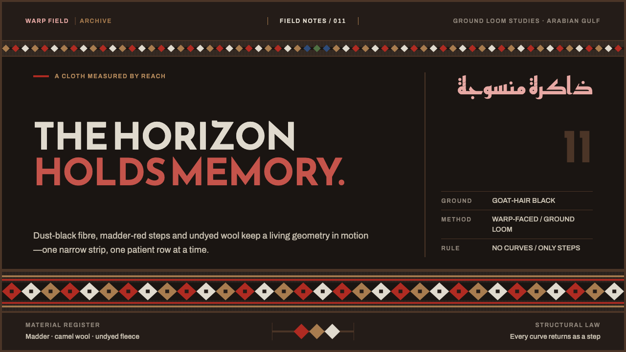 Emirati Sadu WeavingMemory runs in bands. Madder steps cross dusty goat-hair black with no curve…
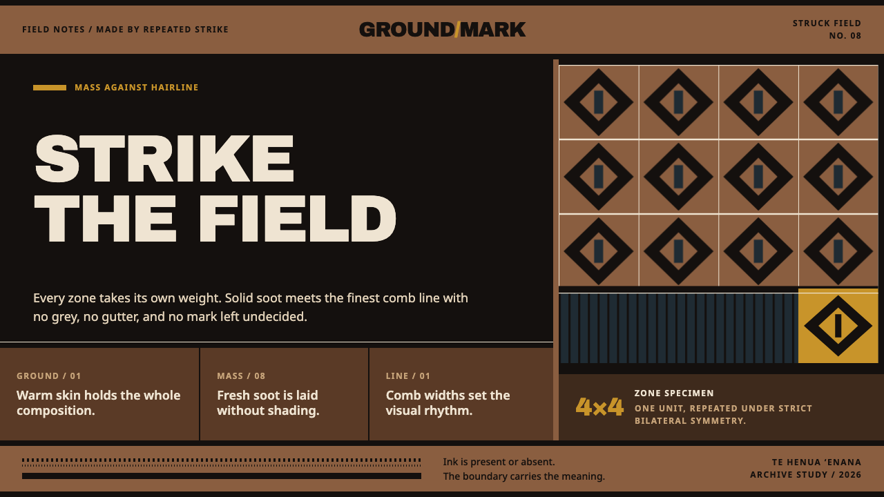 Marquesan PatutikiSoot meets skin without compromise. Solid black zones collide with comb-struc…
 Mossi Burkina Plank MaskCarved, not rendered. Charcoal fields, dust-red cuts, and kaolin bands stack…