What is Escolta Art Deco Manila?
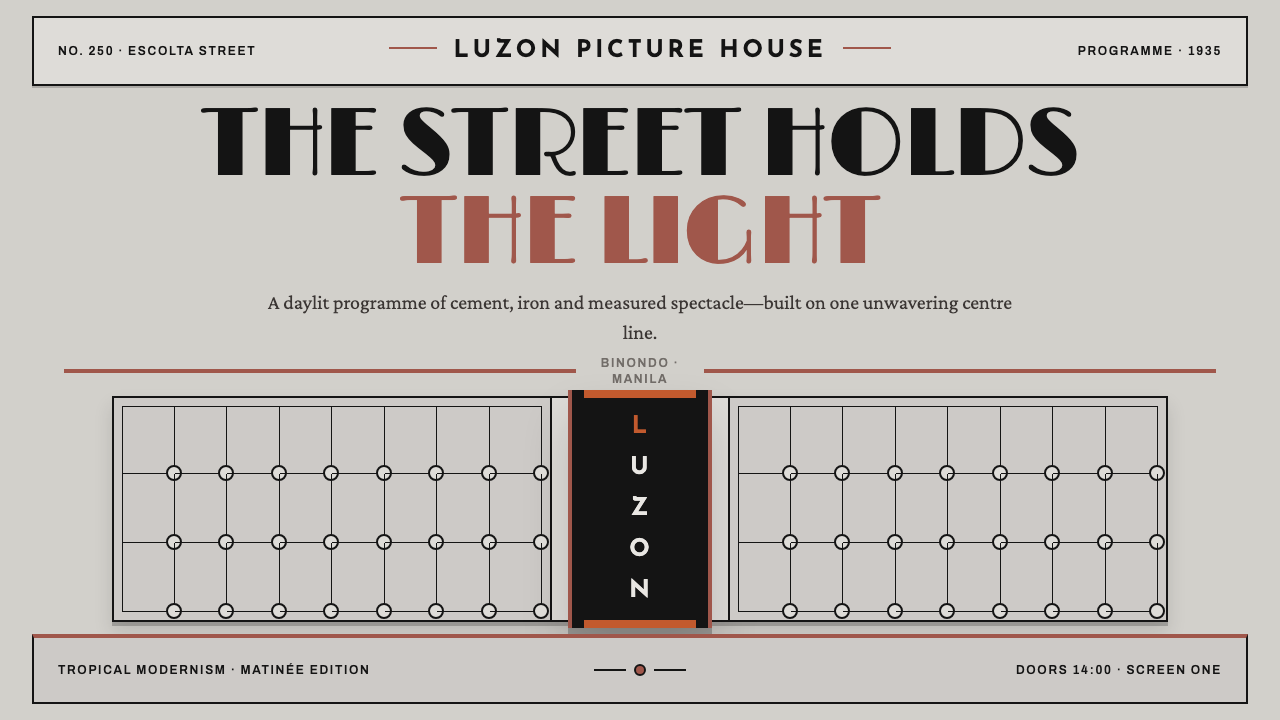
Escolta Art Deco Manila is pale cement under tropical noon, black iron holding it up and a single oxide red — a symmetrical, stepped order with no curves, no gold and no pastel.
Escolta Art Deco Manila in brief
Escolta Art Deco Manila takes its cues from a single street. Escolta was the commercial spine of prewar Manila, in the district of Binondo, and its landmark was the Capitol Theater at No. 250: a setback tower in pale grey cement render, stepped like a ziggurat, with a tall vertical CAPITOL sign held in a cage of near-black cast iron and two low-relief figures of Filipinas set in rectangular reserves. The style turns that building, and the street around it, into a visual system.
The page is sunlit render: a light, mineral grey-white that suggests cement washed by tropical daylight. The structure is black ironwork, drawn as grilles, frames and ribs that hold the content in place. The heat of the palette comes from one oxide red, borrowed from the trim of the 1928 Perez-Samanillo Building, also called the First United Building, where it marks parapets, window surrounds and the heads of pilasters. It is the only warm colour on the street, and in the style it is the only warm colour on the page.
Everything is bilaterally symmetric and stepped. Nothing curves and nothing is gilded. This is Art Deco without its usual luxury cues: no gold, no streamlined swoops, none of the pastel tones associated with Miami. What remains is order, verticality and the weight of age, delivered with a daylight lightness that keeps it from feeling heavy or grim.

Where does Escolta Art Deco Manila come from?
Escolta's years of prominence ran, in this style's reckoning, from 1928 to 1941. It was the street where Manila's commerce met its modern architecture: banks, offices, shops and cinemas, built in the vocabulary that is called Philippine Art Deco and, more broadly, prewar commercial modernism. The style does not try to reconstruct a single building. It distils a shared look from a handful of landmarks along one stretch of one street.
The Capitol Theater is the anchor. It opened on 8 January 1935 at No. 250 Escolta, to a design by the architect Juan F. Nakpil. It is an example of what the lineage calls tropical cinema architecture: a public theatre dressed as a monument, with a stepped, tower-like mass, a prominent vertical sign and a face of render and iron. The vertical CAPITOL sign, framed in cast iron, is the source of the style's idea of tall, signage-like emphasis and of its use of ironwork as the structure of the page.
Art and architecture were not separate here. The two low-relief Filipinas on the Capitol Theater were the work of the sculptor Francesco Riccardo Monti, and his figures sit in rectangular reserves so that sculpture stays inside the architectural frame instead of spilling across it. The painter Victorio Edades, associated with modernism in Philippine painting, belongs to the same milieu, and his place among the lineage's key figures reflects how painting, sculpture and building were moving together in these years.
The 1928 Perez-Samanillo Building gives the palette its single hot note. Its oxide-red trim on parapets, window surrounds and pilaster heads stands out against pale render and iron, and it shows how a restrained palette could still carry heat in a tropical city. Andrés Luna de San Pedro is counted among the architects of the commercial Manila of these years and, together with Nakpil, stands for a generation that built streets of confident, orderly modern buildings. The style asks for the same restraint: one red, one grey, one black, inside a symmetrical frame.
What defines the Escolta Art Deco Manila look?
Sunlit Render Ground
The ground is pale grey-white, mineral rather than creamy, like cement render in strong daylight. It is flat, bright and slightly dry, with no warm paper tones and no metallic sheen. Large areas of it are the norm, and it supplies the sense of tropical noon: light that is strong enough to bleach colour and to make every dark line look sharp.
Cast-Iron Structure
Near-black ironwork draws the skeleton of the page: grilles, frames, ribs and rules. It is structural, not decorative, and it holds content in place the way the iron cage holds the CAPITOL sign. Lines are firm and even, with squared corners, and they define boxes and axes. The iron is the second major element of the system after the pale ground.
One Oxide Red
A single oxide red carries all the heat. It appears as trim: a rule at an edge, a surround, a capital or a key action, never as a broad wash. The restraint is the point. Because it is the only warm colour in view, it directs attention at once, and every use of it reads as a decision rather than decoration.
Bilateral Symmetry
Compositions are mirrored about a central axis. A title sits on the axis, flanking elements echo each other left and right, and the layout feels formal, ceremonial and stable. Symmetry is held strictly, since a small asymmetry would read as a mistake in a system this ordered, and the axis gives the eye an unmistakable path from top to bottom.
Stepped Setbacks
Like the ziggurat tower of the Capitol Theater, forms rise in steps, each tier set back from the one below. Headers, panels and blocks narrow as they climb, so hierarchy is expressed as a silhouette rather than as shadow. The stepped outline is the system's main shape and the main way it avoids curves while still looking shaped.
Vertical Signage
Emphasis runs upward. A tall, narrow sign, with capitals stacked or set in a vertical band inside an iron frame, is the system's signature move. Type is upright and formal, built from capitals, and headings often occupy a narrow column rather than a wide line. Verticality supplies the pride and civic presence that a horizontal layout would not.
Reliefs in Reserves
Imagery sits inside rectangular reserves, like the two low-relief Filipinas flanking the theatre. Pictures are framed, flat and tonal, as if carved rather than photographed, and they never float free of their boxes. The system also refuses a list of things: curves, gilding and pastel pinks. Absences define it as firmly as presences do.

Who shaped Escolta Art Deco Manila?
The architect of the Capitol Theater at No. 250 Escolta, which opened on 8 January 1935. His stepped tower, vertical iron-framed sign and render-and-iron face are the clearest single source for the style's structure, bringing setback, symmetry and ironwork together at one address.
The sculptor of the two low-relief Filipinas set in rectangular reserves on the Capitol Theater. His figures explain the style's rule that imagery stays framed and flat, a sculpture held within architecture, never an illustration floating free on the page.
A Manila architect named among the lineage's key figures. His inclusion points to the circle of architects who gave Escolta its modern streetscape in the years from 1928 to 1941. The 1928 Perez-Samanillo Building, the source of this style's red, belongs to that same streetscape.
A painter associated with the modernist current in Philippine art. His place in the lineage is a reminder that Art Deco in Manila was not only a matter of buildings but part of a wider modern movement that included painting and sculpture, and that its geometry and restraint were cultural choices.
How do you use Escolta Art Deco Manila today?
Escolta Art Deco suits interfaces that need order and the weight of age without becoming dull: finance and civic services, heritage and cultural institutions, cinemas and venues, hospitality with a sense of history, and any brand that wants to feel established and bright at once. Its discipline is simple, and it is easy to hold: pale ground, iron lines, one red, a central axis.
On a cover slide, centre the title on the axis between two iron-framed vertical bars, step the top edge of the title block like a tower, and add a single red rule below. Content slides keep the central axis, with headings in stepped blocks and body text in framed columns. Data slides should be symmetrical too: mirrored bars or paired panels, iron-line gridlines, and the one red reserved for the value that deserves attention.
On the web, a centred hero with a stepped silhouette gives the page its identity. Cards can step in width as they rise, and a pricing page can set the recommended plan as the taller central tower between two lower ones. Borders are black iron lines with squared corners, forms use rectangular fields and no pill shapes, and red is reserved for the primary action and the active link. Navigation can be a centred, iron-framed band, like a marquee.
In editorial and marketing work, the style serves city guides, architecture and film writing, banking and hospitality brands, and heritage campaigns. Posters can lean on the vertical sign, with a tall column of capitals in an iron frame. Photography works best in rectangular frames, monochrome or in warm daylight, and relief-like imagery sits inside boxes. A single red rule between sections gives long pages a steady rhythm.
The most common mistake is to drift toward the wrong Art Deco: adding gold, metallic gradients and sunbursts turns it into a Gatsby pastiche, while pastel pinks and teals belong to a different, Miami idiom. Rounded corners and curves break the stepped logic. Spreading the red over many elements dilutes the single decision that gives the page its heat, and breaking symmetry for the sake of variety undoes the formal calm. Restraint is the style.

Escolta Art Deco Manila — FAQ
Is this the same as Miami or Gatsby-style Art Deco?
No. Those idioms lean on pastel pinks and teals, gold, streamlined curves and sunbursts. This style is deliberately without them: its ground is pale cement grey-white, its structure is black iron, and its only colour is one oxide red. The forms are stepped and symmetrical, with square corners. It shares an era with other Art Deco, but its feeling is sober and sunlit.
Why only one red?
Because it copies the street. The oxide red on the 1928 Perez-Samanillo Building's trim is the only warm colour on Escolta, and the style takes that as a rule. With a single warm note, every appearance of red directs attention and carries meaning. Add a second accent and the page stops reading as a decision and starts reading as decoration.
Is this a light or dark style?
It is a light style. The ground is sunlit render, and the black iron is a structural line rather than a field. A dark inversion would lose the daylight quality that the style depends on, and the iron would stop reading as a frame against a pale wall. If a dark variation is needed, it is best treated as a separate, night-time version of the street.
Is it only suitable for Philippine subjects?
It documents a specific time and place, prewar Escolta in Binondo, Manila, and carries that identity with it. Its principles, though, are portable: symmetry, setbacks, an iron frame and one accent colour serve many projects that want a formal, sunlit order. When the content has no link to the Philippines, avoid borrowing specific motifs such as the Filipina reliefs and keep to the structural rules.
How does a strictly symmetric style work on small screens?
By stacking along the central axis. On a narrow screen the mirrored side elements fold into a single centred column, headings stay centred, and the stepped silhouette is kept by letting each block be a little narrower than the one before. The iron lines and the single red carry the identity, so nothing essential depends on width.
Related design styles
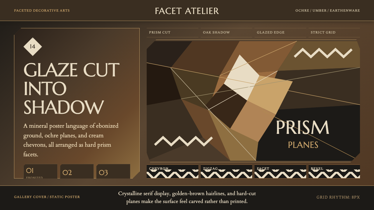 Czech Cubist Decorative ArtsGlazed geometry feels carved. Umber ground, ochre facets, and cream chevrons…
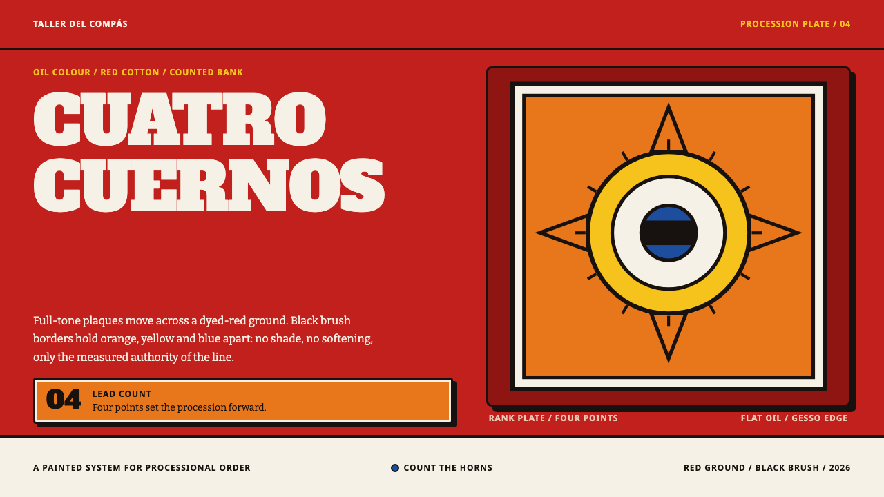 Diablos de YareRank is painted, not implied. Red cotton carries flat orange, yellow and blue…
 Jardin Majorelle BlueCobalt refuses restraint. Electric blue, glazed yellow and grid rhythm turn s…
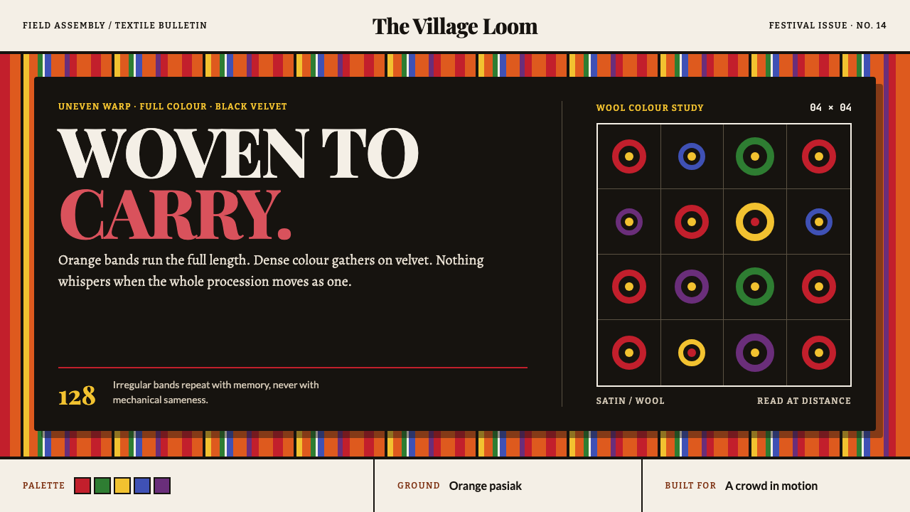 Łowicz Striped CostumeBuilt to carry across a crowd. Uneven orange stripes meet dense color on blac…
 Punjabi Phulkari (Floral Bagh)Joyful density wins. Gold chevrons, rust borders, fuchsia-pistachio butis fil…
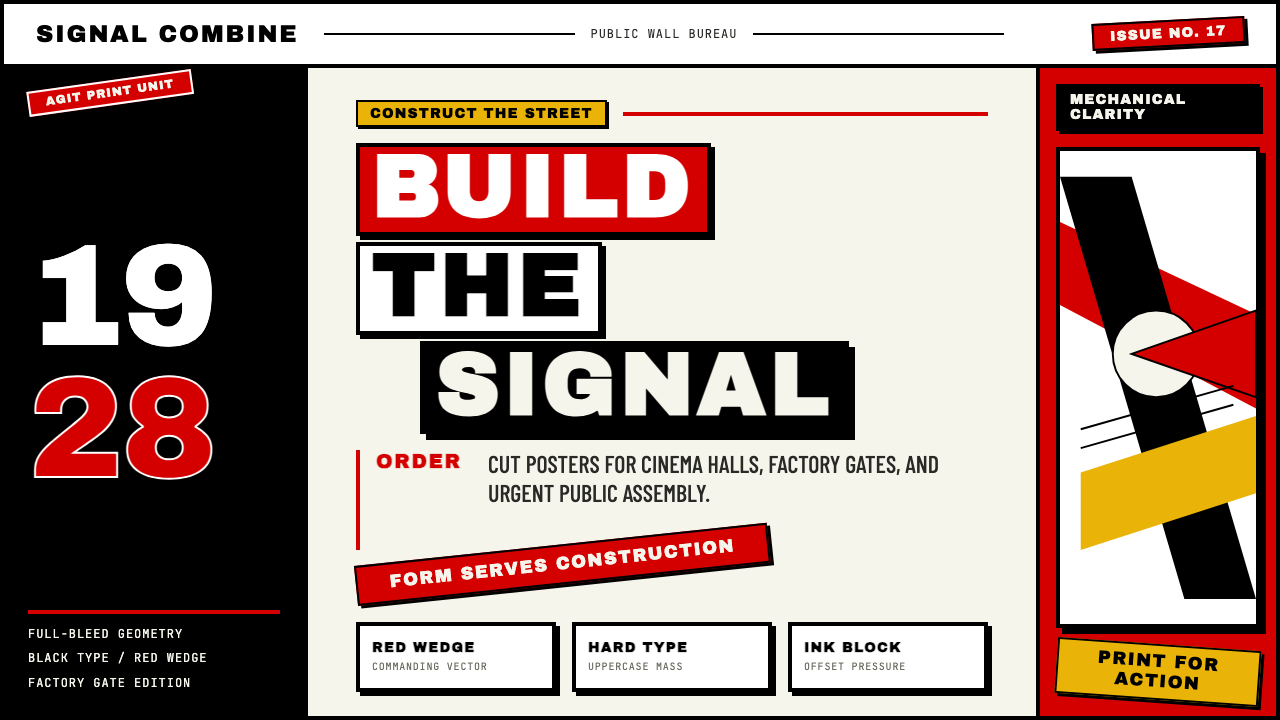 Russian ConstructivismRevolution red, slashed across black and white. Diagonal sans-serif, photomon…