What is Bombay Marine Drive Deco?
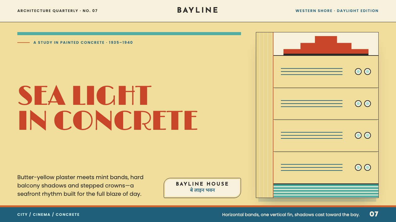
Bombay Deco is Art Deco rebuilt for strong sun and sea air — butter-yellow plaster, mint-green bands, ship-prow curves, and a bilingual nameplate that is its Indian signature.
Bombay Marine Drive Deco in brief
Bombay Deco is the local dialect of Art Deco that took shape in 1930s Bombay, now Mumbai, and survives in its densest form along Marine Drive and the edge of the Oval Maidan. It is Art Deco built in reinforced concrete and finished in painted cement plaster: pale butter-yellow blocks that curve like ship prows along the Back Bay reclamation, banded in mint sea-green and orange, and crowned with stepped turrets. The building boom behind it peaked between 1935 and 1940.
It is a daylight style, not a neon one. Where Miami Deco depends on glow after dark, Bombay Deco depends on shade at noon. Projecting eyebrows over windows and thick balcony slabs throw hard shadows across the plaster, and those cast shadows supply the sense of volume that elsewhere comes from lighting. Colour is rationed rather than splashed: it appears only in horizontal bands and vertical fins, one hue to a band — sea green, orange, sandstone red — against a wall tone that sea light has bleached soft.
What makes the ensemble Indian rather than merely tropical Deco is not an arch or a dome borrowed from older Indian architecture. It is the nameplate. Building names are set in Latin capitals over Devanagari on the same facade, two lines of one name given equal standing, and that bilingual plate is the signature. Streamline Moderne, the rounded and ship-inspired cousin of Deco, supplies the rest of the vocabulary: curved corners, long horizontal lines, glass blocks set into the turns, and railings that echo ship's cable and chrome rods.
Where does Bombay Marine Drive Deco come from?
Art Deco reached Bombay as a global fashion. The style takes its name from the decorative-arts exhibition held in Paris in 1925, and through the late 1920s and 1930s it travelled the world by magazine, film and steamship, adapting to whatever each city could build. Bombay's chance came from its shoreline. The Back Bay reclamation had won new land from the sea along the western edge of the island city, and Marine Drive, the great curving promenade laid along that edge, gave a generation of apartment blocks, hotels and cinemas an open sea frontage and a fresh set of plots to fill.
The peak building phase ran from roughly 1935 to 1940, and the materials explain the shapes. Reinforced concrete lets balconies project far beyond the wall and corners wrap in a smooth curve, forms that are expensive or impossible in load-bearing stone. A skin of cement plaster, painted in light colours and easy to renew, gave the whole street its flat, continuous surface. Builders also borrowed the Streamline Moderne imagery of ocean liners — rounded prows, long horizontal rails, rope-like balustrades and chrome lines — which suited a promenade that faces open water.
The architects who shaped the idiom were largely local practitioners. G. B. Mhatre, Sohrabji Bhedwar and Merwanji Bana are the names most often associated with it, people who worked within the city's own building culture rather than importing a finished style. The adaptations they and their contemporaries made are the reason Bombay Deco looks different from its cousins elsewhere: deep shade in place of neon, a softly painted plaster palette in place of glossy cladding, and landmark corner buildings such as the Eros Cinema, whose stepped tower is wrapped in red sandstone from Agra, bringing a regional material into a modern silhouette.
Many of these buildings are still lived in. In 2018 the stretch was inscribed on the UNESCO World Heritage List together with the Victorian Gothic buildings facing it across the Oval Maidan, an unusual pairing of two eras: one of carved stone and pointed arches, the other of plaster, concrete and horizontal lines. The listing fixed Bombay Deco in public memory as a recognised period style, and gave designers a reason to look past the generic Art Deco label toward the version that grew in one particular place.
What defines the Bombay Marine Drive Deco look?
Colour in Bands
The wall is a pale butter-yellow, the tone of plaster that has spent decades in strong sea light. Colour is then added only in strips: a mint sea-green band, an orange band, a sandstone-red band, each running horizontally or standing as a vertical fin, one hue to a band. There is no all-over wash and no gradient. The result is a warm, daylit ground with accents that behave like trim, never like decoration scattered across the surface.
Cast Shadow as Volume
Depth comes from shade, not from glow. Projecting eyebrows above windows and thick balcony slabs throw sharp-edged shadows downward across the plaster, and those shadows model the building the way light models a neon sign. In graphic terms, shadows are hard, offset in one consistent direction, and tied to a real projection that casts them; there are no soft halos and no luminous outlines.
Ship-Prow Curves
Balconies and corners swing outward in rounded curves like the prow of a ship, and corner windows wrap around the building rather than stopping at it. Glass-block panels sit in the turns. The geometry favours long, smooth arcs over crisp right angles, and a curve is almost always paired with a straight horizontal line to keep it disciplined.
Stepped Crowns
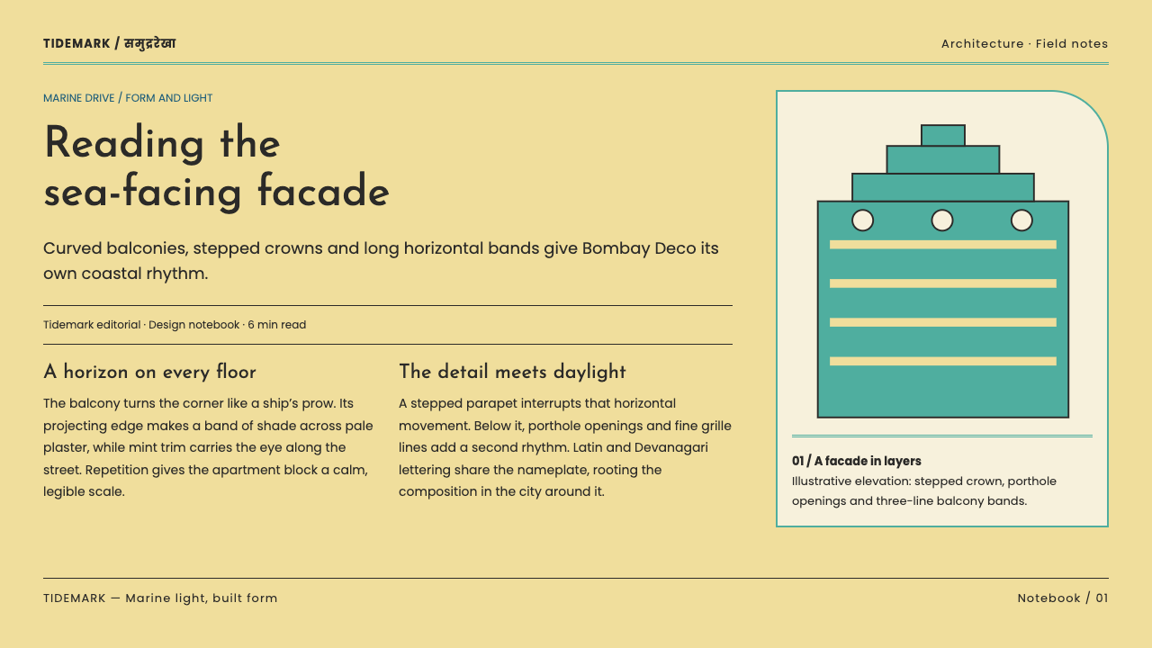
Rooflines resolve into receding steps and small turrets, giving each block a distinct top. The stepped crown is the style's punctuation mark: it ends a facade with a stack of progressively smaller, simpler rectangles. In layout terms this translates into ziggurat-like step motifs used sparingly as terminals, not as repeating wallpaper.
Bands, Rails and Fins
Rhythm comes from lines: long horizontal bands, chrome-like rails, and vertical fins that interrupt them at intervals. Railings borrow the look of ship's cable and polished horizontal rods. The grid is real, but it is expressed through repeated strips and measured intervals rather than through rows of identical windows punched into a box.
The Bilingual Nameplate
Building names are set in Latin capitals with the Devanagari rendering directly beneath, both at comparable weight and with clear spacing. Neither is decoration and neither is subordinate; the pair is the facade's most distinctive graphic act. The lettering is clean and geometric, with no flourishes and no ornamental pastiche. Transposed to design, a second script is treated as an equal, legible partner rather than a texture.
Plaster Surface and Small Metals
The skin is painted cement plaster laid over concrete: smooth, flat and matte, closer to a wall than to a showcase. There is no stone texture, no tile pattern, no faux wood. The few exceptions are deliberate accents — chrome horizontals, glass blocks at the corners, red sandstone cladding on the Eros tower. Flatness on the main surfaces is what lets these accents read clearly.
Who shaped Bombay Marine Drive Deco?
G. B. Mhatre is one of the three architects most closely tied to the Bombay Deco idiom. His name belongs to the generation of Indian practitioners who translated an imported fashion into concrete, plaster and local lettering, designing sea-facing homes for a city that wanted to look modern. For a designer, the useful lesson of that generation is adaptation rather than imitation: the form came from abroad, but the climate, the material and the script were decided locally.
Sohrabji Bhedwar is the name most often linked with the Eros Cinema, the street-corner landmark whose stepped tower is clad in Agra red sandstone. Eros shows the style at its most confident: a modern stepped silhouette in plaster, one regional stone brought in as a deliberate accent, and Latin-over-Devanagari lettering at street level. It is a useful reference for how Bombay Deco spends its few ornamental moments.
Merwanji Bana is the third architect commonly named in connection with the style. Like his contemporaries, he worked within the same limited vocabulary — banded colour, curved balconies, stepped crowns — and the cumulative effect of many hands using one vocabulary is why Marine Drive reads as a coherent ensemble rather than a collection of one-off buildings. The lesson for a design system is consistency: a small set of repeated moves, applied everywhere.
How do you use Bombay Marine Drive Deco today?
Bombay Deco translates well because it is built from repeatable moves — a warm daylit ground, banded colour, hard cast shadow, curved terminals and bilingual labels — rather than from heavy ornament. The key to applying it is to preserve that daylight logic: treat colour as trim, shadow as structure, and curves as accents against straight horizontals.
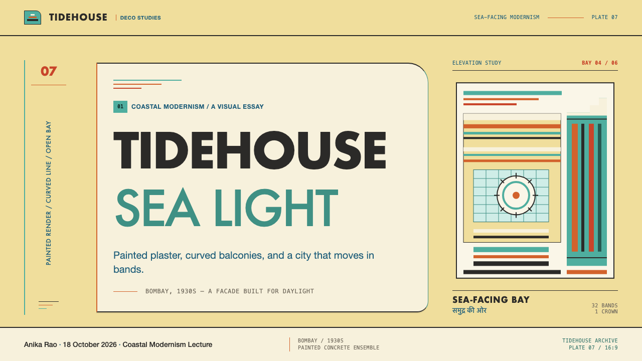
For presentation slides, cover pages work best with a pale butter-yellow field, a title set in clean capitals, and a single horizontal band of sea green or orange running across the slide like the stripe of a facade. A small stepped or curved shape in one corner acts as a crown. Content slides should be organised as horizontal strips: each band holds one idea, with colour reserved for the band that matters. Data slides suit stacked horizontal bars, a natural echo of the banded elevations, drawn with flat fills and one hard cast shadow beneath each bar.
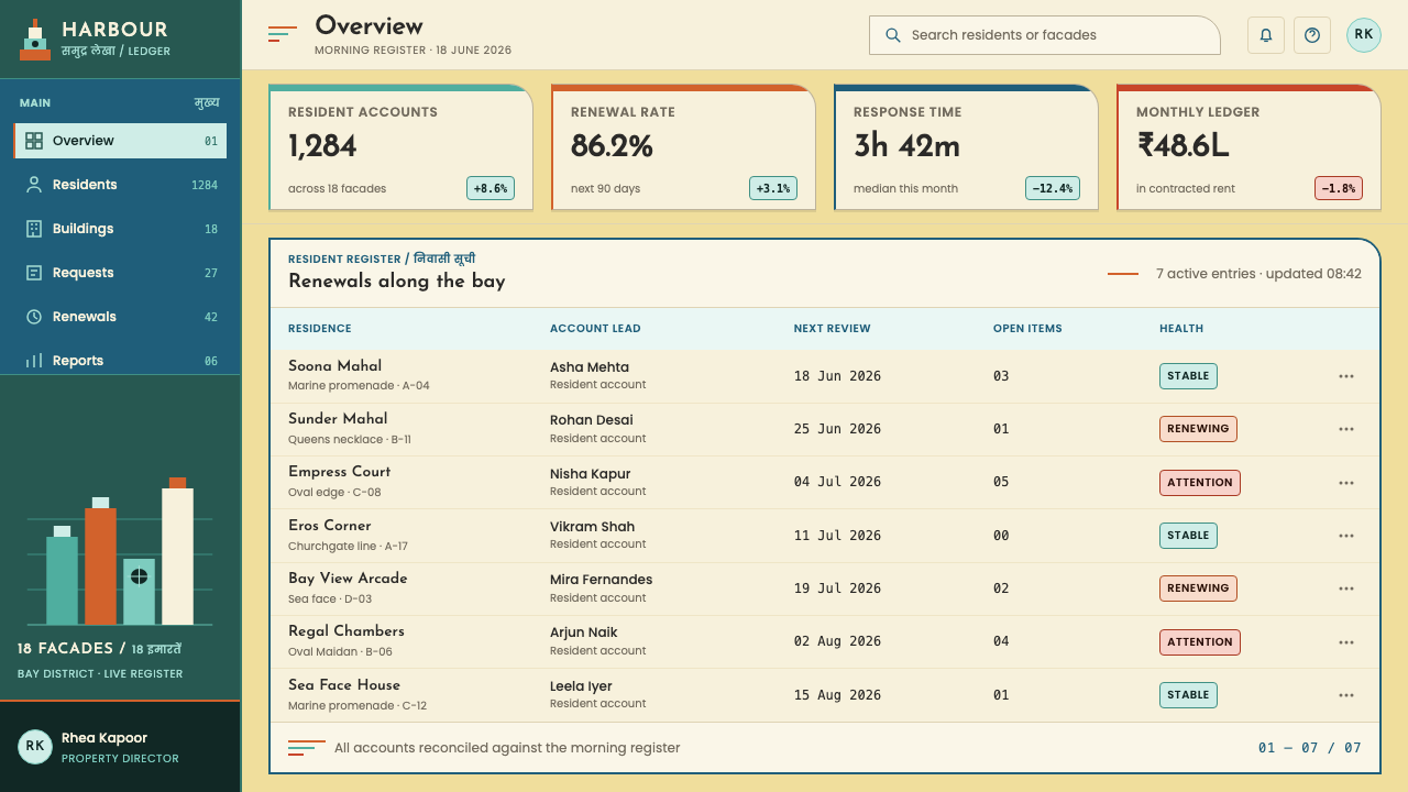
For web interfaces, the style suits dashboards, booking and travel products, hospitality, and neighbourhood or city guides. Keep the page ground warm and light, use horizontal colour bands as section dividers or status strips, and give cards a hard, consistently angled shadow rather than a blurred glow. Buttons and tags can adopt rounded ship-prow ends. Pricing tables work well as stacked horizontal tiers, each marked with a different band colour, while navigation labels can carry a secondary script beneath the primary one.
For editorial and marketing work, the style gives travel features, architecture writing, city histories, and real-estate or hotel brands an immediately specific mood — breezy, seaside, mid-century — without nostalgia clichés. Long-form layouts benefit from a bilingual headline convention, a primary language in capitals with a second script below, and from section breaks drawn as single coloured bands. Posters and campaign pages can lean on one stepped silhouette against a flat field of butter-yellow.
The most common mistake is treating Deco as one global look and importing its night-time version: gold sunbursts, black grounds, neon outlines and soft glows. Bombay Deco is the opposite — matte, daylit, shadow-driven. A second error is using every band colour at once on every surface; the style rations one hue per band and lets plaster do most of the talking. Finally, do not fake the second script. If a layout cannot carry a real second language at equal standing, leave the second line out rather than decorating with pseudo-lettering.
Bombay Marine Drive Deco — FAQ
Is Bombay Deco the same as Miami Art Deco?
They share a parent but differ in climate logic. Miami Deco is famous for pastel colour, neon and glow after dark. Bombay Deco is a daylight style: pale butter-yellow plaster, banded accents, and deep cast shadows beneath projections. Miami leans on light that is emitted; Bombay leans on light that is blocked. In a design system that means hard shadows and flat colour bands rather than glow effects.
Why is the base colour butter-yellow rather than white?
Plaster that has weathered under strong sea light drifts toward a warm, softened pale tone, and the style builds on that. A butter-yellow ground also gives cast shadows something to land on; pure white would glare and flatten the shading. In digital use, a warm pale ground keeps the mint, orange and sandstone bands legible without needing outlines to separate them.
Can Bombay Deco work in a dark mode?
It is fundamentally a light-ground style, so a dark mode needs care. The glow-after-dark treatments that suit other Deco variants are exactly what this one avoids. If you need a dark version, think of dusk rather than night: a deep, warm ground, the plaster tone kept for the lit faces of blocks, band colours kept as flat strips, and shadows still hard. Avoid neon outlines and luminous halos.
How should the bilingual nameplate be used in a modern interface?
Treat the pair as a lockup: the primary label in Latin capitals and a second script beneath at comparable weight, with clear spacing. It works best in genuinely bilingual contexts such as place names, wayfinding, section titles or brand marks in markets that use two scripts. If your audience does not read a second script, use a real second language only where it adds meaning. Pseudo-scripts used as decoration contradict the whole point.
What kinds of products does it suit, and where does it struggle?
It suits travel, hospitality, architecture, culture and city-guide products, and any brand that wants breezy, mid-century, seaside confidence. It also gives dashboards a friendly, structured look. It struggles where a product needs dramatic night-time glamour, high-tech coolness, or dense data with many categories, since the palette rations its hues. Highly ornamented, gold-and-black luxury applications are better served by other Deco styles.
Related design styles
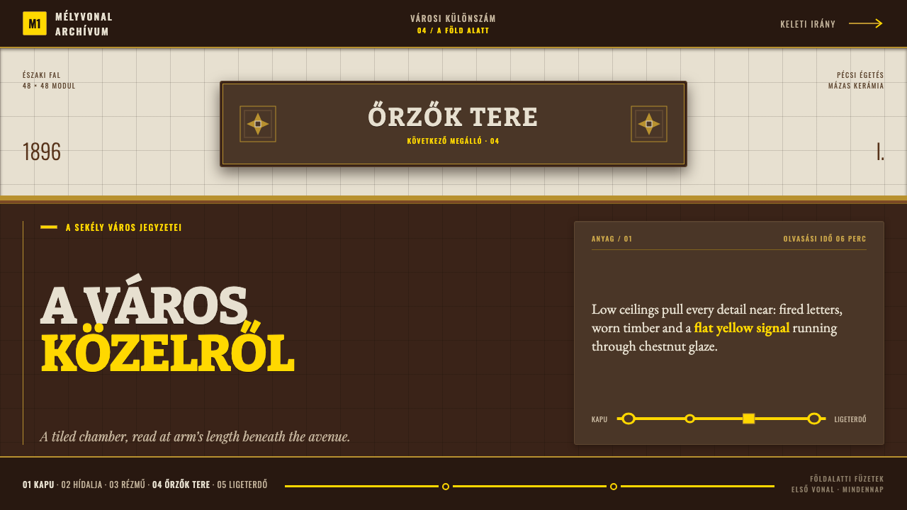 Budapest Millennium LineChestnut glaze turns transit into a room. Fired slab type and flat yellow run…
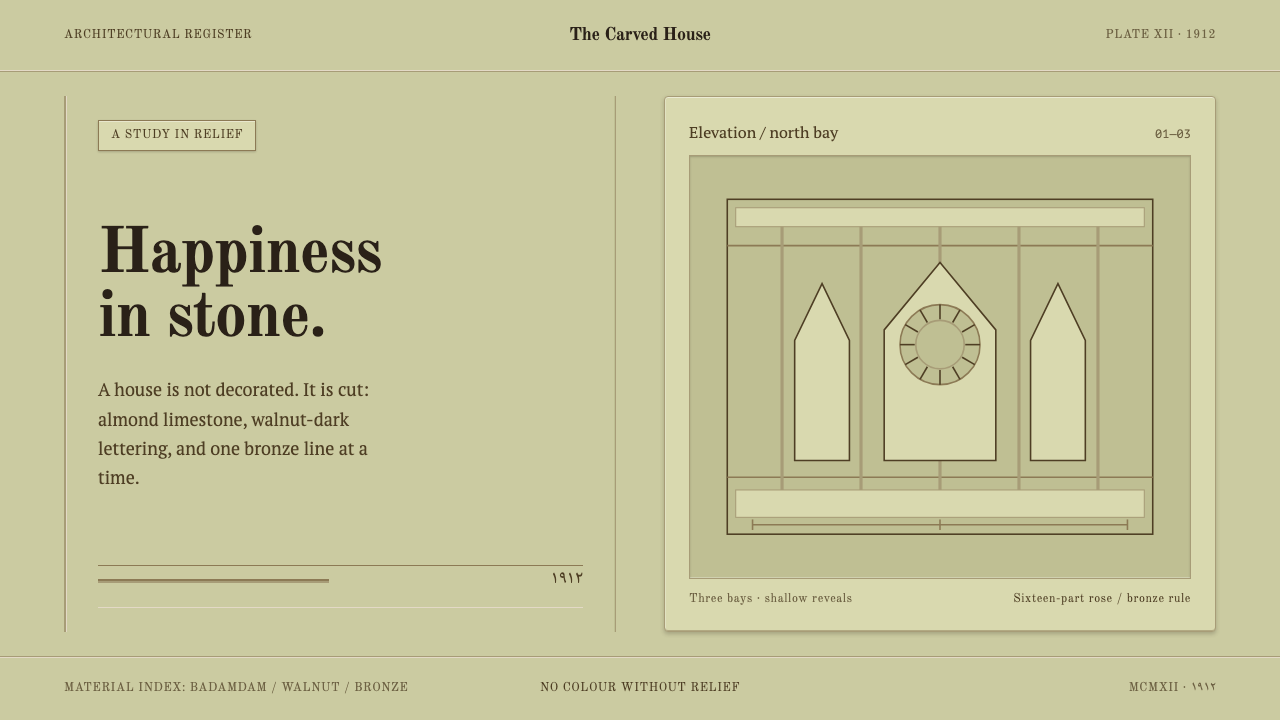 Baku Oil Boom MansionsWealth made tactile. Almond limestone, Old Standard TT, and recessed bays car…
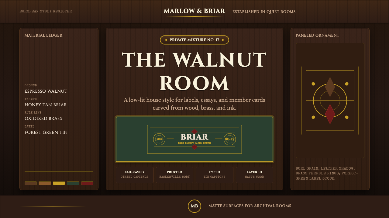 Briar Pipe & TobaccoWarm gloom, precisely aged. Brass rules and Cinzel capitals sit on espresso w…
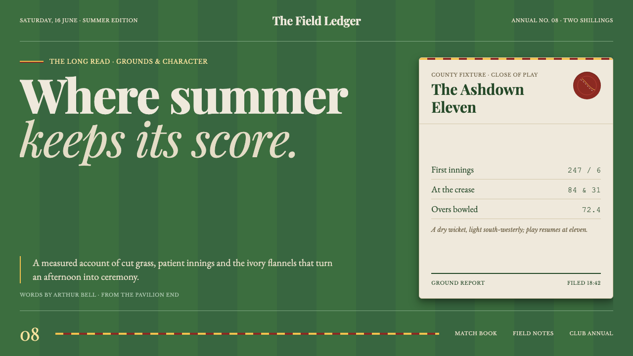 Cricket Whites FlannelsSummer, kept in good order. Ecru serif and fine club trim cross a dark mown g…
 Dior New Look (1947)Couture speaks softly. Cream ground, navy Didot capitals, and gold hairlines…
 Shanghai Calendar 1930Old Shanghai glows softly. Cream paper, dusty rose, jade panels, and gold Dec…