What is Hanoi Indochine Style?
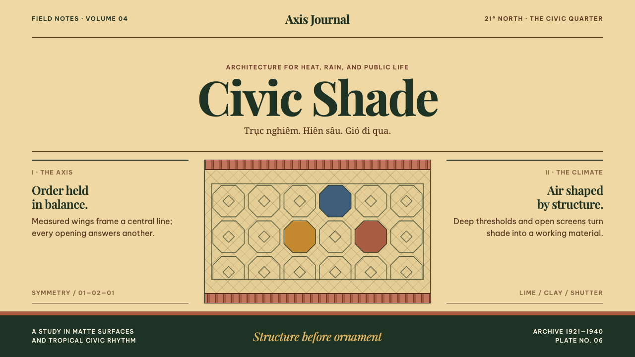
Hanoi's Indochine style set French civic symmetry beneath stacked Vietnamese tile roofs, then let the climate decide everything else — limewash, lattice, deep verandas, and not one glossy surface.
Hanoi Indochine Style in brief
Hanoi Indochine style is the architectural and visual language that took shape in the Vietnamese capital from the 1920s into the 1940s under French colonial planning. It joined French civic design to Vietnamese roof-building and produced a recognizable family of institutional buildings. Its ingredients are a strong central axis, symmetrical wings, stacked red-brown tile roofs, openwork lattice for ventilation, deep veranda galleries, and a surface palette of limewashed pale yellow, ochre, blue-painted joinery and near-black bottle-green shutters. The French term is style indochinois, and the look sits at the meeting point of French colonial civic architecture and the late phase of Art Deco as it travelled into Southeast Asia.
What separates it from a plain transplant of French architecture to the tropics is that the climate was allowed to argue back. European facades, flat, glazed and tightly shuttered, struggle in heat and humidity. The Hanoi buildings answer with roofs that overhang and shade the walls, galleries that put a deep layer of shade and moving air between the sun and the rooms, and lattice screens that pass air while holding out glare. These devices are practical, but they are also the style's ornament: the appearance comes from the way the building keeps itself cool.
Visually, the decisive trait is that everything is matte. Limewash carries visible brush marks and takes in light without handing it back. Roof tiles have ridges and overlaps that break the light into rows. Paint on timber is flat rather than glossy. Nothing is polished, mirrored or glazed to a sheen. When this style is carried into an interface, that light-absorbing quality matters far more than any quantity of Southeast Asian symbols: a layout can tick every motif and still be wrong if its surfaces shine.

Where does Hanoi Indochine Style come from?
The story begins in 1921, when the French architect Ernest Hébrard took charge of urban planning in French Indochina. In Hanoi he built something with no precedent in the city: a hybrid in which French civic massing, meaning the central axis, the projecting wings and the insistence on symmetry, was set beneath stacked Vietnamese tile roofs. Ventilation lattice and deep verandas did the climate work that European facades could not do. The idea was not decoration borrowed from a pattern book. It was a working answer to a practical question about how a public building should stand and breathe in a hot, damp city.
Two buildings are the most complete specimens of the language. The Louis Finot Museum, today the National Museum of Vietnamese History, and the auditorium of the University of Indochina show the grammar entire: a symmetrical civic block, roofs that rise in tiers, and walls whose colour tells you the building's rank. The palette is architectural fact rather than mood. Ordinary walls are limewashed a light yellow, institutional facades deepen that wash to ochre, the roof tiles are red-brown and laid in overlapping courses, window joinery is painted blue, shutters are a bottle green so dark it reads as nearly black, and the structural timber is dark hardwood.
The corpus is concentrated in two districts, the French Quarter and Ba Đình. These were planned parts of Hanoi, laid out so that public buildings could stand on an axis and be read from a distance, and the repeated colours and roof profiles are what make the planning legible. Walking from one institutional building to the next, a visitor meets the same limewash, the same tile rhythm and the same shutters again and again. The consistency is the point: the style was meant to give a city's public face one voice.
Three currents feed it. Indochine style, the style indochinois, was a deliberate programme of absorbing local forms into French building. French colonial civic architecture supplied the institutional skeleton of axis, wing and symmetry. Late Art Deco supplied the flattened geometry and the horizontal banding. The result belongs to a particular moment, the 1920s through the 1940s, and to a particular political situation, since the buildings were commissioned by a colonial administration. Today they stand as part of Hanoi's everyday built fabric, and any honest use of the style keeps both of those facts in view.
What defines the Hanoi Indochine Style look?
Civic Symmetry and Axis
Composition is organized around a central axis, with wings stepping out on either side. This is the French part of the hybrid, and it gives the style its authority: a main entrance or title sits on the centre line and the rest of the page balances around it. Symmetry here is formal and calm, not decorative; the wings exist to support the centre and to frame the approach to it.
Stacked Roofs and Horizontal Bands
The Vietnamese contribution is the roof: tiles laid in overlapping courses and stepped in tiers, so the top of every building reads as a series of horizontal bands. In a layout this becomes terracotta-coloured stripes and stepped blocks, each band a clear tier of information. The layers are visible and ordered, never merged into a smooth gradient.
Limewash Ground and Ochre Rank
The ground is a limewashed light yellow, warm and slightly chalky rather than clean white. Limewash is applied by brush, so the surface carries faint streaks; it is pale but still has body. Colour also signals rank: public and institutional facades deepen the wash into ochre, a heavier yellow-brown. In design terms, ochre is the tone of weight, used for headers and the main block of a composition, while the paler yellow stays in the background.
Blue Joinery and Bottle-Green Shutters
Two small colours do the finishing. Window joinery is painted blue, a cool note against the warm walls, and shutters are a green so dark it almost reads as black. They appear as thin, repeated details: frames, bars, shutter slats. Used sparingly, they give the page crispness and a rhythm of openings without competing with the warm tones.
Matte Surfaces Only
Everything absorbs light. Limewash shows brush marks, tile faces have ridges, painted timber is flat, and nothing reflects. In interface terms: no glossy highlights, no glassy sheen, no mirrored chrome, and shadows that behave like the shade under an eave rather than a glow. This single rule does more to make a layout feel Indochine than any decorative motif.
Climate Devices as Ornament
Lattice openings and deep verandas began as ventilation and shade, and they became the style's decorative vocabulary. Translated to a page, a repeated openwork pattern can serve as a divider or a border, and a deep, shaded band along an edge can play the role of the veranda, giving content a sheltered margin. The decoration is earned by a function, which keeps it restrained.
Inscriptional Typography
The history gives no single typeface to copy, so treat this as a translation of the style's civic character: lettering should behave like an inscription on masonry. Upright, evenly spaced, centred over the entrance, with a clear step down from title to caption. Type is set to be read from a distance on a public building, which means order and dignity rather than flourish.

Who shaped Hanoi Indochine Style?
Hébrard took charge of urban planning in French Indochina in 1921 and is the figure most closely tied to the Hanoi hybrid. The style records his central decision: keep the French grammar of the civic building, with its axis, wings and symmetry, but accept that the roof, the veranda and the ventilated screen had to come from the climate and from local building practice. That reconciliation is the reason the style reads as one coherent language rather than a collage.
Kruze is listed among the architects associated with the Hanoi corpus alongside Hébrard. His place in the story corrects the lone-genius picture: Indochine style was a shared working vocabulary, repeated by several hands on institutional commissions, which is why its massing, roofs and colours stay so consistent from building to building. For a designer, that consistency is the lesson, because a style that several people can repeat is a style that can be written down as a system.
Batteur is the third name attached to the corpus. With Kruze, he stands for the working architects who turned a planning doctrine into individual buildings, each one restating the same grammar of civic massing, tiered roof, shade and colour. The point of naming them is not biography but method: the style survives because its rules were simple enough to be carried from one commission to the next without losing their character.
How do you use Hanoi Indochine Style today?
Hanoi Indochine style is easy to misuse because its symbols are so photogenic. The reliable way to apply it is to follow what the buildings actually do: put a clear axis through the layout, assign colour by rank, keep every surface matte, and let a few functional details become the decoration. Treated that way it produces calm, dignified, warm work that suits subjects with civic, cultural or institutional weight.
For presentation slides, build the cover on the axis. A centred title block sits in the middle of a limewash-yellow field, flanked by two quieter side panels in the same family, with a thin band of terracotta along the top or bottom edge standing in for the roofline. Content slides can keep that symmetry: a header band in ochre, body text in a calm column, and a repeated lattice-like rule as a divider. Data slides work best with banded charts, using the stacked-roof logic of clear horizontal tiers, and with colour limited to the warm palette plus a single blue or green accent.
For web interfaces, the style suits museum, heritage, cultural-institution and public-service sites, plus calm dashboards and documentation where authority matters more than excitement. Use a symmetric header with the wordmark on the centre line, ochre for primary panels, pale yellow for the page ground, blue for links and focus, and the dark green for navigation bars and footers. Keep cards and buttons matte with flat fills and thin edges, and let hover states shift tone rather than adding glow. Shadows should be short and directional, like the shade beneath an overhanging roof.
For editorial and marketing work, the style gives travel, architecture, history and craft stories a warm, grounded voice. A feature article can use a centred title, a generous measure for body text, and a band of roof-tile colour as a section break. Marketing pages can use the veranda idea for sheltered pull-quotes and the lattice idea for borders around product or gallery images. Photography of real buildings, with their limewash texture and tiles, works far better than clip-art motifs.
The most common mistake is to treat Indochine as a costume: scattering lanterns, bamboo, conical hats or other tourist symbols over a glossy, rounded interface. That inverts the style, which is architectural, matte and ordered. A second mistake is a palette drift in which the pale yellow is swapped for white and the roof colour for bright orange, which loses the chalky warmth. Finally, avoid using the style carelessly for political or commercial purposes that ignore its colonial origin; when in doubt, credit the buildings and the place.

Hanoi Indochine Style — FAQ
What is Hanoi Indochine style?
It is the architectural and visual language that grew up in Hanoi from the 1920s into the 1940s, after Ernest Hébrard took charge of urban planning in French Indochina in 1921. It places French civic massing, with its axis, wings and symmetry, under stacked Vietnamese tile roofs, and uses ventilation lattice and deep verandas to handle the climate. Visually it is recognizable by limewashed pale yellow walls, ochre institutional facades, red-brown tile, blue window frames and near-black green shutters, all in matte finishes.
Why does the style insist on matte surfaces?
Because every material in the buildings absorbs light: limewash has brush marks, tiles have ridges, and paint on timber is flat. The matte character is part of what the style is, not a finishing choice. In an interface, preserving that light-absorbing quality, by avoiding glossy gradients, glassy highlights and glowing shadows, matters more than adding a large number of regional symbols, and it is the single most reliable way to make a layout read as Indochine.
Is it the same as Art Deco?
No, but they overlap. Indochine style draws on late Art Deco for its flattened geometry and horizontal banding, yet its roots are in French colonial civic architecture and in climate-driven devices such as lattice and verandas. Art Deco is usually glossy and metallic; this style is the opposite, matte and earthy. Think of it as a regional architecture that borrows some Deco geometry, not as a Deco variant.
Should I add Southeast Asian motifs to make it feel authentic?
Mostly no. The authenticity of the style lies in its structure and its surfaces: the axis, the tiered roof, the colour by rank and the matte finishes. Lanterns, bamboo and similar tourist symbols tend to turn it into a costume. If you want a decorative element, use the one the buildings themselves provide, the openwork lattice, and use it sparingly as a divider or border.
Which kinds of projects suit it, and which do not?
It suits projects that want civic calm and warmth: museums, cultural and heritage organisations, public-service sites, architecture and history publishing, and presentations that need dignity without coldness. It is a poor fit for high-energy, neon or glossy consumer products, and for contexts that rely on glassy depth or playful motion. Because it comes from a colonial administration's buildings, it also calls for some care in tone when used in political or promotional settings.
Related design styles
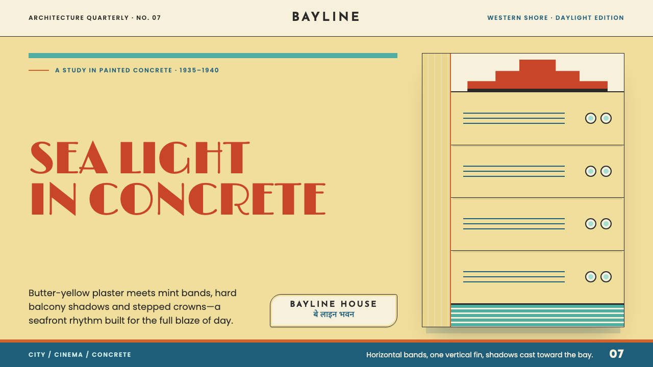 Bombay Marine Drive DecoDeco built for daylight. Butter-yellow plaster, mint bands and stepped crowns…
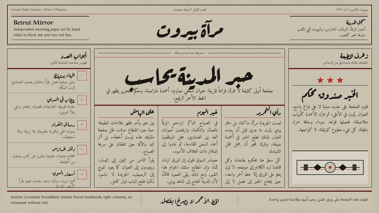 An-Nahar Beirut PressDense authority. Aged newsprint, black naskh columns, and one red rule hold t…
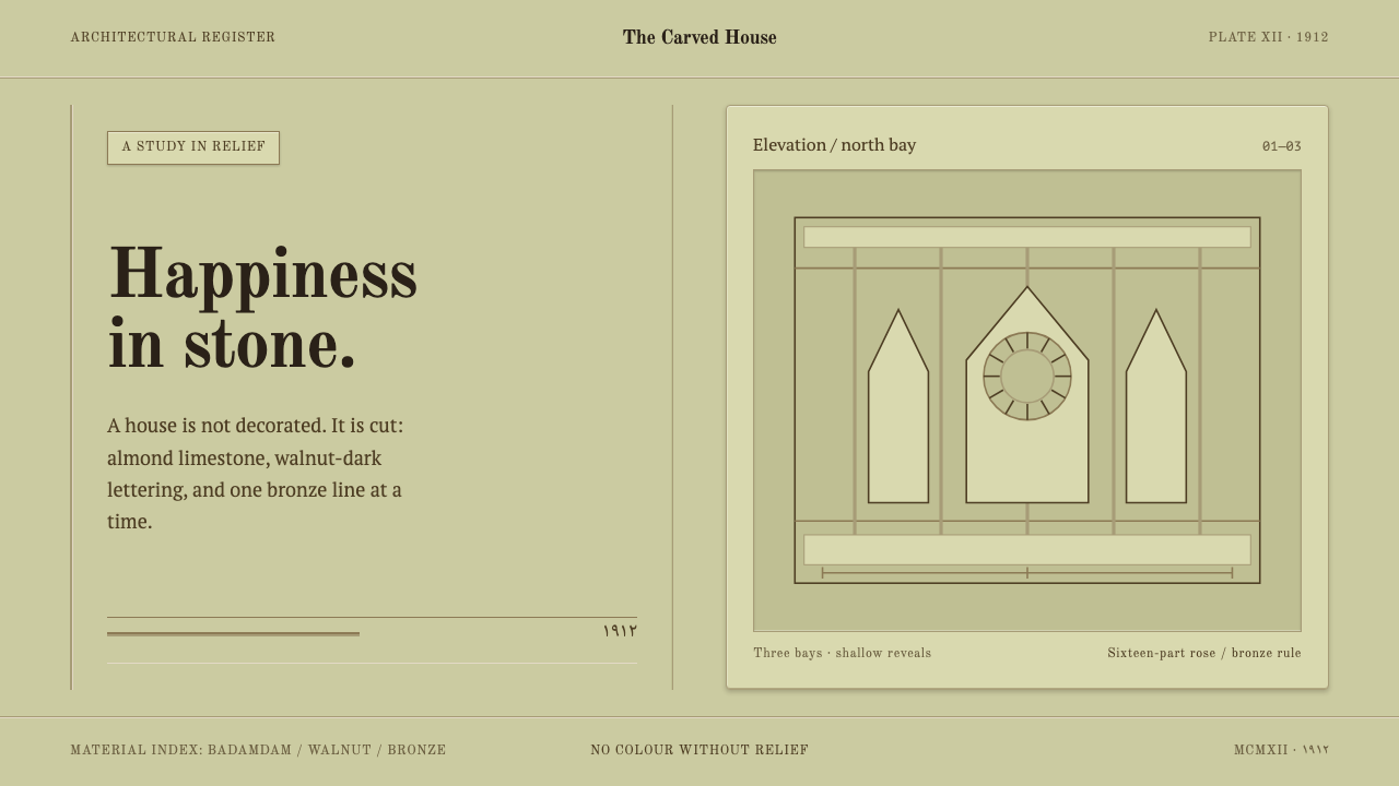 Baku Oil Boom MansionsWealth made tactile. Almond limestone, Old Standard TT, and recessed bays car…
 Briar Pipe & TobaccoWarm gloom, precisely aged. Brass rules and Cinzel capitals sit on espresso w…
 British Racing Green (Motorsport, 1907)Quiet authority at speed. Deep BRG, cream leather, walnut, and chrome hairlin…
 Cricket Whites FlannelsSummer, kept in good order. Ecru serif and fine club trim cross a dark mown g…