What is Baku Oil Boom Mansions?
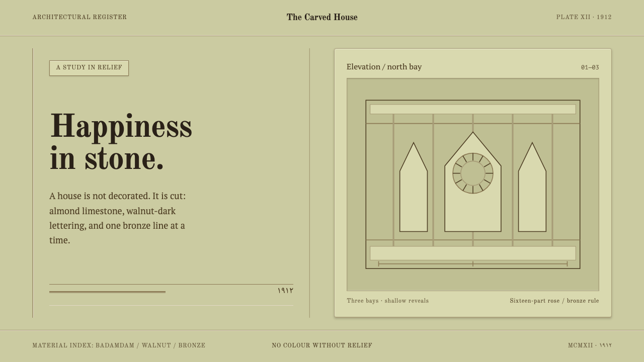
Baku's oil millionaires turned crude into carved stone, and the result is a style where wealth is felt through relief — recessed panels, almond limestone, hard shadow and a thin line of bronze.
Baku Oil Boom Mansions in brief
Baku Oil Boom Mansions is a design style drawn from the grand private buildings that Baku's oil millionaires commissioned in the years around 1900 to 1914. It takes its character from one reference building, the Palace of Happiness, completed in 1912: a Gothic Revival house built from imported French plans and cut into local limestone, with tracery, pinnacles and deeply carved wall panels on the outside, and walnut joinery, wrought iron and bronze on the inside.
The core idea is that wealth should be tactile. Where many luxury styles signal richness with gold, saturated colour or heavy ornament, this one signals it with depth. Panels sit recessed under a hard shadow, edges catch a thin line of light, and a surface looks valuable because you can imagine running a hand over its carving. Hierarchy in the style is carried by relief, not by colour and not by weight.
Visually it is warm, pale and sculpted. The dominant tone is a soft almond-tan stone that reads slightly olive in strong sun, set against dark timber, black ironwork and fine bronze hairlines. Type is a refined, classical serif. The overall impression is calm authority: a house built to last and to impress, but through craft rather than through noise.
Where does Baku Oil Boom Mansions come from?
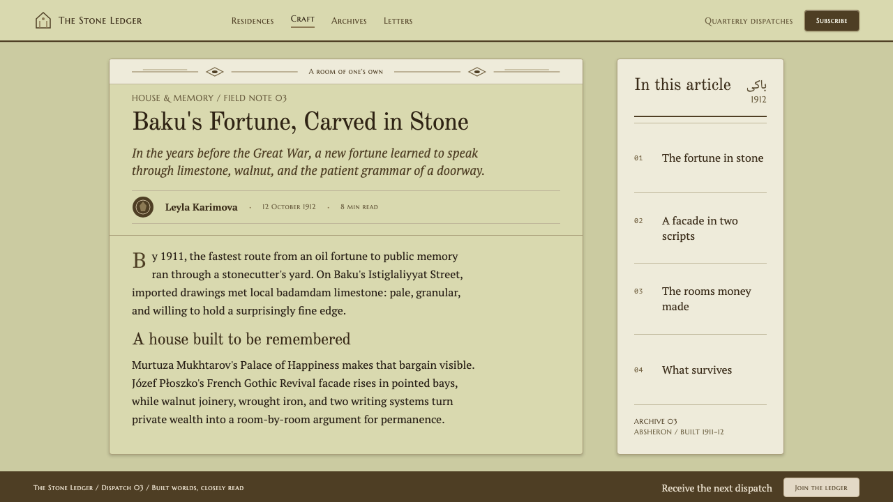
The decade before 1914 was the high point of Baku's oil boom, and its fortunes were poured into buildings. The source material describes the period bluntly as one in which the city's oil millionaires spent their money 'turning crude into carved stone'. The Absheron peninsula, on which Baku sits, had a stonecarving tradition of its own, and the boom brought that local skill into contact with architectural fashions from elsewhere.
The reference building tells the story in miniature. Murtuza Mukhtarov built the Palace of Happiness for his wife, Liza Tuganova, between 1911 and 1912. He hired the Polish architect Józef Płoszko and imported French blueprints, so the design that arrived in Baku was French Gothic Revival: pointed forms, tracery and pinnacles that belong to a northern European cathedral tradition. What made it Bakuvian was the material. The house was cut into badamdam limestone from the Absheron area, a pale almond stone that looks olive-tan under the Caspian sun.
That meeting of an imported style and a local stone is the heart of the aesthetic. The source places the style within three overlapping currents: Gothic Revival, Russian-imperial eclecticism and Absheron stonecarving. None of them is pure, and the result is neither a copy of a French original nor a vernacular building, but a hybrid in which a borrowed vocabulary is carved by local hands in local stone. The shadows that define the facade are those of strong southern light falling on deeply recessed work.
The interior adds a second register. The source describes walnut joinery, wrought iron and bronze, and doorways where Cyrillic and Arabic-script Azerbaijani sit together on the same lintel, a faithful record of how signs were written at the time rather than a decorative flourish. The era is given as the 1900 to 1914 Baku oil boom, with the reference building completed in 1912. Key figures in the style's reference list are Murtuza Mukhtarov, Liza Tuganova, Józef Płoszko and Zivar bey Ahmadbeyov.
What defines the Baku Oil Boom Mansions look?
Almond limestone palette
The base colour is the pale, warm stone of the Absheron area, an almond tone that tips toward olive-tan in strong sun. It is neither white nor cream, and it carries a faintly mineral warmth that makes the whole surface feel quarried rather than painted. Secondary tones are dark walnut, black wrought iron and the soft gold-brown of bronze, kept to small areas so that stone remains the overwhelming impression.
Relief as hierarchy
Importance is expressed by depth: what matters most sits proud of the surface, and what supports it is recessed. Every panel is cut back into the wall, with a bright edge on the upper side and a shadow on the lower side. This replaces the usual tools of emphasis — colour contrast and heavy type — so that a page can feel rich without becoming loud or colourful.
Hard shadow
Shadows are sharp, directional and consistent, as if cast by a high Caspian sun on carved stone. They define the edge of each recess and give panels their weight. Soft, diffuse blurs would turn the carving into fog; the style needs the shadow to be a clean shape that you can read as a cut in the stone.
Gothic tracery and pinnacles
The French Gothic Revival design shows up as pointed arches, window tracery and slender pinnacles. In a layout, these translate into vertical emphasis, pointed or stepped silhouettes at the top of key panels and delicate subdivision of large areas into smaller bays. The effect is lofty and formal, but carved in a stone that is warmer than any northern cathedral.
Bronze hairlines and timber
Inside the house the palette turns to walnut joinery, wrought iron and bronze. In design this appears as dark timber-like tones for surfaces of use, black for structural linework and a very thin bronze line marking edges of actions, such as the outline of a button. The bronze is a hairline, never a fill: a gleam on the edge, not a gold surface.
Classical serif voice
Type is a refined, classical serif of the sort associated with printed books and civic inscriptions of the period, with clear contrast between thick and thin strokes. It lends the style an air of record and permanence. Headlines read like carved dedications, and text blocks like pages from a well-made volume, so that even interface labels feel as though they could be incised.
Two scripts on one lintel
The source highlights doorways where Cyrillic and Arabic-script Azerbaijani share the same lintel, a record of the city's real writing practice at the time. In design terms this is a licence for bilingual or multi-script layouts that stack or pair scripts within a single frame, treated as equals and set in the same weight. It is a structural feature of the style rather than a decorative one.
Who shaped Baku Oil Boom Mansions?
Mukhtarov is the oil millionaire who built the Palace of Happiness between 1911 and 1912. His role in the story is that of patron, the person who turned boom-era money into a building cut in carved stone. The commission shows the ambition of the whole period: private wealth expressed as architecture, built to be admired from the street.
Tuganova was the wife for whom Mukhtarov built the palace. The source records the house as made for her, which gives the style an unexpected tenderness: this is a monument of money that was also a gift. For designers, her presence in the story is a reminder that the severity of the stonework sits alongside intimacy and domestic life.
Płoszko was the Polish architect whom Mukhtarov hired for the palace. The palace combined imported French blueprints with local limestone, and he stood at the point where the two met. His position, between a foreign pattern and a local material, is the position of the whole style: an international vocabulary made specific by where and in what it is built.
Ahmadbeyov appears in the style's reference list among the key figures of the period. The source does not tie him to a single building, so the cautious reading is as a marker of the local side of Baku's building world, which sat alongside the Polish architect and the imported French plans. His name, by its form, belongs to the Azerbaijani circle of the boom-era city.
How do you use Baku Oil Boom Mansions today?
This style is among the best choices for work that must feel valuable without shouting. Its rule is simple: show importance with depth, and keep colour quiet. Choose a warm stone ground, set content in recessed panels with a hard shadow, and reserve the bronze hairline for the few places where something can be acted upon.
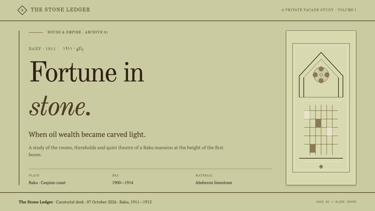
For presentation slides, a cover can be built like a facade: a large recessed panel on a stone ground, a refined serif title carved into it, and a thin bronze rule beneath. Content slides work as a series of bays, each content block sitting in its own recessed frame, with hierarchy shown by how deeply a panel is set. Data slides suit charts built from carved blocks, in muted stone, timber and iron tones, with the shadow doing the work that bright series colours would normally do.
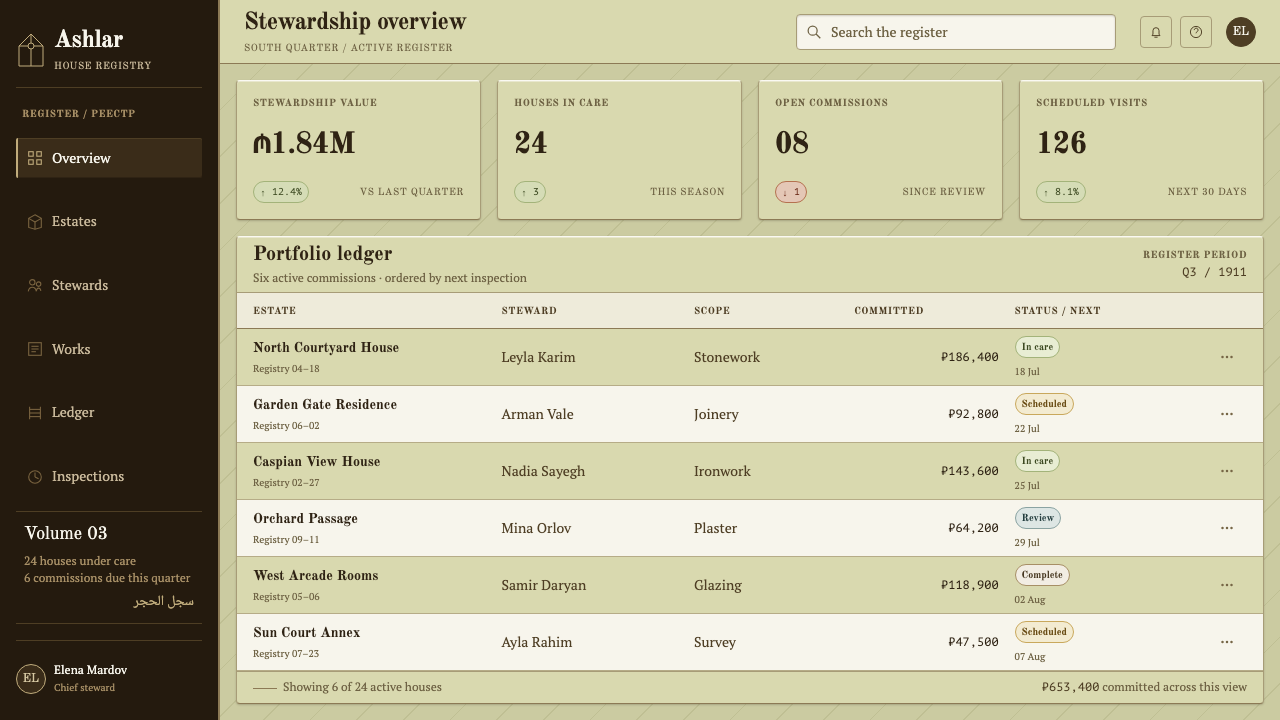
For web interfaces, the style fits finance, legal, hospitality, heritage and premium commerce products. Dashboards can use recessed cards for secondary information and raised panels for primary actions, with a restrained palette that lets depth organise attention. Pricing pages can show the recommended tier as the most prominent raised panel while other tiers stay recessed. Buttons take a thin bronze outline, and labels use the serif for headings with a simple companion face for dense data.
For editorial and marketing work, the style gives a sense of provenance and craft, well suited to stories about architecture, family firms, regional history and luxury goods. Pages can be organised like a facade, with a wide recessed hero, columns of text in tall narrow bays and section breaks drawn as a carved moulding. Bilingual copy sits comfortably here: place two scripts in the same frame, side by side, at equal weight, as on the lintels of the original building.
The most common mistake is to use soft, blurred shadows, which dissolve the carving and turn the look into generic luxury. A second is to rank content with colour or boldness instead of relief, which contradicts the style's core logic. A third is to over-gild: bronze belongs on the hairline, and filling large areas with gold turns a carved stone house into a showroom. Finally, avoid cartoon Gothic decoration; tracery should be structural and sparing.
Baku Oil Boom Mansions — FAQ
Is this a Gothic Revival style?
It draws on Gothic Revival, but it is not only that. The source lists Gothic Revival, Russian-imperial eclecticism and Absheron stonecarving as its currents. The Palace of Happiness was designed from French Gothic Revival plans, then cut into local limestone by local craft, so the result is a hybrid with its own warm, pale, sculpted character rather than the dark stone of a northern cathedral.
Why is relief used instead of colour for hierarchy?
Because the reference building is cut from a single pale stone, and stone does not offer many colours. Depth is the natural way to create emphasis in carving, and the strong local light turns that depth into shadow. Carrying the logic into design means letting recessed panels, edges that catch light and hard shadow sort the information, which also keeps the palette calm and the result feeling expensive.
What does the bilingual lintel mean for a layout?
It suggests that two scripts can share a frame as equals. The source notes Cyrillic and Arabic-script Azerbaijani on the same lintel as a genuine record of the time. In a layout, that means setting two languages in one panel at the same weight and size, rather than shrinking one into a caption. It is a particularly natural fit for products serving two language communities.
Can I use gold in this style?
Sparingly. The source speaks of bronze hairlines on interior details such as buttons, not gold surfaces. A warm metallic line on an edge fits the style, and a gold fill does not. The richness is meant to come from carved depth and good material, so metallic colour should never become the main way a page signals value.
Does the style work in dark mode?
The reference is a pale stone building under strong sun, so the faithful version is light. A dark variant is possible by treating the timber and iron tones as the ground and keeping the relief logic intact, with highlights on upper edges and shadows below. It will read more like the building's interior than its facade, and it needs the bronze hairline to stay thin to avoid looking garish.
Related design styles
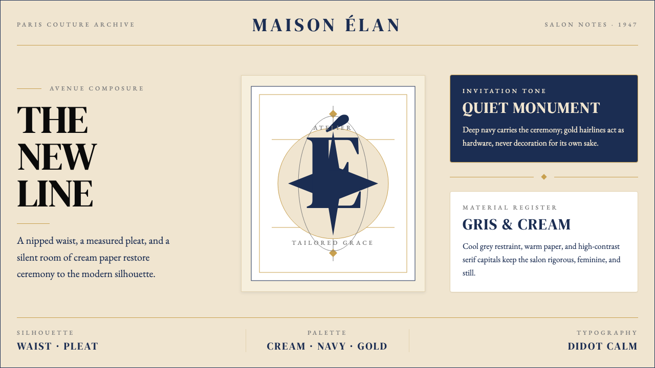 Dior New Look (1947)Couture speaks softly. Cream ground, navy Didot capitals, and gold hairlines…
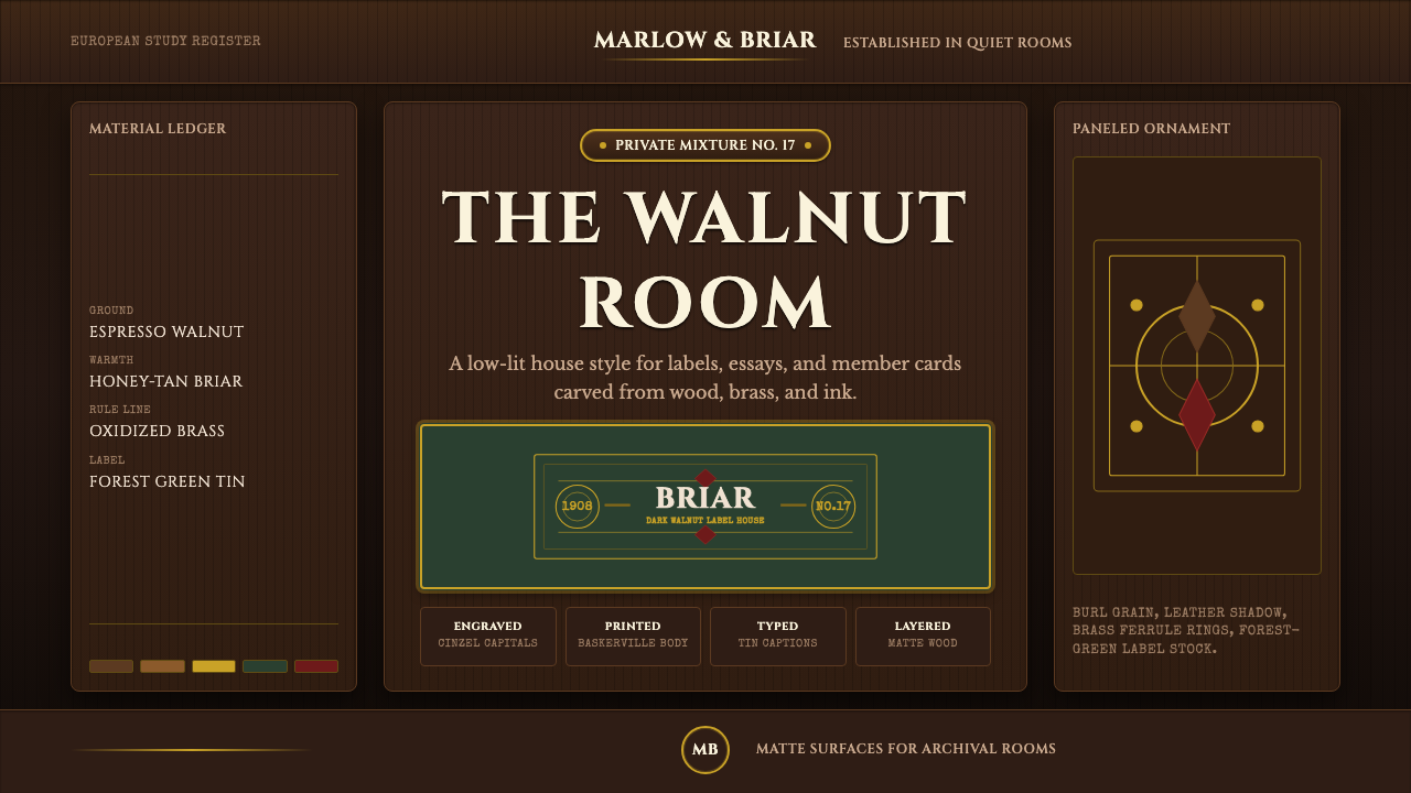 Briar Pipe & TobaccoWarm gloom, precisely aged. Brass rules and Cinzel capitals sit on espresso w…
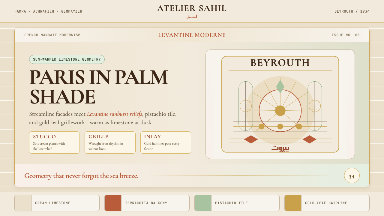 Lebanese Art Deco (Beirut)Cosmopolitan warmth. Cormorant friezes, gold hairlines, terracotta-pistachio…
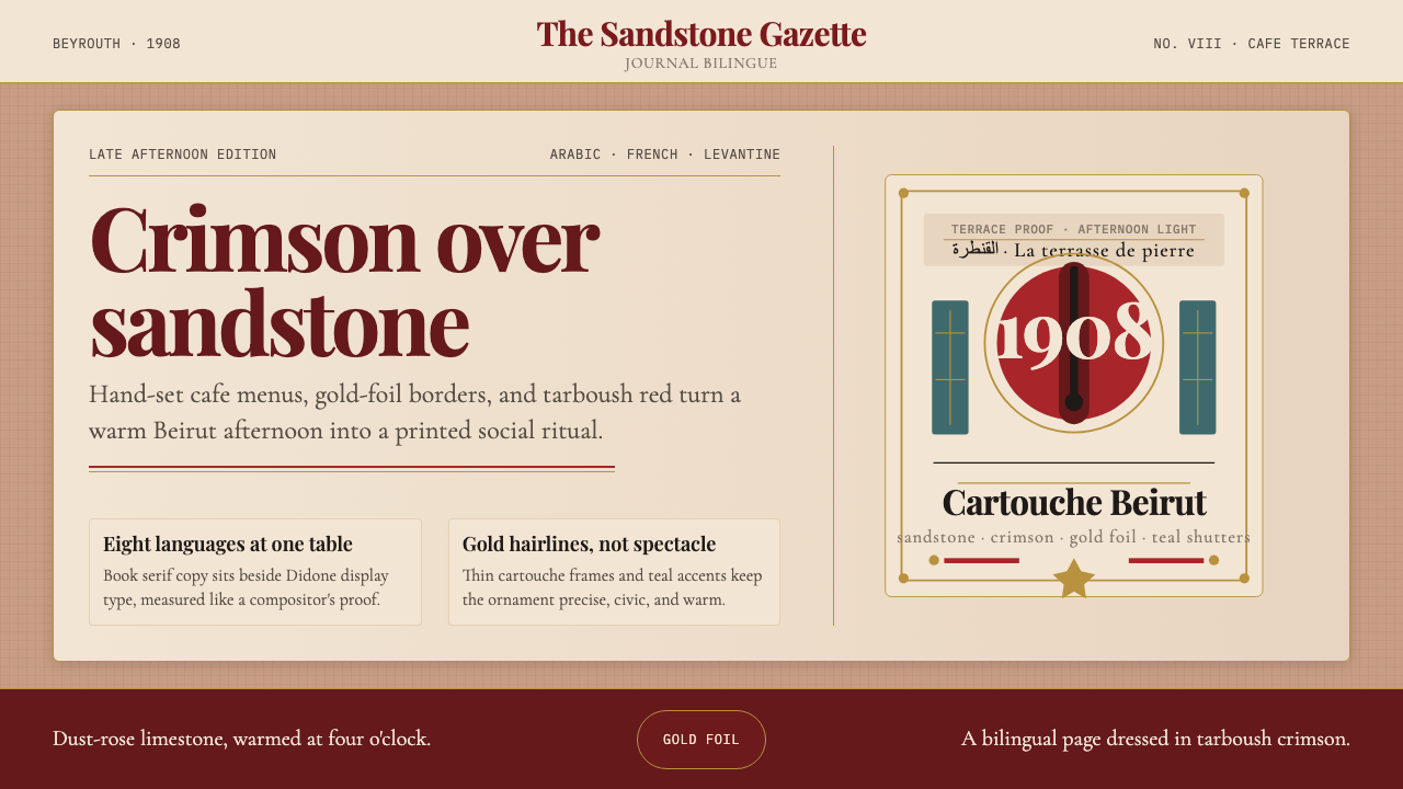 Lebanese Tarboush Belle Époque BeirutWarm Levantine opulence. Dust-rose stone, tarboush crimson, and Didone cartou…
 Studio Misr CairoEgyptian cinema's golden age, gilded. Silver-nitrate brown, Deco gold frames,…
 Bordeaux Wine ChâteauAged claret authority. Cinzel capitals, gilt rules, and label symmetry on win…