What is Lebanese Tarboush Belle Époque Beirut?
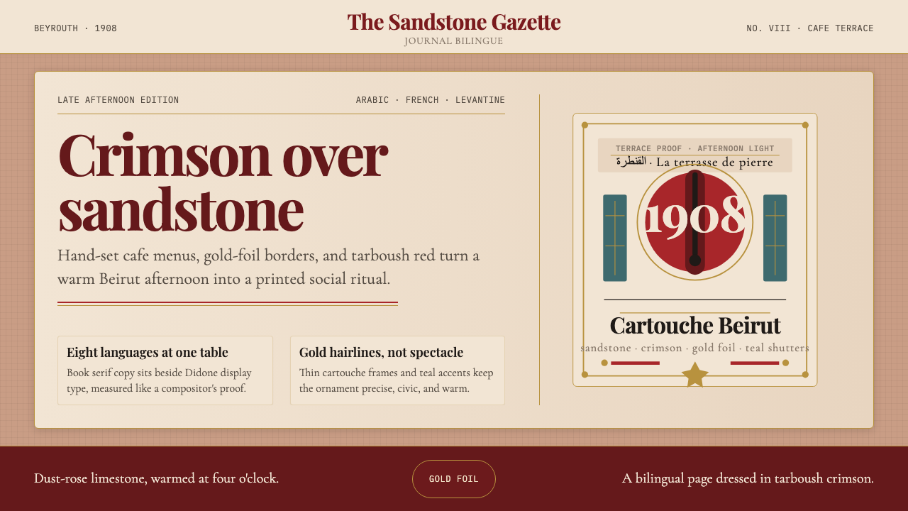
Belle Époque Beirut dressed itself in two scripts, tarboush crimson, and the warm glow of sandstone at four o'clock — a layered visual culture that design can revisit without orientalist fantasy.
Lebanese Tarboush Belle Époque Beirut in brief
Lebanese Tarboush Belle Époque Beirut is a design style rooted in the visual culture of late-nineteenth and early-twentieth century Beirut, when the city occupied a singular position as a crossroads of Ottoman, French, and Levantine influences. The name distils two emblems of that era: the tarboush — the brimless felt hat in deep crimson that Ottoman officials, professionals, and merchants wore across the Levant — and the Belle Époque moment when Beirut's sandstone townhouses, Francophone press, and flourishing Nahda literary culture all occupied the same city block.
The aesthetic is warm and layered rather than spare. Its tonal foundation is dust-rose limestone — the colour of Beirut's most characteristic domestic architecture — offset by the saturated crimson of the tarboush and touches of aged gold reminiscent of hand-applied cartouche ornament. Typography draws on the encounter between Didone headline faces — the high-contrast, hairline-serifed cuts fashionable in European print culture of the period — and the flowing calligraphic weight of Arabic Nashki press type, which Beirut's pioneering printers like Khalil Sarkis brought to a high craft standard.
Unlike styles that borrow orientalist imagery as surface decoration, this system is grounded in the specific visual production of Beirut itself: the hand-tinted postcards of Fouad Debbas, the ornate mastheads of the Nahda journals, the carved limestone windows of Gemmayzeh and Achrafieh. The result is a language that feels archival and warm without resorting to cliché — opulent through restraint rather than through accumulation.
Where does Lebanese Tarboush Belle Époque Beirut come from?
The Belle Époque in Beirut stretches roughly from the 1880s through the outbreak of the First World War in 1914, though the tarboush as a formal Ottoman garment had been codified by Sultan Mahmud II's Tanzimat-era dress reform decrees of 1829, which mandated the red felt hat across the empire as a symbol of modernizing uniformity. By the time Beirut was thriving as the Ottoman province of Greater Syria's commercial and intellectual capital, the tarboush had become so naturalised that its crimson appeared in studio portraits, street photographs, and illustrated journals alike — a colour that read simultaneously as Ottoman officialdom, Levantine bourgeois respectability, and individual professional pride.
The city's distinctive sandstone architecture emerged from the same period. Beirut's triple-arched townhouses — built from the honey-coloured and dust-rose limestone quarried from the surrounding hills — created an urban palette of extraordinary warmth and consistency. French and Ottoman architectural vocabularies coexisted in the same facades: Italianate pilasters and arched loggias decorated in carved arabesque detail. The afternoon light in Beirut, falling on this stone, produced the particular warm rose-gold tonality that defines the colour register of the style.
The Arabic press and the Nahda cultural renaissance gave the period its typographic character. Khalil Sarkis, publisher of the journal Lisan ul-Hal, was among the foremost craftsmen of Arabic moveable type in the region, producing elegant Nashki fonts at a moment when the encounter between European Didone display type and Arabic calligraphic tradition was still being actively negotiated. Jurji Zaydan, the Lebanese Egyptian novelist and historian who founded the journal Al-Hilal in Cairo, and Émile Eddé, jurist and cultural figure, represent the Francophone intellectual side of this bilingual culture — a class for whom reading Arabic and French in the same sitting was entirely ordinary.
The painter Daoud Corm — trained in Rome and returned to Beirut — and the postcard photographers who documented the city for the European market together produced the visual archive that most concretely embodies this style today. The hand-tinted postcard, in particular, is the period's most characteristic designed artefact: a photographic image coloured by hand in soft rose, dusty blue, and warm ochre, often framed by a decorative cartouche border in gold or sepia. These cards circulated across Europe and the diaspora, and they remain the clearest single-image distillation of what the Belle Époque Beirut visual register looked and felt like.
What defines the Lebanese Tarboush Belle Époque Beirut look?
Palette
The colour register is warm and layered: a dust-rose limestone ground — the colour of Beirut's quarried stone walls in afternoon light — sits alongside tarboush crimson as the dominant accent. Aged gold, the tone of cartouche ornament and gilt lettering on journal mastheads, provides a third register. Dusty slate-blue and faded olive appear as supporting tones, evoking the cooler shadows of arched colonnades. The palette avoids both orientalist jewel-brightness and the flat, cool beige of contemporary minimalism.
Typography
The typographic register is Didone at its most dramatic — high-contrast roman letterforms with hairline thin strokes and bold thick stems, the style dominant in European book and periodical printing of the late nineteenth century. In bilingual applications, Arabic type carries equivalent calligraphic weight: flowing Nashki forms whose cursive rhythm echoes the organic quality of Didone's thick-thin contrast. Headlines are set generously, with the open spacing and cartouche framing of a journal masthead. Body text is tight and economical, as befits the dense column setting of a nineteenth-century periodical.
Surface Texture
Every surface carries a faint material memory: the fine grain of laid paper, the slight unevenness of letterpress impression, the warm tooth of limestone. This is not skeuomorphic decoration but a tonal quality — a warmth and slight visual weight that distinguishes the style from flat digital surfaces. In practice, it manifests as a slight depth in background tones, as though the ground colour were ever so faintly textured rather than perfectly uniform.
Ornamental Framing
Cartouche ornament — the oval or rectangular decorative frame used in North African and Levantine print culture to enclose titles, portraits, and editorial headings — is the style's most characteristic structural element. It appears not as gratuitous decoration but as an organisational device: a frame that elevates and isolates key content. Gold or sepia cartouches recall the hand-tinted postcard format and the gilded mastheads of Nahda journals, lending a sense of archival ceremony to whatever they enclose.
Bilingual Register
The style is structurally bilingual — it is designed to hold Arabic and Latin scripts together without privileging either. This is not mere internationalisation; it is a reflection of Belle Époque Beirut's actual lived culture, where café menus, newspaper pages, and official correspondence moved fluidly between Arabic and French. In practice, this means treating the two scripts as compositional equals: giving each its own typographic weight and rhythm, using a shared colour and framing system that does not favour one over the other.
Spatial Generosity
Despite its ornamental richness, the style does not crowd. Layouts carry generous margins — the white or stone-coloured air that surrounds cartouches, headings, and text columns in period printing. This spaciousness prevents the layered palette and decorative framing from reading as clutter. Each element has room to be seen on its own terms before it contributes to the whole, a quality consistent with the best nineteenth-century periodical design.
Light and Warmth
The overarching quality that distinguishes this style from other historical revival aesthetics is its specific quality of warmth. This is not a cool, archival sepia — it is the warmth of Mediterranean afternoon light on dusty rose stone, of gaslit interiors, of aged paper that has taken on a cream-gold cast. The warmth permeates every tonal choice: whites lean cream, blacks lean warm brown, shadows are amber rather than grey. It is a temperature as much as a colour system.
Who shaped Lebanese Tarboush Belle Époque Beirut?
Beirut publisher and typographer, founder of Lisan ul-Hal and one of the leading craftsmen of Arabic moveable type in the Levant during the Belle Époque. Sarkis's print workshop produced some of the finest Arabic periodical typography of the period, navigating the encounter between European mechanical printing and the calligraphic traditions of Arabic script with exceptional skill. His mastheads and editorial layouts are a direct visual source for the style's bilingual typographic register.
Lebanese painter trained in Rome under the academician Nicola Palizzi, who returned to Beirut and became the leading portrait painter of the Ottoman Lebanese bourgeoisie. Corm's formal portraits — sitters often wearing the tarboush above European frock coats — are the canonical images of Belle Époque Beirut's social elite. His studio practice, combining European academic technique with Levantine subjects, embodies the same cultural fusion that defines the design style.
Lebanese-Egyptian novelist, historian, and journalist, founder of the Cairo journal Al-Hilal in 1892. Zaydan was one of the most prolific figures of the Arabic Nahda and a master of the bilingual intellectual culture that Beirut exported across the Arab world and diaspora. His historical novels, serialised in Al-Hilal, brought European narrative forms into Arabic prose; his journal's decorated mastheads and generous layouts exemplify the period's editorial visual culture.
Beirut-born collector and historian whose archive of hand-tinted postcards documenting early-twentieth-century Lebanon became, posthumously, one of the most important visual records of the Belle Époque city. The Debbas collection — soft rose stone architecture, tarboush-wearing figures in the Place des Canons, gold-framed portrait cartouches — is the single most direct visual source for the style's tonal and compositional language. Though Debbas collected rather than created, the postcards in his archive are the clearest surviving distillation of how Belle Époque Beirut understood its own image.
Lebanese jurist, politician, and cultural figure who embodied the Francophone Levantine elite of the late Ottoman and French Mandate periods. Eddé represents the class for whom bilingualism was not accommodation but identity — the class that commissioned the sandstone townhouses, subscribed to the Nahda journals, and wore the tarboush as a mark of professional distinction rather than political compliance. His milieu is the social world from which this visual culture emerged.
How do you use Lebanese Tarboush Belle Époque Beirut today?
Lebanese Tarboush Belle Époque Beirut is one of the more demanding historical styles to apply well, because its richness depends on calibration rather than accumulation. The palette is warm and multi-layered, the typography is high-contrast and historically specific, and the ornamental cartouche framing can easily tip into pastiche if not handled with care. The style works best when it is treated as a tonal and compositional system — dust-rose, crimson, and aged gold in careful proportion — rather than as a collection of period props to assemble.
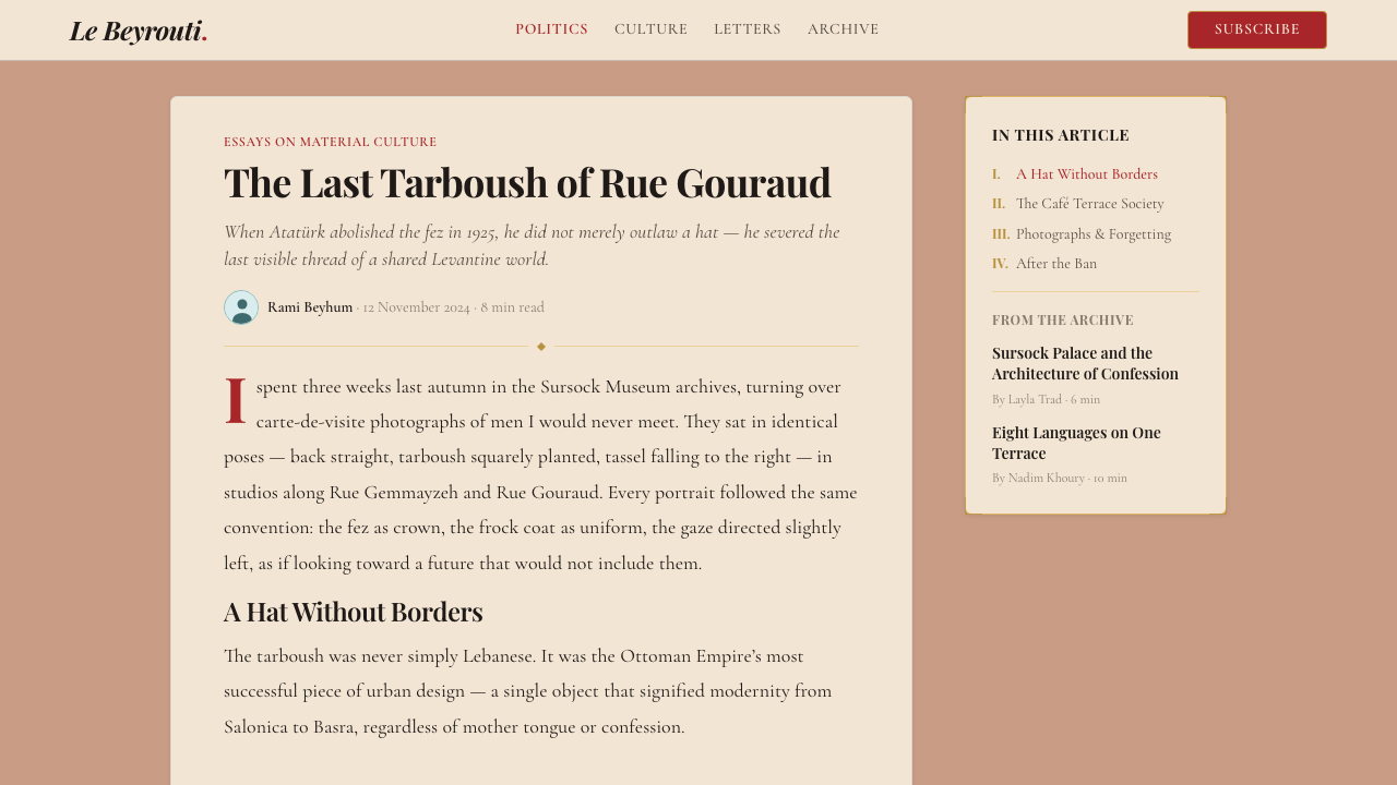
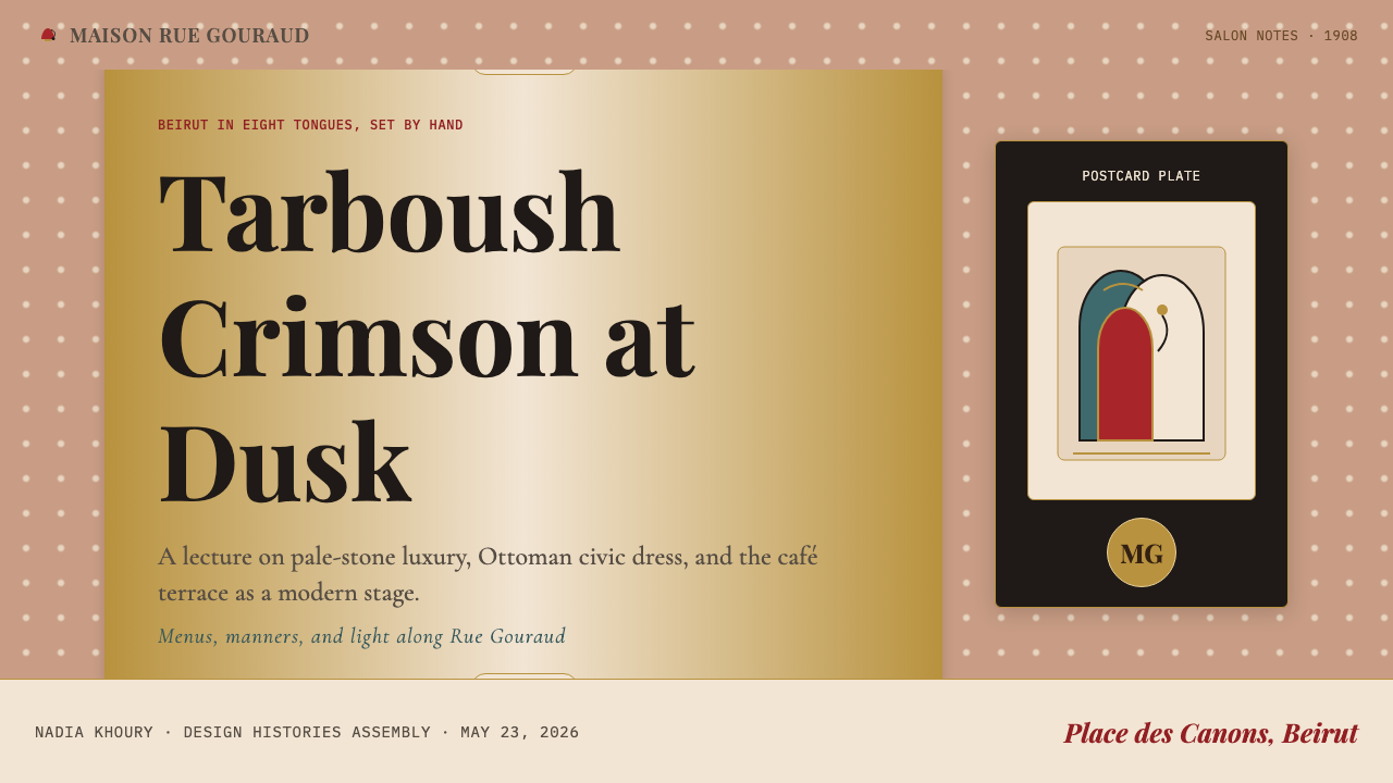
For presentation slides, the style is well-suited to covers that need to feel ceremonial and authoritative without coldness. A cover built on a dust-rose or warm cream ground, with a Didone headline set inside a gold cartouche frame and a crimson accent rule beneath, achieves exactly the warmth and gravitas the style offers. Content slides should preserve the generous margin and the Didone typographic hierarchy, but drop the cartouche framing for clean, airy layouts — the ornament belongs at moments of emphasis, not throughout. Data slides work best when charts are treated as diagrams within the style's warm palette: bars in deep crimson or dusty rose, annotation text in a warm dark tone, backgrounds in the lightest limestone register.
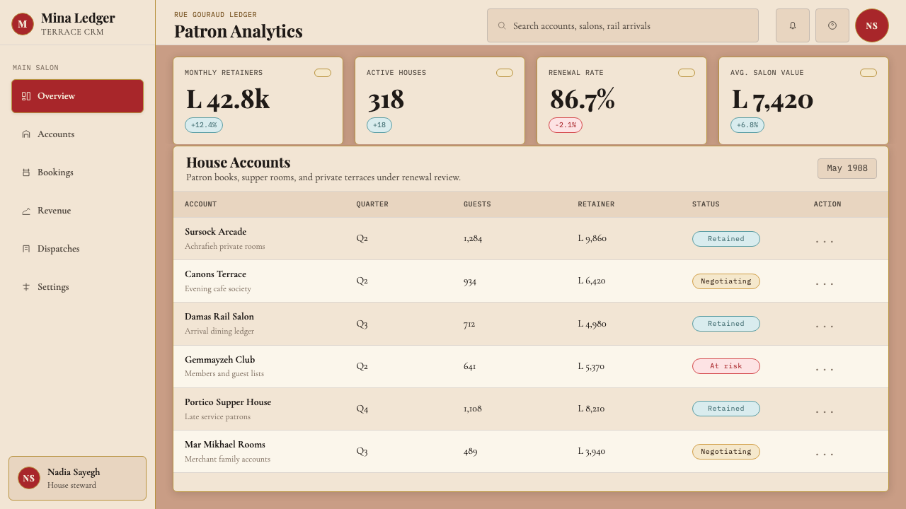
For web interfaces, the style is particularly well-suited to editorial platforms, cultural institutions, and luxury or heritage brands where warmth, history, and bilingual cultural credibility are valued. A dashboard in this style would use the dust-rose as a sidebar background, reserve crimson for active states and key data points, and deploy aged gold only for the highest-hierarchy labels or navigation items. The cartouche framing translates naturally into card borders with decorative corner details or section headers with period-style rule ornaments — but these should appear sparingly, as structural punctuation rather than wallpaper.
For editorial and marketing work, the style is among its most natural. A long-form article layout with a Didone headline, a generous drop capital, tight Nashki-inflected body text (or its typographic equivalent in a contemporary face), and a cartouche pull-quote frame carries the full weight of the Nahda journal tradition without feeling like costume. Marketing pages work well when they lead with the warm limestone background and use crimson and gold as accent colours for calls to action and highlighted features — the warmth of the palette is itself a marketing quality, suggesting craft, provenance, and care.
The most common mistake when applying this style is mistaking richness for accumulation. Using the full crimson, the full gold, the full ornament, and the full Didone weight simultaneously produces something that reads as fussy rather than opulent. Authentic Belle Époque Beirut print culture was generous but never cluttered; the cartouche framing was always a frame around empty space as much as around content. Apply one strong element per composition — a single cartouche, a single crimson accent, a single gold rule — and let the warm ground colour carry the rest.
Lebanese Tarboush Belle Époque Beirut — FAQ
How does this style differ from generic orientalist or Moorish revival aesthetics?
The distinction is specificity and source. Orientalist revival aesthetics draw on a Western fantasy of the East — jewel tones, arabesques, and exotic figuration derived from European colonial-era illustration rather than from actual Eastern visual culture. This style is grounded in the specific documented visual production of Beirut itself: the hand-tinted postcards of Fouad Debbas, the mastheads of the Nahda press, the sandstone architecture of Gemmayzeh. Its palette is warm and dusty rather than jewel-saturated, its ornament is cartouche framing rather than arabesque wallpaper, and it holds Arabic and French typography as equals rather than treating Arabic as decoration.
Can this style work in a digital-first context, or does it only suit print?
It translates well to screen when handled correctly. The key is treating the warmth as a tonal quality of the surface rather than as a physical texture effect — warm cream backgrounds, slightly amber-shifted dark tones, and the characteristic warm dusty rose ground all read cleanly on screen without requiring faux-grain overlays. The Didone typographic register works equally well on screen as in print, given the high resolution of contemporary displays. The cartouche ornament may need simplification for smaller UI contexts — a clean rule-and-corner device rather than detailed carved ornament — but its structural role as a framing element remains entirely valid.
Is the tarboush politically sensitive as a design reference?
It is worth understanding the complexity. The tarboush began as an Ottoman imperial dress-reform symbol and was later banned by Atatürk in Turkey in 1925 as part of his secular nationalist modernisation — the ban was itself politically charged. In Lebanon and across the Levant, however, the hat was worn with a distinct cultural meaning: it was the mark of the educated, secular, professional class that produced the Nahda. The design style draws on this specifically Lebanese and Levantine cultural memory — the tarboush as a symbol of that bilingual, cosmopolitan Belle Époque bourgeoisie — rather than on either Ottoman imperialism or the politics of Atatürk's secularism. Contextualising the reference clearly, especially in any textual framing, ensures it reads as the intended cultural homage.
What types of brands or projects is this style most unsuitable for?
The style is poorly suited to any context where speed, efficiency, and contemporary technological authority are the primary values — software-as-a-service platforms, fintech dashboards, developer tools, or any brand positioning itself as forward-facing and frictionless. The warmth and historical depth of the palette read as deliberate, unhurried, and rooted in the past, which is an asset for cultural, editorial, and heritage contexts but a liability where the promise is instant, modern, and scalable. It is also ill-suited to contexts requiring strong accessibility contrast at scale, since the warm dusty tones can present contrast challenges that a starker palette would not.
How should the bilingual element be handled when working in a single-language context?
The bilingual register is a historical fact of the style's origin, not a mandatory design requirement. In a single-language application, the visual spirit of bilingualism translates into a tolerance for typographic contrast — using two distinctly different type voices in the same composition, as the original culture used Arabic and French. A Didone headline and a lighter, more open body type in the same Latin script can carry this quality without actual bilingualism. Conversely, the ornamental cartouche framing and warm palette function entirely independently of language and should be retained as the style's primary structural signatures.
Related design styles
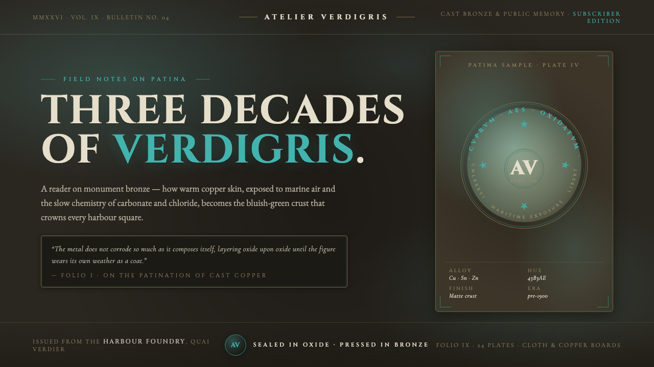 Bronze Patina StatueThree decades of weather, worn as a coat. Verdigris crust on dark bronze, eng…
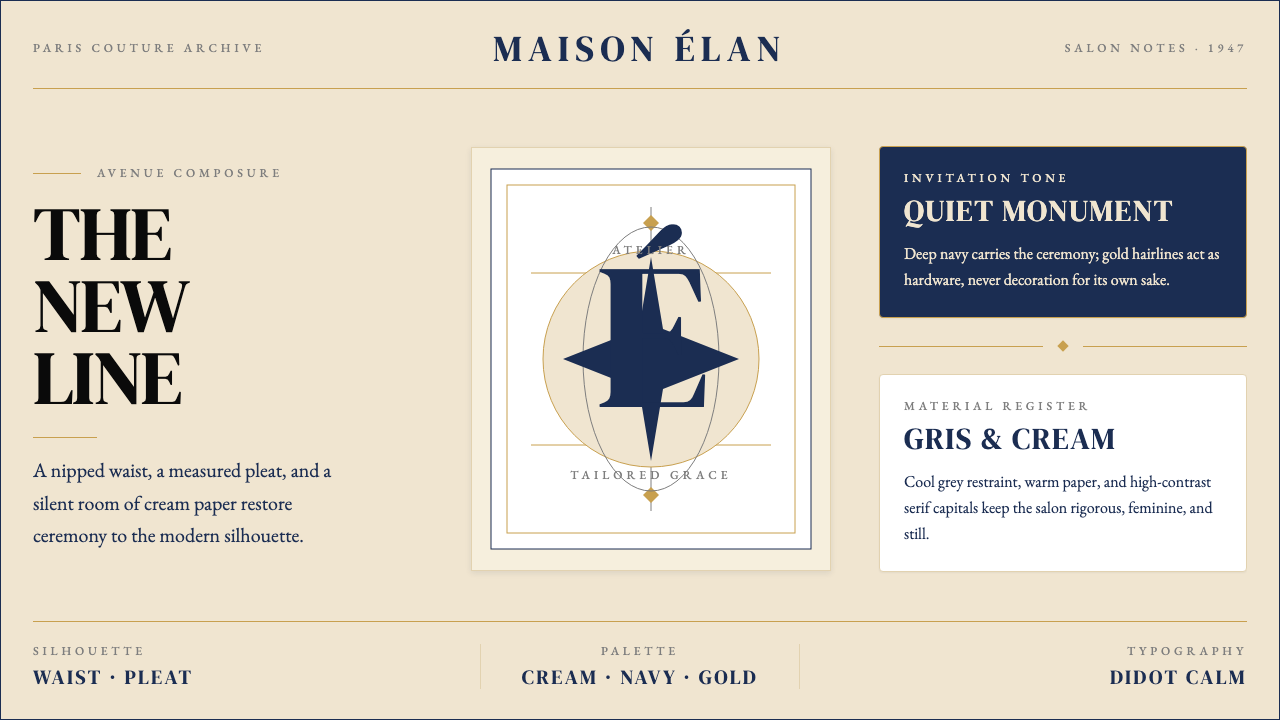 Dior New Look (1947)Couture speaks softly. Cream ground, navy Didot capitals, and gold hairlines…
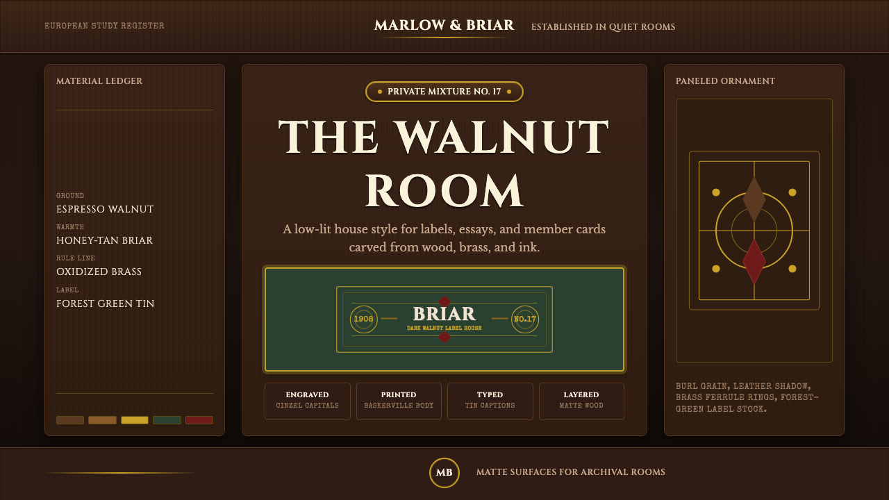 Briar Pipe & TobaccoWarm gloom, precisely aged. Brass rules and Cinzel capitals sit on espresso w…
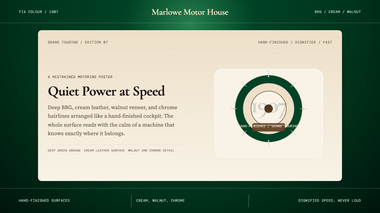 British Racing Green (Motorsport, 1907)Quiet authority at speed. Deep BRG, cream leather, walnut, and chrome hairlin…
 Fado SaudadeSaudade in shadow. Mourning black holds wine red, honey wood, and one gold li…
 Fatimid LustrewareOpulence fired into earth. Copper-gold lustre glows through dense medallions…