What is Studio Misr Cairo (1935)?
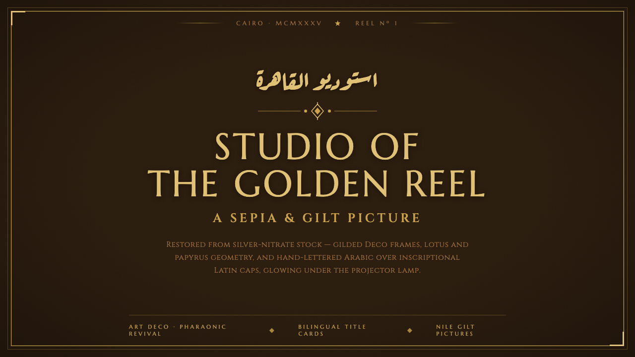
Studio Misr turned Egyptian cinema’s golden age into a visual language of sepia film, gilded Deco geometry, and Arabic handwriting rising over monumental Latin capitals.
Studio Misr Cairo (1935) in brief
Studio Misr Cairo is the visual language of Egypt’s early studio cinema rendered as a designed system. Its atmosphere begins with an aged silver-nitrate brown ground: neither cream nor white, but a darkened photographic field carrying the memory of film stock, projection rooms, and title cards. Across that ground, gold behaves less like decoration than inscription, framing the page with the authority of a cinema façade or an engraved opening credit.
The style joins three forces that must remain visible together. Art Deco supplies symmetry, stepped borders, radiating geometry, and the controlled luxury of gilded cinema interiors. Early Egyptian studio cinema supplies the sepia atmosphere and the sense that every title card is an entrance into a larger narrative world. Arabic Deco lettering supplies expressive movement, allowing ornate handwritten Arabic to sit over or alongside Latin capitals without either script becoming subordinate decoration.
The resulting system is theatrical but disciplined. Marcellus and Cinzel provide the carved, inscriptional Latin voice; Aref Ruqaa supplies a more fluid Arabic voice; papyrus and lotus motifs connect the frame to Egypt without becoming literal illustration. A faint photographic grain prevents the surface from feeling digitally immaculate, while symmetrical framing keeps the composition ceremonial. The aim is not generic vintage nostalgia. It is the particular meeting of Cairo, studio cinema, Art Deco, and gilded film memory.
Where does Studio Misr Cairo (1935) come from?
Studio Misr was founded in Cairo in 1935 by Talaat Harb’s Banque Misr. It was Egypt’s first true film studio and became the engine of Egyptian cinema’s golden age. That origin gives the style a dual character: it belongs to an industrial studio system, yet it also carries the grandeur of a cultural beginning. The visual language therefore feels produced and ceremonial at once, built for repeated cinematic use but presented with the dignity of an event.
The historical atmosphere associated with the system belongs to the golden-age Art Deco period extending roughly from the studio’s founding through 1960. Art Deco contributes the grammar of the frame: symmetry, geometric structure, polished gold, and ornament reduced to controlled pattern. The cinema context changes how those devices are read. A border is not merely a border; it resembles the proscenium of a theater, the edge of a title card, or the architectural threshold through which a film begins.
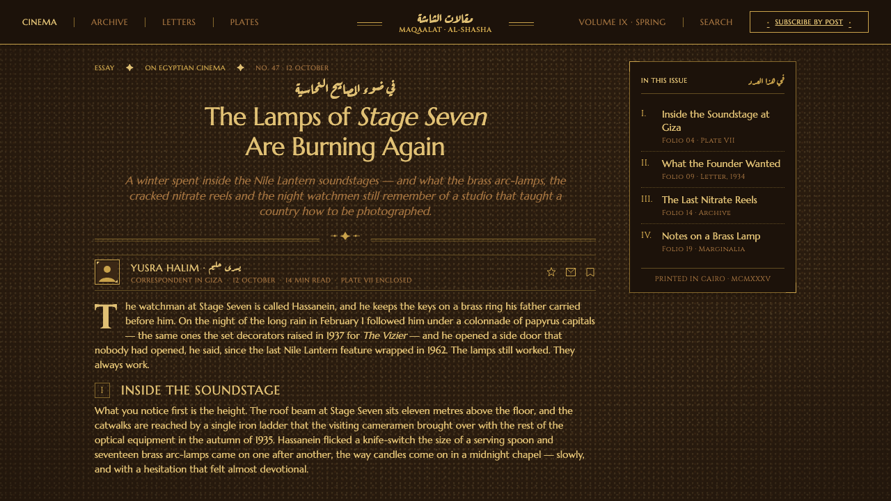
Studio Misr’s title cards and Deco cinema interiors brought sepia-and-gold framing together with geometric papyrus and lotus motifs. These motifs are important because they make the style geographically specific without requiring dense illustration. Papyrus and lotus appear as organized symbols inside the frame, not as naturalistic scenery. Their role is to give the geometry a local vocabulary while preserving the clean, symmetrical authority of Art Deco.
The digital design system distills these sources into a consistent surface and typographic hierarchy. The ground remains aged silver-nitrate brown; gold supplies the inscriptional emphasis; Marcellus and Cinzel establish Latin capitals with a carved presence; Aref Ruqaa introduces ornate Arabic handwriting; and faint photographic grain adds the tactile trace of film. The system’s defining discipline is what it refuses: no off-white or pure white ground, no weightless modern minimalism, and no separation between Arabic expression and Latin monumentality.
What defines the Studio Misr Cairo (1935) look?
Silver-Nitrate Ground
The ground is an aged silver-nitrate brown, closer to darkened sepia film than to paper. It should feel photographic, mineral, and slightly timeworn, carrying enough depth for gold lettering to appear illuminated without becoming glossy. The surface is never neutral white or pale cream. Its darkness establishes the cinema atmosphere before typography, framing, or ornament appears.
Gilded Inscriptional Type
Latin typography uses Marcellus and Cinzel for an inscriptional voice: carved, formal, and monumental rather than casual or editorial. Gold should read as a printed or gilded surface laid onto the brown ground, with enough restraint to preserve legibility. Capitals are most effective when treated as architectural elements, holding titles, names, or short declarations with the composure of a cinema façade.
Arabic over Latin
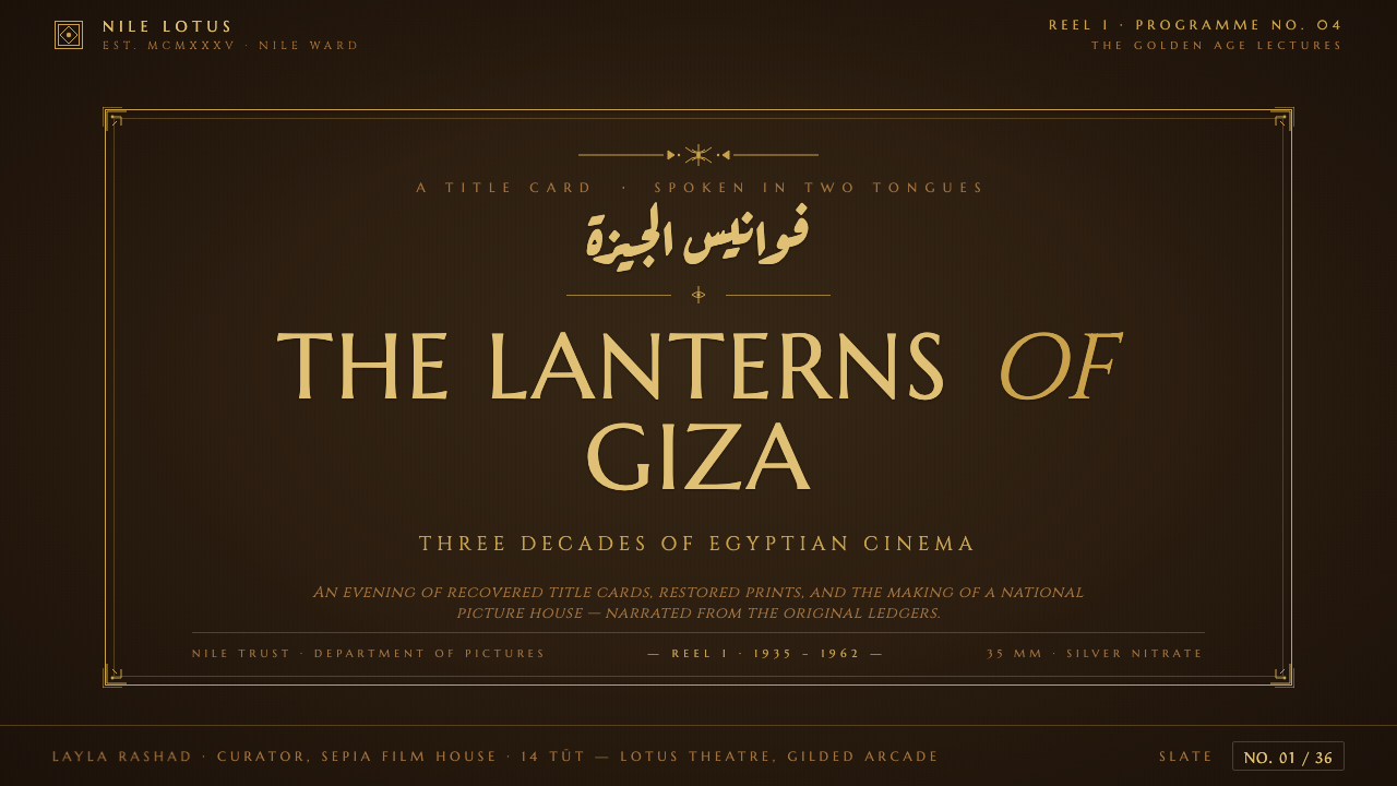
Aref Ruqaa introduces an ornate handwritten Arabic voice that can sit over, cross, or accompany the Latin capitals. The relationship is compositional rather than merely bilingual: Latin supplies vertical authority and engraved stability, while Arabic supplies gesture, rhythm, and human movement. Their overlap should feel intentional, like two title treatments sharing the same cinematic frame.
Symmetrical Deco Frames
Frames organize the composition with symmetrical Deco geometry: stepped edges, repeated bands, angular corners, and carefully controlled ornament. The frame should act as a structural threshold, not a decorative afterthought. Its symmetry gives the title card a ceremonial stillness, while its geometric vocabulary keeps the surface connected to cinema interiors and the visual logic of Art Deco.
Papyrus and Lotus Geometry
Papyrus and lotus motifs are reduced to geometric signs that can live inside borders, dividers, title panels, or corner ornaments. They should remain patterned and symbolic rather than botanical or illustrative. Their purpose is to locate the style in Egypt while preserving the discipline of Deco repetition. A small vocabulary of recurring motifs is more convincing than a crowded field of unrelated symbols.
Photographic Patina
A faint photographic grain keeps the digital surface from feeling sterile. The grain should be quiet enough that letters and frames remain authoritative, but present enough to suggest silver-nitrate film and the physical history of projection. It is a material trace, not a distressed filter. The design should feel aged because its surface has memory, not because every edge has been artificially damaged.
Who shaped Studio Misr Cairo (1935)?
Talaat Harb is the founding figure named in the Studio Misr story. Through his Banque Misr, the studio was established in Cairo in 1935, giving the visual system its point of origin in Egyptian industrial cinema. In design terms, his presence is represented by the style’s confidence: the frame is not nostalgic ornament floating without purpose, but the ceremonial identity of a serious studio and its golden-age ambition.
Banque Misr is the institution through which Studio Misr was founded. Its role anchors the style in a particular relationship between cultural production and organized enterprise. That relationship helps explain why the visual language feels both luxurious and systematic: gold, geometry, and repeated framing are not random embellishments, but part of an identity designed to appear established, legible, and consequential.
Studio Misr is the central subject and institutional figure of the style. As Egypt’s first true film studio and an engine of the country’s cinematic golden age, it provides the connection between title cards, cinema interiors, and a repeatable visual identity. The design system does not imitate a single artifact; it extracts the shared atmosphere of a studio world built from sepia film, Deco framing, Egyptian motifs, and bilingual lettering.
How do you use Studio Misr Cairo (1935) today?
For presentation slides, use the style as a cinematic title sequence. A cover should feel like a framed opening card: the aged brown ground establishes atmosphere, a gilded Latin title provides the monumental anchor, and Arabic handwriting introduces a second, more fluid layer. Content slides should retain the frame but reduce ornament, allowing the typography and the brown-gold contrast to carry hierarchy. Data slides can treat charts as title-card geometry, using repeated bands, symmetrical panels, and restrained gold emphasis rather than bright functional color.
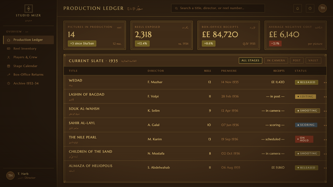
In web interfaces, Studio Misr Cairo suits dashboards and pricing pages that want to feel curated, archival, or culturally specific. The brown ground can hold the main experience, while Deco frames divide navigation, metrics, plan comparisons, and calls to action into ceremonial panels. Gold should identify emphasis, selected states, or important thresholds; it should not coat every surface. Arabic and Latin can create a distinctive bilingual hierarchy, but both scripts need generous breathing room so the composition remains legible rather than ornamental.
For editorial and marketing work, the system supports strong cover pages, cultural essays, film programs, event announcements, and brand stories with a sense of historical theater. Use a framed opening spread, then let interior pages simplify into brown fields, gilded headings, narrow text measures, and occasional papyrus or lotus geometry. Marketing campaigns can use the contrast between dark photographic atmosphere and formal lettering to make a product, venue, or event feel like an invitation to a premiere.
For data communication, the Deco vocabulary can make information feel staged without making it obscure. A dashboard might place each metric inside a clearly bounded title panel, use repeated geometric separators to create rhythm, and reserve the strongest gold for the most consequential figure or action. On pricing pages, plan names can use Latin capitals while supporting Arabic labels or notes move with a more handwritten rhythm. The key is to keep the frame subordinate to the information it presents.
The common mistake is treating the style as generic sepia nostalgia: adding random scratches, excessive gold, unrelated Egyptian symbols, or ornamental Arabic text without a compositional role. Another failure is introducing a pale or white background that breaks the system’s defining atmosphere. Authentic application depends on restraint. Keep the brown ground constant, make gold structural, let Arabic and Latin perform different but equal jobs, and repeat a small family of Deco and botanical forms with confidence.
Studio Misr Cairo (1935) — FAQ
Is Studio Misr Cairo simply a vintage film style?
No. Vintage film is only one surface reference. The complete system depends on the relationship between aged silver-nitrate brown, gilded Deco framing, inscriptional Latin capitals, ornate Arabic handwriting, and Egyptian geometric motifs. Remove that structure and the result becomes generic nostalgia. The style works when every visible device reinforces the same cinematic, ceremonial, and Cairo-specific atmosphere.
Can the style use an off-white or pure white background?
The design system is defined against that choice. Its ground is always aged silver-nitrate brown, because the brown surface carries the photographic and cinematic memory that allows gold to feel inscribed. A pale ground may produce an attractive Deco design, but it belongs to another system. If the Studio Misr identity is the goal, the dark brown field should remain the visual foundation.
How should Arabic and Latin lettering relate to each other?
They should be treated as complementary voices rather than duplicate translations. Marcellus and Cinzel bring vertical, inscriptional stability; Aref Ruqaa brings gesture, flow, and handwritten character. The scripts can overlap, cross, or occupy adjacent zones within the same frame, but the relationship should be intentional. Arabic should not be reduced to a decorative flourish, and Latin should not be treated as the only carrier of authority.
How much gold and ornament should be used?
Gold should establish hierarchy and frame important content, not flatten the entire composition into spectacle. Use it for inscriptional titles, structural borders, selected states, and decisive accents. Papyrus and lotus motifs should repeat as a controlled vocabulary, with enough empty brown ground around them to preserve clarity. The style is luxurious because its ornament is organized, not because every surface is embellished.
What makes the style specifically Egyptian rather than generic Art Deco?
The Egyptian specificity comes from the complete combination of Cairo, early Egyptian studio cinema, Arabic Deco lettering, geometric papyrus and lotus motifs, and the sepia-and-gold title-card atmosphere associated with Studio Misr. Art Deco alone supplies only a general geometric framework. The regional identity appears when the Arabic script and Egyptian motifs are treated as structural participants in the frame, while the brown photographic ground keeps the work tied to cinema.
Related design styles
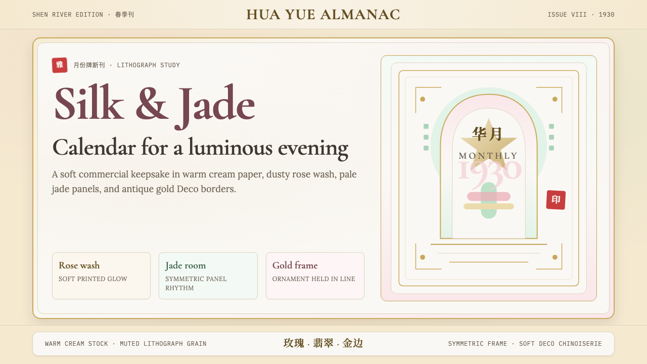 Shanghai Calendar 1930Old Shanghai glows softly. Cream paper, dusty rose, jade panels, and gold Dec…
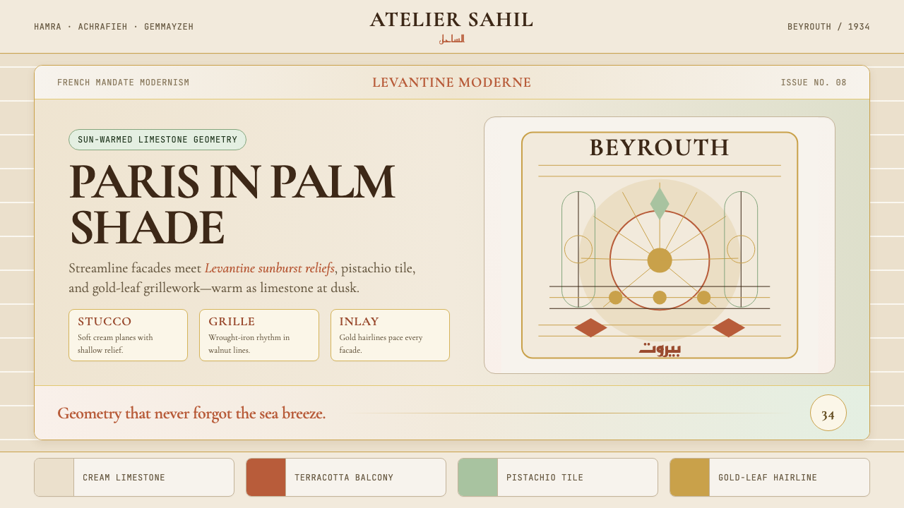 Lebanese Art Deco (Beirut)Cosmopolitan warmth. Cormorant friezes, gold hairlines, terracotta-pistachio…
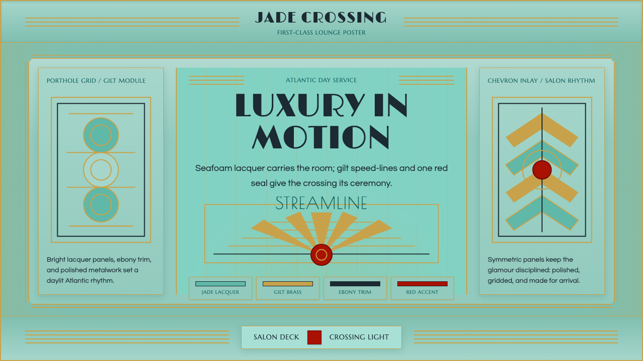 Ocean Liner SeafoamLuxury in motion. Seafoam lacquer, gilt speed-lines, and Deco symmetry frame…
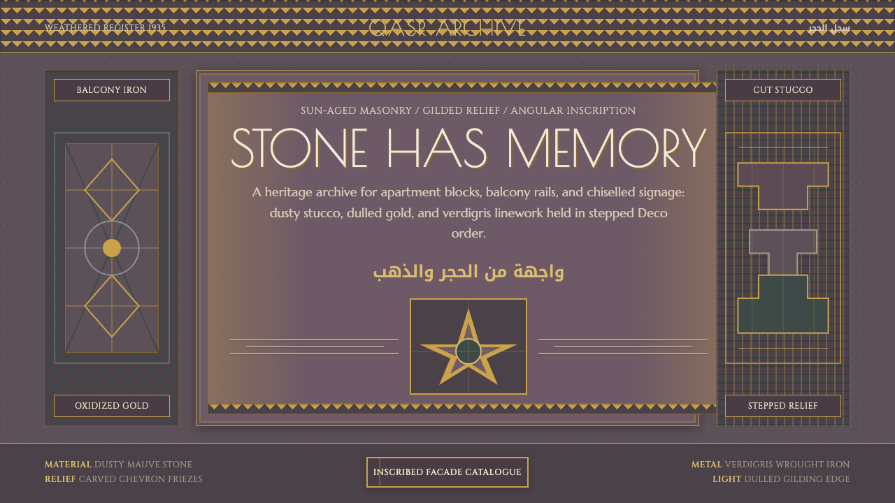 Cairo Downtown Art DecoStone-real glamour. Mauve stucco, dulled gold rules, and verdigris Deco geome…
 Dior New Look (1947)Couture speaks softly. Cream ground, navy Didot capitals, and gold hairlines…
 Wiener Secession (Klimt)Opulence made modern. Teal grounds, gold inlay, vesica frames and Cormorant d…