What is Budapest Millennium Line?
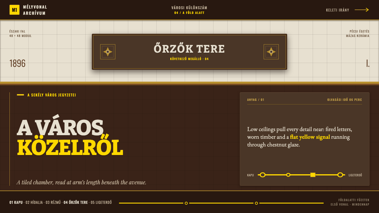
Chestnut glaze turns a transit tunnel into a room. Fired ceramic type and flat signal yellow run in low, wide bands you can lean against.
Budapest Millennium Line in brief
This system belongs to the Budapest Millennium Underground Railway, a line built so shallow beneath Andrássy út that its station rooms are wide, low, and close enough to touch on every surface. That physical proximity is the reason the line was finished in glazed ceramic rather than paint or bare concrete: a dark chestnut dado at the height a passenger's hand or shoulder would actually meet, a plain white tile field above it, and station names fired directly into the clay rather than lettered on afterward.
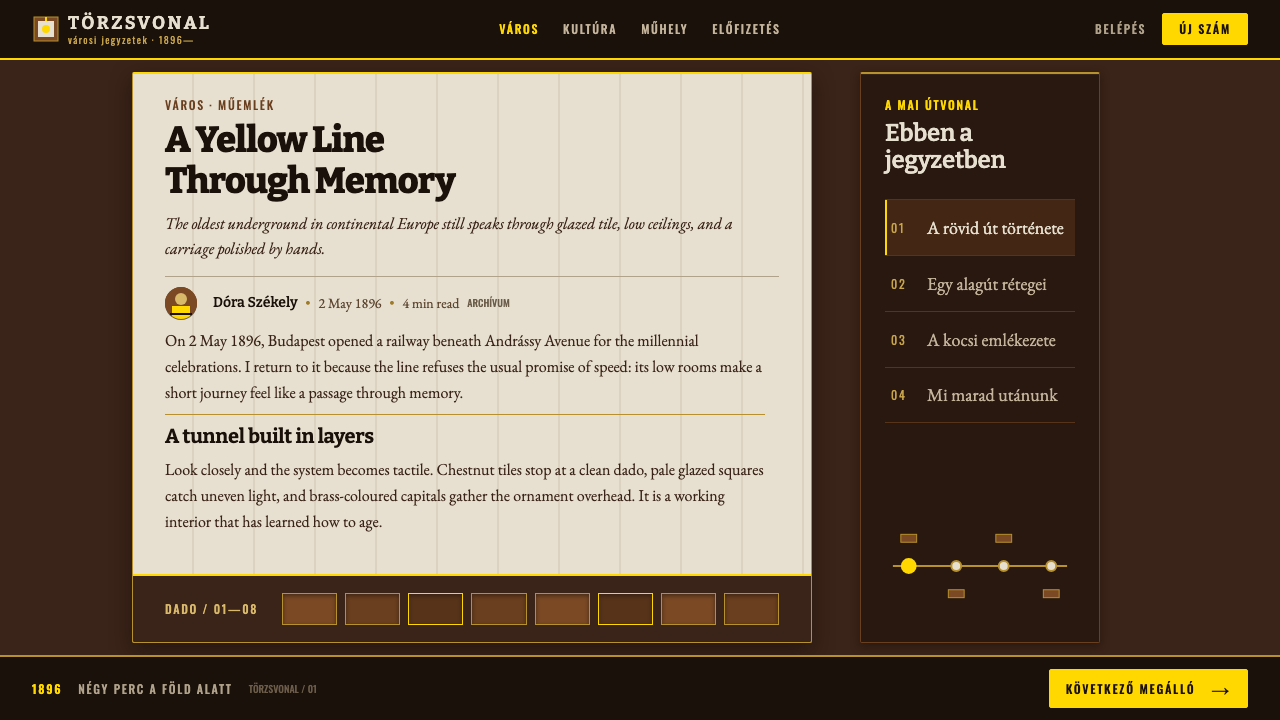
The defining decision is which surface carries the visual weight. This design treats the chestnut band as the ground, not the white tile above it — type sits light-on-dark against the chestnut, the white field reads as a horizontal accent band rather than a page to fill, and the line's signal yellow appears as a flat, undiluted color reserved for wayfinding rather than as a decorative accent scattered elsewhere.
Ornament is deliberately rationed and placed only where the original stations placed it: column capitals, sign frames, and corner motifs, never spread as a general texture across walls or ceilings. Hungarian's long-vowel diacritics, ő and ű, are treated as structurally load-bearing characters in any type set for this system, never simplified away.
Where does Budapest Millennium Line come from?
The Millennium Underground opened in 1896 to mark the thousandth anniversary of the Magyar conquest of the Carpathian Basin, running beneath Andrássy út from Vörösmarty tér to Széchenyi fürdő and becoming continental Europe's first electrified underground railway. Its construction sat within the Austro-Hungarian Empire's broader millennium celebrations, and the line's finish materials were chosen to match the ceremonial weight of that occasion rather than treated as purely utilitarian infrastructure.
The line's distinctive ceramic surfaces came from the Zsolnay factory in Pécs, the same manufacturer whose pyrogranite and eosin-glazed architectural ceramics defined much of the era's Hungarian Secession building work. Vilmos Zsolnay's factory supplied the dark chestnut dado tile and the fired lettering used for station names, a material choice suited to a space where passengers would be standing and leaning at close range every day, in a way that painted plaster could not survive.
The station architecture itself was designed by Albert Schickedanz, whose work situates the line within Hungarian Secession design more broadly — a movement that combined the era's taste for ornamental Art Nouveau detail with an emerging Hungarian national visual identity. Siemens & Halske supplied the line's electrical and engineering systems, reflecting the same fusion of German industrial engineering and Hungarian architectural design present across other Austro-Hungarian infrastructure of the period, undertaken under the reign of Franz Joseph.
The original fabric was restored twice in the twentieth century, in 1973 and again in 1995–96, preserving the chestnut-and-white ceramic scheme and the fired station lettering rather than replacing them with contemporary transit-system materials. That continuity of restoration, rather than modernization-through-replacement, is part of why the line's nineteenth-century material logic — glaze over paint, fired letters over printed signage — remains intact and legible today.
What defines the Budapest Millennium Line look?
Chestnut as Ground
The dark chestnut ceramic dado, not the white tile above it, functions as the compositional ground of the system. Type and signage are designed to sit light against this dark band, and the band itself is set at the height where a passenger's body would naturally make contact, giving it a tactile, room-like quality rather than a purely visual role.
White as Accent Band
The white tile field above the chestnut dado is treated as a horizontal band of relief rather than a full page to be filled with content or decoration. Its role is contrast and lightness, giving the low, close-in station rooms visual air without competing with the chestnut ground for attention.
Fired Ceramic Typography
Station names and key signage are fired directly into the clay body at the point of manufacture rather than painted, printed, or applied afterward. This produces a permanent, slightly dimensional letterform integrated into the material itself, distinct from any signage system that separates lettering from its underlying surface.
Flat Signal Yellow
Line yellow appears as a single, flat, undiluted color reserved strictly for wayfinding and line identification — never rendered with a metallic gradient or used as a general decorative accent. Its rarity within the overall palette is what preserves its function as a clear, unambiguous signal.
Localized Ornament
Decorative detail — column capitals, sign frames, corner motifs — appears only at the specific architectural points where the original stations placed it, never as a repeating pattern spread across whole walls or ceilings. Ornament in this system marks structure and transition points, not surface texture.
Hungarian Diacritics as Load-Bearing
Long-vowel diacritics such as ő and ű must be rendered fully and clearly in any typeface used for this system, never simplified or dropped for convenience. These marks are treated as structurally necessary characters rather than optional decoration, consistent with the system's overall respect for its specific linguistic and material origin.
Who shaped Budapest Millennium Line?
Zsolnay's Pécs factory manufactured the dark chestnut ceramic dado and the fired lettering that give the Millennium Underground its material identity, applying the same pyrogranite and glazed-ceramic expertise that defined Hungarian Secession architecture more broadly. His factory's durable, glazed surfaces were specifically suited to a space where passengers would stand and lean against the walls daily.
Schickedanz designed the Millennium Underground's station architecture, situating the line within Hungarian Secession design and combining the era's ornamental Art Nouveau sensibility with an emerging Hungarian national visual identity. His architectural framework is what the chestnut-and-white ceramic scheme and its localized ornament were built into.
The German firm Siemens & Halske supplied the electrical and engineering systems that made the Millennium Underground continental Europe's first electrified underground railway, reflecting the fusion of German industrial engineering with Hungarian architectural and decorative design characteristic of Austro-Hungarian infrastructure projects of the period.
The line opened under the reign of Franz Joseph as part of the broader Austro-Hungarian millennium celebrations marking a thousand years since the Magyar conquest, situating its ceremonial material choices — ceramic rather than paint, fired lettering rather than printed signage — within a moment of deliberate national commemoration rather than routine infrastructure building.
How do you use Budapest Millennium Line today?
The core transferable idea here is that a single warm, dark material can function as a room's ground rather than its accent — treating a dark surface as the base the eye settles on, with lighter tones and signal colors appearing as bands or marks against it, rather than defaulting to a white or neutral background with dark text on top.
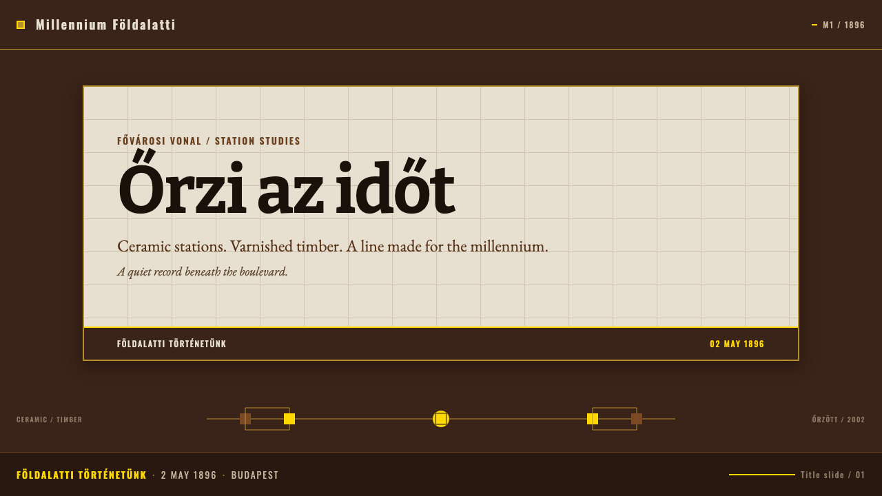
For presentation slides, this system suits a cover slide that wants warmth and permanence rather than sterile corporate polish: a chestnut-toned field with light, evenly weighted type reading directly against it, and a single flat yellow reserved for one wayfinding-style element such as a page number or section marker. Content slides should keep the chestnut ground for structural framing — headers, dividers — while body content sits on the lighter accent band, mirroring how the historical stations reserved their brightest surface for the upper field rather than the working surface at hand height.
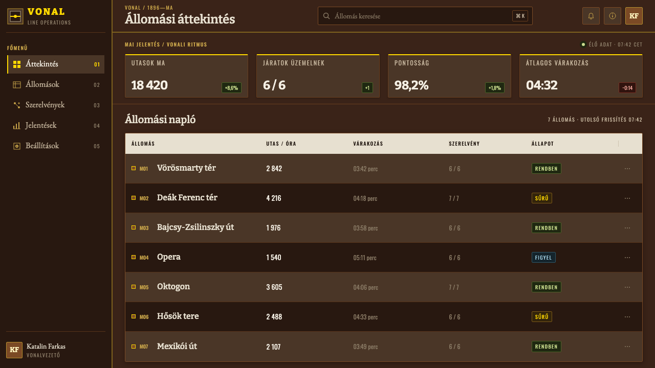
For web interfaces, the ground-versus-accent logic maps well onto navigation and wayfinding-heavy products — the chestnut tone can anchor a persistent navigation rail or header treated as the 'wall' of the interface, with the flat signal yellow reserved strictly for active states, current-location indicators, or primary calls to action, never spread across decorative elements where it would dilute its signaling function.
In editorial and brand contexts, the system supports a tone of civic permanence and craft — appropriate for heritage brands, transit or infrastructure storytelling, or any content wanting to feel built rather than printed. Ornament should stay localized to specific structural marks, such as a single corner motif or divider treatment repeated consistently, rather than becoming a background texture.
The most common mistake is inverting the ground logic — defaulting to a white or neutral background with the chestnut tone reduced to a thin decorative accent — which erases the system's central material argument that dark, warm ceramic is the room itself, not a trim color applied to a conventional light interface. A second common mistake is overusing the signal yellow decoratively, which destroys its function as a rare, unambiguous wayfinding mark.
Budapest Millennium Line — FAQ
Why is the dark chestnut band treated as the primary ground instead of the white tile above it?
Because the chestnut dado sits at the height where a passenger's body actually makes contact with the wall, making it the surface people experience directly, close-up, every day — while the white field above it is seen more than touched. Treating the tactile surface as the compositional ground, with the white field as a lighter accent band, mirrors how the original stations physically organized the space rather than defaulting to a page-like white background.
Can the line yellow be used more broadly as a general accent color throughout a design?
Doing so undermines what makes it effective. In the historical system, yellow appears strictly for wayfinding — it means 'this is the line, this is the direction' — and its rarity is exactly what makes it instantly legible. Spreading it across buttons, backgrounds, or general decoration turns a clear signal into background noise, which is the opposite of the material discipline the original system practiced.
Does this system require literal ceramic or tile textures to work in a digital context?
No — the transferable substance is the compositional logic (a warm dark tone as ground, a lighter tone as an accent band, one flat signal color reserved for wayfinding, ornament kept localized) rather than a literal material simulation. A flat, digitally rendered chestnut tone used with the same structural discipline carries the system's identity more effectively than a photorealistic tile texture applied without that underlying logic.
Why does keeping the Hungarian diacritics like ő and ű matter for a visual design system?
Because the system's authenticity is tied specifically to its Hungarian origin — the language, the factory, the architect, the historical moment — and simplifying away diacritics for typographic convenience quietly erases that specificity, turning a precise cultural reference into a generic vintage-transit look. Treating these characters as structurally necessary, the same way the original fired lettering did, keeps the system honest to its source.
Related design styles
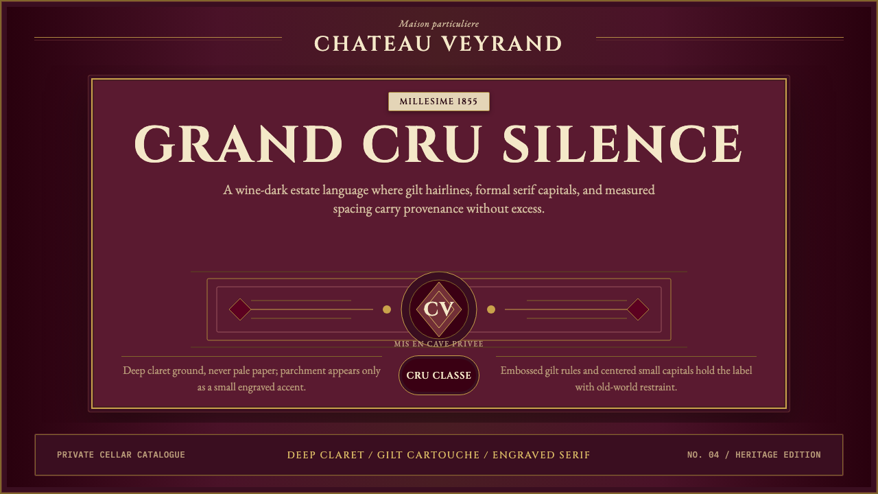 Bordeaux Wine ChâteauAged claret authority. Cinzel capitals, gilt rules, and label symmetry on win…
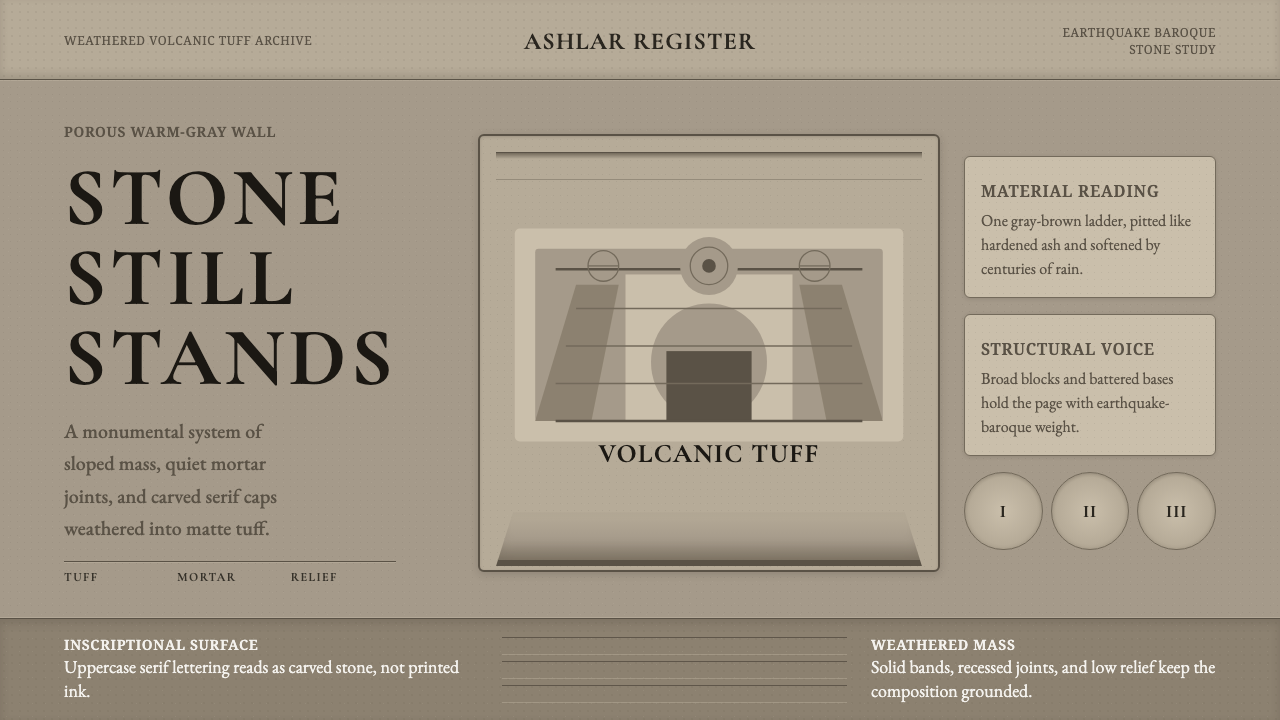 Philippine Adobe TuffStone refuses polish. Warm tuff gray, incised serif caps, and buttress-heavy…
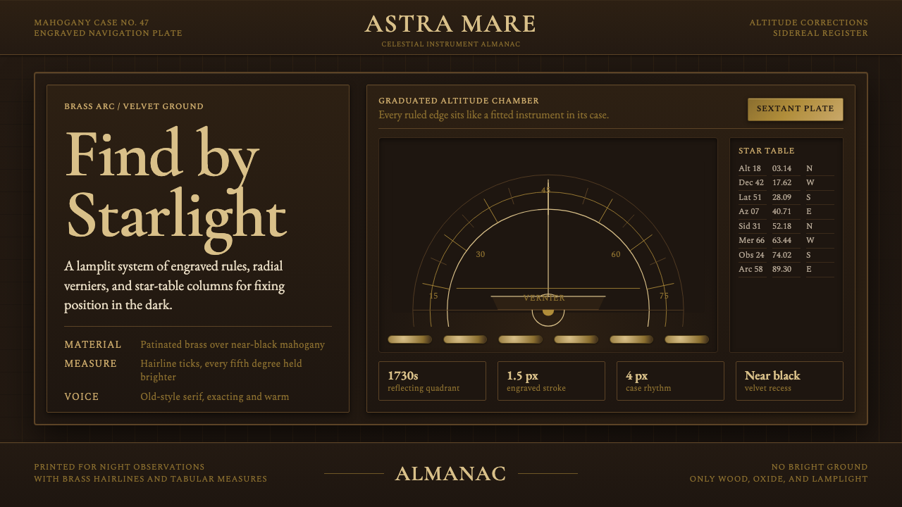 Sextant NavigationPrecision feels ceremonial. Brass ticks and mahogany grids chart the dark by…
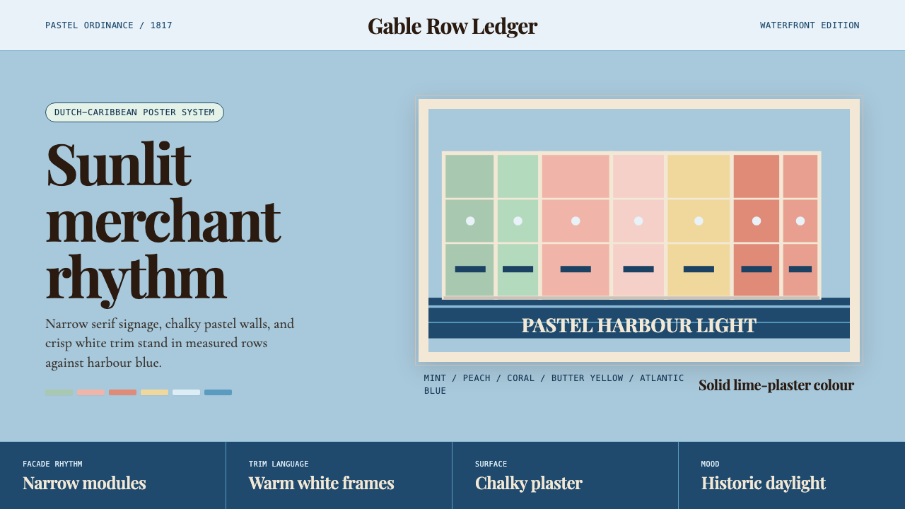 Curaçao Handelskade PastelPastel order feels sunlit. Coral, mint, and serif gables march across sky blu…
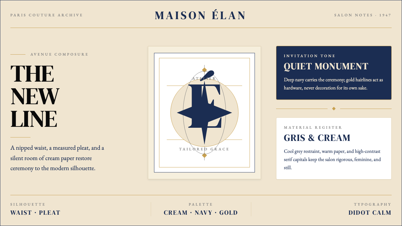 Dior New Look (1947)Couture speaks softly. Cream ground, navy Didot capitals, and gold hairlines…
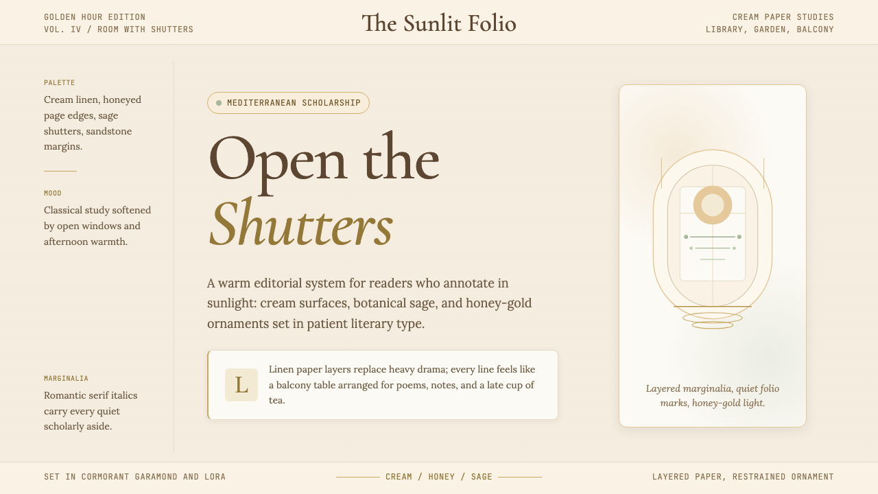 Light AcademiaScholarship turns sunlit. Cream linen, honey gold, sage botanicals, and roman…