What is Mardin Stone Terraces?
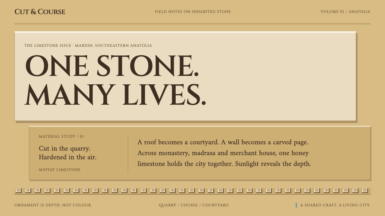
Mardin Stone Terraces takes a whole city carved from one honey-coloured limestone and turns it into a design language in which depth, not added colour, does the decorating.
Mardin Stone Terraces in brief
Mardin Stone Terraces is a design style modelled on the old city of Mardin in southeastern Anatolia, a hillside town built almost entirely from a single honey-coloured limestone. Its visual language is made of stacked horizontal bands, squared and chiselled edges, hard cast shadows and large inscriptional capitals, all set on warm stone tones that shift in value far more than they shift in hue. It is a style for people who want a design to feel as though it has stood for centuries.
The central idea is that ornament should be depth rather than paint. In Mardin, doorways, window lintels, arches and niches are relief cut into the same block of stone as the wall around them; nothing is applied afterwards. The style carries that logic onto screens: panels and section bands read as cut and stepped surfaces, and visual interest comes from how far something sits in or out of the wall, not from an extra accent colour.
At a glance it is quiet, warm and monumental. Light moves across it the way a day's sun moves across a terraced hillside, from gold through cinnamon to a pale rose. Shadows are crisp and offset, as if thrown by strong sun onto a cut edge, never soft or blurred. The effect sits between a heritage monument and a modern editorial page: heavy, calm and plainly made from one material.

Where does Mardin Stone Terraces come from?
Everything starts with the stone. Midyat limestone comes out of the ground soft enough to be cut with a hand chisel, then hardens as it is exposed to open air. That single property shaped a whole building culture: because the material is easy to work when fresh and durable once set, Mardin's builders carved rather than assembled. Madrasas, monasteries and merchant houses are not stacks of separate parts with decoration applied afterwards; they are walls with the ornament cut out of them.
The town itself is a piece of terraced urbanism. It steps down a hillside above the Mesopotamian plain, and on a slope that steep the roof of one house is the terrace of the house above it. Seen from the plain, the city reads as horizontal layers of pale stone climbing the hill, each layer lit differently as the sun crosses the sky. This is the tradition usually described as Mesopotamian vernacular terrace urbanism: ordinary building organised by topography rather than by any master plan.
Three strands of patronage fed the same stone vocabulary. Artuqid patrons, whose period gives the city's early Islamic architecture its shape from the twelfth to the fourteenth century, founded madrasas such as the Zinciriye and the Kasımiye. The Syriac Orthodox community built and maintained the Deyrulzafaran Monastery, a Christian monastic complex in the same region. Ottoman builders and local merchant families then carried the tradition forward into the late Ottoman period. Door surrounds, lintels, arches and niches in Muslim and Christian buildings share one carved grammar, so closely that ornament alone rarely tells them apart.
The knowledge was held by Mardin's hereditary stone-carving families, and the stone architecture is not a museum piece: it is still the living building fabric of the city today. The Curio system draws its rules from that continuity. It takes four things literally: stepped horizontal bands for layout, cut edges for shape, cast shadows for depth, and relief in place of colour for ornament. The warm range of the stone is the palette, and the inscribed capital is the voice. Nothing in this lineage is a revival or a pastiche: the stone fabric is still in daily use, which is why the style can be rigorous without feeling like a costume.
What defines the Mardin Stone Terraces look?
Color
One material, many values. The palette is a family of warm limestone tones: honey as the ground, deeper cinnamon in shaded faces and heavier bands, a pale rose in the lightest highlights. It changes with light rather than with hue. There is no separate accent colour; emphasis comes from a darker or lighter cut of the same stone, which keeps the whole page reading as a single wall.
Horizontal banding
Layouts are organised as stacked horizontal courses, each band stepping slightly against the one above it, like the terraces of the town. Sections are separated by a change in depth rather than by a divider line or a switch of background colour, so the page reads from top to bottom as layers of masonry.
Relief instead of decoration
Ornament exists as depth in the surface. Frames, insets, raised plates and recessed wells play the part that carved door surrounds, lintels and niches play in Mardin. Patterns, textures and illustrations laid on top of the surface are avoided; if something needs emphasis, it is cut in or pushed out, never painted on.
Hard cast shadows
Shadows are sharp-edged and offset in one consistent direction, as if cast by a single strong sun. They are the main way a surface announces its thickness. Soft, blurred glows belong to a different material and are left out, because a blurred edge would make the stone look like fabric.
Inscriptional capitals
Display type behaves like lettering cut into a lintel: large, upright capitals with firm, even strokes and generous spacing, reserved for headlines and section names. Body text stays plain and readable, so the carved voice appears only where something is being named or declared.
Cut edges
Corners are squared and edges are clean, as though a chisel has just finished with them. Pillowy, inflated or heavily rounded shapes are rare, because anything that looks poured or blown up breaks the impression of a carved block.
Terraced hierarchy
Hierarchy descends the way the town does, with each level sitting on the one below it. Primary content occupies the highest and widest band, and secondary material steps back into narrower or deeper bands. Reading order and depth order agree, so the eye never has to guess what is in front.

Who shaped Mardin Stone Terraces?
Artuqid patrons commissioned the Zinciriye Madrasa, one of the carved stone colleges that define the Islamic architecture of Mardin. It is the reference for how a single material can carry portals, arches and courtyards with no applied finish, and for the ordered, repeated geometry the style borrows for its bands.
Patrons from the same Artuqid tradition stand behind the Kasımiye Madrasa, another landmark where stone is the only finish. Together with the Zinciriye it shows the grammar the system follows: deep reveals, arch rings and inscriptions cut from the same stone as the wall.
The monastery shows that this stone language was never confined to one faith. The Syriac Orthodox community built and kept Deyrulzafaran in the same limestone and the same carved vocabulary as the nearby Islamic buildings, which is why the system treats its rules as regional and material rather than religious.
Mardin's carving knowledge was held in families, not in a single school. Their long practice of cutting door surrounds, lintels and niches into fresh, soft stone before it set is the human side of this style, and the reason its details feel cut rather than drawn.
How do you use Mardin Stone Terraces today?
Mardin Stone Terraces is most convincing where a design wants warmth, weight and permanence without ornament. Its principles are structural: one family of tones, layered bands, honest edges and depth doing the work of decoration. Apply those, rather than simply tinting everything beige. The payoff is a page that feels deliberately built rather than decorated, which is the impression the city itself leaves on a visitor.
For presentation slides, the cover is the place to be bold. Set a large inscriptional title across a wide band of honey stone, step a slightly deeper band beneath it for the subtitle and date, and let one hard shadow separate the two. Content slides work as courses of masonry: a heading band, a body band and an optional footer band, each a different value of the same stone. Data slides suit horizontal bars and stepped area charts, because they already behave like terraces; label them in the capital face and keep every fill inside the stone range.
For web interfaces, the style fits documentation, cultural and heritage sites, hospitality, craft and property pages, and calm dashboards. Cards become raised blocks with a single, consistent shadow direction; inputs and wells are recessed rather than outlined; navigation sits in a heavy top band. A pricing page can step its tiers like terraces, with the recommended plan standing one course forward instead of being flagged with a bright accent.
In editorial and marketing work the style gives long-form pages a monumental opening and a quiet rhythm. Use a carved-capital headline, wide horizontal section breaks as masonry courses, and pull quotes set like inscriptions between bands. Campaigns for travel, architecture, ceramics, food and craft can lean on the warmth, and photography is best cropped into wide horizontal strips that echo the terraces.
The most common mistake is treating stone as a texture. Photographic limestone backgrounds, noise overlays and bevelled buttons turn depth into costume and bury the text. A second mistake is adding a bright accent colour for convenience: the moment a saturated blue or green appears, the single-material illusion breaks. Finally, soft glowing shadows contradict the hard, sunlit logic. Stay with flat tones, crisp offsets and honest edges.

Mardin Stone Terraces — FAQ
Is Mardin Stone Terraces a historical reconstruction of Mardin's architecture?
No. It is a design language derived from how Mardin is built: one carved limestone, stepped terraces, relief ornament and strong sun. It borrows the construction logic and the quality of light, not specific facades, patterns or inscriptions, and it makes no claim to reproduce any monument.
What colours does it use?
A single warm family of limestone tones. Honey is the ground, cinnamon appears in shaded faces and heavier bands, and a pale rose shows in the lightest highlights, mirroring the way the stone changes across a day. There is deliberately no separate accent hue; contrast comes from lighter and darker cuts of the same material.
How is it different from neo-brutalism?
They share hard shadows and squared edges, which is why they are sometimes confused. Neo-brutalism usually pairs flat, saturated colour blocks with heavy outlines to create energy. Mardin Stone Terraces uses one tonal stone family, relief and layering to create calm, and it never relies on outlines or bright accents for emphasis.
Can it be used on dark backgrounds?
It is built as a sunlit, light-ground system, because the logic of the style is stone catching daylight. A dark variant is possible, but it would need to behave like the same stone in shade, tone on tone with the same hard shadows, rather than a conventional night mode with glowing accents.
Which projects suit it best?
Projects that want weight, warmth and permanence: heritage and cultural institutions, architecture and craft studios, hospitality, long-form editorial, documentation with a strong identity, and presentations that need to feel considered and grounded. It is less suited to playful consumer apps that depend on bright, saturated feedback colours.
Related design styles
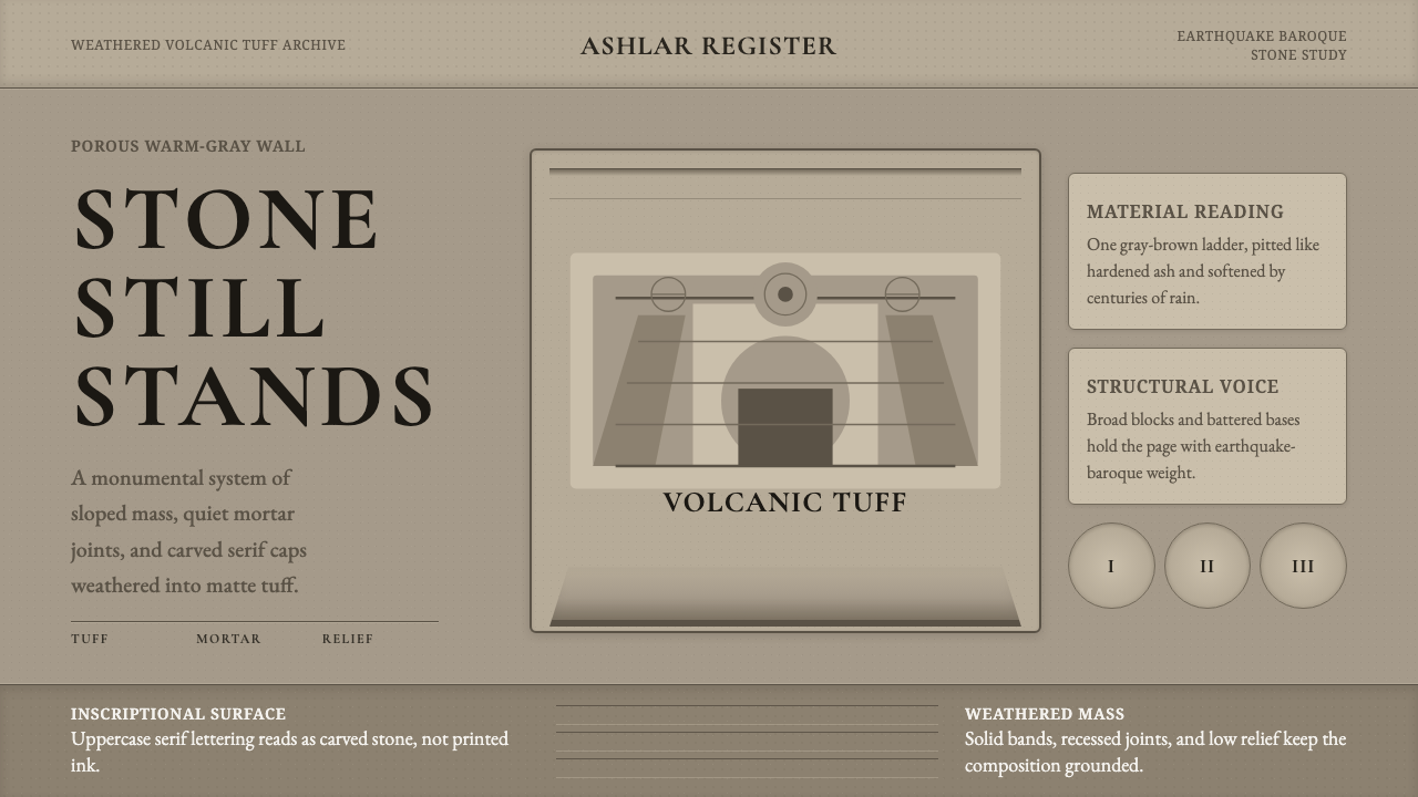 Philippine Adobe TuffStone refuses polish. Warm tuff gray, incised serif caps, and buttress-heavy…
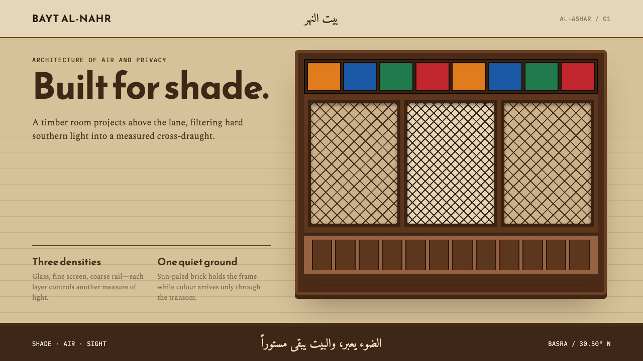 Basra ShanasheelClimate craft becomes ornament. Dark timber lattice projects over sun-paled I…
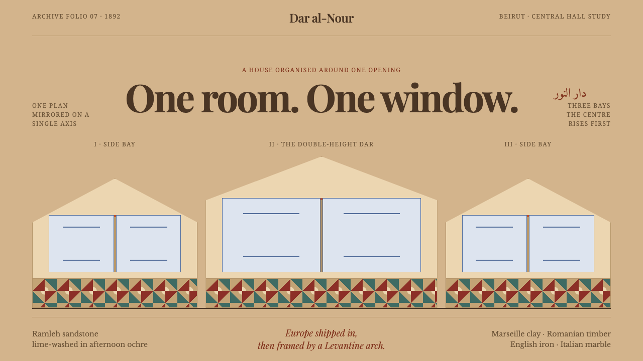 Beirut Triple-Arch HouseSymmetry holds the house together. Sandstone ochre frames three pointed bays…
 Emirati Bait Al Naboodah Coral HouseFeels built, not styled. Coral ochre, teak brown, and a sky-square courtyard…
 Hatra Parthian ReliefStone faces forward. Cinzel capitals and recessed red pigment hold a strict a…
 Light AcademiaScholarship turns sunlit. Cream linen, honey gold, sage botanicals, and roman…