What is Philippine Adobe Tuff?
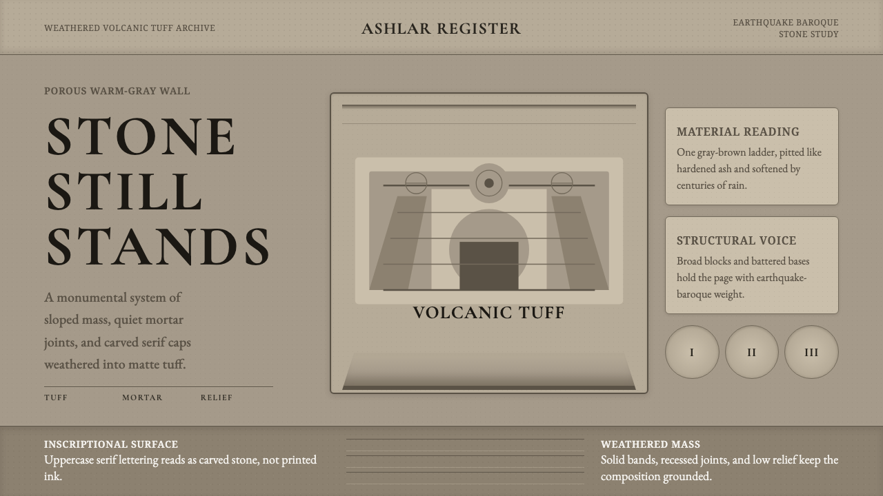
Philippine Adobe Tuff turns the weathered stone churches of Paoay and San Agustin Manila into a visual language of warm gray mass, incised serif capitals, deep joints, and buttress-like structure.
Philippine Adobe Tuff in brief
Philippine Adobe Tuff is a design style derived from the Spanish-colonial churches of Paoay in Ilocos Norte and San Agustin in Manila. Despite the familiar use of adobe in the name, its defining buildings are not mud-brick structures. Their visual identity comes from volcanic tuff, coral stone, and thick mortar made with lime, coral, and molasses. The style therefore begins with masonry as substance rather than masonry as surface decoration.
Its dominant impression is one of weathered permanence. A muted, warm mid-pale stone gray fills the field, while pores, pits, worn edges, and uneven joints reveal the accumulated effects of climate and age. The stone is never presented as freshly quarried or smoothly finished. Irregularity is essential, but it remains contained within massive walls, repeated bands, and deliberate architectural divisions.
The visual grammar combines defensive weight with restrained Baroque ornament. Sloped buttresses and thick load-bearing walls create broad, grounded shapes; low-relief scrollwork adds movement without dissolving the underlying mass. Inscriptional serif capitals appear as though carved into a facade or set above an entrance. The result is solemn but not sterile, decorative but never delicate: a system in which every flourish must answer to the authority of stone.
Where does Philippine Adobe Tuff come from?
The style originates in the Spanish colonial Philippines before 1900, across two distinct settings: Ilocos Norte in the north and Manila farther south. Its architectural sources belong to the broader tradition of Spanish colonial building, but they were shaped by local stone, local construction knowledge, and the environmental demands of the archipelago. Volcanic tuff and coral stone supplied walls with a porous, variegated character unlike the polished stone associated with many European monuments.
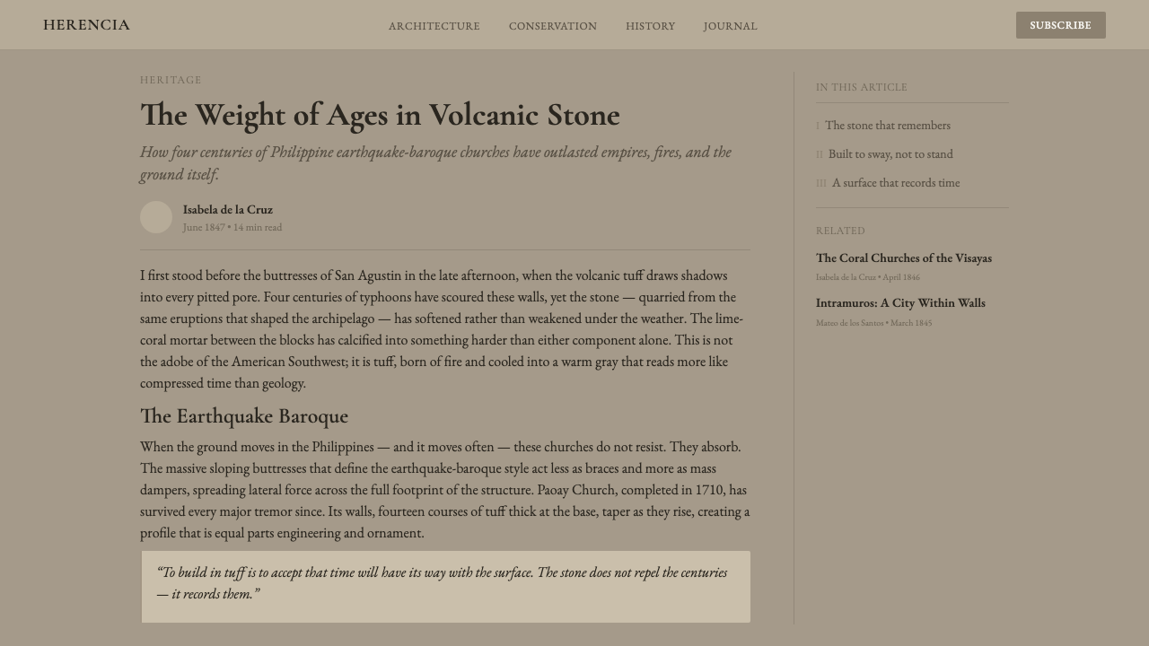
Paoay Church, completed in 1710, provides the clearest expression of the style's buttress-heavy geometry. Its massive sloped supports extend outward from the main wall, making structural resistance visible as a sequence of broad triangular masses. The architecture belongs to Earthquake Baroque, a tradition in which the pressures of seismic conditions are answered through low, substantial forms, thick load-bearing walls, and emphatic lateral support. Stability is not concealed behind ornament; it becomes the building's principal image.
San Agustin Manila contributes the metropolitan and inscriptional dimension of the visual language. Together with Paoay, it situates the style within the Baroque Churches of the Philippines recognized by UNESCO. Baroque scrollwork is present, but it appears in low relief and remains bound to the wall rather than floating free of it. Carved capitals, facade bands, and framed openings organize the stone into readable zones while allowing the masonry to retain its age, porosity, and material force.
The relevant builders and custodians are collective rather than individual heroic designers: Augustinian friar-builders, the Paoay parish, and the San Agustin Manila parish. Their churches emerged through religious, communal, and material practice sustained over time. The contemporary style reads these buildings in their weathered condition, not as newly completed colonial monuments. Age is therefore not a later defect to be corrected; it is the state through which the architecture now communicates endurance, memory, and place.
What defines the Philippine Adobe Tuff look?
Weathered Stone Palette
The palette is deliberately narrow: an aged, muted stone gray with a warm undertone dominates backgrounds, surfaces, and large structural fields. Tonal variation comes from erosion, porous stone, accumulated shadow, and mortar rather than from a collection of unrelated accent colors. Pale areas should feel chalky or sun-worn; darker areas should resemble deep joints and sheltered recesses. The effect is quiet, mineral, and continuous.
Porosity and Patina
Texture is essential, but it must read as the condition of a load-bearing material. Pitting, granular inclusions, chipped edges, and softened relief suggest volcanic tuff and coral stone exposed to weather. The surface should not become noisy or picturesque; marks gather unevenly and leave broad areas of calm mass. Patina communicates duration, making the design feel inherited and maintained rather than artificially distressed.
Buttress Geometry
Composition is organized through broad, sloped masses that recall the outward thrust of Paoay's buttresses. Side panels widen toward their base, headings sit beneath heavy horizontal bands, and content blocks feel supported rather than suspended. Diagonal edges are used sparingly because each one implies force and resistance. This geometry gives even a flat page the grounded stance of architecture prepared to withstand pressure.
Inscriptional Typography
Baroque serif capitals provide the principal display voice. Their role is ceremonial and architectural: titles resemble dedications carved above a portal, not fashionable editorial headlines. Body text should remain sober and readable so that the capitals retain authority. Spacing is measured and stately, with words given enough air to appear individually incised. Excessively delicate strokes or casual lowercase display styles weaken the sense of carved permanence.
Mortar-Band Structure
Lime-coral-molasses mortar joints inspire thick dividers, framed compartments, and irregular horizontal courses. These lines should feel embedded between masses, not drawn over them as decoration. Slight variation in their rhythm prevents mechanical sterility while preserving the logic of masonry. A successful layout makes the joints perform organizational labor: separating sections, holding captions, and marking transitions with the credibility of construction.
Low-Relief Ornament
Baroque scrolls appear as shallow, worn relief contained within panels, borders, or architectural crowns. Ornament never overwhelms the wall plane and should look as though it was carved from the same material rather than attached afterward. Curves provide a controlled counterpoint to buttress geometry, introducing devotion and ceremony into an otherwise severe structure. Repetition must remain limited enough for each motif to carry weight.
Weight over Polish
The style rejects sleekness, gloss, and frictionless perfection. Corners may be worn, alignments may acknowledge masonry's small irregularities, and shadows may gather heavily in recesses, but the overall hierarchy remains disciplined. Visual authority comes from mass, depth, and endurance rather than immaculate finish. Any refinement should clarify structure or inscription; polishing away every trace of material history removes the style's central argument.
Who shaped Philippine Adobe Tuff?
The Augustinian friar-builders represent the religious and organizational tradition behind the churches from which this style is drawn. Their importance lies less in individual authorship than in the coordination of worship, construction, material knowledge, and long-term institutional presence. Through that collective practice, Spanish colonial Baroque forms were adapted to Philippine stone and environmental conditions, producing architecture whose structural mass became inseparable from its sacred expression.
The Paoay parish is associated with the church completed in 1710, the principal source for the style's sloped buttresses and Earthquake Baroque stance. The parish context emphasizes that the building is not merely a formal monument but a place sustained through communal religious life. Its outward-reaching supports, thick walls, and weathered surfaces provide the visual model for grounded layouts, structural bands, and mass that visibly resists pressure.
The San Agustin Manila parish anchors the style in the colonial urban setting of Manila and in the wider legacy of the Baroque Churches of the Philippines. Its contribution to the visual system is the union of enduring masonry with ceremonial articulation: carved inscriptions, ordered facade divisions, framed openings, and low-relief ornament. It demonstrates how devotional richness can remain subordinate to a wall's material gravity.
How do you use Philippine Adobe Tuff today?
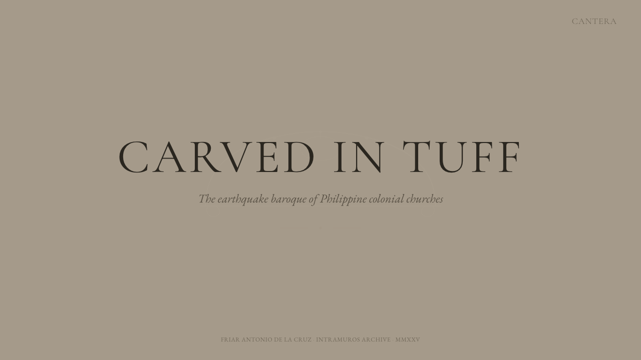
For presentation slides, the style is strongest when each page behaves like a facade. A cover can place an inscriptional title within a broad stone field, held by a heavy lower band or flanked by sloped buttress forms. Content slides should divide information into masonry-like courses: generous blocks, firm separators, and restrained relief motifs at major transitions. The stone surface establishes continuity, while hierarchy comes from mass and placement rather than a busy range of colors.
Data slides benefit from the architecture's distinction between load, support, and opening. Charts can sit inside recessed compartments, with heavier forms reserved for totals or primary findings and paler stone fields used for context. Rules and labels should align like mortar joints rather than float independently. Avoid turning every data mark into a distressed stone object; the visual metaphor should organize the information, while the data itself remains clean, comparable, and easy to read.
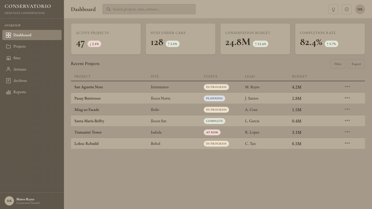
For web interfaces, Philippine Adobe Tuff suits dashboards, archives, institutional portals, and pricing pages that need gravity and continuity. Navigation can read as an inscription band, panels as shallow recesses, and primary actions as carved or framed openings. Pricing tiers work best when differentiated through depth, framing, and relative mass rather than unrelated colors. Interactive states should feel like changes in relief or illumination while preserving clarity and accessibility.
Editorial and marketing layouts can use the style to connect narrative with place, material, memory, or endurance. A long article may alternate broad stone fields with narrow inscription bands, allowing photographs or quotations to occupy portal-like frames. Marketing pages should let one monumental message dominate before introducing supporting details in lower courses. Low-relief scrollwork can mark ceremonial moments, but it should never become a generic heritage border repeated around every block.
The most common mistake is applying a uniform stone texture to every surface and calling the result historical. That produces visual noise without architectural logic. Authentic use depends on the relationship between mass, support, joint, recess, inscription, and restrained ornament. Another error is polishing the palette into fashionable neutral luxury: once the pores, age, and structural heaviness disappear, the work no longer evokes Philippine tuff churches but merely an elegant gray interface.
Philippine Adobe Tuff — FAQ
Is Philippine Adobe Tuff a mud-brick style?
No. The name can invite that assumption, but the source churches are defined here by volcanic tuff, coral stone, and mortar combining lime, coral, and molasses. Their character comes from porous stone masonry, thick load-bearing walls, and weathered joints rather than sun-dried earthen brick. Treating the style as mud plaster would erase the material distinction on which its geometry, texture, and sense of permanence depend.
How is Earthquake Baroque visible in the style?
It appears through low, massive composition, thick walls, and emphatic sloped buttresses that make resistance visible. In graphic or interface work, those principles translate into broad grounded blocks, widening side supports, heavy horizontal courses, and content that appears held within a structure. The goal is not to imitate a church facade literally, but to make support and stability active parts of the composition.
Can the style use color beyond warm stone gray?
Its identity depends on a nearly monochromatic stone field, so additional color should remain subordinate. Variation is better created through weathering, recess, mortar, and changes in illumination than through a broad decorative palette. If contextual imagery introduces other hues, the surrounding system should remain mineral and muted. Strong accents can quickly make the stone feel like a backdrop rather than the primary material argument.
How much Baroque ornament is appropriate?
Enough to signal ceremony and colonial inscription, but never enough to overpower the masonry. Scrollwork should be shallow, contained, and visibly part of the same wall plane. It is most effective at entrances, headings, transitions, or other moments that deserve emphasis. If every border curls and every panel carries a flourish, the style loses the tension between severe structure and devotional ornament that makes the source architecture distinctive.
Where does Philippine Adobe Tuff work poorly?
It struggles where speed, lightness, playfulness, or glossy technological novelty must dominate. The style naturally communicates endurance, institutional memory, sacred gravity, and material resistance. Those qualities suit archives, cultural narratives, civic presentations, and products concerned with heritage or permanence, but they can burden casual entertainment, youthful consumer branding, or interfaces that require an airy sense of rapid change. The subject should deserve the visual weight.
Related design styles
 Light AcademiaScholarship turns sunlit. Cream linen, honey gold, sage botanicals, and roman…
 Romantic AcademiaScholarship turns tender. Dusty rose and lavender frame ink-on-cream poetry w…
 Ainu Attus RobeProtection is cut, not painted. Indigo bands and square-ended thread hold elm…
 Audubon Birds of AmericaAged natural history breathes. Buff rag paper, sepia rules, and italic binomi…
 Budapest Millennium LineChestnut glaze turns transit into a room. Fired slab type and flat yellow run…
 Caspar David FriedrichSilence becomes vast. Prussian blue depth, pearl mist, and parchment framing…