What is Nepali Lokta Paper?
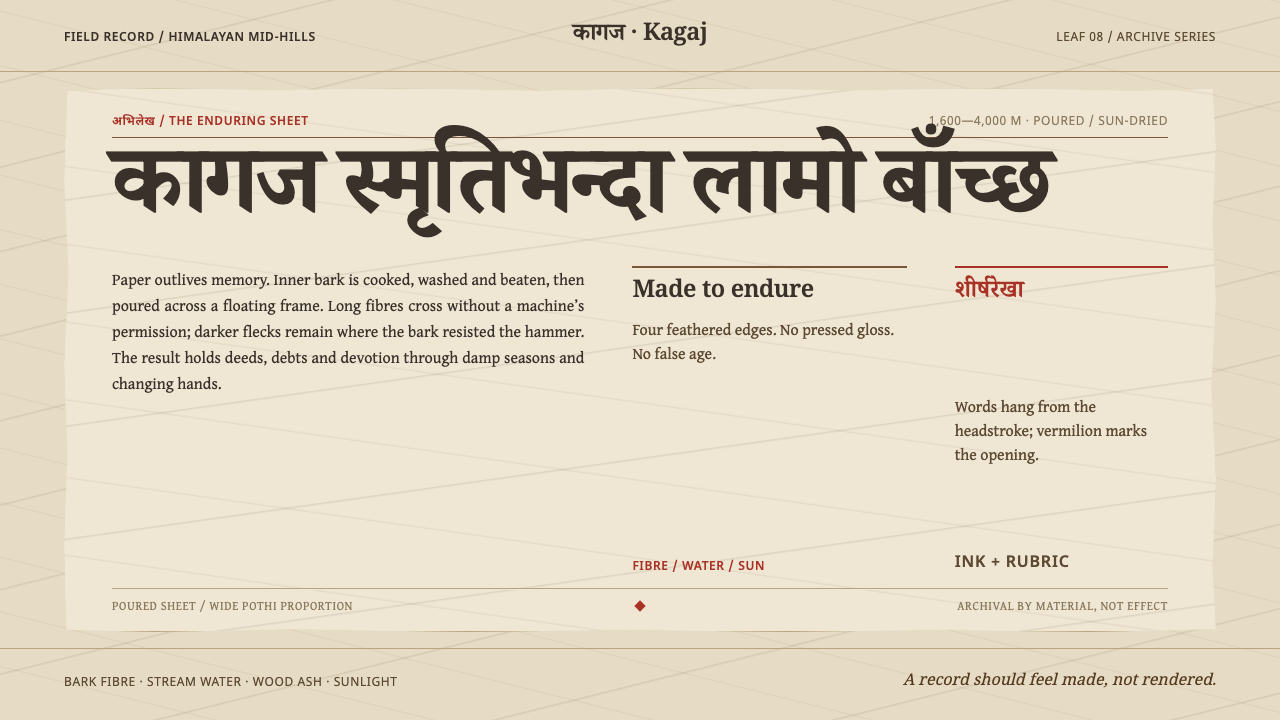
Lokta is a design language modelled on Nepal's bark paper — tan-ivory sheets of long fibre, text hanging from a headstroke, and vermilion marks that break the black.
Nepali Lokta Paper in brief
Nepali Lokta Paper is a design language modelled on a material rather than a movement. Lokta is the inner bark of two Himalayan daphne species, Daphne cannabina and Daphne papyracea, cut between 1,600 and 4,000 metres above sea level. The bark is cooked twice, washed, and beaten with a wooden hammer into pulp, which is poured over a floating frame and dried in the sun. What comes off the frame is a tan-ivory sheet with long fibres crossing it at random angles, darker flecks of bark, and four feathered edges.
That sheet matters because of what Nepal asked of it. Land registrations, loan deeds and lalmohar — official documents bearing a red seal — were written on lokta, and sutras were copied onto it, because the fibre resists tearing, damp, insects and mildew. The style keeps that substrate literal: it asks an interface to behave like a sheet that has to last, not like a screen that has to impress.
In visual terms, this means a wide pothi proportion, text that hangs from a headstroke, vermilion rubrics that break the black, and a surface in which nothing is mechanically smooth. The page is warm, fibrous and irregular, and every red mark means something.

Where does Nepali Lokta Paper come from?
Lokta papermaking is centuries old. The sources describe it as documented well before 1900 and still poured the same way, and place it in the Himalayan mid-hills — Baglung, Dolakha and Ilam are named — and in the trade that runs through the Kathmandu Valley. The paper's makers are the kagate papermaking households, named in the sources among the key figures; kagate is the name given to the families who make it. That continuity is part of the style's argument: a design language based on a paper whose pouring has not changed can afford not to follow fashion.
The character of the sheet is a record of its making. The bark is cooked twice and washed; it is beaten by hand with a wooden hammer rather than milled; it is poured over a floating frame, so the sheet forms in place and its edges are feathered rather than trimmed; and it is dried in the sun. The long fibres that cross the sheet at random angles are not decoration. They are the structure that makes it resist tearing.
Its uses made it a state paper. The sources list Nepali government record-keeping among the traditions behind the style: land registrations, loan deeds and lalmohar were written by government deed scribes on lokta, documents that had to survive damp, insects and mildew for as long as the claims they recorded. Lalmohar means, literally, red seal, and the vermilion marks that break the black text of this style echo that official red.
The same paper carried religion. The sources name Tibetan-Buddhist manuscript production as the third strand, and Buddhist manuscript copyists as the third group of key figures: sutras were copied onto lokta. The wide, horizontal pothi format, a long strip of a page recalling palm-leaf manuscripts, shapes the proportion; and Devanagari, the script used for Nepali, hangs its letters from a headstroke, a horizontal line along the top, rather than standing them on a baseline. Records of land and records of faith, written with black ink and red marks on the same sheet, give the style its double character: bureaucratic and devotional at once.
What defines the Nepali Lokta Paper look?
Tan-Ivory Ground
The ground is the colour of the paper itself: undyed, a warm tan-ivory that is lighter in some places and darker in others. It is never pure white and never flat in a mechanical sense. In a design it works as the base for everything: a warm neutral that makes black text feel inked and red marks feel stamped.
Fibre and Bark Specks
Long fibres cross the sheet at random angles, and darker specks of bark are scattered through it. The texture is visible but low-contrast: it should be felt as the substance of the paper rather than as a pattern laid on top. Its randomness matters; repeating tiles or regular noise destroy the effect.
Feathered Edges
All four edges of the sheet are feathered, not cut. Containers and panels in this style avoid hard, perfectly straight outlines; edges soften, lift or fray slightly. Used with restraint, this makes a card or panel read as a physical leaf rather than a rectangle, while the reading area inside it stays entirely stable.
Pothi Proportion
The page is wide and low, following the horizontal pothi format rather than the tall portrait sheet. Content sits in long horizontal strips and wide folios. The proportion gives the layout a reading rhythm that moves along rather than down, and it suits tables, timelines and sequences of records.
Hanging Type
Text hangs from a headstroke rather than standing on a baseline. Devanagari letters carry a horizontal line along the top, and the lines of text are organised beneath it. The principle extends beyond Devanagari: alignment is taken from the top of the line, a rule or headline stroke sits above the text, and the letters seem to be suspended from it.
Vermilion Rubrics
Vermilion is the second ink. Black carries the text; vermilion breaks it, for headings, section marks, seals and the occasional key word. It is used the way a scribe uses red, to signal 'begin here' or 'this is official', and it is never spread across large areas. A page with too much red has no rubrics left.
Nothing Mechanically Smooth
The surface rules out mechanical perfection: no gloss, no glassy gradients, no hard drop shadows, no perfectly regular grid of dots. Irregularity is permitted where it belongs to the material, and prohibited where it would impair reading. Interaction should feel like handling paper: matter-of-fact, quiet, with no flourish.

Who shaped Nepali Lokta Paper?
The makers. These are the families who cut the bark, cook and wash it, beat it with a wooden hammer and pour the sheets; the sources place their work in the mid-hills and the Kathmandu Valley trade. They are the design language's real authors: every characteristic of the surface is a result of their method, which the sources describe as unchanged in how it is poured.
The writers of the state's records. They wrote land registrations, loan deeds and lalmohar on lokta, and these documents of land, debt and authority are why the paper has a reputation for permanence. The red of the official seal is a plausible root of the style's vermilion accents.
The copyists of sutras. They are the reason the style's proportions are those of a pothi and its tone is devotional as well as official. A copyist's page pairs black text with red rubrics, headings and marks that guide the reader through the text, and the style takes that pairing as its basic colour structure.
How do you use Nepali Lokta Paper today?
Nepali Lokta Paper suits work whose job is to be trusted over time: records, archives, documents, cultural and educational material. It is a warm, tactile style, but a serious one.
For slides, a cover can be a wide tan-ivory sheet with the title hanging from a single headstroke rule and one vermilion mark: a seal, a section number or a single word. Content slides use the horizontal pothi proportion: wide strips with text hanging beneath rules, black body type and vermilion for headings and key terms. Data slides should read as ledgers, with ruled tables, black figures and vermilion only for the number being argued. Avoid photographic backgrounds; if an image is needed, let it sit on the paper as a plate.
For websites, use the tan-ivory ground, a wide content measure and horizontal sections, with top-aligned rules above headings and text blocks. The style fits archives, libraries, heritage and non-profit sites, craft and paper brands, tea and food producers, cultural-tourism pages, and documentation or knowledge bases that want a calm, reliable voice. Dashboards should be ledger-like: rows with rules, black figures, vermilion for flagged items. Pricing is best as plain tables, one row per tier, with vermilion marking the recommended tier like a seal. Motion should be minimal: panels turn or slide like leaves of paper rather than bounce, and nothing should flash.
For editorial and marketing, it supports books, long-form essays, reports, certificates, invitations, packaging for natural products and the identity of anything that stands for authenticity and provenance. Use wide margins, headings set under a rule, and a single seal-like vermilion mark. Photography should be natural and unretouched.
The common mistake is to turn the paper into a rustic filter: heavy brown textures, torn-edge graphics, coffee stains and parchment clichés. Lokta is not antique and not distressed; it is a working paper, tan-ivory and fibrous, made today as it was made for centuries. Another mistake is to scatter vermilion across a page until it stops meaning anything, or to set Latin text on a baseline with no top rule, which loses the hanging-type logic. And the fibres should be random: a tiled texture is the opposite of the material.

Nepali Lokta Paper — FAQ
What is lokta paper made from?
It is made from the inner bark of two daphne species, Daphne cannabina and Daphne papyracea, cut between 1,600 and 4,000 metres in the Himalayan hills. The bark is cooked twice, washed, beaten with a wooden hammer, poured over a floating frame and dried in the sun. The sheet that results is tan-ivory, with long fibres crossing at random angles, darker flecks of bark and four feathered edges.
Why does the text hang from a line?
Because the script does. Devanagari, the script used for Nepali, hangs its letters from a horizontal headstroke along the top of each line rather than standing them on a baseline, and the style keeps that logic. With Latin text, the equivalent is to align from the top of the line and place a rule or headline stroke above the text, so the letters read as suspended from it.
Is this the same as a rustic or kraft-paper look?
No. A rustic look usually signals handmade charm or cheapness, and kraft is a utility board. Lokta is a record paper: it carried land registrations, loan deeds, official red-sealed documents and sutras. The colour is a pale tan-ivory rather than brown, the layout is disciplined and horizontal, and the only second colour is vermilion, used as a scribe would use it.
Which colours belong in this style?
Three: the tan-ivory of the paper, black ink for text and rules, and vermilion for rubrics, seals and key marks. Resist adding a fourth. The restraint is the point: when red appears on a mostly black-and-ivory page, it reads as meaningful, the way a seal does on an official document.
Where does the style struggle?
It struggles wherever speed, glossy precision or sterile polish is the promise: high-end consumer electronics, sleek fintech, futuristic AI products. It also does not suit bright, playful brands. The material is deliberately not mechanically smooth, so anything that depends on a frictionless surface will fight it.
Related design styles
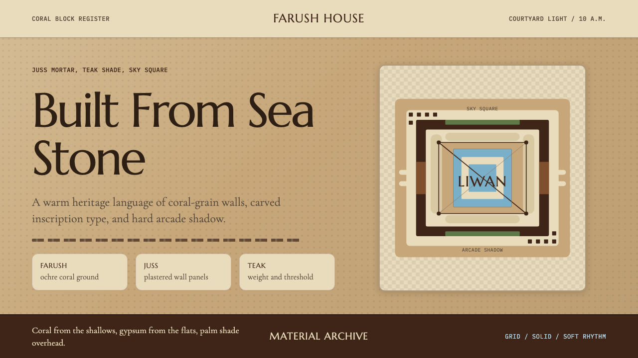 Emirati Bait Al Naboodah Coral HouseFeels built, not styled. Coral ochre, teak brown, and a sky-square courtyard…
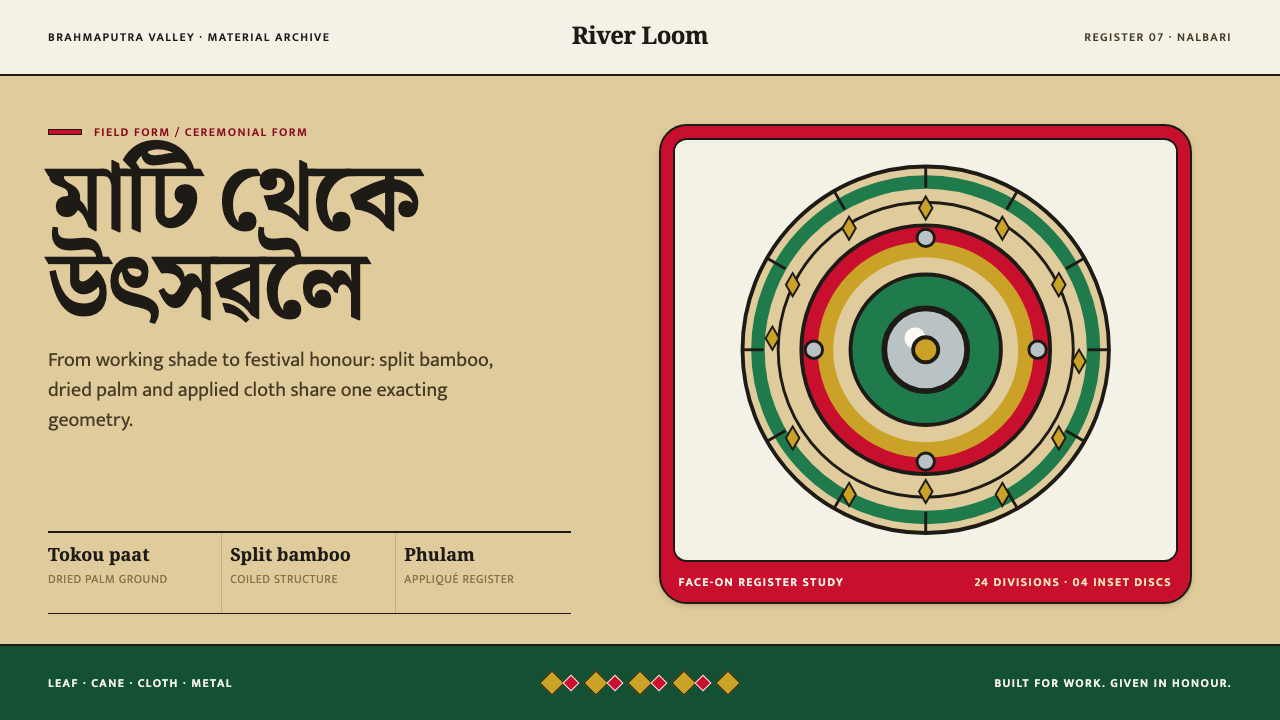 Assamese JapiWork becomes ceremony. Straw-gold rings carry green appliqué, festival red an…
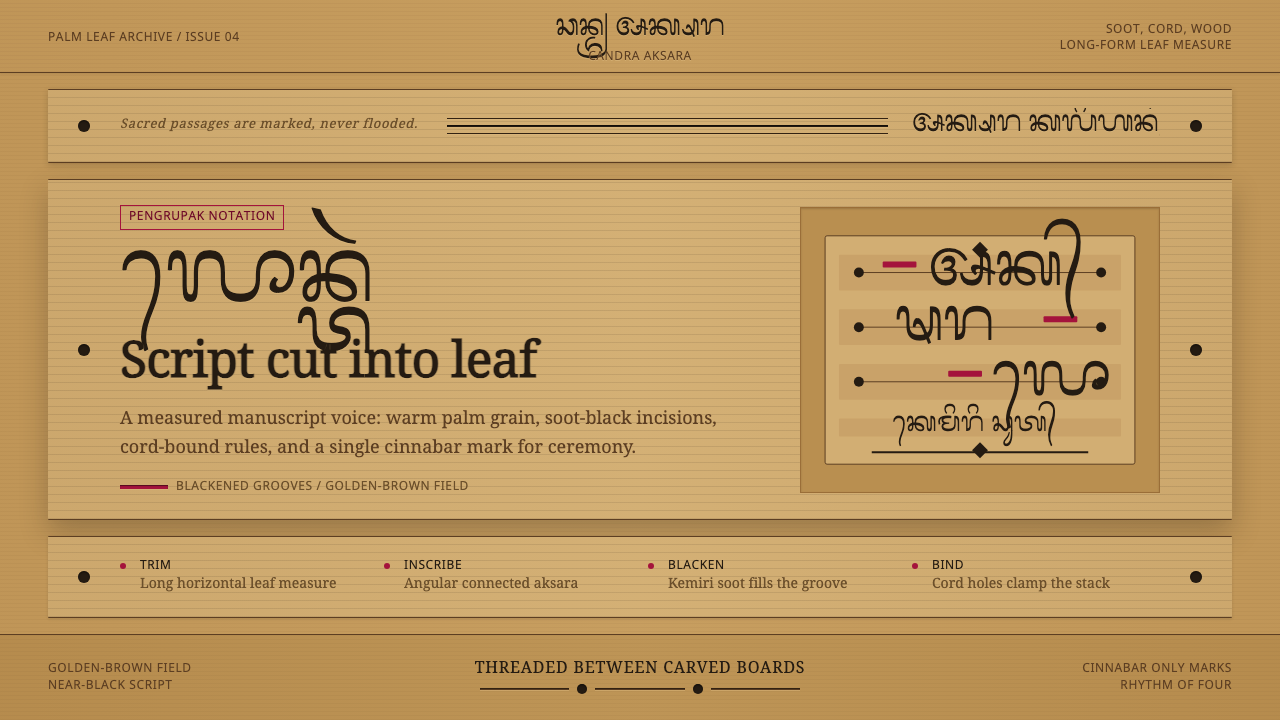 Balinese LontarHandmade memory, incised. Golden leaf strips carry soot script and spare cinn…
 Burmese Shan Thanaka (Bark Paste)Handmade warmth on dark bark. Thanaka cream roundels soften rose, jade, and g…
 Kadazan SompotonEight uneven voices, held as one. Padi green bamboo rises from a waxed gourd…
 Lepcha Bamboo CraftThe weave holds memory. Madder and green bands cross split-bamboo diagonal tw…