What is Telegraph Office Form?
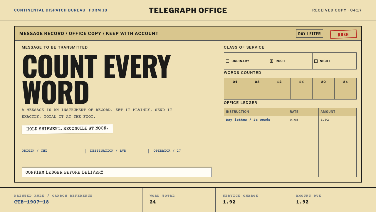
A telegram blank was never decoration: the customer paid by the word, so the sheet itself had to count — ruled fields, boxed classes of service and a charge block totalled at the foot, all printed on cheap yellow pulp.
Telegraph Office Form in brief
Telegraph Office Form is a design style drawn from the paper forms of the commercial Morse telegraph in the United States. It looks like administration because it was administration. A message was written on a printed blank, counted word by word, priced by its class of service and totalled in a charge block at the bottom of the sheet. The page was an instrument for counting and recording, and every visible element on it is there because someone had to fill it in, check it or pay for it.
The visual signature follows from that function. The stock is cheap yellow wood-pulp paper that drinks ink. The type is set in capitals, because Morse code carries no case and every received message was transcribed in capitals, every time. Fields are ruled rather than styled: thin lines mark the boxes, the classes of service and the charge area. Content is packed to the edge of the sheet, with no margin used for show. Where the style is distinctive it is distinctive through accumulation of useful detail, never through ornament.
As a reference for contemporary design, the form is a lesson in making record-keeping visible. It shows how a page can be dense without being confused, authoritative without being decorated, and how imperfection — a rubber stamp a little off the rule, a carbon copy fainter than the top sheet — records the process by which the page was made.
Where does Telegraph Office Form come from?
By the early twentieth century the telegram was a mass commercial service. The source material places the peak of the commercial telegram between 1900 and 1950, in North America, where Western Union and Postal Telegraph offices stood in towns across the United States. A customer wrote a message on a printed blank at the counter, a clerk checked and counted it, and operators sent it over the wire in Morse code. At the far end another operator wrote out what he or she heard, and the result was delivered on a form of the same family. The sheet of paper was the point at which a spoken or written thought turned into a priced unit of service.
The customer paid by the word, so the sheet had to count. That single commercial fact shaped the layout. Ruled fields separated the address from the text and the sender's details; boxed classes of service told the office how urgently, and at what rate, the message should travel; and a charge block totalled at the foot closed the transaction. The form was less a place to write than a small machine for arithmetic, and its visual order is the order of the calculation: top to bottom, each field earning the next.
The capitals are not a style choice either. Morse code carries no case: the signal for a letter is the same whether it was meant as capital or lower case. An operator receiving a message therefore had no information about case to preserve, and wrote everything in capitals, every time. The all-caps look of the telegram is a property of the channel, not of a typographer's taste. The materials added their own signature. Cheap yellow wood-pulp stock took the ink in and let strokes bloom at their edges, the rubber stamp that marked the office and time landed a little off the rule, and the carbon copy underneath came out fainter than the top sheet.
Three layers of history sit under the form. Samuel Morse and Alfred Vail stand for commercial Morse telegraphy itself, the technology and the code the whole business ran on. Standardized business forms stand for the paperwork culture that grew around it, in which a printed grid of boxes made sure that every clerk recorded the same facts in the same places. And American gothic job printing, the world in which Morris Fuller Benton worked as a type designer, supplies the plain, sturdy sans-serif letterforms in which such forms were set. The style is the meeting point of a code, a paperwork standard and a print idiom.
What defines the Telegraph Office Form look?
Yellow Pulp Stock
The ground is a cheap, warm yellow, the colour of wood-pulp paper rather than of a designed vintage tint. It is slightly dull, slightly uneven, and takes ink in so that strokes spread a little at the edges. The yellow is not nostalgia: it is simply what inexpensive stock looked like. Everything else on the page, black type, dark rules, stamped marks, sits on this stock as if printed onto it.
All-Capitals Type
Type is set in capitals throughout, in a plain, sturdy sans-serif of the American gothic job-printing tradition. This is not a display gesture; it is how every received message was written, because Morse code has no case. Labels, field names, addresses and message text all share the same register. The effect is flat, institutional and even, with hierarchy made by position in the box and by the label, not by switching between upper and lower case.
Ruled Fields
Structure is made with lines. Thin dark rules divide the sheet into boxes for the address, the text, the sender, the time and the class of service. Fields are rectangles with small labels, not cards with shadows and rounded corners. The ruling does the job that styling does in other systems: it separates, groups and tells you where to write. The page is ruled, not designed.
Boxed Classes of Service
The kind of service chosen determines speed and price, so it is presented as a set of boxes to be ticked or marked. Each class sits in its own cell, labelled in capitals, close to its neighbours. In a contemporary layout this becomes a row of mutually exclusive options rendered as plain rectangles, a pattern that suits plans, priorities and statuses far better than pills, toggles or coloured chips.
The Charge Block
At the foot of the sheet a block of boxed figures totals the cost: the number of words, the rate and the amount due. It is the end of the form's logic and its most important part, because the whole page is built to arrive at it. Numerals line up in columns, labels sit directly beside their figures, and nothing is rounded off or hidden. The total is visible as the result of a visible calculation.
Packed to the Edge, Imperfectly Printed
Content runs close to the edge of the sheet; white space exists only where someone has to write. Beyond that density, the page carries evidence of its making: a stamp that landed slightly off the rule, strokes that bloomed into the pulp, a duplicate fainter than the original. These flaws come from process, not decoration. They work when they appear in specific places for specific reasons, and fail when scattered as a general distress effect.
Who shaped Telegraph Office Form?
Morse trained as a painter and became the best-known name in American telegraphy; his name is on the code that carried messages as sequences of short and long signals. The all-caps logic of the telegraph form follows directly from the code that bears his name: a medium with no case produces text with no case. He stands for the technological layer of the style, the reason the page looks as it does.
Vail worked with Morse and is usually credited as a collaborator in developing both the telegraph apparatus and the code. Where Morse is the famous name, Vail is the reminder that the system was an engineered collaboration, refined in practice. That practical, workshop-minded spirit is the right register for a style whose beauty comes from usefulness.
Benton was an American type designer, associated with the gothic sans-serif faces that gave American commercial printing its plain, sturdy look. He is the human face of the style's print layer: the letterforms in which forms, handbills and signs were set. For designers, he is the reason to choose lettering that is unfussy and legible at small sizes, rather than a typewriter face worn as a costume.
How do you use Telegraph Office Form today?
Telegraph Office Form works for subjects that are really about counting, recording or accounting, and for any design that wants to look as though it has been filled in by someone responsible. Applying it well means keeping the logic of the form: ruled fields, labels in capitals, a charge block at the foot, a yellowed stock. It does not mean pasting an aged-paper filter over an ordinary layout.
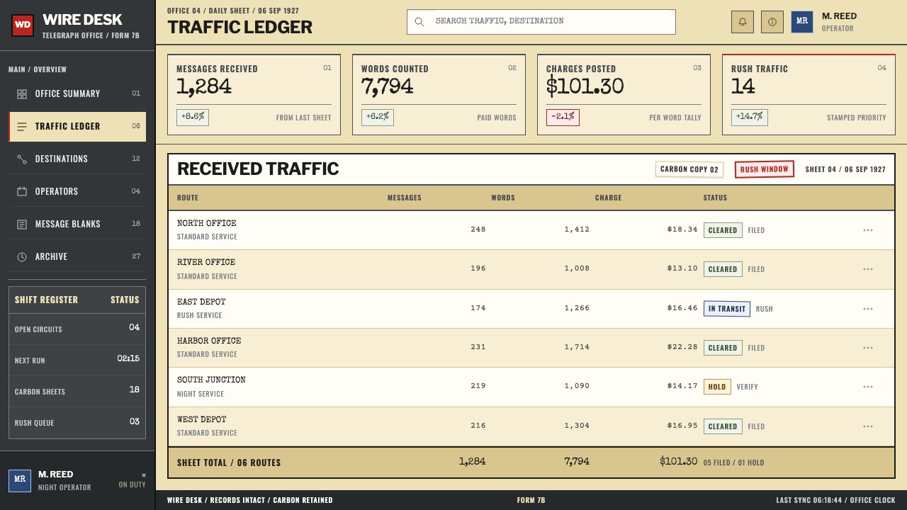
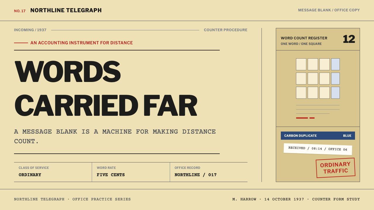
For presentation slides, the cover can be the header of a form: the title in capitals inside a ruled box, with small boxed labels for date, recipient and class of service. Content slides present each key point in its own labelled field, so a slide reads as a record of a few facts rather than a poster. Data slides are tables or tallies first; where a chart is needed, build it from counted units in ruled cells, and close the slide with a charge-block-style footer that totals the headline number.
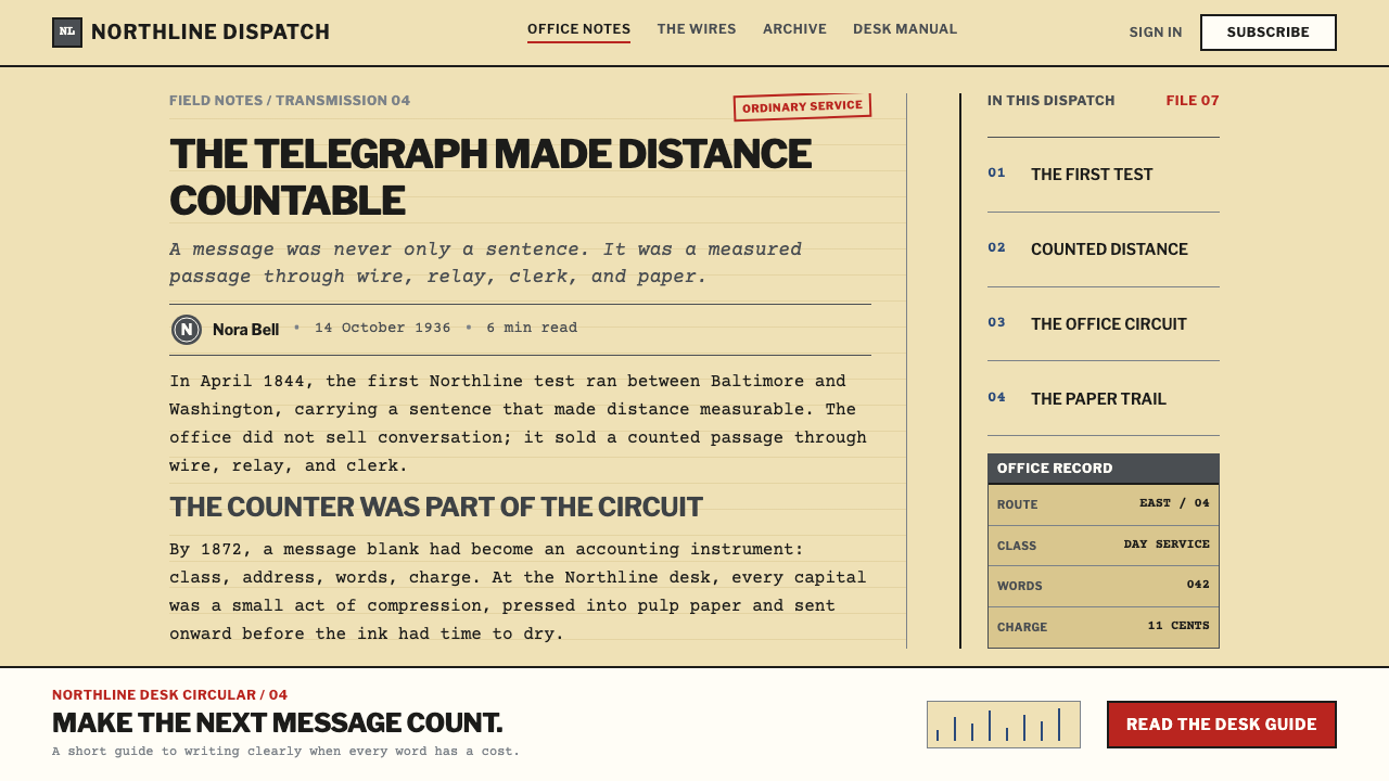
On the web, the style is a natural fit for dashboards, ledgers, logs and admin tools, where dense information should be scanned in rows and totals matter. Cards give way to ruled cells, and numerals align in columns. Pricing pages can borrow the form's central device: an itemised charge block that lists what is counted, how it is priced and the total at the foot, so the customer can see the calculation. Checkout steps, invoices and receipts all benefit, since they are descendants of exactly this kind of paper.
In editorial and marketing work, the style suits archives, logistics, finance, journalism, history and anything built around the idea of a dispatch. Copy can be terse, in the clipped manner of telegraphic writing, with short labelled blocks in place of flowing paragraphs. Photography, if used, is plain documentary and sits inside a ruled box with a caption field. Campaign pages can echo the form's structure, with the call to action presented as the charge block at the foot of the sheet.
The most common mistake is treating the style as vintage decoration: torn edges, coffee stains, sepia gradients and a typewriter face used as a costume. The form is functional, and a layout that does not count or record anything is only borrowing its surface. A second mistake is introducing lower-case body text or soft rounded cards, which break the capitals-and-rules language. A third is applying distress everywhere: imperfections such as an off-rule stamp should appear in a few places, for a reason, rather than as a uniform texture.
Telegraph Office Form — FAQ
Why is everything in capitals?
Because Morse code carries no case. The signal for a letter is the same whether it was meant as upper or lower case, so an operator receiving a message had no case information to keep, and every received message was transcribed in capitals. The all-caps look is a result of the channel, not a stylistic flourish, and it is the reason body text in this style should not drift into lower case.
Why did the form have to count?
Because the customer paid by the word. The sheet therefore needed a place to count the words, a choice of class of service that affected the rate, and a charge block at the foot where the total was worked out. That commercial arithmetic is why the layout reads top to bottom as a chain of ruled fields. A design in this style should likewise compute or record something real, not merely borrow the boxes.
Is the yellow just a nostalgic tint?
No. It is the colour of cheap wood-pulp stock, which was chosen for economy rather than charm. That stock also behaves in specific ways: it absorbs ink, so strokes spread slightly at the edges. Treat the yellow as a material property of the page, together with the soft ink edges and the faint duplicate, rather than as a sepia filter placed over a clean layout.
What does 'American gothic job printing' mean here?
In American printing, gothic is the traditional name for plain sans-serif type, and job printing is the commercial trade that produced everyday forms, cards, handbills and signs. Together they describe the sturdy, unfussy lettering in which telegraph forms and much other paperwork were set. Morris Fuller Benton, one of the source's key figures, belongs to that tradition as a type designer.
Can this style work for a modern, dense interface?
Yes, and it is one of its strengths. The style was built for dense information that had to be read, checked and totalled quickly. Ruled cells, labelled fields, aligned figures and a clear total at the foot translate well to dashboards, admin tools, ledgers and pricing tables. The key is to keep the rules and labels functional, and to leave decorative effects out.
Related design styles
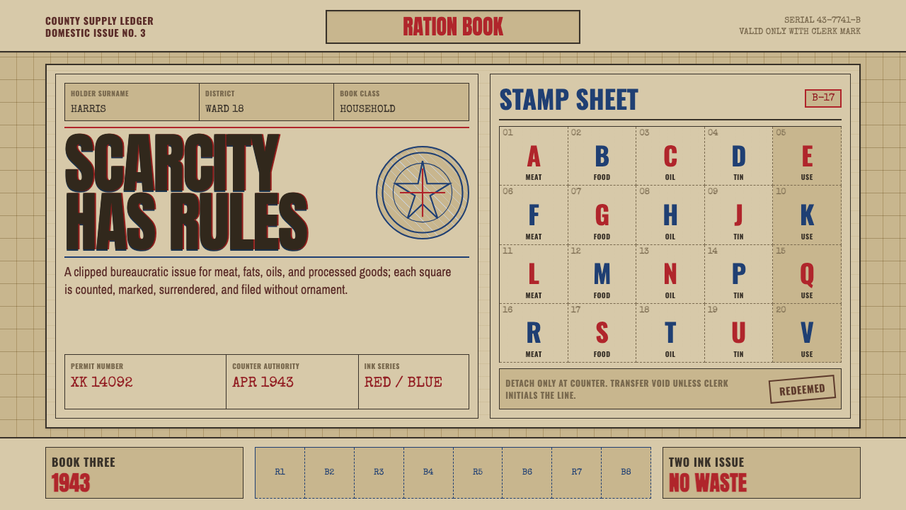 Wartime Ration CouponScarcity made visible. Buff card, red-blue overprint, and perforated grids do…
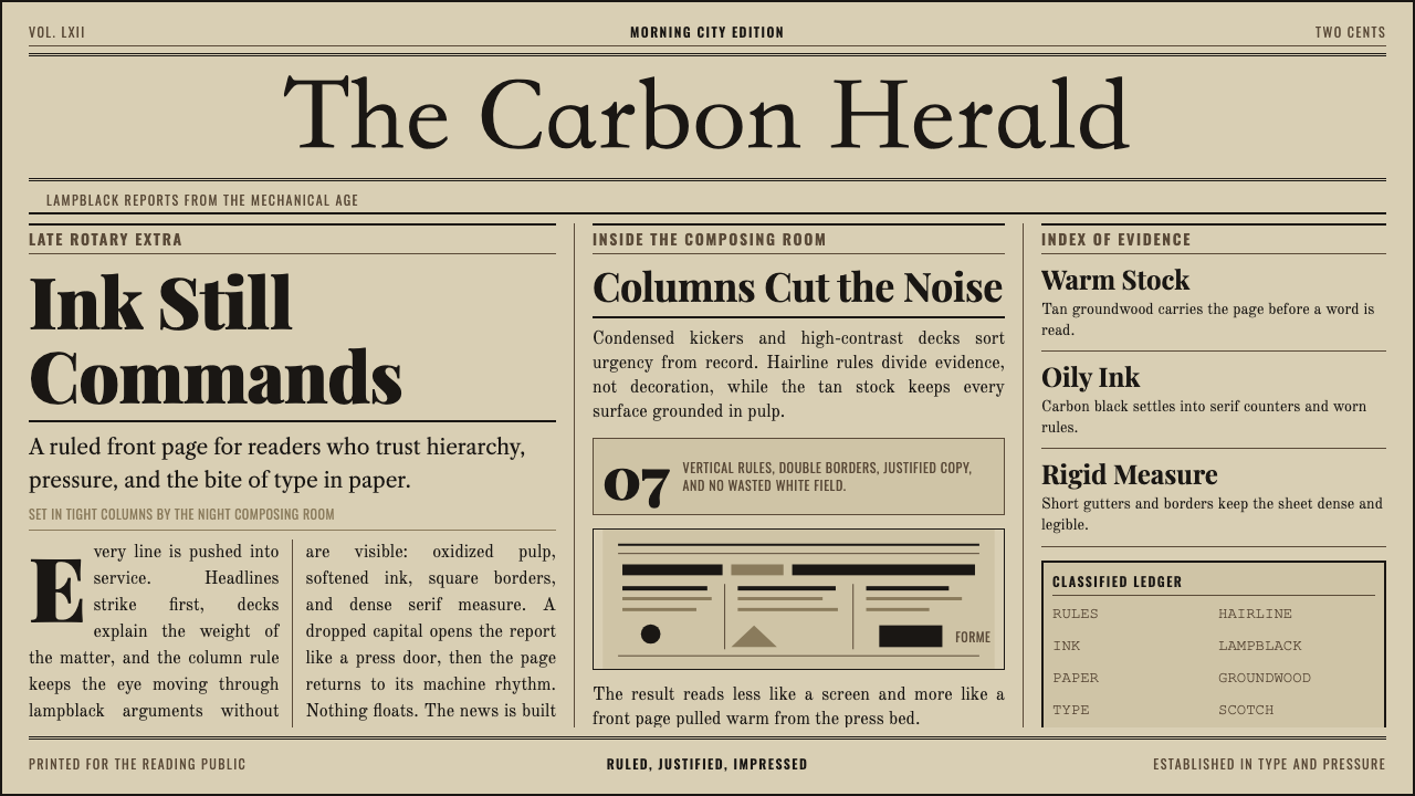 Broadsheet LetterpressAuthority in ink. Lampblack serif decks lock into tan paper with strict ruled…
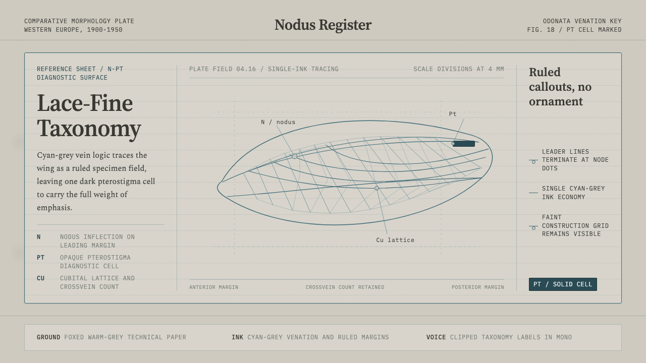 Dragonfly Wing VenationPrecision, nearly weightless. Cyan-grey veins rule a foxed paper taxonomy pla…
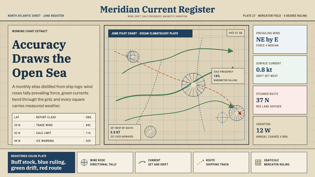 Ocean Pilot ChartAuthority by accumulation. Blue graticules and green currents crowd warm char…
 Ore Specimen TrayMuted metal does all the speaking. Lead-gray galena and brass pyrite lit on n…
 Topographic Survey MapMeasurement becomes beauty. Sepia contours and blue hydrography sit on aged m…