What is Ocean Pilot Chart?
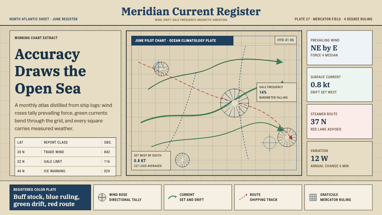
Ocean Pilot Chart builds authority from accumulation — thousands of ship-log observations distilled into blue wind roses and green current arrows crowding warm chart stock.
Ocean Pilot Chart in brief
Ocean Pilot Chart is a design system drawn from the pilot charts published for a century by the US Navy Hydrographic Office — monthly navigational sheets that distilled millions of individual ship-log entries into a single dense page for each ocean region. Every element on a real pilot chart is a statistical summary: wind roses with feathered arms showing the frequency and strength of wind from every compass direction for that month, curved green arrows tracing the average path and speed of ocean currents, and fine isogonic lines marking magnetic variation across the sea.
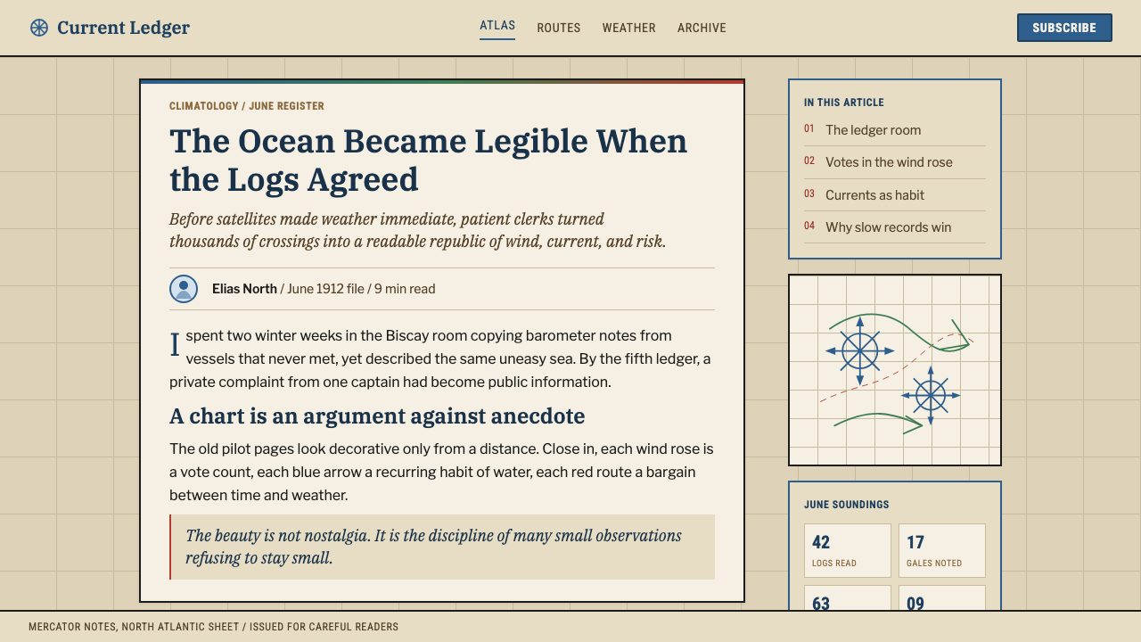
The system carries that same density of information into its visual language. It is built on ocean blue for the graticule and wind data, green for current arrows, and a warm chart-buff background standing in for the aged, slightly yellowed paper stock these charts were printed on for decades. Nothing is illustrated for its own sake — every mark exists because it encodes a measurement, and the visual richness of the style comes entirely from how many of those measurements are packed into one page.
This is a system whose beauty is a byproduct of accuracy rather than a goal pursued separately. A real pilot chart was a working document, consulted by ship captains planning a month's voyage, not a decorative object — and the design language preserves that utilitarian density: layered tints, fine line-work, statistical boxes, and a Mercator grid that never disappears from beneath the data sitting on top of it.
Where does Ocean Pilot Chart come from?
The pilot chart tradition traces back to Matthew Fontaine Maury, a US Navy officer who served as superintendent of the US Naval Observatory in the mid-nineteenth century and is often credited as a founder of modern oceanography. Beginning in the 1840s, Maury pursued an idea that was, for its time, a remarkably early form of crowd-sourced data collection: he asked merchant ship captains to keep detailed logs of wind, weather, and current conditions along their routes, and in exchange for their observations, he gave them free copies of the charts those observations helped produce.
Maury compiled these thousands of voluntary ship-log entries into his Wind and Current Charts, statistical maps that let a captain choose a route based on the accumulated experience of every ship that had sailed that ocean before, rather than on individual guesswork alone. His 1855 book The Physical Geography of the Sea, drawing on this same data, became one of the foundational texts of oceanography as a scientific discipline, and his charting method became the template the US Navy Hydrographic Office adopted and refined for a century afterward as the modern Pilot Chart.
Each monthly Pilot Chart packed a remarkable density of accumulated statistics onto a single Mercator-projection sheet: wind roses at regular grid points showing the historical frequency of wind from each direction for that specific month, green arrows tracing typical current paths and speeds, isogonic lines marking magnetic declination for compass navigation, and boxed tables of supplementary statistics — ice limits, great-circle routes, storm frequency — arranged around the margins. The chart's authority came directly from this accumulation: no single observation was dramatic, but a century of aggregated ship-log data, rendered in fine engraved-style linework, made the ocean's behavior visible in a way no single voyage's account ever could.
The US Navy Hydrographic Office's successor agency continues publishing Pilot Charts today, carrying Maury's original method — observation, aggregation, cartographic distillation — forward largely unchanged in principle even as the underlying data collection has modernized. The visual identity this design system draws from is therefore not a single historic artifact but a full century of consistent cartographic practice: blue and green statistical overlays on warm chart paper, dense with measured fact.
What defines the Ocean Pilot Chart look?
Color
Ocean blue carries the graticule, wind data, and structural grid lines; green is reserved specifically for current arrows and current-related data. Both sit against a warm chart-buff ground that reads as aged paper rather than a clean digital white — the palette encodes what kind of data each color represents rather than serving decoration.
Data Density
Visual richness comes from accumulation rather than illustration: wind roses, current arrows, statistical boxes, and grid lines are packed tightly across the whole surface, echoing how a real pilot chart crammed a century of aggregated ship-log data onto a single monthly sheet.
Wind Rose Iconography
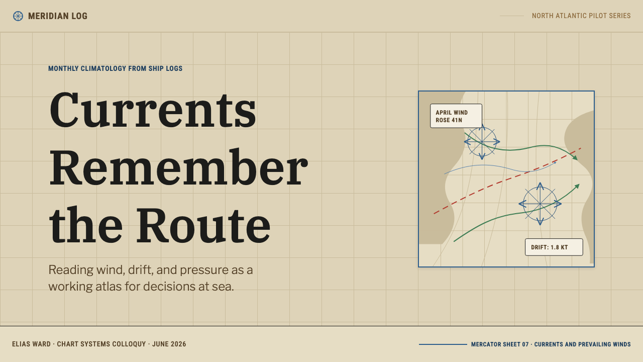
The wind rose — a circular diagram with feathered arms radiating in compass directions, each arm's length or weight indicating historical wind frequency and strength — is the system's signature data glyph, used wherever directional or frequency-based statistics need visual form.
Current Arrow Linework
Curved, tapering green arrows trace flow paths across the composition, matching the way current arrows were drawn on real pilot charts to show both direction and relative speed along a great ocean current's path.
Graticule Structure
A Mercator-projection grid of latitude and longitude lines underlies the entire composition, visible beneath the data layered on top of it. This grid should never fully disappear — it is the structural proof that everything else on the page is anchored to a real, measured location.
Fine Line-Work
Lines throughout the system are fine and engraved-looking rather than bold or blocky, matching the disciplined hand-drafted and later engraved cartographic style of the original charts. Precision of line is itself a visual signal of the chart's underlying precision of measurement.
Statistical Boxes
Small bordered boxes containing supplementary tables or figures — ice limits, route notes, seasonal statistics — sit at the margins of the composition, echoing how real pilot charts framed auxiliary data separately from the main chart body.
Who shaped Ocean Pilot Chart?
Maury, superintendent of the US Naval Observatory, originated the method this entire style is built on: gathering voluntary ship-log observations from merchant captains and compiling them into statistical Wind and Current Charts. His 1855 book The Physical Geography of the Sea helped found oceanography as a modern discipline, and his charting approach became the direct ancestor of the Pilot Chart.
The Hydrographic Office adopted and refined Maury's method into the modern monthly Pilot Chart series, publishing statistically rigorous sheets for each major ocean region for a century. Its output established the visual conventions — wind roses, current arrows, isogonic lines, chart-buff paper — that define this design system.
The thousands of merchant captains who kept and submitted detailed logs in exchange for free charts were, in effect, the original data-gathering network the entire system depends on — an early instance of collaborative, crowd-sourced observation predating that term by well over a century.
The modern successor to the Hydrographic Office continues publishing Pilot Charts today, carrying Maury's original observation-and-aggregation method forward with updated data sources. Its continuity is why this style reads as an unbroken century-long cartographic tradition rather than a single frozen historic artifact.
How do you use Ocean Pilot Chart today?
Ocean Pilot Chart works best wherever a design needs to project authority earned through accumulated data rather than assertion — the sense that a claim is backed by thousands of measurements, not a single confident statement. Applying it well means treating density as a feature: the style should feel packed with fine, purposeful detail rather than sparse and airy.
On a presentation cover slide, a chart-buff field crossed by a faint visible graticule, with one or two wind-rose-style diagrams anchoring the composition, reads as immediately data-backed. Content slides should keep the underlying grid visible even behind text blocks, and use fine rule lines rather than bold dividers to separate sections — mimicking how a real chart layers information without ever losing its base structure. Data slides are the style's natural home: bar and line charts rendered with fine engraved-style strokes, current-arrow-style flow lines for any directional data, and statistical callout boxes at the margins rather than inline annotations.
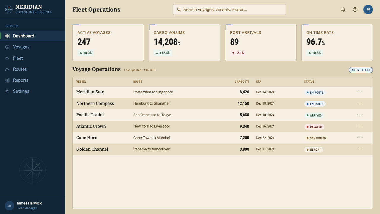
For web interfaces, the system suits products built around aggregated data, forecasting, or analytics — weather and climate dashboards are an especially direct fit given the style's origin, but the same logic serves any product whose value proposition is 'we've compiled more observations than anyone else.' A dashboard can use chart-buff as its base surface, blue for structural and primary metrics, and green reserved specifically for trend or flow-related data, keeping a faint graticule grid visible behind chart components. Pricing pages benefit from a wind-rose-style diagram as a visual anchor, implying that the recommended tier is itself a statistically informed recommendation.
In editorial and marketing contexts, the style supports content about data, forecasting, exploration, or maritime history particularly well. Long-form articles read well with marginal statistical callout boxes running alongside body text, echoing the chart's own margin tables; marketing pages can use a wind-rose motif as a hero graphic to signal that the product's confidence is quantitatively earned rather than merely claimed.
A common mistake is treating this as a generic 'nautical' or 'vintage map' theme and defaulting to sparse decorative compass roses and empty ocean-blue backgrounds — this misses the point entirely, since the real style's identity comes from density and statistical purpose, not from maritime iconography alone. An equally common error is using green and blue interchangeably; in the original charts the color distinction encoded a real difference between wind data and current data, and collapsing that distinction removes information the palette is meant to carry.
Ocean Pilot Chart — FAQ
Why is the style so densely packed with detail instead of clean and minimal?
Because density is the entire point — a real pilot chart's authority came from packing a century's worth of aggregated ship-log observations onto a single sheet. Thinning out the detail to look 'clean' would remove the exact quality that makes the style feel data-backed rather than decorative.
What's the difference between the blue and green in this system?
They encode different categories of data, matching the historic convention: blue carries the graticule, wind data, and structural grid, while green is reserved specifically for ocean currents and flow-related information. Treating them as interchangeable accent colors removes information the palette was designed to carry.
Does the underlying grid need to stay visible under all the data?
Yes, faintly. The Mercator graticule is the structural proof that every wind rose, current arrow, and statistic on the chart is anchored to a real, measured location rather than floating decoratively. Hiding it entirely turns a working navigational document into a generic illustration.
Can this style suit a playful, consumer-facing brand?
Not typically. Its identity depends on projecting measured authority and statistical density, which reads as serious and analytical rather than playful. It fits data, forecasting, analytics, and maritime or exploration products far more naturally than it fits a lighthearted consumer brand.
What's a common mistake when applying this style to a modern product?
Reducing it to generic vintage-nautical decoration — a compass rose here, an ocean-blue wash there — without the underlying data density and structural grid that give the original charts their authority. The style only works when it looks like it's showing real accumulated measurements, not when it's simply borrowing maritime imagery.
Related design styles
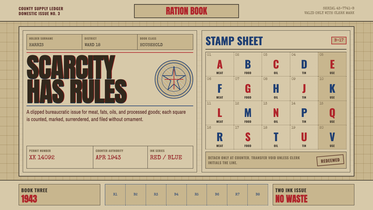 Wartime Ration CouponScarcity made visible. Buff card, red-blue overprint, and perforated grids do…
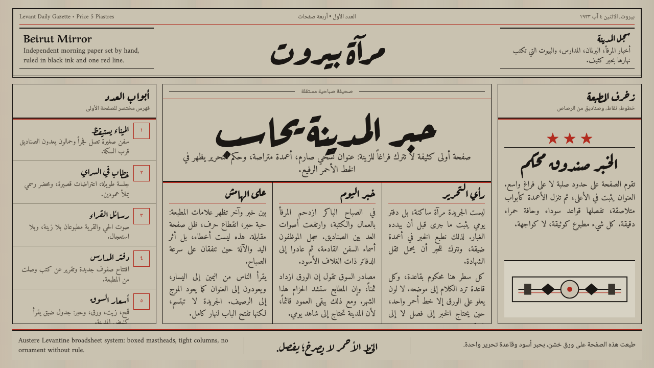 An-Nahar Beirut PressDense authority. Aged newsprint, black naskh columns, and one red rule hold t…
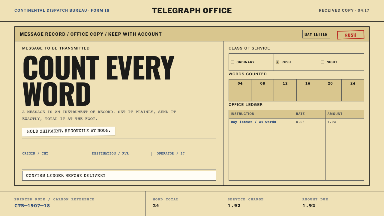 Telegraph Office FormA page that counts. Yellow pulp stock, all-caps type, and ruled charge fields…
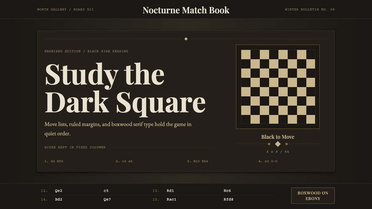 Chess TournamentQuiet intellect. Cream Playfair type, walnut rules, and notation glow on ebon…
 Dragonfly Wing VenationPrecision, nearly weightless. Cyan-grey veins rule a foxed paper taxonomy pla…
 Hejaz Railway SignageState engineering, bolted down. Locomotive green enamel meets basalt rules an…