What is Hejaz Railway Signage?
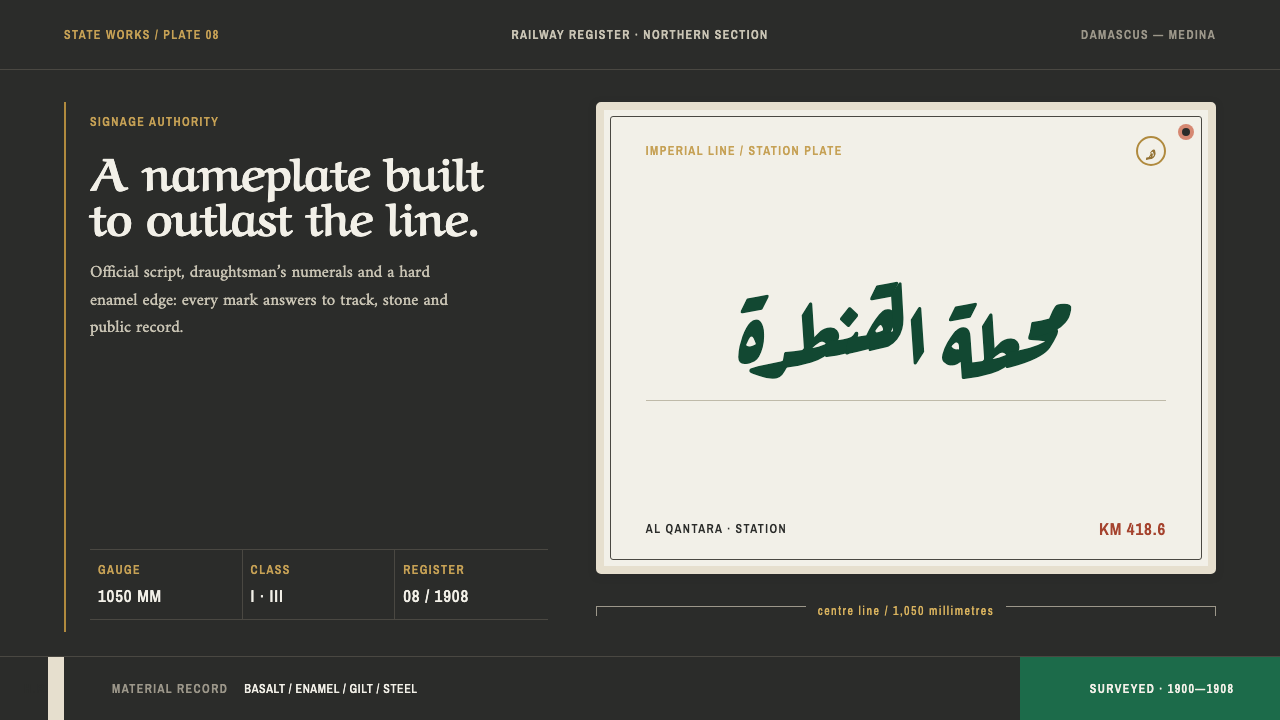
Hejaz Railway Signage is the look of an empire's engineering made public: enamel plates bolted to stone, locomotive green on black basalt, official script above narrow numerals.
Hejaz Railway Signage in brief
Hejaz Railway Signage is a design language drawn from the station plates of the Hejaz Railway, the line that ran from Damascus towards Medina in the early twentieth century. The plates were fired enamel, bolted onto stone walls, lettered in two tiers for two languages, and built to be read in hard sun by people arriving after a long journey. The style takes its whole vocabulary from the plate and from the wall behind it.
Visually it is dark, ruled and heavy. A black basalt ground carries a green taken from the locomotive that still stands at Medina, pale limestone bands, and gilt reserved for a single purpose: the sultan's tughra, the calligraphic monogram of state. Type is divided into two voices. Naskh and thuluth, two classical scripts of the Arabic tradition, carry the official voice, while narrow condensed numerals carry the working facts of the railway: gauge, kilometre and class.
It is important to say what the style is not. It is a state engineering identity, not a travel poster. There is nothing romantic or exotic in it, no desert sunset and no ornamental border. Everything is bolted down, ruled in straight lines, chipped at the corners where the enamel has been knocked, and legible at a distance. The tone is institutional, confident and slightly worn, the voice of an administration that wants to be believed rather than admired.
Where does Hejaz Railway Signage come from?
The Hejaz Railway was a late Ottoman project in the full sense. It was built between 1900 and 1908 under Sultan Abdülhamid II and financed by public subscription across the Muslim world, so the line was, in a very literal way, paid for by ordinary believers who wanted a safer and faster route for pilgrims. It ran from Damascus south through the Hauran, Deraa, Ma'an and Tabuk, with Mudarraj among the points on the way, towards Medina. The scale of the effort made it a statement of state capacity as much as a transport route.
The engineering came from abroad. The route was surveyed and the construction directed by a German engineer, Heinrich August Meissner, in a period when German railway engineering was a major export. The result was a narrow-gauge line built to a European technical standard and run with Ottoman authority. That mixture explains much of the system's visual character: the numerals and rules come from engineering culture, while the lettering and the tughra come from the Ottoman state. Neither is decorative. Each states who built the line and what it was for.
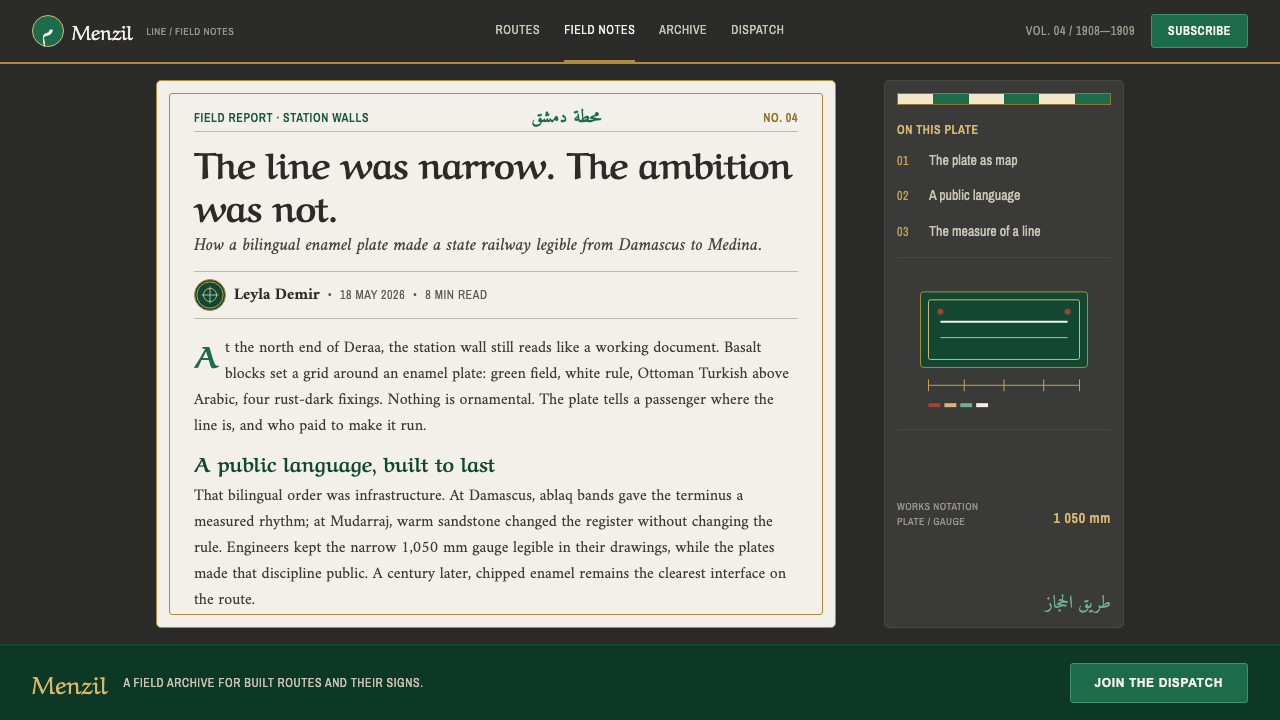
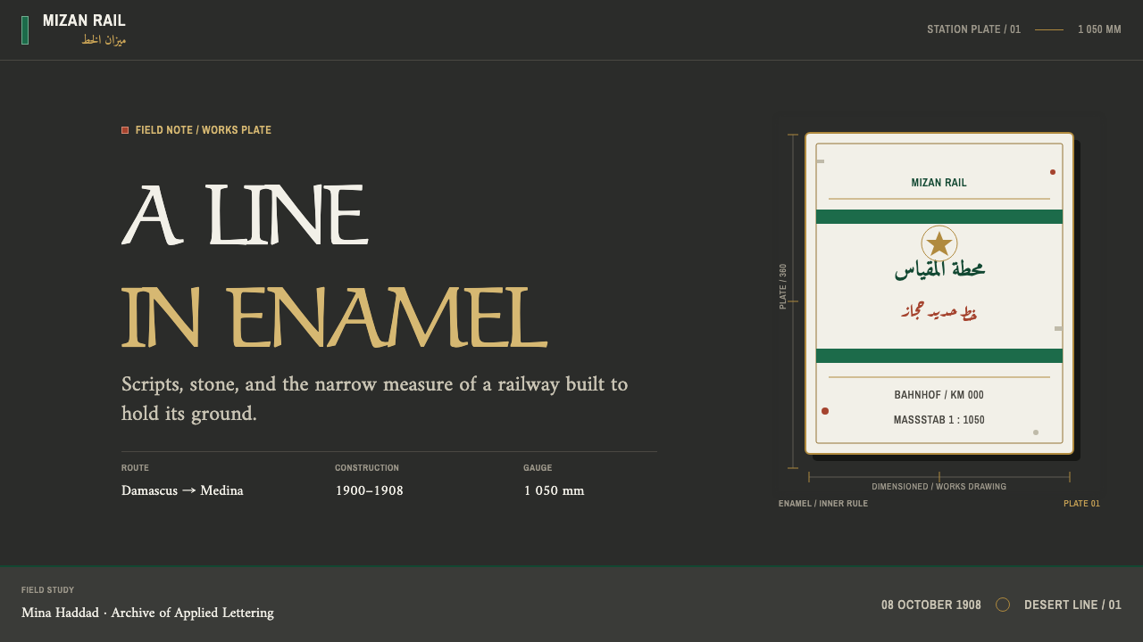
The signage itself is the visual inheritance the style draws on. The enamel station plates carried two tiers of text, Ottoman Turkish and Arabic, with naskh and thuluth set side by side. Over time the plates took on the marks of use: edges chipped to show the steel beneath, rust bleeding from the rivets, a patina on the stone behind. The system translates these into its own parts: a basalt ground from the volcanic Hauran, a green taken from the locomotive body at Medina, and pale bands that echo the alternating black and white stone coursing, known as ablaq, of the station at Damascus.
The railway's life was short and eventful. It was cut apart in the years 1916 to 1918, when the line became a military target, and later sections fell out of use, although the northern section kept running into the 1950s. What survives is partly ruin and partly working memory: a locomotive still standing at Medina, plates still bolted to walls. The library treats this as part of the style. The surfaces are not pristine, and the wear belongs to the identity: a system built to last, shown at the point where lasting began to cost something.
What defines the Hejaz Railway Signage look?
Basalt Ground
The base is a black volcanic basalt, taken from the Hauran on the line's northern stretch. It is a matt, heavy ground that does not glow and does not recede: it is a wall. Everything else is read against it, which gives the system its seriousness and also its practical advantage, since enamel and light text separate cleanly from such a dark field even in the harshest glare.
Locomotive Green
The primary colour is the green of the locomotive still standing at Medina: a deep, industrial enamel green, not a fresh or leafy one. It works as the identity colour, the one that says this is the railway. Because it is a painted metal colour rather than a nature colour, it sits comfortably beside black and stone, and it never reads as casual or friendly. It reads as official.
Limestone Bands
Pale blocks are taken from the white limestone in the alternating black-and-white masonry, ablaq, of the Damascus station. They are used as bands and fields, set against basalt to make a banded rhythm of dark and light. This is where the style gets its structure: a strict alternation, like courses of stone, rather than a soft gradient between tones. Light areas carry text and data, dark areas carry the frame.
Gilt for the Tughra
Gold has one job: the sultan's tughra, the calligraphic monogram of the Ottoman state. That restriction is the whole point. Gilt is not a general highlight or a premium accent but a seal of authority, applied once and in its proper place. Used sparingly, it gives the otherwise sober palette a single point of ceremonial weight; used everywhere, it would turn the system into the decoration it is designed to refuse.
Two Voices of Type
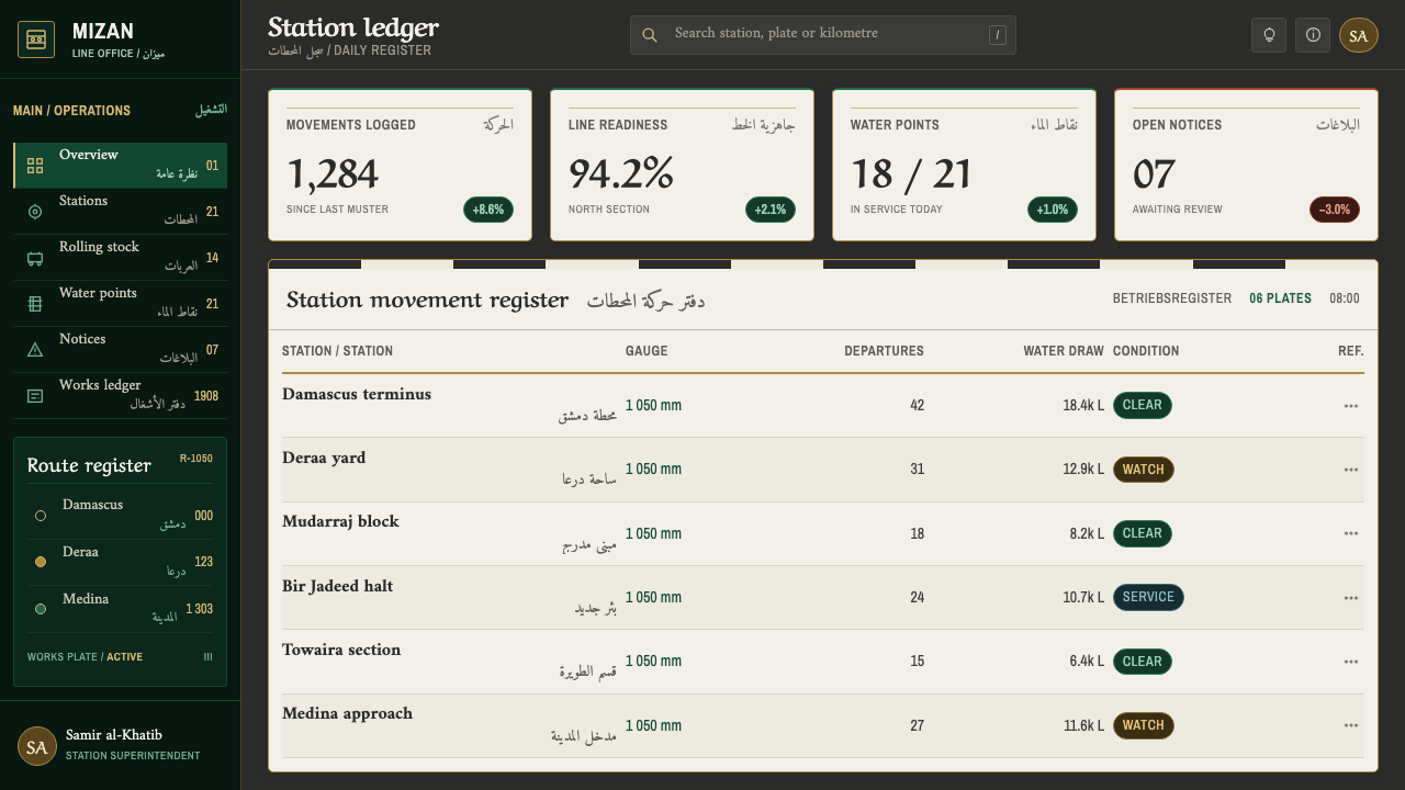
Type is split by function. Naskh and thuluth carry the official voice: names, titles and statements of authority, with the compact clarity of one script and the monumental sweep of the other. Narrow condensed numerals carry the measurable facts, such as gauge, kilometre and class. This separation of language and number into two distinct textures is the system's clearest idea, and it makes a screen feel like a plate.
Bolted Down
Everything looks fixed in place: ruled lines, rivets, squared plates, hard edges. Enamel cracks at the corners, and rust marks appear around the fasteners. These signs of wear are used with restraint as a texture of truth rather than a distressed effect, and they never interfere with legibility. The overall impression is of objects meant to stay where they were put for decades, in sun, dust and wind.
Not a Travel Poster
The register is institutional: the identity of an engineering project run by a state, not a visitor's souvenir. That rules out sunsets, camels, arabesque borders and anything that treats the region as scenery. What replaces them is information design: tables, timetables, kilometre markers, class labels. The beauty comes from the exactness of the system and the legibility of its lettering, not from exoticism.
Who shaped Hejaz Railway Signage?
The Ottoman sultan under whom the railway was built. His tughra is the single mark the style reserves gold for. The line's public subscription across the Muslim world made it a project of both state authority and religious solidarity, which is why the system speaks with an official voice and still carries a sense of shared ownership.
The German engineer who surveyed the route and directed its construction. His role stands for the German railway engineering export of the period and for the technical discipline that gives the system its numerals, rules and measured clarity. He is the reason the identity reads as engineering first and ornament never.
The British officer whose name is tied to the wartime attacks on the line during the cutting-apart of 1916 to 1918. He appears in the lineage as the figure through whom the railway entered a wider public memory, and he is a reminder that the story of the line includes its destruction as well as its construction.
The public that financed the line through donations gathered across the Muslim world. They are the least visible figures in the record and in some ways the most important: the railway was a collective act, and the system's institutional confidence should be understood as that of a shared project, not a single ruler's vanity.
How do you use Hejaz Railway Signage today?
This is a style for contexts where a visual identity needs to say something about reliability, infrastructure and institutional weight. Its strongest uses are operational: wayfinding, status, scheduling and anything where a reader must find a fact quickly. Its dark, banded, ruled nature rewards systematic content and punishes anything loose.
For slides, a cover works like a station plate: a dark basalt field, a bold green band, the title in a formal serif or script-inspired face, and a narrow numeral set in the corner like a kilometre marker. Content slides should be organised in bands of alternating dark and pale, with the official voice carrying headings and the condensed numerals carrying figures. Data slides are a natural fit. Tables, timetables and ranked lists look like they belong, and gold should appear once, at most, as a seal.
For web interfaces, dashboards and status pages are the obvious home. A dark ground with a green identity colour suits infrastructure monitoring, logistics, travel and transit tools, and any product where uptime and exactness are the selling point. Pricing pages can borrow the idea of class: tiers presented as labelled classes, with narrow numerals for prices and quiet ruled lines separating each tier. Buttons should look like plates, with square corners and firm edges, and error states can use the style's wear marks sparingly.
For editorial and marketing work, the style suits documents that want to sound like an authority: annual reports, engineering white papers, infrastructure announcements and archive-driven storytelling. A page can alternate dark and pale bands the way the Damascus station's masonry does, with captions set in condensed numerals. Because the language and the numbers are separate textures, long content stays scannable, and a single gold seal can mark the one thing that carries official weight.
The most common mistake is to let the style slide into exoticism: adding arabesque borders, desert imagery or faux-Arabic decoration to make a page feel regional. Another is to use Arabic-looking letterforms as texture without real text, which is disrespectful to the scripts it imitates. If Arabic or Ottoman text appears, it should be genuine, correctly shaped and set in an appropriate typeface. Finally, do not spread the gold. One seal is a statement of authority; three are a decoration.
Hejaz Railway Signage — FAQ
Is this an Ottoman style or a railway style?
Both, but the emphasis is on the railway. The library places it within late Ottoman state modernisation and German railway engineering export, so the identity combines the empire's official voice, the tughra and the two scripts with an engineer's rules and numerals. It is not a general Ottoman revival. It is the specific look of a state infrastructure project and of its signage, and it should be used where that kind of authority fits.
Why does the style use a dark ground?
Because its source is a dark basalt wall and a set of enamel plates, and because dark grounds carry enamel colour and pale lettering clearly in strong light. The darkness is structural, not a mood: it makes the green, the limestone bands and the gold legible against each other. A pale inversion would lose the sense of weight and the contrast that makes the plate a plate.
Do I need Arabic text to use the style?
No. The system works in any language, and the two-voices idea, a formal face for statements and condensed numerals for figures, can be translated into Latin type. But if you do use Arabic or Ottoman Turkish, use real text set properly in appropriate letterforms. Decorative pseudo-script is the fastest way to turn a serious identity into a caricature.
Can I use it for something that is not infrastructure?
Yes, wherever the product wants to sound exact, official and durable: public services, archives, logistics, timetables, institutional reports and tools that deal in measurable facts. It is a poor fit for playful consumer products, soft wellness brands or anything that depends on warmth and friendliness. The style is confident and unsentimental, and its worn edges signal endurance rather than charm.
How much wear and distress should I add?
Very little. The wear in the original comes from decades of use: a corner of enamel knocked away, a stain of rust at a rivet. Treat it as a texture of truth in a few chosen places, never as a filter over the whole layout. If the distress reduces legibility or turns the surface into a vintage pastiche, it has stopped serving the system and become costume.
Related design styles
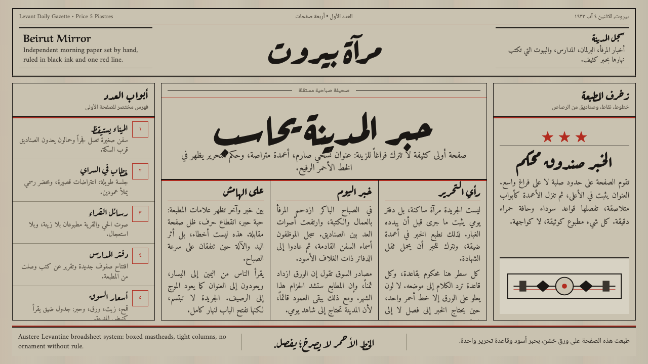 An-Nahar Beirut PressDense authority. Aged newsprint, black naskh columns, and one red rule hold t…
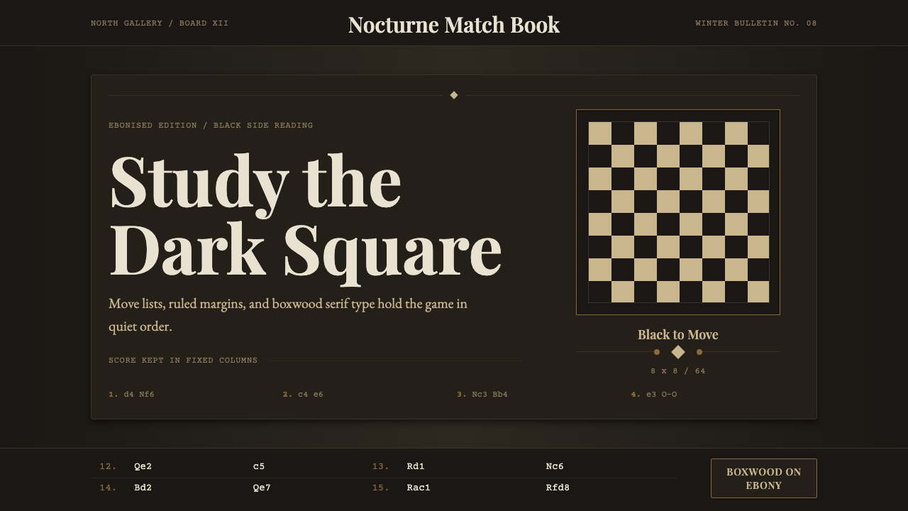 Chess TournamentQuiet intellect. Cream Playfair type, walnut rules, and notation glow on ebon…
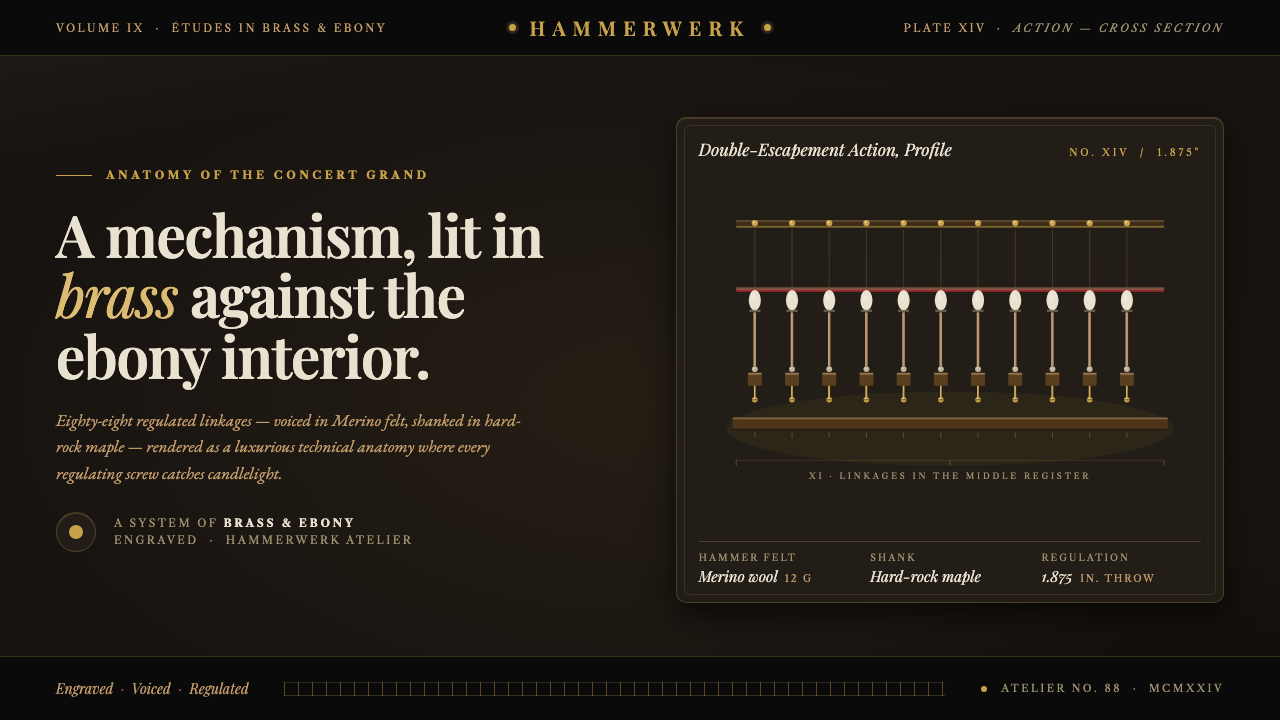 Grand Piano ActionMechanism as luxury. Brass screws and felt hammers lit out of ebony gloom, se…
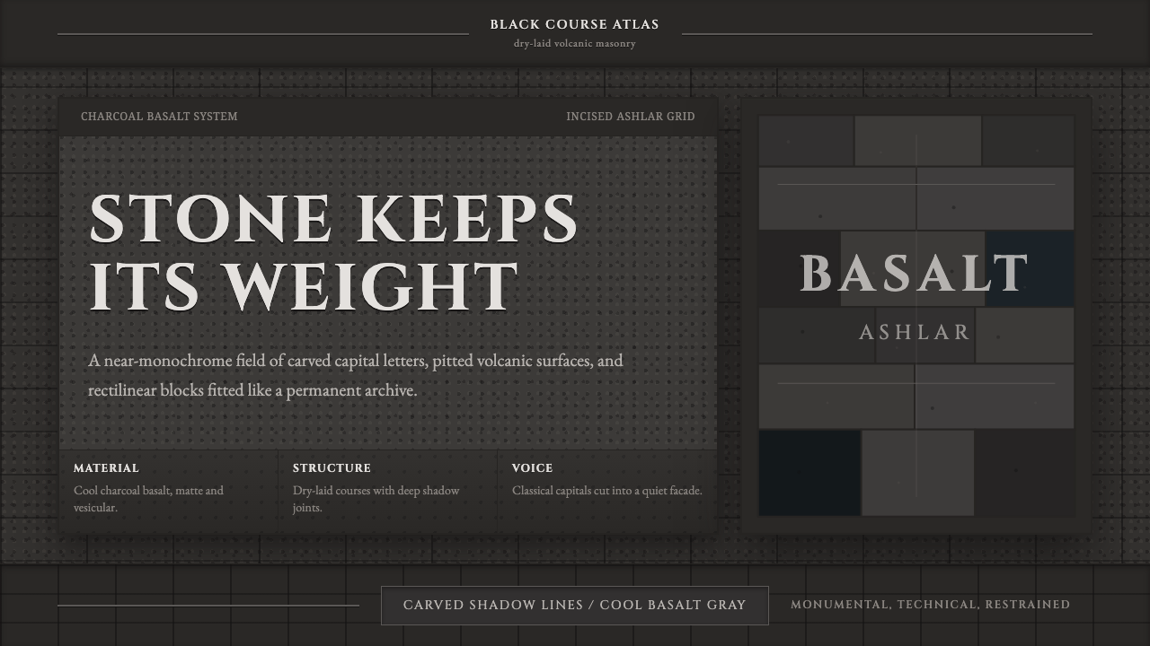 Hauran Basalt StoneMonolith refuses shine. Charcoal Cinzel capitals lock into dry-laid basalt gr…
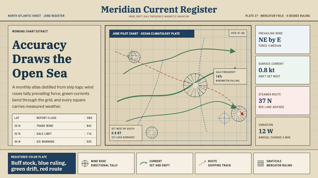 Ocean Pilot ChartAuthority by accumulation. Blue graticules and green currents crowd warm char…
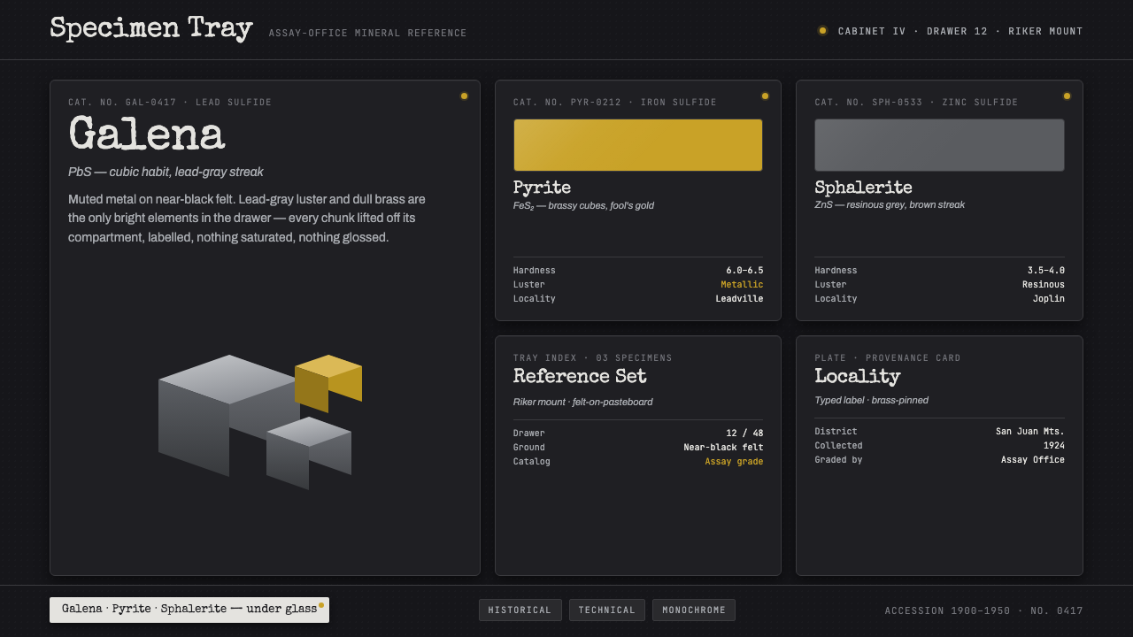 Ore Specimen TrayMuted metal does all the speaking. Lead-gray galena and brass pyrite lit on n…