What is Grand Piano Action?
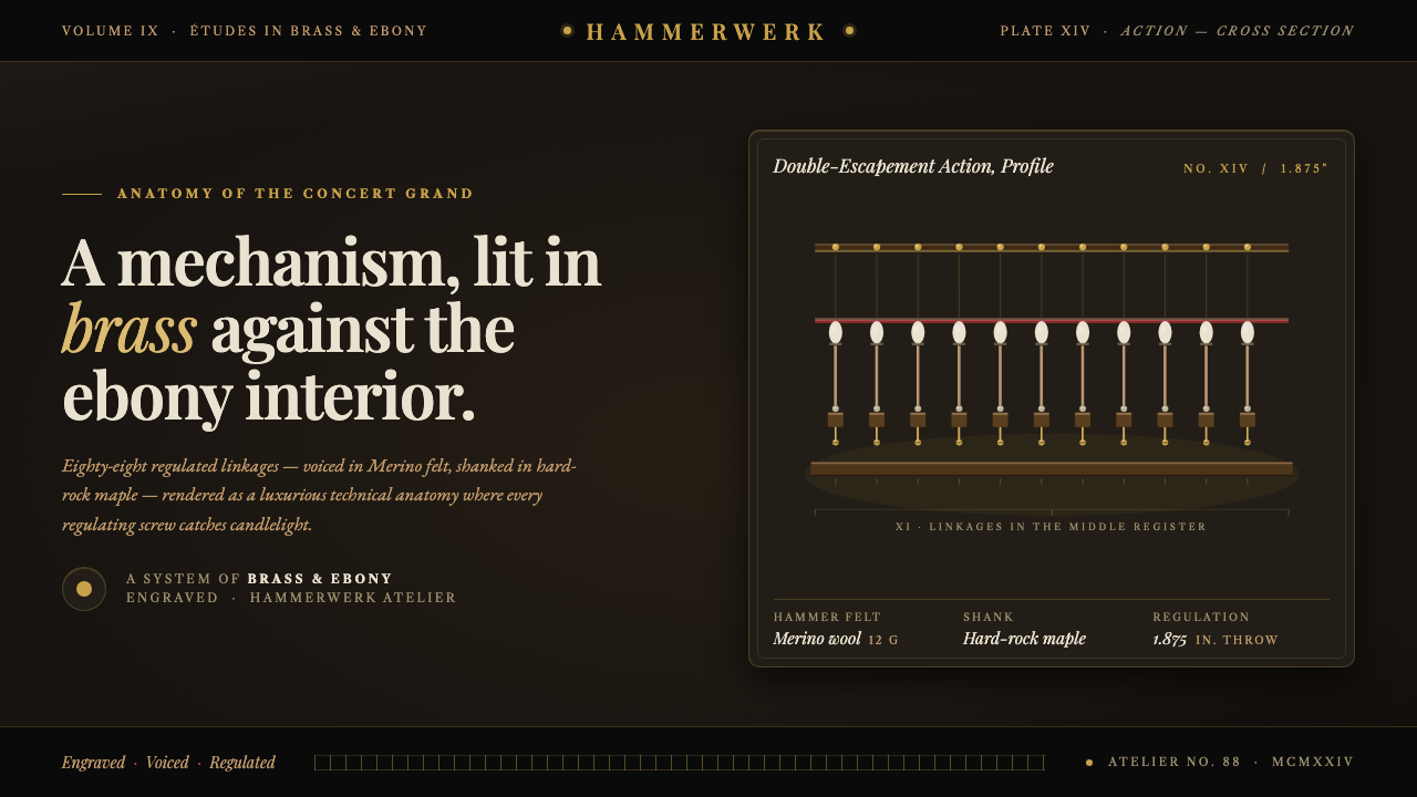
Grand Piano Action turns the hidden machinery of a concert grand into a vision of luxury — brass, felt, leather, and maple emerging with measured brilliance from ebony darkness.
Grand Piano Action in brief
Grand Piano Action is a dark visual style derived from the precision mechanism inside a concert grand piano. Rather than depicting the instrument as a polished silhouette or a symbol of performance, it enters the case and studies the action in cross-section: felt-and-leather hammers, warm hard-maple rails, brass regulating screws, and repeated linkages arranged in disciplined sequence.
Its central idea is mechanism as luxury. Refinement comes not from applied ornament but from exact construction, carefully chosen materials, and the promise that every small part has been adjusted by hand. Near-black grounds conceal most of the field, allowing pale felt, warm wood, and points of brass to appear as if revealed by a narrow inspection light. The result combines theatrical darkness with the authority of a technical plate.
The style translates the action's physical rhythm into information design. Repeated linkages become rows, timelines, tables, or aligned cards; regulating screws become precise highlights; rails become long structural dividers. High-contrast classical serif typography supplies the concert-hall dignity, while restrained supporting text preserves the clarity of an instrument diagram. It is elegant because it is exact, and dramatic because much of it remains in shadow.
Where does Grand Piano Action come from?
The style draws on the mature grand-piano manufacturing tradition of 1900–1950, when the Romantic concert grand developed into the modern precision instrument. Its cultural setting spans Western Europe and the wider European and American piano tradition, where musical ambition depended on an equally ambitious union of woodworking, metalwork, felt preparation, leatherwork, and mechanical regulation.
Inside the polished case, the action converts a player's touch into a controlled sequence of mechanical movement. The visual appeal lies in the contrast between repetition and minute variation: related components recur across the instrument, yet each must respond accurately within the larger system. Hard maple provides warm structural rails; felt and leather soften points of contact; brass regulating elements introduce concentrated glints within the darker assembly.
Steinway & Sons and the Steinway family figures named in this tradition — Heinrich Engelhard Steinweg and C. F. Theodore Steinway — represent the union of instrument engineering and fine cabinetry that informs the style. The relevant inheritance is not a single decorative school but a manufacturing culture in which the case, action, and acoustic purpose belong to one coordinated object. Polished ebony conceals the mechanism in ordinary use, making an opened or sectioned view feel both technical and privileged.
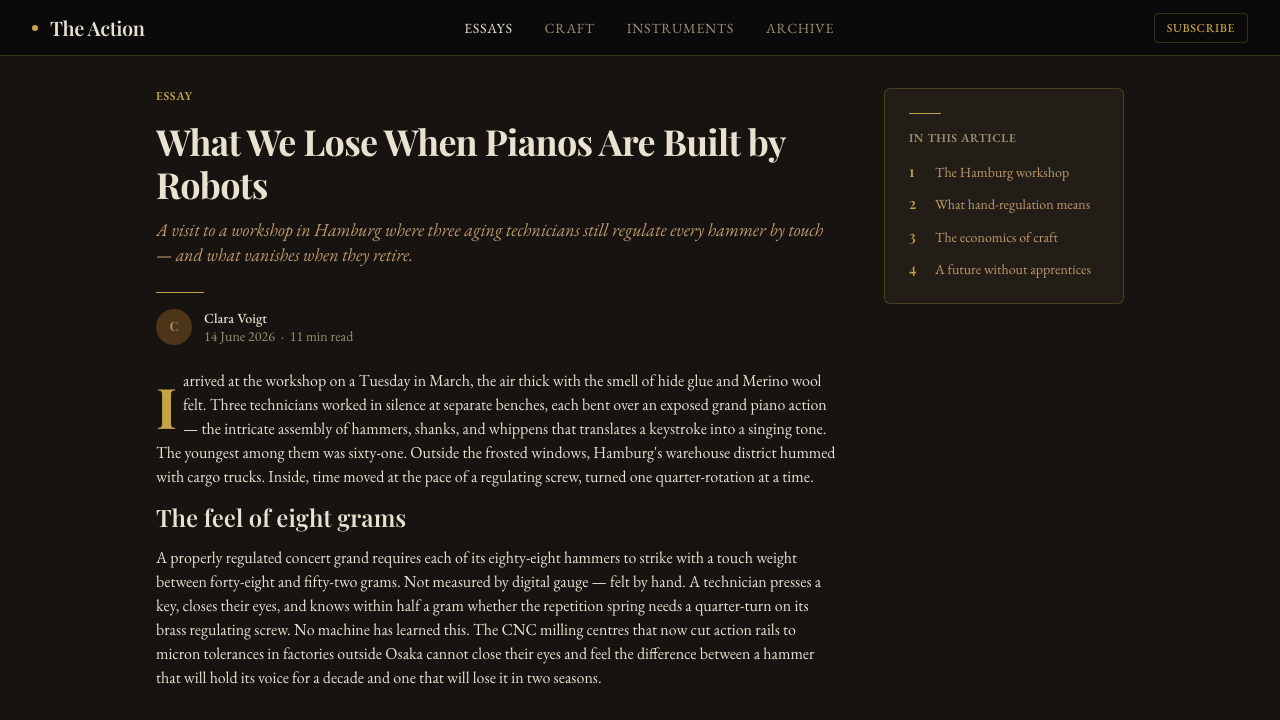
Grand Piano Action converts that privileged view into a contemporary design language. It treats the interior mechanism as an early-twentieth-century technical anatomy, preserving the deep case darkness, warm metallic highlights, pale hammer materials, and repeating mechanical cadence. The classical serif voice connects the system to concert culture, while the disciplined alignment of interface elements reflects the regulator's patient work: inspecting relationships, correcting small deviations, and bringing many moving parts into coherent response.
What defines the Grand Piano Action look?
Ebony Gloom
The dominant field is near-black, recalling the polished ebony case and the unlit cavity beneath it. Darkness is active rather than empty: it withholds secondary detail, isolates important components, and gives every illuminated edge a sense of rarity. Large quiet areas should remain genuinely dark instead of being filled with decorative texture.
Material Highlights
Warm brass, pale felt, leather, and maple form a compact material palette. Brass is reserved for small points of adjustment or emphasis; felt supplies soft luminous masses; maple introduces restrained warmth without turning rustic. These materials should remain distinguishable through tone and surface character, as though inspected under controlled workshop light.
Classical Serif Voice
High-contrast serif typography, exemplified by the Playfair character named in the source, gives the style its cultivated voice. Headlines may feel poised and ceremonial, with delicate transitions set against darker mass. Supporting copy should be quieter and highly legible, allowing the display face to suggest concert programs, engraved labels, and the dignity of a finished instrument.
Mechanical Rhythm
The repeating units of the piano action provide the compositional grammar. Elements align along rails, recur with measured intervals, and vary only when information requires distinction. Repetition should create anticipation rather than monotony: a sequence of related modules becomes compelling when one highlighted adjustment, active state, or exceptional datum interrupts the cadence.
Technical Anatomy
Layouts resemble sectional drawings more than ornamental luxury advertising. Labels, fine rules, ordered groups, and isolated components explain how a system relates internally. The anatomy remains selective: only relationships needed for understanding are exposed. This balance between explanation and concealment prevents the page from becoming either a sterile schematic or an atmospheric but unreadable image.
Controlled Illumination
Light behaves like a workshop inspection lamp or a narrow stage beam. It catches screw heads, felt edges, lettering, and the upper planes of rails while allowing surrounding structures to recede. Highlights should be concentrated and directional, never scattered everywhere. Luxury emerges from the deliberate decision about what the viewer is permitted to see.
Who shaped Grand Piano Action?
Steinway & Sons stands in the source as the defining maker associated with this mature concert-grand tradition. For the design style, the company represents a complete standard of craft rather than a logo reference: precision action work, refined case construction, and the expectation that concealed engineering deserves the same care as the polished exterior.
Heinrich Engelhard Steinweg is identified as a key figure in the manufacturing lineage behind the theme. His relevance lies in the tradition's union of skilled making and ambitious instrument building. Within Grand Piano Action, his name anchors the sense that mechanical refinement and fine cabinetry are interdependent aspects of one musical object.
C. F. Theodore Steinway appears in the source as another central figure in the Steinway tradition. In the visual narrative, he connects inherited craftsmanship with the mature precision culture of the concert grand. The style draws on that continuity by making small engineered relationships feel as significant as the instrument's imposing outer form.
The unnamed master regulators and voicers are essential figures because the action achieves its purpose through expert adjustment rather than assembly alone. They inspect touch, response, alignment, and tonal behavior across a repeated mechanism. Their work supplies the style's deepest metaphor: excellence is the cumulative result of many subtle corrections that ordinary viewers may never notice directly.
How do you use Grand Piano Action today?
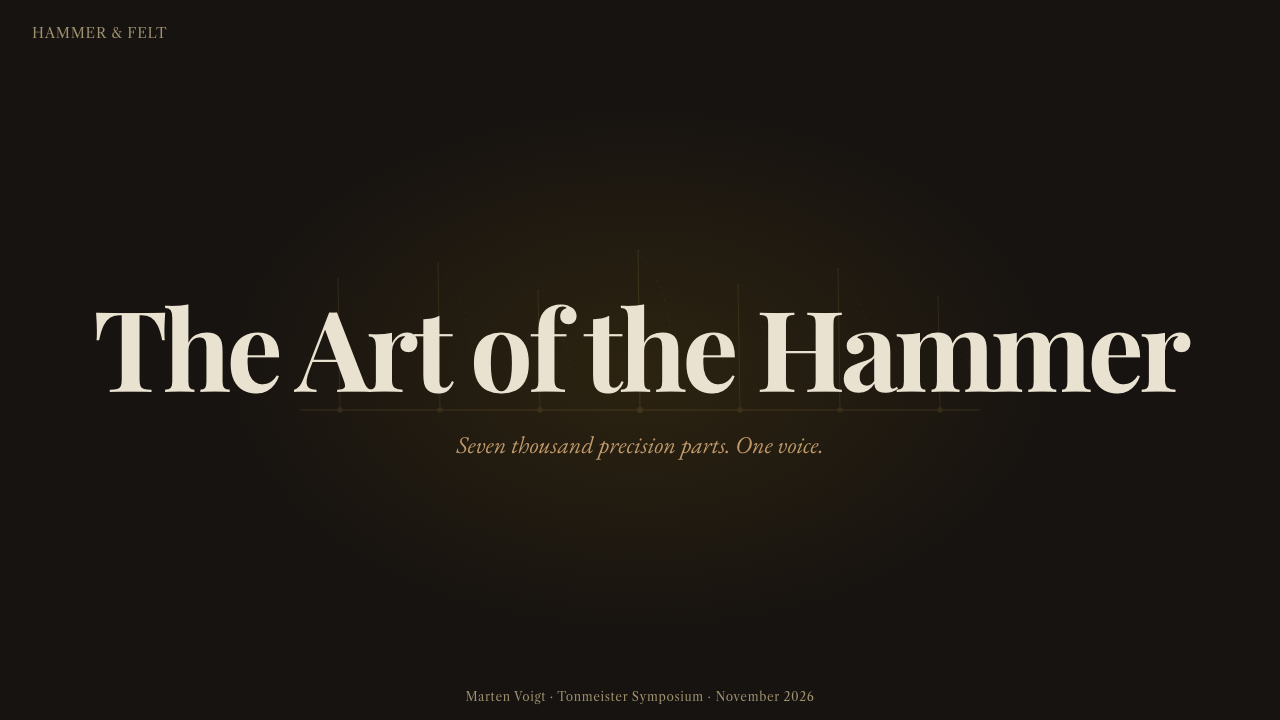
On presentation covers, Grand Piano Action works best as a controlled reveal. Let a near-black field dominate, then expose a cropped hammer, rail, or brass adjustment point beside a poised serif title. Content slides should inherit the action's orderly cadence through aligned text groups and restrained rules, allowing section titles to behave like engraved component labels rather than promotional slogans.
Data slides can translate the mechanism more literally. Repeated bars, markers, or timeline events may follow the rhythm of aligned hammers, while a warm metallic accent identifies the active series or critical finding. Keep most data pale and quiet against the dark field. The goal is not to disguise a chart as a piano, but to give analytical information the measured progression of a regulated action.
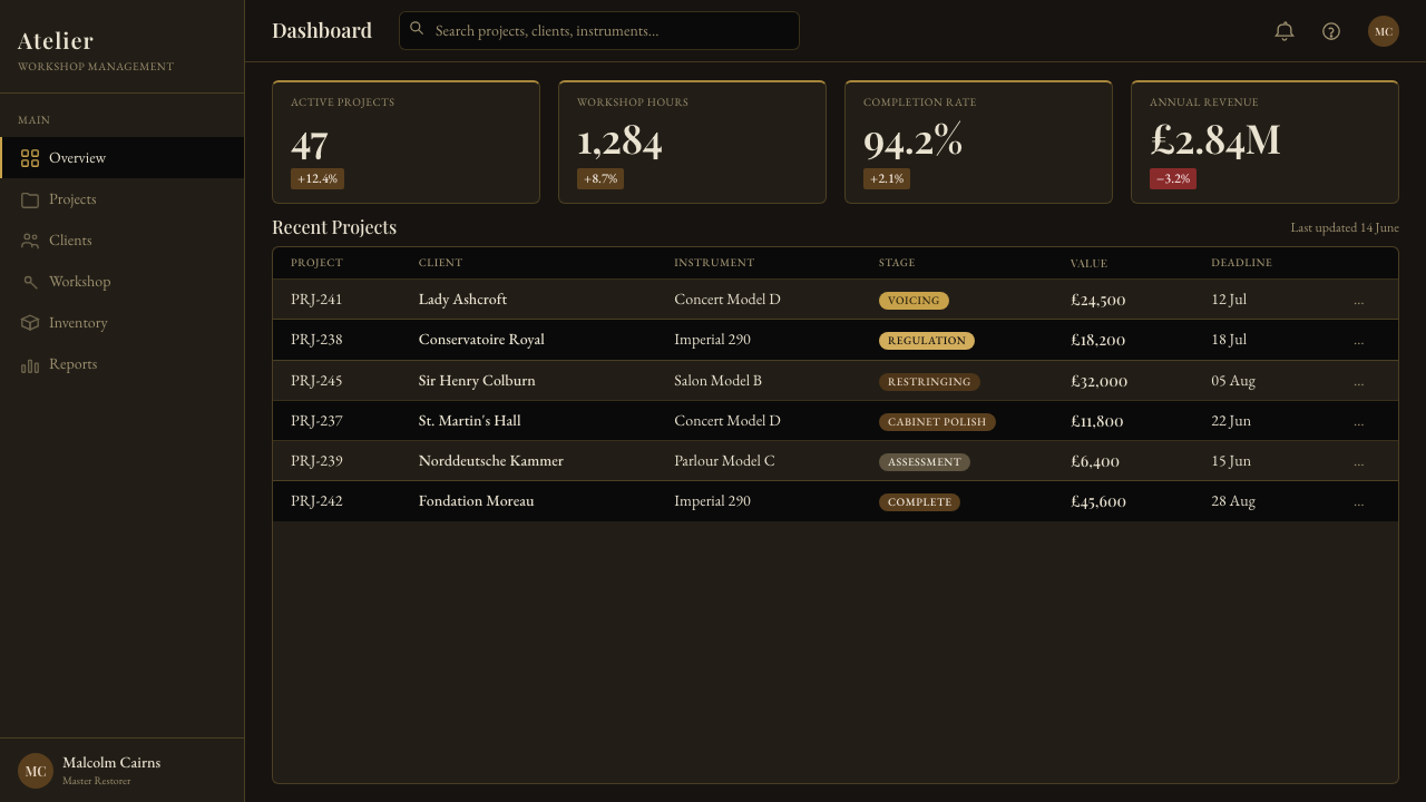
For web interfaces, the style suits premium dashboards, pricing pages, technical products, and services whose value depends on precision. Panels can resemble compartments within a dark instrument case, separated by fine rails and occasional warm highlights. Pricing tiers should be distinguished through hierarchy, material emphasis, and illuminated states rather than a noisy range of colors. Controls must remain clear even when the surrounding atmosphere is subdued.
Editorial and marketing layouts benefit from the tension between concealed structure and selective disclosure. A long article can alternate dark reading fields with sectional illustrations, annotations, and close material studies. Marketing pages may introduce a product as if opening an instrument: begin with silhouette and promise, reveal the internal system in successive sections, and reserve the brightest brass-like emphasis for proof, decisions, or calls to action.
The common mistake is to equate luxury with abundant gold, glossy effects, and decorative piano imagery. When every border shines and every panel imitates lacquer, the design becomes theatrical pastiche. Authentic Grand Piano Action is quieter: brass appears in small functional moments, serif typography remains disciplined, and darkness preserves hierarchy. The mechanism must organize the experience; it cannot survive as a superficial motif pasted onto an unrelated layout.
Grand Piano Action — FAQ
Is Grand Piano Action simply a piano-themed luxury style?
No. Piano imagery supplies the source, but the transferable system comes from the action itself: repeated components, aligned rails, selective highlights, material contrast, and expert regulation. A design can express the style without showing a complete piano. If its hierarchy feels mechanically coordinated and its luxury comes from precision rather than decoration, it remains faithful to the theme.
Why is the palette so dark?
The darkness refers simultaneously to the polished ebony case and the shadowed interior where the action is normally concealed. It also gives the design its method of attention: pale felt, warm maple, and brass become meaningful because they are scarce. A broadly illuminated layout would weaken the sense of discovery and flatten the hierarchy between structure and adjustment.
Can the style be adapted to a light background?
A light adaptation is possible, but it changes the emotional center. The original system depends on components emerging from an ebony-like cavity, so a pale field should resemble a technical sheet or workshop drawing rather than a bright lifestyle page. Preserve the ordered linkages, material distinctions, fine annotation, and concentrated warm accents so the mechanical identity survives the inversion.
What kinds of products suit Grand Piano Action?
It suits products that promise precision, cultivated expertise, or access to a complex system: analytical tools, premium technical services, musical or cultural platforms, specialist education, and carefully structured portfolios. It is less natural for contexts that require casual friendliness, playful spontaneity, or bright abundance. The style speaks with concentration and authority, so the product should benefit from those qualities.
How can designers keep the style readable without losing atmosphere?
Separate atmosphere from information. Darkness may surround and frame content, but primary text, controls, and data require stable contrast and predictable alignment. Use the dramatic serif voice mainly for headings, then let supporting text remain calm. Reveal fewer components with greater clarity, and treat brass-like emphasis as a regulating signal that guides attention rather than as a decorative finish.
Related design styles
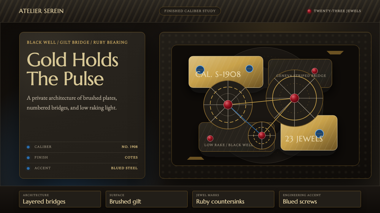 Watch MovementLuxury turns mechanical. Gilt stripes, ruby points, and blue accents glow on…
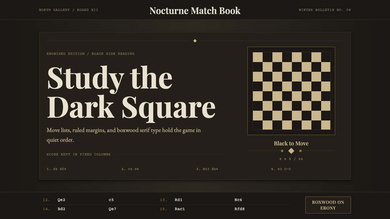 Chess TournamentQuiet intellect. Cream Playfair type, walnut rules, and notation glow on ebon…
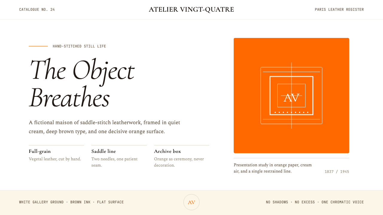 HermèsTwo centuries of restraint in orange. Brown serif on cream, gallery-quiet, ne…
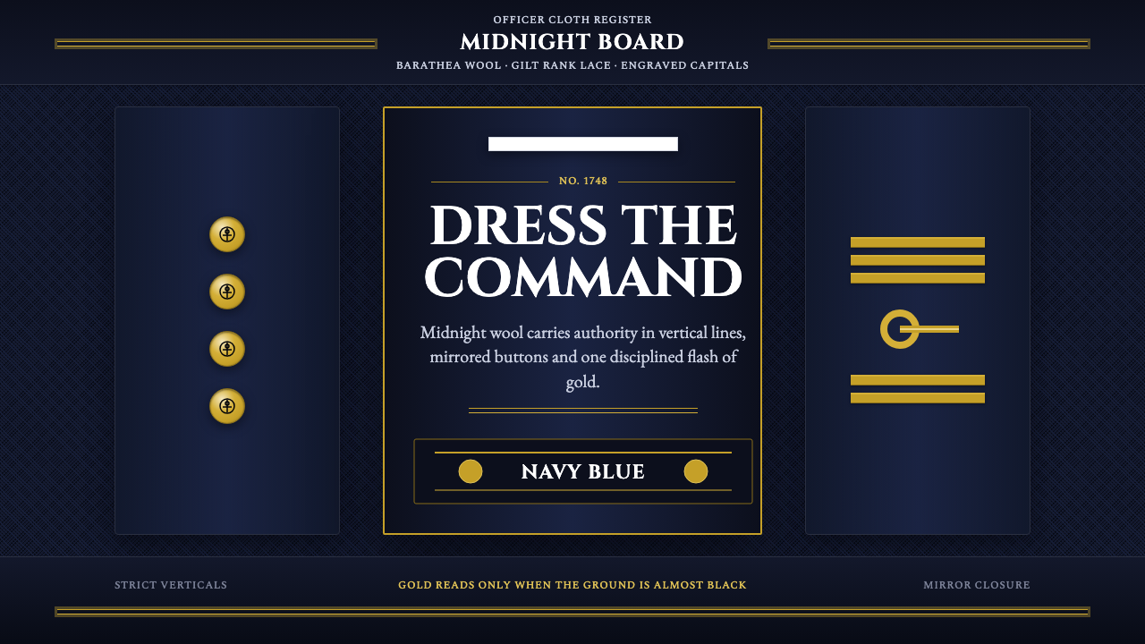 Naval Dress UniformAuthority in midnight wool. Cinzel capitals, gold lace and button symmetry ho…
 British Racing Green (Motorsport, 1907)Quiet authority at speed. Deep BRG, cream leather, walnut, and chrome hairlin…
 Dragonfly Wing VenationPrecision, nearly weightless. Cyan-grey veins rule a foxed paper taxonomy pla…