What is Ore Specimen Tray?
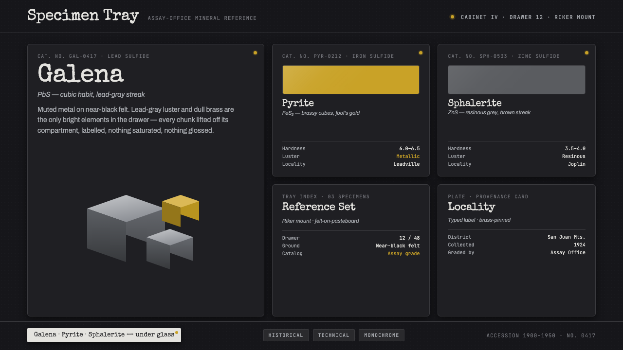
Ore Specimen Tray turns the quiet authority of an assay-office reference case into a dark interface where metallic evidence, not decoration, carries the eye.
Ore Specimen Tray in brief
Ore Specimen Tray is a dark technical style derived from an early-twentieth-century assay-office ore reference tray. Its essential image is a Riker-mount-like display: mineral specimens arranged beneath glass on matte felt, each paired with a small locality label. Cubic lead-gray galena, brassy pyrite, and resinous gray sphalerite establish the visual vocabulary. The ground stays deeply subdued so that luster, facets, and label surfaces become the active elements.
The style treats an interface as a specimen cabinet rather than a theatrical dark mode. Information is placed, identified, and observed. Every object should appear to have been selected for a practical reason: a record, a material sample, a classification, or a point of inspection. Spacious darkness does not imply luxury emptiness; it functions like the felt surrounding a specimen, giving the viewer enough visual silence to assess shape, surface, and provenance.
Its character comes from the tension between restrained presentation and highly specific material presence. Lead-gray reads as dense and mineral, dull brass as a contained point of discovery, and paper labels as human documentation inside a disciplined system. The result is catalog-grade rather than nostalgic: a style for interfaces that need to feel measured, collectible, and technically legible without becoming sterile.

Where does Ore Specimen Tray come from?
The source setting is the North American mining-district assay office and specimen cabinet of the period from 1900 to 1950. Ore was not presented primarily as interior decoration. A reference tray gave mineralogists, ore-graders, and collection curators a stable way to compare material: a dark support surface, separated specimens, and identifying notes that linked what was seen to where it had come from.
The Riker-mount presentation is central to the style’s logic. Matte felt creates a noncompetitive field beneath glass; it suppresses visual noise instead of trying to imitate a landscape or a mine. The enclosure turns each mineral into an observed object. Even before a viewer reads a label, the arrangement signals that these are specimens to be distinguished by surface, geometry, and relative luster.
Galena, pyrite, and sphalerite provide the documented material contrast. Galena contributes cubic lead-gray mass, pyrite contributes brassy highlights, and sphalerite brings a resinous gray sheen. This is not a broad metallic fantasy palette. It is a narrow set of mineral behaviors: dense reflection, muted glow, hard facets, and small changes in brightness against a nearly black ground.
When translated into digital work, the historical reference should remain a discipline rather than a costume. Typewriter-like labels, compartmental presentation, and dark felt-like restraint preserve the assay-office mood because they support identification and comparison. The design succeeds when the interface feels like a carefully maintained technical collection, not when it merely adds random mineral imagery or antique props.
What defines the Ore Specimen Tray look?
Near-Black Felt Ground
The background should feel absorptive, matte, and almost silent. It behaves like the felt inside a specimen tray: a support plane that makes materials above it easier to inspect. Avoid visual textures that announce themselves. The darkness is there to create contrast for mineral-like surfaces and labels, not to create atmosphere by itself.
Restrained Metallic Contrast
Lead-gray and dull brass carry the visual emphasis. Their value lies in different kinds of reflection: galena-like density versus pyrite-like glint. Keep bright material cues scarce and purposeful. A metallic accent should read as a specimen, status signal, or decisive interface action, never as a general wash spread across the page.
Specimen Separation
Elements need clear breathing room and compartmental logic. Cards, panels, and records should resemble individually placed samples rather than floating fragments. Separation can come from dark gaps, fine enclosure cues, or changes in surface value. The aim is not ornamental framing; it is to preserve the ability to compare one object with another.
Catalog Labels
Text should feel documentary: compact, exact, and attached to the thing it identifies. Typewriter-label character is useful when it conveys a field note or collection record, but the interface must remain readable before it becomes evocative. Metadata, locality, classification, and status should be calm companions to the primary object rather than competing headlines.
Real Surface Behavior
Materiality should be suggested through luster, facet, and muted contrast, not through glossy ornament. Galena appears weighty and planar; pyrite appears hard and brassy; sphalerite appears resinous and gray. These references encourage surfaces with discernible character while keeping the overall system dry, technical, and controlled.
Glass-Case Reserve
The implied glass cover introduces distance and care. It suggests that information has been preserved for inspection, not thrown forward for instant consumption. Use this reserve in hierarchy: reveal emphasis deliberately, keep secondary content subdued, and let important records feel protected by the system around them.
Who shaped Ore Specimen Tray?
Assay-office mineralogists anchor the style’s observational mindset. Their role, as reflected in the reference tray, is to make mineral material distinguishable through orderly presentation and identification. The digital translation should preserve that discipline: visible evidence first, decorative interpretation second.
Ore-graders represent the practical, comparative side of the source material. A tray is useful because differences can be seen side by side: density, luster, form, and label context. Interfaces borrowing the style should likewise make comparison effortless and avoid effects that blur distinctions.
Riker-mount collection curators embody the presentation system itself: specimens are held, separated, labeled, and kept legible under glass. Their relevance is not a decorative antiquarianism. It is a model for how an interface can make a collection feel maintained, inspectable, and trustworthy.
How do you use Ore Specimen Tray today?
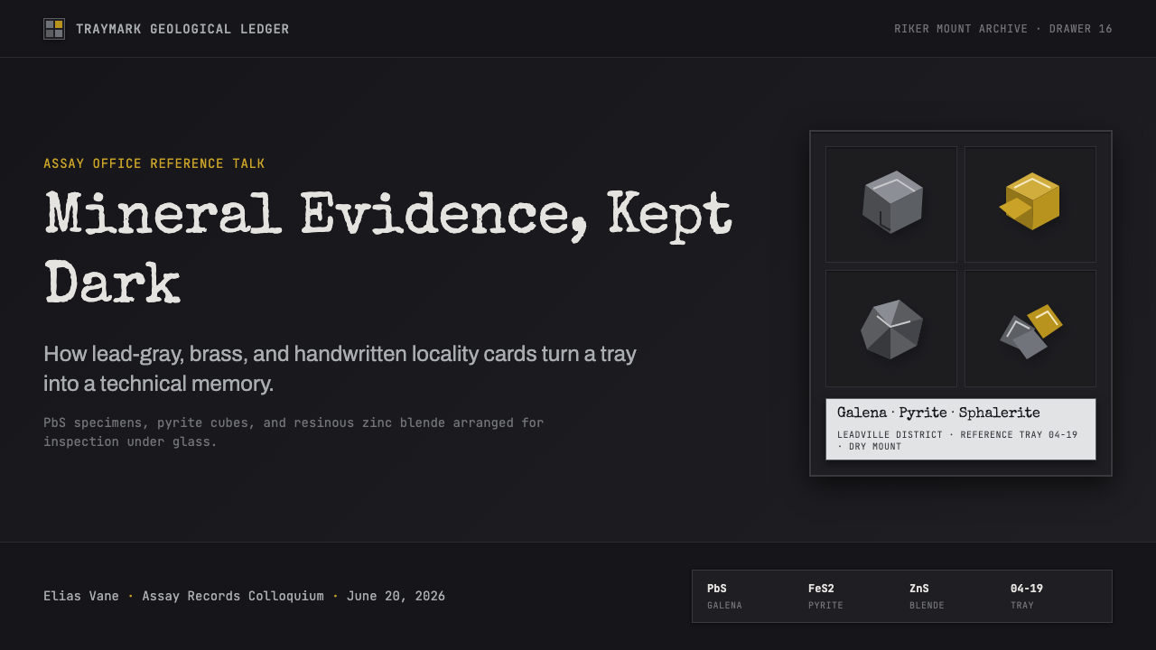
For presentation covers, use the style as a controlled display case. Let a single mineral-like form, a lead-gray mass, or a restrained brassy signal establish the focal point against a nearly black field. The title should read like the principal catalog entry: direct, sharply placed, and supported by only the metadata that matters. Resist filling the cover with decorative geology.
Content slides work best as organized trays. Give each idea its own bounded area, pair headings with short documentary labels, and use surface contrast to distinguish active evidence from supporting context. On data slides, charts should feel like specimens being compared: the important series receives the metallic emphasis, while the surrounding structure stays quiet enough for the viewer to judge differences without distraction.
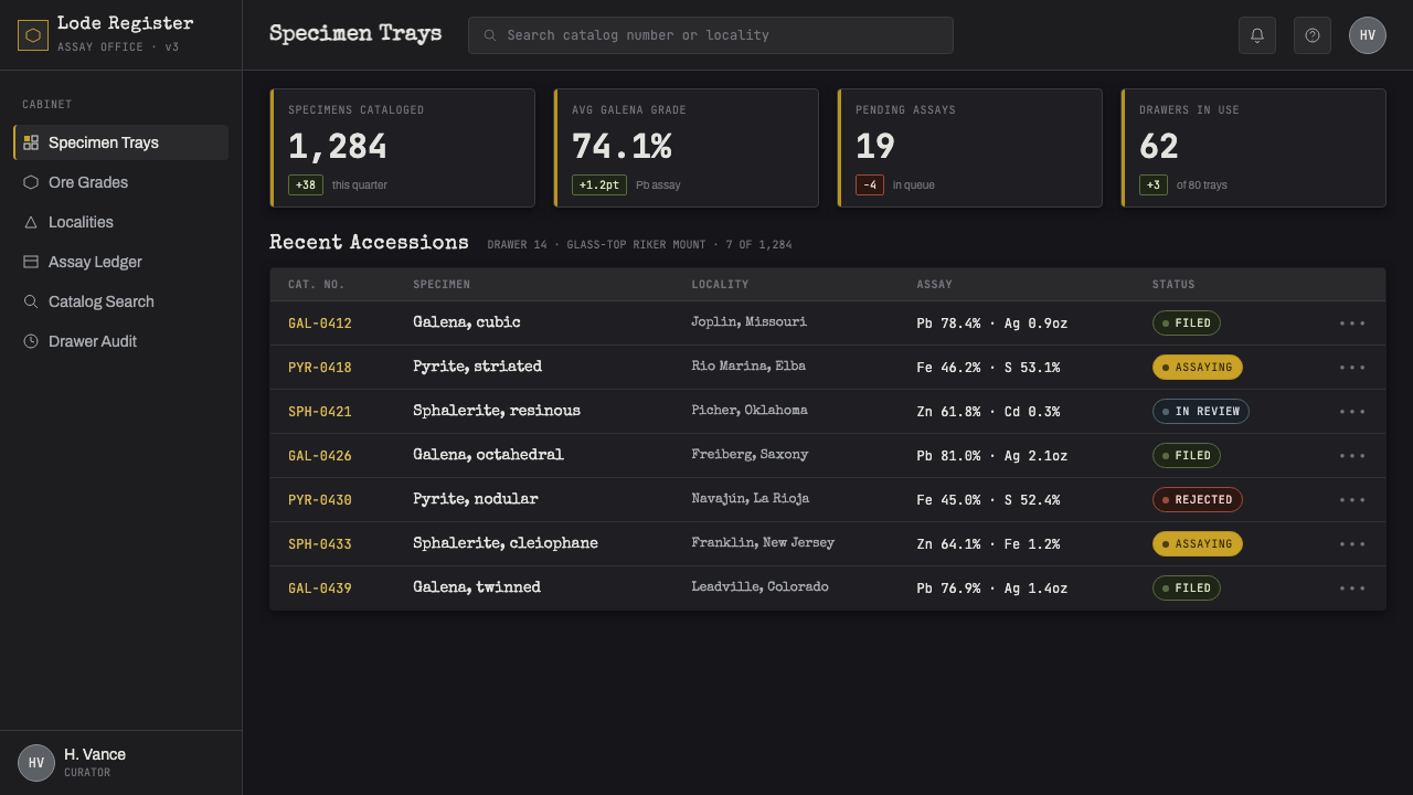
For web interfaces, Ore Specimen Tray suits dashboards, monitoring views, technical collections, and pricing pages where users need confidence in the system’s order. A dashboard can treat key metrics as selected samples, with lesser readings held back in the dark field. A pricing page can use brass-like emphasis for the recommended path while keeping plan details cataloged, separated, and easy to scan.
Editorial and marketing work should use the style to create authority through evidence. An article can place a lead image or principal statement like a specimen under glass, then use compact labels for source context and navigation. Marketing pages benefit when product details feel collected and examined rather than shouted. The dark ground is especially effective for material, industrial, archival, or analytical subjects.
The common mistake is mistaking the style for generic black-and-gold luxury. Its brass note is dull, mineral, and selective; its lead-gray is technical rather than glamorous. Excessive shine, abundant ornament, ornate typography, or unrelated crystal imagery breaks the assay-office logic. If every surface is bright, nothing feels like a specimen; if every panel is dramatic, the catalog loses its authority.
Ore Specimen Tray — FAQ
Is Ore Specimen Tray simply a dark industrial style?
No. Industrial darkness can be broad, rough, or machine-forward. Ore Specimen Tray is narrower and more archival. Its reference is the assay-office collection tray: matte felt, enclosed specimens, handwritten or typewriter-like identification, and a limited set of mineral surface behaviors. The desired feeling is careful inspection, not factory spectacle.
Should every interface use metallic accents?
No. Metallic contrast works because it is exceptional against the dark field. Reserve it for the selected specimen, a meaningful state, a recommended choice, or a genuinely important data point. Most surrounding elements should remain quieter, so the user can understand why the emphasized object has earned attention.
Can the style include photography or product imagery?
Yes, when imagery is handled as a specimen. Crop for material evidence, isolate a surface or form, and pair it with concise identifying context. Images should appear collected and examined rather than used as expansive scenery. A photograph that competes with every label and panel weakens the reference-tray structure.
Where does this style work poorly?
It is less suitable where the product needs immediate warmth, playful abundance, or an open social atmosphere. The dark field and reserved catalog logic can feel distant if the experience depends on spontaneity or softness. It works best when users benefit from concentration, comparison, material credibility, and a sense that records are being kept with care.
Related design styles
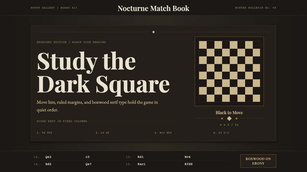 Chess TournamentQuiet intellect. Cream Playfair type, walnut rules, and notation glow on ebon…
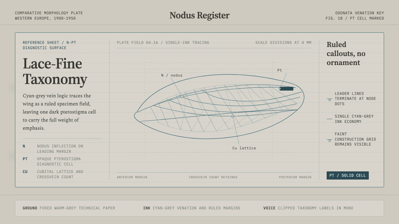 Dragonfly Wing VenationPrecision, nearly weightless. Cyan-grey veins rule a foxed paper taxonomy pla…
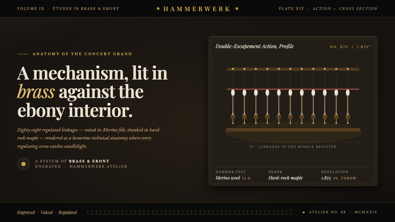 Grand Piano ActionMechanism as luxury. Brass screws and felt hammers lit out of ebony gloom, se…
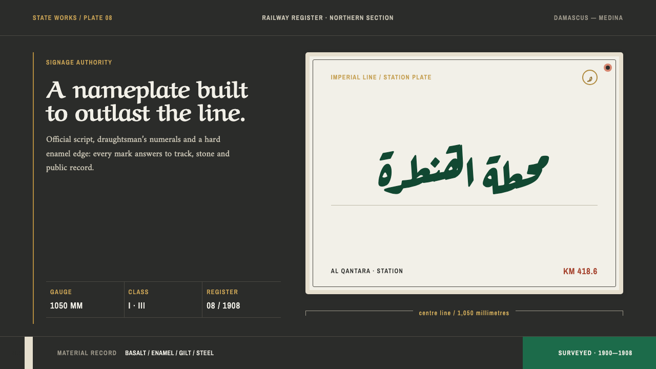 Hejaz Railway SignageState engineering, bolted down. Locomotive green enamel meets basalt rules an…
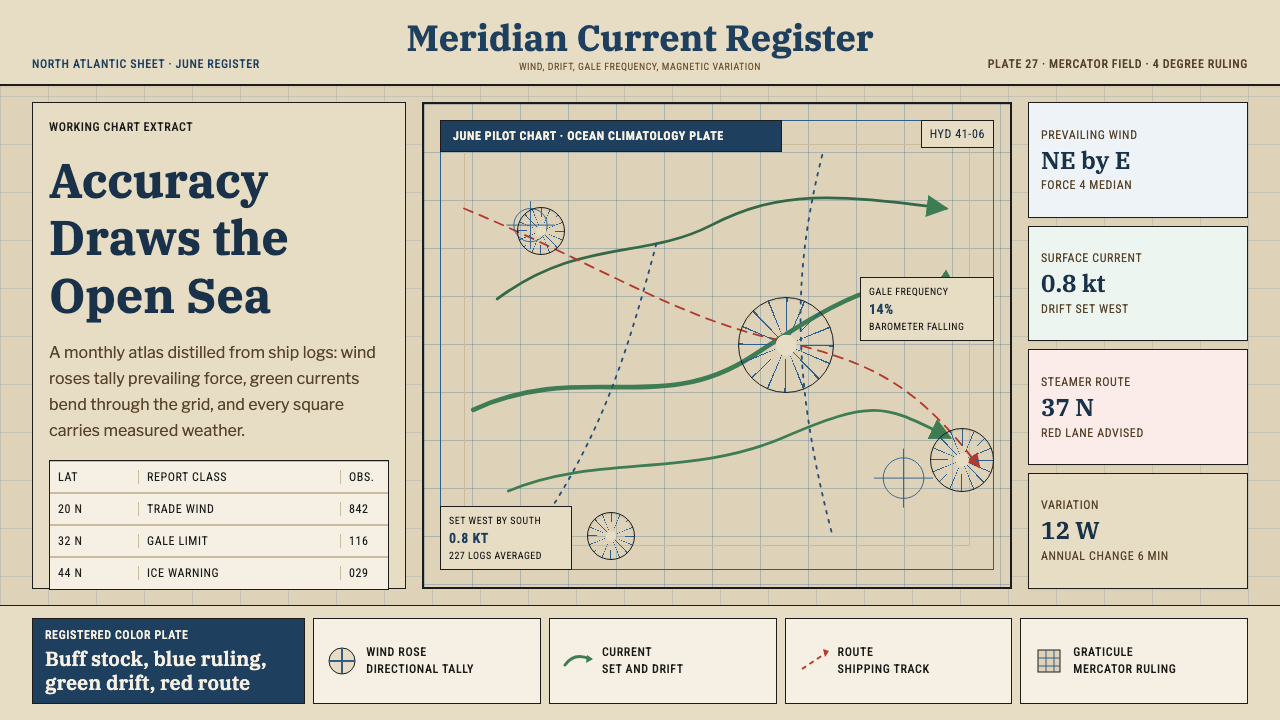 Ocean Pilot ChartAuthority by accumulation. Blue graticules and green currents crowd warm char…
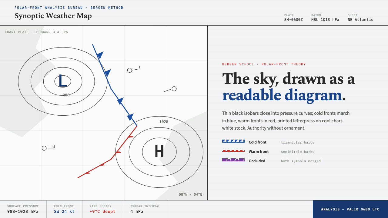 Synoptic Weather MapThe sky as a readable diagram. Black isobars, blue cold fronts, red warm fron…