What is Signal Box Lever Frame?
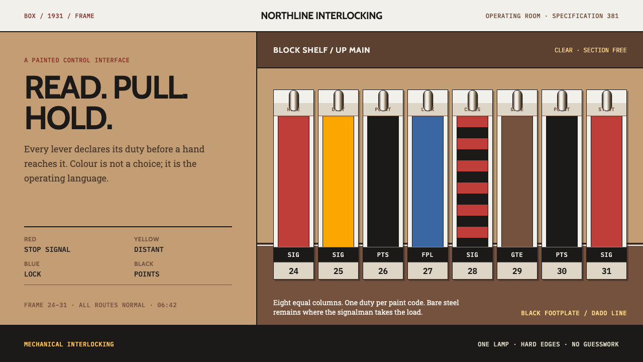
A British signal box is an interface built from paint and steel — a frame of levers where every colour carries a consequence and a signalman can read the whole board at a glance, in the dark, and pull.
Signal Box Lever Frame in brief
Signal Box Lever Frame is a design style drawn from the operating room of a British mechanical signal box. The room is painted brown up to dado height, a pale stone colour above, and white at the ceiling. A frame of levers stands on a black footplate, and each lever is painted for what it does. Red stops a train. Yellow is a distant signal. Black throws points, blue locks them, and brown works the gates.
The look that results is rule-based and unmistakably functional. Colour is not mood or branding but a code, a hard-ruled painted frame in which each hue carries a defined consequence. The signalman reads the frame in the dark, under a single lamp, and acts on it. Nothing is there for decoration. The visual language is the language of an instrument: clear, orderly, and built so that the wrong lever is hard to mistake for the right one.
One detail stands out as the style's signature. The handles are never painted. They are left as bare polished steel, worked through a cloth so that sweat cannot rust them. The one part of the interface that people touch is the one part that is left raw, bright and tactile. Everywhere else, colour tells you what a thing is; on the handle, metal tells you where your hand goes.
Where does Signal Box Lever Frame come from?
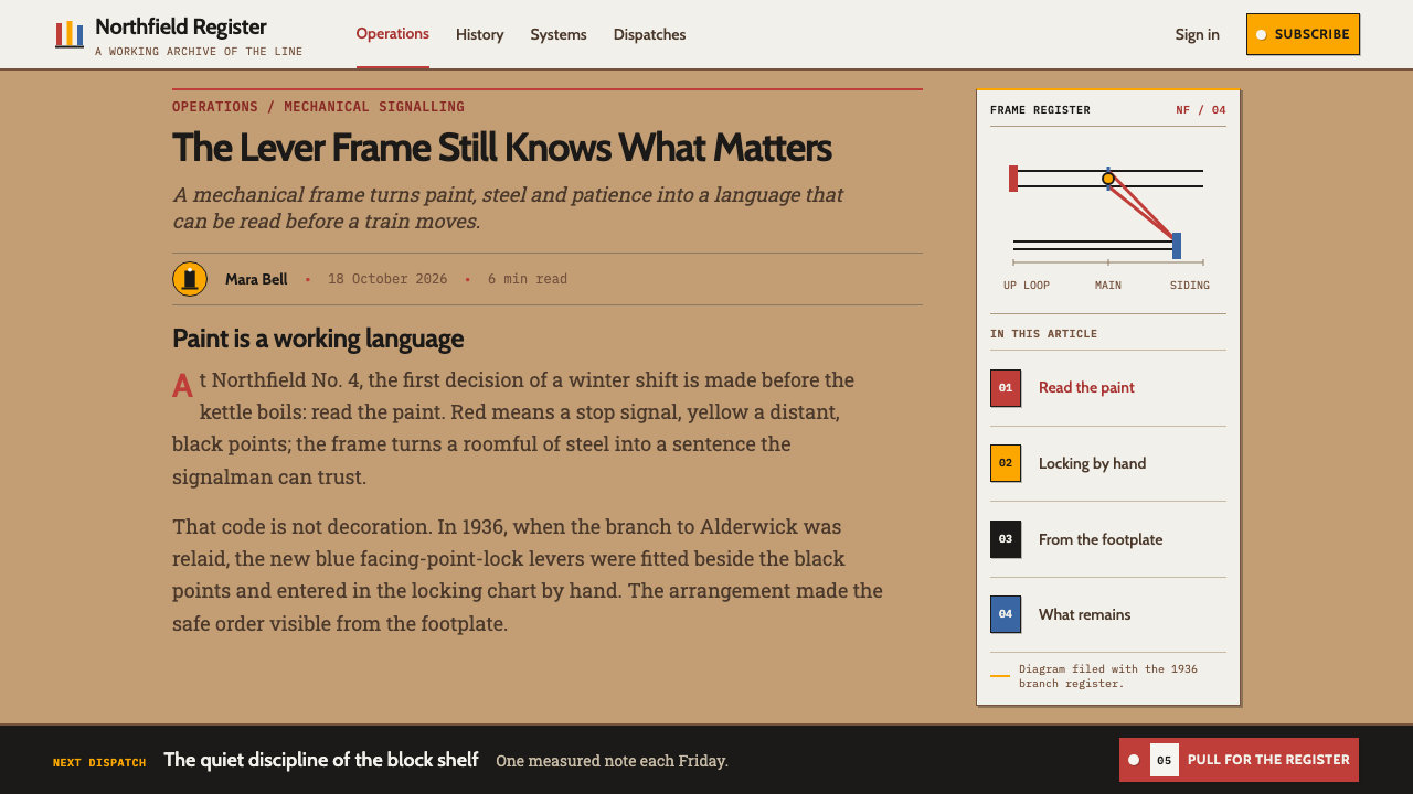
The style belongs to Great Britain and to the railway companies the source names: the Great Western, the London and North Eastern, the London Midland and Scottish, and the Southern. Its period is 1900 to 1950, the age of mechanical interlocking, when signals, points and gates were worked by hand through rods and wires from a lever frame. The source also dates one important element, the 1931 interior paint scheme associated with the Great Western Railway.
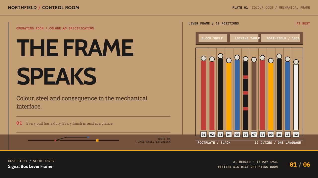
That scheme gave the room an official palette. The walls were split at dado height, brown on the lower half and a light stone colour above. The stone colour is described as a mix of yellow oxide and white lead in linseed oil, said to have been matched to Cotswold stone. Ceiling and window frames were white, and the lever frame stood on a black footplate. The levers themselves were numbered from left to right and coloured by function: red for stop signals, yellow for distant signals, black for points, blue for locking, brown for gates and white for spares.
Levers that did two jobs were painted in stripes. On the Great Western, the source records, those were red and black in equal bands. The point of all this colouring was legibility: a person who was tired or working at night had to be able to find the right lever without thinking. Behind the frame lay the logic of mechanical interlocking, the principle that levers lock each other so that conflicting movements cannot be set up. The dog chart is the record of that locking, a diagram of which levers hold which.
Around that practical core grew a tradition of standardised colour and plain lettering. The source lists British Standard 381C railway colours, which turned paint colours into specified references, and a broader tradition of British railway signage typography, in which Eric Gill, Jock Kinneir and Margaret Calvert are named. The Curio system draws on that whole inheritance: a numbered, functional palette, hard-ruled structure, plain sans-serif lettering and a single unpainted, polished-steel exception where the hand meets the machine.
What defines the Signal Box Lever Frame look?
Colour as Consequence
Every lever colour has a defined meaning: red stops a train, yellow is a distant, black throws points, blue locks them, brown works the gates, and white is spare. Colour is therefore a code, not a mood. In an interface this means choosing a small set of hues, assigning each a fixed role, and never reusing them for decoration. If a colour appears, it must tell the reader what will happen if they act.
The Dado Line
The room is divided horizontally at dado height: a brown lower half and a light stone upper half, with a white ceiling above. This banding gives the whole composition a calm, grounded structure. It translates directly into layouts that split a page into a darker, working lower zone and a lighter upper zone, with a clean horizontal line marking the transition.
Hard-Ruled Frame
The levers stand upright in a row, on a black footplate, numbered from left to right. Everything is a straight line or a fixed angle, including the track diagram that faces the operating position. There are no curves for their own sake. The frame is a grid made physical, and it asks the designer to use rules, uprights and consistent intervals instead of soft containers.
Striped Dual-Role Markers
When a lever does two jobs it is painted in two colours, as equal alternating bands. The idea of striping to show combined meaning is a useful visual device: it shows states that belong to two categories at once without inventing a third colour. Stripes should be regular and bold, so that the combination is read instantly.
Bare Polished Steel
The handles are the one unpainted element, left as bright polished steel and handled through a cloth so that sweat cannot rust them. In design this is a rule about affordance: the thing you touch is visibly different from the thing you read. Use a neutral metallic or high-contrast treatment for the interactive part, and keep colour for the labels around it.
Waxed Wood and Instruments
Overhead sit the block instruments in waxed wooden cases, warm and finished, in contrast to the cold steel of the frame. Together with the plain railway lettering used for labels, they supply the room's second material voice: tactile, slightly aged and orderly. Warm wood tones belong in the supporting palette, not in the colour code itself.
Who shaped Signal Box Lever Frame?
Gill is named in the source for the tradition of British railway lettering. An English letter-cutter and typeface designer, he is associated with the clear, humanist sans-serif forms that shaped how railway names, notices and timetables looked. For this style he stands for the idea that plain letters, carefully proportioned, can carry authority without ornament.
Kinneir is one of two designers named for British railway signage typography. He belongs to the later chapter of the same tradition, concerned with making public instructions legible at speed and from a distance. His relevance to the signal-box style is conceptual: the shared conviction that a sign or label should be understood at a glance, without effort.
Calvert is named alongside Kinneir as the other half of that signage partnership. Together they represent a design culture in which lettering and symbols are tested against real conditions of use: speed, distance, poor light. The signal box applied the same logic in paint and steel years earlier. Her name anchors the typographic side of the style's heritage.
How do you use Signal Box Lever Frame today?
Signal Box Lever Frame suits interfaces where colour has to mean something: operations consoles, status and monitoring dashboards, permission and workflow systems, admin tools, logistics and transport products, and any technical product with states that a user must tell apart quickly. It is a light-ground style, with a banded wall and a stone-coloured upper field, and it prefers clarity to atmosphere.
For presentation slides, a cover can echo the room: a brown lower band, a pale stone upper field, a thin white ceiling line, and a row of vertical coloured levers standing on a black base as the key graphic. Content slides can use the dado line to split heading and working area. Data slides can treat bars as levers, each coloured by function, with a legend that spells out what each colour means, so the chart reads as a control panel.
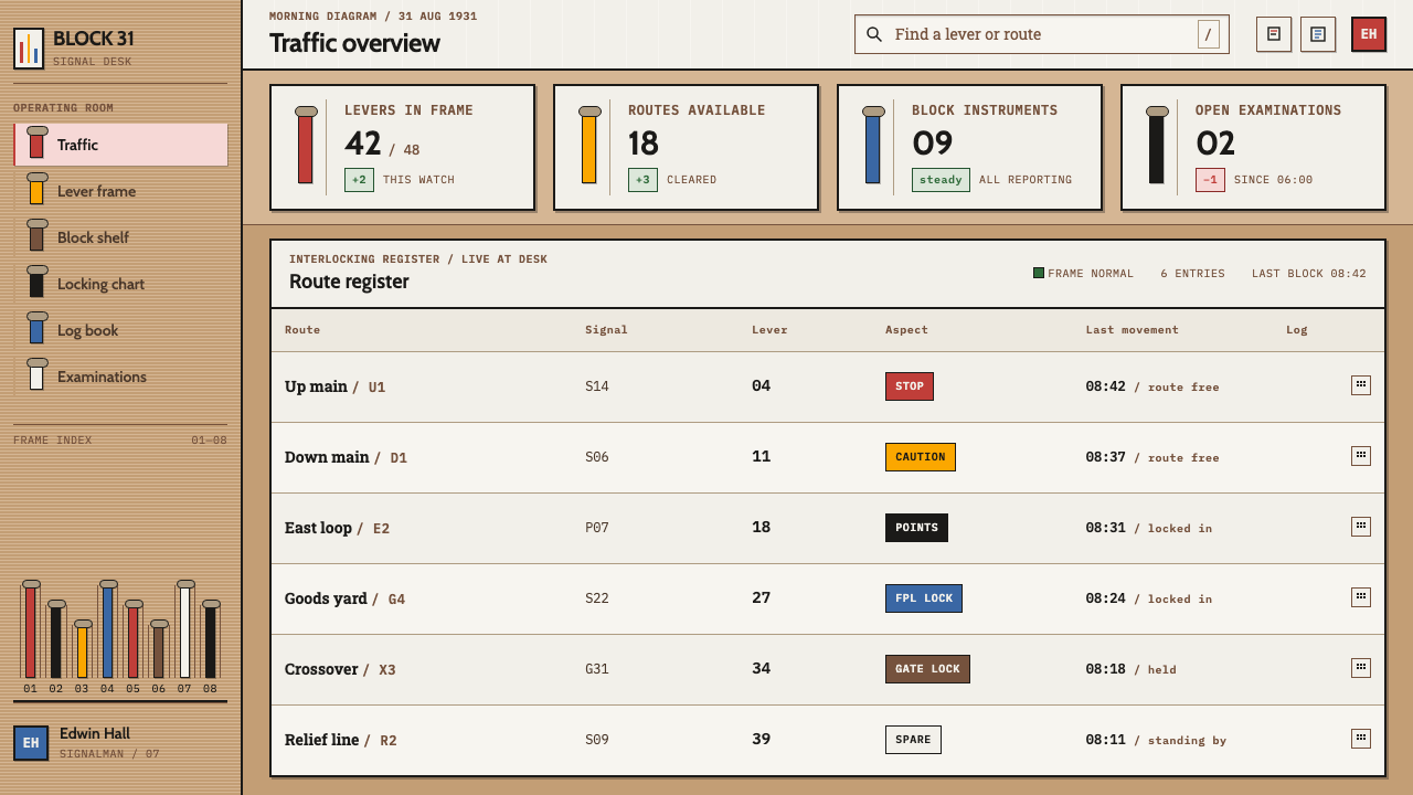
For web interfaces, define a small semantic palette and hold to it: red for stop or destructive, yellow for warning or advance notice, blue for locked or protected, black for switching, brown for access, white for spare. Build dashboards around a ruled frame of controls with fixed intervals, and keep the interactive handles in a neutral metallic treatment. Pricing or plan pages can use numbered lever columns, each plan identified by a single code colour and a plain label.
For editorial and marketing work, set short, plain statements in a clear sans-serif, and use the track-diagram idea for infographics: straight lines, fixed angles and labelled junctions. Explainers about systems, safety or process can pair a banded page structure with a colour key. Photography of enamel, steel and wood in warm light supports the tone. The voice should be factual and procedural, like a notice at the foot of the frame.
The most common mistake is to treat the palette as a pleasant retro set and use red, yellow, blue and brown as decoration on every surface. That empties the code of meaning, because a colour that is everywhere tells nobody anything. A second mistake is painting the handles, removing the one place where bare metal marks the touch point. A third is softening the frame with curves, glows and gradients, which loses the sense of a hard-ruled instrument. Fewer colours, fixed meanings, and clear legends are the discipline.
Signal Box Lever Frame — FAQ
What do the lever colours mean?
In the scheme the source describes, red is a stop signal, yellow is a distant signal, black throws points, blue locks them, brown works the gates, and white is a spare lever. Levers with two functions are striped in two colours. The key idea for design is that each colour has one fixed job, so the palette works as a code rather than as decoration.
What is a dog chart?
It is the record of the locking in a mechanical interlocking system: a diagram of which levers lock which, so that conflicting movements cannot be set up. The source lists it with mechanical interlocking among the movements behind the style. In design terms it points to a structure in which actions are constrained by clearly stated rules, and the interface makes those rules visible.
Why are the handles left unpainted?
Because they are worked through a cloth, and bare polished steel does not rust from sweat the way an unprotected surface might. As a design principle it separates the thing you touch from the thing you read. Colour labels the lever; metal receives the hand. Keep that distinction and the interface becomes easier to scan and to operate.
Can the style work in dark mode?
It can, because the original frame was read under a single lamp and the footplate is black. But the source classifies the style as light, with a brown lower wall and a pale stone upper field. A dark variant should keep the colour code and the hard-ruled frame intact, and keep the handles bright, so that the meanings of the colours survive the change of ground.
Where does the style struggle?
It struggles where softness, ambience or luxury is the aim: lifestyle brands, wellness products, storytelling pages that rely on atmosphere. A strict colour code and a hard-ruled frame can feel severe in those settings. It is strongest where users must make fast, correct decisions, and weakest where the goal is to relax them.
Related design styles
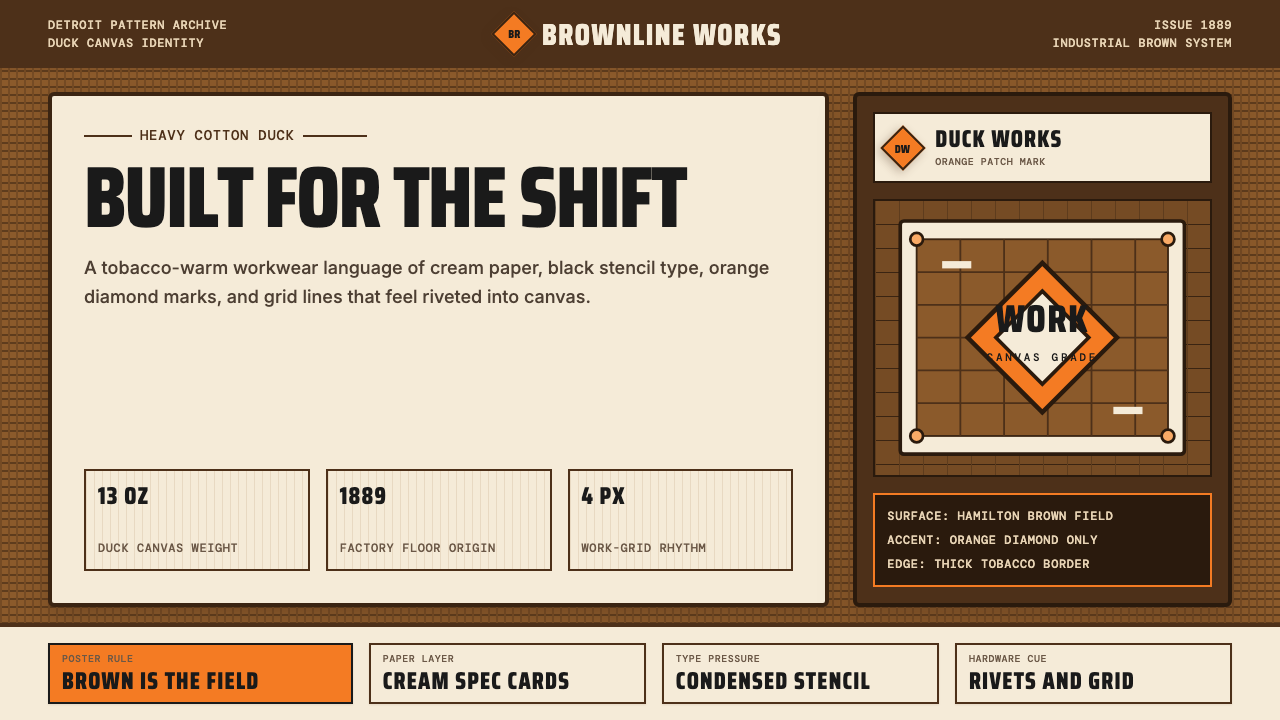 Carhartt Work Jacket Brown (1889)Built like work. Hamilton brown, orange diamond, and condensed type carry can…
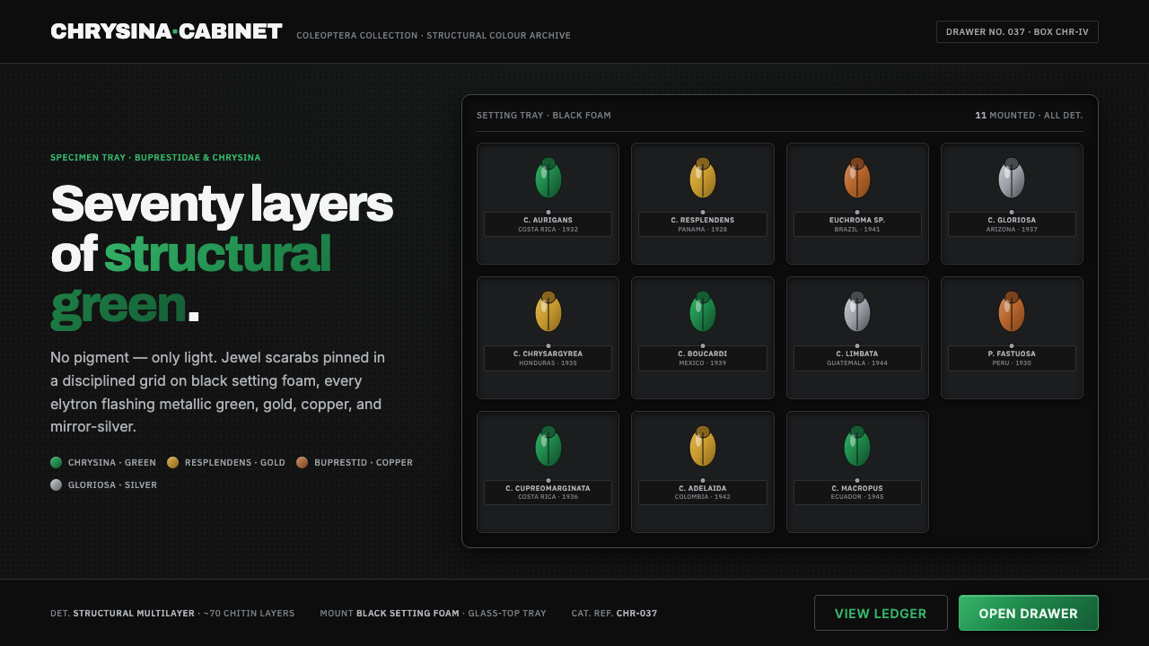 Iridescent Scarab DrawerOrder makes the shimmer read. Jewel scarabs pinned in a grid on black foam, m…
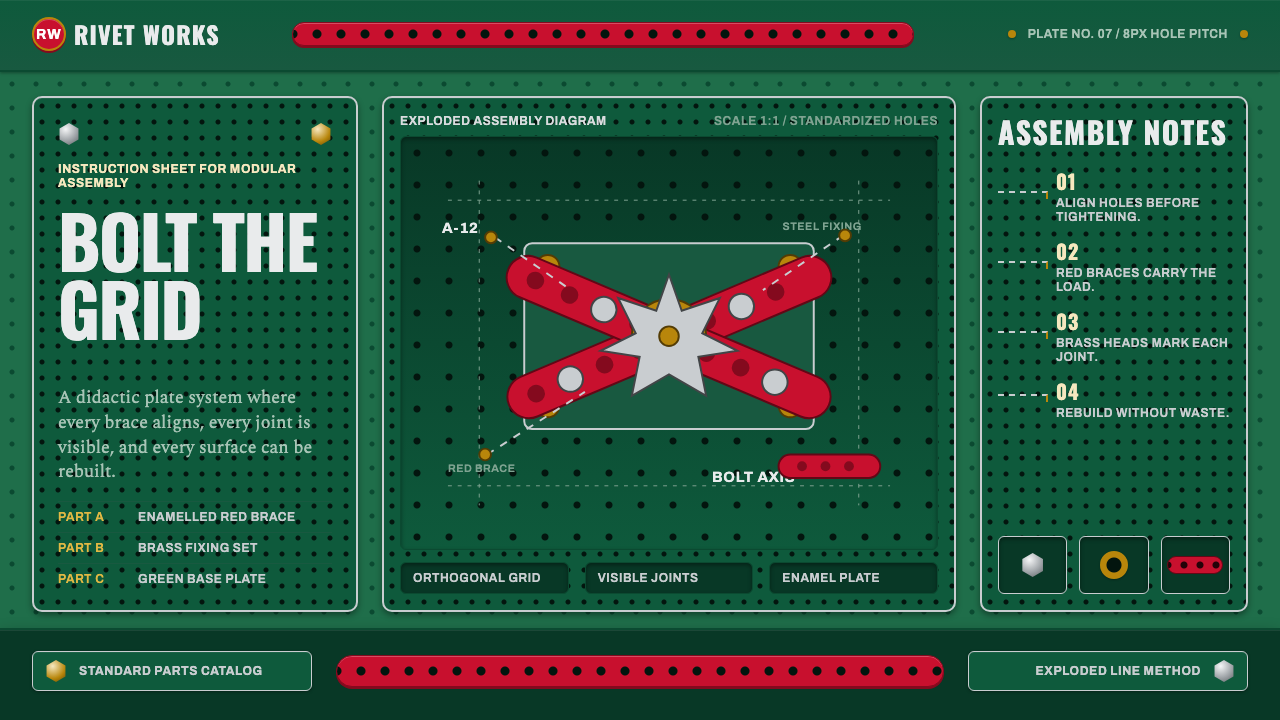 Meccano Erector SetEngineering becomes tactile. Red perforations and brass bolts lock to a green…
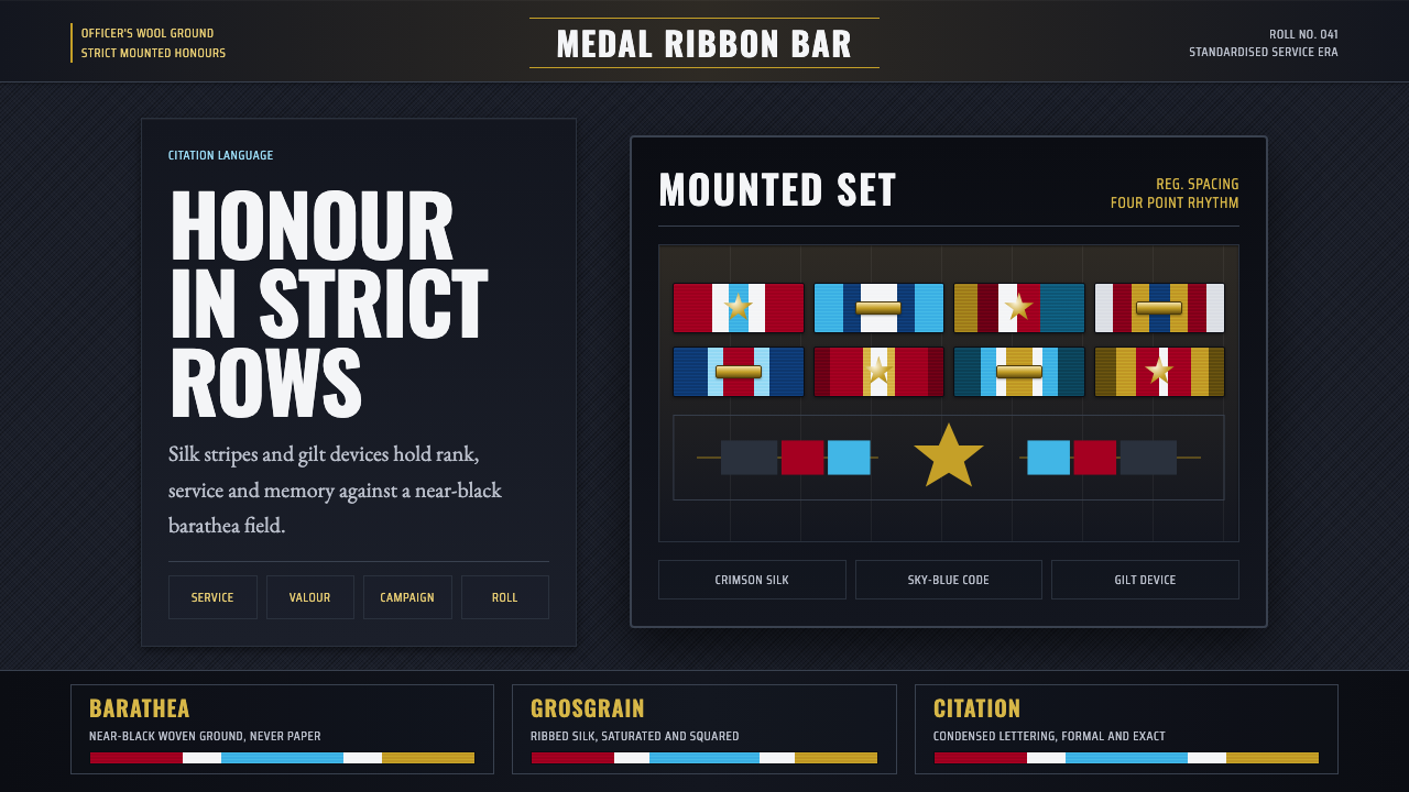 Medal Ribbon BarDiscipline worn as color. Crimson, sky-blue and gilt bars lock onto black woo…
 Ordnance Survey One-InchPrecision has a paper trail. Buff margins, red contours and engraved black ru…
 Ship Class Society PlateLaw made visible on steel. White lead marks and ruled survey columns cut acro…