What is Ship Class Society Plate?
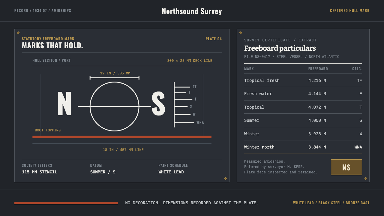
A load line is law made visible on steel — a few white marks on black plating that a surveyor measured, a society certified, and a ship's master had to obey.
Ship Class Society Plate in brief
Ship Class Society Plate is a design style drawn from the amidships panel of a merchant ship: the load line mark, the classification society's letters and the bolted maker's plate, together with the survey certificate that records the same numbers on paper. A load line is not decoration. It is a legal instrument painted onto steel, a disc cut through by a long horizontal line, flanked by two letters naming the society that surveyed the hull, with a comb of short seasonal marks stepping off a vertical spine at separately calculated heights.
The style takes its whole vocabulary from that one panel. The ground is black-painted topsides. The primary tone is the weathered grey of the plate itself. Every mark is drawn in white lead. A single band of red oxide runs at the boot-topping, and a burnished bronze plate is bolted on. The result is a dark, hard, regulatory look, in which every mark is a statement with legal weight and nothing is placed for ornament.
Typography is split in two, exactly like the object. On the hull itself, the lettering is condensed and stencil-hard. On the survey certificate, headings are in a slab style and the data is in monospaced ruled columns, with dates, tonnage, freeboard and surveyor initials all aligned in order. The voice is copied from the certificate: it records and does not emote. This is a style for facts that must be believed.
Where does Ship Class Society Plate come from?
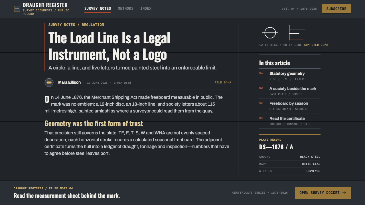
The style belongs to Britain and the North Atlantic classification societies, in the period the source dates to 1900–1950. Its legal anchor is the Merchant Shipping Act of 1876, which turned the marking of a ship's loading limit into a statutory matter. The mark's geometry was fixed by law, and the source describes the version used in this period as working under the 1930 Load Line Convention, which was later superseded by the 1966 International Convention on Load Lines.
Behind the mark stands the work of classification societies, bodies that survey and certify ships. The cast letter pairs on the plate name those societies: LR, AB, BV, NV, GL and NK are the codes the source gives, belonging to the British, American, French, Norwegian, German and Japanese traditions of ship surveying. The letters are cast in bronze and bolted beside the load line, so the mark answers two questions at once: how deeply may this hull sit in the water, and who has inspected it.
The seasonal comb that steps off the vertical spine is the most distinctive part of the geometry. Its labels, TF, F, T, S, W and WNA, stand for the conditions in which the ship may load to different depths: tropical fresh water, fresh water, tropical, summer, winter and winter North Atlantic. They look like the ticks on a ruler, but the source stresses that each height is computed individually, and it lists the Lloyd's Rule freeboard tables among the traditions behind them. Their spacing is not regular because the physics and the law are not regular.
The sources of authority named in the material are Samuel Plimsoll, the reformer whose name became attached to the load line, and the Lloyd's Register surveyors who applied the rules to actual hulls. The Lloyd's Register A1 classification, a mark of good standing for a ship, belongs to the same culture of certification. The Curio system translates that culture into design terms: a dark ground, white lead marks, ruled columns and a deliberately unemotional voice. It is a language of inspection, not of persuasion.
What defines the Ship Class Society Plate look?
Black Topsides as Ground
The ground is the black-painted side of the hull, a deep, matte, slightly worn dark that carries everything else. Against it the weathered grey of the plate acts as the primary tone, never a bright mid-tone. The surfaces feel heavy, industrial and sober. Nothing glows. The darkness is not a mood but a working surface on which marks must be visible at a distance.
White Lead Marks
Every mark, whether disc, line, letter or numeral, is drawn in a single chalky white lead. There is only one white, applied flat and consistently, which makes the system strictly legible. White is for information, not for fill or decoration. A page in this style can be read as a set of declarations painted onto a dark surface, each one equal in rank to the others.
Disc and Line
The central mark is a circle cut through by a longer horizontal line. It is the simplest possible geometry, and its power comes from being fixed by law rather than invented by a designer. In layouts it works as a locator, a datum, a signature. It should not be rotated, redrawn as a logo, or softened, because its authority comes from being exactly what the rule says it is.
The Seasonal Comb
Short horizontal ticks step off a vertical spine, labelled with letters such as TF, F, T, S, W and WNA. Their heights are computed separately and are not evenly spaced. This is a useful reminder that a scale need not be regular to be trustworthy. In an interface it suggests tick scales, tier markers and thresholds whose positions carry meaning rather than being laid out on a grid by habit.
Stencil Hull Type
Lettering on the hull is condensed, upright and stencil-hard, built for being painted through cut templates and read from a distance. It is set in capitals with broken strokes. The style uses it for names, codes and headings that must read quickly. It is blunt and impersonal, which is the point: the hull speaks in the voice of the regulation, not the voice of a brand.
Certificate Columns
The survey certificate supplies the second typographic voice: slab-style headings over monospaced ruled columns recording dates, tonnage, freeboard and surveyor initials. Numbers are aligned, rules are thin and consistent, and white space exists only to separate columns. In digital form this becomes a table with strict alignment, which is the style's most reusable component.
Red Oxide and Bronze
Two warm accents punctuate the grey and black. Red oxide appears as a single band at the boot-topping, the paint line near the waterline, and burnished bronze appears on the bolted maker's plate. Both are low-key and metallic rather than bright. They are used sparingly as signals of function: one marks a boundary, the other certifies authorship.
Who shaped Ship Class Society Plate?
Plimsoll is the reformer whose name became attached to the load line, so closely that the mark is still called the Plimsoll line in everyday speech. His place in this story is as the public face of the idea that a ship's loading limit should be visible, fixed and enforced, not left to the judgment of owners. The Merchant Shipping Act 1876 belongs to that same argument.
The surveyors are the people who turned rules into marks on steel. They inspected hulls, worked within the Lloyd's Rule freeboard tables, recorded their findings on the certificate and signed with their initials. Their work explains the style's double vocabulary of painted hull marks and ruled survey columns, and the A1 classification belongs to the same culture of inspected, certified quality.
The societies whose letter codes appear on the plate, LR, AB, BV, NV, GL and NK, are the institutional authors of the system. A bronze pair of letters cast and bolted beside the load line identifies which society surveyed the ship. For a designer they offer a model of institutional identity done without logos: a brief code, in a fixed place, backed by a body of rules.
How do you use Ship Class Society Plate today?
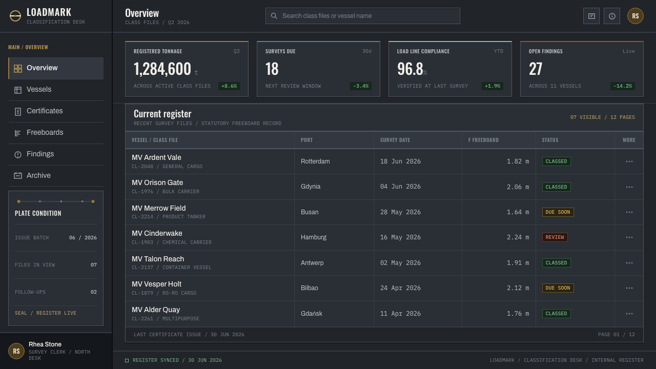
Ship Class Society Plate suits subject matter where trust is earned through inspection: compliance and audit tools, certification services, insurance and risk products, logistics and maritime software, engineering documentation, legal and regulatory dashboards, and technical reports. It is a dark-mode language by nature, and it reads as serious, exact and unembellished.
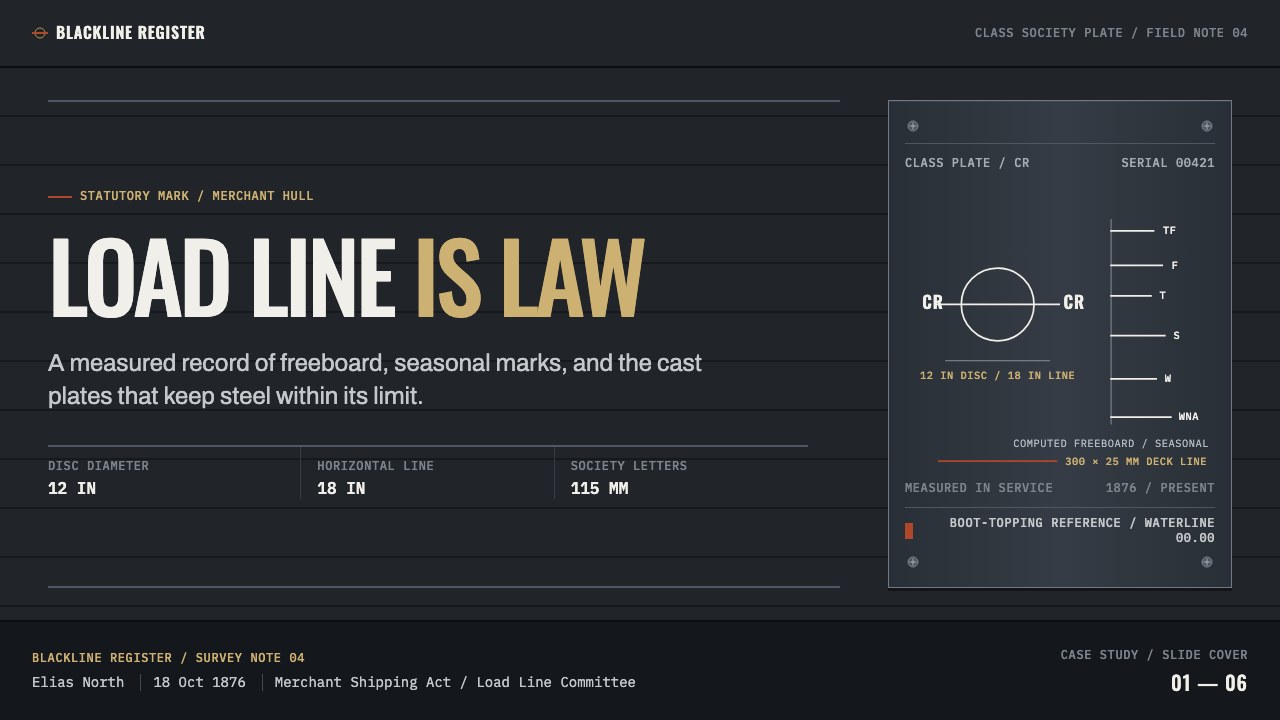
For presentation slides, a cover can be a black field with the disc-and-line mark as a quiet datum, the title in condensed stencil capitals in white, and a single thin red band as the waterline. Content slides work as survey sheets: slab headings above ruled monospaced columns, with numbers aligned and no decorative imagery. Data slides can use a vertical spine with uneven tick marks, letting the spacing of thresholds carry the story.
For web interfaces, the style fits dashboards, audit logs, status pages and pricing or plan comparisons that must feel exact. Use a dark ground, white information, and ruled tables with strict alignment. Keep the stencil type for short labels and codes, and use the slab and monospaced voice for data. Buttons and states should be flat and unembellished, with the bronze and red oxide held back as rare signals of authority or boundary.
For editorial and marketing work, write in the register of the certificate: plain statements, specific figures, no superlatives. A report page can open with the disc-and-line mark, a condensed title and a ruled summary table. Marketing for serious infrastructure products can lean on the quiet confidence of the register, using photography of steel, paint and plate in muted tones. Let the numbers sit in columns rather than inside colourful infographics.
The most common mistake is to treat it as a nautical theme. Anchors, ropes, waves, and compass roses are decoration, and the system's rule is that nothing is decorative. A second mistake is to soften it: gradients, glows and rounded friendly shapes dissolve the legal hardness that gives the style its meaning. A third is regularizing the seasonal comb into evenly spaced ticks, which discards the idea that each height is separately computed. Keep the marks exact, and keep the tone unemotional.
Ship Class Society Plate — FAQ
What is a load line and why does it inspire a design style?
A load line is a legal marking painted on a ship's hull that shows how deep the vessel may sit in the water under different conditions. It is a disc cut by a horizontal line, with the society's letters beside it and a comb of seasonal ticks. It inspires a style because it is fixed by law, entirely functional and highly legible, which gives a very pure visual grammar.
What do TF, F, T, S, W and WNA mean?
They are the seasonal and water-type marks of the load line: tropical fresh water, fresh water, tropical, summer, winter and winter North Atlantic. Each marks the deepest permitted loading under those conditions. They look like ruler ticks but their heights are computed separately, so in design they work best as labelled thresholds with meaningful, uneven spacing.
Why are the classification society letters important?
Because they name the body that surveyed the hull. Codes such as LR, AB, BV, NV, GL and NK are cast and bolted beside the load line, so the mark records both a limit and who certified it. In design terms they show how an institution can be identified by a short code in a fixed place rather than by a decorative logo.
Can the style use more colour?
Only with discipline. The source palette is black topsides, weathered grey, white lead, a band of red oxide and burnished bronze. Colour is therefore functional and rare. Adding bright hues or gradients destroys the sense that every mark has legal weight. If a new accent is needed, keep it muted and metallic and let it mark a boundary or an approval.
Where does the style struggle?
It struggles where warmth, play or sensory richness are the goals: children's products, food and lifestyle brands, creative tools that need to feel friendly. Its voice is deliberately cold, exact and impersonal. It shines when the message is that the facts are inspected and the limits are known, and it feels wrong when the message is delight.
Related design styles
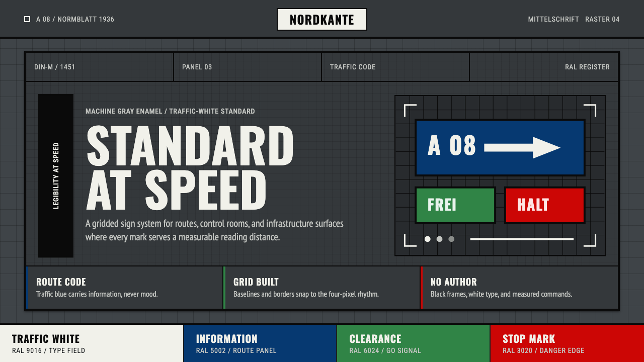 DIN 1451 SignageAuthorless and exact. Enamel gray grid, traffic-white DIN type, and RAL signa…
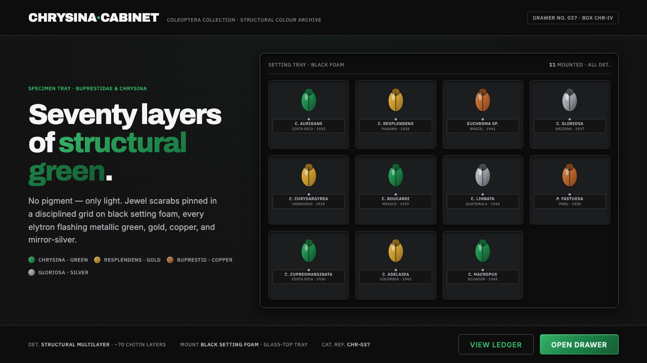 Iridescent Scarab DrawerOrder makes the shimmer read. Jewel scarabs pinned in a grid on black foam, m…
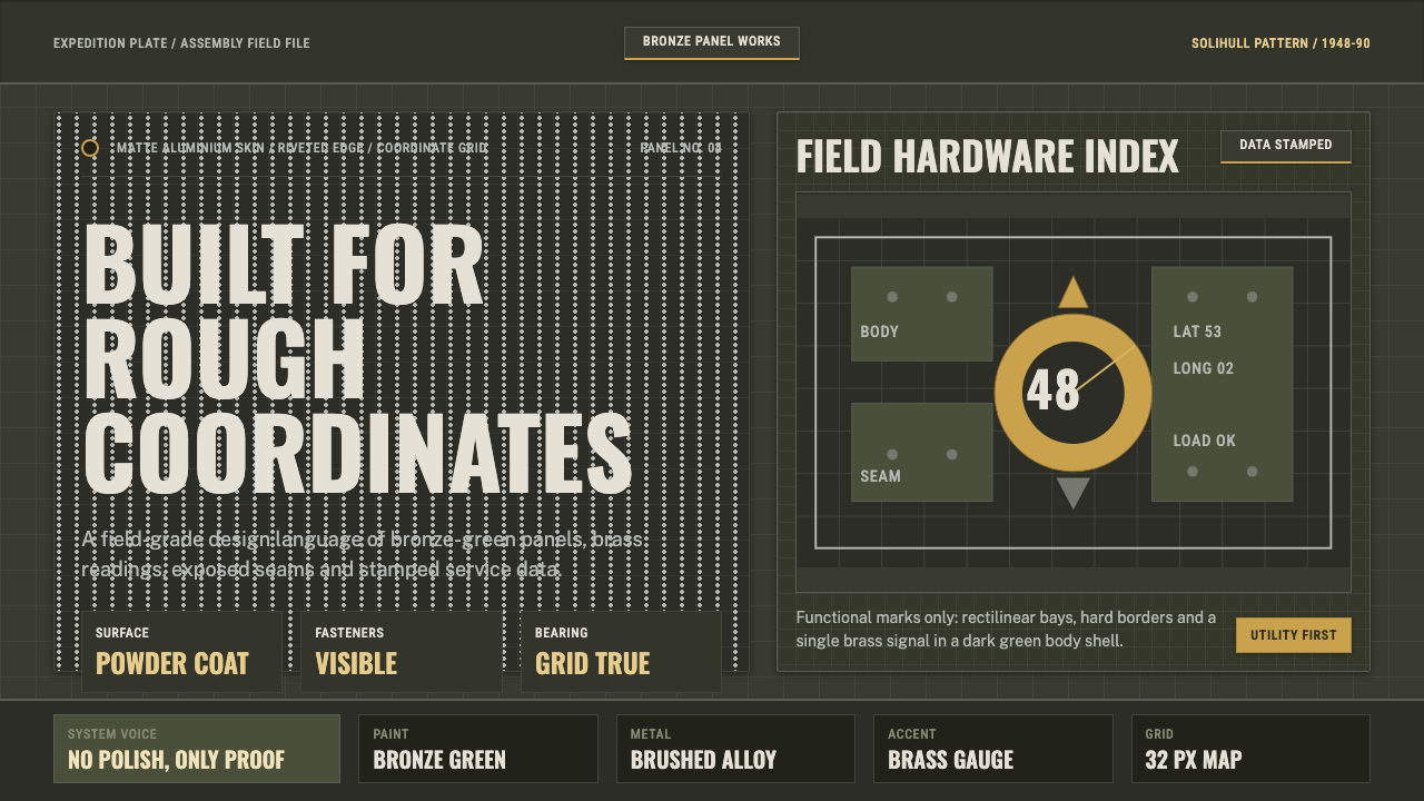 Land Rover DefenderUtility refuses polish. Bronze green panels, rivets and brass grid data do th…
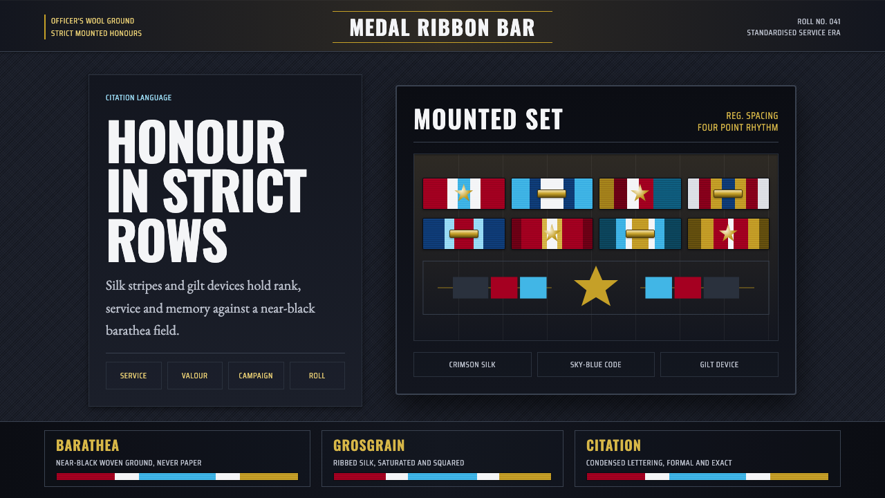 Medal Ribbon BarDiscipline worn as color. Crimson, sky-blue and gilt bars lock onto black woo…
 Alpine Funicular TicketIssued, not decorated. Oat-buff stock, slab fares and one longitudinal red st…
 Architect CyanotypePrecision in negative. Prussian blue ground, paper-white grid, mono dimension…