What is Radiograph Film Jacket?
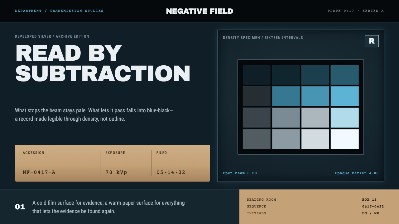
The radiograph film jacket reads evidence by subtraction: a cold blue-black film glowing on a viewbox, and a tan kraft jacket that keeps every number, field and filing detail.
Radiograph Film Jacket in brief
The radiograph film jacket is a design style drawn from two linked objects in a hospital radiology department: the developed X-ray film seen on a lit viewbox, and the manila jacket the film returns to once the examination is over. Its period is the first half of the twentieth century, and its setting is the radiology room together with the film-jacket filing room, a pairing of image and administration that was global rather than tied to one place.
A radiograph is read by subtraction. Bone stops the beam and stays pale; air passes it and goes black; everything between is a continuous gradient of developed silver. The film base carries a blue anthracene dye, so the whole image sits cold, and that tint is what makes a radiograph identifiable across a room. Evidence emerges from the darkness by the removal of light, not by the addition of decoration.
Off the viewbox, the film goes back into its jacket, tabbed and pocketed and filed by accession number. This style runs on both surfaces: lit blue-black film for content, tan kraft jacket for metadata. Corners are square, numerals are typewriter numerals, and the lead markers in the corners of the image are opaque rather than translucent. Hierarchy comes from density and from filing, and nothing in the system pretends to be glass.

Where does Radiograph Film Jacket come from?
The film side of the style rests on the physics and chemistry of the early twentieth century. X-rays, discovered by Wilhelm Röntgen at the end of the nineteenth century, pass through soft tissue and air but are stopped by denser matter such as bone. A sheet coated with silver-halide emulsion, exposed behind the body and then developed, records that difference as a continuous scale of silver density. What a radiologist reads is therefore not a drawing but a measurement made visible: how dark each region is records how much radiation reached it.
The film itself was a product of the photographic industry. Carl Schleussner, a German maker of photographic plates, is among the names associated with early photographic materials used for radiography, and the wider tradition of silver-halide imaging gave radiology a mature, mass-produced medium to work with. The blue tint of the film base, produced by a dye mixed into the base itself, became the visual signature of the medium: a cold cast shared by the whole sheet, which radiologists learned to recognise at once.
The jacket side comes from hospital medical-records practice. Once a film had been read, it went into a manila jacket, tabbed and pocketed, labelled by accession number and filed on shelves in the film-jacket room. The jacket carries the metadata of the examination: numbers, fields and filing information. This filing culture gave the style its second surface, a tan, tactile, typewritten world of identifiers that sits in deliberate contrast to the cold, luminous film.
Marie Curie's wartime work, which brought radiography to field hospitals during the First World War, belongs to the same story. The technology moved from laboratory curiosity to routine hospital service, and routine services need records. The style's period, 1900 to 1950, is the era in which this system of image plus paperwork became standard practice. What a designer can take from it is a clear division of labour: the thing being examined is lit and cold, and everything known about it is warm, numbered and filed.
What defines the Radiograph Film Jacket look?
Two Surfaces
The whole system rests on a pairing: the lit film for content and the kraft jacket for metadata. Content lives on the cold, luminous surface; identifiers, fields and filing details live on the warm, matte one. Keeping the two apart gives every screen or page a clear logic about what is being looked at and what is being recorded about it.
Blue-Black Film
The film surface is a dense blue-black, the cold cast of a tinted film base lit from behind. It is not a neutral black: the blue is part of the identity, the way a radiologist recognises a film across a room. Text and graphics that sit on it read as light emerging from the dark, so the surface feels luminous even when it is quiet.
Silver Tonal Range
Between the pale of dense bone and the black of open air lies a continuous gradient of developed silver. In the style this becomes a restrained range of pale silver greys, used to rank importance by density rather than by hue. Transitions are tonal and soft inside the image, while the frames and edges around them stay exact.
Kraft Jacket
The jacket surface is the tan of manila kraft paper, tabbed and pocketed, with the matte, slightly fibrous presence of filing stock. It holds the facts around the film: examination numbers, fields, dates, status. Its warmth is functional as well as visual, since it marks the zone where information is read rather than looked into.
Square and Opaque
Corners are square, because film sheets and filing jackets are cut rectangles. There are no rounded corners and no glass: no frosted translucency, no blur, no floating layers. Where something sits on top of something else, it does so as an opaque object, the way a label or a marker sits on a physical sheet.
Typewriter Numerals
Identifiers are set in a typewriter-style monospaced face, so accession numbers and field values line up the way typed index cards do. This gives the record side of the system its impersonal, bureaucratic reliability. The monospaced voice is reserved for the data that is filed, leaving a more ordinary reading face for explanatory text.
Lead Markers
In a real radiograph, a small lead marker placed in the corner records the side of the body, and it appears as a solid, fully opaque white mark pressed into the image. The style carries this over: side labels, corner codes and similar markers are set as crisp, opaque marks that sit on top of the image, never as ordinary caption text and never as translucent overlays.

Who shaped Radiograph Film Jacket?
The physicist whose discovery of X-rays at the end of the nineteenth century made the radiograph possible. Everything the style depicts, the beam stopped by bone and passing through air, rests on that discovery. His legacy for designers is a way of seeing through surfaces: a picture in which the contents are revealed by what the beam does not reach.
Best known for her work on radioactivity, Curie also brought radiography to field hospitals during the First World War, helping turn a laboratory technique into a working medical service. She represents the moment when the radiograph stopped being a novelty and started to be filed, numbered and routinely read in hospitals.
A German maker of photographic plates, associated with the early photographic materials used for radiography. His name stands for the silver-halide side of the story: the industrial photographic stock that made it possible to record the beam as a continuous scale of density, and so gave the style its tonal range.
How do you use Radiograph Film Jacket today?
The radiograph film jacket works best where content needs to be examined and the record around it needs to be trusted. Its two-surface logic is the main thing to carry over: decide what is the film, the thing under inspection, and what is the jacket, the information filed about it, and keep the two visibly separate.
For presentation slides, a cover can be a single blue-black film field with a pale subject emerging from the dark and a crisp opaque marker in one corner, with the title set like a typed label. Content slides can pair a film panel on one side, holding the image or chart, with a kraft panel beside it holding numbers, fields and sources. Data slides suit density plots, histograms and heat-style charts, where tone does the work that colour normally does and a typed index number ties each figure to a record.
For web interfaces, the style fits record viewers, audit logs, document archives, inspection tools, review queues and any dashboard where an item is examined and its metadata matters. A detail view can show the item on the film surface and its fields on a kraft panel, much as a jacket sits beside a lit sheet. Pricing pages can present plans as filed jackets with tabs, each carrying numbered fields. Navigation should be sober and indexed, with square tabs rather than pills.
For editorial and marketing work, it suits investigations, case files, forensic and inspection stories, archives and any narrative about evidence and verification. A feature can open with a dark film image and carry its notes, credits and sources on kraft-coloured sidebars with typed numerals. Marketing pages can use it to signal rigour and traceability: every claim has a number, every number has a place in the file.
The commonest mistake is turning the cold film into a glowing sci-fi cliché, with neon cyan, bloom and translucent glass panels. The style is the opposite: matte, exact and opaque. Other errors are mixing in saturated brand colours that fight the blue-black, setting long body text in the monospaced face, and dropping the kraft side altogether so the film has nothing to be filed against. If the product is genuinely clinical, remember that the style is a visual language and not a medical claim, and never present stylised imagery as a real diagnostic image.

Radiograph Film Jacket — FAQ
Why does the style use two surfaces, film and jacket?
Because the real objects do. A radiograph in use is a luminous film on a viewbox; the same film, put away, is a sheet in a kraft jacket carrying numbers and labels. The two surfaces hold different kinds of information: content on the film, metadata on the jacket. Separating them gives interfaces a clean rule for what goes where, and it stops records and labels from competing with the image they describe.
Is this only for medical products?
No. The vocabulary comes from radiology, but the logic is general: an item is examined under light and its record is kept on a separate, filed surface. That fits archives, inspection and audit tools, forensic or investigative journalism, quality assurance, research databases and anything built around evidence and traceability. Medical products can use it too, as long as the styling is not presented as real diagnostic imagery.
How is it different from a generic dark mode or a sci-fi X-ray glow?
A generic dark mode is a neutral inversion of a light interface, and a sci-fi glow is decorative bloom. This style is neither. Its dark has a specific cold blue cast, its tonal range comes from silver density rather than neon accents, and it is balanced by a warm, matte kraft surface that dark modes do not have. It is also strictly opaque, with no blur and no glass, which sets it apart from most futuristic dark interfaces.
Why square corners and no glass effects?
Film sheets, jackets, tabs and index cards are all cut rectangles, and they are physical objects: they cannot blur what is behind them. Square corners and opaque layers keep the system honest to those materials. Translucency would also muddy the central idea that tone is evidence, since a frosted panel changes the density of whatever sits beneath it.
How should the lead markers be used in a layout?
Treat them as small, opaque marks pressed into the corners of the image area, carrying only what a marker would carry: a side, a code, a short identifier. They should be sharper and brighter than anything around them, and they should never be treated as captions or decoration. Used sparingly, they make a layout feel like a real examined sheet; used everywhere, they become noise.
Related design styles
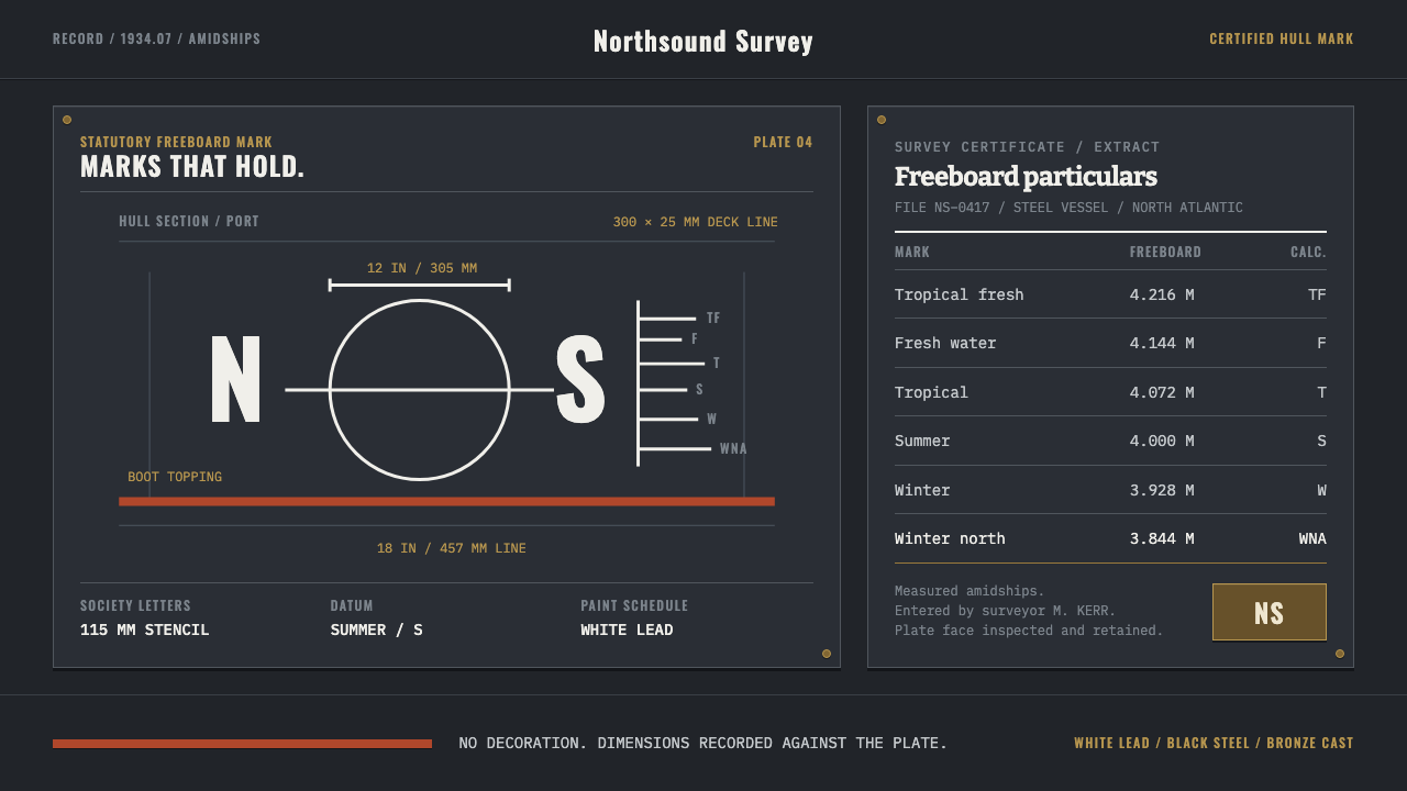 Ship Class Society PlateLaw made visible on steel. White lead marks and ruled survey columns cut acro…
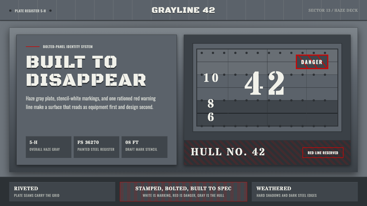 Battleship Naval GrayBuilt to spec. Haze gray steel, rivet grids, stencil white, and one danger-re…
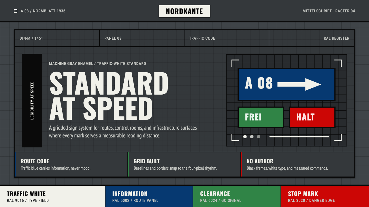 DIN 1451 SignageAuthorless and exact. Enamel gray grid, traffic-white DIN type, and RAL signa…
 Iridescent Scarab DrawerOrder makes the shimmer read. Jewel scarabs pinned in a grid on black foam, m…
 Land Rover DefenderUtility refuses polish. Bronze green panels, rivets and brass grid data do th…
 Medal Ribbon BarDiscipline worn as color. Crimson, sky-blue and gilt bars lock onto black woo…