What is Carhartt Work Jacket Brown (1889)?什么是 Carhartt Work Jacket Brown (1889)?
Hamilton Brown — Carhartt's tobacco-warm signature — carries the weight of duck canvas, railroad grit, and a century of American labor into every layout it touches.汉密尔顿棕——Carhartt 那抹烟草暖调的标志色——将帆布的重量、铁路的尘砾与一个世纪的美国劳动气质,带入它所接触的每一个版面。
Carhartt Work Jacket Brown (1889) in briefCarhartt Work Jacket Brown (1889) 速览
Carhartt Work Jacket Brown is a design system rooted in the visual identity of one of America's oldest surviving workwear brands. Founded in Detroit in 1889 by Hamilton Carhartt, the company outfitted railroad workers, construction crews, oil-field roughnecks, and factory hands with garments built for durability above all else. The brand's color identity — a deep, saturated tobacco-brown paired with a vivid orange accent and a cream ground — was never designed by a studio. It emerged from material reality: the natural color of heavyweight duck canvas, the orange of railroad safety equipment, and the off-white of work shirt lining.Carhartt 工装夹克棕是一套植根于美国最古老在世工装品牌视觉识别的设计系统。汉密尔顿·卡哈特于1889年在底特律创立公司,为铁路工人、建筑工人、油田工人和工厂工人提供以耐用性为首要诉求的服装。品牌的色彩标识——深厚饱和的烟草棕搭配鲜活的橙色和奶油色——从未出自工作室设计,而是从材料现实中自然生长:重磅鸭帆布的本色,铁路安全设备的橙色,工作衬衫内里的米白。
As a digital design language, the system translates those material facts into a visual vocabulary that feels earned rather than invented. The dominant surface is the brown of the jacket itself, dense and warm, used the way a canvas coat wraps a body — enveloping, load-bearing, protective. Against it, cream provides a breathing ground for content, and Carhartt orange functions as a single chromatic accent: bright enough to stop the eye, disciplined enough never to compete with the brown.作为数字设计语言,这套系统将那些材料事实转化为一套感觉是被挣得而非被发明的视觉词汇。主导色面是夹克本身的棕色——深沉而温暖,像帆布工装裹住身体那样使用:包裹性的、承重的、保护性的。奶油色在其对面提供内容呼吸的底面,Carhartt 橙作为唯一的彩色强调:明亮到足以让眼睛停驻,克制到绝不与棕色竞争。
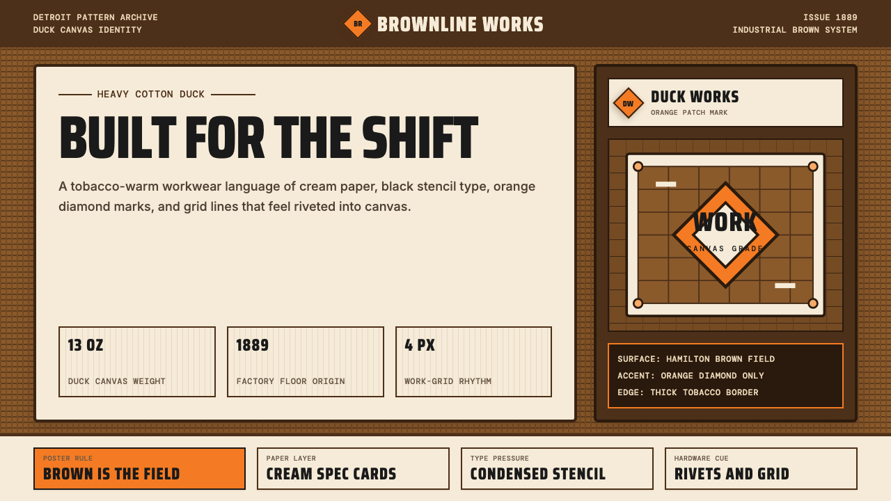
Typography in this system is condensed and stencil-bold, referencing the stamped lettering on industrial crates and the patch text sewn onto chore coats. Geometry favors rectilinear forms and the diamond motif drawn from the brand's iconic logo patch. Every surface, every edge, and every element carries the implied weight of cotton-duck canvas — nothing feels light, airy, or provisional. This is design that communicates reliability the way a well-worn jacket does: through accumulated material presence.这套系统的字体压缩而粗壮如模版印刷,参照的是工业木箱上的冲压字母和工装外套上缝制的标贴文字。几何形态偏向直角形式与源自品牌标志性菱形徽章的钻石母题。每一个色面、每一条边线、每一个元素都携带着棉鸭帆布的隐含重量——没有任何东西感觉轻盈、通透或临时。这是像一件磨合好的夹克那样传递可靠性的设计:通过积累的材料存在感。
See the Carhartt Work Jacket Brown (1889) design system查看 Carhartt Work Jacket Brown (1889) 完整设计系统
Where does Carhartt Work Jacket Brown (1889) come from?Carhartt Work Jacket Brown (1889) 从何而来?
Hamilton Carhartt arrived in Detroit in the mid-1880s with a modest amount of capital, a set of sewing machines, and a conviction that American railroad expansion represented an underserved market for durable workwear. He began by selling directly to railroad companies — not to retailers — pitching overalls and jackets he could guarantee would outlast whatever cheaper competitors offered. The brand's first major customer was the Michigan Central Railroad. By the early twentieth century, Carhartt was operating mills and factories across the United States and had expanded into Britain and France.汉密尔顿·卡哈特于19世纪80年代中期带着有限的资本、几台缝纫机和一个判断抵达底特律——他认为美国铁路扩张代表着一个对耐用工装服务不足的市场。他最初的销售对象不是零售商,而是铁路公司,兜售他能保证比任何更廉价竞品都更耐用的工装裤和夹克。品牌第一个主要客户是密歇根中央铁路。到20世纪初,卡哈特已在美国各地经营工厂,并扩展至英国和法国。
The brown duck canvas that became the brand's signature material was not an aesthetic choice but an engineering one. Heavyweight duck — a tightly woven plain-weave cotton fabric — resisted tearing and abrasion far better than lighter alternatives. The tobacco-brown color, which Carhartt called Hamilton Brown in honor of the founder, served partly as a practical camouflage for the oil, grease, and soil that workwear inevitably accumulates. Cream-colored lining provided a contrasting interior that showed wear and signaled when a garment needed replacement. The orange diamond patch, introduced as a brand identifier on jacket backs and chest pockets, was visible at distance on a job site and became one of the most recognized brand marks in American labor contexts.成为品牌标志性材料的棕色鸭帆布,并非出于审美选择,而是工程决定。重磅鸭布——一种经纬紧密的平纹棉织物——抵抗撕裂和磨损的能力远优于更轻的替代材料。这种烟草棕色调,卡哈特称之为「汉密尔顿棕」以纪念创始人,在实用层面也起到了对工装不可避免积累的油脂、机油和泥土的伪装作用。奶油色内里提供了对比性的内部衬面,显示磨损并告知何时该更换衣物。橙色菱形徽章作为品牌标识印于夹克后背与胸口袋上,在施工现场可从远处辨认,并成为美国劳工语境中最广为人知的品牌符号之一。
The brand's design language remained almost entirely unchanged through the mid-twentieth century. Post-World War II industrial uniform standardization locked in what had already become convention: the brown field, the orange diamond, the condensed stencil type. Unlike fashion brands that refresh their visual identity on seasonal cycles, Carhartt treated its appearance the way it treated its garments — built once, correctly, to last. This conservatism, which might have read as stagnation in another context, instead accumulated into authority.品牌的设计语言在二十世纪中期几乎原封未动。二战后工业制服的标准化将已然形成惯例的一切固化下来:棕色主色面、橙色菱形、压缩模版字体。与按季节更新视觉识别的时装品牌不同,卡哈特对待自己外观的方式就像对待自己的服装——只建造一次,正确地建造,以求持久。这种保守主义在另一语境下或许会被读作停滞,在这里却积累成了权威。
The late 1980s and 1990s brought an unexpected development: the workwear-as-fashion crossover. Carhartt's utilitarian identity, unchanged for nearly a century, became desirable precisely because it had never tried to be desirable. Hip-hop artists, skateboarders, and subsequently streetwear and luxury-adjacent consumers adopted the jacket for its visible authenticity — a garment that had never performed toughness because it was toughness. By the 2000s, Carhartt WIP (Work In Progress), the brand's European licensee, had built an entire parallel line around this cultural translation. The design system thus carries two inheritances simultaneously: the original industrial utility and the layered cultural authority that accrued when those utilitarian codes were read back through fashion.20世纪八九十年代带来了一个意料之外的发展:工装即时尚的跨界。卡哈特近一个世纪未曾改变的实用性标识,恰恰因为从未试图令人向往而变得令人向往。嘻哈艺人、滑板少年,随后是街头潮流与奢侈品边缘消费者,纷纷接纳这件夹克,因其显而易见的真实性——一件从未表演坚韧,因为它本身就是坚韧的服装。到2000年代,品牌的欧洲被许可商 Carhartt WIP(Work In Progress)已围绕这一文化转译建立了整条平行产品线。这套设计系统因此同时承载两重遗产:原初的工业实用性,以及当那些实用性代码被时尚重新解读时所积累的文化权威。
What defines the Carhartt Work Jacket Brown (1889) look?Carhartt Work Jacket Brown (1889) 的视觉特征是什么?
Color色彩
The palette is built around three tones that function as distinct roles rather than decoration. Hamilton Brown — a deep, warm tobacco hue — serves as the primary surface color, used for backgrounds, large blocks, and any element that needs to feel structural and load-bearing. Cream, the color of unbleached cotton, provides the ground for readable content and brings tactile warmth without competing with the brown. Carhartt orange is the sole chromatic accent: saturated and high-visibility, reserved for calls to action, logo marks, and the diamond motif. No other colors belong to the system; every additional tone dilutes the jacket-and-patch logic.色板围绕三个各司其职而非仅作装饰的色调构建。汉密尔顿棕——一种深沉温暖的烟草色调——作为主色面使用,用于背景、大色块以及任何需要传达结构感和承重感的元素。奶油色,漂白前棉布的颜色,为可读内容提供底面,带来触感温度而不与棕色竞争。Carhartt 橙是唯一的彩色强调:饱和而高可见性,专用于行动号召、标志符号和菱形母题。系统中不属于其他颜色;每一个额外色调都会稀释夹克与徽章的逻辑。
Typography字体排印
Typefaces are condensed and structurally heavy, referencing the compressed stencil lettering stamped onto industrial packaging and the bold patch text sewn directly onto garments. Headlines are set wide and tight, commanding space the way a chore coat logo commands a chest pocket. Body text is set at a comfortable weight with generous line spacing to suggest the legibility of a printed work order rather than editorial refinement. No script, no decorative face, and no lightweight variant belongs here — every typographic choice should feel like it could be stenciled onto a crate.字体压缩而结构厚重,参照的是冲压于工业包装上的压缩模版字母和直接缝制于服装上的粗体标签文字。标题宽幅而紧凑地排布,以工装外套标识占据胸口袋的方式占领空间。正文以舒适的字重配合宽裕的行距排列,暗示工作单的清晰可读而非编辑精炼。手写体、装饰字体和轻量字重均不属于这里——每一个字体选择都应该感觉可以被模版印在木箱上。
Geometry几何形态
The diamond is the system's primary geometric motif, drawn directly from the Carhartt logo patch. It appears as a framing device, a section marker, a bullet stand-in, or a decorative terminal — always referencing the fabric patch rather than abstract decoration. Secondary geometry is strictly rectilinear: right angles, horizontal rules as thick as a stitch line, and rectangular blocks that evoke cut canvas panels. Curves and circles are foreign to this vocabulary; even the label patch corners are sharp. Every geometric choice should feel like something a pattern-maker or factory floor would recognize.菱形是这套系统的主要几何母题,直接源自 Carhartt 标志徽章。它作为框架装置、章节标记、项目符号替代或装饰终结符出现——始终参照织物徽章而非抽象装饰。次级几何形态严格直角化:直角、如缝线般粗的水平线,以及唤起裁剪帆布面板的矩形色块。曲线和圆形对这套词汇而言是异物;即便是标签徽章的角也是锐利的。每个几何选择都应该感觉像是打版师或车间工人会认出的东西。
Texture and Surface质感与表面
Unlike design systems that insist on perfectly smooth digital surfaces, Carhartt Work Jacket Brown embraces a sense of physical material — not through literal texture filters, but through compositional choices that evoke weight and grain. Large color blocks feel thick rather than flat; borders feel stitched rather than drawn; type feels stamped rather than set. The system tolerates a degree of roughness in execution that most digital styles would smooth away, because that roughness is itself part of the brand's claim to authenticity.与坚持完美光滑数字表面的设计系统不同,Carhartt 工装夹克棕拥抱一种物质材料的感觉——不是通过字面意义上的纹理滤镜,而是通过唤起重量与纹粒的构图选择。大面积色块感觉厚实而非平薄;边框感觉是缝制而非绘制;字体感觉是冲压而非排版。这套系统容许一定程度的粗粝感,而大多数数字风格会将其磨平——因为那种粗粝本身就是品牌真实性主张的组成部分。
Contrast and Hierarchy对比与层级
Hierarchy in this system is communicated through tonal contrast rather than color variety. Brown-on-cream and orange-on-brown are the two primary contrast pairs; everything else is a variation within those relationships. Headlines differ from body text through scale and weight, not color. Interactive elements are distinguished by the orange accent, not by shape change alone. The system's limited palette means that hierarchy must be established through the precision of tonal relationships — the difference between a cream that reads as background and one that reads as foreground is entirely a matter of how much brown surrounds it.这套系统通过色调对比而非色彩多样性传达层级。棕底奶油字与棕底橙字是两组主要对比配对;其他一切都是这两种关系的变体。标题与正文的区别通过尺度和字重而非颜色体现。交互元素通过橙色强调而非仅靠形状变化加以区分。系统有限的色板意味着层级必须通过色调关系的精确性来建立——被读作背景的奶油色与被读作前景的奶油色之间的区别,完全取决于周围有多少棕色。
Logo and Patch Logic标志与徽章逻辑
The Carhartt orange diamond patch is not simply a logo — it is the system's compositional anchor. In any layout, the diamond element occupies the position that the patch occupies on a jacket: a fixed, high-recognition marker that the eye finds immediately and that establishes the identity of the entire piece. Layouts that lack a clear diamond anchor tend to feel unmoored in this system, as if the jacket is missing its label. Brand marks should be treated as structural elements, not decorative afterthoughts placed wherever space permits.Carhartt 橙色菱形徽章不仅仅是一个标志——它是系统的构图锚点。在任何版面中,菱形元素占据徽章在夹克上所占据的位置:一个固定的、高辨识度的标记,眼睛能立即找到,并为整件作品确立身份。缺乏清晰菱形锚点的版面在这套系统中往往感觉失去根基,好像一件夹克缺少了它的标签。品牌符号应被视为结构性元素,而非在有空间的地方随意放置的装饰性事后添加。
Restraint克制
The system's authority comes precisely from what it refuses to include. No gradients soften the transitions between brown and cream. No ambient shadows blur the edges of elements. No secondary palette introduces visual variety for its own sake. No decorative illustration lightens the tone. The orange accent is used once per composition, never twice. These refusals are not minimalism — they are the design equivalent of a garment that has exactly the pockets it needs and no more. Every absence is a decision about function.这套系统的权威感恰恰来自它拒绝包含的东西。没有渐变柔化棕色与奶油色之间的过渡。没有环境投影模糊元素的边缘。没有次级色板为了变化而引入视觉多样性。没有装饰性插图冲淡基调。橙色强调在每件构图中只使用一次,绝不两次。这些拒绝不是极简主义——它们是设计上等同于一件恰好只有它需要的口袋数量的服装的状态。每一处缺席都是关于功能的决定。
See the Carhartt Work Jacket Brown (1889) design system查看 Carhartt Work Jacket Brown (1889) 完整设计系统
Who shaped Carhartt Work Jacket Brown (1889)?谁塑造了 Carhartt Work Jacket Brown (1889)?
The founder arrived in Detroit in the mid-1880s and built his first workwear business on a simple premise: sell directly to railroad companies, not to middlemen, and guarantee that the product would outlast competitors. His decision to use heavyweight duck canvas — a material chosen for structural performance, not appearance — established the brand's material identity before any visual one existed. Hamilton Brown, the color that defines the system, bears his name directly. His insistence on industrial distribution channels rather than retail kept the brand embedded in actual labor contexts for decades, which is why its visual codes carry genuine rather than performed authority.这位创始人于19世纪80年代中期抵达底特律,基于一个简单前提建立起他的第一家工装服装生意:直接向铁路公司而非中间商销售,并保证产品比竞争对手更耐用。他选用重磅鸭帆布——一种因结构性能而非外观而被选择的材料——的决定,在任何视觉标识存在之前就确立了品牌的材料身份。定义这套系统的颜色汉密尔顿棕,直接以他的名字命名。他坚持工业分销渠道而非零售的做法使品牌数十年间深植于真实劳动语境,这也是为什么它的视觉代码承载的是真实而非表演性的权威。
Edwin Faeh was the Swiss-born designer who established Carhartt's European presence in the 1980s through what became Carhartt WIP (Work In Progress), operating first as a licensed distributor and later as a creative entity with significant design autonomy. Faeh's contribution was recognizing that Carhartt's unchanged visual language — its brown, its orange, its diamond, its condensed type — was not a liability in fashion-adjacent markets but an asset. His approach preserved the original system's integrity while deploying it in contexts — streetwear, music, youth culture — where its authenticity became a form of cultural currency. The dual inheritance of the design system, both utilitarian and culturally charged, is substantially his creation.埃德温·法是瑞士出生的设计师,他在20世纪80年代通过后来成为 Carhartt WIP(Work In Progress)的机构在欧洲建立了卡哈特的存在,最初作为被许可分销商运营,后来发展为拥有相当设计自主权的创意实体。法的贡献在于认识到卡哈特未曾改变的视觉语言——它的棕色、它的橙色、它的菱形、它的压缩字体——在时尚相邻市场中不是负担而是资产。他的方法在保持原始系统完整性的同时,将其部署于街头潮流、音乐、青年文化等语境中,使其真实性成为一种文化货币。这套设计系统同时承载实用性与文化重量的双重遗产,在很大程度上是他的创造。
Carhartt remained family-controlled through successive generations — an unusual fact in American manufacturing, where most comparable workwear brands were absorbed by conglomerates during the twentieth century. This continuity of ownership is directly relevant to the design system's character. Unlike brands that undergo periodic visual rebranding as ownership changes, Carhartt's identity was stewarded by people with long institutional memory and no incentive to modernize for its own sake. The visual language that emerged from Hamilton Carhartt's original material choices was never subjected to the kind of design-agency rationalization that tends to soften, lighten, and render brands more broadly palatable. The family's conservatism is structurally encoded in the system's density and refusal of compromise.卡哈特历经数代始终保持家族控制——这在美国制造业中是不寻常的事实,因为大多数同类工装品牌在二十世纪都被大型集团收购。这种所有权的连续性与设计系统的性格直接相关。与随所有权变更而定期进行视觉品牌重塑的品牌不同,卡哈特的身份由拥有长期机构记忆、没有为其本身而现代化动机的人来守护。从汉密尔顿·卡哈特最初的材料选择中涌现的视觉语言,从未经历那种倾向于柔化、轻量化并使品牌更广泛可口的设计机构理性化处理。家族的保守主义被结构性地编码进系统的厚重感与对妥协的拒绝中。
From its base in Regensburg, Germany, the Carhartt WIP creative direction — operating under license but with genuine design latitude — has been responsible for translating the original industrial system into contexts far removed from its railroad origins. WIP's lookbooks, retail environments, and collaborations with artists and musicians demonstrated that the visual system was robust enough to operate across a wide tonal range without losing its core identity. The condensed type could anchor a skate zine as readily as a worksite supply catalog; the brown-and-orange palette held its authority in a Berlin concept store as clearly as on a Michigan factory floor. WIP's work proved that the system's power was structural, not contextual.以德国雷根斯堡为基地的 Carhartt WIP 创意总监团队——在许可协议下运营但拥有真实的设计空间——负责将原始工业系统转译到远离铁路起源的语境中。WIP 的时尚图录、零售环境以及与艺术家和音乐人的合作证明,这套视觉系统足够强健,能够在广泛的语调范围内运作而不失去核心身份。压缩字体可以像锚定工地供应目录那样轻松地锚定滑板杂志;棕橙色板在柏林概念店中的权威感与在密歇根工厂地板上一样清晰。WIP 的工作证明,这套系统的力量是结构性的,而非情境性的。
How do you use Carhartt Work Jacket Brown (1889) today?今天怎么用 Carhartt Work Jacket Brown (1889)?
Carhartt Work Jacket Brown is one of the more demanding historical systems to apply correctly in digital work, because its authority depends on consistency of density rather than visual variety. The temptation is to soften it — to introduce a lighter brown, a more muted orange, a rounded corner here and there — and each individual softening seems reasonable. Collectively, those compromises remove the very quality that makes the system distinctive. Apply it fully or reconsider the choice.Carhartt 工装夹克棕是在数字工作中正确应用难度较高的历史系统之一,因为它的权威感依赖密度的一致性而非视觉多样性。诱惑在于软化它——引入更浅的棕色、更柔和的橙色、这里那里的圆角——每一处单独的软化看起来都合情合理。累积起来,这些妥协移除了让这套系统与众不同的恰恰那种特质。要么完整应用,要么重新考虑这个选择。
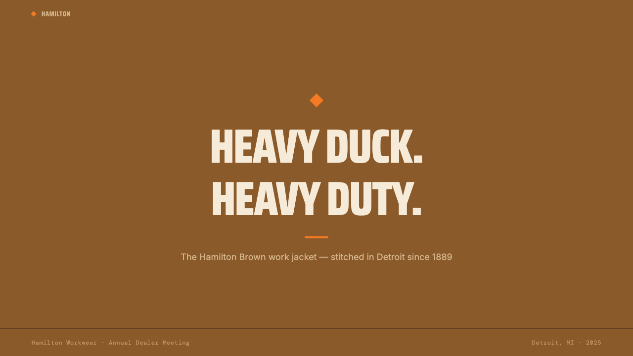
For presentation slides, the system works best when the brown is committed to as a full-bleed surface on cover slides rather than used as an accent or header bar. A cover benefits from a bold, asymmetric composition: the orange diamond anchoring one quadrant, the title in condensed heavy type against the brown, and no more than one secondary element in cream. Content slides should treat the cream ground as the primary surface, with brown used only for structural blocks — a sidebar, a header band, a footer rule — and orange reserved exclusively for the single most important call-out per slide. Data slides work well in this system because the restricted palette forces clarity: bars are brown or orange, backgrounds are cream, and labels are dark enough to read without a legend.对于演示文稿,当棕色作为封面页的满版底面而非用作强调色或标题栏时,这套系统效果最佳。封面受益于大胆、非对称的构图:橙色菱形锚定一个象限,标题以压缩粗体字置于棕色底面上,奶油色次级元素不超过一个。内容页应将奶油色底面作为主色面,棕色仅用于结构性色块——侧边栏、标题带、底部线——橙色专门保留给每张幻灯片最重要的单一引用。数据幻灯片在这套系统中效果出色,因为受限的色板强制产生清晰度:柱形为棕色或橙色,背景为奶油色,标签足够深以无需图例即可阅读。
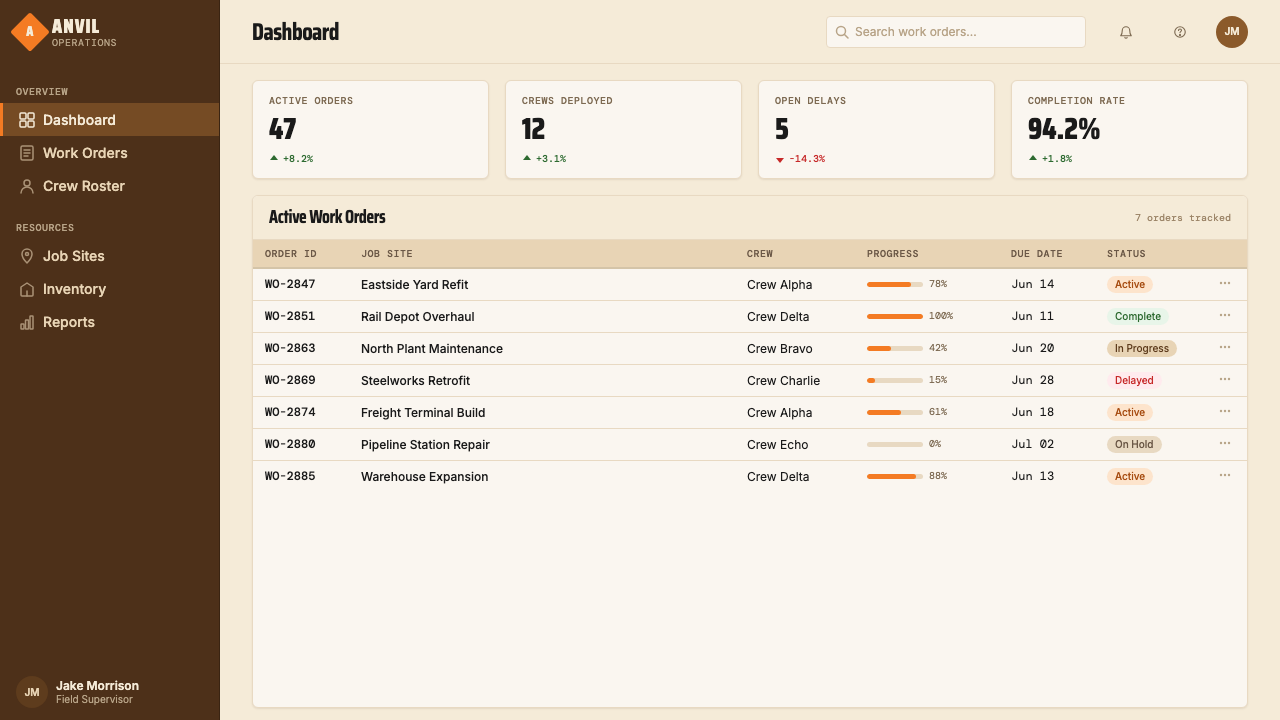
For web interfaces — dashboards, pricing pages, tool UIs — the system performs best when the brown is used for navigation, sidebar, or header zones that need to feel fixed and structural, with cream as the primary content surface. Card components should have visible, heavy borders rather than soft shadows; the border communicates stitch-line construction rather than digital floating. Pricing tiers work well with the orange accent marking the recommended or featured option. Interactive states — hover, focus, active — should shift to orange on brown or brown on orange, maintaining the two-color discipline. Do not introduce any additional accent colors for alert states or secondary actions; use tonal shifts within the existing palette instead.对于网页界面——仪表板、定价页面、工具界面——当棕色用于需要感觉固定而结构性的导航区、侧边栏或标题区域,奶油色作为主内容底面时,系统表现最佳。卡片组件应有可见的粗边框而非柔和阴影;边框传达的是缝线结构感而非数字漂浮感。定价层级适合用橙色强调标记推荐或特色选项。交互状态——悬停、聚焦、激活——应在棕底橙或橙底棕之间转换,保持双色纪律。不要为警示状态或次级操作引入任何额外强调色;改为在现有色板内使用色调移位。
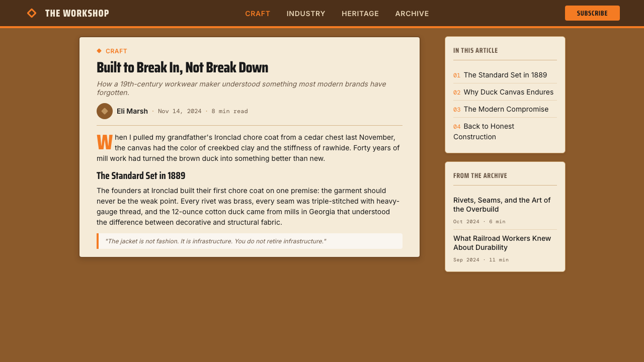
For editorial and marketing work, the system's poster-like density suits full-width feature sections where a strong visual statement is required. A Carhartt-derived editorial layout uses the brown as a full-bleed section background for feature blocks, cream for body text sections, and orange used once per section as a pull quote background or section label. Marketing pages benefit from the alternation of brown-surface and cream-surface sections with consistent typographic treatment across both: same condensed headline type, same weight hierarchy, different ground color. The orange diamond used as a section break or decorative terminal ties the composition back to its source.对于编辑与营销内容,这套系统的海报式密度适合需要强烈视觉陈述的全宽特性区块。Carhartt 衍生的编辑版面将棕色用作特性区块的满版背景,奶油色用于正文段落,橙色在每个区块中只使用一次——作为引用语背景或章节标签。营销页面受益于棕色底面与奶油色底面区块的交替,两者保持一致的字体处理:相同的压缩标题字体,相同的字重层级,不同的底面颜色。将橙色菱形用作章节分隔符或装饰终结符,将构图拉回到它的来源。
A common mistake is using the orange accent too frequently, treating it as a general highlight color rather than a high-value signal reserved for the single most important element per layout. When orange appears on every interactive element, every section header, and every pull quote simultaneously, it loses its stop-sign function entirely — the eye has nowhere to go. The correct discipline is closer to the original patch: one orange element per composition, used where it would be sewn onto a jacket. A related mistake is introducing warm grays or mid-browns as intermediary tones to ease transitions between the system's three values. Intermediary tones dilute the contrast that gives the system its weight; the transitions should be direct, the way canvas meets thread rather than fading into each other.最常见的错误是过于频繁地使用橙色强调,将其视为通用高亮色而非保留给每个版面最重要单一元素的高价值信号。当橙色同时出现在每个交互元素、每个章节标题和每个引用语上时,它完全失去了停车标志的功能——眼睛无处可去。正确的纪律更接近原始徽章:每件构图中一个橙色元素,用在它会被缝到夹克上的位置。相关的错误是引入暖灰色或中间棕色作为过渡色调来缓和系统三个值之间的转换。中间色调稀释了赋予系统重量的对比;转换应该是直接的,就像帆布与线接触的方式而非相互淡入。
See the Carhartt Work Jacket Brown (1889) design system查看 Carhartt Work Jacket Brown (1889) 完整设计系统
Carhartt Work Jacket Brown (1889) — FAQCarhartt Work Jacket Brown (1889) · 常见问题
How is this system different from general earth-tone or brown palettes?这套系统与一般大地色调或棕色色板有什么不同?
Most earth-tone palettes use brown as one tone among many — paired with sage, terracotta, warm gray, or sand to create a layered naturalistic feeling. Carhartt Work Jacket Brown uses brown as the dominant structural surface, cream as a single contrast ground, and orange as a single chromatic accent. The system has exactly three values, and each has a fixed role. The result is not naturalistic warmth but industrial authority. If your reference palette has more than three tones, or if the brown is warm and yielding rather than deep and saturated, you are building something adjacent to this system but not this system.大多数大地色调色板将棕色作为众多色调之一使用——与鼠尾草绿、赤陶色、暖灰色或沙色搭配,营造出分层的自然主义感觉。Carhartt 工装夹克棕将棕色作为主导结构底面,奶油色作为单一对比底面,橙色作为单一彩色强调。这套系统恰好有三个值,每个都有固定角色。结果不是自然主义的温暖而是工业权威感。如果你的参考色板有超过三个色调,或者棕色是温暖柔和的而非深沉饱和的,你在构建的是与这套系统相邻但不是这套系统的东西。
Can the system work on a dark or black background?这套系统能在深色或黑色背景上使用吗?
The system's canonical ground is either the brown itself or the cream — not black or near-black. A dark inversion is possible but requires significant adjustment. On a black ground, Hamilton Brown reads as a mid-tone accent rather than a dominant surface, which inverts the system's fundamental logic. If a dark mode is required, the most workable approach is to darken the brown further — toward near-black with a warm undertone — and use cream for body text, with orange retained as the accent. The system's identity will survive this if the diamond and condensed type are maintained; it will not survive if a neutral cool dark replaces the warm-toned ground.这套系统的标准底面是棕色本身或奶油色——不是黑色或近黑色。深色反转是可能的,但需要重大调整。在黑色底面上,汉密尔顿棕被读作中间调强调而非主导色面,这颠倒了系统的基本逻辑。如果需要深色模式,最可行的方法是将棕色进一步加深——向具有暖色调的近黑色靠拢——正文用奶油色,橙色保留为强调色。如果菱形和压缩字体得以保持,系统的身份将在此调整中存活;如果中性冷调的深色替换了暖调底面,则不会存活。
Is this style appropriate for digital products aimed at a general consumer audience?这种风格适合面向普通消费者受众的数字产品吗?
The system works best for products where heaviness, durability, and no-nonsense authority are desired values: professional tools, B2B platforms, outdoor and workwear commerce, logistics and supply chain applications, and any product positioning itself as built rather than designed. It is poorly suited to consumer contexts that require warmth, approachability, or sensory delight — food delivery apps, children's products, wellness platforms, social networks. The style communicates a specific value proposition that must match the product's actual positioning. Using it on a product that needs to feel gentle, playful, or inviting will create a friction the user will feel but not be able to name.这套系统最适合厚重感、耐用性和不废话的权威感是期望价值的产品:专业工具、B2B 平台、户外与工装服饰商业、物流与供应链应用,以及任何将自身定位为被建造而非被设计的产品。它不适合需要温暖感、亲和力或感官愉悦的消费者场景——外卖应用、儿童产品、健康平台、社交网络。这种风格传达的是一种必须与产品实际定位相符的特定价值主张。将其用于需要感觉温和、活泼或令人向往的产品,会产生一种用户能感受到但无法说清楚的摩擦。
How should the orange be used to avoid it looking generic or accidental?橙色应该如何使用,才能避免看起来随意或普通?
The orange works only when it is used with the same logic that governs the placement of the patch on the jacket: in a fixed, predictable position that the eye learns to seek out. In a slide deck, that means the same quadrant every slide. In a web interface, that means the same element type — the primary action button, the tier badge, the logo mark. In an editorial layout, that means one designated role per composition — section label or pull quote, not both. When orange appears in a different position or role each time it is used, it loses its reference to the patch and becomes an arbitrary highlight color indistinguishable from any other system's use of orange. The patch is always in the same place on the jacket; the orange should always be in the same role in the layout.橙色只有在以与夹克上徽章放置逻辑相同的逻辑使用时才有效:在一个固定的、可预期的位置,眼睛学会寻找的位置。在幻灯片组中,这意味着每张幻灯片的相同象限。在网页界面中,这意味着相同的元素类型——主要操作按钮、层级徽章、标志符号。在编辑版面中,这意味着每件构图中一个指定角色——章节标签或引用语,不能两者皆是。当橙色每次使用时出现在不同的位置或角色,它就失去了对徽章的参照,成为与任何其他系统使用橙色无异的任意高亮色。徽章在夹克上永远在同一个位置;橙色应该在版面中永远处于同一个角色。
What makes this system feel authentic versus a generic vintage-brown aesthetic?是什么让这套系统感觉真实,而非普通的复古棕色美学?
Generic vintage-brown aesthetics typically layer multiple warm tones, introduce aged textures or distressed finishes, use serif or hand-drawn type to signal heritage, and deploy warm amber tones that feel nostalgic rather than industrial. Carhartt Work Jacket Brown does none of these things. Its brown is not aged or distressed — it is the actual color of new duck canvas, dense and solid. Its type is condensed and mechanical, not rustic or calligraphic. Its geometry is rectilinear and diamond-sharp, not organic or hand-crafted in feel. The system feels authentic because it references a specific object — the chore coat — with material precision rather than nostalgic suggestion. Authenticity here is a matter of specificity: if the visual choices could be equally attributed to any number of vintage or heritage brands, the system has drifted into generic territory.普通的复古棕色美学通常叠加多种暖色调,引入做旧纹理或磨损效果,使用衬线或手绘字体来传递传承感,并部署让人感觉怀旧而非工业的琥珀暖调。Carhartt 工装夹克棕什么都不做。它的棕色不是做旧或磨损的——它是新鸭帆布的实际颜色,密实而厚重。它的字体是压缩而机械的,不是质朴或书法性的。它的几何形态是直角和菱形尖锐的,在感觉上不是有机或手工艺制作的。这套系统感觉真实,因为它以材料精确性而非怀旧暗示参照一个具体对象——工装外套。这里的真实性是特殊性的问题:如果视觉选择同样可以归因于任何数量的复古或传统品牌,这套系统就已经漂移到了通用领地。
Related design styles相关设计风格
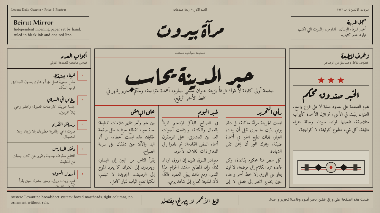 An-Nahar Beirut PressDense authority. Aged newsprint, black naskh columns, and one red rule hold t…肃穆而密集。旧报纸底、黑色纳斯赫栏与一道红线定版。
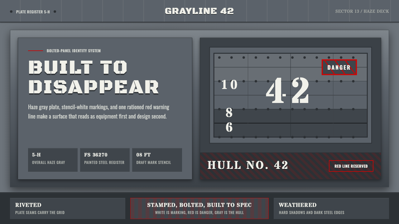 Battleship Naval GrayBuilt to spec. Haze gray steel, rivet grids, stencil white, and one danger-re…严格按规格制造:雾灰钢板、铆钉网格、喷印白字与一道危险红线。
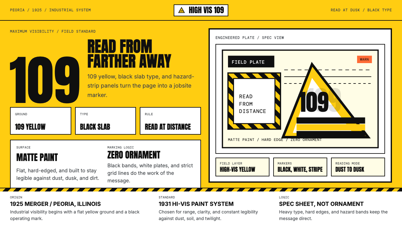 Caterpillar Construction Yellow (1925)Maximum visibility, zero softness. 109 yellow ground and black slab type.高可见度,零柔和。109 黄底配黑色粗体。
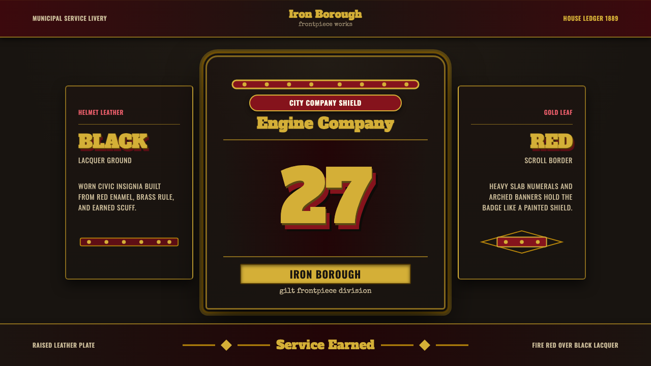 Fire Brigade ShieldEarned civic armor. Gold leaf numerals, fire-red borders, black leather symme…像服役挣来的徽章:黑皮底、金箔数字、消防红边框。
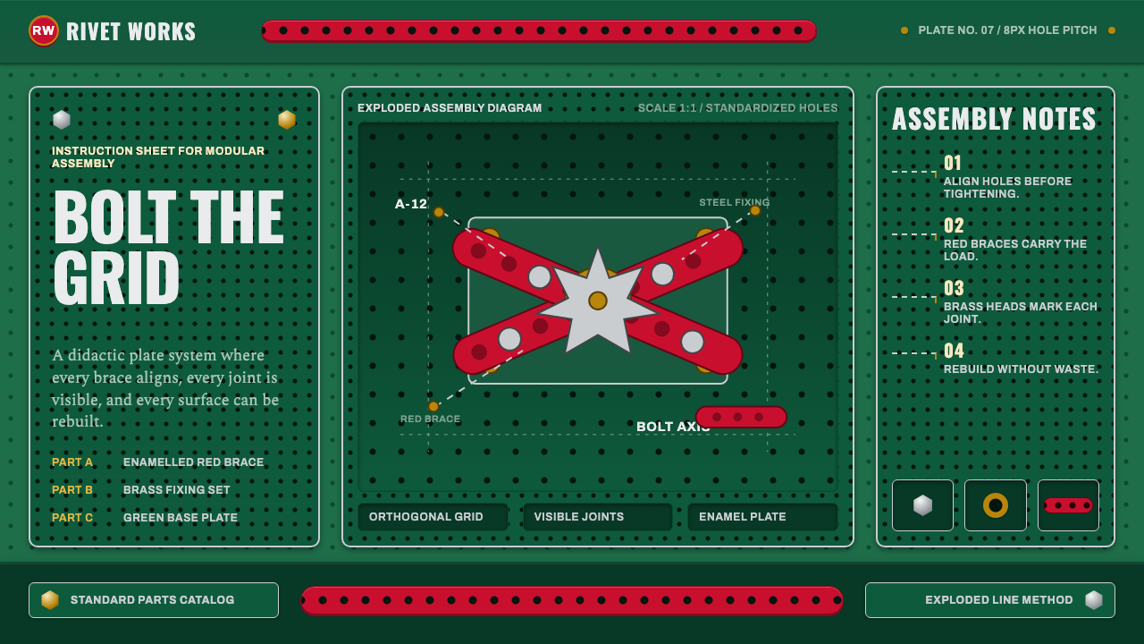 Meccano Erector SetEngineering becomes tactile. Red perforations and brass bolts lock to a green…工程变得可触:红色孔条与黄铜螺栓锁在绿色网格上。
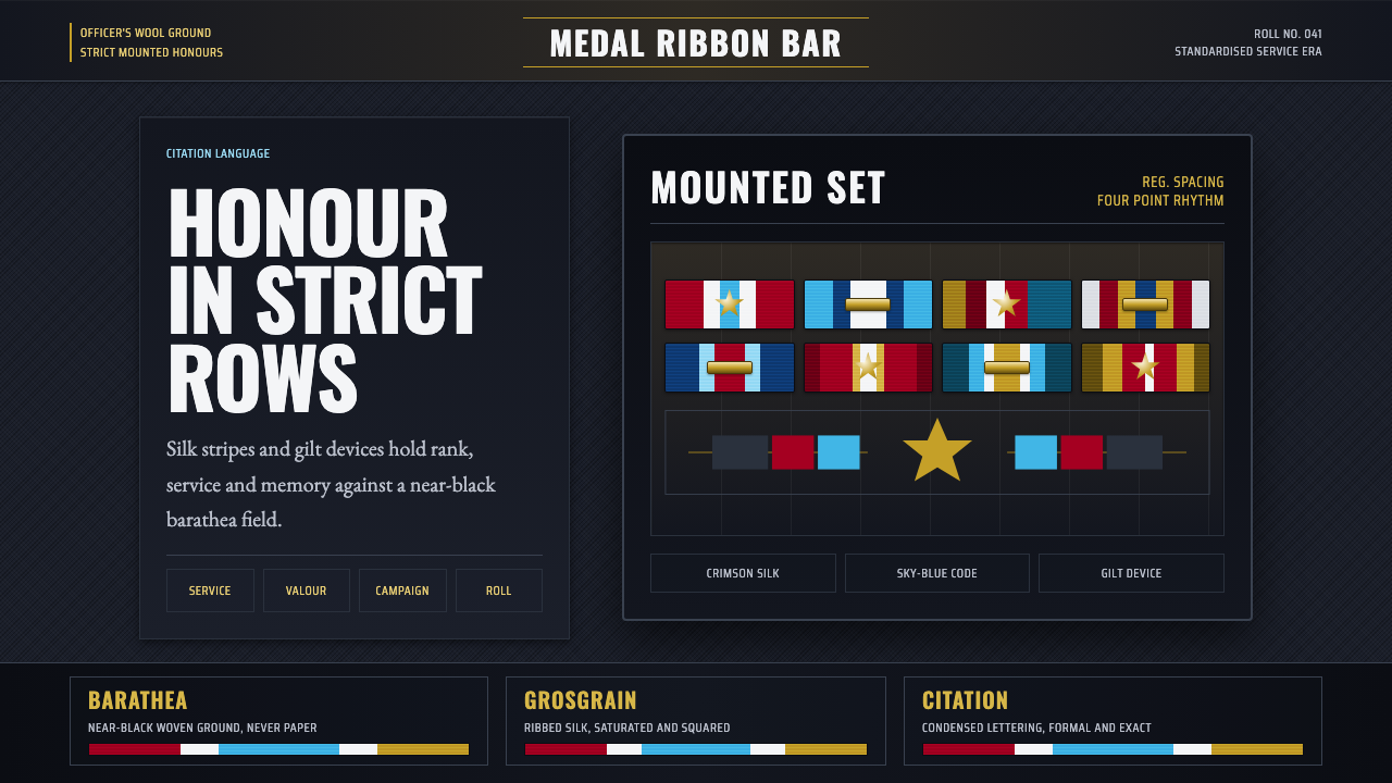 Medal Ribbon BarDiscipline worn as color. Crimson, sky-blue and gilt bars lock onto black woo…军规化为色彩:绯红、天蓝与鎏金绶带钉在黑呢上。