What is Fire Brigade Shield?
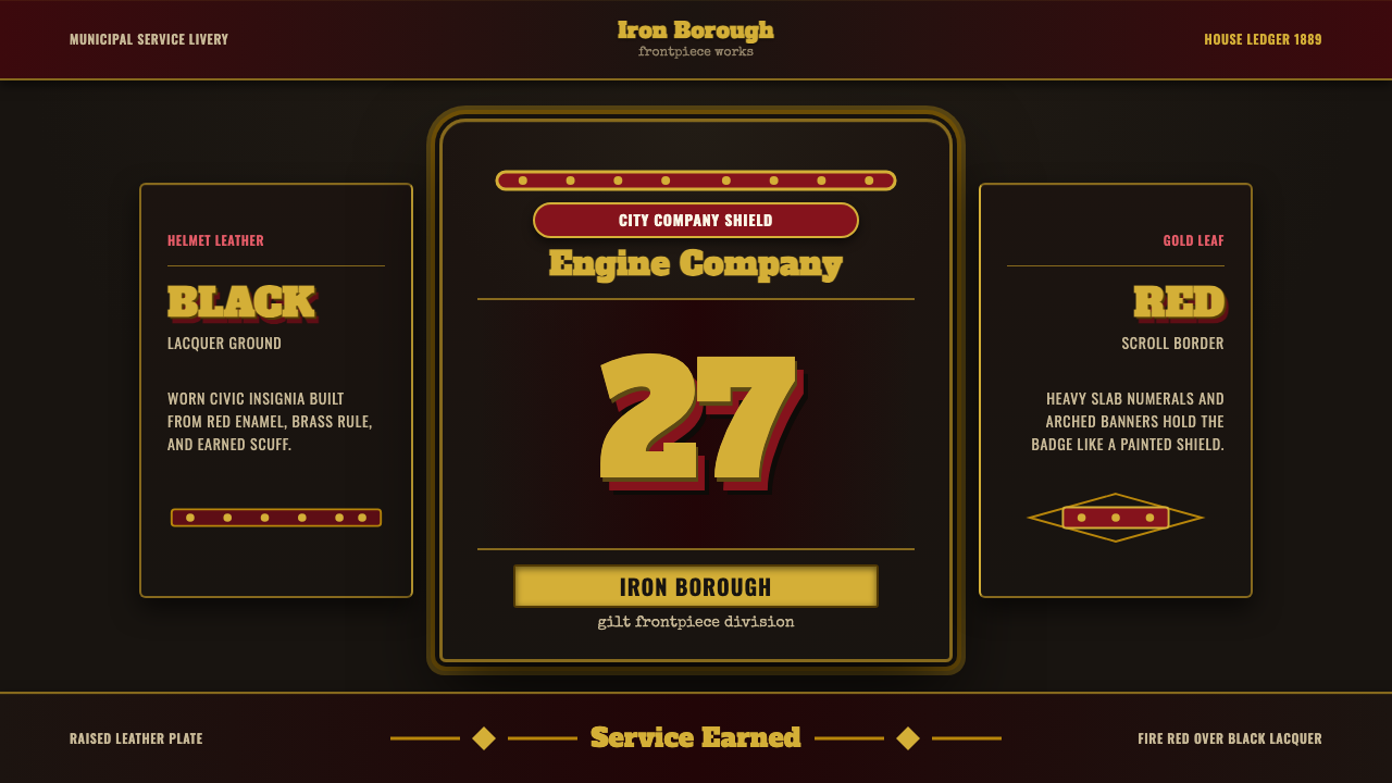
The firefighter helmet shield turns a leather badge worn under a brass eagle into a design system — earned, civic, and unmistakably American.
Fire Brigade Shield in brief
The firefighter helmet shield (also called a fire brigade shield or helmet frontpiece) takes its visual language directly from the stacked leather badge worn on the front of traditional American fire helmets. Where most historical design styles in this library trace back to art movements, printing houses, or corporate branding programs, this one traces back to a piece of protective equipment that quietly became folk heraldry: a hand-painted leather shield, lacquered black or oxblood red, carrying a company's number and name in gold leaf.
As a design system, it distills that badge into something usable well beyond helmets: a high-contrast palette of fire-engine red and gold leaf set against lacquered black, heavy slab-serif or block numerals standing in for company numbers, arched banners that once carried a company or city name, and heraldic edge details — beading, riveting, scrollwork — that read as metal and stitched leather rather than printed ornament.
The overall effect is not decorative in the ordinary sense. It reads as insignia — something conferred rather than chosen, worn rather than designed. Anything built in this style should feel like it was issued to someone who earned it, not printed for someone who bought it.
Where does Fire Brigade Shield come from?
The lineage of this style begins with a very specific object: the leather frontpiece of the American fire helmet, a tradition that took shape in the 1820s and 1830s and reached its most recognizable form by the turn of the twentieth century. The classic American fire helmet — with its long rear brim to shed water and embers down a firefighter's neck, and its high, ridged 'comb' crown — was already distinctive on its own. The leather shield mounted on the front, beneath a brass eagle finial, is what turned a piece of protective headgear into a badge of civic identity.
These shields were not mass-manufactured graphic designs. They were built up in layers of leather, hand-painted and lacquered, then lettered by sign-painters and gilders working in gold leaf — the same trade that lettered storefront windows and horse-drawn fire wagons. A shield would carry the volunteer or paid company's number in large numerals, the company's name and city arched above or below it, and a border of scrollwork or beading applied by hand. Cairns & Brother, one of the best-known American helmet makers, produced the leather and metal helmet bodies onto which these company-specific shields were mounted, but the shield itself was typically a local, bespoke commission — closer to a tailor's or engraver's craft than a factory product.
The period from roughly 1900 to 1950 is when this look became codified as a recognizable municipal style rather than a purely individual craft object. As professional, salaried fire departments replaced or absorbed volunteer brigades in American cities, the shield's function shifted: it stopped being just a maker's flourish and became an institutional marker, closer to a police badge or a regimental crest, signaling rank, company, and jurisdiction at a glance across a smoky street.
What makes the style durable as a design reference today is that every one of its details had a job to do. The gold leaf was legible in firelight and gaslight long before electric street lighting was common. The black or oxblood leather ground hid soot and wear rather than showing it. The scrollwork and riveted edges reinforced a shield built from layered material, not a printed sheet. None of it was invented for looks — which is exactly why it still reads as authentic and 'earned' rather than decorative more than a century later.
What defines the Fire Brigade Shield look?
Color
The palette is built around two anchors: a lacquered black (or deep oxblood red) ground, and a warm metallic gold used for numerals, lettering, and border details. Fire-engine red appears as a secondary structural color — borders, banner fills, accent bands — pushed toward a slightly dulled, worn red rather than a bright, synthetic one. There is no pastel range and no tertiary color noise; every hue present is doing the job of an insignia color, not a decorative one.
Numerals and Lettering
Company numbers are rendered as heavy, slab-like numerals — thick strokes with minimal contrast between thick and thin, built to be read at a glance from across a street. Lettering for company or city names follows the same weight logic and is almost always set on a curve, arching to fit inside or above the shield's banner shape rather than sitting on a straight baseline. This is lettering meant to be gilded and hand-painted, not typeset — it should look laid down stroke by stroke, not output from a font file.
Shield and Banner Geometry
The core compositional device is the shield outline itself — a symmetrical, vertically stacked silhouette, often with a slightly pointed or rounded base, echoing armor more than any modern badge. Layered onto it is a ribbon or scroll banner, usually arched, that carries the name text. These two shapes — shield body and banner — are the load-bearing geometry of the style; almost everything else (numerals, borders, ornament) is placed in relation to them, not freely composed.
Edge Ornament and Metalwork
Borders are heraldic rather than minimal: scrollwork, bead-like dot chains, and riveted or studded edges that imply the shield is a built, layered object rather than a flat printed one. This ornament is always structural in placement — it traces an edge or seam, it does not float freely in open space. The riveting detail in particular is what separates this style from generic 'vintage badge' clichés: it references real leather-and-brass construction, not an abstract idea of oldness.
Surface and Finish
Surfaces read as lacquered leather, not flat vector fills: a subtle sheen sits across the black or oxblood ground, and the gold is metallic rather than a flat mustard yellow. Where wear is suggested, it appears at edges and high points — the parts of a real badge that would catch light and abrasion first — rather than as an even, all-over distress texture. Restraint matters here: the finish should feel worn-in, not artificially aged or overworked with texture effects.
Composition and Symmetry
Unlike many modernist systems in this library that prize asymmetric tension, this style is built on strict vertical symmetry, mirroring the shape of the shield itself. Numerals sit centered, banners arch symmetrically left to right, and border ornament repeats in mirrored pairs. This symmetry is what gives the style its sense of institutional authority — it reads as issued and official rather than composed by an individual designer's eye.
Mood and Register
The overall register is earned rather than aspirational — closer to a uniform patch or a regimental crest than to a luxury monogram. It should never feel playful, whimsical, or trendy. Everything from the color choices to the ornament placement should support a single idea: this object has history, service, and standing behind it, and that standing is being displayed, not manufactured.
Who shaped Fire Brigade Shield?
Founded in the nineteenth century, Cairns & Brother became one of the best-known American manufacturers of leather and metal fire helmets, the physical objects onto which company shields were mounted beneath the brass eagle finial. Their helmet bodies set the structural template — the ridged comb crown, the long protective rear brim — that made the shield's placement on the front the natural focal point of the whole object.
The anonymous tradesmen who lettered fire company shields came from the same trade lineage as those who painted storefront windows, wagon panels, and early commercial signage. Their craft brought hand-lettering conventions — arched banner text, consistent stroke weight, confident scale — directly onto leather, which is why the style's numerals and names still read as painted rather than typeset.
Distinct from painters working in ordinary pigment, gold-leaf letterers specialized in applying real metal leaf to lettering and ornament, a slower and more skilled process that produced the metallic gleam central to this style. Their work is the reason the gold in an authentic shield reads as reflective metal rather than flat mustard-yellow paint — a distinction this design system tries to preserve even when reproduced digitally.
How do you use Fire Brigade Shield today?
This style earns its keep whenever a product needs to feel like an institution rather than a startup — something with rank, service, or standing behind it. Applying it well means treating every element as if it had to survive being read across a smoky street: bold, high-contrast, symmetrical, and legible before it is pretty.
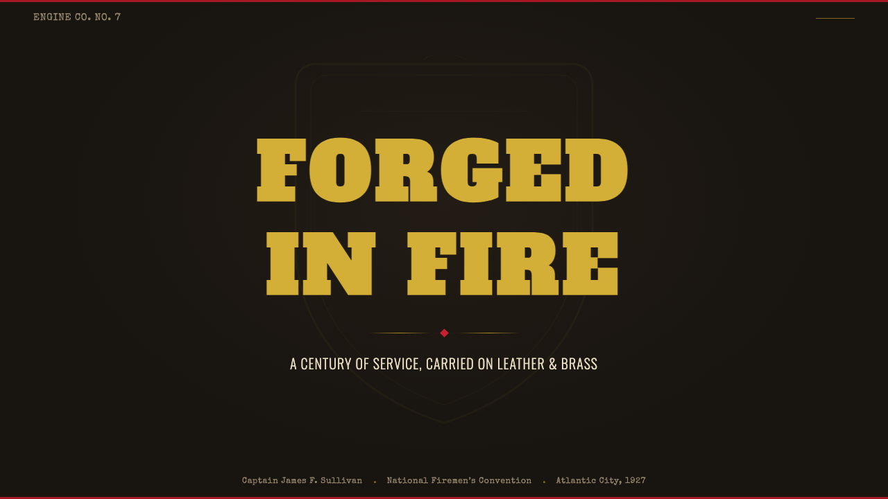
For presentation cover slides, lead with the shield-and-banner geometry itself: a centered, symmetrical emblem shape carrying the title in arched or centered heavy lettering, gold against a lacquered dark ground. Content and data slides should keep the same restraint the original object had — one gold accent against dark grounds, numerals treated with real weight and presence (a large metric can borrow the same slab-numeral confidence as a company number), and borders used sparingly as structural frames rather than page-wide decoration. Resist the temptation to gild every element; the original shields saved the gold for what mattered.
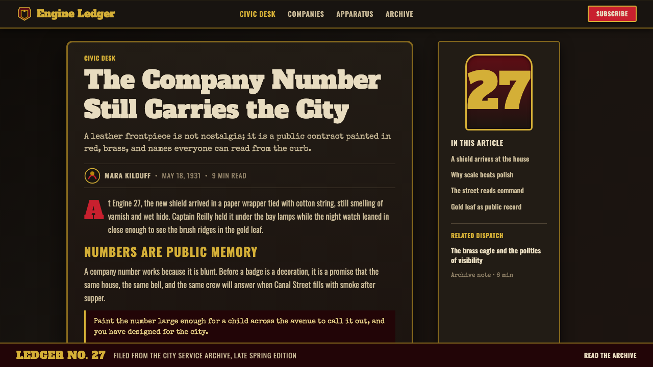
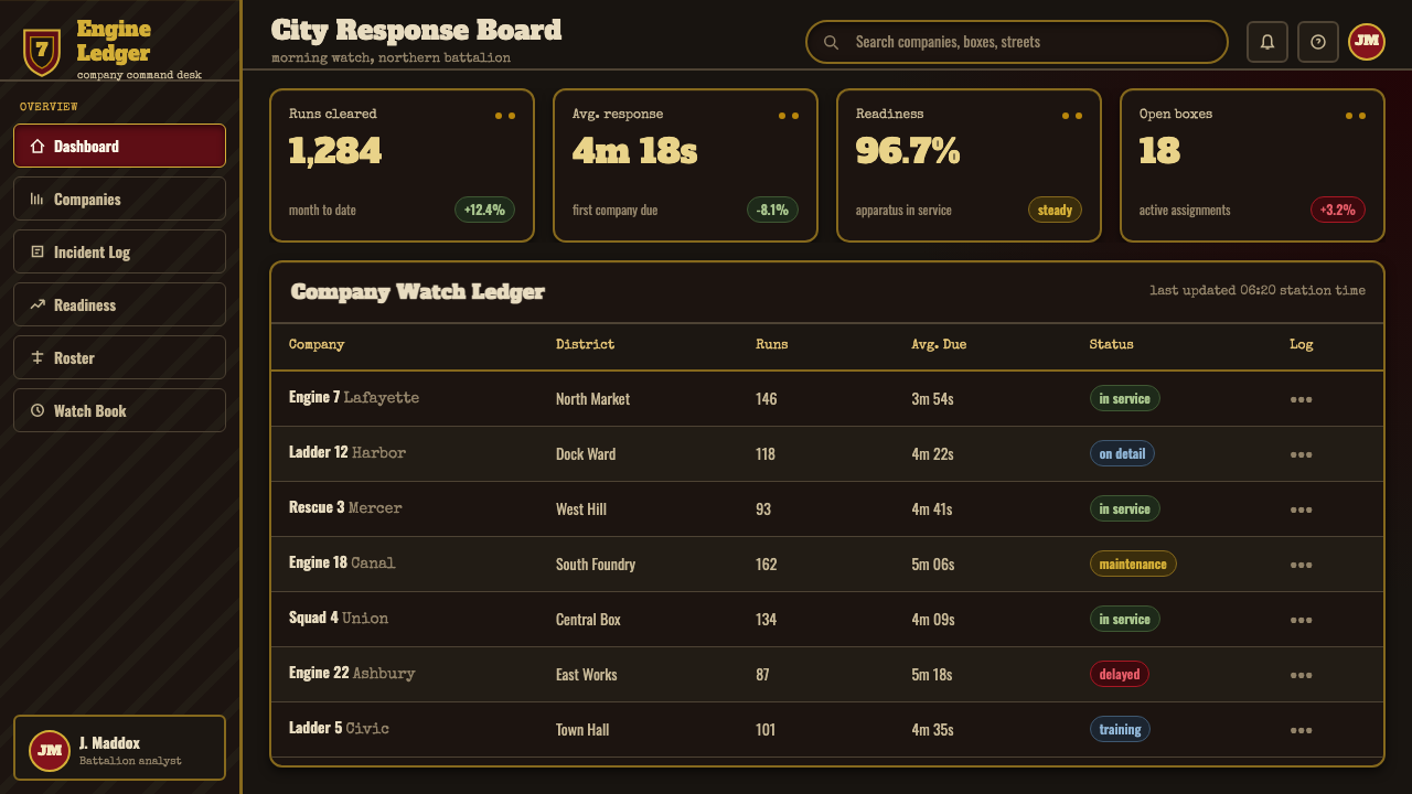
For web interfaces, this style is a strong fit for dashboards and pricing pages that want to project authority, tenure, or membership status — a 'you've earned this tier' feeling rather than a 'buy this plan' feeling. Dark, lacquered-feeling surfaces pair with gold for key numerals, active states, and tier badges; borders on cards or pricing tiers can borrow the beaded or riveted edge motif without overdoing it. Symmetry in layout — centered pricing cards, centered dashboard summary numbers — reinforces the style's institutional character far more than the asymmetric grids common to modernist systems.
For editorial and marketing use, the style suits anything with a service, heritage, or membership angle — a founding date, a badge of tenure, a 'member since' marker, or content about craft, tradition, and institutions. A masthead or section marker built from the shield shape reads immediately as a mark of standing. Marketing pages benefit from treating the emblem as a stamp of approval or credential rather than a logo to be scattered everywhere — one strong placement carries more weight than many small repetitions.
The most common mistake is treating this as generic 'vintage' or 'rustic' decoration — adding random distress textures, mixing in unrelated ornament, or using the gold as a flat mustard color instead of a metallic one. The style only works when the symmetry, the numeral weight, and the structural (not decorative) placement of borders are respected; strip those away and it collapses into a costume rather than an insignia.
Fire Brigade Shield — FAQ
Is this the same thing as generic 'vintage badge' or 'retro emblem' design?
No, and the distinction matters. Generic vintage-badge design borrows loosely from many sources — military insignia, sports crests, whiskey labels — and often adds artificial distress texture as a shortcut to 'oldness.' This style has one specific source: the hand-painted, gilded leather frontpiece of the American fire helmet. That specificity is what gives it its particular vocabulary — the shield-and-banner geometry, the riveted leather-construction edges, the arched company lettering — rather than a vague grab-bag of old-looking motifs.
Does this style require a dark background to work?
Not strictly, but a dark, lacquered-feeling ground is what makes the gold read as metallic and the whole composition read as insignia rather than print. The historic shields were black or oxblood leather specifically because that dark ground made gold leaf and painted red both more legible and more durable-looking. A light-ground version is possible but needs real care: the gold has to be handled as a deep, warm metallic rather than a pale yellow, or the emblem quality collapses into flat, printed decoration.
How does this style differ from a police badge or military insignia aesthetic?
They share a family resemblance — all are institutional, symmetrical, and built to confer standing rather than decorate. But this style's specific vocabulary comes from leatherwork and gold-leaf sign-painting rather than stamped metal or embroidered cloth. That means softer, hand-painted lettering curves rather than die-stamped precision, and a warmer, leather-and-gold material story rather than the cooler steel-and-enamel story of a police or military badge. The construction cues — riveted edges implying layered leather — are also specific to this tradition.
What kinds of products or brands should avoid this style?
Anything that wants to feel playful, casual, cutting-edge, or youth-oriented will fight against this style rather than benefit from it. Its entire value proposition is earned institutional weight — that is the opposite of a brand trying to feel approachable, fun, or new. It also sits awkwardly on products with no plausible connection to service, tenure, or craft; applying it to, say, a casual social app or a children's game would feel like costume rather than identity.
Can the shield-and-banner motif be simplified for small digital contexts like app icons or favicons?
Yes, and simplification should preserve hierarchy rather than detail: keep the symmetrical shield silhouette and a single bold numeral or initial, and let the banner, scrollwork, and riveted edge detail drop away first at small sizes. The shield outline and the weight of the central mark are what make the emblem recognizable at a glance; the ornamental edge detail is the first thing a viewer stops noticing once the object gets small, exactly as it would on a real helmet seen from a distance.
Related design styles
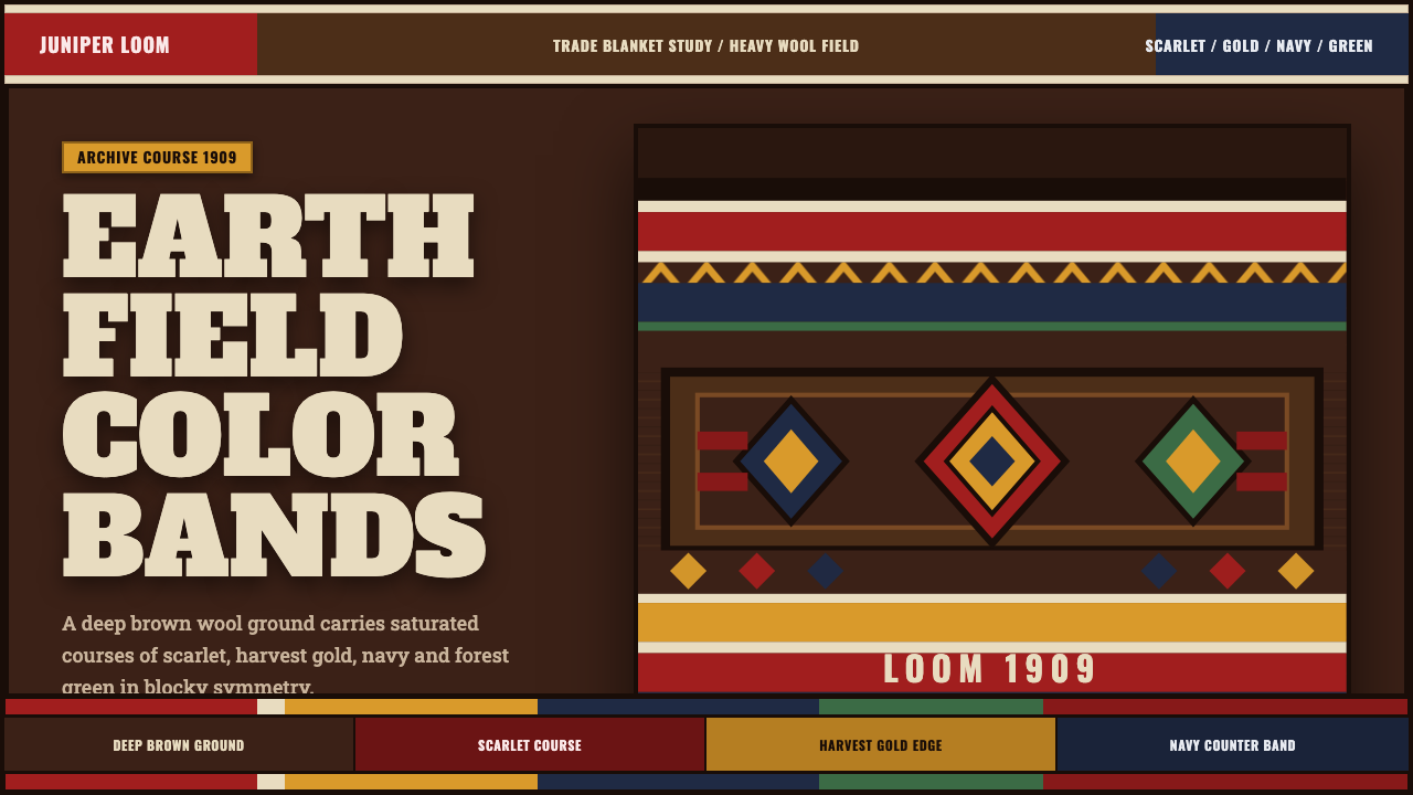 Pendleton Wool BlanketWoven authority. Scarlet-gold-navy bands lock into diamonds on dark brown woo…
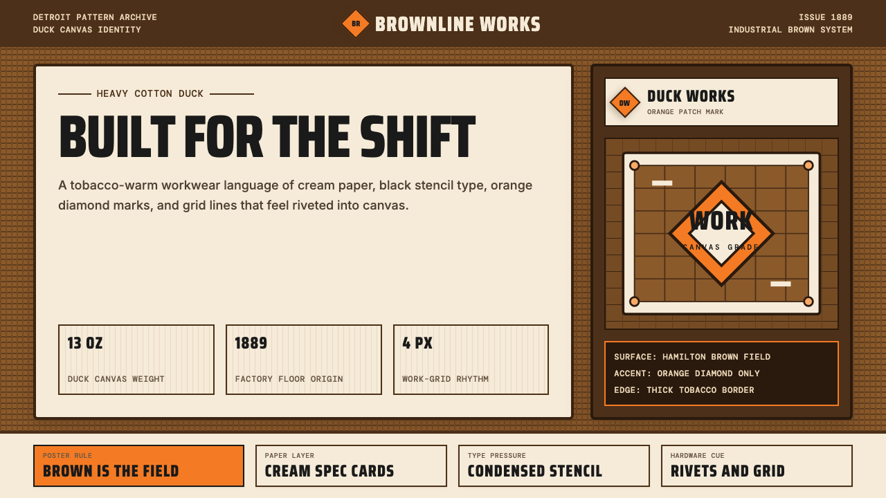 Carhartt Work Jacket Brown (1889)Built like work. Hamilton brown, orange diamond, and condensed type carry can…
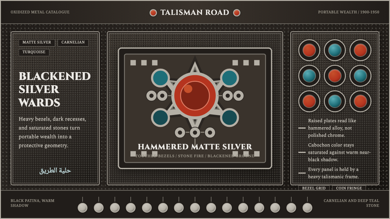 Kuchi Nomad Silver JewelryWeight becomes protection. Matte silver frames carnelian and teal stones on b…
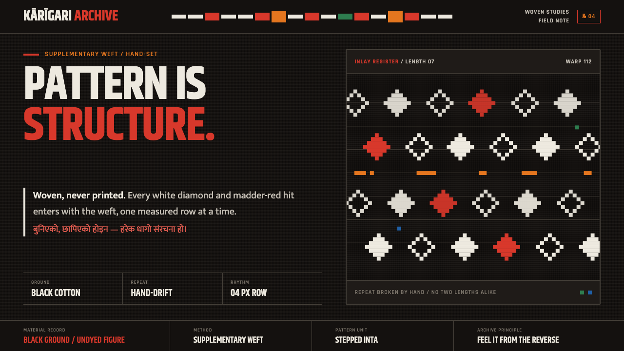 Nepali Dhaka TopiPattern becomes structure. White diamonds and madder-red hits advance row by…
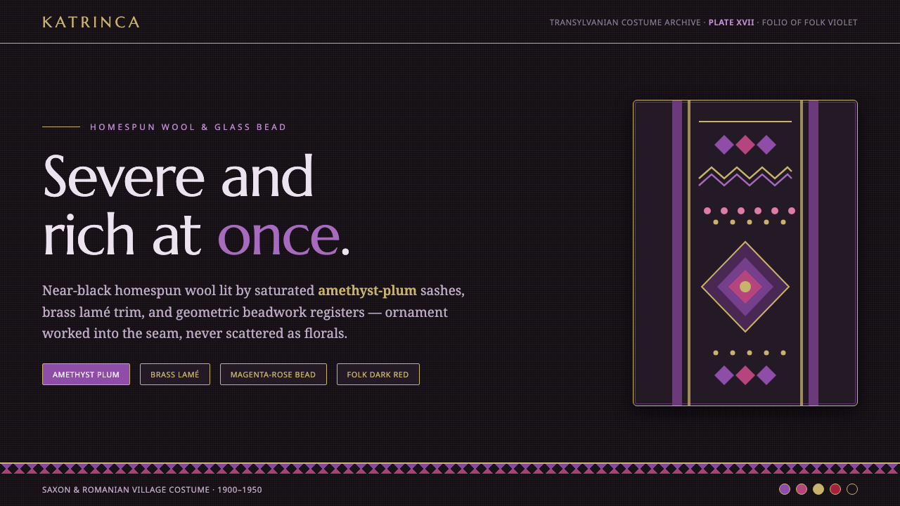 Romanian Folk VioletSevere and rich at once. Near-black homespun wool lit by amethyst-plum and br…
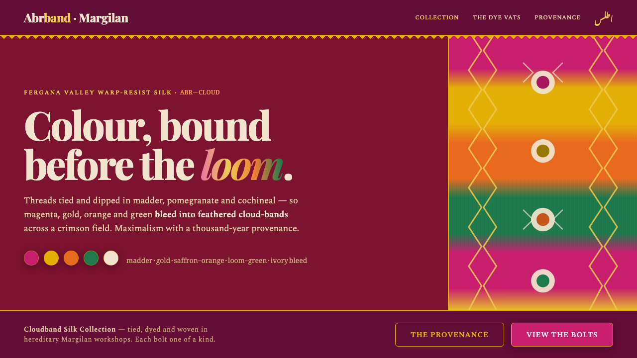 Uzbek Adras & Atlas IkatColour bound before the loom. Magenta, gold and green bleed into feathered cl…