What is Pendleton Wool Blanket?
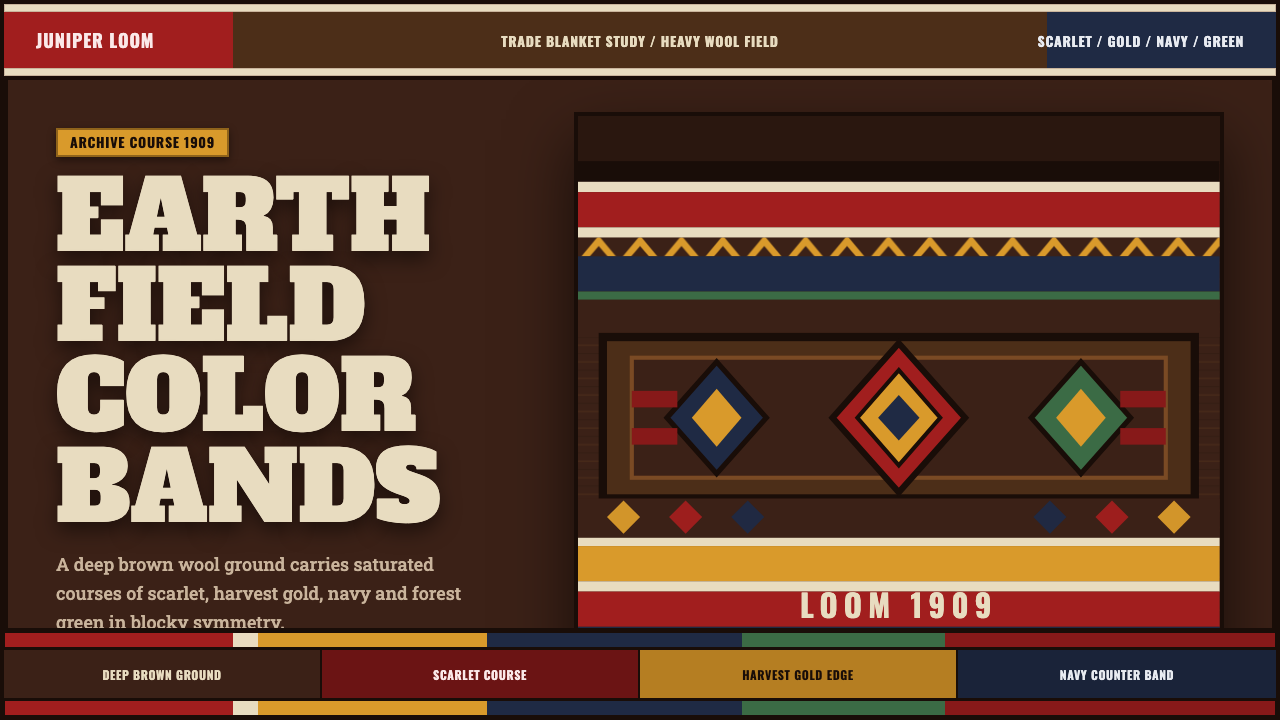
Pendleton Wool Blanket weaves authority directly into the page — scarlet, gold, and navy bands locking into diamonds across a deep brown wool field, exactly as they have on a loom since 1909.
Pendleton Wool Blanket in brief
Pendleton Wool Blanket is a style built directly from a physical object: the trade blankets woven since 1909 by Pendleton Woolen Mills in Oregon, where bold, saturated geometric bands — scarlet, harvest gold, navy, and forest green — stack in blocky symmetry across a deep, earth-brown wool field. The style treats the page itself as the blanket's body rather than as a sheet of paper displaying a picture of one: the background is never white, but always that dark, warm brown.
The pattern language draws on stepped chevrons and diamonds that march across the field in disciplined repetition, inspired by stripe and motif traditions found in Native American textile design — most famously in named blanket patterns evoking places and figures such as Glacier National Park and Chief Joseph. These are woven, not printed, motifs in spirit: every shape reads as though it were constructed one weft thread at a time on a loom, built from blocks and steps rather than drawn with a free curving line.
Color in this style is high-contrast and confident rather than muted or blended. Saturated bands sit directly against the dark brown ground with almost no transitional tones between them, and undyed cream wool — the natural, unbleached fiber color — appears only in thin accent stripes, never as a dominant field. This restraint keeps the cream special: it functions the way a highlight functions on a loom, a rare bright thread among many saturated ones.
Where does Pendleton Wool Blanket come from?
Pendleton Woolen Mills traces its roots to a family wool business in Oregon that expanded significantly when it opened its Pendleton, Oregon mill in 1909, specifically to produce trade blankets for sale to Native American communities and, increasingly, to a broader American market fascinated by the West. The company's founders understood from the start that this was not a generic commodity blanket business — it required genuine engagement with the specific stripe, block, and diamond motifs already meaningful within Native American textile traditions of the Pacific Northwest and beyond, and the mill built relationships with Native communities to understand which patterns and colorways would be well received and appropriately respectful.
The trade blanket itself has a longer history than Pendleton's own founding: blankets had functioned as both practical bedding and a form of wealth, gift-giving currency, and ceremonial regalia in many Native American communities for generations before industrial mills began producing them at scale, with earlier European and American manufacturers also entering this trade through the nineteenth century. Pendleton's particular contribution was to bring a dedicated jacquard-loom manufacturing capability, and a serious design sensibility, to a category that had often been treated by other manufacturers as an afterthought or a cheap imitation.
Joe Rawnsley, a British-trained textile designer who joined the company in its early years, is widely credited as a key figure in establishing Pendleton's design language — translating the jacquard loom's technical capabilities into confident, boldly scaled geometric patterns that could carry real visual weight rather than reading as timid or overly busy. Under this design direction, Pendleton developed named blanket patterns tied to specific places and cultural references — including the Glacier Park blanket, associated with the American national park and the tourism boom around it, and the Chief Joseph blanket, honoring the Nez Perce leader — establishing a practice of naming and storytelling around each pattern that continues to this day.
Over the twentieth century, roughly from 1900 through 1950 and beyond, Pendleton blankets became genuinely woven into American cultural life beyond their original Native American trade context: they were used as gifts at graduations, weddings, and other milestone events across many communities, collected by museums and private collectors, and recognized as a distinctly American design object in the way that few other textile products have achieved. The blankets' bold geometric banding and deep-brown-and-saturated-color palette became so recognizable that the pattern language itself, independent of any single named blanket, now reads instantly as 'Pendleton' to anyone familiar with American textile history.
What defines the Pendleton Wool Blanket look?
Deep Brown Wool Ground
The base surface is a dark, warm, earth-brown — never white, never paper-like. This is the single most important rule of the style: the page is the wool itself, and every other element is woven into it rather than printed on top of a neutral background.
Scarlet, Gold, Navy Bands
A confident, high-contrast trio of saturated colors — a deep scarlet red, a warm harvest gold, and a rich navy blue — forms the working palette, deployed as solid blocks and stripes rather than blended or gradient tones. Forest green sometimes joins as a fourth accent, but the core identity rests on the red-gold-navy combination.
Stepped Chevron and Diamond Motifs
Pattern is built from stepped, blocky chevrons and diamonds that march in disciplined repetition — never a free curving line. Each shape reads as though constructed thread by thread on a loom, giving the pattern a constructed, geometric quality distinct from a hand-drawn or painted motif.
Blocky Symmetrical Stacking
Bands and motifs stack in clear horizontal registers across the composition, balanced symmetrically top to bottom or across a central band. This stacked structure gives the style its sense of stability and order, echoing the physical construction of a woven blanket built row by row.
Cream as Rare Accent
Undyed, natural cream wool appears only as a thin accent stripe between saturated bands, never as a dominant background. Its rarity is what gives it power — a single bright thread among many saturated colors, functioning as a highlight rather than a base tone.
Heavy Slab and Condensed Display Type
Typography leans toward heavy, blocky slab letterforms for display moments and tightly condensed forms for supporting text — letterforms with real visual weight that can hold their own against the bold color banding, rather than thin or delicate type that would be visually overpowered by the pattern.
Woven-Loom Layout Logic
Overall composition follows the logic of a loom: elements align to a strict horizontal-band structure, colors don't blend at their edges but meet in hard, clean lines, and the whole page reads as something constructed thread by thread rather than freely composed.

Who shaped Pendleton Wool Blanket?
Founded in Pendleton, Oregon, with its dedicated blanket mill opening in 1909, the company built its identity around producing trade blankets with genuine design engagement rather than treating the category as an afterthought. Its jacquard-loom manufacturing capability and sustained relationships with Native American communities established the visual language this style draws directly from.
A British-trained textile designer who joined Pendleton in its early years, Rawnsley is widely credited with translating the jacquard loom's technical capabilities into the confident, boldly scaled geometric patterns that define the company's design language, establishing a design sensibility that has persisted for over a century.
How do you use Pendleton Wool Blanket today?
Pendleton Wool Blanket suits any product wanting to feel authentic, warm, and rooted in genuine craft heritage — outdoor and heritage brands, Americana-inspired products, textile and homeware businesses, and any context where handmade authority and pattern-based storytelling are values worth signaling.
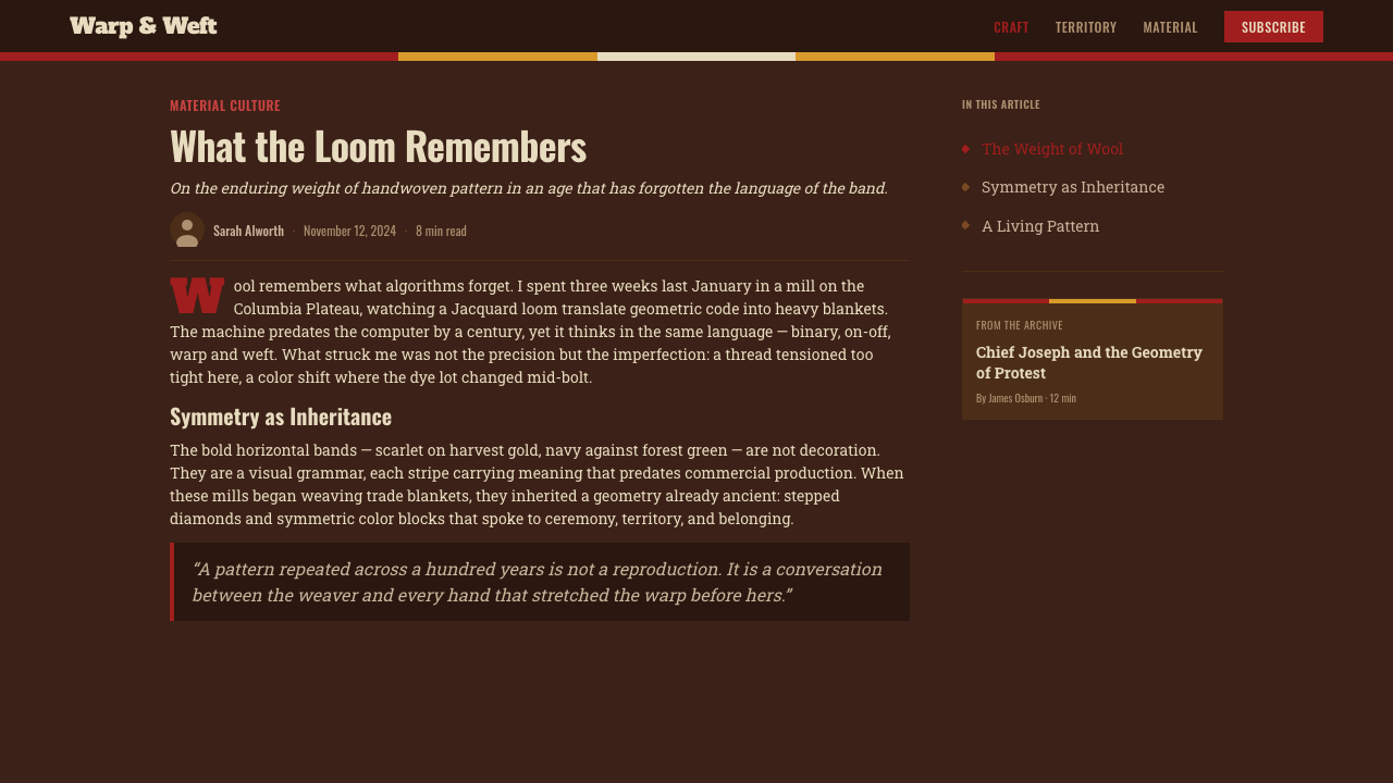
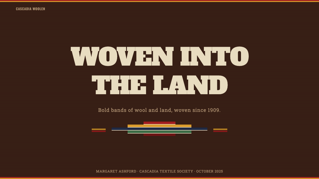
For presentation slides, a cover page benefits from treating the entire slide as the blanket field: deep brown ground, a bold stepped-diamond motif anchoring one section, and heavy display type set directly against the color banding rather than floating on a separate white card. Content slides should keep the brown ground consistent throughout the deck, using the red-gold-navy palette for section dividers and headers so that color, not decoration, carries the hierarchy.
For web interfaces, the style suits heritage retail, outdoor gear, and lifestyle brands particularly well. Dashboards and account pages can use the brown ground with restrained banding at structural edges — headers, footers, card borders — while keeping large content areas calm so the pattern reads as a frame rather than noise. Pricing tables work well when each tier is distinguished by a different saturated accent color from the core palette, echoing how each named blanket pattern carries its own recognizable colorway.
For editorial and marketing work, the style favors storytelling around craft, heritage, and place — feature articles about textile history, American West culture, or maker traditions. Marketing pages can use full-bleed sections of the deep brown ground punctuated by bold chevron or diamond dividers between content blocks, giving the page the rhythm of a woven blanket's banding.
A common mistake is lightening the background toward a paper-white or cream base instead of committing to the dark brown wool ground — this collapses the style into a generic 'southwestern pattern' look rather than the specific, woven authority of the source material. Another is blending or gradienting the saturated colors at their edges; the style depends on hard, clean color transitions that read as woven bands, not painted washes.
Pendleton Wool Blanket — FAQ
Why must the background always be dark brown rather than white?
Because the entire style is built on the premise that the page is the wool blanket itself, not a picture of one printed on paper. A white or light background reintroduces the idea of 'paper displaying a textile pattern,' which breaks the style's core logic. The dark, earth-brown ground is what makes every other color — the scarlet, gold, and navy — read as woven bands rather than printed graphics on a neutral sheet.
Are the named patterns like Glacier Park or Chief Joseph meant to be copied directly?
No — those specific named patterns belong to Pendleton's own historical design catalogue and carry their own particular stories and colorways. The style described here draws on the underlying design logic those patterns share — stepped chevrons, diamonds, blocky symmetrical stacking, high-contrast banding on a dark ground — rather than reproducing any single named pattern exactly. Applying the logic rather than copying a specific pattern is both more respectful and more flexible.
How much of the cream accent color should appear in a composition?
Very little — the cream should function as a thin accent stripe, not a field of its own. A useful guideline is to treat it the way a single bright thread appears among many saturated colors on a loom: present, noticeable, but clearly a minority presence. If cream starts to occupy large areas or competes with the brown ground for dominance, the balance has tipped away from the style's authentic proportions.
Can this style be adapted for a lighter, more casual brand voice?
The style's core power comes from its density and confidence — bold saturated color against a dark ground is inherently a formal, weighty statement rather than a light one. It can support a warm, approachable tone (it is, after all, drawn from a blanket, an object of comfort), but pushing it toward pastel colors or a white ground moves it out of this specific style and into a generic 'folk pattern' look instead.
Does the style require literal wool texture, or can it work as flat digital color?
It works effectively as flat, clean digital color — the important quality to preserve is the deep brown ground and hard-edged color banding, not a literal woven texture overlay. Adding a heavy, literal fabric-weave texture on top of the flat colors can actually work against the style by muddying the crisp, confident color blocking that gives the pattern its visual authority. Restraint in surface treatment keeps the geometric banding the clear focus.
Related design styles
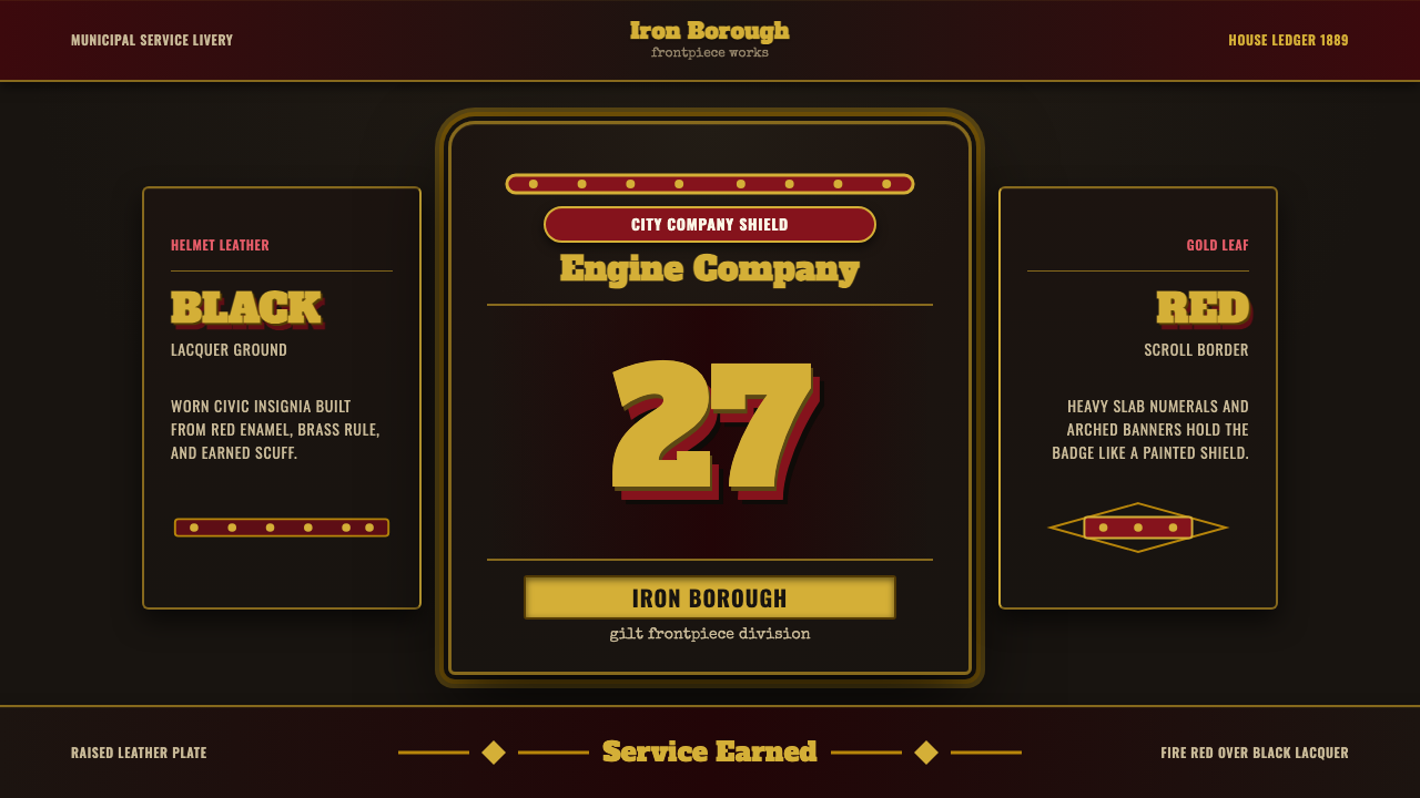 Fire Brigade ShieldEarned civic armor. Gold leaf numerals, fire-red borders, black leather symme…
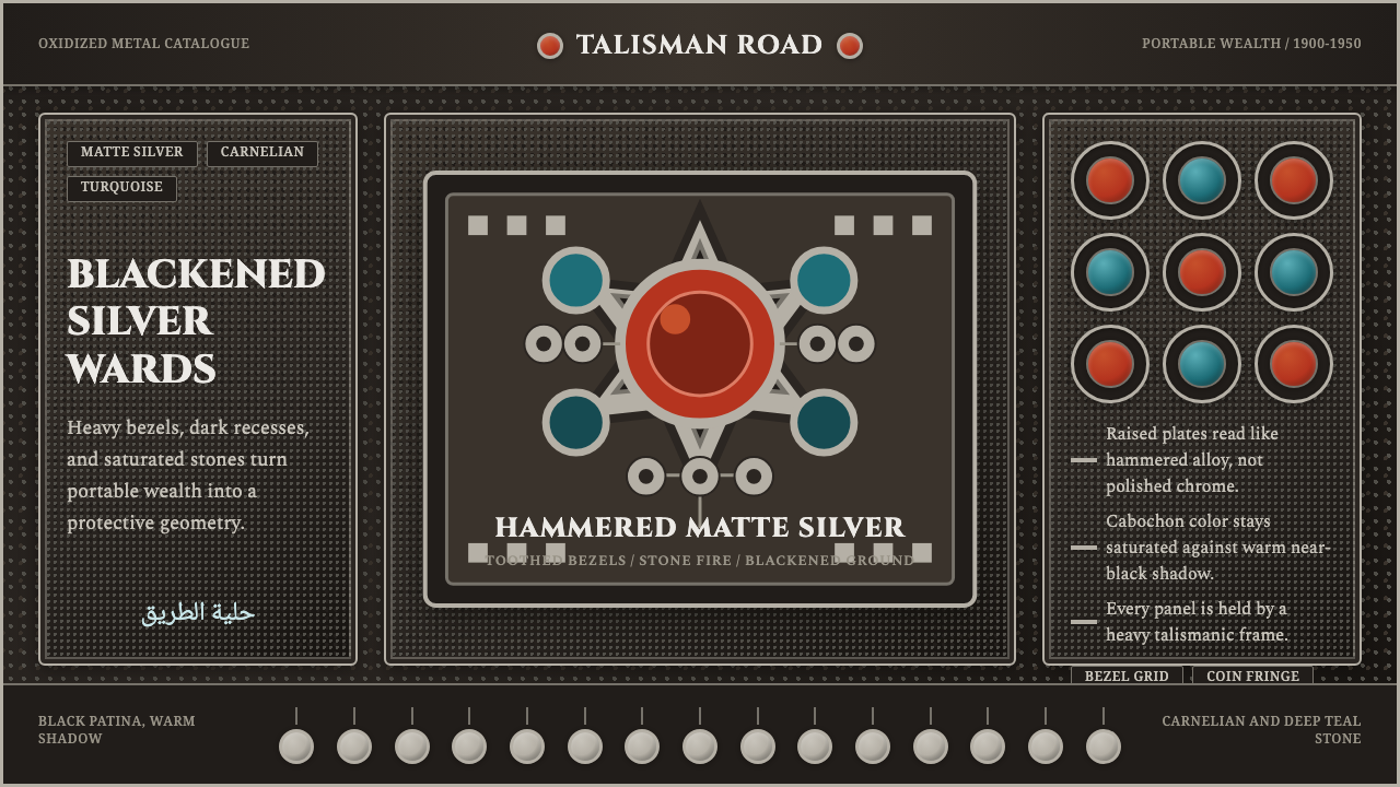 Kuchi Nomad Silver JewelryWeight becomes protection. Matte silver frames carnelian and teal stones on b…
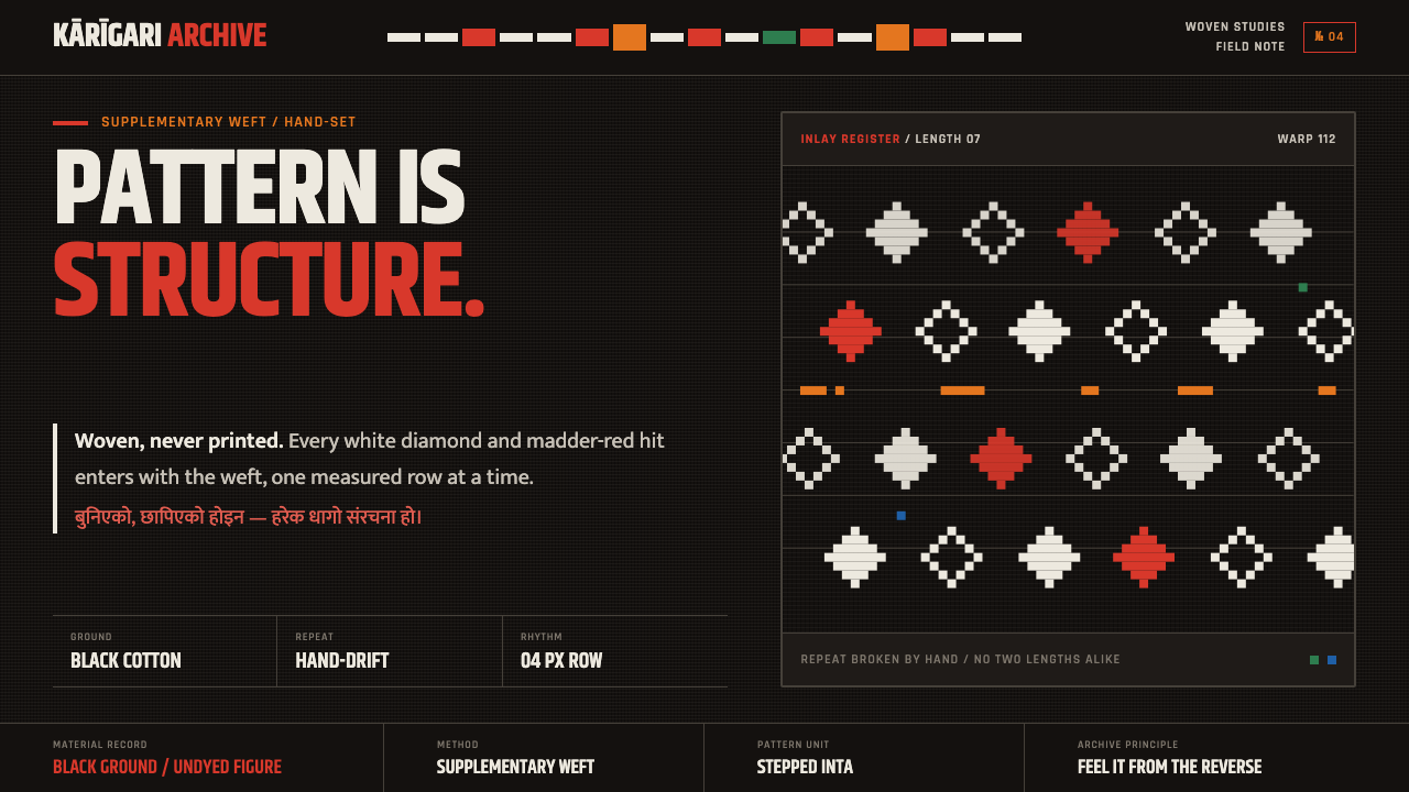 Nepali Dhaka TopiPattern becomes structure. White diamonds and madder-red hits advance row by…
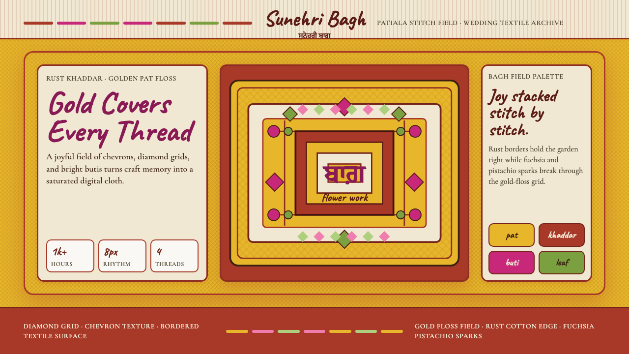 Punjabi Phulkari (Floral Bagh)Joyful density wins. Gold chevrons, rust borders, fuchsia-pistachio butis fil…
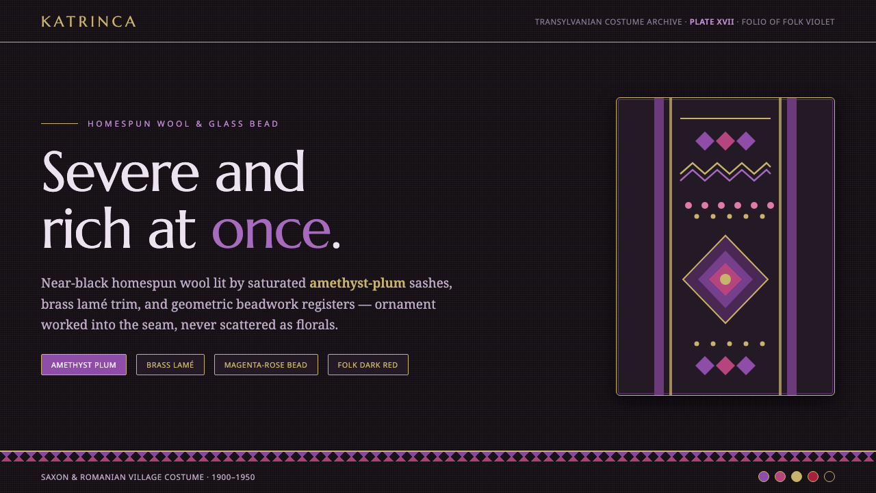 Romanian Folk VioletSevere and rich at once. Near-black homespun wool lit by amethyst-plum and br…
 Atlas Silk (Etles)Soft before it is woven. Walnut-black silk holds vertical emerald and gold dy…