What is Neapolitan Pizza?
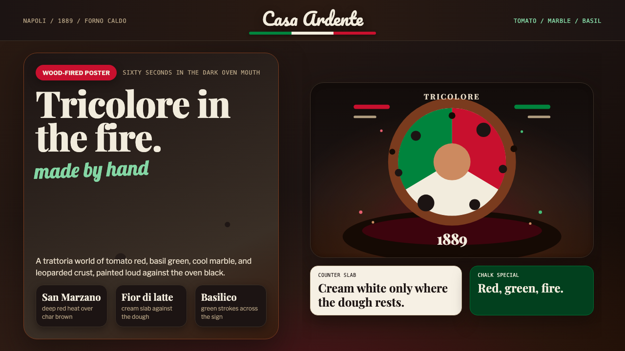
Neapolitan Pizza turns the 1889 Margherita moment — tomato red, mozzarella white, basil green scorched onto a wood-fired crust — into a maximal, hand-chalked design system with zero interest in cool minimalism.
Neapolitan Pizza in brief
Neapolitan Pizza is a design system drawn from the visual world of a wood-fired pizzeria in Naples: the char-blackened mouth of a wood-burning oven, the vivid red-white-green of a Margherita pizza fresh from that oven, and the hand-lettered signage tradition of Italian trattorias. It is a system built entirely around warmth, abundance, and the visible evidence of human hands at work, in direct contrast to the cool, gridded restraint of more industrial design languages.
The palette reads as edible rather than abstract: a vivid tomato red and a fresh basil green, both kept saturated and appetizing, set against the deep charred brown of an oven interior rather than a neutral white or gray. A cool marble white appears only in a supporting role, evoking the countertop slab a pizzaiolo works dough on rather than serving as the system's dominant field. Together these colors are not chosen for abstract harmony; they are chosen because they are, quite literally, the colors of the dish itself.
Typographically and texturally, the system rejects precision in favor of visible craft. Lettering mixes a high-contrast, dramatic serif style associated with old advertising posters and menu boards with a looser, hand-scripted flourish reminiscent of a signwriter's brush lettering. Surfaces are allowed to look blistered, leoparded, and imperfect — char spots, uneven textures, and organic edges are treated as authenticity markers rather than flaws to be smoothed away.
Where does Neapolitan Pizza come from?
Neapolitan pizza's most celebrated origin story centers on a single event in June 1889, when King Umberto I and Queen Margherita of Savoy visited Naples and, according to tradition, grew tired of the elaborate French cuisine typically served at court. Pizzaiolo Raffaele Esposito of Pizzeria Brandi was summoned to prepare pizzas for the royal couple, and among the pies he presented was one topped simply with San Marzano tomatoes, fior di latte mozzarella, and fresh basil — red, white, and green, matching the colors of the newly unified Italian flag.
The queen reportedly favored this pie above the others, and Esposito named it 'Pizza Margherita' in her honor. Whether every detail of this story is historically precise or partly legend embellished over time, it captures something true about Neapolitan pizza's identity: a humble, working-class dish — pizza had been street food for Naples's poor for generations before this — suddenly given royal validation and, in the process, permanently linked to a specific patriotic color story that no other regional food carries in quite the same way.
Naples itself had been making pizza in something close to its modern form for at least a century before 1889, using wood-fired ovens capable of reaching very high temperatures that cook a thin, soft-centered dough in only a minute or two, producing the characteristic leopard-spotted char on the crust's edge. This technique — high heat, minimal cook time, simple fresh toppings — remains the technical foundation that Neapolitan pizza tradition insists on to this day, and it directly produces the visual signature of char against pale dough that the design system borrows.
Pizzeria Brandi, where Esposito is said to have worked, still operates in Naples and continues to trade on this origin story, and Neapolitan pizza-making was eventually recognized by UNESCO as an Intangible Cultural Heritage practice, formalizing what had long been true informally: that the specific gestures, oven technique, and simple ingredient philosophy behind this pizza constitute a living craft tradition rather than merely a recipe.
What defines the Neapolitan Pizza look?
Tricolor Palette
The core palette is a vivid tomato red, a fresh basil green, and a soft dairy white, deliberately echoing the Italian flag through the toppings of the original Margherita pizza. All three are kept saturated and warm rather than muted, reading as appetizing and vivid rather than restrained or corporate.
Charred Oven Brown
The system's grounding tone is not white or neutral gray but a deep, warm charred brown evoking the interior of a wood-fired oven. This dark ground makes the tomato red and basil green appear more vivid by contrast, the same way they appear more vibrant against a scorched crust than they would against a plain white plate.
Leopard-Spotted Char
A hallmark of true wood-fired Neapolitan crust is uneven, blistered charring around the edge — dark spots scattered irregularly rather than a uniform browning. The system treats this irregular blistering as a texture worth preserving and referencing directly, rather than smoothing surfaces into a clean, even gradient.
Didone Display Lettering
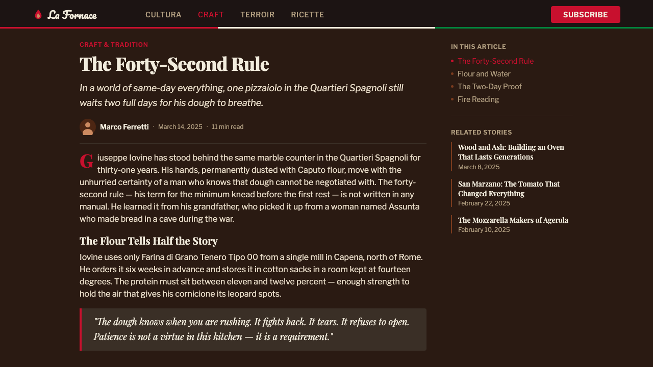
Headline and signage-style lettering draws from the dramatic high-contrast serif tradition seen on old Italian advertising and menu boards, with thick and thin strokes exaggerated for maximum visual punch. This is paired, not replaced, by looser hand-script accents rather than used alone throughout.
Hand-Scripted Flourish
Alongside the bold display lettering, a looping, hand-drawn script style appears for accent text, signatures, or callouts, evoking a signwriter's brush rather than a stencil or ruler. This human, slightly imperfect line quality is essential to the system's warmth and stands in deliberate contrast to any rigid, mechanical typeface.
Maximal Abundance
Composition favors density and generosity over restraint: color fields, textures, and lettering styles are layered together rather than isolated by whitespace. This is a deliberate rejection of cool minimalist convention — the system communicates warmth precisely through its refusal to hold back.
Marble as Cool Counterpoint
Where a cool, pale surface does appear, it is treated specifically as a marble countertop slab — the surface dough is worked on — rather than a generic neutral background. It functions as a brief resting point for the eye amid the otherwise warm and saturated palette, never as the system's dominant field.
Who shaped Neapolitan Pizza?
Esposito was the Naples pizzaiolo credited with creating the Pizza Margherita in 1889 for Queen Margherita of Savoy, topping a pie with San Marzano tomatoes, fior di latte mozzarella, and basil in the colors of the Italian flag. His name and the pie he is said to have invented remain the foundational reference point for the entire Neapolitan pizza tradition and its associated visual identity.
The queen's visit to Naples in 1889 and her reported preference for the tricolor pie gave the dish royal validation and its enduring name. Her association with the pizza permanently linked a working-class Neapolitan food to a story of national pride and unification-era symbolism, which is why the red-white-green palette carries patriotic weight rather than being an arbitrary color choice.
The Naples pizzeria where Esposito is said to have worked still operates today and continues to trade on its association with the 1889 royal visit and the Margherita's creation. As a living, continuously operating institution, it anchors the design system's origin story in an actual place rather than pure legend.
How do you use Neapolitan Pizza today?
Neapolitan Pizza suits any project that wants to feel warm, handmade, and generous rather than polished or corporate. It is a maximal system by design, and applying it well means resisting the instinct to clean it up — the warmth comes directly from density, texture, and visible craft.
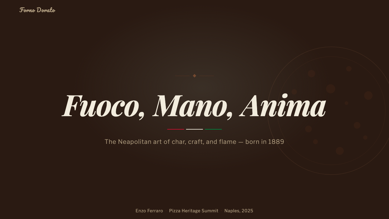
On presentation slides, the style produces strong cover pages built around a rich charred-brown field with a Didone-style headline in tomato red or a hand-scripted accent, evoking a trattoria chalkboard rather than a sterile title card. Content slides should let a warm background carry through rather than defaulting to white, using basil green sparingly for supporting labels or highlights. Data slides can render simple figures as hand-lettered numerals against the charred field, keeping the maximal, tactile feeling even where the content is quantitative.
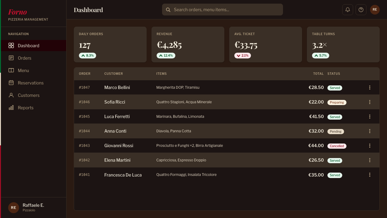
For web interfaces, this system works well for food and hospitality brands, artisanal or craft-positioned products, and any platform wanting to feel human-made rather than automated — recipe platforms, restaurant booking tools, farmers'-market or local-vendor marketplaces. Dashboards should avoid the cool, gridded feel of enterprise software; instead use warm background tones, hand-script accents for friendly microcopy, and tomato red reserved for primary calls to action so it retains its appetite-driving punch. Pricing pages benefit from a chalkboard-menu treatment, listing tiers the way a trattoria lists daily specials.
In editorial and marketing contexts, the system is a natural fit for food writing, hospitality marketing, and heritage or craft-food storytelling. A magazine feature can pair the Didone display face for headlines with hand-script pull-quotes, using the charred-brown ground as a recurring section-break color rather than plain white space.
The most common mistake is applying the tricolor palette in a flat, evenly saturated way without the charred, textured ground that gives it context — three bright flat colors on white read as a generic flag motif rather than Neapolitan pizza specifically. The system depends on the interplay between vivid toppings and a dark, imperfect, char-marked field; remove the char and the reference collapses into something closer to a national-flag graphic than a trattoria.
Neapolitan Pizza — FAQ
Is the Margherita pizza origin story historically accurate?
The core details — a 1889 royal visit, Raffaele Esposito of Pizzeria Brandi, and a pie topped in the colors of the Italian flag named for the queen — are the traditional account, though like many culinary origin stories some elements may be embellished or simplified over generations of retelling. What is not in dispute is that Naples had been making pizza for the working poor for at least a century before this event, and that this specific royal moment permanently attached a patriotic tricolor story to the dish.
Why does the design system avoid a clean white background?
A plain white ground belongs to a different design tradition — cool, restrained, and modern — that runs against what this system is trying to communicate. The charred oven brown is not a stylistic substitute for white; it is the literal ground the dish itself is cooked against, and using it keeps the vivid tomato and basil colors reading as warm and appetizing rather than as flat, isolated hues on a neutral field.
What role does the leopard-spotted char play beyond decoration?
The uneven, blistered char is a direct byproduct of the very high heat and very short cooking time that defines authentic wood-fired Neapolitan technique, so referencing it is a way of pointing to genuine craft and method rather than an arbitrary pattern. Including this irregular texture is what separates the style from a generic 'pizza theme' that only borrows the color palette.
Can this system work for a brand that is not food-related?
It can, though it transfers best to brands wanting to feel handmade, warm, generous, or rooted in a specific place and tradition — hospitality, craft goods, community marketplaces, or heritage storytelling. It is a poor fit for anything wanting to feel precise, technical, or corporate, since its entire visual identity is built around abundance and visible imperfection rather than restraint.
Why does the lettering mix two very different styles instead of one?
The high-contrast display serif and the looping hand-script both come from the same real-world source — Italian trattoria signage, which typically combines a formal display face for headline dishes with an informal handwritten flourish for specials or personal touches. Using only one of the two would flatten the system into either pure formality or pure casualness, losing the specific warmth that comes from combining both registers the way an actual sign painter would.
Related design styles
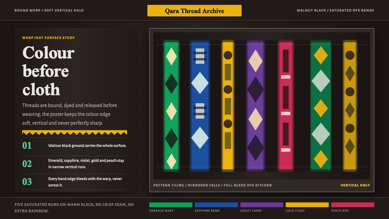 Atlas Silk (Etles)Soft before it is woven. Walnut-black silk holds vertical emerald and gold dy…
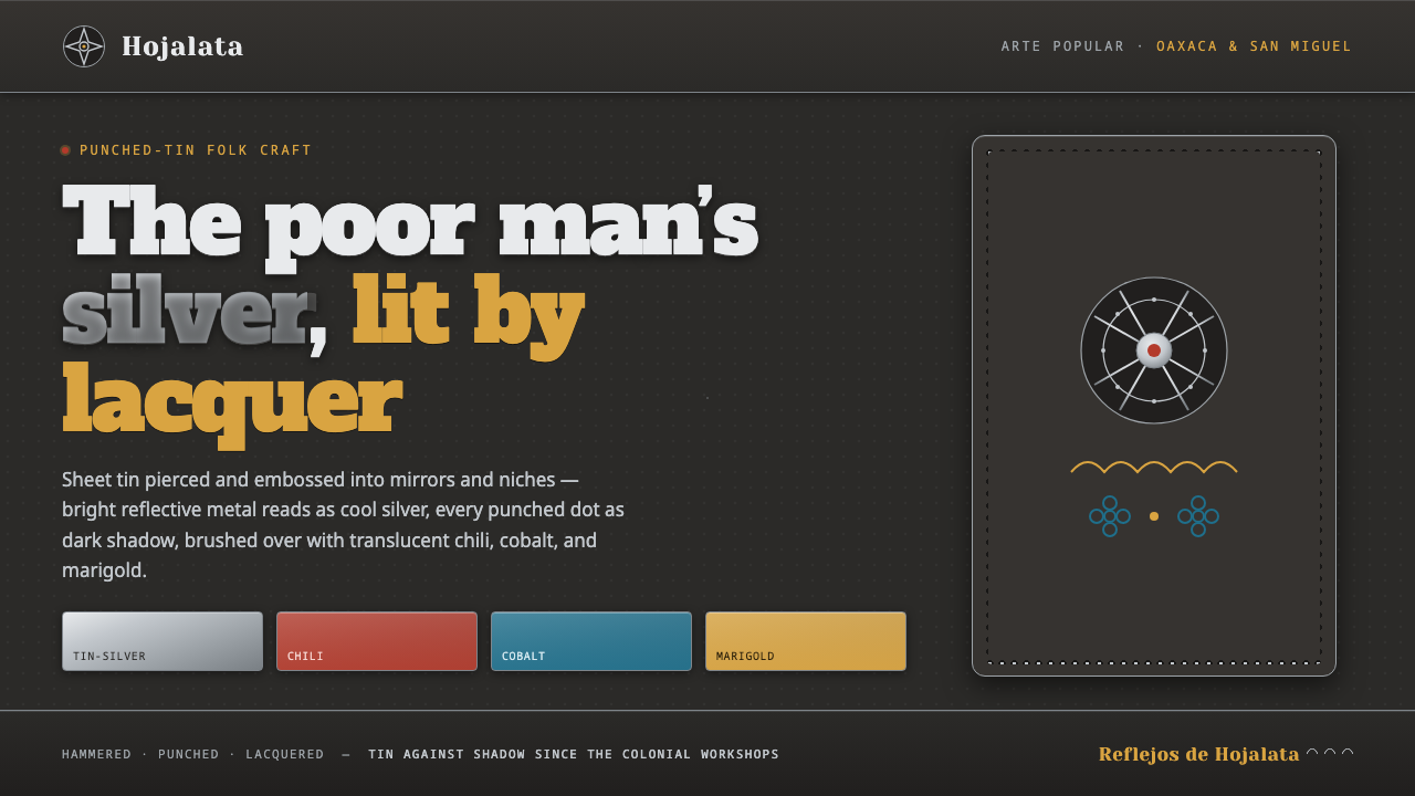 Punched Tin HojalataThe poor man's silver. Pierced tin on oxidized shadow, washed in chili, cobal…
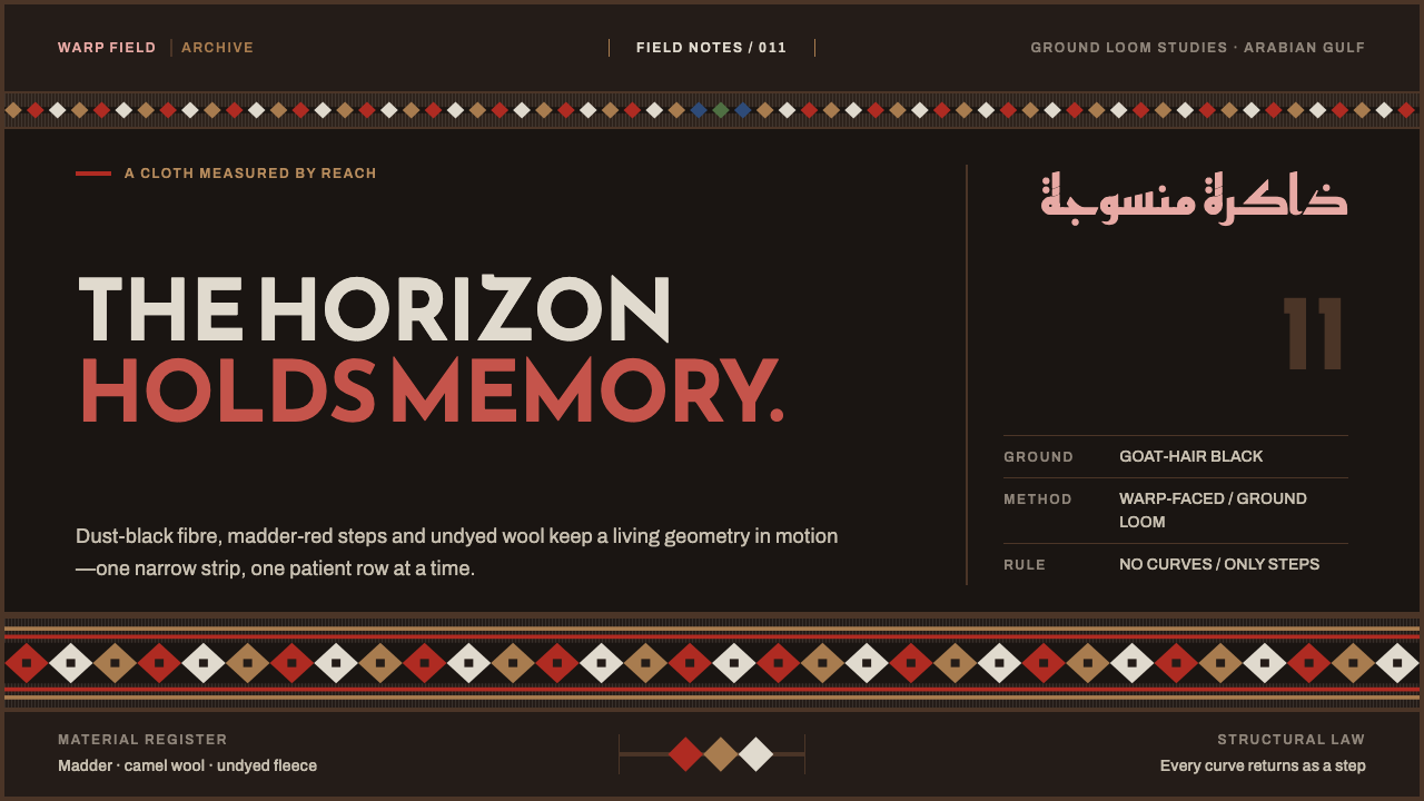 Emirati Sadu WeavingMemory runs in bands. Madder steps cross dusty goat-hair black with no curve…
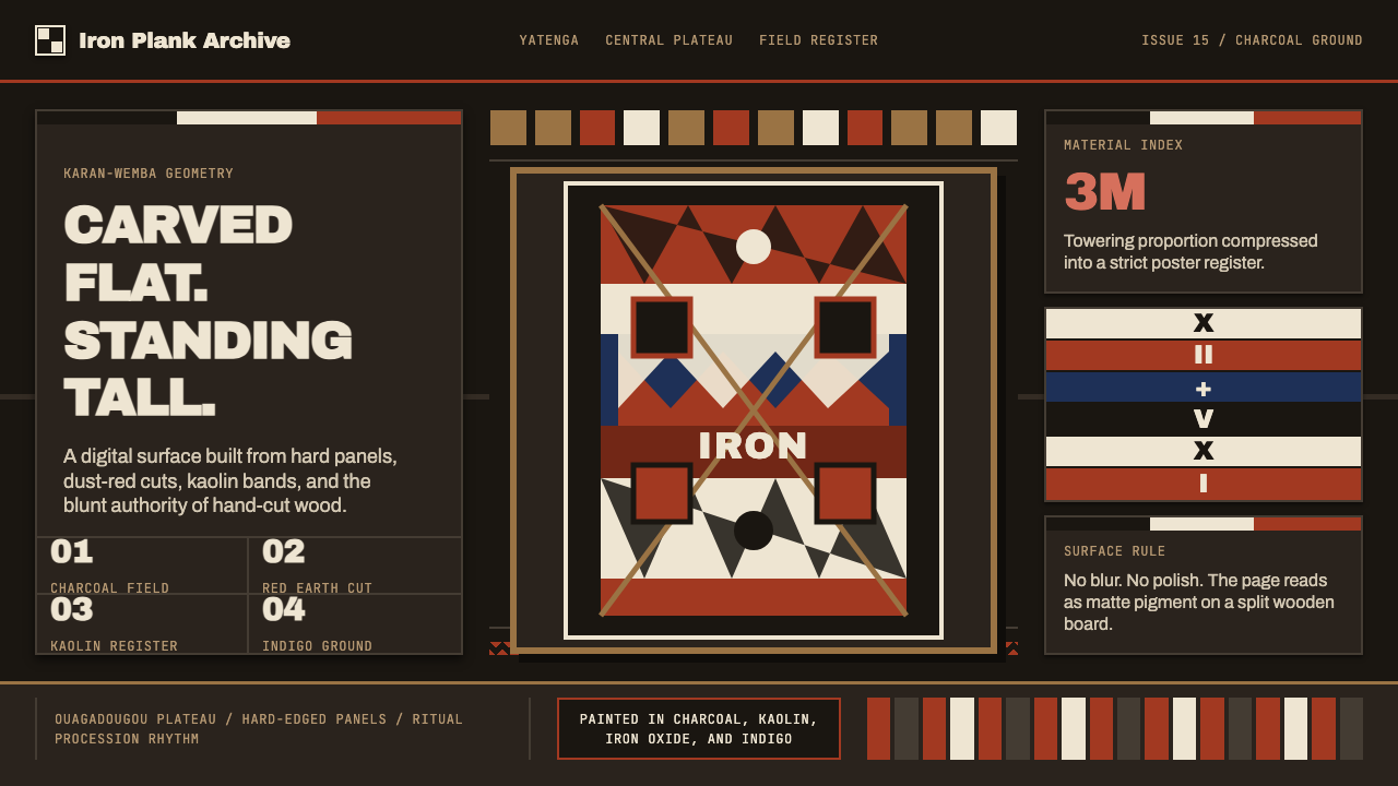 Mossi Burkina Plank MaskCarved, not rendered. Charcoal fields, dust-red cuts, and kaolin bands stack…
 Tatar Leather Mosaic IchigiJewel tones held by thread. Emerald leather blocks clash under raised gold se…
 Andean ChulloOrnament carries a code. Cochineal red stacks strict stitch bands with bead-w…