What is Biplane Aviation (1920s)?
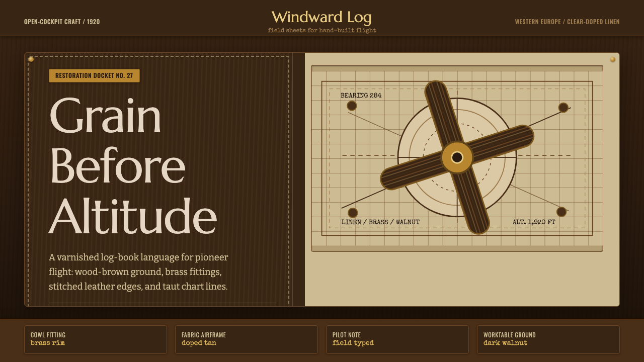
The 1920s biplane was flown, not manufactured — every wing, cowl, and cockpit carries the hand-built texture of an era when aviation was still a craft.
Biplane Aviation (1920s) in brief
Biplane Aviation as a design system draws on the visual and material world of the open-cockpit biplane at the height of the Golden Age of Aviation. It is not a generic 'airplane' motif — it is specifically the era running from roughly 1918 into the 1930s: two stacked wings braced by wires and struts, an exposed engine and a laminated-wood propeller up front, an open cockpit where the pilot sat behind goggles and a leather helmet, and fabric-covered surfaces that had to be varnished, doped, and re-taped by hand between flights.
Because the aircraft themselves were assembled from natural materials rather than stamped metal, the system inherits their material logic: everything is walnut and mahogany veneer, tanned and stitched leather, aged linen fabric, and brass fittings that oxidize rather than gleam. The palette sits entirely in warm browns and tans — there is no cream-white or chrome silver here, because those belong to the jet age that arrived decades later. Anything unweathered or machine-polished reads as wrong for this system.
The system's other core ingredient is the aeronautical chart: buff paper covered in fine hand-drawn linework, compass roses, dead-reckoning corrections, and cramped marginal numerals. This is the aesthetic of pilots who navigated by landmark and dead reckoning rather than instrument, and it supplies the system's typographic and diagrammatic register — thin ruled lines, hand-lettered numerals, and the sense of a document that has been folded into a cockpit pocket more than once.
Where does Biplane Aviation (1920s) come from?
The biplane configuration — two wings stacked one above the other and cross-braced with struts and wires — dominated powered flight from the Wright brothers' first successes in the early 1900s through the 1930s, when it was gradually displaced by the faster, cleaner monoplane. Two shorter wings, cross-braced, gave more lift per unit of wingspan and more structural rigidity than a single long wing could achieve with the wood-and-fabric construction techniques available at the time — a real engineering trade-off, not an aesthetic choice, though it produced one of the most recognizable silhouettes in the history of design.
World War I accelerated biplane development enormously and left, at the armistice in 1918, a huge surplus of aircraft and trained pilots with nowhere to fly. Curtiss JN-4 'Jenny' trainers, declared obsolete by the military, could be bought by civilians for a few hundred dollars. Out of this surplus grew barnstorming — the itinerant air circuses that toured rural America and Europe through the 1920s, in which pilots performed loops, wing-walking, and parachute stunts over county fairgrounds for a paying crowd, then sold rides in the same machine that had just looped overhead. Barnstorming is the culture that made the open-cockpit biplane a popular icon rather than a military curiosity.
The technical core of the era's construction was clear-doped linen: aircraft fabric — cotton or linen — stretched taut over a wood or steel-tube frame, then coated in dope, a cellulose lacquer that shrank the fabric drum-tight as it dried and sealed it against moisture. Ribs were reinforced with rib-stitching, visible seams running the length of each wing panel, and the whole surface was often given a final coat of aluminum-pigmented dope for ultraviolet protection, giving these aircraft their characteristic taut, faintly translucent skin. Propellers, meanwhile, were carved from laminated hardwood — thin sheets of walnut, mahogany, or birch glued in alternating grain directions for strength, then shaped, balanced, and varnished to a deep, glossy brown. A propeller was as much a piece of furniture-grade woodworking as it was an engineering component.
By the mid-to-late 1930s, all-metal monoplane construction, led by manufacturers such as Douglas and Boeing, made the biplane commercially obsolete for passenger and military work, though biplanes persisted in agricultural crop-dusting and aerobatics for decades afterward. The aeronautical charting tradition that developed alongside the era standardized much of the symbology still used in flight navigation today. What survives in design terms is the whole material vocabulary of the period: an aircraft built and repaired by hand, from materials a carpenter or a leatherworker would recognize, at the exact historical moment flight stopped being experimental and started being romantic.
What defines the Biplane Aviation (1920s) look?
Color
The palette lives entirely in the browns of the material world it depicts: dark walnut and aged leather anchor the ground, with tan, buff, and ochre carrying midtones and highlights. There is no cream-white — every neutral leans warm, as though seen under the amber cast of hangar light or an aging photograph. Cool tones appear only sparingly, in the dark blue-black of gun-metal fittings or the faded blue-gray of an old chart's ink.
Wood & the Laminated Propeller
Every wood surface should read as laminated and hand-finished rather than solid or machine-milled: alternating bands of grain direction, a deep varnished sheen that pools light rather than reflecting it sharply, and edges that curve rather than snap to a right angle. This is furniture-grade craftsmanship applied to a flying machine, and it sets the tone for every other material in the system — nothing in this world was extruded or injection-molded.
Leather
Leather surfaces — the flying helmet, the seat, the map case — are worked and weathered rather than showroom-new: visible stitching, soft creasing at the folds, and a patina that darkens unevenly with use. Leather in this system functions the way upholstery does in a well-used tool: it should look like it has a history, not like it was unwrapped this morning.
Doped Linen & Fabric
Fabric surfaces are taut rather than draped — the visual signature of dope-shrunk linen pulled drum-tight over a rib structure. Where the fabric shows structure at all, it appears as fine parallel rib-stitching rather than loose folds or gathers, and any translucency in the material should feel sealed and varnished rather than sheer or soft.
Brass & Metal Fittings
Metal appears sparingly and specifically: cowl fasteners, gauge bezels, and hardware, always in warm brass rather than cool chrome or brushed steel. These pieces should carry a soft oxidized glow rather than a mirror polish — a material that has been handled, tightened, and re-tightened by hand rather than stamped and lacquered on an assembly line.
Chart Linework & Type
The system's graphic register comes from the aeronautical chart: thin ruled lines, compass roses, dead-reckoning annotations, and small hand-set or hand-lettered numerals on buff paper. Typography favors a period-appropriate, slightly irregular hand over anything crisp or digitally perfect — the sense of a document folded and refolded in a cockpit rather than printed and laminated.
Weathering & Patina
Nothing in this system should read as brand new. Wood shows the faint sheen of repeated handling, leather shows creasing and darkened highlights, brass shows soft tarnish rather than mirror shine, and fabric shows the gentle unevenness of hand-taping and hand-doping. This weathering is not damage — it is evidence of a machine that is flown, maintained, and loved rather than displayed.

Who shaped Biplane Aviation (1920s)?
Thomas Sopwith founded the Sopwith Aviation Company in England in 1912 and, through the First World War, produced some of the era's most influential biplane fighters, including the Sopwith Camel — an aircraft whose tight turning radius made it both formidably effective and notoriously difficult to fly. Sopwith's factories were central to establishing the biplane fighter as the dominant military aircraft configuration of the war, and the company's postwar reorganization, as Hawker Aircraft, continued to shape British aviation design for decades. Sopwith himself lived to 101, later finding a second career as a competitive yachtsman.
Barred from American flight schools because she was Black and a woman, Bessie Coleman traveled to France in 1920 to train, and in 1921 became the first African-American and the first Native American woman to earn a pilot's license. She returned to the United States as a barnstorming stunt flier, performing loops and daring maneuvers before enthusiastic crowds throughout the early 1920s, and became one of the era's most celebrated aviators before her death in a flying accident in 1926. Her career embodies the barnstorming culture that carried the open-cockpit biplane into American popular imagination.
The Dutch aircraft designer Anthony Fokker built some of the First World War's most feared biplanes and triplanes for the German air service, pioneering synchronization gear that let a machine gun fire through a spinning propeller without striking the blades. After the war he relocated his manufacturing operations and became a major supplier of civil biplane transports through the 1920s, his aircraft carrying passengers and mail across Europe and the Americas during exactly the period this system draws from.
Before his celebrated solo transatlantic flight in 1927, Charles Lindbergh spent the early 1920s as a barnstormer and wing-walker, then flew the open-cockpit de Havilland DH-4 biplane as a U.S. Air Mail pilot — a job that meant flying in open cockpits through fog and night with only a compass and dead reckoning for navigation. That early career, more than the record-breaking flight that followed it, is the world of pioneer aviation that this design system represents.
How do you use Biplane Aviation (1920s) today?
Biplane Aviation works best when it is used to signal craftsmanship, heritage, and hand-built authority rather than literal air travel. It reads well anywhere a brand wants to claim 'made by hand, tested by experience' — travel and outdoor brands, heritage goods, watchmaking, adventure and exploration products — and it reads badly anywhere the underlying message is speed, efficiency, or futurism, because the material vocabulary is deliberately pre-industrial.
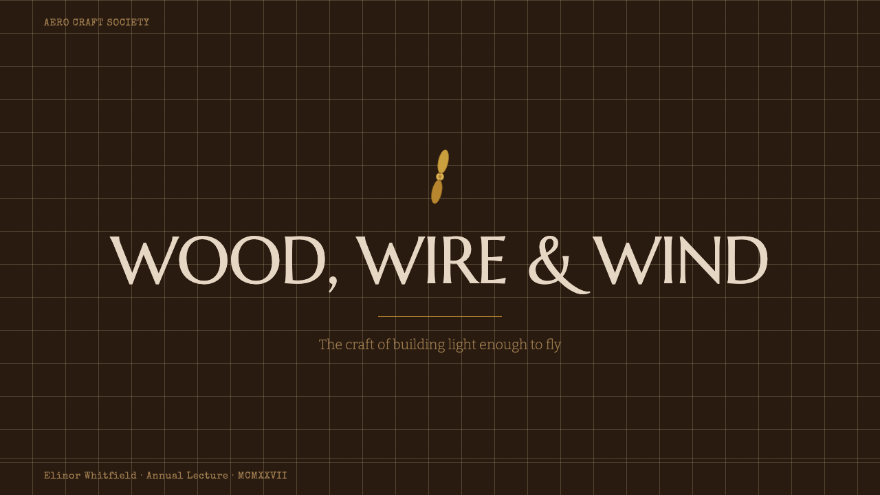
On a presentation cover slide, the system rewards a single strong image treated as a period photograph or engraving rather than a decorative illustration — a propeller, a chart fragment, or a silhouette against sky, with the title set in a hand-lettered or period display face over a warm brown ground. Content slides should keep the doped-linen and leather textures to borders and section dividers rather than full backgrounds, so body text stays legible; a thin ruled chart-line motif works well as a running footer or section marker. Data slides can lean directly into the aeronautical-chart idiom — numbers and comparisons framed like flight-instrument readouts or chart annotations on buff paper, rather than generic modern bar charts.
For dashboards and product UI, the palette translates into warm neutral backgrounds with brass or leather-brown accents standing in for the system's usual bright interactive color, and card components can borrow the soft, worked edge of leather rather than a hard modern shadow. Pricing pages benefit from treating each tier like an instrument panel or logbook entry — bordered, chart-like, precise — rather than a floating modern card; this is a system that rewards structure and legibility over glossy contrast.
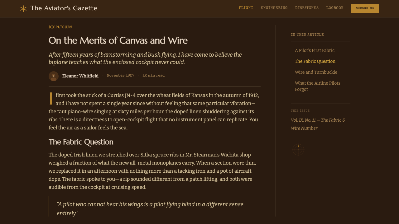
In editorial and marketing contexts, the system suits long-form storytelling — travel narratives, brand heritage pages, founder stories — where warm sepia-toned photography and a hand-lettered pull-quote treatment reinforce the sense of an artifact from another era. Full-bleed marketing sections work well alternating dark walnut-brown grounds with buff chart-paper panels, using brass rule lines rather than modern dividers to separate content blocks.
The most common mistake is reaching for chrome, silver, or cool metallics to suggest 'vintage aviation' — that instinct belongs to a later jet age, not this one. Everything metallic in this system should be warm brass, not cool steel, and every surface should show some sign of use. A pristine, unweathered version of this palette reads as a costume rather than a material history, and undermines the exact quality — hand-built authenticity — that makes the system work.
Biplane Aviation (1920s) — FAQ
Is Biplane Aviation the same as 'steampunk'?
They share a Victorian-to-interwar material vocabulary — brass, leather, wood, exposed mechanism — but they come from different sources and read differently. Steampunk is a speculative-fiction aesthetic that imagines Victorian-era machinery advanced beyond its real technology, often stylized and fantastical. Biplane Aviation is grounded in a specific, real, documented decade of actual aircraft construction, and its restraint comes from historical accuracy rather than fantasy — no gears-as-decoration, no impossible mechanisms, just the real materials of a 1920s airframe.
Does this style require literal airplane imagery to work?
No — in fact leaning too hard on literal airplane silhouettes can make the system feel like a novelty travel brand rather than a considered material language. The strongest applications borrow the palette, textures, and chart-linework typography and apply them to unrelated subject matter — a coffee brand, a leather-goods retailer, a travel journal — the same way a heritage brand might use tweed or waxed canvas without ever picturing the sheep or the boat.
Can this system work for a modern technology product?
It can, but only for products that want to claim heritage, precision-by-hand, or trustworthiness earned through experience — a mechanical-watch app, a craft-tool marketplace, an aviation-history archive. It works poorly for products whose actual value proposition is speed, automation, or cutting-edge novelty, since the material vocabulary actively signals 'assembled and maintained by a human,' which can undercut a message about frictionless software.
How dark should the palette actually be?
The system is built around darkness as a foundational choice — grounds should be genuinely dark walnut-brown rather than a light tan trying to suggest wood. Highlights and chart elements can move into buff and cream-tan to create contrast, but the base should feel like a hangar interior or a well-oiled leather journal, not a sunlit picnic. If the overall impression reads bright and cheerful rather than warm and worn, the palette has drifted too light.
What differentiates this from a generic 'vintage travel' aesthetic?
Generic vintage-travel design tends to borrow decorative period typography and pastel color without any material logic behind it. Biplane Aviation is anchored specifically in construction technique — doped linen, laminated wood, rib-stitching, hand-lettered charts — which gives every visual decision a reason. If you cannot explain why a texture or color choice belongs to an early-1920s open-cockpit aircraft, it probably does not belong in this system.
Related design styles
 BathyspherePressure turns precise. Cyan porthole light cuts gunmetal grids and rivet row…
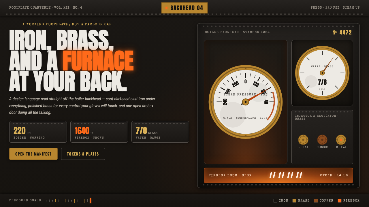 Steam LocomotiveWorking iron, not parlour car. Soot-black cast iron, polished brass gauges, o…
 Taishō RomanLonging framed in bronze. Maroon ground, Mincho type, and sepia ornament hush…
 Tide Table AlmanacData becomes ornament. Deep teal grids and parchment serif figures carry a ca…
 Cramer Exotic MothsJewel-like precision. Sienna specimens glow in formal rows on a near-black pl…
 Dhahran Aramco Camp ModernismDesert order, sun-baked. Ochre stucco fields, terracotta bands, turquoise tri…