What is Cramer Exotic Moths?
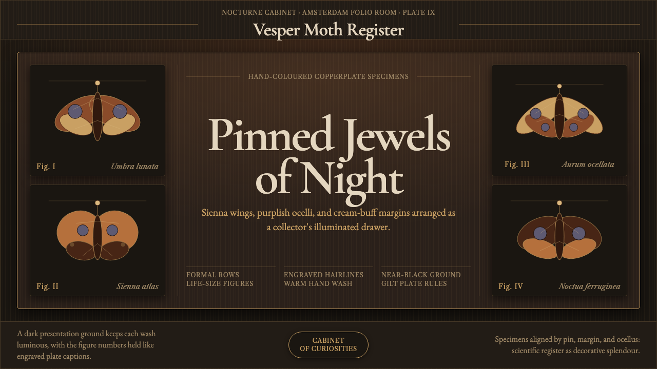
Pieter Cramer's 1779 moth plates turned specimen-drawer science into jewel-like art, pinning each hand-colored insect in formal rows against a plate almost black.
Cramer Exotic Moths in brief
Pieter Cramer's De uitlandsche Kapellen (1779) rendered exotic moths as life-size, hand-colored copperplate engravings, with the colorist Gerrit Lambertz applying each wash of pigment by hand, plate by plate. Warm sienna and tan scaling, purplish eyespots, and cream-buff wing margins glow against a deep, near-black ground — a deliberate staging choice that makes every pale or iridescent detail on the wings read as luminous rather than merely visible.
This design system distills that eighteenth-century cabinet-of-curiosities plate into a digital language: pinned specimens arranged in formal rows, engraved hairlines standing in for the copperplate's incised marks, hand-colored washes suggesting the individual variation of a colorist's brushwork, and old-style serif captions identifying each specimen with the same restrained authority as an original plate.
Nothing here is casual or documentary in the way a modern nature photograph is documentary. Every specimen is composed, lit, and captioned as though it were on display in a collector's cabinet — precise, jewel-like, and treated with the formal reverence of a scientific record that was also, unmistakably, a work of art.
Where does Cramer Exotic Moths come from?
Pieter Cramer (1721–1776) was an Amsterdam merchant and amateur entomologist working within the eighteenth-century culture of the cabinet of curiosities — private collections, assembled by wealthy merchants and scholars, that gathered natural specimens and exotic objects from across the world as displays of both wealth and Enlightenment-era curiosity about the natural order. Amsterdam's position at the center of Dutch global trade networks, run through the Dutch East India Company, put collectors like Cramer in direct contact with specimens arriving from colonies and trading posts across Asia, Africa, and the Americas — insects that European naturalists had, in many cases, never before formally recorded.
De uitlandsche Kapellen, whose title translates roughly as "The Exotic Butterflies," was published in installments beginning in 1775 and was completed posthumously by the naturalist Caspar Stoll after Cramer's death in 1776. Each plate began as a copperplate engraving — a technique in which an image is incised into a metal plate with a fine tool, then inked and pressed onto paper, producing crisp, precise linework — and every printed impression was then individually hand-colored with watercolor washes by a colorist, meaning no two surviving copies of a plate are ever perfectly identical.
The work arrived at a specific moment in the history of natural science: Carl Linnaeus's Systema Naturae, published in 1758, had recently established the binomial classification system still used today, giving naturalists across Europe a shared formal language for organizing the flood of newly encountered species arriving via colonial trade. Cramer's illustrated catalog belongs to the resulting wave of systematic natural-history publishing, following earlier illustrated naturalists such as Maria Sibylla Merian, and helping formalize entomology — the study of insects — as its own visual and scientific discipline.
The plates' visual convention — specimens pinned in careful rows against a dark ground, engraved with fine precision, and captioned in a formal typographic hand — reflects the physical collector's cabinet these publications were made to document and, in effect, replace: a drawer of pinned specimens, arranged for study and display at once, where a dark lining made pale or iridescent wing-scaling visible from across a room. The book brought the cabinet's own display logic onto the printed page.
What defines the Cramer Exotic Moths look?
Near-Black Plate Ground
The background is a deep, near-black tone rather than the cream or white paper typical of most natural-history plates of the era. This dark staging is a deliberate display technique: it makes pale, cream, or iridescent wing detail glow by contrast, the same way a collector's cabinet was lined dark to make pinned specimens more legible under available light.
Warm Sienna and Tan Scaling
The dominant specimen coloring sits in a warm, earthen range of sienna, tan, and ochre-brown — the natural palette of many moth wing scales — rendered with the soft variation of hand-applied watercolor rather than any flat or uniform fill. Purplish eyespots and cream-buff margins provide the palette's only real departures from this warm earth range.
Engraved Hairlines
Fine, precise linework stands in for the incised marks a copperplate engraving tool would cut into metal — every contour, vein, and structural detail rendered as a crisp, controlled line rather than a soft or sketchy stroke. This precision is what separates the system from looser, painterly natural-history illustration traditions.
Hand-Colored Wash
Color is applied as a wash with the gentle, uneven variation characteristic of hand-colored printmaking, rather than as flat, mechanically uniform fill. This is what gives the system its individual, slightly imperfect warmth — the sense that a specific human hand, not a machine, applied every tone.
Formal Pinned-Row Composition
Specimens are arranged in careful, evenly spaced rows rather than a scattered or naturalistic scene — the composition of a display case, not a habitat. Each specimen occupies its own clear space, oriented for maximum legibility of its wing pattern rather than for any narrative or environmental context.
Old-Style Serif Captions
Identifying text is set in a restrained old-style serif with the formal, slightly worn character of eighteenth-century engraved typography, kept small and subordinate to the specimens themselves. Captions carry authority through quiet consistency rather than any decorative flourish.
Jewel-Like Precision
The combined effect of dark staging, warm hand-applied color, and precise engraved line is a display that reads as jewel-like rather than merely illustrative — each specimen sits like a gem in a display drawer, lit for maximum glow rather than documented for maximum neutrality.
Who shaped Cramer Exotic Moths?
The Amsterdam merchant and amateur entomologist who conceived and largely authored De uitlandsche Kapellen (1779), assembling and documenting exotic moth and butterfly specimens that reached Dutch collectors through global trade networks. His death in 1776 left the work unfinished, but his formal, plate-based approach to cataloging set the visual convention the completed publication followed throughout.
The colorist who applied the hand-painted watercolor washes to Cramer's engraved plates, specimen by specimen. Because each impression was colored individually rather than mechanically reproduced, Lambertz's hand is directly responsible for the warm, slightly varied tonal quality that distinguishes surviving plates from flatter, machine-printed natural-history illustration of later periods.
The naturalist who completed De uitlandsche Kapellen after Cramer's death in 1776, seeing the remaining plates and text through to publication and ensuring the systematic, formally captioned cataloging approach Cramer had established was carried through to the work's conclusion rather than left unfinished.
The broader systematic natural-history tradition that followed Carl Linnaeus's 1758 binomial classification system, within which Cramer's catalog sits. This tradition established the formal convention of pairing precise illustration with structured, consistent captioning to make newly encountered species legible and comparable across an entire published record.
The eighteenth-century European collecting practice — assembling natural specimens and exotic objects gathered through global trade as private displays of wealth and Enlightenment curiosity — that gave Cramer both his access to specimens and the display logic his published plates translate onto the page.
How do you use Cramer Exotic Moths today?
This system carries a formal, collector's-cabinet gravity, so it works best wherever precision, rarity, and considered display matter more than energy or approachability — it reads as scholarly and deliberate rather than casual, which makes it a poor match for anything that wants to feel fast, playful, or mass-market.
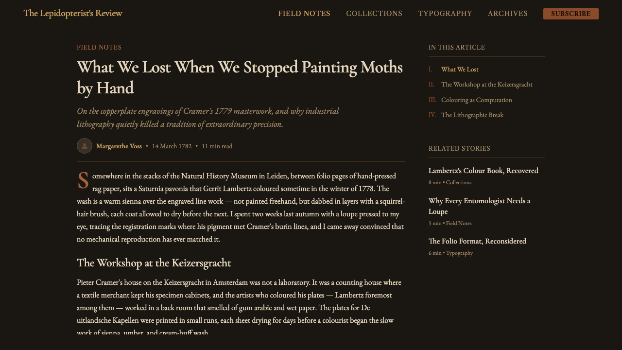
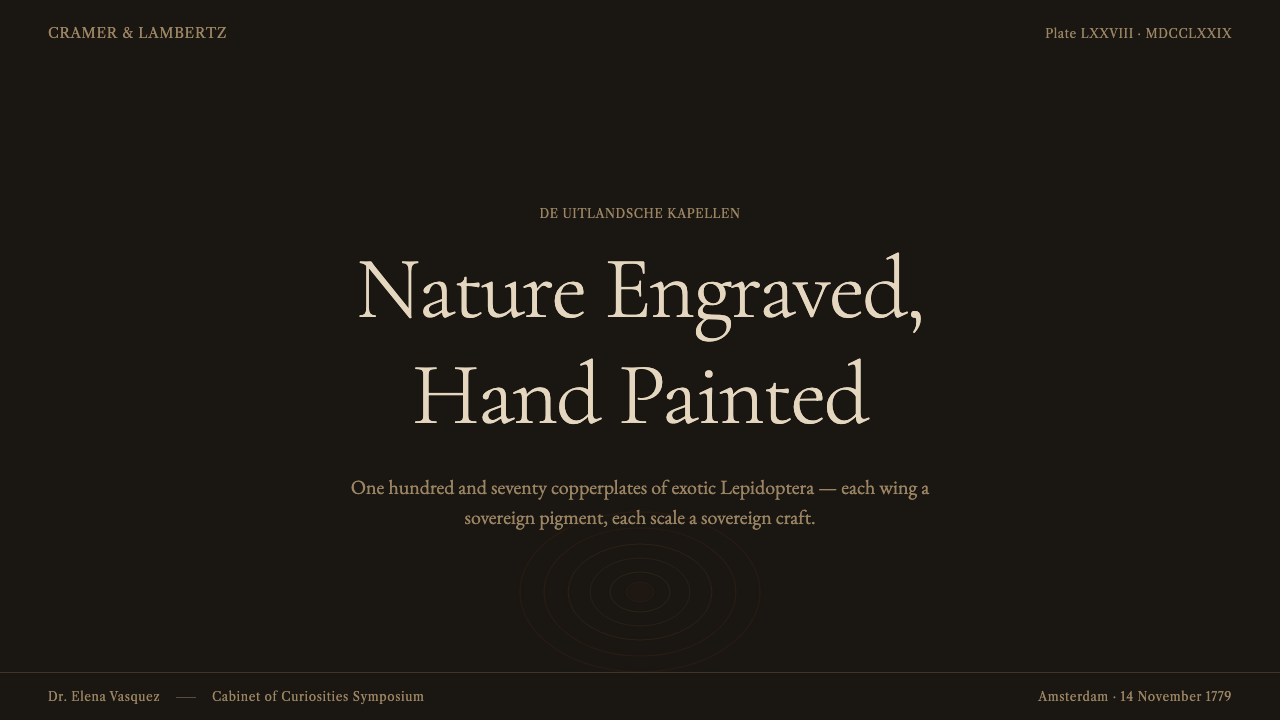
On slides, the aesthetic suits cover and section pages built around a single, formally composed specimen-like image against the near-black ground, captioned in restrained old-style serif exactly as an original plate would be. Content slides should carry supporting information in the same quiet serif, kept small and subordinate, while any diagram or icon should be rendered as fine engraved linework rather than flat modern iconography. Data slides can borrow the pinned-row composition directly — arranging figures or comparisons in even, formal rows against the dark ground reads as a systematic catalog rather than a casual chart, though numbers themselves should stay in the palette's pale, warm tones so they glow against the dark ground rather than disappearing into it.
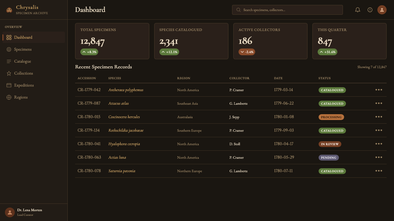
For web interfaces, the system suits dashboards and premium pricing pages aimed at an audience that responds to scholarly authority and rarity rather than energy — a dark-ground pricing table with warm, sienna-toned accents and fine hairline dividers can communicate considered exclusivity effectively. It is a poor match for interfaces that need to feel fast, casual, or highly interactive; the formality and dark staging work against quick scanning and light, frequent use, and are better suited to a considered, occasional visit than a tool used dozens of times a day.
In editorial and marketing contexts, the style suits long-form natural-history or collector-adjacent content, premium product catalogs, and any brand positioning itself around rarity, craft, or specimen-like precision — a product photographed and captioned like a plate, isolated against a dark ground with a restrained serif label, borrows the system's authority directly. It is poorly suited to anything casual, youthful, or trend-driven, where the formal weight of a specimen plate would read as stiff or out of place.
The most common mistake is lightening the ground to a paper cream or white in the belief that it will make the system feel more approachable — this removes the exact contrast mechanism that makes the warm scaling and pale margins glow, flattening the whole system into generic vintage illustration rather than the specific, jewel-box display logic that defines it. A second common mistake is over-cleaning the hand-colored warmth into flat, uniform color, which trades the system's individual, slightly imperfect character for a sterile look that loses the sense of a specific human hand behind every plate.
Cramer Exotic Moths — FAQ
Why is the background so dark when most natural-history illustration of the period used pale paper?
The dark ground is a display technique borrowed directly from the physical collector's cabinet these plates were made to document. A dark-lined display drawer makes pale, cream, or iridescent wing scaling far more visible and luminous by contrast than a pale background would, the same way a jeweler shows gems against dark velvet rather than white paper. Cramer's plates carried that same staging logic onto the printed page, which sets them apart from the flatter, paper-white convention used by many contemporaries.
Is it accurate to call this "Linnaean" illustration, or is that too specific a label?
It is fair as a broader lineage label rather than a claim that Cramer worked directly from Linnaeus. Cramer's catalog belongs to the wave of systematic natural-history publishing that followed Linnaeus's 1758 binomial classification system, sharing its underlying commitment to precise, comparable, formally captioned documentation of newly encountered species. The connection is disciplinary and methodological — a shared scientific culture — rather than a direct personal collaboration between the two men.
How much of the coloring on surviving plates is historically accurate versus artistic interpretation?
Because each impression was hand-colored individually by a colorist working from reference rather than mechanically reproduced, some variation between surviving copies of the same plate is expected and documented — this is a known characteristic of hand-colored eighteenth-century printmaking generally, not a flaw specific to this publication. The engraved linework itself, cut once into the copperplate, is consistent across impressions; it is the applied color that carries the individual colorist's hand and therefore some degree of natural variation.
Does this system work if applied to a light-background layout instead of the canonical dark ground?
It loses much of its defining logic if inverted. The entire staging mechanism — warm scaling and pale margins glowing by contrast — depends on the near-black ground; move the same elements onto a pale background and the specimen coloring simply reads as muted rather than luminous, since there is no dark field for it to glow against. A version intended for a lighter context is better served by keeping the dark plate as a contained panel within an otherwise lighter page, rather than inverting the whole system to a pale ground.
What makes this different from generic "vintage botanical illustration" styling?
The specificity is in the combination, not any single element. Vintage botanical illustration generically often uses pale paper grounds, looser painterly color, and a general sense of age; this system is defined by the precise pairing of a near-black staging ground, warm sienna-toned hand-coloring, engraved copperplate-style hairlines, and formal pinned-row composition — all four together, drawn specifically from a documented eighteenth-century entomological cabinet tradition rather than a generalized nostalgia for old prints.
Related design styles
 ClockpunkInventive antiquity. Walnut vellum, Cinzel capitals, brass orrery rings, and…
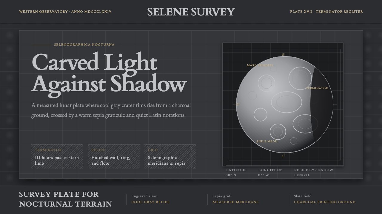 Lunar SelenographyMoonlight becomes measurement. Slate ground, sepia grid, and hatched gray cra…
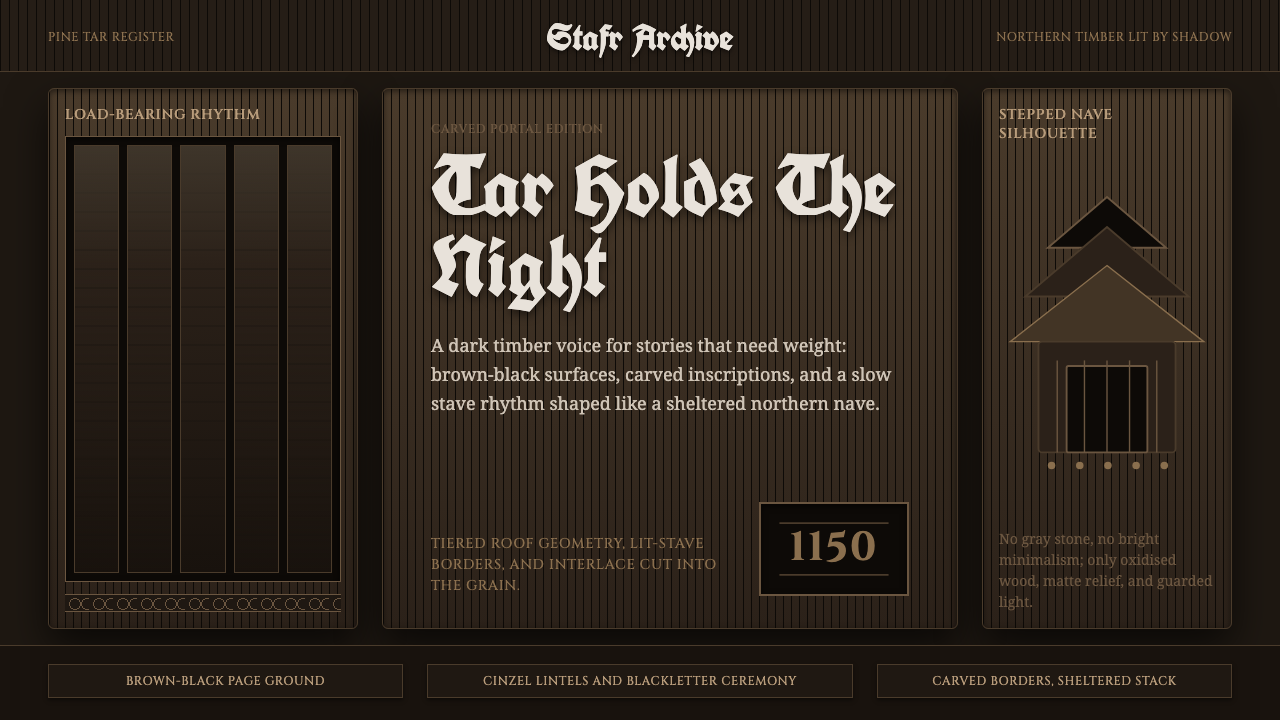 Norwegian Stave ChurchTar makes the sacred heavy. Brown-black fields, Cinzel inscriptions, tiered t…
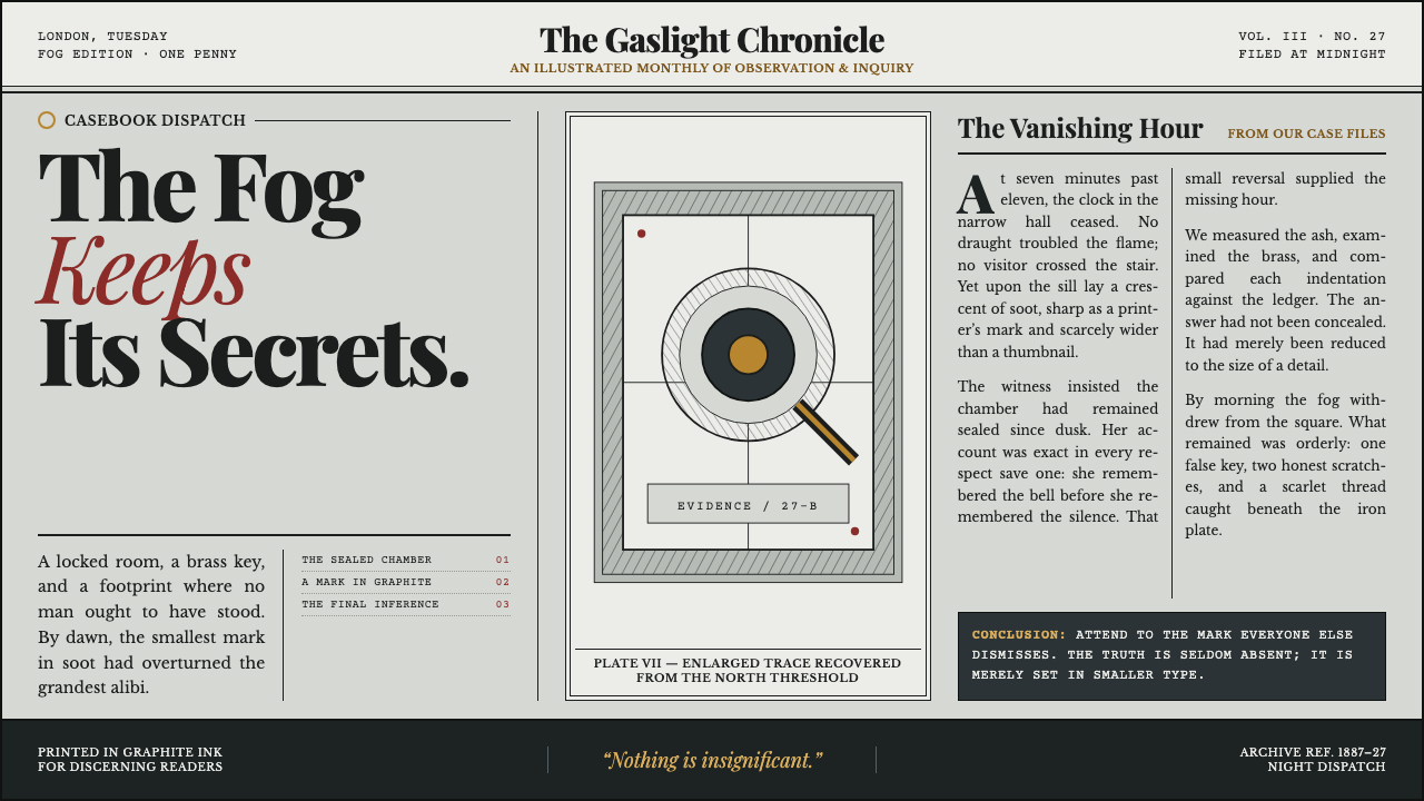 Sherlock Holmes — Baker Street (1887)Mystery, printed in ink. Fog-gray columns and cross-hatched plates glow with…
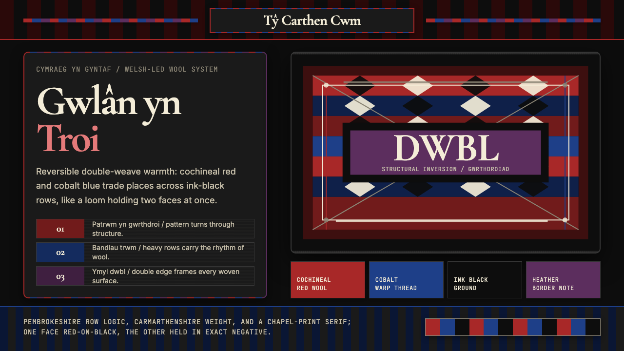 Welsh Tapestry Blanket CarthenWarmth has two faces. Cochineal and cobalt invert across ink-black woven band…
 Bhutanese Tiger's Nest Cliff MonasterySacred altitude, mineral-dark. Cinnabar tiers and bronze rules climb charcoal…