What is Clockpunk (da Vinci)?
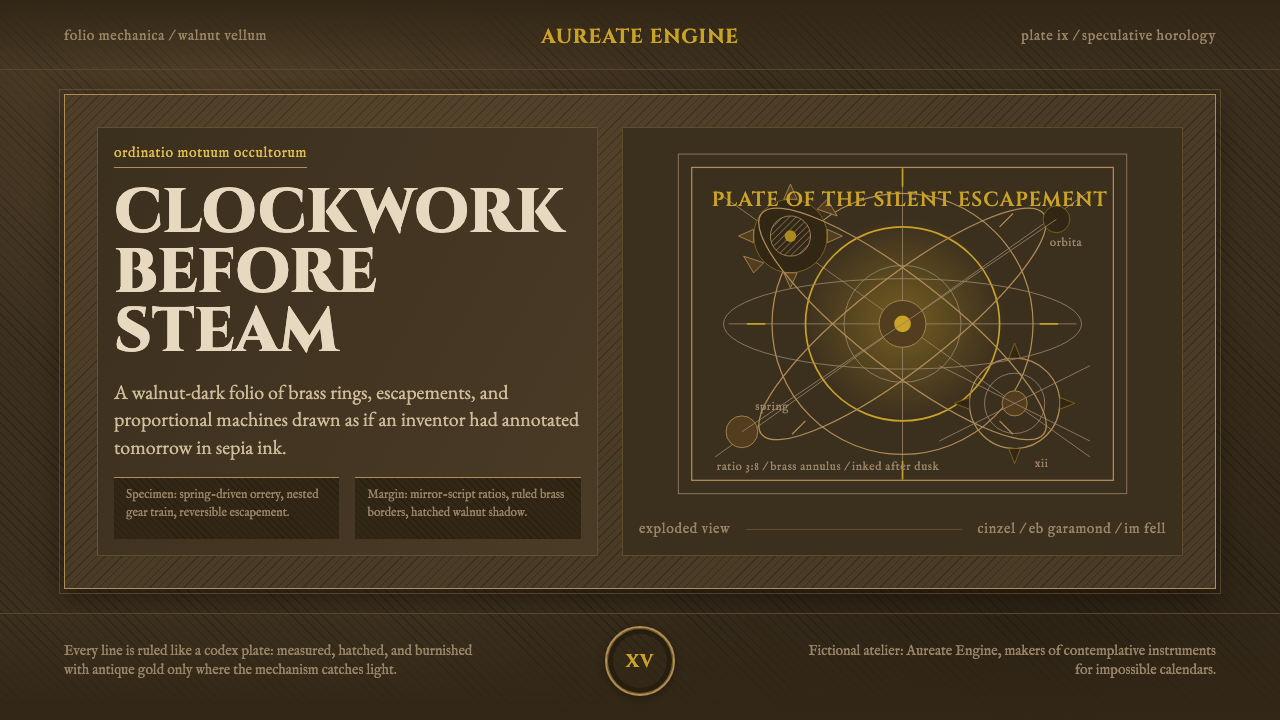
Clockpunk renders Renaissance speculative engineering the way Leonardo himself sketched it — brass gearwork and orrery rings inked in sepia across a walnut-stained notebook page.
Clockpunk (da Vinci) in brief
Clockpunk is a retrofuturist visual style that imagines advanced mechanical technology — clockwork, gear trains, orreries — as though it had been invented centuries early, during the Italian Renaissance, and drawn up in the engraved, hand-annotated notebook pages of an inventor like Leonardo da Vinci. Rather than the steam-driven, iron-and-rivet machinery associated with steampunk's Victorian setting, clockpunk's technology runs on brass gearing, springs, and precision-cut wheels, and its visual source is not an industrial factory floor but a solitary draftsman's notebook.
The canvas is aged, walnut-brown vellum — the color of parchment darkened by ink and centuries of handling, never a light or clean cream. Wood, brass, and bronze recur throughout as the only material palette, rendered as engraved, cross-hatched sepia line-art rather than as full-color illustration, so that every mechanical form looks etched into the page rather than painted onto it.
The compositional grammar borrows directly from the conventions of Renaissance codices: mirror-written marginal notes, densely hatched ink shading used to suggest volume and shadow, geometric overlays reminiscent of idealized human-proportion studies, and exploded diagrams that pull a mechanism apart into its constituent gears and rings so a reader can see how it fits together. Classical inscriptional lettering and a warm antique gold complete the register, so that any panel in this style reads like a page torn from a folio of inventions.
Where does Clockpunk (da Vinci) come from?
The historical anchor is the Italian High Renaissance, roughly 1480 to 1519, and specifically the notebooks of Leonardo da Vinci — thousands of pages mixing anatomical studies, hydraulic devices, military engineering, flying-machine concepts, and gear mechanisms, sketched not as finished inventions but as speculative studies, worked and reworked in the margins across years of observation.
Clockpunk as a genre label is a retrofuturist term, a sibling to steampunk, that imagines mechanical technology advanced well beyond its real historical moment while keeping the material palette of an earlier age — brass and clockwork rather than steam and iron, Renaissance rather than Victorian. Leonardo's speculative machine drawings function as the style's founding text precisely because they combine real engineering rigor with genuinely fantastical ambition, which is exactly the tension the genre as a whole is built on.
Leonardo did not work in isolation on this front. He drew on and extended a tradition of Renaissance engineer-illustrators that included the Sienese engineer Mariano Taccola, whose illustrated treatises on machines circulated decades before Leonardo's own notebooks took shape, and Francesco di Giorgio Martini, whose treatise on architecture, engineering, and military devices was itself illustrated in the same exploded, annotated diagram style that later notebooks would refine and make famous.
The wider engineering culture of the era supplied real precedent for the fantastical: Filippo Brunelleschi's practical work on the dome of Florence Cathedral, including the hoists and cranes he engineered to lift materials to unprecedented heights, demonstrated that Renaissance Italy's problem-solving culture was genuinely capable of ambitious mechanical invention, not merely of sketching it on paper. Those notebook conventions — mirror script, hatched shading, exploded views — are the literal source of clockpunk's graphic vocabulary today, centuries after the ink dried.
What defines the Clockpunk (da Vinci) look?
Ground and color
The base surface is a deep, aged walnut-brown vellum, never a light or clean parchment tone, evoking a page darkened by ink and centuries of handling rather than a fresh sheet. Sepia line-work and a warm antique gold are the only accent notes against that ground, keeping the entire register within a narrow, warm, aged spectrum.
Engraved line work
Every form is rendered as cross-hatched ink line-art in the manner of an engraving, not as flat color fill or a painted illustration. Shadow and volume are built entirely from the density and direction of hatched lines, which is what gives the style its etched, contemplative, almost archival quality.
Exploded mechanical diagrams
Mechanisms are frequently shown pulled apart into their constituent gears, rings, and springs, arranged so a viewer can trace how each piece connects to the next, rather than shown only as a sealed, finished object. This exploded-view convention treats the machine as something to be understood, not merely admired.
Marginalia and mirror script
Dense, handwritten-style annotation crowds the margins around each diagram, echoing the working-notebook habit of commenting directly beside a sketch rather than separating text and image into distinct zones. Passages of mirror-written script — read only with the aid of a reflected surface — appear as a recurring motif drawn from Leonardo's own well-documented notebook habit.
Typography
Titles and section labels favor classical inscriptional capitals in the tradition of Roman monumental lettering, giving even a diagram label the weight of a carved dedication rather than a casual caption. Body annotation, by contrast, leans toward a period-flavored handwritten register, creating a deliberate contrast between formal capitals and informal working notes.
Material motifs and geometry
Brass gearwork and orrery rings recur as central visual motifs, always rendered in the same sepia engraved line rather than as glossy or reflective metal. Idealized human-proportion diagrams in the Vitruvian tradition appear as geometric overlays, linking the mechanical subject matter back to the era's broader fascination with proportion, symmetry, and the mathematics of the human body.
Who shaped Clockpunk (da Vinci)?
Leonardo's notebooks — thousands of pages spanning roughly 1480 to 1519 and mixing anatomy, hydraulics, military engineering, and flying-machine concepts with gear mechanisms — are the direct visual and conceptual source for clockpunk. His habit of annotating sketches in mirror script, shading forms with dense cross-hatching, and exploding a mechanism into its constituent parts on the page defined the graphic conventions the style still draws on today.
Brunelleschi's engineering work on the dome of Florence Cathedral, including the hoists and cranes he designed to lift building materials to unprecedented heights, demonstrated that Renaissance Italy's ambition for mechanical invention was matched by real engineering capability. His practical machines are part of the historical culture that made speculative gear-driven invention feel plausible rather than purely fantastical.
A Sienese engineer whose illustrated treatises on machines circulated decades before Leonardo's own notebooks took shape, Taccola established an early precedent for combining technical machine drawings with written annotation on the same page. His work is part of the tradition of Renaissance engineer-illustrators that clockpunk's visual grammar ultimately descends from.
Martini's treatise on architecture, engineering, and military devices was illustrated with exploded, annotated diagrams that anticipated the conventions later refined and popularized in Leonardo's notebooks. His work reflects how deeply embedded the illustrated-machine-diagram tradition already was in Renaissance engineering culture before Leonardo's own notebooks were even begun.
How do you use Clockpunk (da Vinci) today?
On a presentation cover slide, clockpunk reads best as a single large engraved mechanical motif — a gear cluster or orrery ring — set against the walnut-vellum ground, with the title in classical inscriptional capitals placed with the same restraint as a title inscribed on a folio's opening page. Content slides work well when body copy is treated as a notebook page: a primary block of readable text with smaller, denser marginal annotation running alongside it, echoing the way Leonardo's own pages mixed formal explanation with working notes. Data slides suit the exploded-diagram convention especially well — a chart or comparison can be presented as though it were a mechanism laid open for inspection, with sepia line-work standing in for chart strokes rather than flat modern chart styling.
In web interfaces, clockpunk is best suited to storytelling-driven experiences, museum or archive-style browsing, and premium or collectible product presentation rather than to dense, fast-moving dashboards, since its hatched, engraved rendering asks to be read slowly rather than scanned quickly. On a pricing page, the register can differentiate tiers the way a folio might distinguish chapters — a heavier gold rule or a more elaborate diagrammatic flourish marking the higher tier — while keeping every tier within the same walnut-and-sepia material logic so the page reads as one coherent manuscript rather than a mix of styles.
For editorial and marketing content, the style performs strongly for history, invention, horology, and craftsmanship subject matter, where the engraved, notebook-page treatment reinforces a sense of considered, hand-worked authority. It is a poor match for anything that needs to feel fast, casual, or contemporary — a same-day delivery app or a social feed gains nothing from a register built around slow, deliberate, centuries-old draftsmanship, and forcing the two together tends to read as a costume rather than a genuine fit.
A common mistake is treating clockpunk as simply 'old paper plus gears,' which produces generic antique or steampunk pastiche rather than the specific register this style is built on. The defining details are the exploded, annotated diagram convention, the mirror-script marginalia, and the restrained walnut-and-sepia-and-gold material palette; drop any one of these and the result drifts toward a more generic vintage-technical look rather than the notebook-of-inventions feeling that defines clockpunk specifically.
Another frequent misstep is over-cluttering every panel with dense hatching and diagram lines until legibility suffers, mistaking density for authenticity. Leonardo's own pages balance dense technical passages with genuine open space where the eye can rest; a clockpunk layout that never lets the walnut ground breathe loses the contemplative, folio-like quality that separates the style from mere visual noise.
Clockpunk (da Vinci) — FAQ
How is clockpunk different from steampunk?
Steampunk imagines advanced technology built on a Victorian, steam-and-iron industrial base — factories, boilers, rivets. Clockpunk pushes the same retrofuturist impulse further back in time, to the Italian Renaissance, imagining advanced mechanical technology built on brass gearwork, springs, and clockwork rather than steam power. Visually, steampunk tends toward industrial grime and exposed pipework, while clockpunk favors the engraved, hand-drawn notebook page — closer to a folio of inventions than to a factory floor.
Why does the style use mirror-written script in the margins?
Mirror script is drawn directly from Leonardo da Vinci's own well-documented habit of writing his notebook annotations right-to-left, legible only with the aid of a reflected surface. As a design motif in clockpunk, it functions less as a literal instruction to reverse every line of text and more as a recurring visual signature — a small passage or heading rendered in mirror script signals authenticity to the notebook tradition the whole style draws from.
Does clockpunk work well for modern, fast-paced digital products?
Generally not. The style's engraved, hatched line-work and dense marginal annotation reward slow, deliberate reading, which sits at odds with interfaces built for speed and quick scanning — a same-day logistics app or a real-time trading dashboard gains little from a register built around centuries-old draftsmanship. It performs best in contexts where users are expected to linger: storytelling, archives, premium product presentation, and history or craftsmanship-focused content.
What role do gears and orrery rings play beyond decoration?
In the source tradition, gears and orrery rings were never purely decorative — they were the actual subject matter of Renaissance engineering speculation, and the exploded-diagram convention exists specifically to show how such mechanisms fit together. Applying the style well means treating these motifs the same way: as things being explained or investigated, ideally paired with some annotation or diagram logic, rather than as generic ornamental flourishes scattered for visual texture alone.
Is clockpunk historically accurate to the actual Renaissance?
It is historically grounded but deliberately speculative — it borrows real conventions (mirror script, hatched engraving, exploded diagrams, inscriptional lettering) and a real historical figure's documented working habits, but the advanced clockwork technology it depicts as functional and widespread is fantasy layered on top of genuine Renaissance engineering culture. It is best understood as an alternate-history extrapolation grounded in real notebooks and real engineers, not as a literal historical record.
Related design styles
 Cramer Exotic MothsJewel-like precision. Sienna specimens glow in formal rows on a near-black pl…
 Honeybee Anatomy PlateAn 1886 beekeeping manual, reopened. Amber wash over engraved anatomy, letter…
 Belarusian RushnykRed carries meaning. Madder rhombs crowd aged flax edges while the woven cent…
 Derge Woodblock Sutra PrintHand-pulled scripture gravity. Cinnabar uchen and ochre rules press into dark…
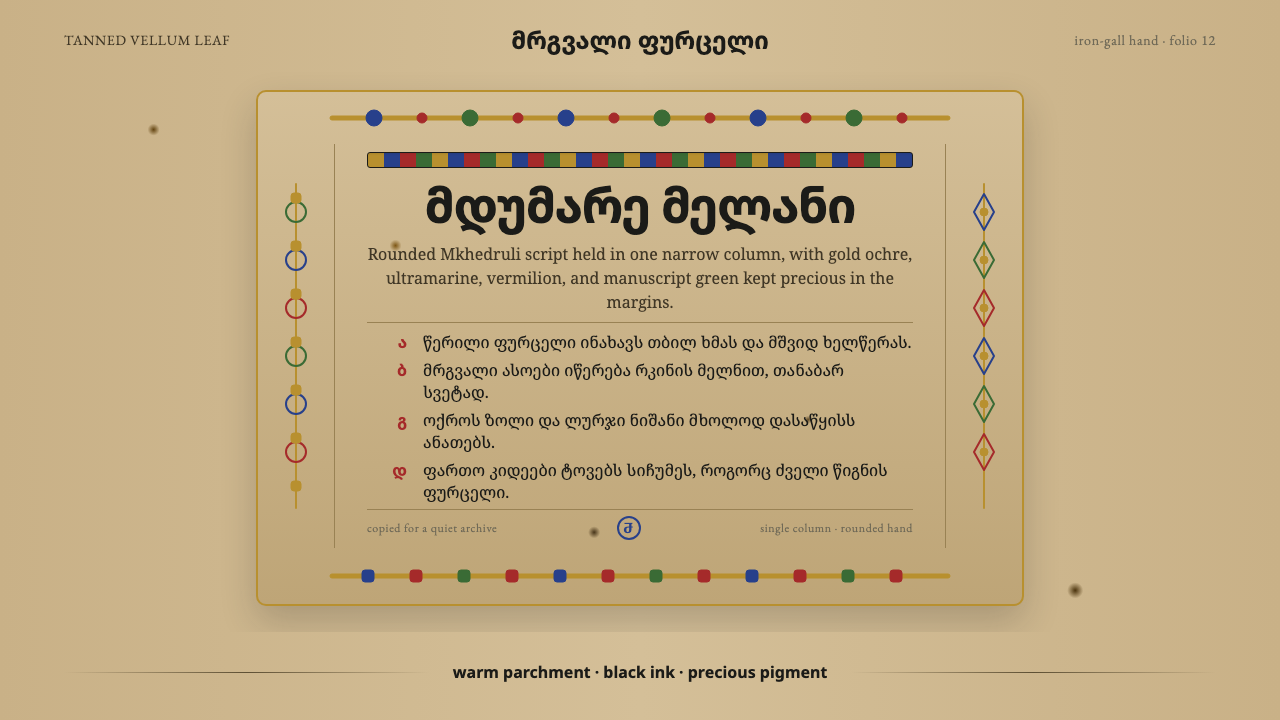 Georgian MkhedruliA manuscript breathes slowly. Tanned vellum, round Mkhedruli ink, ochre and u…
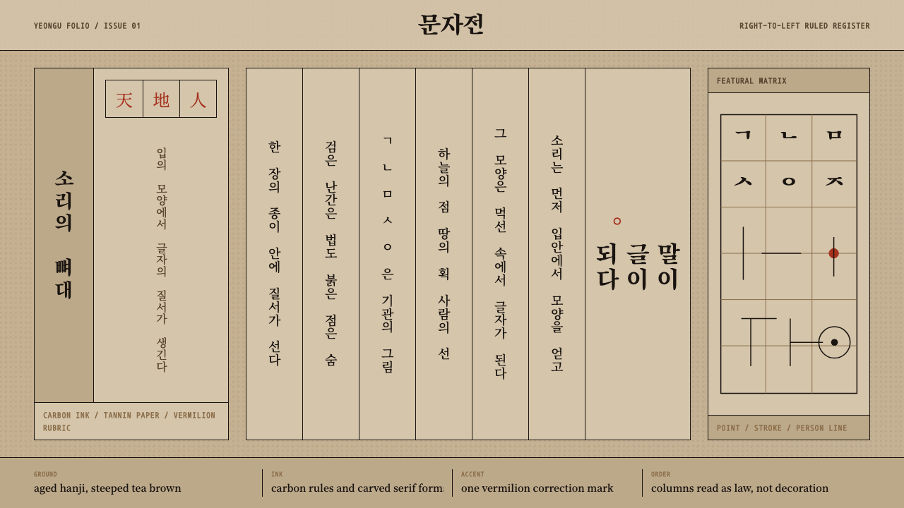 Hangul 訓民正音Ink obeys the grid. Carbon rules, vertical Myeongjo columns, and rare vermili…