What is Tide Table Almanac?
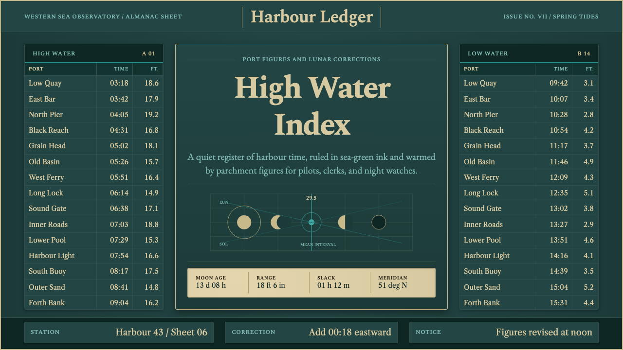
Tide Table Almanac turns dense navigational data into ornament — deep sea-green ink, aged-paper columns, and calm serif figures borrowed from early-20th-century tide books.
Tide Table Almanac in brief
Tide Table Almanac is a design system built on the visual conventions of early-20th-century nautical ephemerides — the reference books that told harbourmasters, pilots, and merchant crews exactly when the water would rise and fall at a given port. Rather than treating numbers as a necessary evil to be minimized, this style treats a dense grid of figures as the main visual event of the page.
The identity comes from two decisions working together: a deep teal or sea-green ground standing in for the ink used in period printing, and warm parchment-toned accents standing in for the aged paper such almanacs were printed on. Set against that ground, ruled hairline columns hold port names, high- and low-water figures, and small moon-phase glyphs in strict tabular order.
The overall effect is quiet authority rather than decorative flourish. Nothing about the style shouts; instead it relies on the trustworthiness that comes from a publication whose entire reason for existing is to be correct — the same reason official reference documents, from railway timetables to admiralty charts, tend to share a restrained, columnar visual language.

Where does Tide Table Almanac come from?
Tide tables belong to the broader tradition of maritime ephemeris publishing, a genre of reference book that emerged as sea trade and naval navigation professionalized in the eighteenth and nineteenth centuries and reached its most refined typographic form in the early twentieth century. These publications had to compress enormous amounts of location- and date-specific data — tide heights, times, moon phases, across dozens or hundreds of ports — into a form that could be read quickly and correctly under working conditions, often on a ship's chart table rather than a quiet desk.
In Britain, this tradition was formalized through institutions like HM Nautical Almanac Office, which computed and published the astronomical and tidal data that underpinned safe navigation, and through the wider Admiralty hydrographic publishing apparatus that produced charts and companion reference books for the merchant marine and Royal Navy alike. Almanac compilers — often working anonymously within these institutional structures rather than as named individual authors — refined a house typographic style over decades of editions.
The visual conventions that resulted — hairline rules separating columns, a restrained serif for numerals so that figures remained legible even in small sizes, and a limited color range dominated by the sea-green or teal ink common to period printing — were driven by necessity rather than decorative ambition. A misread tide table could run a ship aground; the typography had to prioritize accuracy over expressiveness.
This body of publishing sits within the broader field of tabular reference typography and navigational science more generally — a lineage shared with railway timetables, star catalogues, and other dense reference documents from the same era, all of which arrived independently at similar solutions: rules, restraint, and a serif built for legibility under pressure rather than display impact.
What defines the Tide Table Almanac look?
Color
The ground is a deep teal or sea-green rather than paper white, standing in for the ink saturation typical of period nautical printing. Warm parchment or aged-paper tones carry the numerals and rule lines, creating a two-color relationship — cool ground, warm figure — that never expands into a broader palette.
Columnar Discipline
Content is organized into strict vertical columns — port name, high water, low water, moon phase — each aligned with hairline rules that separate but never decorate. The grid is load-bearing: every piece of information has exactly one column it belongs to, and nothing floats free of that structure.
Typography
Numerals are set in a restrained serif chosen for legibility at small sizes rather than display character — figures must remain distinguishable even when densely packed. Headings and port names may use slightly larger weight for hierarchy, but the contrast between levels stays modest compared to more expressive editorial styles.
Moon-Phase Glyphs
Small circular glyphs indicating lunar phase punctuate the tables at regular intervals, providing the only rounded, non-typographic form in an otherwise rectilinear system. Their smallness keeps them functioning as data markers rather than illustrative flourishes.
Hairline Rules
Rule weight is kept as thin as legibly possible, a convention carried over from letterpress printing where heavier rules would have competed with the numerals for attention. This restraint is what allows a page dense with figures to still read as calm rather than cluttered.
Restrained Hierarchy
Unlike editorial styles that build drama through large size jumps, this system keeps its hierarchy modest — a section header only modestly larger than the body figures beneath it. Authority is communicated through consistency and order rather than typographic spectacle.
Data as Ornament
There is no illustrative imagery in this style; the page's visual interest comes entirely from the rhythm of the tabular grid itself — repeated rows, aligned columns, the occasional moon glyph. Density and order substitute for decoration.

Who shaped Tide Table Almanac?
This British institution computed and published the astronomical and tidal data underlying safe navigation, establishing the calculation standards that period tide tables relied on. Its output shaped what information a tide almanac needed to contain and in what order, indirectly setting the columnar template the style is built on.
The broader Admiralty hydrographic apparatus produced the charts and companion reference publications used by the merchant marine and Royal Navy alike. Their house style — restrained, tabular, built for use under working conditions — is the direct visual ancestor of this system's grid discipline and muted palette.
Working largely anonymously within institutional publishing structures, generations of compilers refined the typographic conventions edition after edition. Their collective, iterative craftsmanship — rather than any single named designer's vision — produced the calm, dependable visual language this system draws on.
How do you use Tide Table Almanac today?
This style is well suited to any content that wants dense information to read as trustworthy rather than overwhelming. On a presentation cover slide, a deep teal field with a single restrained serif title and a thin rule beneath it signals precision before a single data point appears. Content and data slides are where the style truly earns its keep: tables of figures set in the same restrained serif, separated by hairline rules, will read as authoritative reference material rather than a spreadsheet dump.
For web interfaces, the approach suits dashboards, reporting tools, and any product whose core value proposition is accurate, dense data — financial reporting, logistics tracking, scientific instrumentation panels. A teal or deep sea-green surface with parchment-toned numerals and hairline dividers between rows will make a data table feel considered rather than default-styled.
In editorial and marketing contexts, the style supports long-form content built around reference material — almanac-style listicles, annual reports, technical documentation — where the reader expects density and accuracy over persuasion. A pull-quote can be set as a single oversized figure in the parchment tone against the teal ground, borrowing the moon-phase glyph's restraint rather than adding new decorative elements.
The style is less suited to contexts that need to feel playful, warm, or emotionally expressive — its whole visual argument is built on restraint, and pushing it toward brighter accent colors or looser type dilutes the sense of institutional trustworthiness that makes it work. Content with a single hero image or large illustration should keep that imagery small and framed by the columnar grid rather than letting it dominate the page.
A common mistake is treating the teal ground as simply 'a dark mode' and populating it with a conventional modern sans-serif UI. The style depends specifically on the serif numerals and hairline rules that recall letterpress printing; swapping in a generic grotesque typeface removes the historical specificity that gives the palette its calm authority.

Tide Table Almanac — FAQ
Why does this style use a colored ground instead of plain white or black?
The deep teal or sea-green ground is a direct reference to the ink saturation typical of early-20th-century nautical printing, where sea-themed reference books often used a distinctive tinted ink rather than plain black. Using that same tone as a digital background ground preserves the specific historical association rather than defaulting to generic light or dark mode, which would lose the maritime reference entirely.
Is this style only appropriate for maritime or nautical content?
No — while its origin is maritime, the underlying value it offers is making dense, precise data feel authoritative and calm. Any product or publication whose core promise is accuracy — financial reports, scientific data, logistics reference material — can borrow the columnar discipline and restrained serif without needing a literal nautical theme. What should be avoided is stripping away the density and rules to leave only the color, which loses the reason the style works.
How dense should a table be before this style stops working?
The style is specifically built to handle very high density — dozens of rows and multiple columns at once — because that was the actual working condition of a period tide almanac. The limiting factor is not density itself but consistency: as long as every row follows the same column structure and rule weight, the grid can absorb a great deal of information. The style breaks down when rows start varying in structure, mixing different column counts or spacing on the same page.
Can the moon-phase glyphs be replaced with other small icons?
They can be adapted for a different data type, but the replacement should follow the same principle: small, simple, and functioning purely as a data marker rather than an illustration. Introducing a more detailed or colorful icon in their place would break the restraint that keeps the page calm — the glyph's job is to be glanced at and understood instantly, not admired.
Related design styles
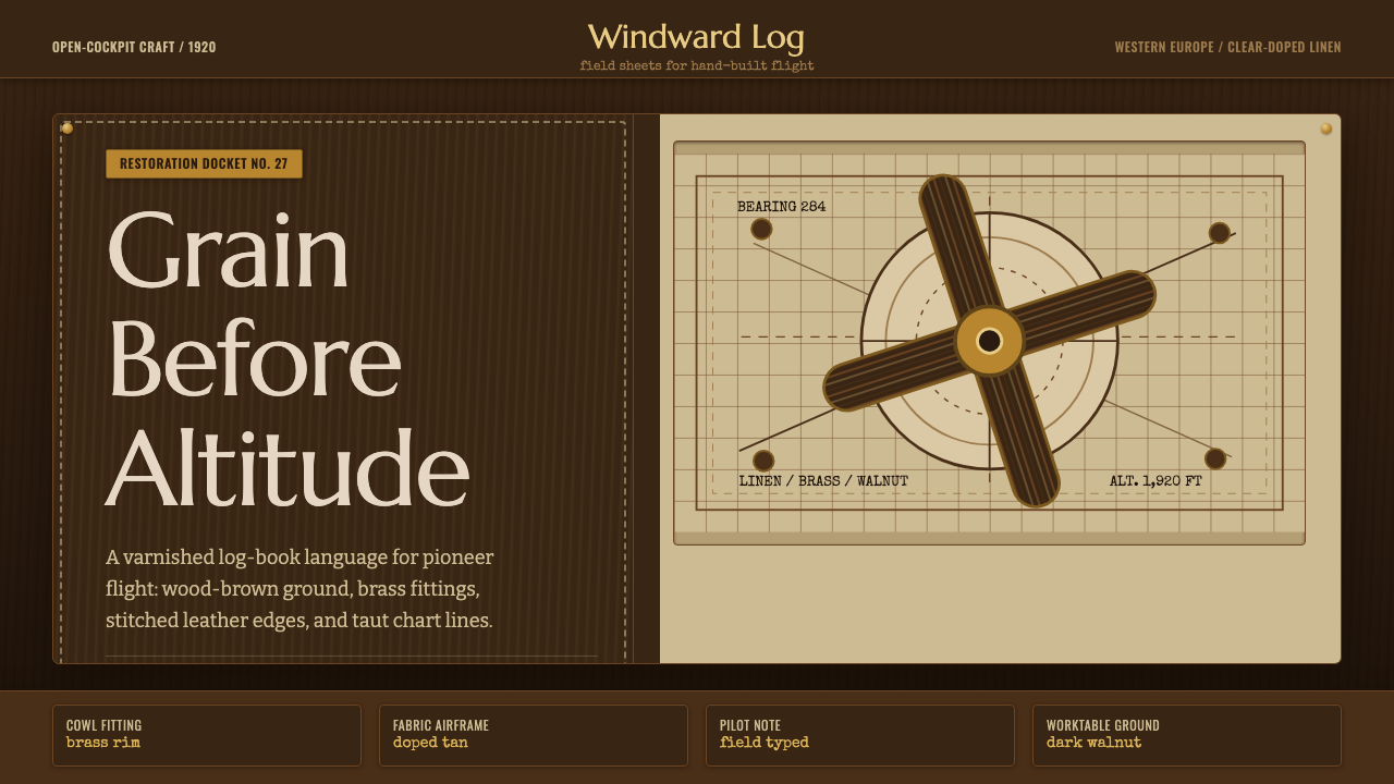 Biplane AviationPioneer flight feels hand-built. Dark walnut, brass, stitched edges, and char…
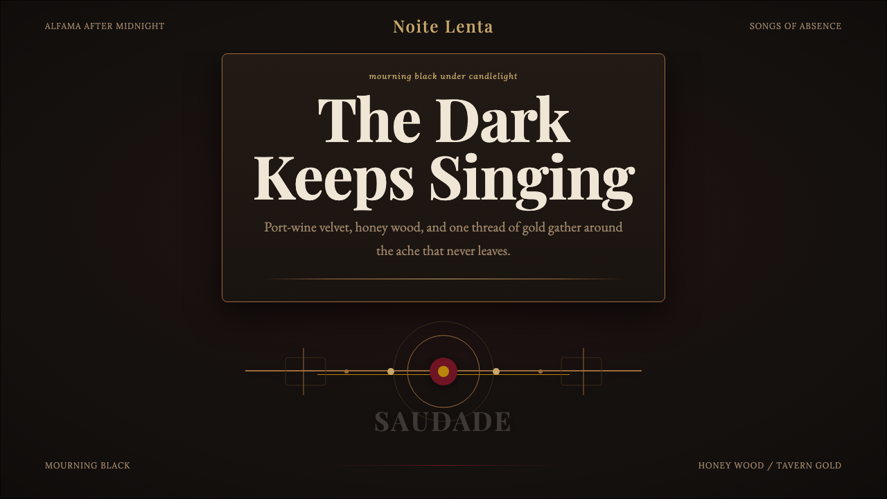 Fado SaudadeSaudade in shadow. Mourning black holds wine red, honey wood, and one gold li…
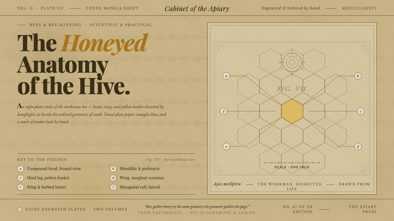 Honeybee Anatomy PlateAn 1886 beekeeping manual, reopened. Amber wash over engraved anatomy, letter…
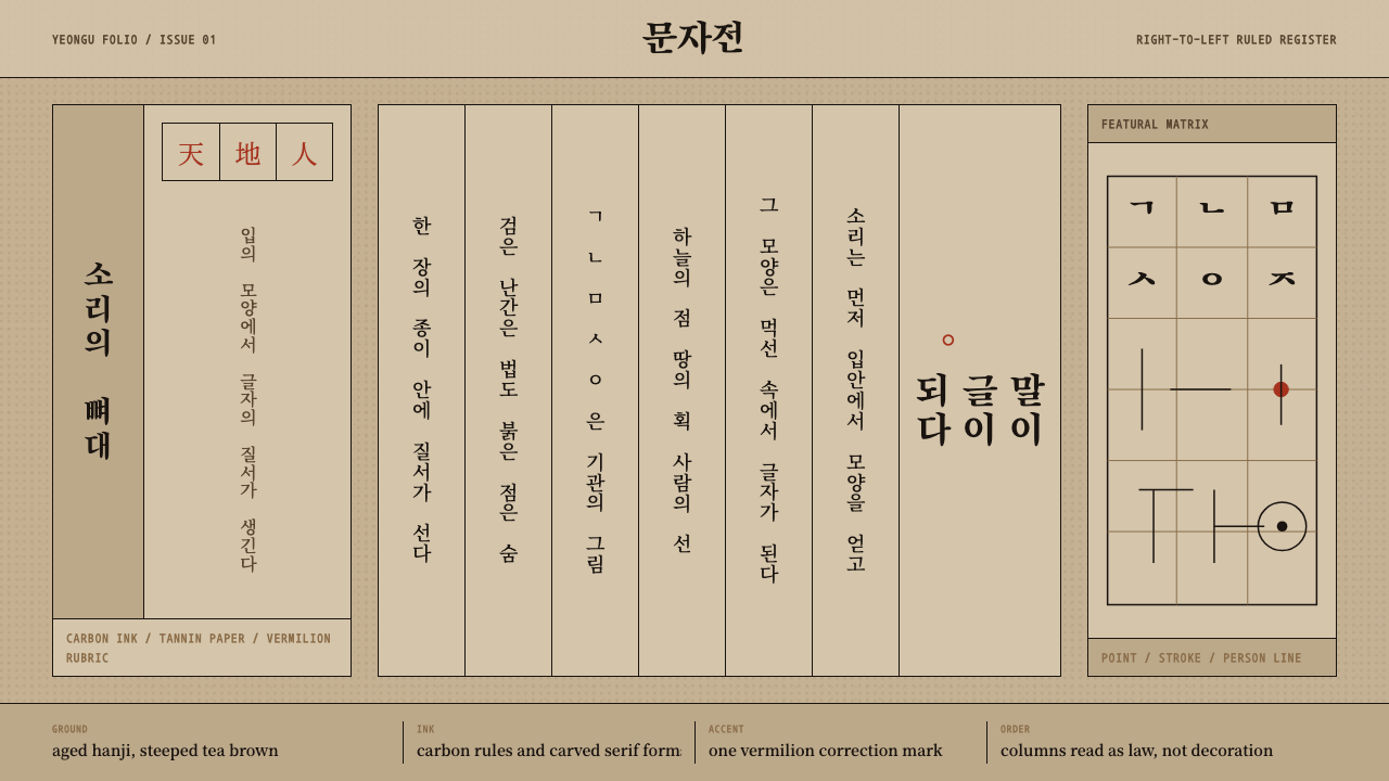 Hangul 訓民正音Ink obeys the grid. Carbon rules, vertical Myeongjo columns, and rare vermili…
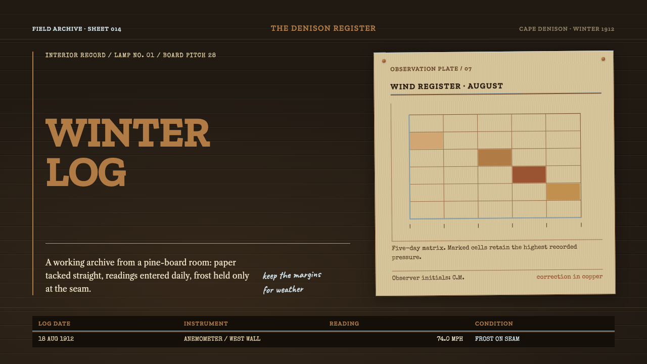 Mawson's Hut ExpeditionAn archive that stays at work. Buff survey paper, slab type and frost-thin ru…
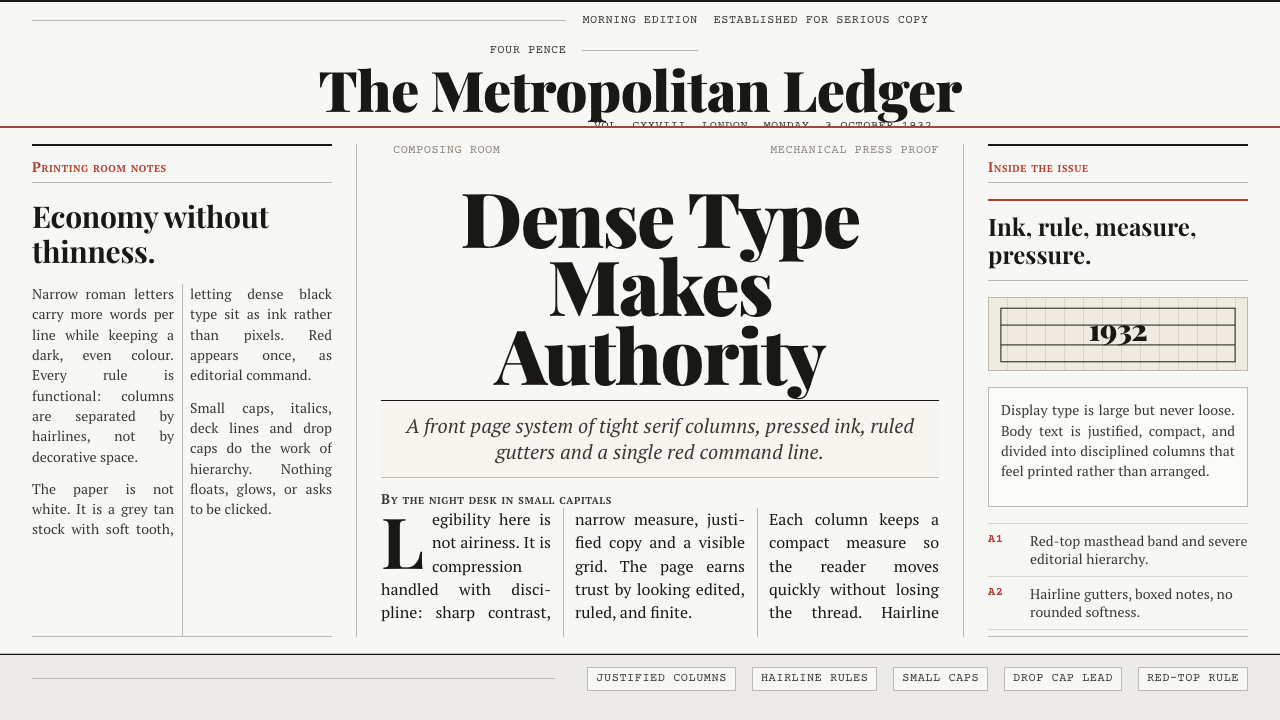 Times New Roman by MorisonAuthority under pressure. Dense black serif columns on grey-tan newsprint, ru…