What is Mawson's Hut Expedition?
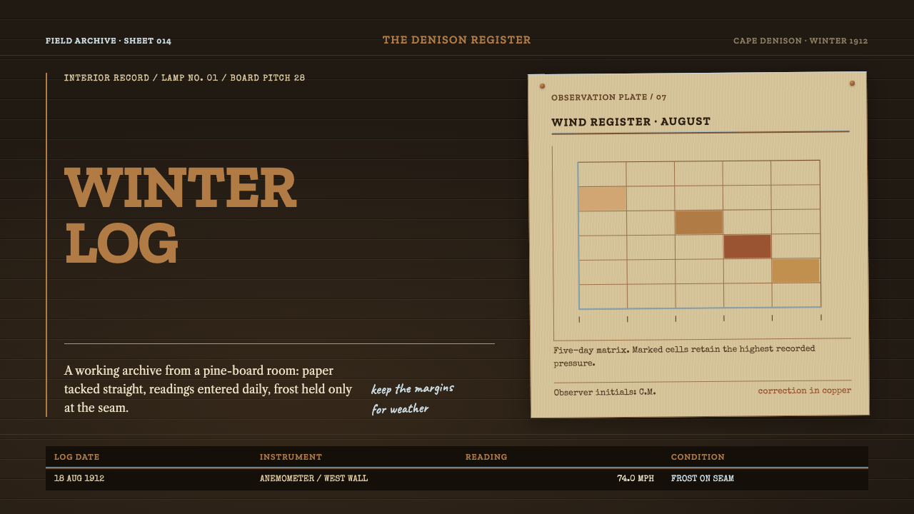
Mawson's Hut Expedition is a dark archival style built from a timber room at the bottom of the world: smoke-darkened pine, buff survey paper, typewriter figures and rules as thin as frost.
Mawson's Hut Expedition in brief
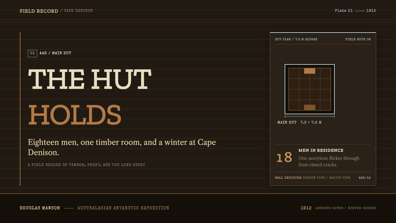
Mawson's Hut Expedition is a dark, archival design language modelled on the interior of the Main Hut at Cape Denison, the timber building from which Douglas Mawson's Australasian Antarctic Expedition worked between 1911 and 1914. The hut was small, 7.3 metres square, framed in Oregon pine and clad in Baltic pine tongue-and-groove boarding, with tarred paper and hessian stretched against the wind and copper nails salvaged from the wreck of the Clyde. Eighteen men worked and slept inside it at a spot often described as the windiest place on earth.
The style takes its surfaces from that room rather than from the landscape outside. Boarding darkened by blubber smoke becomes the ground. Buff survey paper, tacked to the wall and written over in pencil, becomes the panel. Typewriter figures from the meteorological log become the typography, and the thin glaze of frost that formed along every seam becomes the rule. One acetylene lamp lights the whole scene. The result is a working archive — left-aligned, ruled, ledgered, kept by the day — rather than an expedition poster.
That distinction is the heart of the style. There are no aurora skies, no penguins, no sweeping white vistas. The Antarctica it offers is an administrative one: wood, paper, copper verdigris and cold, arranged so that information can be recorded, checked and found again. It suits subject matter in which the work itself is the story, and it makes a dark layout feel purposeful rather than moody.
Where does Mawson's Hut Expedition come from?
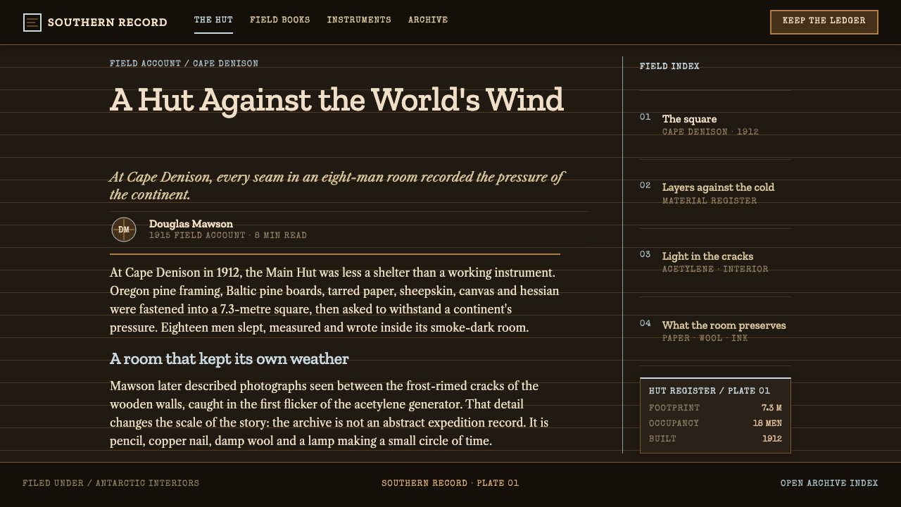
The Australasian Antarctic Expedition ran from 1911 to 1914 under Douglas Mawson, outfitted from Hobart, Australia, and based at Cape Denison on Commonwealth Bay in George V Land. It belongs to what historians call the Heroic Age of Antarctic Exploration, but the expedition's character was shaped as much by Edwardian scientific fieldwork as by adventure. Its members were expected to come home with measurements, maps and records, and the room they lived in was organised around producing them.
The Main Hut was finished in 1912 and is the physical origin of this style. Its frame was Oregon pine, its cladding Baltic pine tongue-and-groove boards, and its weather skin was tarred paper and hessian. The nails were copper, salvaged from the wreck of the Clyde. That detail says a great deal about the place: the hut was assembled from what could be shipped, reused or rescued, and every material in it was chosen to survive wind rather than to look a particular way. The style inherits this honesty about materials.
Inside, life revolved around a few objects. Smoke from burning blubber darkened the pine boards over time. A single acetylene lamp lit the room. Survey paper in a buff tone was tacked to the walls and annotated in pencil. Meteorological observations were typed into a log in neat columns of figures, and frost crept along every seam in the cladding. The room served at once as laboratory, office, kitchen and dormitory, and the men spent about two years in it. Those textures — smoked wood, buff paper, pencil, typewriter, frost — are precisely what the design system keeps.
The hut has had a second life as a heritage site, and conservation campaigns from 1997 to the present have worked to keep the fabric that gives the interior its character: darkened boarding, copper fixings, paper and the traces of use. The design system is not a memorial to heroism, though. It borrows the building's logic as a place where records were made, and asks of a screen what the hut asked of a wall: that it hold information plainly, in a cold and demanding setting, and stay legible.
What defines the Mawson's Hut Expedition look?
Smoke-Darkened Pine Ground
The ground is dark, but it is a wood dark, not a screen black. It reads as pine boards stained by years of lamp and blubber smoke: warm brown-black, with the sense of horizontal boarding behind everything. The darkness is a place that has been lived in. Because the ground is a material tone, the style does not need glossy blacks or glows; its depth is a matter of how much light the room is given.
Buff Survey Paper
Content lives on buff survey paper, a warm, slightly yellowed neutral, as though sheets had been tacked to the boarding. These are the light areas of the layout, and they carry nearly all the reading: tables, notes, reports, forms. Paper panels sit against the dark wall like pinned documents, so the page has two clear tiers, the room and the record, rather than a gradual spread of tones.
Slab and Typewriter Type
Type draws on the typewriter and the printed survey sheet. Headings use sturdy slab-serif forms with the weight of a stamped label, and figures take the even-width character of typed meteorological entries, so columns of numbers line up cleanly. The tone is practical and slightly severe. Nothing about the typography tries to be charming; it is there to be read under poor light and to keep a record straight.
Frost-Thin Rules
Lines are very fine and pale, like the glaze of frost that formed along every seam of the cladding. They divide tables, separate days and edge paper panels without ever becoming heavy borders. Their coolness is the only cold colour in an otherwise warm palette, which is how the style evokes Antarctica without painting a glacier: the chill is in the hairlines.
Ledger Structure
The layout logic is that of a daily record: left-aligned text, ruled columns, entries in sequence, one day after another. Information is arranged in tables, lists and dated blocks rather than in expressive compositions. Hierarchy is by position and weight inside a stable grid. A reader should be able to scan down a page and find an entry the way one finds a reading in a logbook.
Copper and the Single Lamp
Accent comes from two sources in the hut: the dull copper of the salvaged nails, with its verdigris tint, and the warm pool of the acetylene lamp. In the style this means a small, muted copper tone for fixed marks such as links and active states, and light that appears to come from a single source and fall off quickly. Brightness is rationed, and it always seems to be doing a job.
Pencil Marginalia
In the source room, notes were written by hand in the margins of survey sheets. The style keeps that layer as a secondary voice: small annotations in a soft graphite grey, set beside the main text rather than over it. They signal that the record is in use, being checked and corrected by a person. This is not a distressed or handwritten effect; the notes stay neat, small and subordinate.
Who shaped Mawson's Hut Expedition?
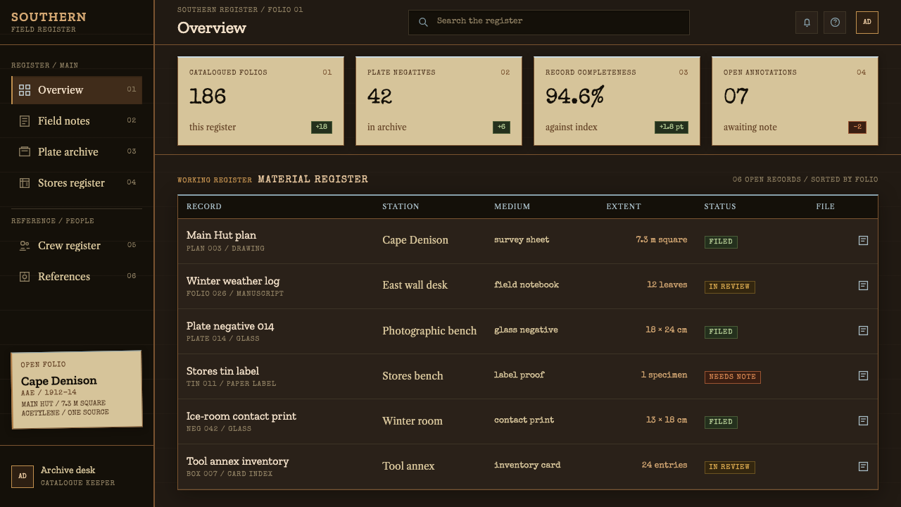
Mawson led the Australasian Antarctic Expedition of 1911 to 1914 and gives the hut its name. His expedition was organised around fieldwork and records, and the Main Hut at Cape Denison served as its base. The design system is a portrait of that base as a working room, not of the leader himself: the paper, the log and the lamp stand in for the organised, scientific character of his enterprise.
Hurley was the expedition's photographer, and his work is the main reason the world can picture the hut and its surroundings. His presence in the lineage matters for a practical reason: this style treats image-making as documentation. Any photograph used with it should behave like evidence, plain and well framed, rather than like a postcard of the polar sublime.
Madigan was a member of the Main Base party and one of the men who led sledging journeys out from the hut. He is closely associated with the expedition's weather and field observations, the kind of numbered entries that the typewriter figures in this style call to mind. He represents the disciplined, quantitative daily work that went on indoors when the wind outside made everything else impossible.
Mertz was part of the far eastern sledging journey with Mawson and did not return from it. His name is a reminder that the quiet ledger of the hut sat alongside very real danger. For a designer, that is the register to aim for: a calm, ordered surface that carries the weight of risk without dramatising it.
Ninnis travelled on the same far eastern journey as Mertz and Mawson and also did not come back. Like Mertz, he is part of the human story behind the hut's records. His inclusion keeps the style honest: it is a design language about work and cost in a hostile place, and it should never become a decorative theme about ice.
How do you use Mawson's Hut Expedition today?
Mawson's Hut Expedition is well suited to content that is documentary, technical or archival, where the interface exists to hold records. It is a good choice for logs, reports, research tools, documentation and anything built around dated entries. Approach it as an interior, not a scene: decide what is pinned to the wall, what is written in the margin and where the one lamp falls.
For presentation slides, a cover can read like the title sheet of a field report: a dark wall ground, a single buff paper panel with the title in slab type, a fine pale rule beneath it and a small dated line. Content slides become pages from a ledger, with tight columns of text and typewriter-style figures. Data slides are particularly strong. Tables of readings, with ruled columns and aligned numerals on buff paper, feel natural here, and a small copper mark can single out the figure that matters.
For web interfaces, the style fits documentation sites, changelogs, status and monitoring dashboards, research portals and developer tools. Place content in paper-toned panels on the dark ground, use frost-thin rules to divide rows, and keep controls plain: ruled inputs, copper-toned active states, small labels. Pricing pages work best as price lists, a simple ruled table of tiers and entries, rather than as a gallery of glossy cards. Dark mode is native to the style, so there is no need to design a separate light variant.
For editorial and marketing work, it supports long-form storytelling about places, expeditions, science and craft. A heritage project, an outdoor equipment brand with a serious tone, or an archive-led exhibition can use dated entries, pinned-paper blocks and marginal notes to give a page structure and authority. Photography should be documentary in manner: plain framing, natural light and a sense of use, with no dramatic grading.
The most common mistake is to treat it as a polar-themed skin. Blue glacier gradients, snowcap silhouettes, aurora glows and penguin illustrations all turn a working archive into a wilderness poster, which is exactly what the style refuses to be. A second mistake is overdoing the age: heavy grunge, fake tears and artificial stains make the paper look staged. The interior should look used but orderly, and the frost should stay thin.
Mawson's Hut Expedition — FAQ
Is this an icy, blue, polar-looking style?
No. Its palette is warm: smoke-darkened wood, buff paper and dull copper. The cold appears only in the thin pale rules that stand in for frost. It is based on the inside of a hut where eighteen men worked, not on the ice outside, so there are no glacier blues, no aurora and no animals. If you want a polar look, use another approach; if you want the feeling of a place where records are kept in difficult conditions, this is the one.
Is it a vintage or distressed style?
It is historical in its materials, but it is not distressed. The source is a working archive in daily use, which means tidy columns, clean rules and carefully written notes. The age shows in the tone of the surfaces, such as smoke-darkened wood and yellowed paper, not in artificial wear. Keep edges crisp and layouts ordered, and let the palette do the work of suggesting time.
Why slab serif and typewriter figures?
Because the room's own records were typed and printed. A slab serif has the sturdy, stamped look of survey sheets and labels, and typewriter-style figures have even widths, which keeps columns of numbers aligned. That alignment is functional: it makes readings easy to compare. The type is meant to feel dependable in poor light, not elegant.
Do I need a dark background?
The style is dark by design: the ground is smoke-darkened pine, and the light areas are the buff paper panels laid against it. You can make a page that is mostly paper, but it should still sit on the dark wall, with the room visible around it. Turning the whole thing into a pale layout loses the central image of paper pinned to a smoked wall under a single lamp.
What kinds of products suit it best?
Anything built around records, measurement or documentation: developer docs, observability and monitoring tools, research and archive platforms, reporting dashboards, field-data apps and publications about science or exploration. It is less suited to playful consumer products or brands that depend on bright, friendly energy, because the style's seriousness will work against them.
Related design styles
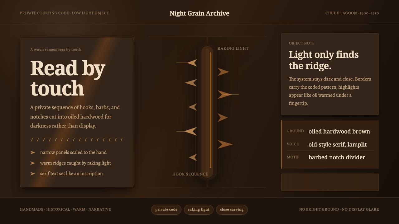 Chuukese Love Stick CarvingIntimacy carved for darkness. Oiled brown grain and hook-notches read by raki…
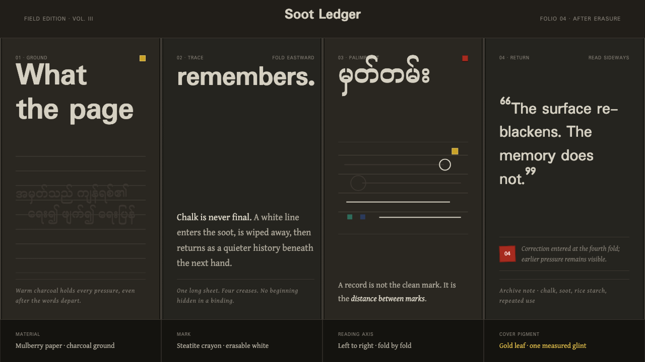 Shan Parabaik ManuscriptMemory survives erasure. Chalk-white lines and grey ghosts travel across warm…
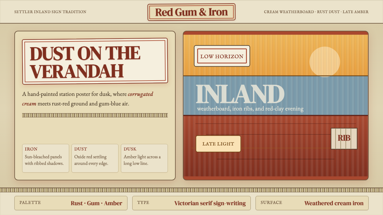 Australian Outback VernacularWeather is the voice. Rust dust, gum-blue bands, and serif sign-writing age t…
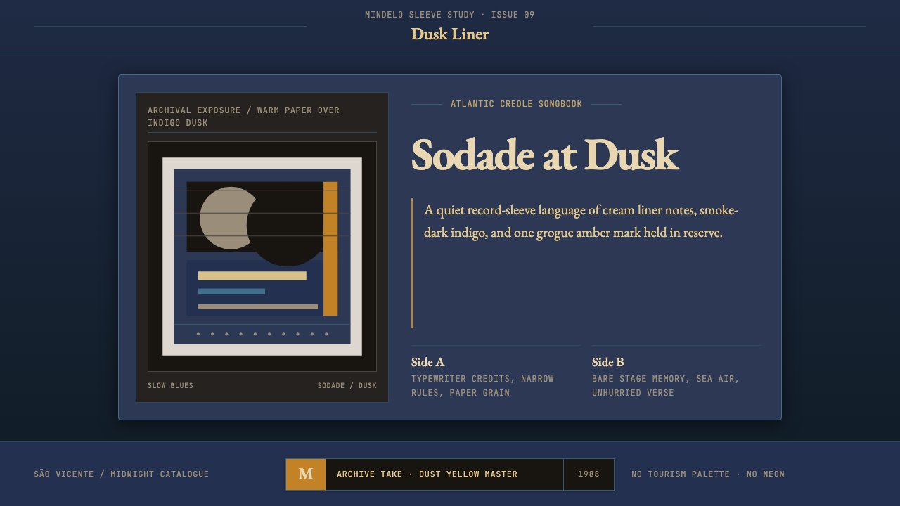 Cape Verdean Morna (Cesária Era)Longing in dusk. Indigo sleeve framing, Garamond liner notes, and one amber e…
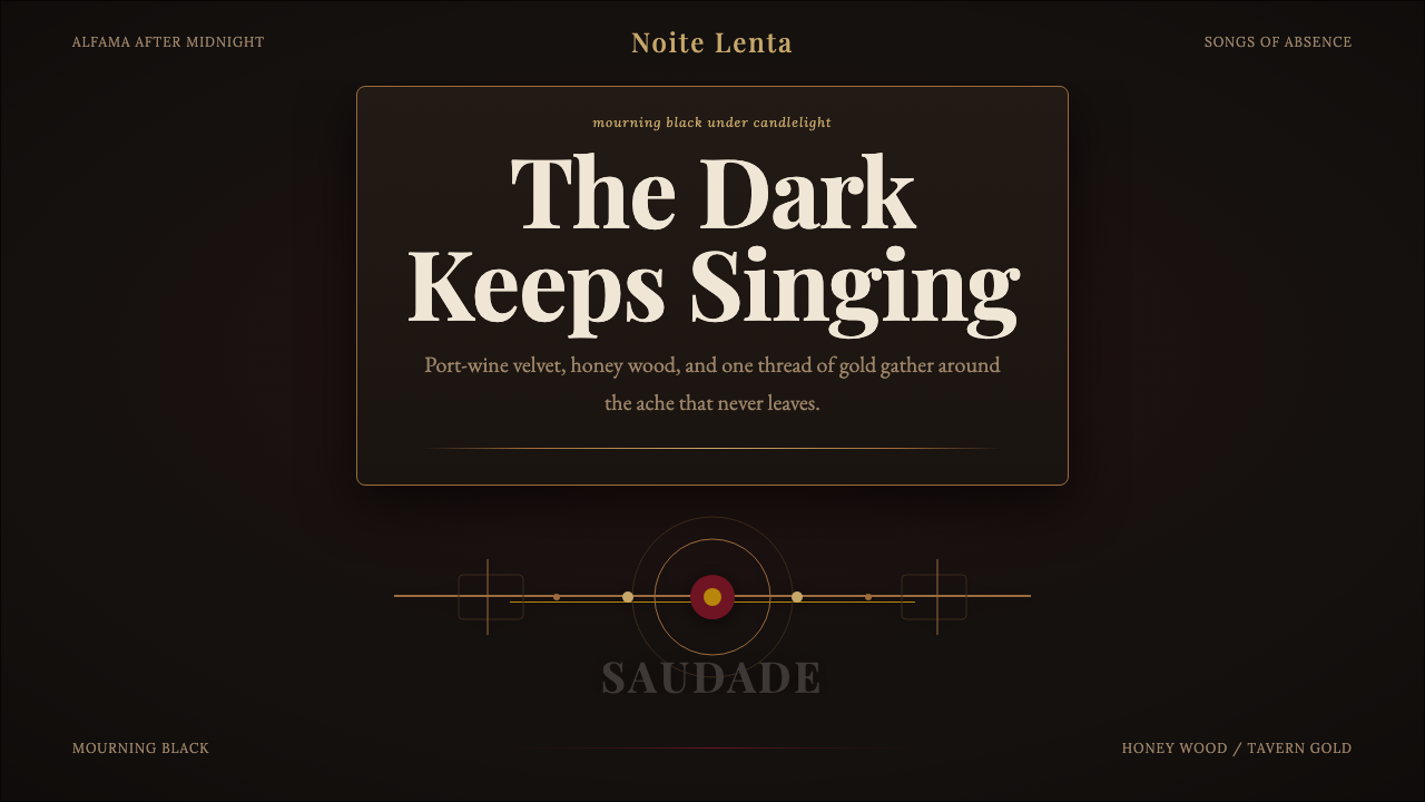 Fado SaudadeSaudade in shadow. Mourning black holds wine red, honey wood, and one gold li…
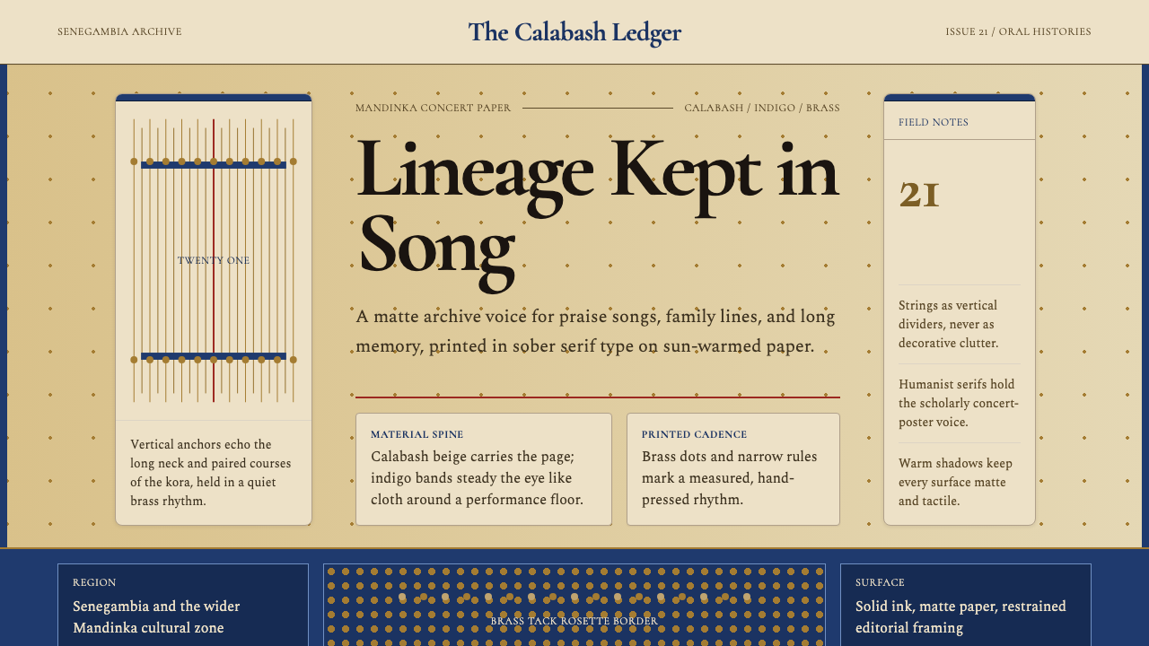 Gambian Griot Kora (21-string)Oral history feels tactile. Calabash beige, indigo bands, and 21 brass string…