What is Bathysphere?
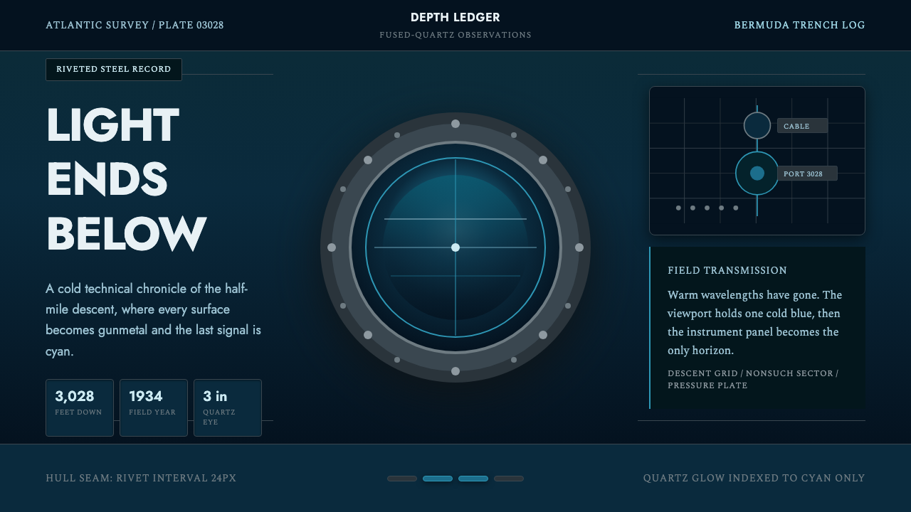
Bathysphere turns the terror of oceanic pressure into order: gunmetal structure, riveted rhythm, and one cold cyan aperture facing the dark.
Bathysphere in brief
Bathysphere is a dark industrial style derived from William Beebe and Otis Barton's 1934 descent off Bermuda, when a 5,000-pound riveted cast-steel sphere carried them 3,028 feet beneath the Atlantic. Its visual language combines an abyssal blue-black field, cold gunmetal surfaces, disciplined grids, repeated rivet forms, and the concentrated cyan light of a fused-quartz porthole.
The style is built around enclosure and penetration. Dense dark planes suggest the steel hull and the pressure beyond it, while narrow lines, seams, frames, and fasteners make that enclosure feel engineered rather than merely gloomy. Cyan is not general decoration; it represents the porthole, the instrument glow, and the last visible trace of the ocean before darkness becomes complete.
Its character lies between early oceanographic exploration and interwar geometric-modern industrial design. The romance comes from confronting an unknown environment, but the form remains restrained: circles function as apertures, grids imply measurement, and repeated hardware establishes rhythm. Every luminous element feels scarce, every boundary feels load-bearing, and every empty dark region carries pressure.
Where does Bathysphere come from?
Bathysphere begins with the 1934 record descent off Bermuda undertaken by William Beebe and Otis Barton under the auspices associated with the New York Zoological Society. The vehicle was radically direct in form: a riveted cast-steel sphere weighing 5,000 pounds, suspended from above and sealed against the surrounding Atlantic. Its geometry was not an aesthetic gesture added after engineering; the sphere itself was the structure that separated observation from lethal pressure.
The descent reached 3,028 feet. Inside, Beebe and Barton occupied an enclosed metal world whose connection to the sea was reduced to a three-inch fused-quartz porthole. That small circular opening established the central visual tension inherited by the style: an immense field of darkness compressed into a limited view, with human knowledge dependent on a single precisely bounded aperture.
Beebe described watching warm light disappear as the sphere descended until an indefinable translucent blue remained, followed by nothing. This progression supplies the palette and its hierarchy. Warmth belongs to the world above and recedes from the composition; blue becomes colder and less familiar; cyan survives as a concentrated optical event; blue-black finally occupies most of the field. Darkness is therefore not neutral background but the destination of the descent.
The associated design language joins early oceanographic exploration with interwar geometric-modern industrial restraint. Cast steel, rivets, circular openings, straight structural divisions, and measured repetition provide the industrial vocabulary. The historical drama remains visible, but it is expressed through controlled geometry rather than illustrative spectacle. Bathysphere does not depict a busy underwater fantasy; it recreates the conditions of looking outward from a small engineered chamber into an environment too vast and dark to comprehend.
What defines the Bathysphere look?
Abyssal Color
The palette is dominated by blue-black darkness and gunmetal neutrals, with cyan reserved for optical or informational emphasis. These colors describe a physical sequence: oceanic void, steel enclosure, then porthole light. Broad bright surfaces weaken the sense of depth; illumination should remain localized, as though every visible signal must cross an immense darkness before reaching the viewer.
Porthole Geometry
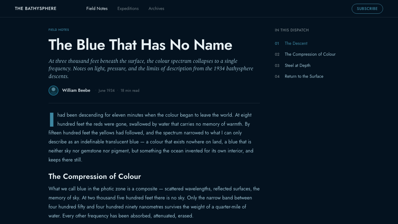
The circle is the governing form because it represents the fused-quartz viewing port and the act of looking through a pressure boundary. Circular frames should feel thick, nested, and mechanically secured rather than playful. Rectangles and straight lines organize surrounding information, allowing the porthole form to interrupt the grid as a rare opening into another spatial condition.
Riveted Rhythm
Repeated dots, fasteners, and short mechanical marks evoke the riveted cast-steel shell. Their spacing should appear deliberate and load-conscious, forming rows that reinforce edges, panels, and joints. Rivets are most convincing when they clarify construction; scattered randomly, they become costume decoration and lose the disciplined engineering logic that gives the style authority.
Measured Typography
Typography should resemble calm technical notation rather than theatrical science fiction. Compact sans-serif forms, restrained capitals, tabular groupings, and sharply separated hierarchies support an atmosphere of observation and record-keeping. Headlines may carry mass, but body text should remain controlled and legible, as if it belongs to an instrument panel or expedition log inside a confined chamber.
Structural Grid
The grid behaves like an internal frame. Strong divisions, inset panels, aligned labels, and repeated modules suggest that information has been mounted into a steel assembly. Density can be high, but alignment must remain exact and negative space must separate systems clearly. The result should feel compressed by circumstance, never confused by careless placement.
Pressure and Scarcity
Bathysphere creates atmosphere by withholding comfort. Light, open space, and vivid color are scarce, so each occurrence gains significance. Heavy borders and dark margins imply containment, while small luminous details suggest survival and perception under pressure. Decorative softness, abundant glow, or loose organic shapes dissolve this tension by making the environment feel accommodating.

Who shaped Bathysphere?
Beebe was one of the two occupants of the Bathysphere during the 1934 record descent off Bermuda. His observation of warm light disappearing into an indefinable translucent blue, and then into nothing, provides the style with its most important experiential sequence. In visual terms, he represents the observer: the human presence interpreting an immense environment through a very small window.
Barton shared the sealed cast-steel sphere with Beebe during the descent to 3,028 feet. Within the design language, his role is inseparable from the engineered vehicle and the practical reality of entering the Atlantic dark inside a suspended pressure enclosure. He represents the union of exploration and mechanism on which Bathysphere depends.
The New York Zoological Society supplies the institutional setting identified with the expedition. Its presence places the Bathysphere within organized North American oceanographic exploration rather than private fantasy. As a design reference, the institution contributes the language of documentation, classification, measured observation, and disciplined presentation that balances the descent's drama.
How do you use Bathysphere today?
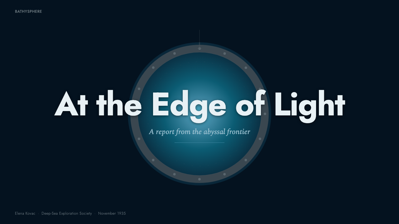
For presentation covers, Bathysphere works best as a controlled confrontation between darkness and one circular point of entry. Let a large porthole form occupy a decisive position while the title sits within a rigid gunmetal framework. Content slides should convert that enclosure into a clear information system: aligned panels, restrained cyan markers, short labels, and enough darkness around each module to preserve the sensation of depth.
Data slides benefit from the style's association with measurement and expedition records. Charts should resemble instruments or plotted observations, using precise lines, repeated divisions, and cyan highlights against a dark field. Keep explanatory text outside the primary plotting area and make one reading dominant. Too many equally luminous series turn the panel into spectacle and destroy the impression of scarce, purposeful information.
For web interfaces, Bathysphere suits monitoring dashboards, analytical tools, and pricing pages that need a serious engineered character. Cards can behave like inset steel panels, navigation like a compact control strip, and status indicators like porthole light. Pricing tiers should be differentiated through framing, hierarchy, and limited illumination rather than a rainbow of accents. Interaction must remain legible even when the overall atmosphere is dark.
Editorial and marketing layouts should treat the historical descent as a sequence of thresholds: surface, fading warmth, translucent blue, and abyss. Long-form articles can alternate dense log-like text with isolated circular imagery or observation panels. Marketing pages can use a single cyan focal area for the principal call to action, while riveted rules and structural bands guide movement through the story without turning every section into a themed prop.
The common mistake is to confuse Bathysphere with generic futuristic or submarine styling. Excessive neon, soft ambient glow, decorative gauges, random rivets, and crowded technical symbols replace historical restraint with fantasy. The authentic approach is quieter and heavier: most of the composition remains blue-black and gunmetal, geometry explains structure, and cyan appears only where the viewer should look or act.
Bathysphere — FAQ
Is Bathysphere simply a nautical or submarine style?
No. General nautical design often uses surface-world symbols and a broad maritime mood. Bathysphere is specifically grounded in the sealed 1934 cast-steel sphere, its riveted construction, its fused-quartz porthole, and the visual transition from fading warm light to blue-black depth. Its emphasis is pressure, observation, and engineered confinement rather than ships, waves, or decorative seafaring imagery.
Why is cyan used so sparingly?
Because cyan represents access to perception. It recalls the porthole view and the last translucent blue Beebe observed before darkness. If cyan floods every panel, it stops functioning as light and becomes ordinary surface color. Restricting it to focal points, active states, and crucial data preserves the impression that visibility itself is a limited resource.
How should Bathysphere typography avoid becoming science-fiction pastiche?
Favor legibility, compact hierarchy, and the tone of an expedition record or measured instrument. Type should organize observations, labels, and evidence rather than perform futurism. Decorative alphabets, excessive fragmentation, and invented technical markings weaken the historical basis. The most convincing typography feels practical enough to belong inside the steel sphere while remaining clear to a contemporary reader.
Can the style support dense dashboards without becoming claustrophobic?
Yes, if density is structural rather than indiscriminate. Group related information into clearly bounded panels, align labels and readings, and leave dark separation between systems. Use cyan to establish a reading path instead of illuminating everything. The interface may feel enclosed, which is appropriate, but it should never make relationships or actions difficult to identify.
Where does Bathysphere work poorly?
It struggles where openness, warmth, softness, or casual sociability is the central promise. The style's dark enclosure, hard structure, and scarce illumination naturally communicate seriousness and controlled risk. Those qualities suit analytical, exploratory, or technical subjects, but they can feel severe when a product depends on abundance, ease, or emotional comfort. The theme should support the message, not overpower it.
Related design styles
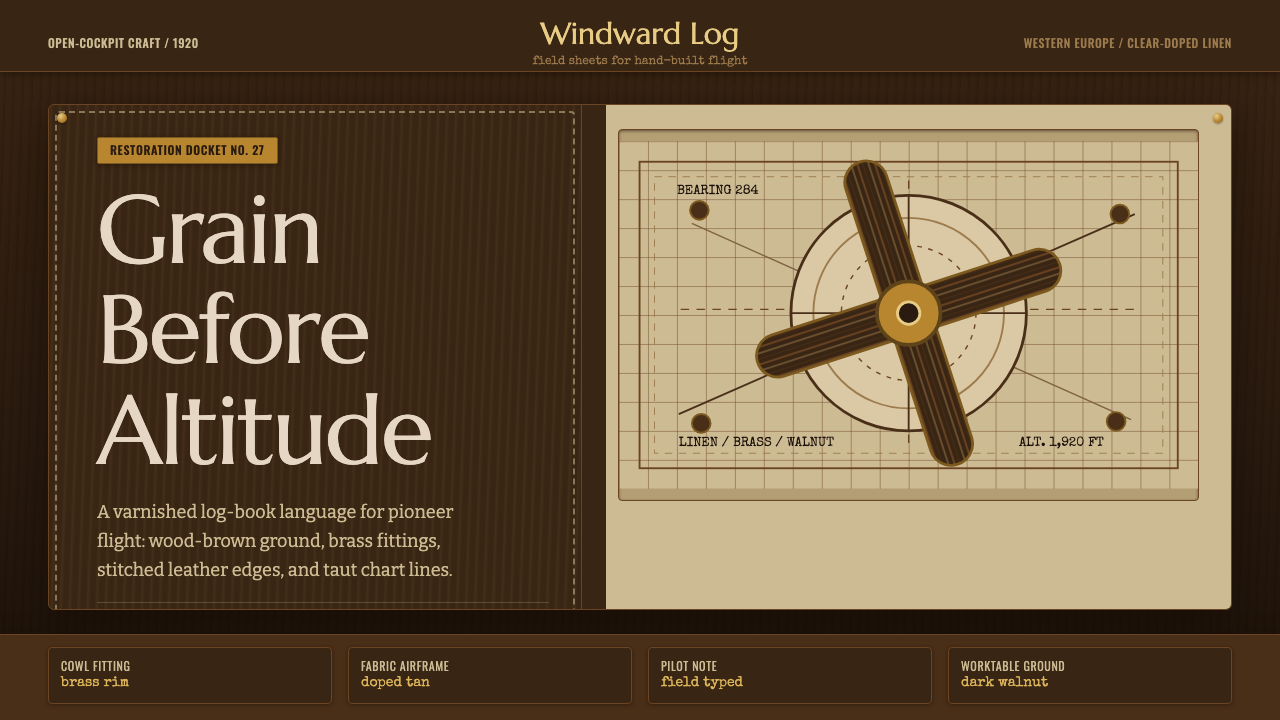 Biplane AviationPioneer flight feels hand-built. Dark walnut, brass, stitched edges, and char…
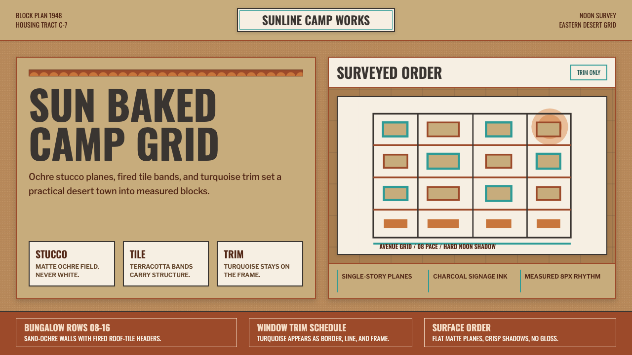 Dhahran Aramco Camp ModernismDesert order, sun-baked. Ochre stucco fields, terracotta bands, turquoise tri…
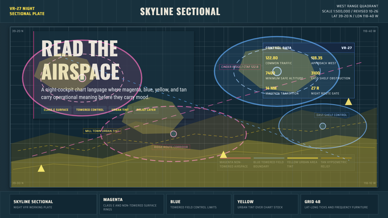 Aeronautical ChartReads like cockpit data. Magenta-blue airspace rings cut through dense dark-c…
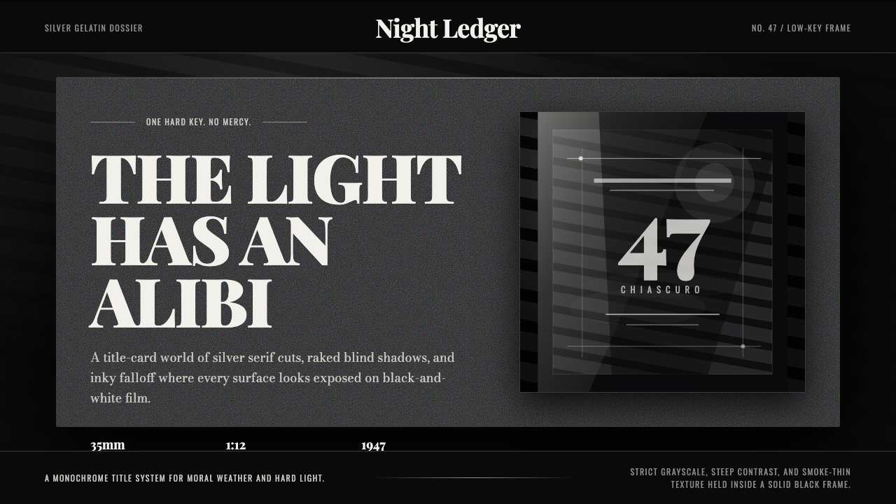 Film Noir ChiaroscuroLight is the crime. Silver serif cards, blind stripes, and grain carve drama…
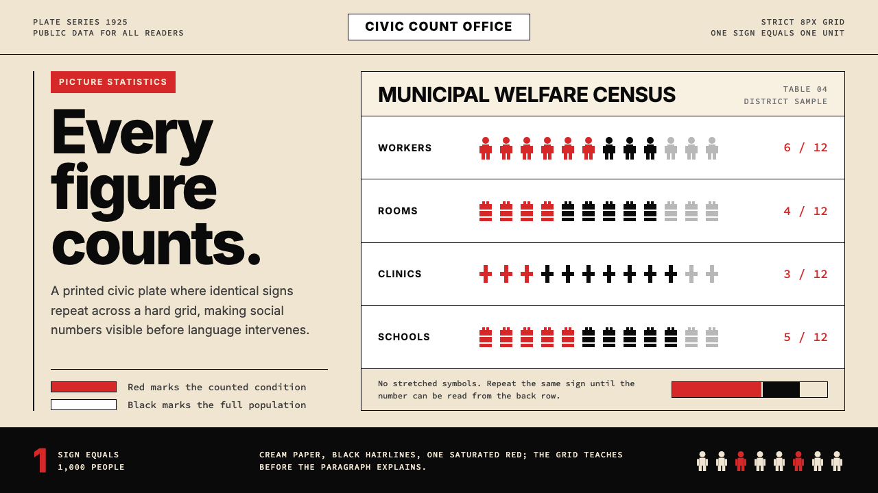 Otto Neurath ISOTYPEData anyone can count. Cream grids, black pictograms, and one red measure.
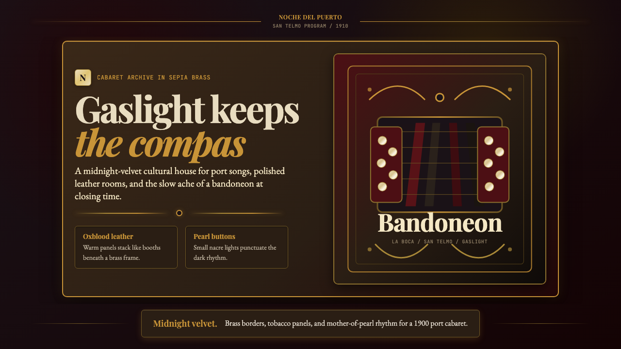 Argentine Bandoneón 1900 (Tango)Gaslit tango luxury. Midnight velvet, brass fileteado, and pearl-button geome…