What is Teletype News Wire?
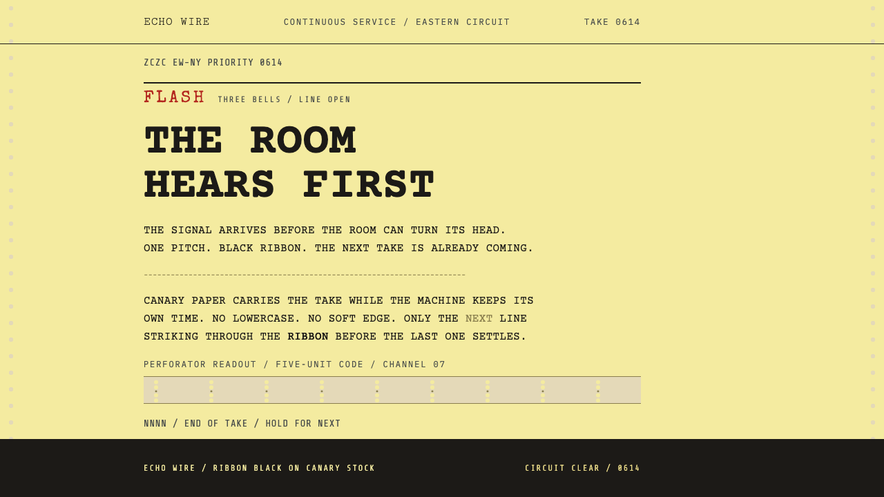
The Teletype news wire turns urgency into a physical format — canary paper, ribbon-black capitals at one fixed pitch, and a single red line reserved for the story that cannot wait.
Teletype News Wire in brief
The Teletype News Wire style recreates the printed output of a newsroom teleprinter in the 1960s, when wire services such as the Associated Press, United Press International and Reuters fed stories to newspapers and broadcasters over machines that hammered copy onto paper all day. It is a design language built on constraint. The machine could print only capital letters, in one fixed width, in one or two colours, on a continuous sheet. Everything the style looks like follows from those limits.
The visual system is easy to describe and hard to fake. A pale canary-yellow paper ground; copy set entirely in capitals at one fixed pitch, ragged on the right and hard-broken at the machine's line length; type that strikes unevenly through a fabric ribbon, so some letters sit heavy and others faint; square corners, since paper has no corners to round; and a single red reserved for priority headings such as FLASH. There is no shadow, no gradient and no soft edge, because a sheet of paper is flat and a mechanical printer does not simulate light.
In use, the style communicates immediacy and authority at once. It reads as a dispatch rather than a post, a bulletin rather than a feature, and it gives numbers, headlines and alerts a documentary seriousness. It is a good language for anything that wants to feel like information arriving in real time.

Where does Teletype News Wire come from?
The style belongs to wire-service journalism between the 1950s and the 1980s, with traffic at its peak in the 1960s. News agencies gathered stories from reporters around the world and relayed them over leased lines to newsrooms, where teleprinters printed them out. Curio's source locates the style in global newsrooms and names the Associated Press, United Press International, Reuters and the US National Weather Service wire. The wire room was a distinct, noisy place, and editors lived inside its rhythms.
The look is rooted in the technology. A teleprinter was a keyboard-driven telegraph machine that turned electrical signals into printed characters, and its ancestry lies in telegraphy, radio teletype and punched-tape data transmission. At the centre was the Baudot code, a five-unit telegraph code devised by the French engineer Émile Baudot that has no lowercase letters; the code was later reworked by Donald Murray, who brought a typewriter-style keyboard to telegraphy. Machines made by the Teletype Corporation were so common that the company's name became the generic word for the whole class of equipment.
A wire room ran on sound and colour, and that is a crucial part of the design heritage. Different services printed on different papers, so an editor crossing the room could tell which one was speaking by the sheet feeding out of it: AP on canary yellow, UPI on white, and the weather wire also yellow. Bells signalled priority before anyone read a word, one ring for ordinary copy and a run of rings for an urgent item. On two-colour ribbons, only the most pressing headings such as FLASH and BULLETIN were struck in red. Hierarchy was physical and legible at a glance.
What made the format distinctive was how plainly it followed the limits of the machine. Capitals-only copy, one fixed width, ragged right margins and hard line breaks were not stylistic choices but consequences of the five-unit code and a mechanical carriage. Later, teletypes became the earliest computer terminals, and the abbreviation tty still survives in computing. The wire aesthetic therefore sits at the root of both newsroom practice and the monospaced, text-first look of early computing, which is why it feels both journalistic and technical today.
What defines the Teletype News Wire look?
Canary Paper Ground
The ground is a pale canary yellow, the colour of light newsprint stock, matte and slightly dull. It is not a bright highlighter yellow but a soft, fatigued paper tone that makes black type sit comfortably. The yellow also had a practical role in the wire room, helping editors identify which service printed the sheet. As a screen colour it works best when applied evenly across the whole page, like paper, rather than as a bold stripe or accent.
Ribbon-Black Capitals
All copy is set in capital letters, because the five-unit code underneath has no lowercase. The ink is a soft black, struck through a fabric ribbon, so letters carry a slightly furry edge and uneven density: a character can be heavy on one line and faint on the next. This gives the page a quality of mechanical work rather than typesetting. The capitals are plain and unadorned, without stylistic flourishes or decorative faces.
Fixed Pitch, Ragged Right
Every character occupies the same width, and lines are hard-broken at the carriage's fixed line length, so text forms a narrow column with a ragged right edge. There is no justification, no hyphenation and no proportional spacing. The grid is a character grid: columns line up because each letter takes one cell. This makes lists, tabular data and short dispatches feel precise, and it makes long paragraphs feel deliberately terse.
Red Reserved for Flash
Red is the one exception to black, and it is rationed. On a two-colour ribbon it was used only for the most urgent headings, such as FLASH and BULLETIN, so its appearance meant something. The style depends on that scarcity: one red line on a page signals a priority that cannot wait, whereas red used for decoration or for every alert would drain it of meaning. Think of red as a single bell, not a colour scheme.
Flat, Square, Shadowless
Corners are square because a sheet of paper has no corners to round, and nothing casts a shadow because a printed page does not simulate light. Boxes, if any, are drawn from characters or ruled lines. There are no gradients, no glows, no depth effects. The style is deliberately two-dimensional and material: it behaves like paper coming out of a machine, not like a glowing screen.
Mechanical Drift and Irregular Strike
Because the print head hammered characters onto paper through a ribbon, the output is slightly imperfect. Letters strike unevenly, lines drift sideways by a small amount, and the right margin never settles. These traces of mechanism are part of the authenticity. In design, they suggest small variations in weight and alignment rather than perfect typographic polish, with the discipline of the grid remaining firm underneath.

Who shaped Teletype News Wire?
Émile Baudot was the French telegraph engineer whose five-unit code underpins the format. A code of this kind has no room for lowercase letters, and that single constraint created the all-capitals look of teleprinter copy. His name also survives in the word baud, a unit of signalling speed. For designers, Baudot represents the principle that a technical limit can become a visual identity.
Donald Murray adapted Baudot's code and is remembered for bringing a typewriter-style keyboard to telegraphy, so that operators could prepare messages by typing them and the system could add control signals such as a return to the start of the line. This is the source of the format's line-by-line, carriage-bound feel. The look of wire copy is the look of a typewriter married to a telegraph.
The Teletype Corporation manufactured the machines that filled wire rooms, and its name became the common word for teleprinters in general. Its equipment fixed the practical details of the aesthetic: the carriage width, the heft of the keys, the chatter of the print mechanism, the rolls of paper. The company is a reminder that the look of a medium is often set by the engineering of one widely used device.
The news agencies themselves, the Associated Press, United Press International and Reuters, supplied the content and conventions of wire copy. Curio's source places the style in their newsrooms and in the US National Weather Service wire. Their house practices, such as priority headings, brevity and the identification of each service by paper colour, gave the format its editorial logic as well as its look.
How do you use Teletype News Wire today?
Teletype News Wire is a high-contrast, text-first system that suits content about information, news, alerts and logs. Treat the page as a printed sheet from a machine: one paper colour, one fixed type pitch, black ink, and a single red exception. Its strength lies in how little it needs; the fewer extra elements, the more convincing it becomes.
For presentation slides, the cover can be a canary paper field with the title set in capitals at a fixed pitch, left aligned and ragged right, and one short line in red above it, such as a flash label that names the topic. Content slides can be built as short dispatches: a few lines of capitals, an editorial headline, a figure. Data slides work well as plain tables and character-based bar charts in black ink, with red used on the single number that matters most.
On the web, the style fits news and media products, status pages, monitoring consoles, changelogs, developer documentation and anything that behaves like a feed. Cards can lose their rounded corners and shadows and become ruled blocks of text, navigation can be a plain list of capital-letter labels, and tables should align on the character grid. Keep one red element per view, such as the most urgent alert, and let everything else remain black on paper.
In editorial and marketing work, it is ideal for breaking-news campaigns, press materials, product announcements written as bulletins, zines and retrospective features. Headlines are short and declarative, body copy is terse and set in a narrow column, and sections are separated by blank lines or ruled rows rather than imagery. Because all capitals are slower to read in long runs, reserve the style for short passages and use more conventional type for extended text.
The most common mistake is to use red decoratively. When every heading or button is red, the flash loses its force and the page stops feeling urgent. Related errors include mixing lowercase body copy with capitals, using a pure white page that removes the paper feeling, adding rounded corners, soft shadows or gradients, centring the text, justifying lines, and applying a heavy fake-distress texture that is dirtier than the clean, flat sheet a real machine produced. The style is spare, upright and literal.

Teletype News Wire — FAQ
Why is all the copy in capital letters?
Because the Baudot code behind teleprinters carries five bits per character and has no lowercase letters. Machines could print only capitals, so wire copy was all capitals by necessity rather than by taste. The style keeps that constraint because it is the single clearest visual signal of the format. If you need lowercase for readability, confine it to supporting text, and keep headlines, alerts and data in capitals.
Why canary yellow rather than white?
In a wire room, different services printed on different papers so editors could tell at a glance who was speaking. In Curio's source the Associated Press runs on canary yellow, United Press International on white, and the weather wire is also yellow. The yellow here therefore carries both a historical association with a major agency and the look of cheap, lightweight newsprint. It also softens contrast so that black capitals feel printed rather than glowing.
How should red be used?
Sparingly and only for priority. On a two-colour ribbon, red was reserved for headings like FLASH and BULLETIN, so each appearance meant something. In a design, give one view at most one or two red elements, always the most urgent information. If red appears everywhere, it stops functioning as a signal. The effect depends on contrast between the many black lines and the single red one.
How is this different from a generic typewriter or terminal look?
A typewriter look usually implies a literary, lowercase-capable, personal document, and a terminal look implies a dark screen with bright text. The wire style is neither. It is a machine-printed, all-capitals, paper-based dispatch with a defined priority system, bell-and-colour coding and a specific newsroom context. It is lighter and flatter than a terminal and more impersonal than a typewriter, closer to a bulletin than a letter.
Is all-caps text a readability problem?
For long passages, yes: capitals are slower to read than mixed case. That is why the style suits short, high-value text such as headlines, alerts, labels, figures and short dispatches. For longer reading, keep the paper ground and fixed pitch but allow lowercase, or use the style as a frame around conventional text. Give lines enough spacing, keep the measure narrow, and maintain strong contrast between ink and paper.
Related design styles
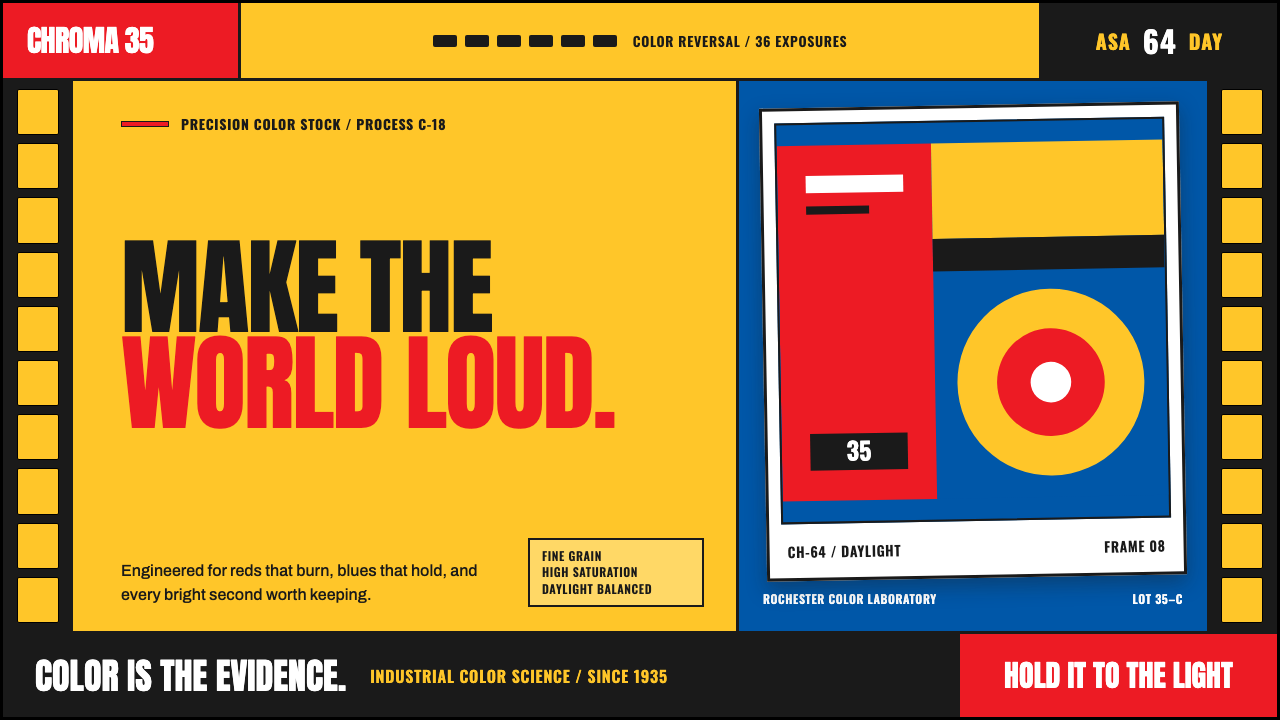 Kodak Film (1935)Color arrives at full volume. Chrome yellow, signal red and filmstrip geometr…
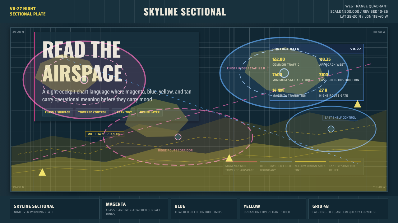 Aeronautical ChartReads like cockpit data. Magenta-blue airspace rings cut through dense dark-c…
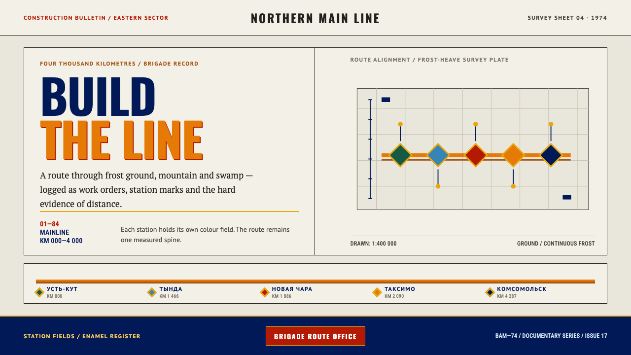 Baikal-Amur RailwayInfrastructure made tangible. Orange route spines and enamel station fields o…
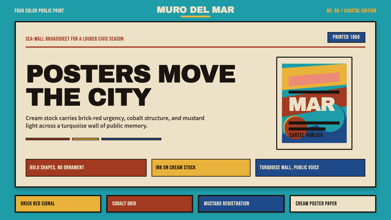 Cuban Malecón 1960 PosterPublic voice in flat ink. Turquoise wall, cream stock, brick red and cobalt b…
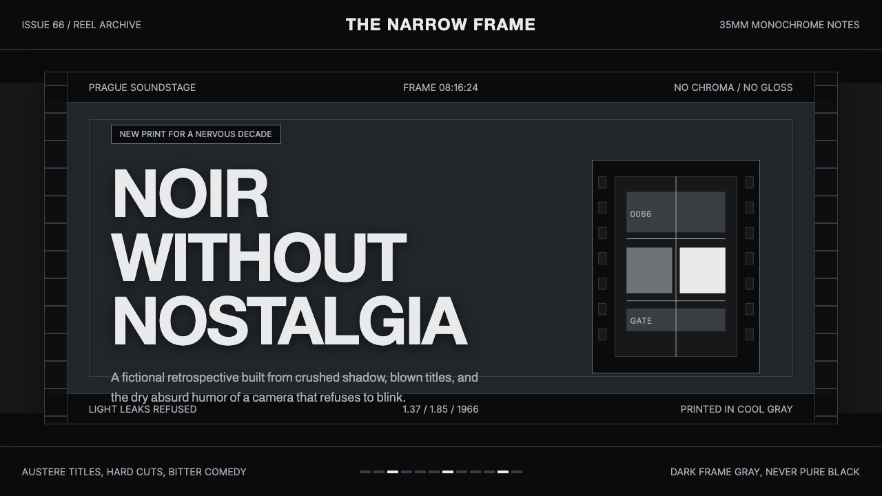 Czechoslovak New Wave CinemaNoir without nostalgia. Letterbox bars, off-white titling, and 35mm grain do…
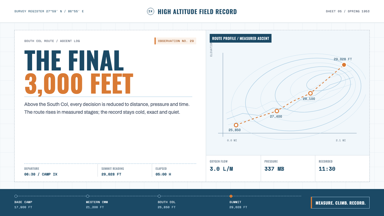 Everest Expedition (1953)Quiet heroism, precisely measured. Ice-blue contours and mono data cross a sn…