What is Kodak Film (1935)?
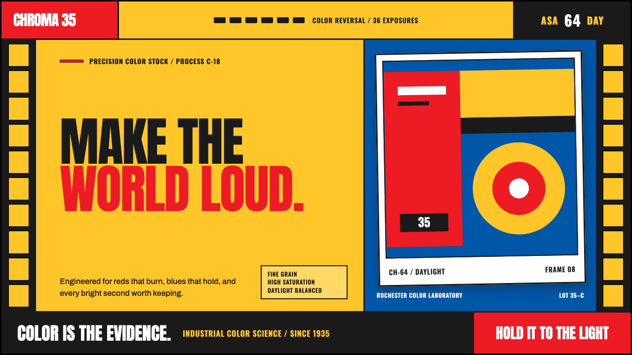
Kodak Film turns color into an event: chrome yellow, signal red, and the mechanical rhythm of a filmstrip make every image feel ready for projection.
Kodak Film (1935) in brief
Kodak Film is a visual language derived from the arrival of Kodachrome in 1935, when Eastman Kodak brought commercially successful color film into the consumer imagination. Its most recognizable cue is the package: a blazing yellow field, a red-and-black wordmark, and dark filmstrip edges that make the surface feel manufactured, labeled, and ready to be loaded into a camera.
The style treats color as evidence of technological possibility rather than atmosphere. Yellow announces saturation and optimism; red supplies urgency, recognition, and commercial force; black gives the system mechanical authority. White is equally important, appearing as the border of a mounted slide or the clean margin around a photograph held up to a lightbox.
Its geometry comes from the physical language of analog photography. Sprocket holes, canister markings, exposure numerals, captions, and slide frames are not nostalgic decorations pasted onto an image. They suggest that an image has passed through a process: loaded, exposed, developed, mounted, labeled, and preserved. The result is warm, high-contrast, industrial, and unmistakably mid-century American.
Where does Kodak Film (1935) come from?
The style begins in Rochester, New York, with Kodachrome's 1935 launch. Eastman Kodak did not present color film as a quiet refinement of black-and-white photography. It gave color a package and a public identity loud enough to be recognized before the film was even exposed. Chrome yellow became the immediate signal: color was inside, and ordinary scenes could return from processing more vivid than memory.
Kodachrome's public identity belonged to an industrial system. Film arrived as a product with a box, a canister, a format, a label, and instructions for handling. That material culture explains the style's durable motifs: strip-like borders, stamped-looking numbers, narrow labeling bands, and image windows that resemble mounted transparencies. The design does not hide manufacturing; it turns manufacturing into reassurance.
Leopold Godowsky Jr. and Leopold Mannes belong to the Kodachrome story because their names are attached to the invention behind the product. In a Kodak Film composition, the chemical and technical achievement is felt indirectly through precision: clean registration, decisive contrast, bright color, and a frame that implies a reliable apparatus rather than a handmade surface.
From 1935 through the mid-century golden age of commercial color photography, the visual language traveled beyond the package. Consumer branding, editorial photography, travel imagery, and advertising all benefited from its promise that modern life could be colorful, portable, and recordable. Steve McCurry represents the later photographic afterlife of Kodachrome: the medium remained associated with saturated color, sharp attention, and images made to endure in collective memory.
What defines the Kodak Film (1935) look?
Chrome Yellow
Yellow is the system's opening statement. It should feel printed, assertive, and almost product-like rather than sunny or delicate. Large yellow grounds immediately establish the Kodak association, while photographs and black structural details gain intensity against them. Use it as the dominant carrier of color, not as a small decorative highlight lost among many competing hues.
Signal Red and Black
Red delivers the wordmark energy: urgent, commercial, and easy to spot. Black is its counterweight, used for labels, type, sprocket strips, and sharp separators. Together they make yellow feel engineered rather than playful. Red works best as a concentrated signal beside or across yellow; black should organize information and give the composition its hard mechanical edge.
Filmstrip Geometry
Sprocket edges are the defining structural motif. Repeated rectangular perforations can frame a page, divide a section, or hold an image in place. Their value is rhythmic rather than ornamental: they imply sequence, transport, and exposure. Keep the repetition precise and materially plausible, so the strip reads as film hardware rather than a generic row of rounded interface marks.
Slide-Mount Framing
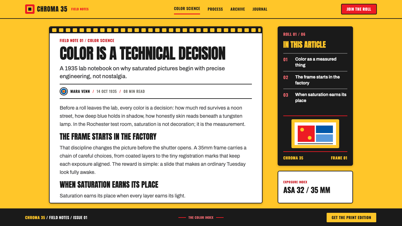
Photography sits inside white borders like a Kodachrome slide held to a lightbox. The frame is not a neutral card treatment. It isolates the image, creates a physical sense of handling, and lets saturated color appear more luminous. A small caption, film label, or exposure-like numeral can live on the mount, turning the image into an artifact with provenance.
Canister Information
Numerals and compact labels should resemble the practical information found on a film product. ISO and ASA references, frame counts, short captions, and technical-looking codes create hierarchy through density and placement. They should clarify what the viewer is seeing, not pretend to be obscure technical data. The tone is factual, stamped, and deliberately visible.
Warm High Contrast
The visual mood is bright but not weightless. Saturated imagery meets clean white mounts, dark borders, and emphatic red marks, producing a contrast that feels warm because color is abundant and controlled. Avoid misty overlays, pale desaturation, or soft atmospheric effects. The reference is a transparency under illumination: clear, vivid, and physically present.

Who shaped Kodak Film (1935)?
Eastman's name anchors the Eastman Kodak identity behind the 1935 launch. Within this visual language, Kodak is not merely a photographer's brand; it is an industrial promise that color photography can be packaged, distributed, and made part of everyday life.
Godowsky Jr. is one of the names attached to Kodachrome's invention. His presence keeps the style connected to a technical achievement rather than reducing it to retro packaging. The visual confidence of the system depends on that association between vivid color and engineered process.
Mannes is associated with the invention that made Kodachrome central to commercial color photography. In design terms, his place in the story supports the style's preference for legible systems: labels, frames, and measured visual components are part of the product's confidence in its own process.
McCurry represents Kodachrome's photographic legacy. His inclusion points to the medium's enduring association with intense color and memorable human images, extending the visual language from a package design system into the cultural memory carried by photography itself.
How do you use Kodak Film (1935) today?
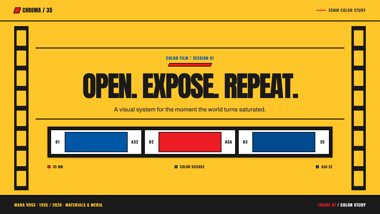
For presentation covers, use a broad yellow field as the main announcement, then let a single photograph appear inside a white slide mount. A red title treatment and a dark filmstrip edge can create immediate recognition without filling every corner. On content slides, let labels and compact technical numerals establish hierarchy, while white space keeps the system from becoming a dense collage.
Data slides benefit from the style's engineering vocabulary. Treat charts as labeled film artifacts: use clear dark axes or rules, reserve yellow for the dominant field, and employ red only to call out a decisive category or change. A sprocket strip can separate the data from the title area, but it should frame the information rather than compete with it.
For web interfaces, Kodak Film works best on dashboards, portfolio archives, media libraries, and pricing pages that need a strong product identity. Image cards can adopt white slide-mount borders, while navigation and filters take their character from canister labels and compact stamped-looking metadata. Keep essential actions highly legible; the analog reference should enrich navigation, never obstruct it.
Editorial and marketing pages can use filmstrip geometry to pace a story from section to section. Photographs should be cropped with confidence and given room to dominate, while captions act as part of the composition. The style is especially effective for travel, archives, launches, photography, and products that want to communicate optimism through material process rather than through generic nostalgia.
The common mistake is treating every available motif as a sticker. Yellow, red, sprocket holes, grain, labels, and slide borders used everywhere will make a layout feel like a novelty scrapbook. Start with the product logic: choose one dominant yellow field, give photography a framed role, and let the technical details do real informational work. The style succeeds when it feels manufactured and intentional, not merely vintage.
Kodak Film (1935) — FAQ
Is Kodak Film style simply a retro filter?
No. A retro filter changes the surface of an image; Kodak Film style organizes the whole communication system around photography as a manufactured medium. Yellow packaging logic, red-and-black identification, sprocket framing, slide mounts, and visible metadata all give the image context. Grain or aging effects may be optional, but they are not the system's foundation.
Why is yellow so important?
The chrome-yellow package is the style's most immediate association with Kodachrome and with color itself. It makes the design feel public, commercial, and optimistic before a photograph is examined. Because it is so forceful, yellow needs space around it and works best when the rest of the palette remains disciplined.
Can the style work without photography?
It can, but it loses its strongest reason for existing. A title page, schedule, or pricing layout can use the packaging palette and filmstrip structure successfully, especially when labels and numerals carry useful information. Without images, avoid overusing empty slide frames; the design should still feel like a film product system, not an imitation camera interface.
How should modern interface components be adapted?
Preserve modern usability first. Buttons, forms, filters, and status messages should remain direct and easy to scan. Bring in the style through hierarchy, borders, image framing, labels, and selective color rather than by making every control look physically old. The strongest adaptation feels contemporary in use while retaining the clarity of a labeled analog object.
Where does Kodak Film style struggle?
It can feel too loud for products that require calm neutrality, understated luxury, or a highly private emotional tone. It also struggles when the content has no relationship to images, process, travel, memory, or consumer culture. The visual system has a strong voice; use it when vividness and material confidence support the message rather than overwhelm it.
Related design styles
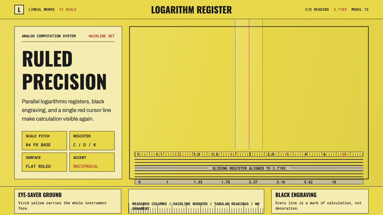 Slide RulePrecision made visible. Eye-saver yellow, black ticks, and one red hairline d…
 Nixie Tube DisplayHeat inside the machine. Neon-orange digits glow over black metal gridwork.
 Office Rubber StampsProcedure made visible. Vermilion Oswald stamps strike a manila logbook grid.
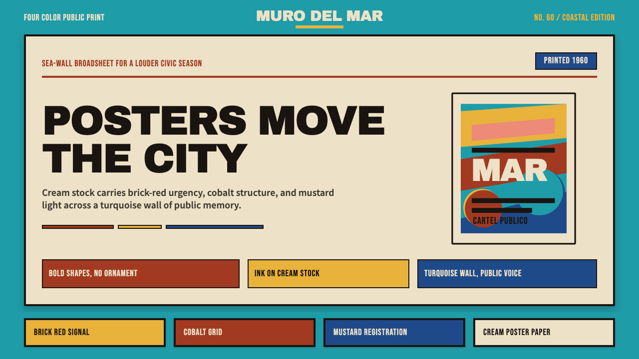 Cuban Malecón 1960 PosterPublic voice in flat ink. Turquoise wall, cream stock, brick red and cobalt b…
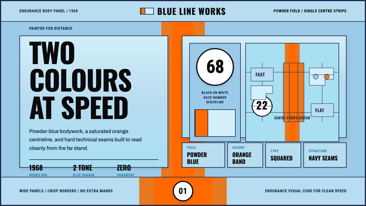 Gulf Racing LiverySpeed made disciplined. Powder blue, orange stripe, black roundel, strict gri…
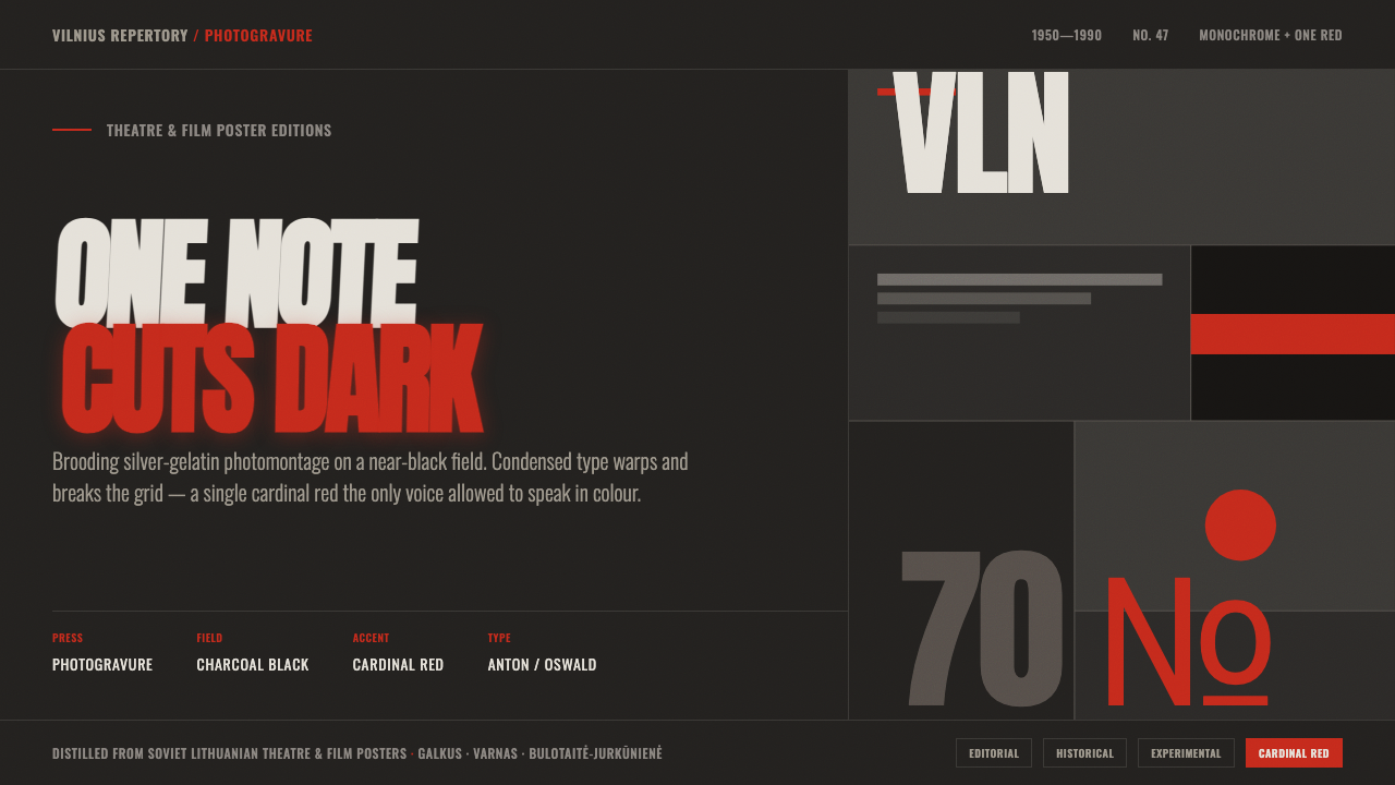 Lithuanian Poster ArtMonochrome plus one red. Charcoal photogravure field, warped Anton type, a lo…