What is Otto Neurath ISOTYPE?什么是 Otto Neurath ISOTYPE?
ISOTYPE transformed census tables into countable pictures — cream paper, deep-black icons, and a single red that anyone could read across a room.ISOTYPE 把人口普查表格变成了可数的图符——奶油色纸、深黑图标,加上一处任何人都能从房间另一头读懂的正红。
Otto Neurath ISOTYPE in briefOtto Neurath ISOTYPE 速览
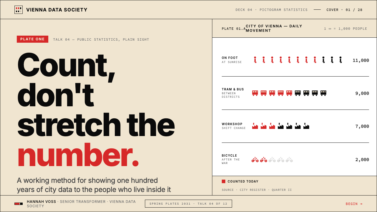
ISOTYPE — the International System Of TYpographic Picture Education — is a visual language developed from 1925 onward in Vienna to communicate social and economic statistics to audiences who could not read official government documents. Its defining method is the isotype chart: instead of drawing a bar proportional to a number, the system repeats a small standardized pictogram — one figure equaling one thousand people, one factory equaling ten thousand workers — so that quantity becomes literally countable rather than abstractly scaled.ISOTYPE——「国际图形教育系统」——是一套从 1925 年起在维也纳发展出来的视觉语言,目的是让看不懂官方文件的工人、移民和儿童,也能读懂社会与经济统计数据。它的核心方法是 ISOTYPE 图表:不是画一根与数字成比例的柱子,而是重复一个小型标准化图符——一个图形代表一千人,一个工厂代表一万工人——让数量变得字面上可数,而不是抽象地按比例缩放。
The visual system is deliberately spare. A warm cream or off-white field forms the ground. Pictograms are rendered in deep flat black, each one reduced to its most legible silhouette — a standing worker, a ship, a house — without perspective, shading, or internal detail. A single saturated red appears as the measuring accent: the one color that marks the unit of measure or highlights comparative difference. No other hue is required. The restraint is not poverty of means but economy of meaning: every visual element is there to carry information, and nothing is there to decorate.这套视觉系统刻意保持简朴。温暖的奶油色或米白色底面构成画面基础。图符以深邃的平涂黑色绘制,每一个都被简化为最清晰易辨的剪影——一个站立的工人、一艘船、一栋房子——没有透视、没有阴影、没有内部细节。单一的饱和正红用作计量强调色:那是标记计量单位或突出比较差异的唯一色彩,不需要其他色相。这种克制不是手段的贫乏,而是意义的经济:每一个视觉元素都在承载信息,没有任何元素是为了装饰而存在。
ISOTYPE sits at the intersection of two modernist currents — the Bauhaus commitment to geometric clarity and the Vienna Circle's ambition to make knowledge universally legible. The result is a graphic language that is simultaneously statistical and humanist: the repeated small figure is an abstraction, but it is also, unmistakably, a person. Data becomes population; numbers become people.ISOTYPE 处于两股现代主义潮流的交汇处——包豪斯对几何清晰度的追求,以及维也纳学派让知识普遍可读的抱负。结果是一种同时具有统计性与人文性的图形语言:重复的小人像是一种抽象,但它也无可置疑地是一个人。数据变成了人口,数字变成了人。
See the Otto Neurath ISOTYPE design system查看 Otto Neurath ISOTYPE 完整设计系统
Where does Otto Neurath ISOTYPE come from?Otto Neurath ISOTYPE 从何而来?
Otto Neurath was not primarily a graphic designer. He was a social scientist and philosopher, a member of the Vienna Circle of logical positivists who believed that knowledge should be communicable across barriers of language, class, and education. After the First World War, Neurath directed the Museum of Society and Economy in Vienna (Gesellschafts- und Wirtschaftsmuseum), an institution explicitly founded to educate the working class about economic conditions through visual means. The museum's audience could not be assumed to read complex statistical tables or German prose; Neurath needed a visual grammar that required no reading at all.奥托·诺伊拉特首先是一位社会科学家和哲学家,而不是图形设计师。他是维也纳逻辑实证主义学派——维也纳学派——的成员,相信知识应当能够跨越语言、阶级和教育程度的壁垒被传达。第一次世界大战结束后,诺伊拉特主持了维也纳的社会与经济博物馆(Gesellschafts- und Wirtschaftsmuseum),这是一所明确以视觉手段向工人阶级传达经济状况的教育机构。博物馆的受众不能被假设为能够阅读复杂的统计表格或德语散文;诺伊拉特需要一套完全不依赖文字的视觉语法。
The key collaborator who made the system graphically viable was Marie Reidemeister, later Marie Reidemeister Neurath, who served as Neurath's 'transformer' — the person who translated raw statistical data into visual sequences according to the system's rules. Reidemeister understood both the statistical logic and the graphic constraints, and her role was central to everything the Vienna Method (as ISOTYPE was originally called) produced. She and Neurath married in 1941 and she continued developing the system long after his death in 1945, writing the definitive account of the transformer's role.使这套系统在图形上切实可行的关键合作者是玛丽·赖德迈斯特,后来的玛丽·赖德迈斯特·诺伊拉特。她担任诺伊拉特的「转化者」——那个依据系统规则把原始统计数据转化为视觉序列的人。赖德迈斯特同时理解统计逻辑和图形约束,她的角色对维也纳方法(ISOTYPE 最初的称呼)所有产出都至关重要。她与诺伊拉特在 1941 年结婚,并在他 1945 年去世后继续发展这套系统,撰写了关于「转化者」角色的权威阐述。
Gerd Arntz, a German graphic artist associated with the Cologne progressive art movement, joined the team in 1928 and became the primary designer of the pictogram library. Arntz brought a woodcut aesthetic — flat, hard-edged, high-contrast — to the icon design. He eventually produced over four thousand standardized pictograms covering occupations, industries, social classes, and demographic categories. These symbols were cut as linoleum blocks and reproduced by hand, giving every chart a quality somewhere between statistical diagram and printed woodcut. The Arntz library is the direct ancestor of every modern icon system.格尔德·阿恩茨是与科隆进步艺术运动相关的德国图形艺术家,1928 年加入团队,成为图符库的主要设计师。阿恩茨将木刻美学——平涂、硬边、高对比度——带入了图标设计。他最终制作了四千余个涵盖职业、行业、社会阶层和人口类别的标准化图符,这些符号以油毡版雕刻并手工印刷,使每张图表都具有一种介于统计示意图与印刷木刻之间的质感。阿恩茨图符库是所有现代图标系统的直接祖先。
The political context was inseparable from the aesthetic one. Vienna in the 1920s was Red Vienna — a Social Democratic city government was attempting one of the most ambitious public housing and social welfare programs in European history. The museum and its visual language were instruments of civic education in a literal sense: the charts appeared on the walls of municipal housing projects, in labor union publications, and in public exhibitions designed to show workers the conditions of their own lives in comparative, historical perspective. When Austro-fascism suppressed the Social Democrats in 1934, Neurath fled first to the Hague, where he continued the work with Reidemeister, then to Oxford during the Second World War. The name ISOTYPE was coined during the Hague years as a way to frame the system as an international standard rather than a Viennese political instrument.政治背景与美学背景密不可分。1920 年代的维也纳是「红色维也纳」——社会民主党市政府正在推行欧洲历史上最雄心勃勃的公共住房与社会福利计划之一。博物馆及其视觉语言在字面意义上是公民教育的工具:这些图表出现在市政住宅的墙壁上、工会出版物中以及公共展览上,旨在以比较性、历史性的视角向工人展示他们自身生活的处境。1934 年奥地利法西斯镇压社会民主党后,诺伊拉特先逃往海牙,继续与赖德迈斯特共同开展工作,随后在第二次世界大战期间辗转至牛津。「ISOTYPE」这个名称正是在海牙时期创造的,目的是将这套系统定位为国际标准,而非维也纳的政治工具。
What defines the Otto Neurath ISOTYPE look?Otto Neurath ISOTYPE 的视觉特征是什么?
Pictogram as Unit of Measure图符作为计量单位
The isotype chart does not scale a single shape — it repeats identical small pictograms in a row, so that quantity is expressed through count rather than size. One figure equals a fixed real-world quantity declared in the key. This makes comparison literal and requires no understanding of axes or proportional scaling. The repeated unit is always the same size, always the same orientation, always the same weight — variation in number is the only variable.ISOTYPE 图表不是缩放单一形状,而是将相同的小型图符排成一行,用数量而非尺寸来表达量级。一个图符对应图例中声明的一个固定现实世界数量。这使比较变得字面可读,不需要理解坐标轴或比例缩放。重复的单元始终相同大小、相同朝向、相同粗细——数量上的变化是唯一的变量。
Silhouette Reduction剪影化简化
Every pictogram in the ISOTYPE system is a flat black silhouette, recognizable from its outline alone. Internal details, facial features, clothing folds, and perspective are stripped away. A worker is a standing human shape; a factory is a rectangular block with a smokestack. The discipline of silhouette reduction ensures that symbols remain legible when printed small, when reproduced across media, and when viewed from a distance on an exhibition wall.ISOTYPE 系统中的每一个图符都是一个平涂黑色剪影,仅凭轮廓就能辨认。内部细节、面部特征、衣物褶皱和透视感全被剥除。一个工人是一个站立的人体轮廓;一座工厂是一个带烟囱的矩形块。剪影化简化的自律确保了符号在小尺寸印刷、跨媒介复制以及在展览墙上远距离观看时都保持清晰易读。
Restricted Palette严格受限的色板
The palette is structurally fixed: a warm cream or off-white ground, deep flat black for all pictograms and type, and a single saturated red reserved for the unit marker or comparative emphasis. No gradients, no tints, no additional hues. The red is not decorative — it marks the quantity being measured or the difference being highlighted. When a second color appears, it typically signals a contrasting category, not aesthetic variety.色板在结构上是固定的:温暖的奶油色或米白色底面,所有图符和文字使用深邃平涂黑色,单一饱和正红保留给计量标记或比较强调。没有渐变,没有色调,没有额外色相。红色不是装饰性的——它标记被测量的数量或被突出的差异。当第二种颜色出现时,它通常表示一个对比性类别,而非美学变化。
Strict Horizontal Grid严格横向网格
ISOTYPE charts are organized on a strong horizontal axis. Rows of pictograms read left to right, categories stack vertically, and labels align to a consistent left edge. The grid is implicit but absolute — no pictogram drifts, no row is misaligned, no element is placed for compositional flair. This regularity is functional: the eye can compare rows at a glance precisely because spatial position is completely predictable.ISOTYPE 图表沿强烈的横向轴组织。图符行从左到右阅读,类别垂直叠加,标签对齐到统一的左边缘。网格是隐性的但绝对的——没有图符偏离,没有行错位,没有元素因构图美感而随意放置。这种规律性是功能性的:视线能够一眼比较各行,正是因为空间位置完全可预测。
Typography as Label Only文字仅作标注
Text in ISOTYPE charts is minimal and subordinate. Labels identify categories; the key declares what one pictogram represents; a source line may appear at the base. Beyond these functional roles, type does not appear. There is no explanatory prose within the chart, no decorative headline, no pull-quote. The visual carries the argument entirely, and text exists only to anchor the reference points that the image cannot itself supply.ISOTYPE 图表中的文字是最少化且从属性的。标签标识类别;图例声明一个图符代表什么;底部可能有数据来源行。除这些功能性角色外,文字不出现。图表内没有解释性散文,没有装饰性标题,没有引用语。视觉完整承载论点,文字仅用于锚定图像本身无法提供的参照点。
Standardized Symbol Library标准化符号库
ISOTYPE's visual power depended on a shared, reusable set of symbols. Gerd Arntz's pictogram library was not a collection of illustrations — it was a designed vocabulary, each symbol developed to be combinable, stackable, and interchangeable across different charts and subjects. The same human figure could represent a worker, a citizen, or a soldier depending on context. Consistency across symbols is as important as the design of any individual symbol.ISOTYPE 的视觉力量依赖于一套共享的、可复用的符号集。格尔德·阿恩茨的图符库不是插图集合,而是一套经过设计的词汇表,每个符号都被设计为可以在不同图表和主题中组合、叠加和互换使用。同一个人体图形根据语境可以代表工人、市民或士兵。符号之间的一致性与任何单个符号的设计同等重要。
No Decorative Ornament零装饰
Borders, frames, decorative rules, drop shadows, gradients, and background textures are entirely absent from ISOTYPE charts. Every element present is a carrier of information; every absent element is a deliberate omission. This is not minimal style — it is a principled decision about the purpose of visual communication. Ornament, by definition, adds without informing, and adding without informing is a violation of what ISOTYPE was built to do.边框、装饰线、投影、渐变和背景纹理在 ISOTYPE 图表中完全缺席。每一个存在的元素都是信息的载体;每一个缺席的元素都是刻意的省略。这不是极简风格,而是关于视觉传达目的的有原则的决定。装饰从定义上说是无信息地增加,而无信息地增加违背了 ISOTYPE 被建立的初衷。
See the Otto Neurath ISOTYPE design system查看 Otto Neurath ISOTYPE 完整设计系统
Who shaped Otto Neurath ISOTYPE?谁塑造了 Otto Neurath ISOTYPE?
Neurath was the originating mind behind ISOTYPE — a social scientist and philosopher who directed the Museum of Society and Economy in Vienna from 1925 and conceived the visual language as a tool for civic education. His driving conviction was that statistical knowledge belonged to everyone, not just to those with formal education or German literacy. After fleeing Vienna in 1934 and the Hague in 1940, he continued developing the system in Oxford until his death in 1945. His broader philosophical project — unified science, visual education, internationalism — gave ISOTYPE its moral urgency as well as its formal constraints.诺伊拉特是 ISOTYPE 背后的原创思想者——一位从 1925 年起主持维也纳社会与经济博物馆的社会科学家与哲学家,他将这套视觉语言构想为公民教育的工具。他的核心信念是:统计知识属于所有人,而不只属于受过正规教育或识读德语的人。1934 年逃离维也纳、1940 年离开海牙后,他在牛津继续发展这套系统,直至 1945 年去世。他更宏大的哲学事业——统一科学、视觉教育、国际主义——赋予了 ISOTYPE 道德上的紧迫性和形式上的约束。
Reidemeister was the transformer: the person who translated raw data into ISOTYPE charts according to the system's rules. In Neurath's methodology, the transformer role was a distinct intellectual function — not mere execution but interpretive judgment about which facts to show, in which sequence, and at which scale of comparison. After Neurath's death she wrote the definitive account of the transformer's role and continued applying and teaching the method through the 1970s. Her contribution was long underappreciated because it did not produce signed artworks; the charts were collective, not individual, products.赖德迈斯特是「转化者」:那个按照系统规则将原始数据转化为 ISOTYPE 图表的人。在诺伊拉特的方法论中,转化者角色是一种独特的智识功能——不是单纯的执行,而是关于展示哪些事实、以何种顺序、在何种比较尺度上的解释性判断。诺伊拉特去世后,她撰写了关于转化者角色的权威阐述,并继续应用和传授这套方法直至 1970 年代。她的贡献长期被低估,因为它没有产生署名的艺术品——这些图表是集体产品,而非个人创作。
Arntz was the graphic artist who designed the ISOTYPE pictogram library, eventually producing over four thousand standardized symbols. He came from the German progressive art movement and brought a woodcut sensibility — flat, high-contrast, hard-edged — to the systematic design of icons. His symbols were not illustrations but designed units: each had to be immediately recognizable, consistent in visual weight with every other symbol, and reproducible across scales and media. The Arntz library is the most direct historical ancestor of contemporary icon systems, from wayfinding pictograms to software interface icons.阿恩茨是设计 ISOTYPE 图符库的图形艺术家,最终制作了四千余个标准化符号。他来自德国进步艺术运动,为图标的系统性设计带来了木刻美学——平涂、高对比度、硬边。他的符号不是插图,而是经过设计的单元:每一个都必须立即可辨认,与其他所有符号在视觉分量上保持一致,并且能够跨尺寸和媒介复制。阿恩茨图符库是当代图标系统最直接的历史祖先,从导视系统图形到软件界面图标,皆有其影响。
Modley brought ISOTYPE thinking to the United States after working with Neurath in Vienna. In the 1930s he founded Pictograph Corporation in New York, which adapted the Vienna Method for American magazine publishing, corporate reports, and government information campaigns. His work introduced pictographic statistical charts to the American mainstream and influenced the visual language of mid-century American information design, from Time magazine to government wartime posters. Modley represents the channel through which ISOTYPE's formal language entered Anglophone commercial design.莫德利在维也纳与诺伊拉特共事后,将 ISOTYPE 思想带到了美国。1930 年代,他在纽约创立了象形图公司(Pictograph Corporation),将维也纳方法应用于美国杂志出版、企业报告和政府信息宣传。他的工作将象形统计图表引入美国主流,影响了二十世纪中叶美国信息设计的视觉语言,从《时代》杂志到政府战时海报皆有其印记。莫德利是 ISOTYPE 形式语言进入英语商业设计的传播渠道。
The Isotype Institute was the organization through which Neurath and Reidemeister systematized and disseminated the method after leaving Vienna — first from the Hague, then from Oxford. The Institute produced hundreds of charts for books, exhibitions, and public health campaigns across Europe and the United States. Its output demonstrated that the system could be applied by teams working from a shared rule set, not only by its inventors. The Institute's archive, now held at the University of Reading, is the primary scholarly source for the history of ISOTYPE and its visual standards.ISOTYPE 研究所是诺伊拉特和赖德迈斯特离开维也纳后用于系统化和传播这套方法的机构——先在海牙,后在牛津。研究所为欧洲和美国的书籍、展览及公共卫生宣传活动制作了数百张图表。其产出证明,这套系统可以由依据共同规则工作的团队来应用,而不仅仅是由发明者本人执行。研究所的档案现藏于雷丁大学,是研究 ISOTYPE 历史及其视觉标准的主要学术来源。
How do you use Otto Neurath ISOTYPE today?今天怎么用 Otto Neurath ISOTYPE?
ISOTYPE is directly applicable to any contemporary design context that needs to communicate quantitative comparisons to a broad, diverse audience. The principles translate naturally to modern infographics, data dashboards, annual reports, and public-facing statistical visualizations. The essential discipline is the same as it was in 1925: choose a single pictogram to represent a defined unit, repeat it a countable number of times, keep the palette to near-white ground with dark pictograms and a single accent color, and let the quantity speak for itself without editorial framing.ISOTYPE 可以直接应用于任何需要向广泛、多元受众传达定量比较的当代设计场景。这些原则自然地转化为现代信息图、数据仪表板、年度报告和面向公众的统计可视化。核心自律与 1925 年完全相同:选择一个图符代表一个已定义的单位,将它重复可数的次数,将色板控制在接近白色的底面配深色图符和单一强调色,让数量本身说话,不需要编辑性框架。
For presentation slides, ISOTYPE logic works exceptionally well on both data and comparison slides. A cover slide can use a single oversized pictogram repeated in a grid as a background texture — the repetition communicates scale before the title is read. Data slides should commit to the row-and-repeat method: one category per row, identical icons in sequence, a clear key declaring the unit. Avoid mixing scaled bars and isotype rows in the same chart — the two methods encode quantity differently and their combination confuses rather than clarifies. For section dividers, a single bold pictogram centered on a cream field communicates more cleanly than a decorative abstract shape.在演示文稿中,ISOTYPE 逻辑在数据页和比较页上都极为有效。封面页可以用单一超大图符在网格中重复作为背景纹理——这种重复在标题被阅读之前就传达了规模感。数据页应当坚守行-重复方法:每行对应一个类别,图标依次排列,用清晰的图例声明单位。避免在同一图表中混用比例柱状条和 ISOTYPE 行——两种方法对数量的编码方式不同,混用会造成混乱而非澄清。对于分节分割页,单一醒目图符居中置于奶油色底面,比抽象装饰形更干净有力。
For web interfaces — especially dashboards, pricing pages, and data-heavy product pages — the ISOTYPE palette and icon discipline provide strong visual hierarchy with low cognitive load. The approach: use a warm off-white as the base background, black or very dark type for all text, and a single accent color for interactive elements, status indicators, or tier labels. Icon sets should follow the silhouette discipline — no gradient fills, no drop shadows, no fine interior line work — so they remain legible at small sizes and high information density. Pricing tier comparison tables rendered with isotype-style row icons communicate plan differences more intuitively than feature checkmarks alone.对于网页界面——尤其是仪表板、定价页面和数据密集型产品页面——ISOTYPE 色板与图标自律以低认知负荷提供强有力的视觉层级。方法如下:以温暖米白色为基础背景,所有文字使用黑色或深色,单一强调色用于交互元素、状态指示或等级标签。图标集应遵循剪影自律——无渐变填充、无投影、无精细内部线条——使其在小尺寸和高信息密度下保持清晰。用 ISOTYPE 风格行图标呈现的定价等级比较表,比单纯的功能勾选框更直观地传达方案差异。
For editorial and marketing design — magazine spreads, annual report pages, social media data cards, and public health communications — ISOTYPE's authority comes from its combination of simplicity and specificity. A data card showing employment figures becomes memorable when the number is embodied as a row of human figures rather than printed as a numeral. The key design decisions are the same across contexts: define the unit, choose the pictogram, commit to the grid, limit the palette. Marketing applications should resist the temptation to vary the pictogram style for visual interest — consistency across a set of charts is more powerful than the most beautifully illustrated individual chart.对于编辑与营销设计——杂志版面、年度报告页面、社交媒体数据卡和公共卫生传播——ISOTYPE 的权威感来自简单性与具体性的结合。当就业数字以一行人体图符而非印刷数字来体现时,一张展示就业数据的卡片变得令人难忘。不同场景中的核心设计决策完全相同:定义单位,选择图符,坚守网格,限制色板。营销应用应当抵制为增加视觉趣味而变化图符风格的诱惑——一套图表之间的一致性,比最精美的单张图表更有力量。
The most common mistake when applying ISOTYPE is adding color for decorative rather than informational purposes — using multiple hues to make a chart more visually appealing rather than to encode additional data categories. A second color in an ISOTYPE chart should always mean something: a different time period, a contrasting group, an anomalous value. If additional color carries no meaning, it should be removed. Similarly, replacing the flat silhouette pictograms with detailed illustrations — even stylistically coherent ones — undermines the system's legibility at scale and at small sizes. The discipline of the silhouette is not a stylistic limitation; it is what makes the system work across media, scales, and contexts.应用 ISOTYPE 时最常见的错误,是为装饰目的而非信息目的添加颜色——使用多种色相使图表更具视觉吸引力,而不是用来编码额外的数据类别。ISOTYPE 图表中的第二种颜色应当始终意味着某种信息:不同的时间段、对比性的群体、异常值。如果附加颜色不承载任何意义,它就应当被去除。同样,用详细插图替换平涂剪影图符——即使风格上协调一致——也会削弱系统在大尺寸和小尺寸下的易读性。剪影自律不是风格上的局限;它正是使这套系统跨媒介、跨尺寸、跨场景运作的原因。
See the Otto Neurath ISOTYPE design system查看 Otto Neurath ISOTYPE 完整设计系统
Otto Neurath ISOTYPE — FAQOtto Neurath ISOTYPE · 常见问题
Is ISOTYPE the same as modern icon design?ISOTYPE 和现代图标设计是同一回事吗?
ISOTYPE is the historical origin of modern icon design, but the two are not the same practice. ISOTYPE icons were designed specifically for use in statistical charts, where their primary function is to represent a countable unit of a defined quantity — a person, a factory, a ship. They are always used in multiples, always in a grid, and always in service of a specific data comparison. Contemporary icon design generally serves navigation, labeling, or interface affordance, and icons appear as individual symbols rather than counted rows. The silhouette discipline of ISOTYPE — flat, high-contrast, outline-legible — remains the most robust approach for interface icons at small sizes, and most modern icon systems implicitly follow it.ISOTYPE 是现代图标设计的历史起源,但两者并非同一种实践。ISOTYPE 图标是专门为统计图表中使用而设计的,其主要功能是代表一个定义数量的可数单位——一个人、一座工厂、一艘船。它们始终以倍数使用,始终在网格中,始终服务于具体的数据比较。当代图标设计通常服务于导航、标注或界面交互,图标作为单个符号而非计数行出现。ISOTYPE 的剪影自律——平涂、高对比度、轮廓可辨——在小尺寸界面图标中仍然是最稳健的方法,大多数现代图标系统都隐性地遵循它。
How does ISOTYPE differ from a standard bar chart or pie chart?ISOTYPE 与标准柱状图或饼图有何不同?
A bar chart encodes quantity through the continuous length of a rectangle; a pie chart encodes it through angle and area. Both require the viewer to estimate magnitude visually — to judge that one bar is roughly twice the height of another, or that one sector is about a third of the circle. ISOTYPE encodes quantity through count: the viewer does not estimate, they enumerate. One row of twelve figures versus a row of four figures is a three-to-one ratio that requires no visual estimation at all. This is the system's core pedagogical advantage — and also its limitation, because it becomes unwieldy when quantities involve fractions or very large numbers.柱状图通过矩形的连续长度编码数量;饼图通过角度和面积编码数量。两者都要求观看者视觉上估算大小——判断一根柱子大约是另一根的两倍高,或某个扇区约占圆的三分之一。ISOTYPE 通过计数编码数量:观看者不是估算,而是逐个数数。一行十二个图形对比一行四个图形是三比一的比例,完全不需要任何视觉估算。这是该系统的核心教学优势——也是其局限所在,因为当数量涉及小数或非常大的数字时,它会变得难以处理。
Can ISOTYPE be used in dark-mode interfaces?ISOTYPE 可以用在深色模式界面中吗?
The canonical ISOTYPE presentation is light-ground: cream or white background with deep black pictograms. A dark inversion is possible, but it requires care. On a dark background, the pictograms need to shift from black to a light cream or near-white to maintain the same flat silhouette quality. The accent color — historically a saturated red — may read very differently on dark grounds, and a warmer or softer accent may serve better. The critical discipline is maintaining the silhouette's flat, high-contrast quality regardless of the ground color. What must not happen is the introduction of glows, gradients, or soft lighting effects that simulate depth — those imports from contemporary dark-mode aesthetics directly contradict the system's founding logic.ISOTYPE 的标准呈现是浅色底面:奶油色或白色背景配深黑色图符。深色反转是可能的,但需要谨慎处理。在深色背景上,图符需要从黑色转变为浅奶油色或接近白色,以保持同样的平涂剪影质感。强调色——历史上是饱和正红——在深色底面上可能呈现非常不同的效果,更温暖或更柔和的强调色可能更适合。关键自律是无论底面颜色如何,都要保持剪影的平涂、高对比度质感。绝对不能发生的是引入模拟深度的光晕、渐变或柔和光照效果——那些来自当代深色模式美学的引入直接违背了这套系统的建立逻辑。
Why is the transformer role so important in ISOTYPE?为什么「转化者」角色在 ISOTYPE 中如此重要?
The transformer — a role formalized by Marie Reidemeister — is the person who decides which statistical facts to show, in which sequence, and at what unit scale. This is not mechanical work. A dataset can be visualized many different ways, and the choice of what to show, what to omit, and how to set the unit (one figure equals one hundred people versus one thousand) fundamentally shapes what the audience understands. Neurath was explicit that the transformer must be statistically literate and intellectually honest — the role carries responsibility for the argument the chart makes. In contemporary terms, the transformer is the data journalist, the information architect, or the analyst who shapes the chart before the designer executes it.转化者——一个由玛丽·赖德迈斯特正式确立的角色——是决定展示哪些统计事实、以何种顺序、以何种单位尺度的人。这不是机械性工作。一个数据集可以用许多不同方式可视化,而展示什么、省略什么、如何设定单位(一个图形等于一百人还是一千人)的选择从根本上塑造了受众的理解。诺伊拉特明确表示,转化者必须具备统计素养并保持智识诚实——这个角色对图表所做的论证承担责任。以当代术语来说,转化者就是在设计师执行之前塑造图表的数据记者、信息架构师或分析师。
Is ISOTYPE suitable for complex multi-variable data?ISOTYPE 适合呈现复杂多变量数据吗?
ISOTYPE is optimized for communicating one or two variables to a general audience quickly and memorably. It is not well suited to multi-variable analysis, correlation display, or continuous data distributions. Scatter plots, heat maps, and network graphs serve those purposes better. The system's power is proportional to its simplicity: the more variables introduced, the more the counting logic breaks down and the more the chart begins to require the kind of trained reading that ISOTYPE was built to avoid. The right question to ask before reaching for ISOTYPE is not whether the data is interesting, but whether the main point can be expressed as a comparison of countable units — if it can, ISOTYPE will communicate it more broadly and durably than almost any other format.ISOTYPE 针对的是向普通受众快速、令人难忘地传达一两个变量。它不适合多变量分析、相关性展示或连续数据分布。散点图、热图和网络图更好地服务于那些目的。这套系统的力量与其简单性成正比:引入的变量越多,计数逻辑就越容易崩溃,图表就越开始需要 ISOTYPE 建立之初就试图避免的那种专业性解读。在使用 ISOTYPE 之前正确的问题不是数据是否有趣,而是核心论点能否被表达为可数单位的比较——如果可以,ISOTYPE 将比几乎任何其他格式更广泛、更持久地传达它。
Related design styles相关设计风格
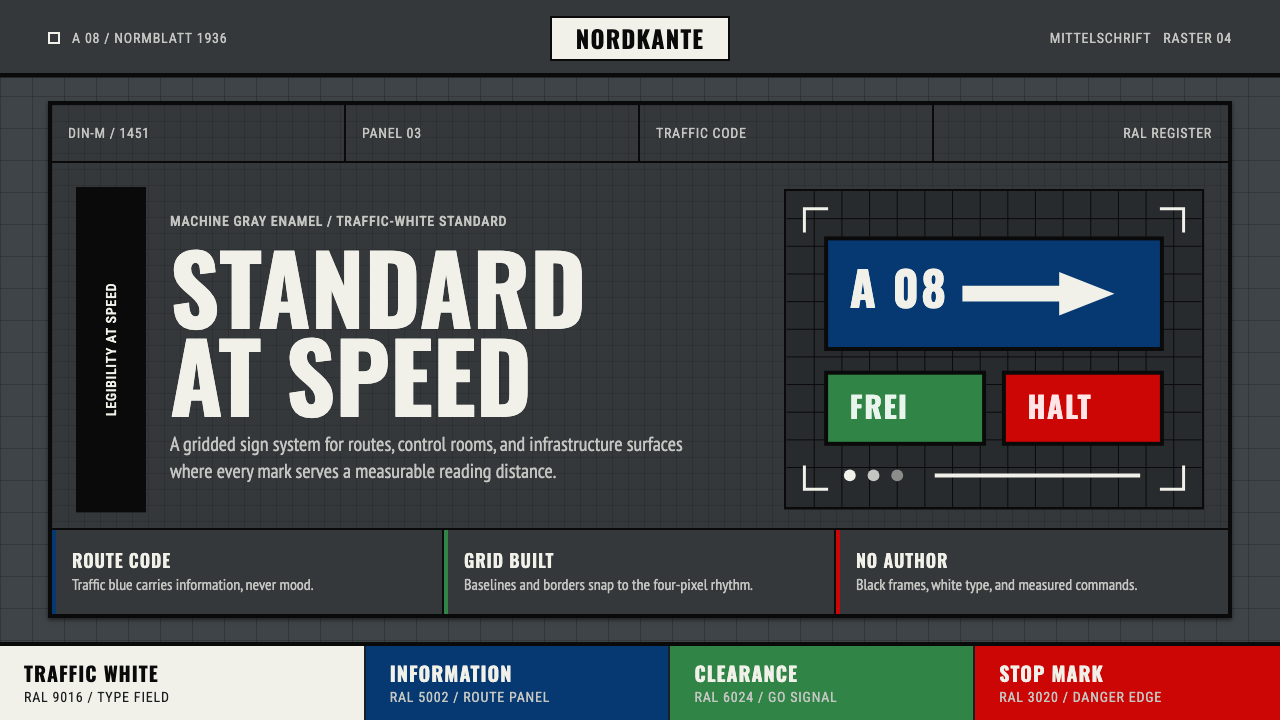 DIN 1451 SignageAuthorless and exact. Enamel gray grid, traffic-white DIN type, and RAL signa…无作者的精确感:珐琅灰网格、交通白字与RAL色条。
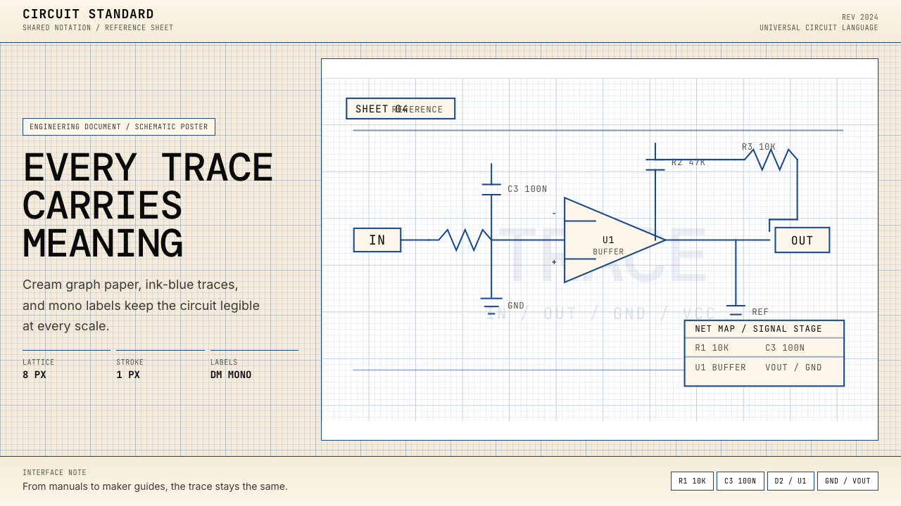 Electrical Schematic WiringAustere and exact. Cream graph paper, ink-blue traces, and mono labels make e…克制而精确。奶油方格纸与墨蓝细线,让每个标签都准确发声。
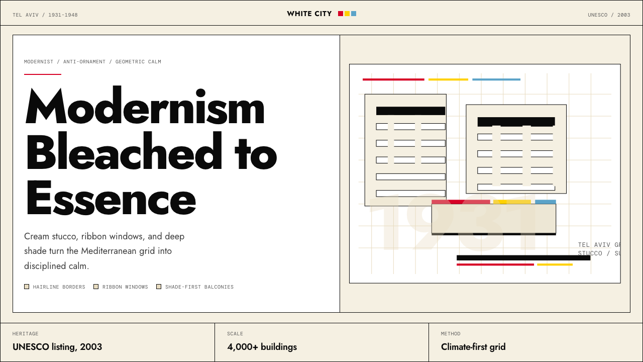 Israeli Bauhaus Tel Aviv (White City)Austere urban modernism. Stucco-white grid, Jost type, hairline borders, and…克制都市现代主义。灰泥白网格、Jost 字体、细黑线与三原色点睛。
 Dieter Rams / BraunQuiet by design. Warm gray, white panels, hairline grids, and one earned gree…安静即设计:暖灰、白面板、细网格,只留一枚绿色指示点。
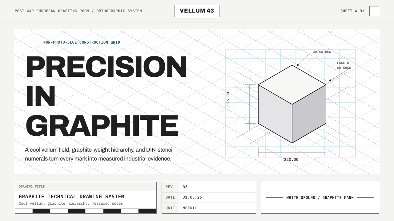 Graphite Technical DrawingDrafting-room precision. Non-photo-blue grid and graphite DIN lettering do th…制图室般精确:淡蓝网格与石墨DIN字母构成秩序。
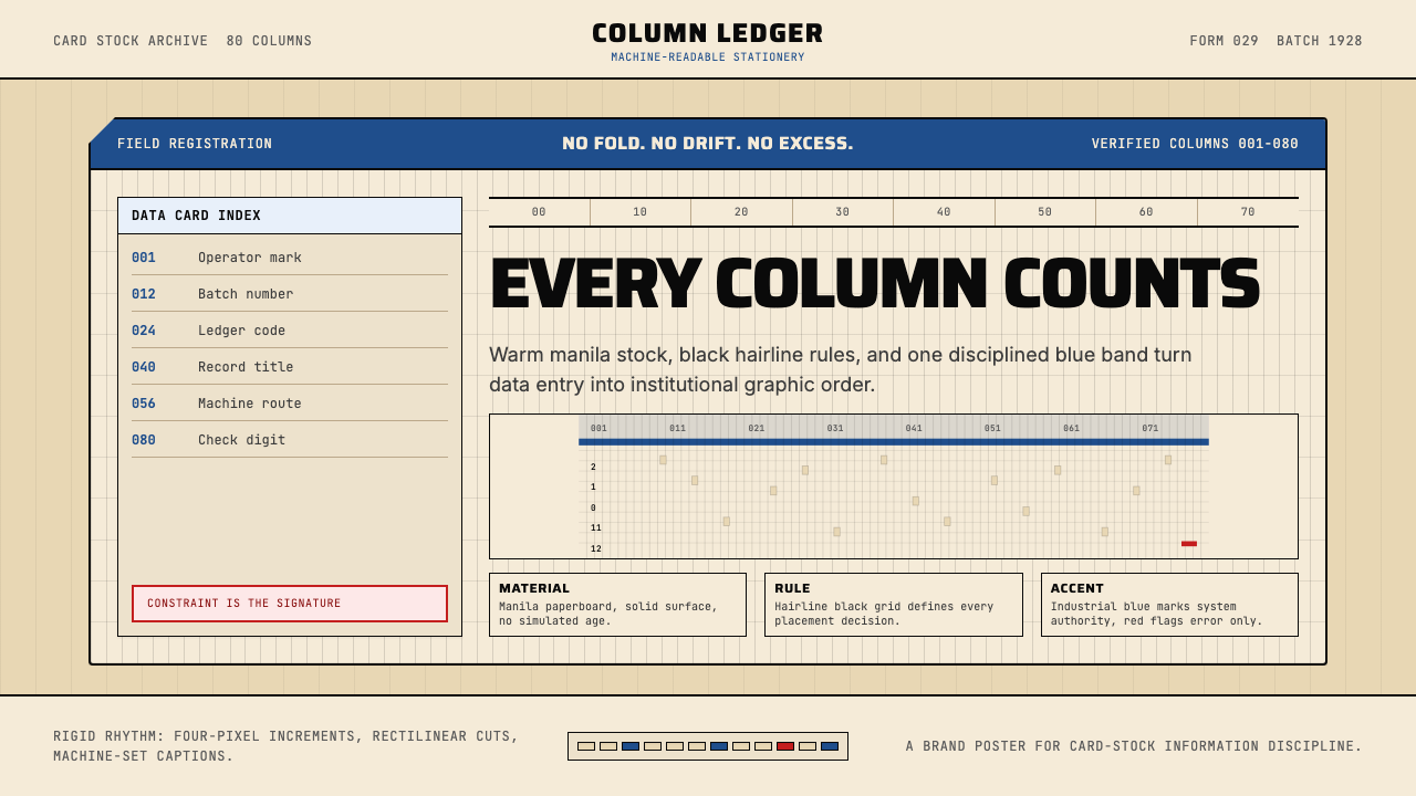 IBM Punchcard 029 (1928)Constraint becomes authority. Manila stock, hairline grid, industrial blue.约束即权威。米黄色卡纸、发丝网格与工业蓝。