What is Vietnamese Pho Street Cart?
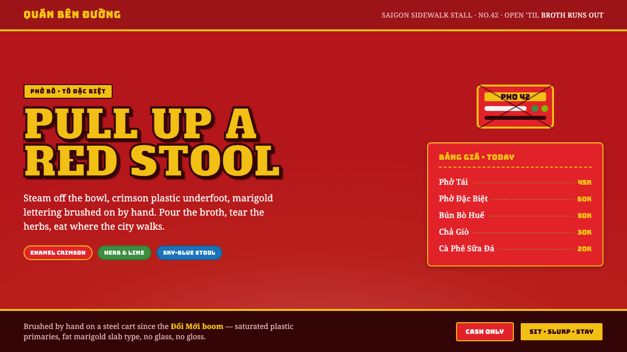
Vietnamese pho street-cart style turns the sidewalk into a visual appetite: crimson enamel, marigold sign letters, blue stools, and broth steam that makes every surface feel alive.
Vietnamese Pho Street Cart in brief
Vietnamese pho street-cart style is a digital translation of the sidewalk pho stall: bright plastic stools, bowls with everyday wear, a steel cart, and hand-painted PHO lettering emerging through the haze above a pot of broth. Its visual force comes from ordinary objects used without apology. Nothing is precious, hidden, or subdued. The scene is built for people walking past, deciding quickly, sitting close together, and eating in public.
The palette begins with a dominant crimson ground and scarlet enamel-like surfaces. Marigold-yellow slab lettering carries the voice of the stall, while herb and lime accents introduce freshness and appetite. A sky-blue plastic stool acts as the essential cool counterpoint. This is not a refined restaurant interior translated to a screen; it is a street-facing system whose colors need to remain visible amid movement, heat, steam, traffic, and visual clutter.
The style is chunky, worn, warm, and saturated rather than slick. Chipped enamel, hand-painted signage, steel-cart utility, and steam-softened contrast create a sense of use rather than perfection. In digital work, the goal is not to imitate damage for its own sake. It is to preserve the stall’s directness: a clear offer, a vivid surface, and enough physical irregularity to suggest that food is being prepared nearby.
Where does Vietnamese Pho Street Cart come from?
The source scene belongs to Vietnamese street-food culture in Saigon and Hanoi during the post-Doi Moi street-food boom, broadly associated here with the period from 1990 to 2010. Pho was not presented as a polished destination experience. It lived on the pavement, around carts and low stools, where the city’s movement became part of the meal. The visual language grew from this public, practical setting.
A pho cart had to communicate under conditions that rewarded immediacy. Its steel structure, bowls, stools, and visible cooking operation were not arranged as a branded showroom; they were working objects. Crimson plastic and enamel made the stall legible and lively. Steam from broth softened the view without concealing the activity, turning heat and preparation into part of the stall’s visual identity.
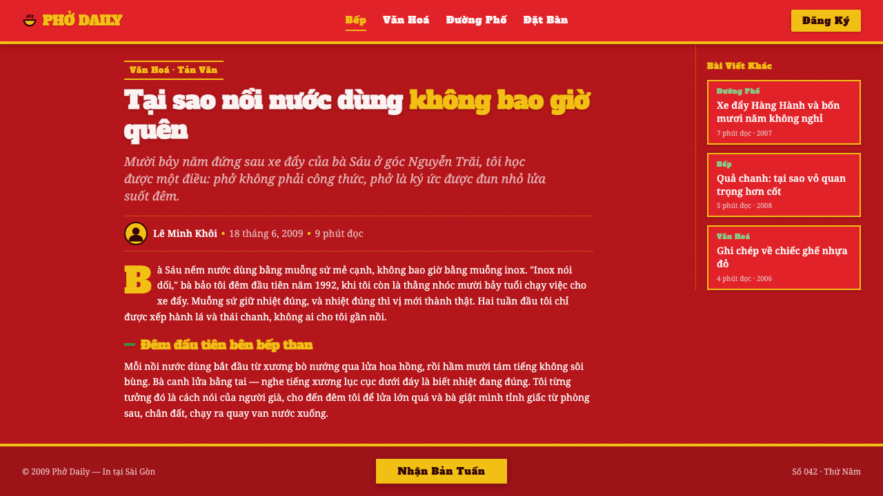
Hand-painted cart signage is central to the system. Large PHO lettering did more than name the food: it called across the sidewalk and gave the cart a recognizable face. Its slab-like mass, warm yellow presence, and painted irregularity distinguish it from anonymous printed advertising. The sign feels made for a particular cart, not issued from a distant corporate system.
The style also depends on anonymous design rather than celebrated authorship. Vietnamese street pho vendors assembled the operating scene; hand-painters gave carts their public voice; unnamed makers of red-and-blue plastic stools supplied the recurring furniture of the sidewalk. Together, these makers produced a vernacular system whose authority comes from repetition, utility, and lived familiarity rather than formal design institutions.
What defines the Vietnamese Pho Street Cart look?
Crimson Ground
Crimson is the environmental field, not a timid accent. It should feel like plastic, enamel, a cart panel, or a stall-facing surface: broad, direct, and slightly tough. Scarlet variations can create layered surfaces, but they should remain within one heated visual atmosphere rather than becoming a decorative spectrum.
Sign-Painted Type
Typography should behave like cart signage. Marigold-yellow slab lettering is bold, compact, and made to announce rather than whisper. Letterforms can retain a hand-painted unevenness, especially in large words, but readability remains non-negotiable. The type should look painted onto a working surface, not polished into luxury branding.
Steam and Haze
Broth steam introduces softness without making the system delicate. It can haze a sign edge, partially veil a panel, or create a warmer transition between foreground and background. The effect should suggest rising heat and nearby cooking, not atmospheric polish. Steam is evidence of the meal being made.
Plastic and Enamel Wear
Surfaces should feel handled and durable. Chipped enamel, scuffed plastic, and slight paint irregularity communicate repetition and everyday service. These cues work best when restrained and located on meaningful surfaces such as bowls, cart panels, or signs. The aim is useful wear, never theatrical decay.
Blue Stool Counterpoint
The sky-blue plastic stool is the cool interruption inside a hot palette. It should appear as a recognizable object, a structural counterweight, or a small field of relief against crimson. Its value lies in familiarity and contrast. Too much blue weakens the cart’s heat; a deliberate appearance makes the red ground feel more vivid.
Garnish Accents
Herb and lime accents should read as freshness, garnish, and appetite. They are not a second dominant palette. Used around food imagery, labels, or small markers, they bring the stall’s ingredients into the visual system and prevent the crimson field from becoming visually heavy.
Who shaped Vietnamese Pho Street Cart?
The vendors are the primary authors of the scene because the visual system begins with service: a cart placed beside pedestrian life, bowls and stools kept ready, and broth steam visible to passersby. Their working environment determines the style’s priorities of immediacy, affordability, appetite, and public visibility.
The anonymous sign painters give the cart its speaking voice. Their hand-painted PHO lettering transforms a practical food label into a public signal with warmth, scale, and personality. The slight irregularity associated with painted signs is not an error to erase; it is part of what makes a stall feel local and specific.
The makers of the familiar plastic stool shaped the visual furniture of the pho sidewalk. Red and blue stools are compact, repeatable, and immediately legible as places to pause and eat. In this design language, the stool is more than a prop: it is a recurring piece of social infrastructure and a crucial color counterpoint.
How do you use Vietnamese Pho Street Cart today?
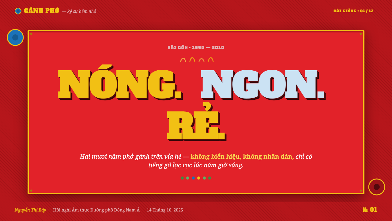
For presentation covers, treat the composition like the front panel of a street cart. Let a broad crimson field establish the scene, then place a concise marigold-yellow title as the visible offer. A blue stool-like block, a lime or herb accent, or a faint band of steam can supply contrast, but the cover should remain readable at a glance. The mood is invitation through presence, not restaurant luxury.
For content and data slides, use the style’s directness to organize information. Keep one strong heading as the sign, use enamel-like panels to group supporting material, and let charts read as practical stall information rather than corporate ornament. Crimson can establish section identity, yellow can draw attention to a key label, blue can separate a secondary category, and herb-like accents can indicate freshness, change, or a positive detail without crowding the page.
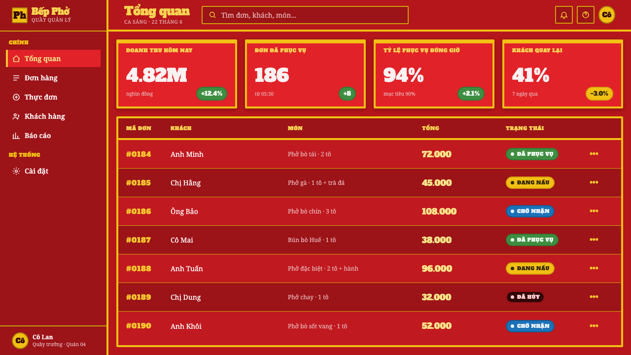
For web interfaces, this style suits food ordering, local discovery, event listings, hospitality dashboards, and pricing pages that benefit from immediate hierarchy. A strong cart-panel ground can anchor navigation or key sections, while hand-sign energy makes calls to action feel public and conversational. Interfaces should still remain functional: menus need clear names, prices need strong visibility, and controls should feel sturdy enough to belong beside a working cart.
For editorial and marketing work, the visual system is especially effective when telling stories about food, neighborhoods, street life, or independent hospitality. Use a large sign-like headline, a spacious field for the story, and sensory accents that suggest broth steam, enamel, garnish, and low stools. Photography or illustration should support the street scene rather than sterilize it. The most successful layouts feel close to the pavement while remaining easy to read.
The common mistake is turning the style into generic red-and-yellow fast-food branding. Pho street-cart style needs the blue stool’s interruption, the freshness of lime and herbs, the physicality of enamel and steel, and the imperfect confidence of hand-painted signage. Equally, do not bury everything under simulated grime or steam. If the screen becomes muddy, the stall’s central quality is lost: it should feel busy and warm, but its offer must remain unmistakably clear.
Vietnamese Pho Street Cart — FAQ
Is this simply a red-and-yellow food-brand style?
No. Crimson and marigold are important, but they only become pho street-cart style when connected to the street scene: enamel-like surfaces, hand-painted PHO signage, steel-cart utility, broth steam, garnish accents, and the blue plastic stool. Removing those relationships produces generic food advertising rather than a sidewalk vernacular.
How should blue be used in such a warm visual system?
Use sky blue as the memorable counterpoint associated with the plastic stool. It is most effective when it appears as an object, a small structural field, or a secondary category rather than a competing background. Its job is to cool and sharpen the crimson environment, not to replace it.
Can the style work without literal food photography?
Yes. The style can be carried by signage, color relationships, cart-like panels, stool references, and steam-like atmosphere. Literal food imagery is useful when the product needs appetite appeal, but the system should still be recognizable through its materials and public-facing sign language when no bowl of pho appears.
How much wear and steam is appropriate?
Use both as evidence, not decoration. A little chipped-enamel character, paint irregularity, or steam haze can make a surface feel close to a working stall. If every panel is distressed or obscured, legibility and appetite disappear. The style needs visible use, but it also needs the clarity of a vendor making an offer to a passerby.
Which products are a good fit for this style?
It fits products that benefit from neighborhood energy, quick recognition, food appetite, and a public conversational tone: food ordering, local guides, street-market events, independent hospitality, and editorial stories about urban life. It is less suitable for products that require an abstract, quiet, or highly formal visual character, because its strength comes from saturation, proximity, and the feeling of active service.
Related design styles
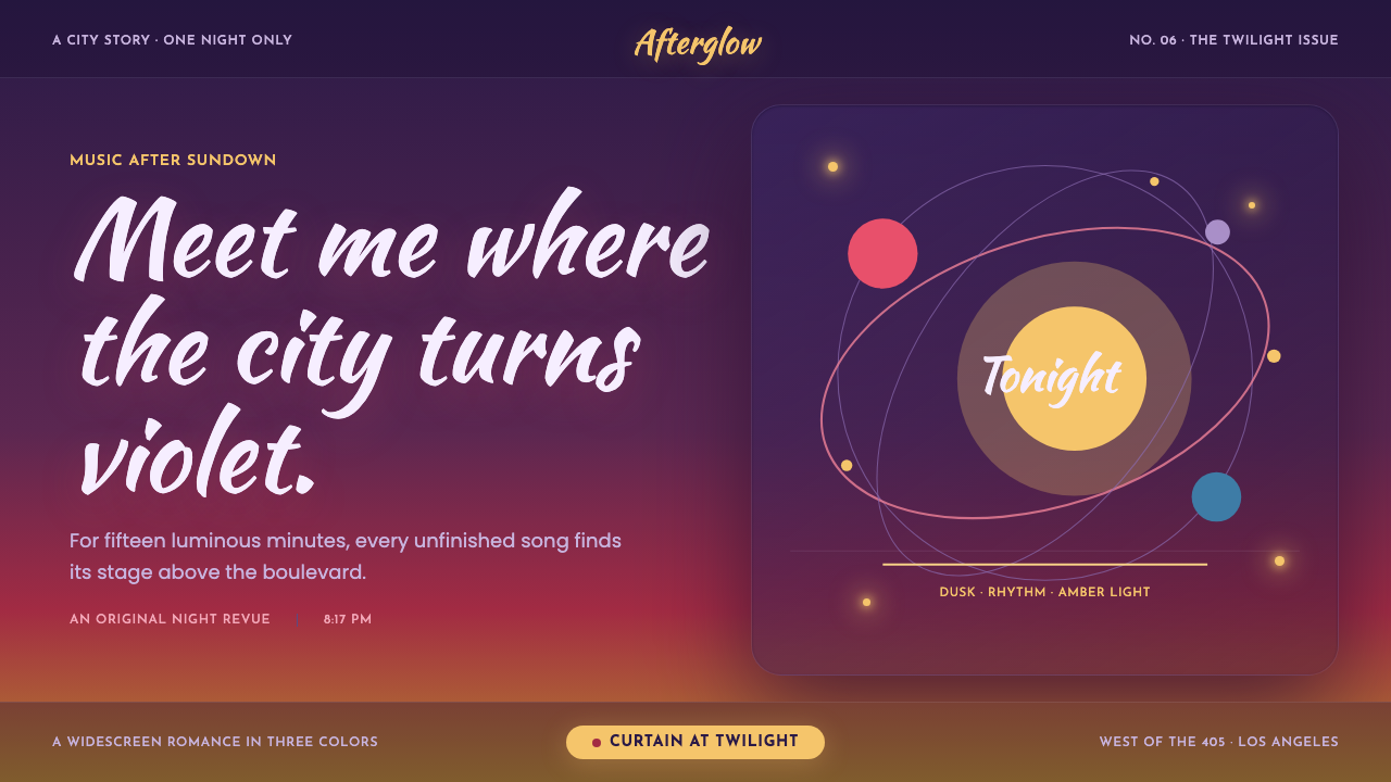 La La Land (2016)Twilight waits for a dance. Violet dusk, rose horizons and amber bulbs frame…
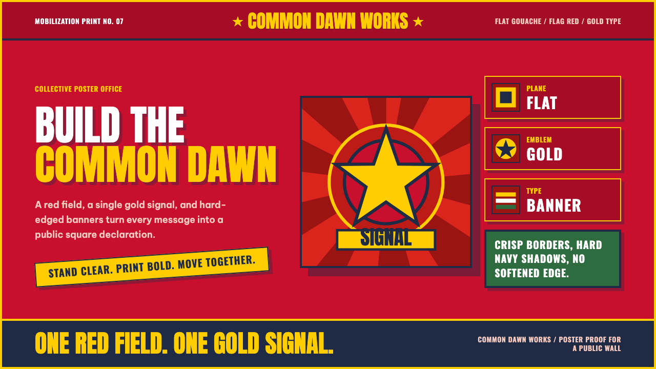 Vietnamese PropagandaFlat color commands. Flag-red fields, gold star rays, and Anton slogans hit a…
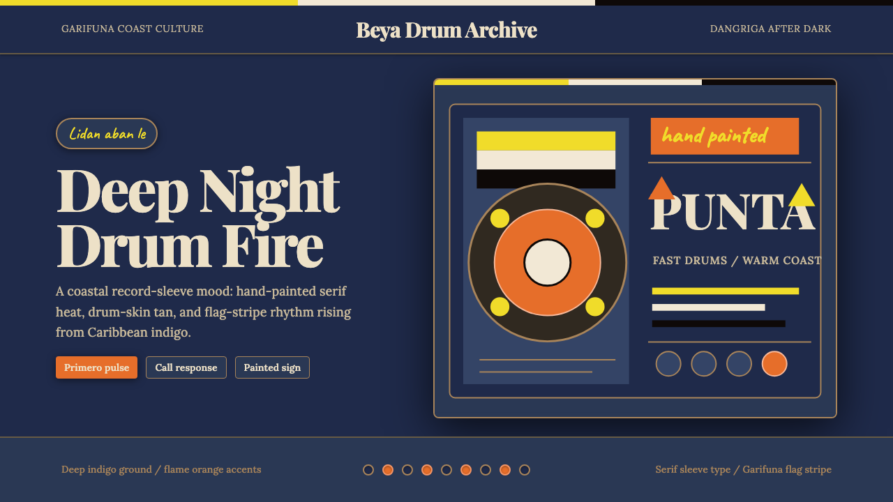 Belizean Garifuna PuntaNight rhythm burns. Indigo fields, flame-orange serif type, and flag stripes…
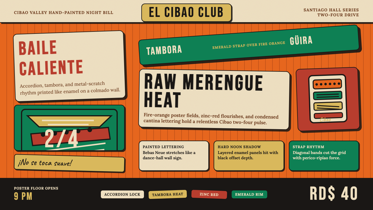 Dominican Merengue Perico RipiaoMaximalism keeps time. Fire-orange fields, Bebas Neue, and diagonal emerald s…
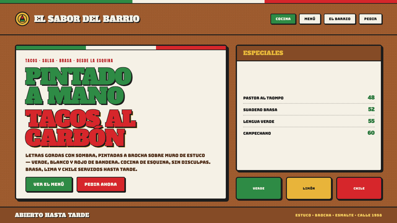 Mexican Taqueria Rotulo SignageStreet craft over polish. Fat outlined letters, hard offset shadows, flag col…
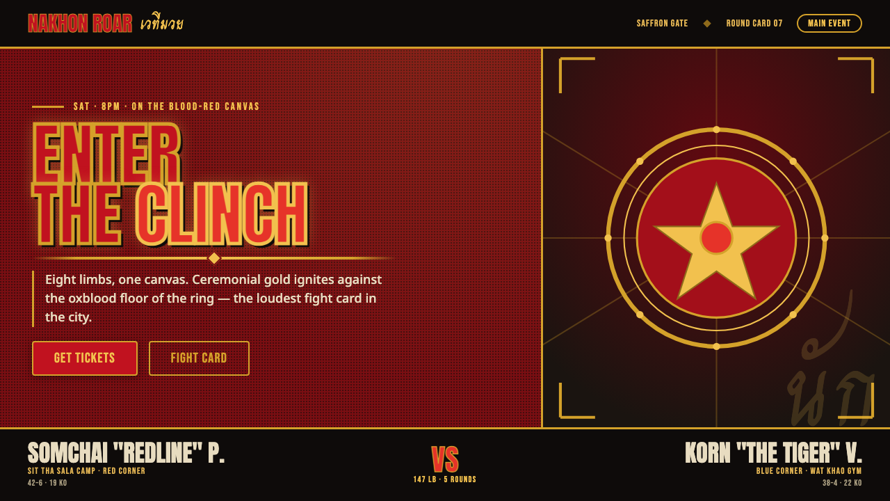 Muay Thai Stadium PosterBangkok's fight night, made loud. Ceremonial gold blazes on oxblood red under…