What is Mexican Taqueria Rotulo Signage?
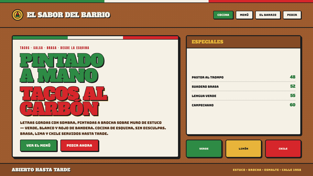
Mexican taqueria rótulo signage turns a meal into a street-side invitation: swollen hand-painted letters, sharp shadows, and flag-bright confidence pressed into a weathered wall.
Mexican Taqueria Rotulo Signage in brief
Mexican taqueria rótulo signage is the hand-painted lettering tradition associated with taquerias, food vendors, panaderías, and food trucks in Mexico. Its most recognizable forms are large, rounded display letters outlined for emphasis, paired with crisp offset shadows and built around green, red, and light accents drawn from the national flag. Rather than appearing as a detached logo applied to a pristine storefront, the lettering belongs to the surface beneath it: a warm, dark terracotta or ochre stucco wall, a painted sign board, a truck panel, or a menu façade exposed to daily street life.
The style is made by rotulistas, sign-painters whose work joins lettering, illustration, commercial information, and local character in one image. A name may be accompanied by painted tacos, chiles, limes, or other food motifs, not as neutral brand assets but as direct visual promises of what is being sold. The letters are intentionally abundant. They expand, curve, lean, and press against their outlines with the physical confidence of paint applied by hand. Their purpose is immediate recognition from the street, but their effect is also convivial: they make the business feel present, generous, and open.
On screen, the language should retain that sense of painted construction rather than becoming a polished corporate identity. Terracotta stucco remains the atmospheric ground; pale sign panels offer a place for dense lettering; green, light, and red banding create a bold directional rhythm. The key distinction is irregularity with control. Edges may carry slight human variation, shadows should feel deliberately painted rather than softly generated, and illustration should preserve folk directness. The result is not nostalgic simulation for its own sake. It is a visual system that values public legibility, appetite, and street craft over immaculate finish.
Where does Mexican Taqueria Rotulo Signage come from?
The golden era of Mexican street rótulo sign-painting is associated with the period from 1950 to 1990. During these decades, hand-painted signs formed a familiar part of commercial streets across Mexico, especially around food businesses whose success depended on being seen, understood, and remembered quickly. Taquerias, panaderías, street vendors, and mobile food sellers needed signs that could announce a name, indicate an offering, and project personality in a crowded visual environment. Rótulo answered all three needs without separating advertising from decoration or lettering from illustration.
Its central makers were the rotulistas: hand sign-painters who worked directly on walls, boards, storefronts, and vehicles. Their practice was practical as well as expressive. The source tradition describes paint mixed from car paint and white gas to create a glossy, flowing application, allowing letters and illustrations to glide across rough architectural surfaces. That material process matters to the look. It helps explain why the lettering appears substantial and fluid at once, why its outlines feel brushed rather than mechanically plotted, and why the finished sign can carry both a firm silhouette and a lively surface.
Mexican town life and street vendors supplied the social setting for the style. Rótulo was not developed as an elite design doctrine or as a standardized corporate system. It grew through vernacular commercial culture: food prepared in public, businesses named for easy recall, and façades that needed to speak immediately to passersby. Folk-illustrated tacos, chiles, and limes gave the signs an unmistakably culinary vocabulary. In this context, imagery did not need explanatory copy to work; a painted lime or taco could establish subject, mood, and appetite in a glance.
The resulting visual language belongs to Mexican vernacular folk lettering and taqueria graphic culture. Its recurring green, light, and red palette makes a clear national reference, while terracotta and ochre walls root the signs in built surfaces rather than abstract brand space. The style has endured as a useful cultural vocabulary because it remains direct: a business name is made large enough to matter, an outline protects it from the wall, a hard shadow pushes it forward, and a food illustration completes the invitation. Its energy comes from the visible hand behind those decisions.
What defines the Mexican Taqueria Rotulo Signage look?
Terracotta Ground
The preferred ground is warm, dark terracotta or ochre stucco, with enough unevenness to suggest a painted wall rather than a blank digital canvas. This surface gives the bright sign colors a physical setting and prevents the composition from feeling sterile. The ground should read as sun-worn, masonry-like, and substantial, never as a pale neutral field.
Fat Outlined Letters
Display lettering is broad, rounded, and packed with visual appetite. A substantial outline separates each letter from its surroundings and makes the word legible at street distance. The letters should feel painted as forms, not assembled from a clean type specimen: slight irregularity, generous curves, and hand-made joins are part of their authority.
Hard Offset Shadow
Shadows are crisp, solid, and visibly displaced behind the letterforms. They act as a second painted layer, adding force and separation without attempting realistic illumination. A consistent offset makes the sign feel boldly constructed; a soft or diffuse shadow weakens the street-painted character by turning a graphic decision into atmospheric decoration.
Flag-Bright Banding
Green, light, and red are used as an assertive system rather than a decorative rainbow. They may divide a sign panel, frame a name, or distinguish lettering from shadow and illustration. The palette works best when the colors have roles: one leads, another supports, and the light element creates contrast. Their force comes from clear adjacency against terracotta, not from indiscriminate saturation.
Folk Food Illustration
Tacos, chiles, and limes function as immediate visual shorthand for the food and the occasion. They should be bold, simplified, and integrated with the lettering rather than treated as detached decorative stickers. Their value lies in recognizability and charm: a painted food motif can turn a business name into a complete street-side scene without requiring a detailed illustration program.
Hand-Painted Irregularity
The style rejects vector-perfect geometry. Curves may swell unevenly, outlines may vary gently, and illustrated details may carry the small asymmetries of a brush moving across stucco. These variations should feel intentional and coherent, never degraded or chaotic. The goal is evidence of a maker’s hand: lively enough to resist corporate polish, disciplined enough to remain highly readable.
Who shaped Mexican Taqueria Rotulo Signage?
Rotulistas are the hand sign-painters at the center of this tradition. Their role combines the work of letterer, illustrator, commercial communicator, and surface painter. By painting directly onto walls, sign panels, and vehicles, they give the style its visible material logic: outlined letters, firm offset shadows, glossy flowing marks, and illustrations that feel inseparable from the business they advertise.
Mexican town businesses and street vendors are the social authors of taqueria graphic culture. Their storefronts, stalls, and food vehicles created the context in which a sign needed to be both information and invitation. The style’s large letters and food imagery answer the practical conditions of public commerce while preserving a local, personal voice that standardized branding often removes.
Taqueria graphic culture is the shared visual environment rather than a single named author. It brings painted food motifs, direct naming, national-color references, and expressive lettering into one public-facing language. Its influence is strongest where graphic elements remain useful: a customer should be able to see the offering, read the name, and feel the energy of the place without needing an explanation.
How do you use Mexican Taqueria Rotulo Signage today?
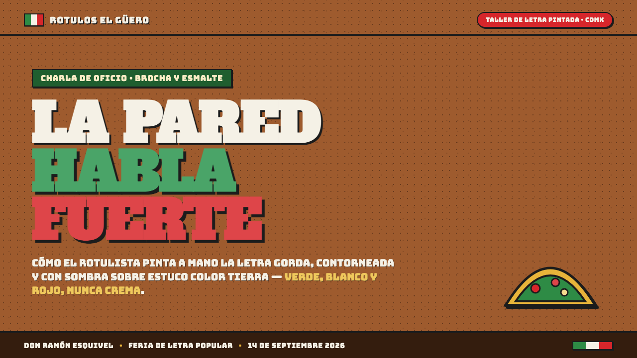
For presentation slides, treat the cover as a storefront sign. Place a short title in fat outlined lettering against a dark terracotta ground, then use a hard offset shadow to establish depth without realism. A pale sign panel or a green-light-red band can carry supporting information, but the title should remain the central painted object. On content slides, keep the same surface language while making the information calmer: use a strong heading, simple text blocks, and a small food illustration or band as an anchor rather than filling every corner.
Data slides can borrow the style’s public clarity without turning charts into novelty graphics. Use the sign-painting palette to separate categories and maintain thick, easily read marks that feel like painted strokes. A chart title can sit in outlined display lettering, while labels and explanatory text should stay straightforward and restrained. The useful principle is the taqueria sign’s distance test: if a passing viewer cannot immediately identify the subject and the leading comparison, the composition has lost the style’s functional directness.
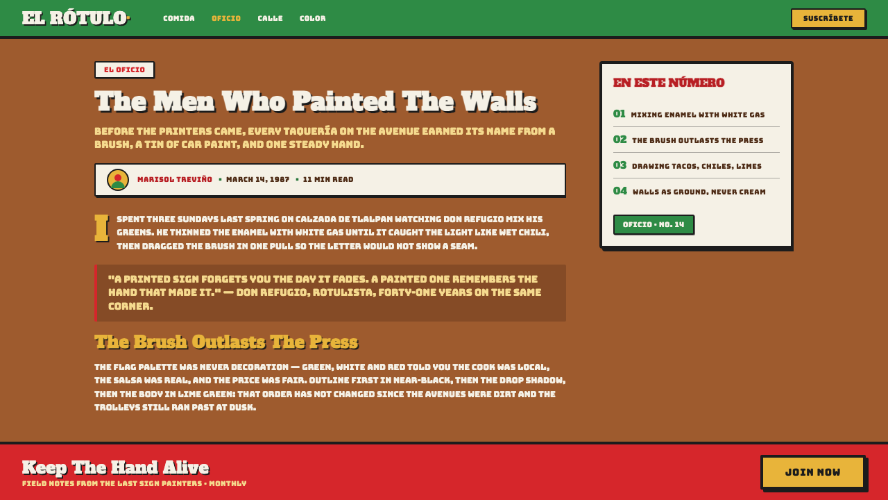
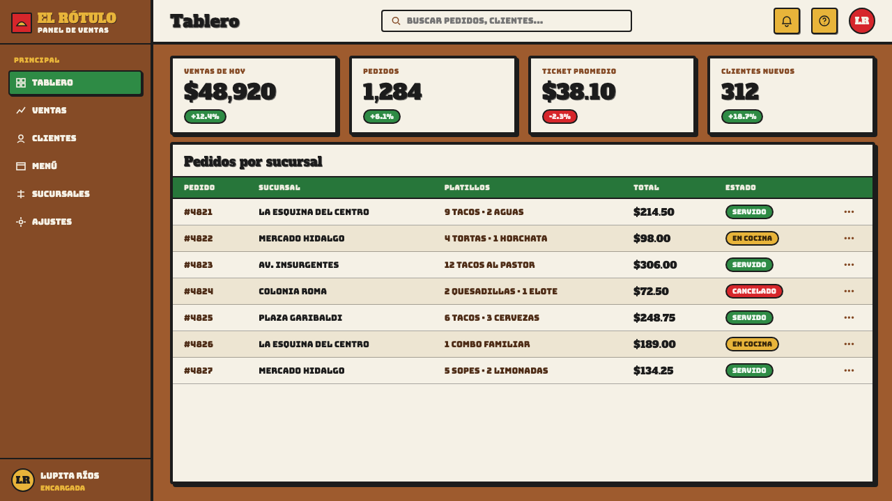
For web interfaces, this style is most effective in food discovery, ordering, venue dashboards, promotional dashboards, pricing pages, and campaign landing pages that benefit from immediate personality. Use terracotta as the environmental field and reserve pale panels for areas requiring concentrated reading. Navigation can be bold and typographic, while alerts, selected states, and tiers can use green, light, and red as meaningful distinctions. Cards should resemble painted placards with clear borders and firm shadows, not floating glass surfaces.
For editorial and marketing work, let the style operate like a sequence of street signs. An article can alternate broad title treatments with compact reading zones, using illustrated tacos, chiles, or limes to mark sections or pull out a key offer. Marketing pages can use banded feature areas and large product names to create an energetic rhythm. Keep the imagery closely tied to food, place, and invitation; the strongest compositions feel like they could plausibly belong on a neighborhood storefront rather than on a generic festival poster.
The common mistake is to reduce Mexican taqueria rótulo signage to flag colors and a playful heavy font. That produces an empty costume if the wall, shadow, illustration, and lettering no longer feel painted together. Avoid pristine light backgrounds, smooth corporate gradients, perfectly sterile curves, and generic clip-art food. Also avoid using every motif at maximum intensity. A convincing application gives one painted name or message priority, lets supporting elements serve it, and preserves enough roughness for the work to feel made rather than merely styled.
Mexican Taqueria Rotulo Signage — FAQ
Is Mexican taqueria rótulo signage just a Mexican-flag color scheme?
No. Green, light, and red are important because they create a familiar national reference, but the style depends equally on painted letter construction, substantial outlines, hard offset shadows, terracotta or ochre surfaces, and food imagery. Remove the hand-painted logic and the colors alone become a generic patriotic palette. The visual system works when every part helps a street-facing business be seen and understood.
Why are the shadows hard rather than soft?
The shadow is part of the painted lettering, not a simulation of ambient light. Its solid offset gives a word a second contour and pushes it away from the wall with immediate graphic force. A soft shadow makes the sign feel digitally atmospheric and weakens the direct, brush-built quality associated with rótulo work. Hardness also keeps the message readable when the sign must compete with a textured wall and busy street surroundings.
Can this style work for a business that is not a taqueria?
It can, provided the business genuinely benefits from public warmth, directness, and food-stall energy. It is especially natural for casual food, markets, neighborhood events, and brands with a strong place-based voice. It is less convincing when applied as surface flavor to services with no relationship to hospitality, craft, or street commerce. The food illustrations should not be copied into unrelated contexts; replace them only with equally direct motifs that belong to the actual offer.
How imperfect should the lettering be?
It should show the confidence of a human-painted sign, not the defects of careless production. Let curves vary slightly, outlines breathe, and illustrated details retain brush character, while preserving a strong overall silhouette and effortless reading. Random distortion is not authenticity. The useful test is whether the variation makes the lettering feel more physical and local, or merely makes it harder to recognize. If it compromises recognition, it has gone too far.
What should be avoided in a digital interpretation?
Avoid making the work pristine, generic, or detached from its painted surface. Pale minimal backgrounds, glossy corporate effects, soft floating shadows, overly perfect vector forms, and unrelated decorative food graphics all pull the style away from its source. Keep the terracotta setting visible, make one message dominant, and let color, outline, shadow, and illustration work as a connected sign-painting system rather than a bundle of separate visual effects.
Related design styles
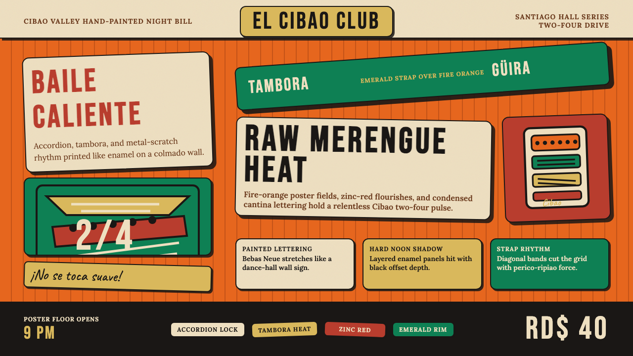 Dominican Merengue Perico RipiaoMaximalism keeps time. Fire-orange fields, Bebas Neue, and diagonal emerald s…
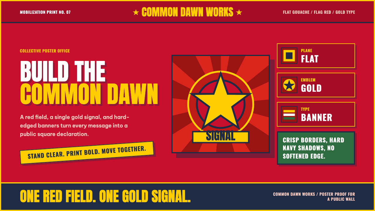 Vietnamese PropagandaFlat color commands. Flag-red fields, gold star rays, and Anton slogans hit a…
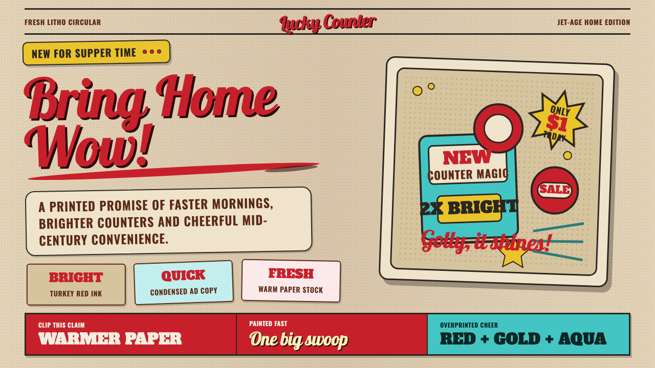 1950s Brush Script AdSells tomorrow in one swoop. Turkey red script, tan paper, starbursts, and ha…
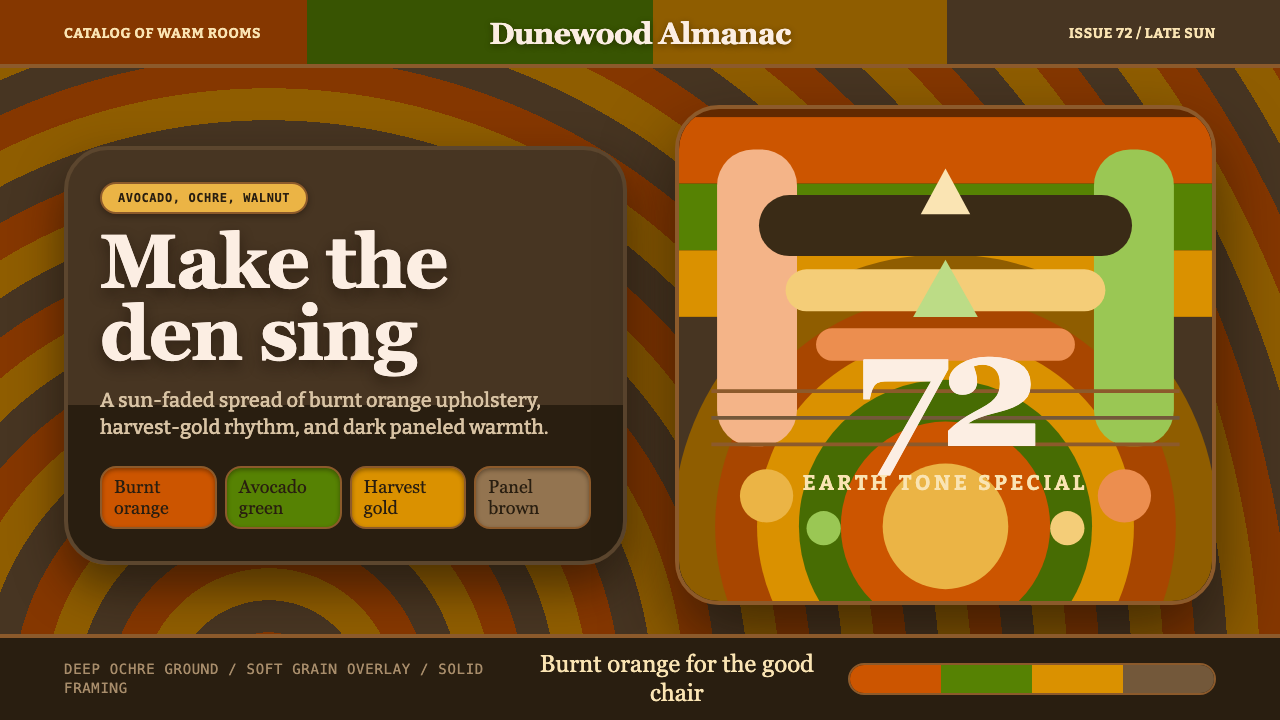 1970s Earth TonesWarm maximalism stays muddy. Bulbous slabs, avocado bands, and harvest-gold r…
 Ghanaian HighlifeMusic before words. Marigold ground, black keylines, red-green signboard bloc…
 Javanese Becak Folk ArtFolk painting at full volume. Sky-blue enamel, red mountains, white-outlined…