What is Muay Thai Stadium Poster?
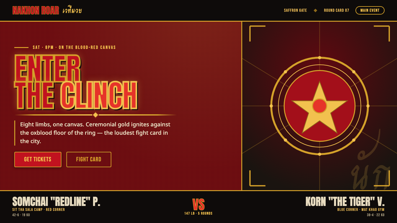
Muay Thai stadium poster design turns Bangkok fight night into a controlled visual impact: oxblood canvas, ceremonial gold, sacred markings, and condensed capitals that land with the force of a clinch.
Muay Thai Stadium Poster in brief
The Muay Thai stadium poster is the graphic language of Bangkok fight night, shaped by the atmosphere around Lumpinee and Rajadamnern Stadiums. Its imagined setting is immediate and physical: nak muay fighting on a blood-red canvas, hot ring lights cutting through a dim and smoky hall, and an audience receiving the event as spectacle, ritual, and confrontation at once. The poster does not aim for polite sports branding. It must announce pressure, noise, honor, and the proximity of bodies in combat.
Its core visual relationship is ceremonial gold against a deep oxblood ground, supported by fight-poster reds and black. Gold is not a luxury accent applied after the composition is finished; it carries the visual authority of the mongkon headband, prajioud armbands, and the ritual world surrounding the bout. Red supplies heat, danger, and the material memory of the ring canvas. Black deepens the field and prevents the layout from becoming festive or decorative. Pure white and creamy white are deliberately excluded, because their clean brightness would break the enclosed, nocturnal intensity of the system.
Typography gives the style its public voice. Condensed, all-caps display lettering is treated as an explosive block rather than a quiet reading surface: names, match titles, locations, and calls to action arrive in compressed vertical pressure. Gold rules and sharp divisions organize the message without softening it. Sacred sak-yant-like linework, fighter imagery, and ceremonial references can enter the composition, but they should reinforce the event's gravity rather than become exotic surface decoration. The resulting language is loud, dark, formal, and unmistakably built for a fight card.
Where does Muay Thai Stadium Poster come from?
This style belongs to the modern stadium-poster era of Thai boxing, spanning 1990–2010, and to Bangkok's Muay Thai stadium culture. Its geographic and emotional center is not an abstract idea of combat but the city’s named arenas: Lumpinee and Rajadamnern. The poster inherits the conditions suggested by those spaces — the red ring, concentrated heat of the lights, darkness around the action, and the public intensity of a fight night.
Its visual vocabulary is inseparable from nak muay and from the ceremonial framework surrounding the bout. The wai khru ritual, the mongkon headband, and the prajioud armbands establish that a match is not presented as raw violence alone. They bring discipline, lineage, respect, and preparation into the same visual field as impact and competition. Gold therefore functions as a ceremonial signal within a dark sporting environment, not as a generic premium-brand finish.
Sak-yant sacred tattooing supplies another important source of form. Its inked marks make line feel charged rather than merely ornamental: a line can imply protection, devotion, identity, or ritual force. In poster language, this influence supports sharp, intentional marks and dense symbolic framing. It should not be reduced to a random texture. The power of the reference lies in its connection to sacred tattoo practice and to the fighters and masters who carry that tradition.
Thai fight-poster graphic design distills these cultural and physical signals into a public announcement system. The digital version preserves the gym-grit intensity rather than copying a museum artifact: deep oxblood replaces neutral space, gold rules construct hierarchy, red raises the temperature, and compressed display type turns every headline into a challenge. The aim is to retain the stadium’s visual roar while making its information structure usable on contemporary screens.
What defines the Muay Thai Stadium Poster look?
Dark Canvas
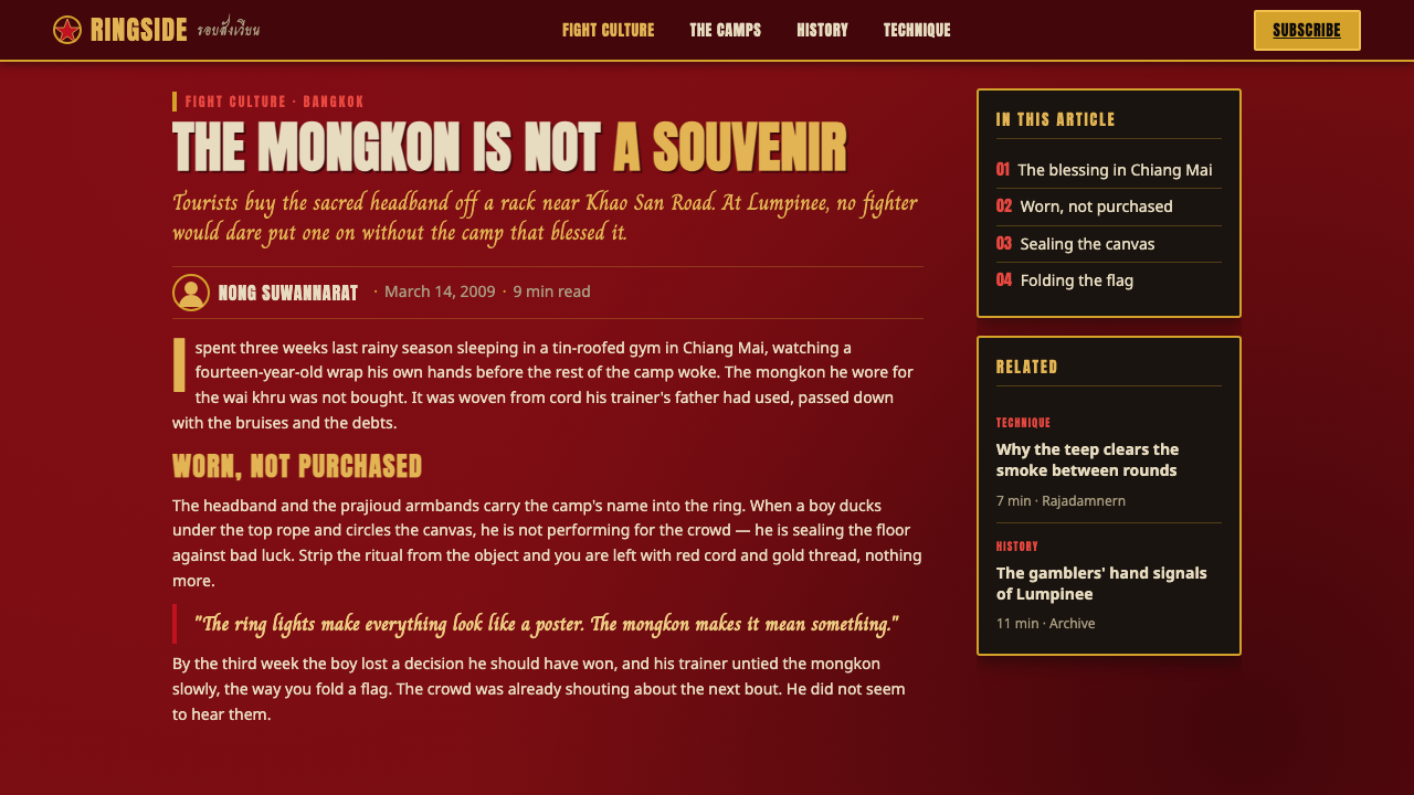
The ground should feel like an enclosed arena rather than an open editorial page. Deep oxblood establishes the dominant field, with black used to increase depth and isolate important blocks. This darkness is active: it makes gold flare, keeps red volatile, and gives the composition the smoky pressure associated with a night stadium. Clean white space is not part of the language; breathing room comes from dark intervals, cropped fields, and controlled empty areas within the red-black environment.
Ceremonial Gold
Gold carries symbolic authority drawn from the mongkon, prajioud, and the ritual atmosphere of Muay Thai. It works best as a sharp, concentrated force: display type, rules, crests, focal marks, or a contained emblematic field. It should appear to blaze against red rather than spread evenly across the whole page. When gold becomes a background luxury treatment, the composition loses its connection to ceremony and begins to resemble generic nightlife promotion.
Condensed Capitals
Condensed all-caps display type is the system’s striking surface. It compresses names and match information into tall, forceful shapes that feel shouted across a hall. Headlines should be allowed to dominate, crop at edges, or stack into a disciplined wall of language. Supporting information must remain legible, but it should not compete with the main announcement. The desired effect is pressure and command, not typographic novelty for its own sake.
Rules and Fight-Card Order
Gold rules, black bars, and decisive horizontal or vertical divisions turn the poster into a fight card. They separate opponents, distinguish event information from spectacle, and give the eye a sequence through the intensity. These lines should feel like boundaries, brackets, ropes, or a formal announcement frame. They are not delicate ornament. Their job is to make an aggressive composition readable without draining it of tension.
Sacred Mark and Fighter Presence
References to sak-yant, mongkon, prajioud, wai khru, and nak muay should make the design more specific, not more crowded. Sacred marks work as deliberate signs, framing devices, or directional energy; fighter imagery should emphasize stance, body, ritual equipment, and proximity to the ring. The visual language becomes weak when these references are scattered as decorative motifs detached from their meaning. Respectful concentration is more powerful than symbolic abundance.
Heat Without Softness
The style should feel hot, abrasive, and immediate, but never airy or glossy. Red-black contrast, hard boundaries, compressed type, and concentrated gold create heat through collision. Soft atmospheric gradients, pale neutral washes, gentle shadows, and polished lifestyle imagery would change the emotional register from stadium pressure to luxury entertainment. The system needs abrasion: each contrast should feel chosen, and each dark area should support the force of the next announcement.
Who shaped Muay Thai Stadium Poster?
Nak muay are the embodied center of the stadium-poster language. Their presence gives the composition its physical stakes: stance, tension, ritual preparation, and confrontation. A useful design does not reduce the fighter to a generic action silhouette. It lets the fighter’s relationship to the ring, the ceremony, and the opponent establish the poster’s sense of force.
The wai khru ritual supplies the style with ceremony and discipline. It reminds the viewer that the event’s visual intensity is not only about impact at the bell, but also about respect and preparation before the fight. In design terms, it justifies formal framing, measured gold accents, and a tone of gravity beneath the poster’s aggression.
The mongkon headband and prajioud armbands are key ceremonial references in the visual system. Their importance explains why gold should read as an honor-bearing signal rather than as decorative shine. Used carefully, their forms and associations can guide focal treatment around a portrait, a name block, or a ritual moment without turning the layout into costume illustration.
Sak-yant tattoo masters stand behind the sacred ink tradition that informs the poster’s charged linework. Their relevance is conceptual as much as visual: the marks belong to a practice with meaning, not to an interchangeable graphic texture. Designers borrowing this visual energy should preserve its concentration and seriousness, using it to deepen the stadium atmosphere rather than to decorate empty space.
How do you use Muay Thai Stadium Poster today?
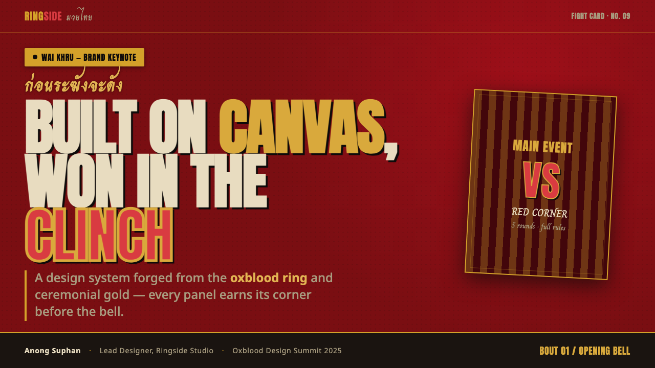
For presentation covers, treat the slide as a fight announcement rather than a corporate title page. Use a deep oxblood or black field, let one condensed all-caps title dominate, and introduce ceremonial gold through a rule, emblematic mark, or short line of event information. A fighter image or sacred line reference can create the focal point, but the cover should keep its hierarchy ruthless: one main declaration, one supporting signal, and darkness that makes both hit.
For presentation content pages, retain the stadium atmosphere while lowering the visual volume enough for sustained reading. Build sections with gold rules, dark panels, and strongly separated text groups. Condensed display type belongs to section titles and decisive labels; supporting copy should be calm, direct, and protected from the headline’s pressure. Avoid restoring white slide backgrounds for convenience. The system works when dark space performs the role usually assigned to blank paper.
For data slides, turn comparison into a fight-card structure. Use red and gold selectively to distinguish the most important result, opponent, category, or callout, while black and the oxblood ground hold the rest in restraint. Clear labels and strong divisions matter more than decorative charts. The point is not to make data look violent; it is to give the audience an immediate hierarchy, as if each result has stepped under the ring lights for inspection.
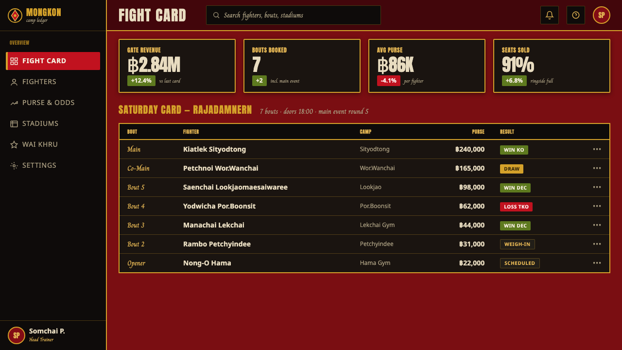
For web interfaces, the style is especially effective for event landing pages, match schedules, ticketing flows, athlete profiles, and dashboards that need urgency. Navigation should be typographic and decisive, with gold rules or bars establishing route and state. Pricing or ticket tiers can adopt the fight-card logic: each option gets a sharply bounded field, a dominant name, a concise benefit list, and one clear action. The dark environment should remain consistent so the experience feels like entering one venue, not browsing disconnected promotional modules.
For editorial and marketing work, use the system for feature stories, bout announcements, gym campaigns, and social assets where atmosphere must arrive before detail. Crop imagery boldly, stage headlines as poster events, and use sacred references with care. The common mistake is confusing intensity with indiscriminate excess: too much gold makes the page ornamental, too much red makes it flat, and too many tattoo-like marks make it costume-like. Let oxblood establish the world, let gold carry ceremony, and let type deliver the strike.
Muay Thai Stadium Poster — FAQ
Is this style only appropriate for a Muay Thai event poster?
Its strongest application is Muay Thai-related communication, because its ceremonial and stadium references are specific. It can also support adjacent work such as gym campaigns, athlete profiles, event platforms, and editorial coverage when the context preserves that connection. Detached from fight culture, its intensity can still be useful, but sacred references should not be used as interchangeable decoration for an unrelated product.
Why must the palette avoid white or cream?
The system is built around an enclosed night-stadium atmosphere: blood-red canvas, hot lights, smoke, and darkness around the ring. White or cream would introduce an editorial cleanliness that changes the setting and weakens gold’s flare against the ground. Readability should instead come from controlled gold, red, and dark contrast, along with disciplined spacing and clear divisions.
Can ceremonial gold be used everywhere in the interface?
No. Gold is powerful because it appears as ceremony and emphasis against the oxblood field. It is most effective on primary names, rules, focal symbols, and the most important actions. If every label, border, panel, and icon is gold, it stops signaling hierarchy and becomes generic ornament. Let dark space carry most of the interface so gold can retain its authority.
How should sak-yant-inspired marks be handled responsibly?
Treat them as references to a sacred tattooing tradition, not as a filler texture or a generic tribal effect. Use them sparingly, place them with purpose, and keep them connected to the design’s ceremonial or fighter-centered message. If a composition does not need that cultural reference, strong type, gold rules, red-black contrast, and fight-card structure can communicate the stadium mood without borrowing sacred marks.
Related design styles
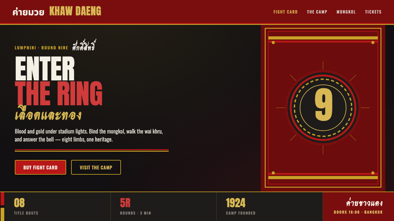 Muay Thai Camp BannerFight-poster physical. Blood-red and gold satin on near-black, heavy Anton ty…
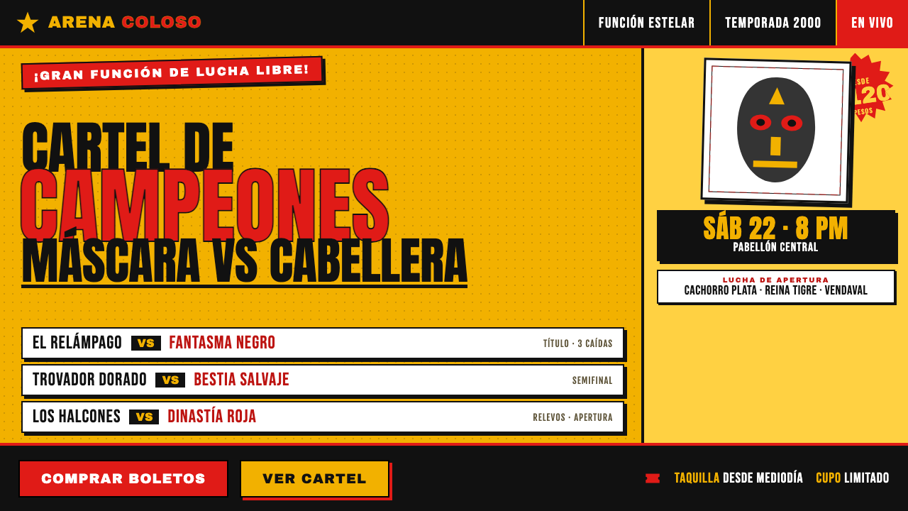 Lucha Libre Fight CartelTwo inks, maximum volume. Blood red on chrome-yellow, fat condensed type, sta…
 Tamil Cinema Poster (MGR era)The wall becomes a shrine. Red, yellow, green, and pink crash into cream pane…
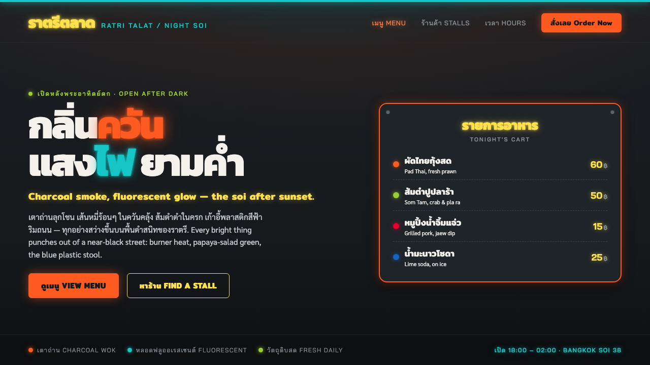 Thai Night Market Street FoodLit against the night. Chili-orange and fluorescent glow punch off a black so…
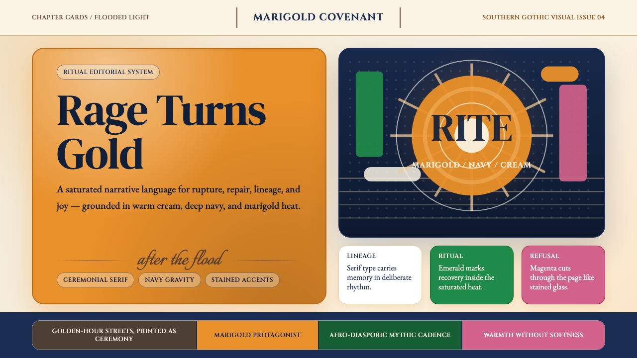 Beyoncé — LemonadeMythic heat refuses restraint. Marigold blocks, navy gravity, serif ceremony.
 Filipino Jeepney (Chrome & Streamer)Maximalism has wheels. Sunshine yellow, chrome strips, Bungee route-sign type.