What is Thai Night Market Street Food?
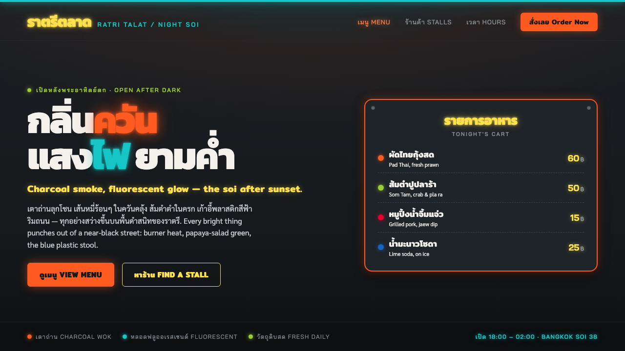
Thai Night Market Street Food captures a Bangkok soi after dark: wok smoke, fluorescent glare, hand-painted Thai lettering, and food colors pushed bright against a street that has almost disappeared into black.
Thai Night Market Street Food in brief
Thai Night Market Street Food is a vernacular visual style drawn from Bangkok and Southeast-Asian Thailand during the night-market street-food heyday between 1990 and 2010. Its setting is not the polished restaurant interior but the roadside cart, the narrow soi, the open grill, and the temporary eating area that comes alive after sunset. Charcoal smoke softens the scene while fluorescent tubes and improvised signs cut through it, making the street feel both dense and theatrical.
The style is organized around contrast. A near-black ground suggests the unlit depth of the street, while chili-orange heat, lime-green papaya salad, and the familiar blue plastic stool emerge as highly visible signals. Brightness is never neutral here: light is an ingredient in the composition. It catches steam, reflects from metal cart surfaces, pools around menu boards, and makes every price, dish name, and cooking gesture feel immediate.
Its visual language is loud, saturated, and practical rather than decorative in a luxury sense. Hand-painted Thai menu boards, often fixed to steel carts, do real work: they name dishes, announce prices, attract a passerby, and identify a stall in a crowded night economy. Fluorescent glow around bright lettering gives the style its halation, while bold callouts and dense signage create a sense of abundance. Nothing is pastel or delicate. The atmosphere depends on things being visibly lit, edible, and close at hand.
Where does Thai Night Market Street Food come from?
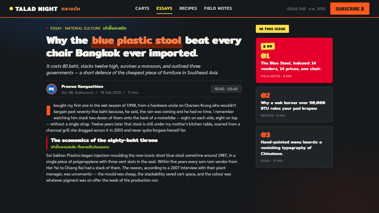
The style belongs to Bangkok and Southeast-Asian Thailand in the years from 1990 to 2010, when night-market street food was experienced as a full after-dark street environment rather than as a single food purchase. A soi at night gathered cooking, ordering, waiting, eating, seating, traffic, and signage into one compressed field. The visual result came from use and repetition: carts had to be found in low light, dishes had to be named quickly, and prices had to be visible among neighboring stalls.
Street-food hawkers shaped this language through daily necessity. Their stalls needed to signal activity from a distance and communicate at close range without the space or restraint of a formal storefront. The roadside cart became both kitchen and billboard. Steel frames held up menu boards, bright lighting extended service into the night, and exposed tools, cookware, and ingredients became part of the visual identity rather than something hidden behind a facade.
Pad Thai cart cooks and Som Tam vendors supplied the recognizable food-centered color logic. Heat, flame, chili, lime, papaya, sauce, smoke, and plastic seating are not abstract styling cues in this context; they are the visible materials of street service. The style takes its force from allowing these everyday signs to remain vivid. A dark street makes the food and equipment appear brighter, and a bright sign makes the stall feel active even before a customer reads it.
Hand-painted sign makers gave this vernacular its most graphic voice. Thai script led the composition because it was the direct language of menus and prices, not an imported decorative layer. Lettering could be bold, glowing, crowded, and emphatic because it was designed for attention under fluorescent light. Together, Thai night-market vernacular, hand-painted cart signage, and fluorescent-lit street culture produced a visual system that feels immediate and local: not staged darkness, but a working street made legible by light.
What defines the Thai Night Market Street Food look?
Night Ground
The background is near-black, recalling an alley after the available light has been claimed by carts, signs, and cooking stations. This darkness is active rather than empty. It gives smoke, metal, plastic, food, and lettering a stage, and it prevents the layout from feeling like a bright daytime menu with a dark surface applied behind it. Large areas of shadow should remain intact so that the illuminated elements retain urgency.
Heat and Fluorescence
Chili-orange and lime-green carry the visual heat of the food, while fluorescent glow introduces a colder, sharper counterpoint. The point is not to make every element equally colorful. Warm food cues should feel like bursts from the wok or sauce bowl, and fluorescent light should feel like a practical overhead source that turns signs and steam visible. The tension between charcoal darkness and artificial brightness creates the style's nighttime charge.
Thai Script First
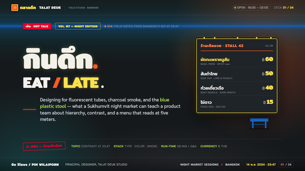
Thai script leads the graphic hierarchy, especially for dish names, menus, and price callouts. It should feel hand-painted, direct, and made for a stall rather than treated as a generic ornamental pattern. Bright lettering can carry a soft halo, as if it is catching fluorescent spill, but it must remain readable. Supporting Latin text, if present, should defer to the Thai-led composition instead of displacing it.
Halation
Bright type and sign edges are allowed to bloom slightly into the darkness. This halation is not a polished digital glow; it should suggest fluorescent tubes, humid air, smoke, and reflective street surfaces. Keep the effect concentrated around the elements that are actually meant to emit or catch light. When every object glows, the street loses depth and the strongest signals stop feeling special.
Cart-Made Surfaces
Steel carts, bolted boards, painted panels, and visible cooking hardware give the style a constructed, roadside character. Surfaces should feel useful and exposed rather than luxurious or seamless. Menu signs can feel mounted, leaned, clipped, or attached to the working equipment around them. The visual system becomes more convincing when information looks like it belongs to the cart and its service rhythm.
Crowded Callouts
Bold prices, dish names, and short sale signals create a dense field of attention. The hierarchy comes from brightness, scale, and placement rather than from abundant decorative motifs. A large callout can anchor the frame while smaller menu text gathers around it like the visual equivalent of neighboring voices. The density should feel energetic, but the primary offer still needs to be found at a glance.
Who shaped Thai Night Market Street Food?
Street-food hawkers are the central authors of this visual culture. Their working conditions required carts, signs, lighting, food display, and service cues to function together in a small roadside footprint. The resulting look is persuasive because it is built around being noticed, understood, and used after dark.
Pad Thai cart cooks embody the style's connection to heat, movement, and direct preparation. The wok, smoke, bright ingredients, and visible work surface turn cooking into part of the stall's public signal. Their carts make the food itself inseparable from the visual identity of the night street.
Som Tam vendors bring the vivid lime-green association of papaya salad into the system. Their work reinforces the style's appetite for sharp, fresh food signals against dark surroundings: ingredients remain visible, recognizable, and energetic rather than softened into restaurant polish.
Hand-painted sign makers supplied the stalls with their most memorable graphic layer. Their Thai lettering and price boards made information visible under fluorescent light while giving each cart an individual voice. The style depends on this practical expressiveness: the sign is simultaneously menu, invitation, and declaration of presence.
How do you use Thai Night Market Street Food today?
For presentation slides, use the style as an after-dark scene rather than a general neon treatment. On a cover, let a dark field hold one forceful Thai-led title, a food-colored accent, and a small pool of fluorescent atmosphere. On content slides, retain the sense of cart signage: section labels can feel painted or illuminated, while body information stays clearer and calmer so that the audience does not have to read through visual smoke.
Data slides work when they borrow the street market's signal logic instead of imitating a menu board indiscriminately. Use one bright food-associated cue to identify the primary series and reserve fluorescent emphasis for the figure or comparison that matters most. Charts should remain legible against the dark ground, with labels treated as stall information: direct, bold, and easy to locate. Decorative glow must never obscure values or make categories compete unnecessarily.
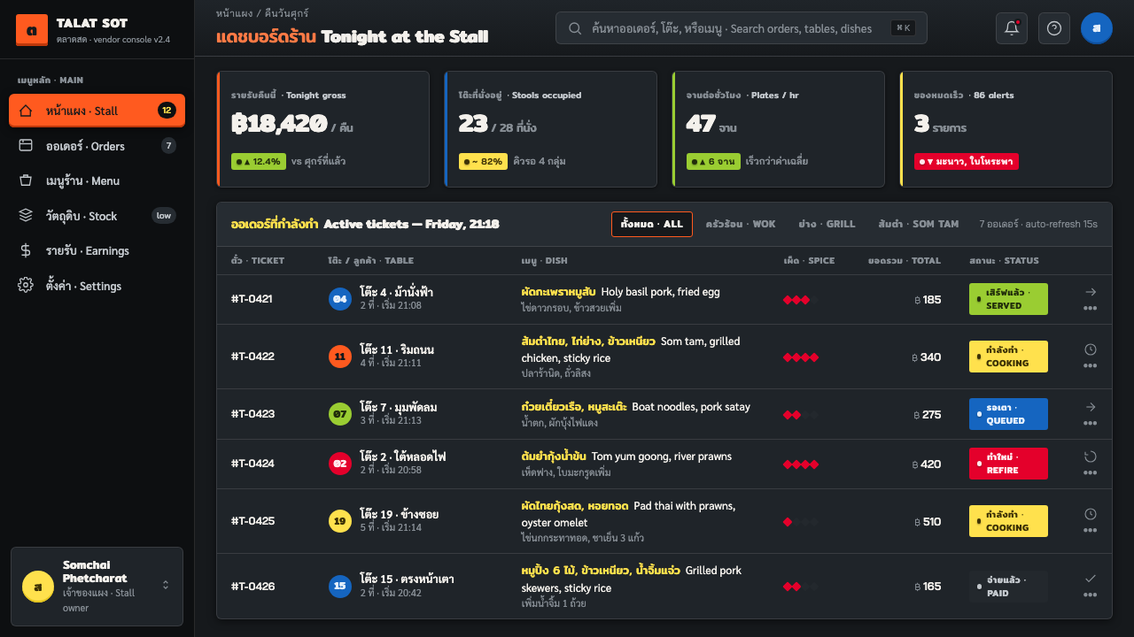
For web interfaces, the approach is especially effective for food discovery, local guides, event listings, and dashboards where activity and immediacy are central to the product. A dashboard can use darkness as environmental depth, Thai-led labels or localized category markers as identity, and bright accents for live availability, urgent choices, or featured dishes. A pricing or ordering page can use bold callouts like a cart menu, but its decision path still needs to be plain: what is being offered, what it costs, and what action the visitor takes.
Editorial and marketing work benefit from the style's sensory specificity. A feature story can open with a large night image, smoke-like dark space, and Thai menu language used as navigational texture around the article. A campaign can make a single dish, price, or vendor moment feel immediate by framing it with fluorescent brightness and roadside material cues. The common mistake is turning the style into generic cyberpunk neon. Thai Night Market Street Food needs food, carts, Thai script, practical signs, and a believable street hierarchy; without those anchors, the glow becomes detached from the culture that gave it meaning.
Thai Night Market Street Food — FAQ
Is Thai Night Market Street Food simply a neon style?
No. Neon-like glow is only one visible effect. The style is grounded in Bangkok night-market street service: steel carts, hand-painted Thai menus, fluorescent tubes, cooking smoke, food colors, prices, and temporary seating. If the work has glow but no relationship to food, Thai lettering, roadside information, or nighttime commerce, it is closer to generic neon than to this vernacular.
Why should Thai script lead the composition?
Because in the source environment Thai script is functional information: it names dishes, marks prices, and identifies the stall. Giving it prominence preserves the style's local logic. It should be handled legibly and respectfully, not copied as texture. Supporting languages can clarify access for a wider audience, but they should not erase the Thai-script-led character of the sign system.
Can the style work without photographs of food?
Yes, provided the food context remains visible through signs, dish names, cart materials, color associations, and price callouts. A photographic image can add atmosphere, but the style does not depend on it. What matters is that the composition still feels connected to a working nighttime stall rather than to an abstract dark poster.
Where does this style struggle?
It struggles when a product needs quiet neutrality, long-form dense reading, or a restrained premium mood. Its contrast and signal density are designed to compete with a busy night street, so applying them everywhere can make a calm task feel unnecessarily urgent. Use the strongest glow and saturation for moments of choice, appetite, discovery, and live activity; give supporting information enough darkness and calm to be comfortably read.
Related design styles
 Champeta Picó SoundLoud after dark. Orange-green banners and fat Bungee type glow like a speaker…
 Cholet — Freddy MamaniSaturation is the architecture. Mirrored teal, chrome trim and textile geomet…
 KAWS Companion (2010)Playful, with its eyes crossed out. Blush fields frame glossy gray vinyl and…
 Muay Thai Stadium PosterBangkok's fight night, made loud. Ceremonial gold blazes on oxblood red under…
 Nairobi Matatu ArtBuilt to be unmissable. Neon airbrush and chrome blaze across night-black hor…
 Sindhi Truck CalligraphyKarachi truck art, digitized. Hot fuchsia and chamak green blaze on deep coba…