What is Sindhi Truck Calligraphy?
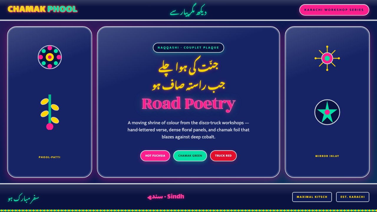
Sindhi Truck Calligraphy turns a working vehicle into a moving shrine of colour, chrome, floral abundance, and Urdu poetry that refuses to stay quiet.
Sindhi Truck Calligraphy in brief
Sindhi Truck Calligraphy is a digital expression of Pakistani truck art associated with Sindh and Karachi. Its source is the painted steel body of a working truck: a dark, saturated field carries hand-lettered Urdu couplets, dense naqqashi ornament, phool-patti flowers, reflective chamak-patti decoration, chrome trim, and mirror inlay. The result is not a restrained identity system. It is a surface built to be noticed in motion, from a distance, and under changing light.
The style translates that visual density into an interface language without losing its central tension: poetry sits inside spectacle. Deep cobalt creates the night-like ground; hot fuchsia and fluorescent green provide the visual burst; silver-toned borders suggest chrome and reflective tape. Nastaliq calligraphy is not an incidental flourish. It is the emotional center of the composition, giving decorative energy a voice, rhythm, and sense of address.
What makes the style distinctive is its refusal to separate utility from display. A truck remains a vehicle, but its panels become places for words, flowers, shine, framing, and personal expression. In digital work, this means functional content can still arrive ceremonially. A heading, status label, invitation, or campaign statement may be treated as something to ornament, frame, and celebrate rather than merely place on a neutral surface.
Where does Sindhi Truck Calligraphy come from?
The relevant cultural setting is Pakistani truck art in Sindh and Karachi, where working vehicles are transformed through painted panel decoration. The visual language is made on painted steel and assembled through layers: lettering, floral painting, reflective material, trim, and mirror-like detail. Rather than treating the vehicle body as a blank industrial shell, the practice treats it as a public-facing surface capable of carrying colour, craft, and language together.
Karachi workshops are central to the source material. Their naqqash, or master panel painters, build dense painted environments around hand-lettered Urdu couplets. The painted vocabulary includes naqqashi ornament and phool-patti floral work, where blossoms and foliage do not merely fill empty space: they make the panel feel inhabited. The calligraphy gives that ornament a literary anchor, allowing a surface of intense visual activity to retain a poetic focal point.
The chamak-patti or disco-truck boom of 1990–2010 intensified the reflective side of the tradition. Sticker artisans added glittering foil and reflective decoration that changed character as light moved across the vehicle. Chrome trim and mirror inlay extended the same effect at the edges, making the frame as active as the painted center. This was a living visual system, not a flat image: shine, reflection, colour, and lettering all competed and cooperated on a moving object.
As a contemporary digital style, Sindhi Truck Calligraphy should preserve that layered logic rather than imitate it as a generic exotic pattern. The dark cobalt field is the equivalent of the saturated truck panel; fuchsia and green carry the electric contrast; chrome-like borders establish ceremony and containment. Most importantly, the Nastaliq couplet remains central. Digital adaptation succeeds when the poetry and the ornamental surround feel inseparable, as they do on the decorated vehicle.
What defines the Sindhi Truck Calligraphy look?
Night-Saturated Color
The ground stays deep, dark, and richly saturated, creating enough visual pressure for neon fuchsia, fluorescent green, reflective silver, and small bright accents to blaze. This is not a pastel interpretation of truck art. The dark field is necessary because it makes the brighter elements feel illuminated, theatrical, and slightly electric rather than merely colourful.
Nastaliq as the Heart
Hand-lettered Urdu couplets are the compositional heart of the style. Nastaliq should feel fluid, ceremonial, and intentionally displayed, not reduced to an unreadable decorative texture. Surround it with room to curve, descend, and breathe; the floral and reflective material should amplify the words rather than overpower their rhythm.
Floral Naqqashi
Naqqashi and phool-patti floral work create density through petals, leaves, curls, and painted infill. These elements should grow around the calligraphy and along panel edges, producing abundance without becoming random wallpaper. Their role is to make the surface feel crafted and inhabited, as though decoration has spread organically across a steel panel.
Chrome and Reflection
Chrome trim, mirror inlay, and chamak-patti suggest a frame that jingles and catches light. In digital work, borders should feel crisp, bright, and physically separate from the cobalt field. Reflective treatment works best as a selective event at corners, edges, labels, and ornaments; if every element shines equally, the surface loses its hierarchy.
Layered Maximalism
The style earns its maximalism through disciplined layering. A dark field supports calligraphy; calligraphy receives floral accompaniment; chrome closes the panel; reflective details punctuate the composition. Every layer has a recognizable job. The goal is not to add more motifs indefinitely, but to create the sensation that an ordinary working surface has been joyfully and completely claimed.
Framed Panel Logic
Composition behaves like a truck panel rather than an open modernist canvas. The outer frame matters, the center is protected, and smaller ornaments gather at thresholds and corners. This containment gives dense imagery coherence. A strong border is not a finishing touch; it is the structure that allows the interior to become exuberant.
Who shaped Sindhi Truck Calligraphy?
Karachi workshop ustad painters are the master panel painters named in the source tradition. Their work joins hand-lettered Urdu couplets with naqqashi decoration on painted steel. In the digital style, they stand for the principle that lettering and ornament should be composed together, not sourced as unrelated layers.
Chamak-patti sticker artisans bring the reflective, glittering dimension associated with the disco-truck boom. Their materials make decoration responsive to changing light and movement. Digitally, their influence appears in restrained foil-like accents, bright edge events, and reflective punctuation that gives a surface kinetic energy.
Phool-patti floral painters supply the blossoms, leaves, and painted abundance that soften the steel-panel base without making it quiet. Their floral work gives the calligraphy an inhabited setting and helps connect separate regions of a vehicle into one decorative field. In interface work, this suggests ornamental clusters rather than evenly repeated floral patterns.
How do you use Sindhi Truck Calligraphy today?
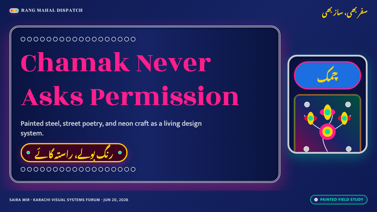
For presentation slides, use the style most forcefully on covers. Set a short statement or Nastaliq couplet inside a chrome-like panel on a deep cobalt field, then let fuchsia, green, floral clusters, and reflective highlights establish the event. Content slides need more restraint: preserve the dark ground and border language, but give explanatory text a calm central panel so that the visual celebration does not defeat reading.
For data and analytical slides, translate charts into framed truck panels. Keep the chart itself clear and direct, while using bright accents to distinguish key findings, callouts, and categories. Floral work belongs at edges or around titles rather than inside dense plots. The contrast between disciplined information and exuberant framing is particularly effective here: the data remains useful while the presentation feels unmistakably authored.
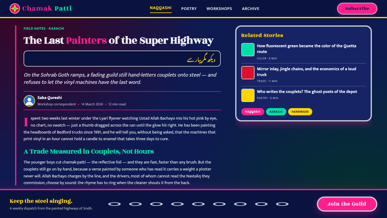
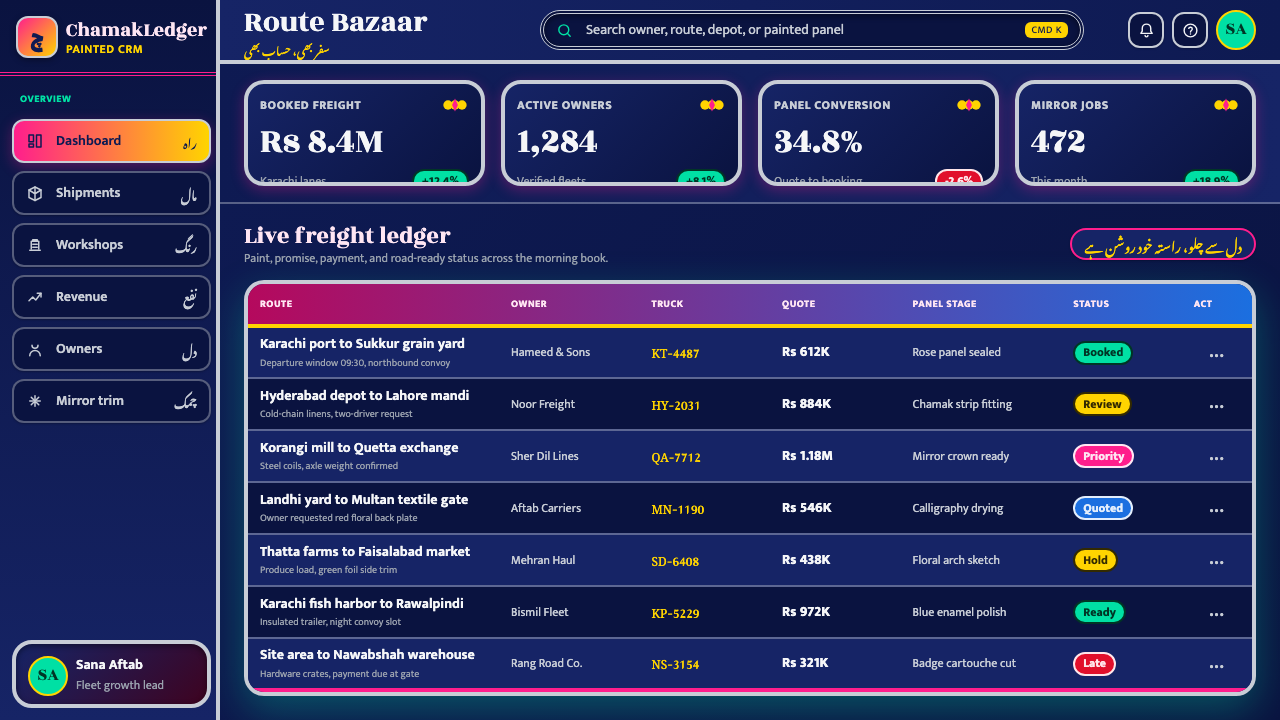
For web interfaces, the style suits promotional dashboards, campaign hubs, event pages, artist portfolios, and pricing experiences where personality is part of the offer. Use cobalt as the continuous environment, reserve the brightest colours for active choices and urgent moments, and frame cards, badges, navigation regions, or featured offers with chrome-inspired detail. Nastaliq works best for hero moments and culturally meaningful statements, while supporting interface copy should remain exceptionally legible.
For editorial and marketing work, treat each major section as a decorated panel with its own verbal center. A long-form article can use a calligraphic opening, floral margin clusters, and metallic dividers while keeping paragraphs in a quieter reading zone. The common mistake is to turn every surface into simultaneous sparkle, pattern, and type. Truck art is maximal, but it is not indiscriminate: a central poem, a dark field, a framing system, and selective bright interruptions create more authority than uncontrolled decoration.
Sindhi Truck Calligraphy — FAQ
Is Sindhi Truck Calligraphy only appropriate for transport-related brands?
No. Its strongest value is expressive ceremony, not transport imagery alone. It can work for cultural programs, music, hospitality, campaigns, creative tools, community events, and editorial projects that need warmth, spectacle, and a strong sense of place. It is less suitable when a product must feel quiet, neutral, or institutionally restrained.
Should every screen use Nastaliq calligraphy?
No. Nastaliq is most powerful when it appears as a focal voice: a couplet, title, invitation, or ceremonial statement. Repeating it across every utility label weakens both readability and impact. Let ordinary navigation, form guidance, and dense content use clear supporting typography, then reserve calligraphy for moments that deserve presence.
How can a digital version suggest chrome and reflection without becoming visually noisy?
Use reflective cues as punctuation rather than as a universal finish. Borders, corners, dividers, badges, and small ornaments can catch attention, while broad reading surfaces remain comparatively calm. Chrome works because it frames and redirects the eye; when it spreads everywhere, it stops behaving like a frame and competes with the poetry.
What is the difference between respectful adaptation and generic maximal decoration?
Respectful adaptation retains the relationships in the source material: Urdu couplets remain meaningful focal elements, floral naqqashi supports rather than replaces language, chamak-patti supplies selective reflection, and chrome contains the panel. Generic maximalism borrows bright colour and pattern while losing those roles. The difference is structural: one carries a living decorative logic, the other merely accumulates effects.
Related design styles
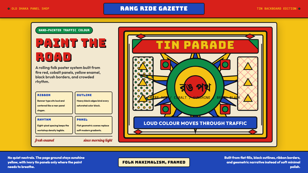 Bangladeshi Rickshaw Painting (Dhaka)Traffic shouts in color. Fire red, cobalt blue, and yellow panels lock into b…
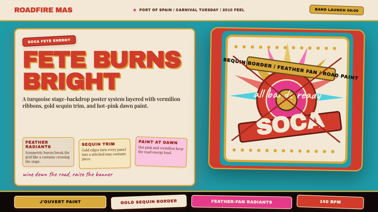 Trinidad Carnival Soca (2010)Joy overload. Turquoise field, vermilion banners, gold sequins, feather-fan g…
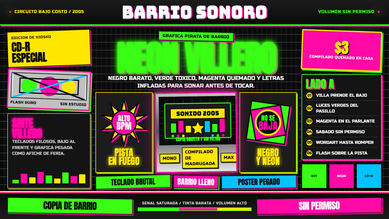 Cumbia VilleraLow-budget defiance. Neon green and hot magenta crowd black with chrome inlin…
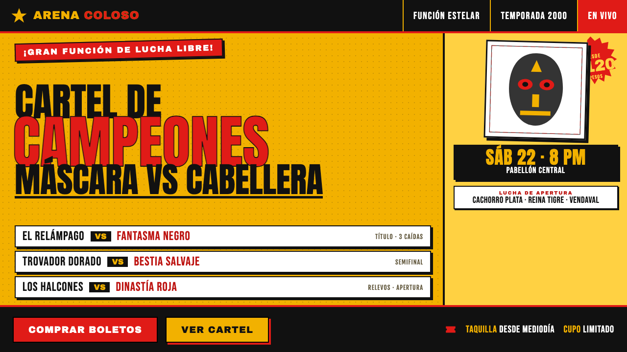 Lucha Libre Fight CartelTwo inks, maximum volume. Blood red on chrome-yellow, fat condensed type, sta…
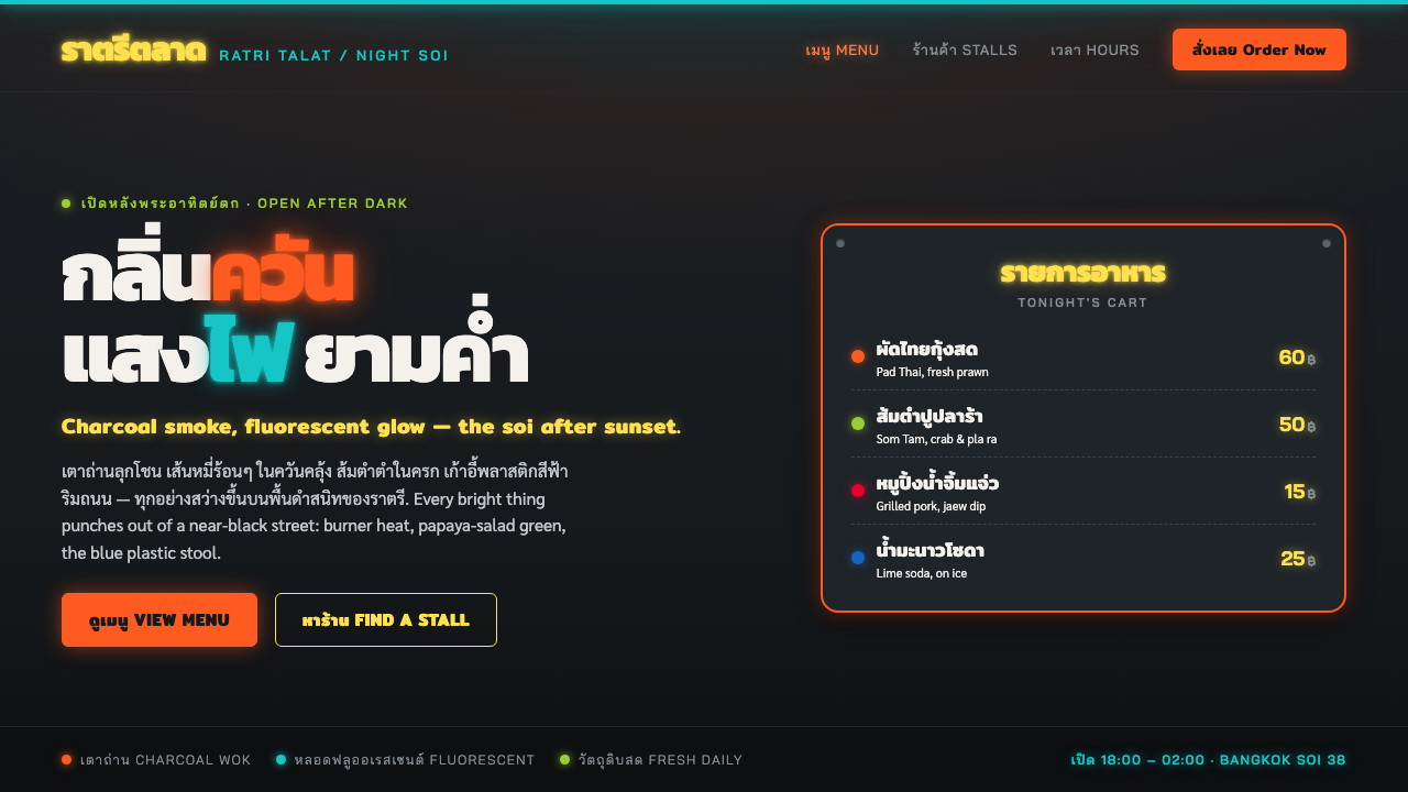 Thai Night Market Street FoodLit against the night. Chili-orange and fluorescent glow punch off a black so…
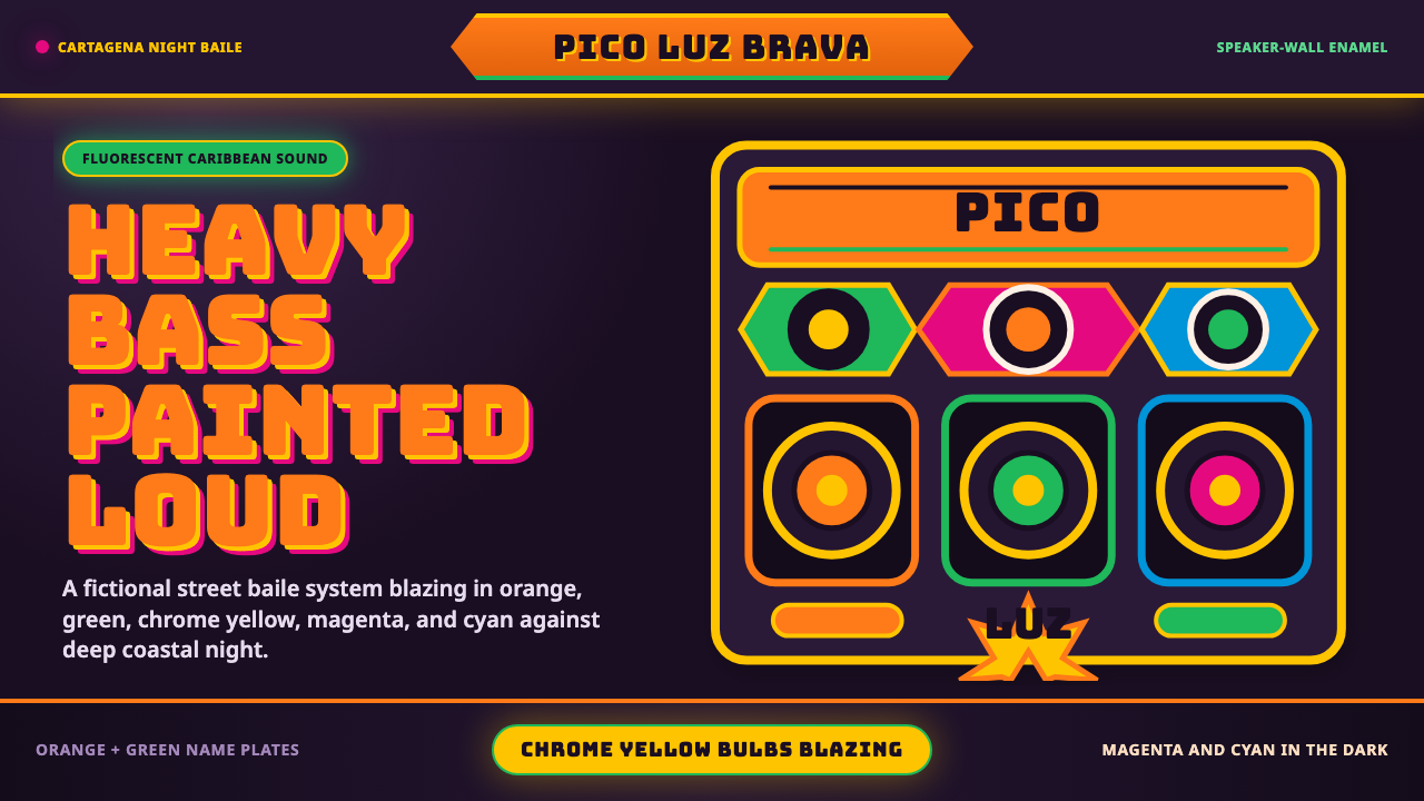 Champeta Picó SoundLoud after dark. Orange-green banners and fat Bungee type glow like a speaker…