What is Senegalese Laamb Poster?
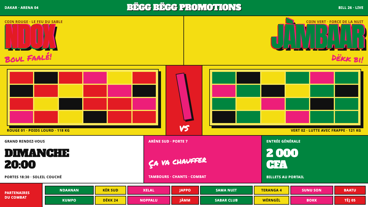
The Senegalese laamb poster treats loudness as the whole point: fluorescent yellow for a page, cut-out wrestlers squared off across the sheet, ring names as large as the paper allows.
Senegalese Laamb Poster in brief
Senegalese Laamb Poster is a design language drawn from the printed bills that sell laamb, Senegal's national sport, which out-draws football. The bills are printed on flat fluorescent stock and pasted in overlapping layers on the walls of Dakar. The system takes that sheet literally: fluorescent yellow is the page and not an accent, tricolour red and green carry the type, fluorescent magenta carries the shouts, and black does the outlining.
On the sheet itself, two wrestlers are cut out of their photographs and squared off across the paper. Their Wolof ring names are set as large as the paper allows, hand-brushed nicknames crowd every gap, and a dense band of sponsor marks runs along the foot. Shadows are hard, flat offsets, figures are keylined with heavy outlines, and the colour layers sit slightly out of register, exactly the way cheap screen printing actually lands.
Loudness is both the point and the logic. A bill pasted among dozens of others has a few seconds to be read from across a street, so every decision pushes toward impact: saturation, scale, contrast, crowding. The system turns that street-level necessity into a style, and the style is honest because nothing in it pretends to be quiet.

Where does Senegalese Laamb Poster come from?
Laamb is the Wolof name for Senegalese wrestling and the country's national sport. In the source's words it out-draws football, and the bills that sell each fight have to match that scale of attention. The source dates the modern promoted era from 1990 to 2020, a period in which fights became advertised events with promoters, sponsors and large arenas behind them, and in which the printed poster became their most visible public face.
The medium is as important as the message. The bills are printed on flat fluorescent stock, the kind of paper that seems to glow in daylight, and pasted in overlapping layers on Dakar's street walls until the surface becomes a collage of old and new fights. The source ties this to two older and parallel traditions: West African screen-printed street bills and hand-painted arena signage. The first supplies the flat inks and the cut-out photography; the second supplies the hand-brushed nicknames and the sign painter's love of oversized lettering.
Four key figures are named in the source: Balla Gaye 2, Siteu, Luc Nicolaï and Christian Bobst. The first two are exactly the sort of ring names that these posters set as large as the paper allows; the other two sit in the source alongside the strand it calls laamb promotion. Read together, they show the two halves of the poster's job, which is to put a fighter's name in front of a crowd and to sell a fight as an event that someone has organised and paid for.
What the design system adds is discipline. The street sheet is chaotic by necessity, and the system extracts its rules: the page is one saturated colour, type takes the flag colours, shouts take a second fluorescent, black outlines everything, shadows are offsets, and misregistration is allowed in a controlled way. In that sense it is a faithful translation. It does not make the poster neater; it makes the poster's logic repeatable, so that a screen or a slide can be as loud as a wall in Dakar without turning into noise.
What defines the Senegalese Laamb Poster look?
Fluorescent yellow page
The ground is not a neutral backdrop but a saturated fluorescent yellow that fills the whole sheet. It is the page itself, not an accent laid over white. That choice makes everything else on the poster work harder, because no element can rely on a calm background: type, figures and ornaments all have to hold their own against a colour that glows.
Flag colours, shout colour, outline
Tricolour red and green carry the headline type, echoing the national colours; fluorescent magenta carries the shouts, the short callouts that interrupt the main message; and black does the outlining and the heaviest strokes. Each colour has a job, and the jobs do not overlap. The result looks wild but is organised by role: names in flag colours, exclamations in magenta, structure in black.
Misregistered ink
Colour layers do not quite line up. A fill slips off its outline, a shadow lands beside its letter, a halftone edge drifts. This is not an error to be corrected but a signature of cheap screen printing, and the system treats it as authenticity. The offset has to be small and consistent in direction, or it stops looking like a printing habit and starts looking like a mistake.
Hard offset shadows
Shadows are flat, hard-edged copies of a shape shifted a little down and sideways. They are never soft or blurred. A shadow is another printed layer, not a light effect, and it makes letters and figures lift off the page like stickers. It also reinforces the cut-and-paste nature of the whole sheet.
Cut-out wrestlers
Two wrestlers are cut out of photographs and squared off across the sheet, each wrapped in a heavy keyline so that the silhouette reads from far away. Poses are confrontational and the figures are scaled to dominate. There is no environment behind them, only the fluorescent field. The effect is a face-off in the most literal sense, and the whole poster is organised around the gap between the two.
Ring names as large as possible
Wolof ring names are set in heavy condensed capitals at the largest size the paper can hold, often filling the width and sometimes bleeding off the edge. The condensed form lets long names sit big on a sheet. Type here is not a caption for the picture; it is the picture, and the names are the main event.
Brushed nicknames and sponsor band
Every gap is filled. Hand-brushed nicknames crowd the spaces between the figures, and a dense strip of sponsor logos runs along the bottom. The crowding is itself a statement: an event with this much attached to it is too big for the paper. Emptiness is rare, and where it exists it is usually short-lived, filled by the next layer.

Who shaped Senegalese Laamb Poster?
Listed in the source among the key figures of the promoted era, and the kind of ring name that these posters print as large as the paper allows. His name stands for the star system at the centre of laamb: the individual fighter whose name alone is meant to sell a sheet, and for whom the cut-out portrait and the oversized lettering exist.
Also named in the source as a key figure of the era, and another ring name of the type that dominates a poster. Paired on a sheet with a rival, a name like this is part of the logic of the face-off: two names, two cut-out figures, one gap, and a crowd that is meant to choose a side.
Named in the source as a key figure, listed alongside the strand it calls laamb promotion. His name is best read as representing the organising side of the poster's job, in which a fight is sold as an event, and it explains why the sheets carry sponsor strips and arena information as well as portraits.
Another key figure named in the source, listed alongside the same laamb promotion strand. Together with Luc Nicolaï his name points to the commercial infrastructure behind the visual style: the printing, the pasting, the banners at the arena. The loudness of the poster is a product of this business as much as of any aesthetic taste.
How do you use Senegalese Laamb Poster today?
The laamb poster style is one of the loudest in the library, and it succeeds by being committed. It is not a style to apply in small doses; either the page is fluorescent, crowded and confrontational, or the effect is lost. The discipline is in keeping the roles straight: yellow is the page, flag colours carry names, magenta shouts, black outlines, and shadows are offsets.
For presentation slides, covers can be full-bleed fluorescent yellow with a single enormous title in heavy condensed capitals, a hard offset shadow and a keylined cut-out image. Content slides should be treated as fight cards: one claim per slide, written in large type, with a magenta callout for the key phrase. Data slides suit scoreboards: huge figures, black outlines, a clear A-versus-B layout, and a sponsor-style strip at the foot for sources and notes.
For web interfaces, the style fits event pages, ticketing, sports and entertainment, festival sites, music promotions and any launch that wants a stadium atmosphere. A hero section can use the face-off layout with two images and a central gap for the call to action. Pricing pages can set ticket tiers as bouts, each with a bold name and a hard-shadowed button. Dashboards are a stretch, but live scoreboards, leaderboards and countdowns work if text is kept in black on the yellow ground and magenta is reserved for status.
For editorial and marketing work, the style is a street poster at its core. Use it for event announcements, campaign flyers, social cards, merchandise and album art, and let layers overlap deliberately. Series can vary the cut-out figures and nicknames while keeping the structure. Because the format came from printed bills, it also translates well to physical posters, banners and stickers, where the misregistration and offset shadows can be literal.
A common mistake is to tidy the style: aligning everything, removing the overlaps, replacing the offset shadow with a soft blur or evening out the misregistration. That makes it look like a cleaned-up template instead of a wall in Dakar. A second mistake is legibility: red or green text over fluorescent yellow can be tiring for long reading, so headlines and names should carry the colour while body text and small print are set in black. A third is mixing in unrelated palettes or gradients, which breaks the role system.

Senegalese Laamb Poster — FAQ
What is laamb, and why does it have its own poster style?
Laamb is Senegalese wrestling, the national sport, which according to the source out-draws football. Each fight is sold with printed bills pasted in overlapping layers on Dakar walls, and the form of those bills, fluorescent stock, cut-out wrestlers, huge ring names and misregistered screen printing, has become recognisable enough to be a style of its own. The design system distils that sheet into repeatable rules.
Why is the page itself fluorescent yellow?
Because on the street the stock is the loudest thing a poster has, and the printer has already paid for it. Fluorescent paper glows in daylight and makes a bill visible across a road, among dozens of other bills. The system keeps that logic: yellow is the page, not an accent, so every other element has to work against a glowing ground and the whole sheet carries attention before any text is read.
Is the misregistration deliberate, and how do I use it?
Yes. Cheap screen printing lands layers slightly out of register, and the system treats that as authentic. Use it sparingly and consistently: shift fills and shadows a small amount in the same direction, so it reads as a print habit. If the offsets vary wildly or are large, the effect reads as a mistake and also hurts legibility.
Can the style work for serious or professional content?
It can, in controlled doses, but it is not neutral. The style signals spectacle, rivalry and celebration, so it suits launches, events, sports data and campaigns more than quiet, regulated or sensitive material. A practical compromise is to use it for covers, section openers and calls to action while setting dense reading in plain black on a simpler ground.
How do I keep a loud style readable?
Give each element a role and respect it. Names and headlines carry the colour, in large heavy capitals; magenta is for short exclamations only; black is for outlines and any text that must be read at length. Keep the figures large and the hierarchy obvious, one dominant name or number per sheet, and let the crowded margins stay decorative. Loudness works when everything shouts in the same order.
Related design styles
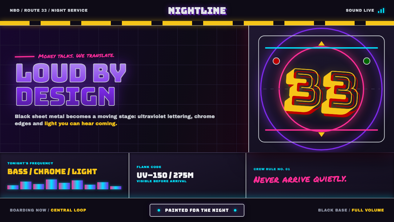 Nairobi Matatu ArtBuilt to be unmissable. Neon airbrush and chrome blaze across night-black hor…
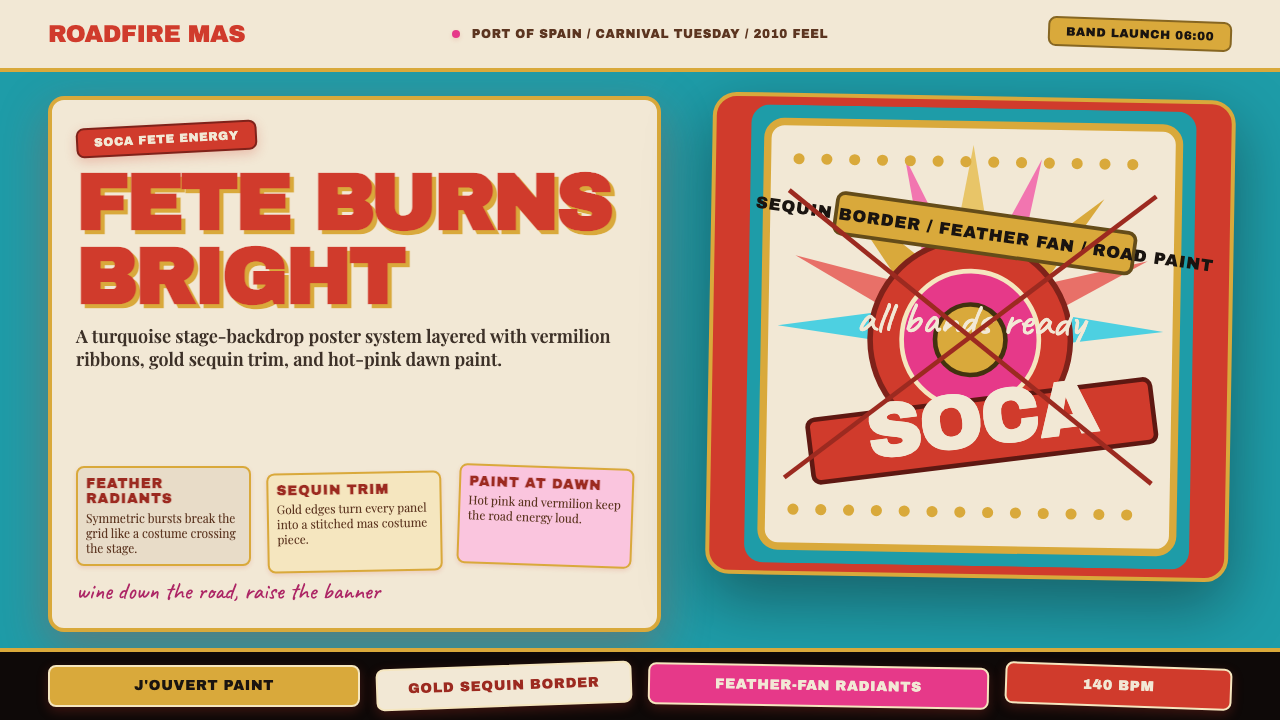 Trinidad Carnival Soca (2010)Joy overload. Turquoise field, vermilion banners, gold sequins, feather-fan g…
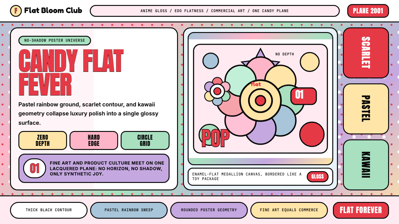 Takashi Murakami SuperflatJoy has no depth. Pastel rainbow, scarlet accents, and black contours flatten…
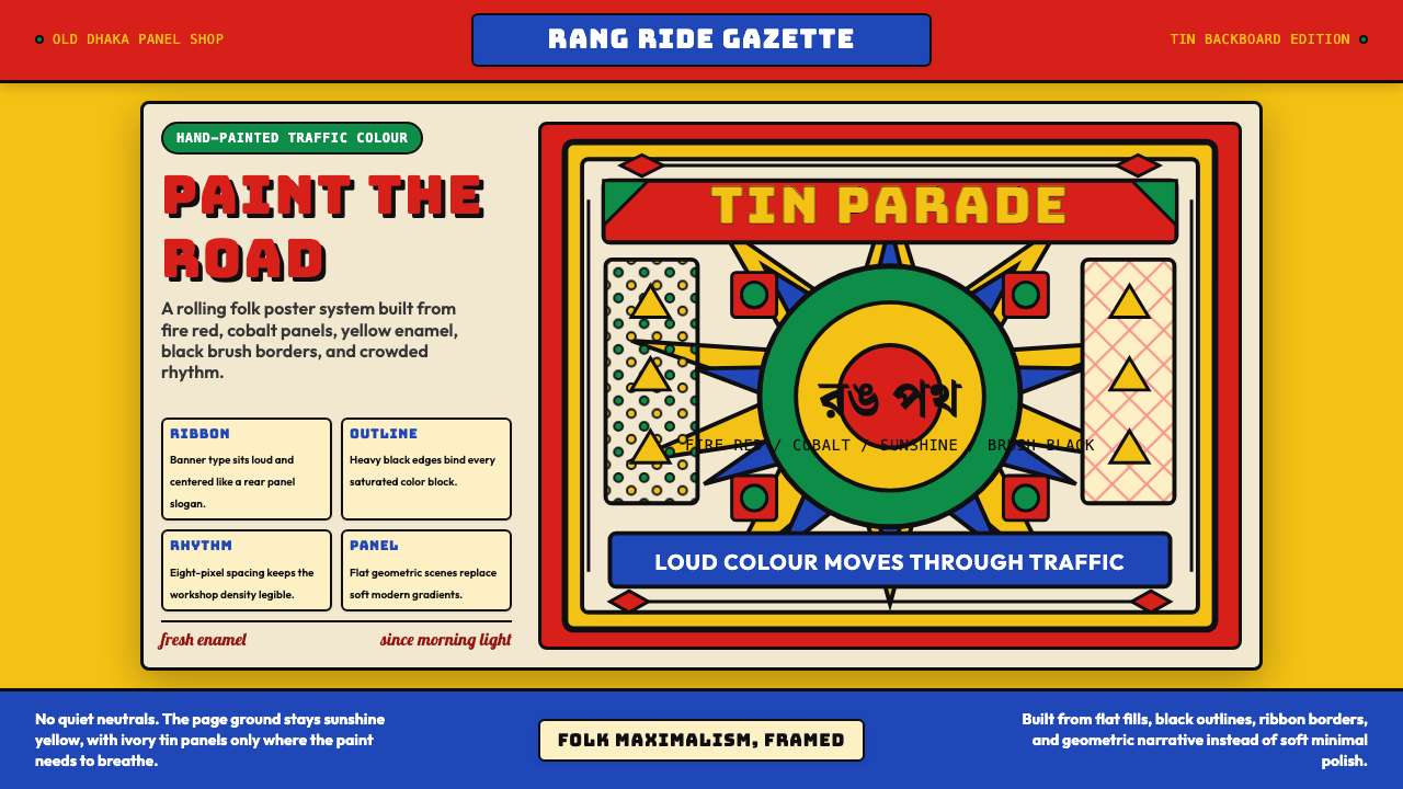 Bangladeshi Rickshaw Painting (Dhaka)Traffic shouts in color. Fire red, cobalt blue, and yellow panels lock into b…
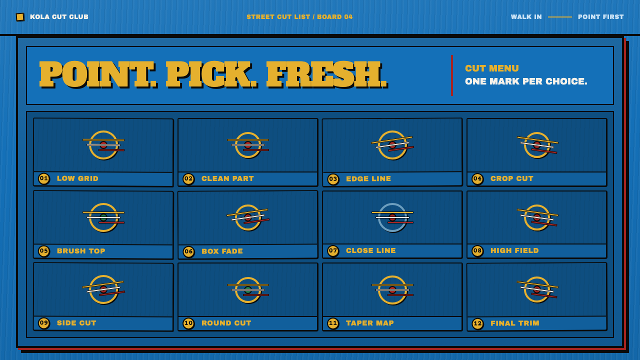 Ghana Barber Shop SignsChoice becomes a painted language. Chrome-yellow codes cut across an enamel-b…
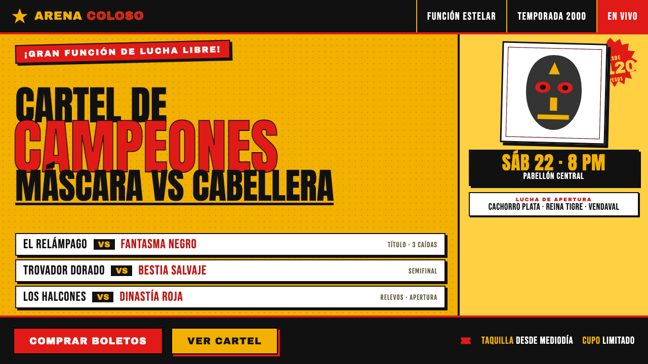 Lucha Libre Fight CartelTwo inks, maximum volume. Blood red on chrome-yellow, fat condensed type, sta…