What is Ghana Barber Shop Signs?
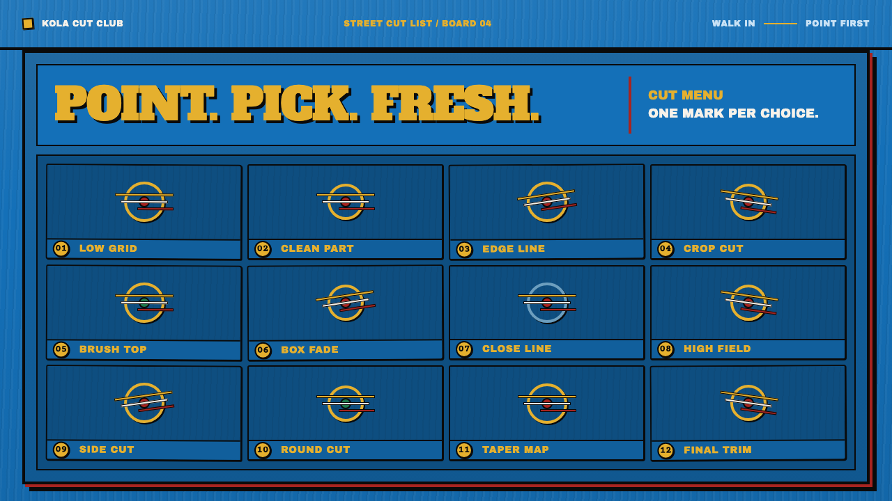
A Ghanaian barber's signboard is a menu you point at: gloss paint on salvaged plywood, a ruled grid of painted heads, and chrome-yellow numbers that turn choice into a language.
Ghana Barber Shop Signs in brief
A barber's signboard in Accra is a menu that a customer points at. It is made with gloss house paint applied directly to salvaged plywood. A ruled grid of equal cells fills the board, and each cell holds a single painted head shown from the front, the side or the back. Beside each head, the cut is identified by a number or a name in chrome yellow. The customer does not have to explain what they want; they point to a cell, and the cut is chosen.
As a visual style, Ghanaian barber shop sign painting is built from a very small set of ingredients. There is an enamel-blue field, brushed on flat and left slightly streaky. There is a hand-ruled grid that organises the whole board. There are chrome-yellow letters and numerals, outlined in black and lifted off the blue by an offset layer of shadow. And there are the painted heads, with every braid, fade and parting traced by a loaded brush. Nothing is stencilled and nothing is printed.
What distinguishes the style is that its irregularities are the evidence of its making. Baselines drift, letters are squeezed to fit whatever space is left on the board, brush marks remain in the paint, and the nail holes that fixed the plywood stay visible. The result is a system that is direct, legible and full of character, a visual language that was not designed in the usual sense but built up by working, one board at a time.

Where does Ghana Barber Shop Signs come from?
The reference material dates the tradition from the 1970s onward, in Ghana, and especially in Accra, Kumasi and the roadside markets where small businesses compete for passing attention. The enamel-on-plywood grid board is described as most widespread between the 1990s and the 2010s. It belongs to the working life of the street: a trade of independent sign painters who produce boards for barbers, salons and shops, usually by hand and often to a customer's verbal brief.
Three overlapping traditions are named in the reference material. West African vernacular sign painting supplies the basic idea that commercial signage is a painted, lettered, illustrated medium rather than a printed one. Hand-lettered shop advertising supplies the techniques: ruled guidelines, outline and offset shadow, lettering adjusted by eye to available space. Informal-economy commercial art supplies the economic logic, in which a sign has to work quickly, cost little, and be understood by anyone passing without a word of explanation. The board is functional first, and its beauty is a consequence.
The process explains the look. A sheet of salvaged plywood is first given a flat coat of blue. The painter then draws the grid in pencil, one cell for each head, and paints the heads, the outlines and the lettering with a loaded brush. The outline is laid down in dense black, and a second layer of shadow is set just off to one side so that the lettering lifts away from the blue. Because the work is done by eye and by hand, the grid and the lettering vary slightly from board to board, and from cell to cell. The variation is not a flaw; it is the signature of the painter.
The tradition has since been noticed outside Ghana. The reference material lists the Indigo Arts Gallery and the Museum of Architecture and Design Ljubljana among its names, which points to the circulation of these boards as objects of attention in gallery and design-museum contexts. That recognition does not change what the boards are for, which is to help a customer pick a haircut. But it does make them a useful reference for contemporary designers who want to understand how a visual language can be both highly systematic and entirely handmade.
What defines the Ghana Barber Shop Signs look?
Enamel-Blue Field
The ground is a saturated, deep blue laid on as a flat coat and left slightly streaky where the brush turned. It has the density and shine of enamel house paint rather than the softness of a screen print. The blue is the stage on which everything else is set, and its strong, even presence is what makes the yellow lettering read so clearly. Imperfections in the coat, such as visible brush direction and slightly uneven coverage, are kept, because they signal a painted surface.
Ruled Grid of Equal Cells
A hand-ruled grid divides the board into equal cells, one for each haircut. The grid is the organising principle of the entire sign: it makes the board scannable, comparable and complete. Each cell has the same structure, with a head and a label, so the customer learns the pattern after looking at the first one. The lines are drawn by eye and are slightly imperfect, but their logic is exact. In digital terms, this is a catalogue layout in which every option has the same footprint.
Chrome-Yellow Codes
Numbers and names are painted in a warm, intense chrome yellow beside each head. They are the information that matters: the thing a customer will say aloud when ordering. They are large, bold and clearly separated from the blue behind them. The yellow-on-blue pairing is extremely legible, and the colour is used for text and codes only, not for decoration. In this system, the number is the interface: a short label that stands for a whole choice.
Drifting Baselines and Squeezed Letters
The lettering is painted freehand, so the baselines wander, the spacing varies and the last letters of a word are compressed to fit whatever room is left. This is not an affectation but a record of how the work was done: the painter fits the words to the board, not the board to the words. The effect is lively and human, and it shows that the sign was made by someone responding to the space in front of them. In design, this suggests flexible, space-aware lettering rather than rigid typesetting.
Black Outline and Offset Shadow
Letters and heads are outlined in dense black, and a second layer of shadow is placed just off to one side. This gives the yellow and the figures a raised, cut-out look against the blue. The shadow is solid, hard-edged and shifted rather than blurred, and it behaves like another painted shape, not a lighting effect. Every braid and fade on a head is traced with the same outline logic. The approach is graphic and bold, built for legibility from across a street.
Visible Material
The board does not hide what it is made of. The plywood is salvaged, the paint is ordinary gloss, the nail holes are left showing, and the brush streaks remain in the blue. This material honesty is part of the style's identity. It is not a distressed filter applied to a clean design: the imperfections are consequences of real choices and real conditions. Reproducing it means keeping the evidence of hand and surface visible, with restraint, rather than manufacturing wear for effect.

Who shaped Ghana Barber Shop Signs?
The sign painters are the authors of the tradition, working independently for individual shops and customers in Accra, Kumasi and the roadside markets. The reference material names them as a group rather than as individuals, which fits a trade in which the board, not the signature, is the product. Their skills include ruling a grid by eye, fitting lettering to space, and painting a human head quickly and recognisably. Any design that borrows from the style is borrowing from their working method.
Indigo Arts Gallery appears among the names in the reference material, which suggests a gallery context in which these boards have been shown and discussed as visual art as well as commercial signage. Its presence indicates that the boards can be read in more than one way: as functional menus for customers and as examples of an elaborate, self-taught graphic tradition. For a designer, that double reading is a reminder to treat the work with respect and to credit its makers.
The Museum of Architecture and Design Ljubljana is listed in the reference material as another institution connected with the style. Its inclusion points to design-museum interest in vernacular graphic work from outside the usual Western canon. It suggests that the logic of these boards, a clear grid, a limited palette, strong outlines and lettering fitted by hand, has been recognised as a serious piece of visual communication rather than as local colour.
How do you use Ghana Barber Shop Signs today?
Ghanaian barber shop sign painting is a strong reference for any design that wants to turn choice into something immediate and human. The key is to keep its logic and not just its look: a flat blue field, a grid of equal options, bold yellow codes, black outline with offset shadow, and a surface that shows how it was made. Applied well, it makes an interface feel direct and unpretentious.
On presentation slides, a cover can be a single blue field with a large hand-lettered title in yellow, outlined in black and lifted by an offset shadow. Content slides work as grids: a handful of equal cells, each with a number and a short label, so the audience can refer to items by number. Data slides suit catalogue-like presentation, with options laid out as cells, the yellow numerals acting as the primary key, and any chart simplified to bold, outlined shapes.
For web interfaces, the style fits catalogues, menus, service lists, marketplaces, booking pages and any product where the user is choosing from many similar options. Each option becomes a cell of the same size with an image or illustration and a bold numeric or short-text label. A pricing page can lay out plans as numbered cells, with the recommended plan marked by a heavier outline. Buttons are flat, outlined and unmistakable; hover states can shift the offset shadow rather than add glow. Keep the page legible and the labels short.
In editorial and marketing work, the style gives street culture, music, food, barbershop and salon brands, local services and community campaigns a confident, handmade voice. Long pieces can be organised as numbered grids of short entries. Posters and social cards can use the board format directly, with a blue field, a few cells and a yellow headline. Where the subject is Ghanaian or West African, work with and credit local painters rather than imitating their hand.
The most common mistake is to treat the style as a texture or a font. A clean vector layout with a hand-drawn typeface and a distress filter reproduces the surface and loses the system, which is a grid, a code and a flat blue field. A second mistake is to use perfect baselines everywhere, or to randomise them heavily, when the real variation is modest and tied to fitting words into space. A third is to dilute the palette with extra colours, which weakens the yellow-on-blue signal. A fourth is to treat the work as exotic; it is a precise piece of commercial communication.

Ghana Barber Shop Signs — FAQ
Is the roughness deliberate?
In the original boards, the roughness is a by-product of fast, skilled, hand-made work on salvaged material, not a deliberate effect. The painter fits letters to the remaining space, rules the grid by eye, and leaves the brush marks where they fall. A design that borrows the style should keep that logic: irregularity that comes from fitting content to space, in modest amounts and always in service of legibility, rather than a random filter laid over a tidy layout.
Why chrome yellow on blue?
Because the pairing is both highly legible and highly visible from a distance, which is exactly what a roadside sign needs. Deep blue provides a stable, dark field, and the warm, bright yellow stands out from it with strong contrast. Using yellow only for text and codes keeps its meaning clear. For digital use, it also holds up well on a range of screens and sizes, as long as the yellow is not used for large fills.
How do I use the grid in a digital interface?
Treat it as a catalogue layout where every option has the same footprint, a clear image or illustration, and a short bold label or number. Equal cells make comparison fast and let users refer to options by code. Keep the number of cells manageable, keep spacing consistent and let selection show through a heavier outline or a shifted shadow. The grid should feel hand-ruled in character but remain exact in its logic.
Can the style work outside barbershops?
Yes, provided the content really is a set of options to choose from. It adapts to food menus, service catalogues, market stalls, salons, repair shops, event programmes and any product with many similar items. It is a poor match for content that needs quiet, long-form reading, or for sober financial or legal contexts where its energy would feel out of place. The test is whether the interface is, at heart, a thing you point at.
Does the style work with a light background?
The source system is a dark one: the saturated blue field is the stage for everything else, and the yellow and white elements are conceived against it. A light version would need a different logic, since yellow loses contrast on pale grounds. If a light background is required, keep a blue panel as the main board and place it within the light page rather than recolouring the whole composition, so that the yellow-on-blue signal remains intact.
Related design styles
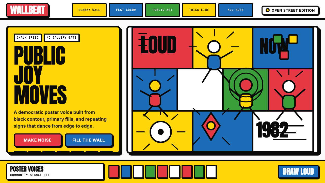 Keith Haring PopJoy refuses the gallery. Thick black contours pack primary color into a danci…
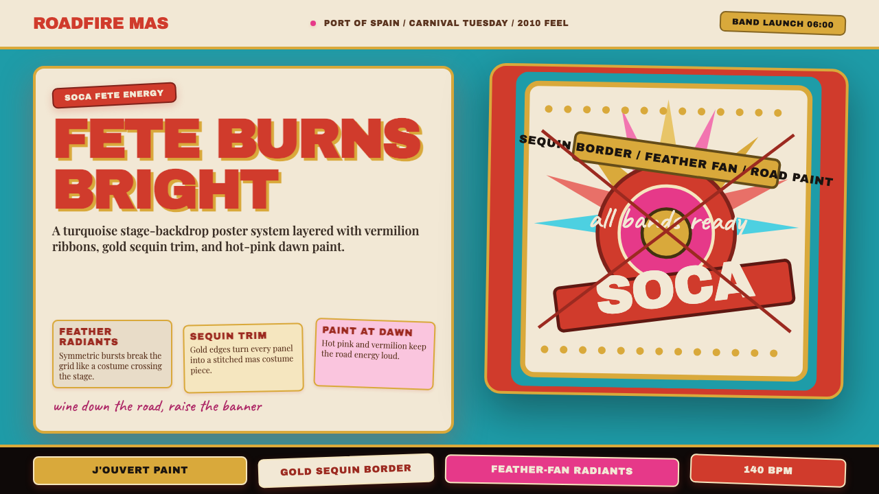 Trinidad Carnival Soca (2010)Joy overload. Turquoise field, vermilion banners, gold sequins, feather-fan g…
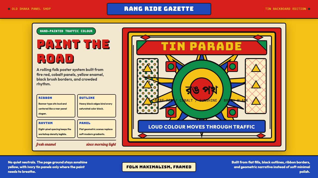 Bangladeshi Rickshaw Painting (Dhaka)Traffic shouts in color. Fire red, cobalt blue, and yellow panels lock into b…
 Nairobi Matatu ArtBuilt to be unmissable. Neon airbrush and chrome blaze across night-black hor…
 Nigerian Nollywood DVD Poster (2010)Market-stall cinema shouts. Tomato red type and yellow burst collide on jet b…
 Champeta Picó SoundLoud after dark. Orange-green banners and fat Bungee type glow like a speaker…