What is Marimonda Mask?
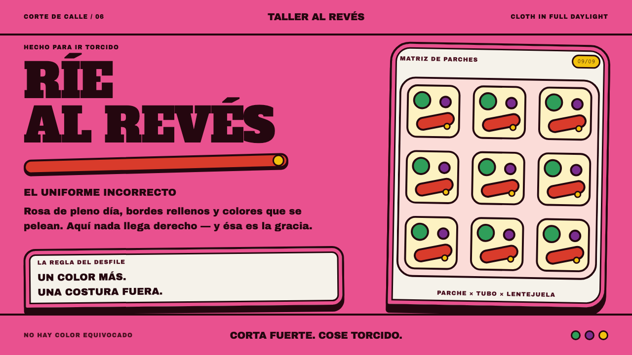
The marimonda is a carnival hood sewn from whatever cloth was left over, and its design language makes loudness a principle: a rose-pink ground, black padded seams, and patches of red, yellow and green that refuse to agree.
Marimonda Mask in brief
The Marimonda Mask style takes its look from one of the best-known figures of the Carnaval de Barranquilla, the great street carnival of Colombia's Caribbean coast. The marimonda itself is a hood of bright cloth with two padded eyeholes, a pair of elephant-like ears and a long, floppy nose sewn on in whatever color happened to be left over. Translated into a design system, that becomes a rose-colored cloth ground, thick black seams that read like padded piping, and patches of red, yellow and green set against each other without apology.
The central idea is that the noise is the point. Most visual systems exist to reconcile colors and quiet the page; this one exists to let the colors argue. A layout in this style is built like a garment rather than like an architectural grid. Panels are stitched onto a ground, edges are visibly sewn, sequin-like trim does the work of dividers, and the headline is set so heavy that it nearly blocks the column it sits in. Nothing is quite level, and that is deliberate.
It is also a satirical style, and the satire is part of what makes it usable. The marimonda was made by people who could not afford a costume in order to laugh at people who could, so the visual language carries a festive, slightly rude energy: closer to a neighborhood parade than to a boutique. Used with confidence it signals humor, pride of place and a refusal to be polite about color. Used timidly it collapses, because a marimonda that has been harmonized is just a pink page.
Where does Marimonda Mask come from?
The marimonda comes from Barranquilla, the port city on Colombia's Caribbean coast, and specifically from the working-class neighborhood of Barrio Abajo. Its documented era runs from roughly the 1880s to the present day. The founding story is one of improvisation and mockery in equal measure: the first marimondas were cut from sacks by people who could not afford a costume and wanted to laugh at those who could. The poverty of the material was not hidden; it was turned into the joke. A sack becomes a hood, two holes become padded eyes, and whatever scraps of colored cloth could be found become the ears and the nose.
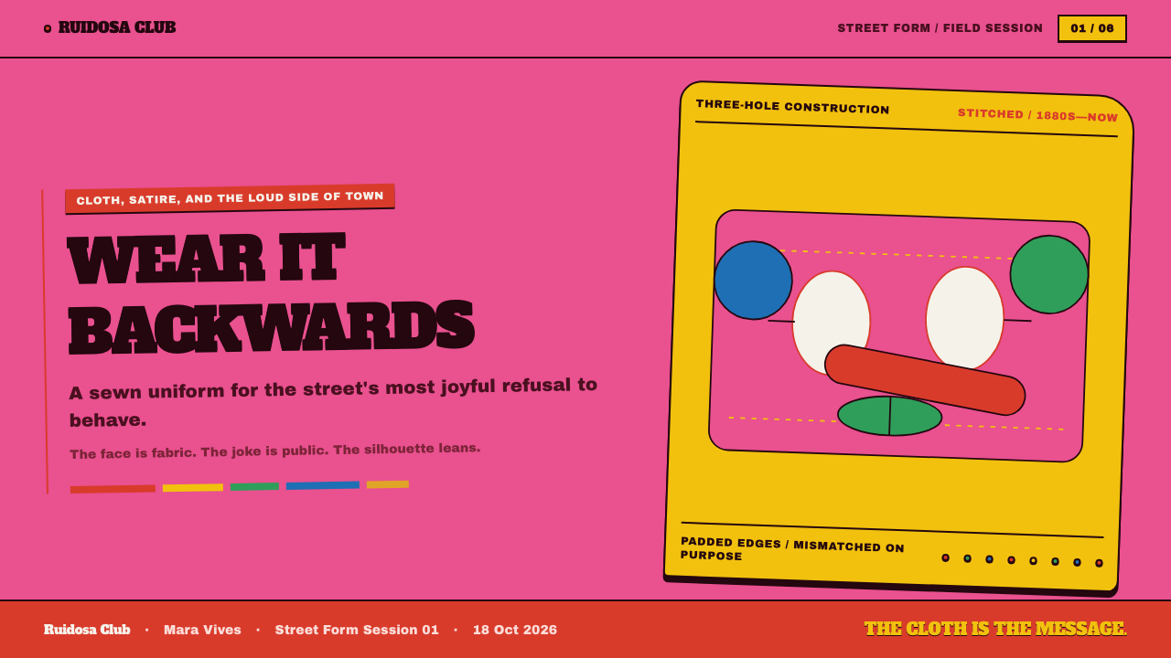
The costume that goes with the mask completes the joke by inverting formal dress. The wearer puts on a white shirt and a waistcoat, then adds two ties, one of them hanging down the back, and trousers worn backwards, and carries a rubber whistle. Everything is inside-out on purpose. The outfit quotes the clothes of the respectable city gentleman and then turns them around, so that formality itself becomes the target of the humor. The long nose and the oversized ears sharpen the caricature: the face is no longer a face but an exaggeration of one.
The marimonda belongs to the wider world of the Carnaval de Barranquilla, and beyond it to a family of Caribbean carnival satire and Colombian popular masquerade traditions. In that family, masks and costumes give ordinary people a license to mock, to exaggerate and to turn the social order upside down for a few days. The marimonda has stayed unusually close to that original job. It is a figure of the street, made by hand, and its comic force depends on being visibly homemade. From the 1980s onward the tradition also saw a revival of the comparsa, the neighborhood troupe that parades together, and groups such as the Marimondas del Barrio Abajo are part of how the figure is carried forward today.
Over time the sack gave way to bright polyester cloth, but the grammar stayed the same: a hood, padded eyeholes, ears, a nose in the wrong color. This is what the design system inherits. It does not imitate a particular mask; it imitates the logic of making one, where color comes from what is available, edges are stitched rather than drawn, and harmony is never the goal. The tradition states the rule in plain terms: once the colors are reconciled, it stops being a marimonda and becomes someone else's carnival.
What defines the Marimonda Mask look?
Color
The ground is a rose-pink cloth, applied without apology, and the patches that sit on it are red, yellow and green — hues chosen for their collision, not their compatibility. Black appears as the seam color that holds everything together. There is no tonal ramp and no tasteful neutral to calm the page down. Color behaves like leftover fabric: it is whatever was available, and it is meant to clash.
Seams and Piping
Edges are thick, padded black seams rather than thin drawn rules. A border here is something that has been sewn: raised, slightly irregular, with the idea of stitching still visible. Where another system would use a hairline to separate two areas, this one stitches them together, so panels feel attached to the ground instead of floating above it.
Typography
Headlines are set in an extremely heavy display weight, so fat that they almost fill the whole column and block the text area. The type competes with the colors rather than yielding to them. Supporting text stays plain and legible beside it, because a page this loud needs one calm place to read. The contrast between shouted headline and quiet body is the main typographic device.
Trim and Dividers
Sequin-like trim does the job that rules and spacers do elsewhere. A line of sparkling dots separates sections, edges a card or underlines a title. It adds glitter without adding depth, in keeping with a cloth costume that catches daylight rather than stage light.
Nothing Quite Level
Alignment is intentionally approximate. Patches sit a little askew, shapes overlap their neighbors, a nose hangs in the wrong direction. The imperfection is not a texture filter laid on top; it is the result of hand assembly. A layout should feel cut and sewn by a person with scissors, so strict mathematical symmetry works against it.
Daylight, Not Spotlight
This is a light-ground system built from loud daylight cloth. Surfaces are flat and matte, like fabric under the sun, with no glow, no glassy sheen and no dark-mode drama. Depth comes from padding and overlap — a seam that stands proud, a patch laid over a patch — rather than from soft ambient shadow.
Inversion and Humor
The costume turns formal dress inside-out, and the style does the same to design etiquette. The expected order is reversed: decoration comes first, hierarchy is established by volume, and the rules of polite palettes are broken on purpose. This inversion is the style's real signature, and it should be done with enough confidence that the joke reads as a joke rather than as a mistake.
Who shaped Marimonda Mask?
César Morales Mejía is named among the key figures of the marimonda tradition as it is documented today. For a reader of the style, his biography matters less than what his presence in the record signals: the marimonda is not an anonymous folk motif but a living craft, carried by named people who make, wear and teach it. When you borrow its look, his name is a reminder of where the look comes from.
The name points to the neighborhood where the figure took shape and to the groups that keep it alive. A comparsa is a troupe that parades together, and its members tend to build their costumes by hand, passing colors, patterns and jokes from one season to the next. The collective, more than any single maker, is the author of the marimonda as it appears on the street.
The carnival is the setting that gives the figure its meaning. It gathers masquerade, music and satire into a single public festival, and the marimonda is one of its recognizable characters. Understanding the carnival as a license for open mockery explains the design logic better than any style guide could: the loudness is not decoration, it is the way the figure speaks.
How do you use Marimonda Mask today?
Marimonda is a high-voltage style, best used when the content wants to be seen and remembered and when the audience is in on the joke. Its principles are easy to state: let the ground be loud, stitch the edges, let the colors clash, and keep exactly one place on the page calm enough to read. The skill lies in committing to all four at once.
On presentation slides the style suits covers and section openers best. A cover can be a single rose-colored sheet with a heavy headline that nearly fills the width, a black padded border running around the frame and one or two clashing patches in the corners. Content slides should keep the cloth ground but simplify: one stitched panel for the main point, a trimmed divider in place of a rule, and body text left plain. Data slides can use the clashing palette to separate series, which works as long as labels sit on a calm area and the chart keeps a clear baseline.
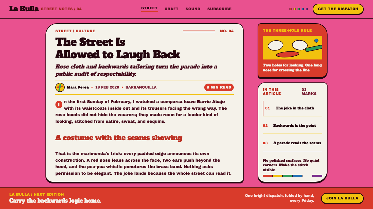
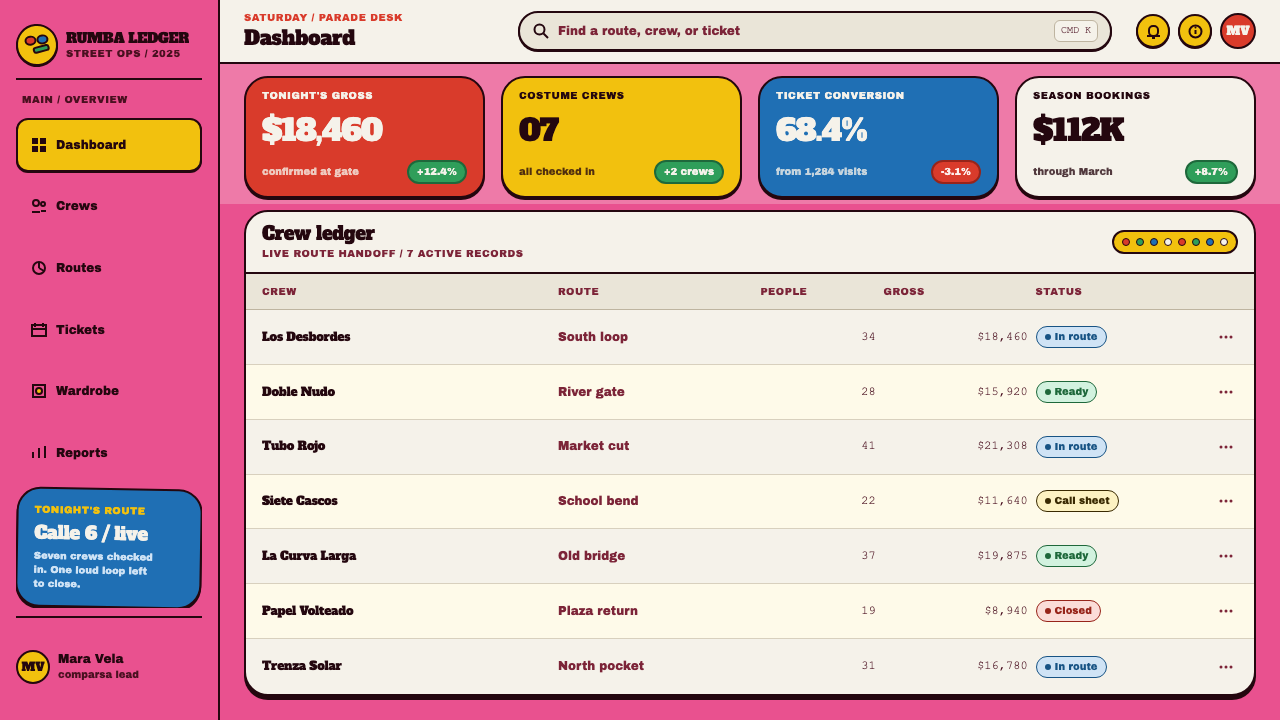
For web interfaces the style is a better fit for playful products than for dense tools: event pages, ticketing, food and drink brands, community and creator sites, onboarding screens and empty states. Cards can be treated as stitched patches with a thick dark edge, buttons as sewn labels, section dividers as sequin trim. In a dashboard or pricing page, keep the loudness in the frame and the headings, and let tables and forms rest on a calmer panel so that the data stays readable. The full rose ground belongs on marketing surfaces rather than on every screen of a working product.
In editorial and marketing work, the style gives posters, invitations, festival programs and campaign pages an immediate voice. Pull quotes can sit on patches of clashing color, headlines can be allowed to nearly fill the measure, and the sequin trim can mark the break between stories. Because the style is satirical at heart, it works especially well for copy that is irreverent, local and a little self-mocking, and badly for copy that needs to sound solemn.
The most common mistake is harmonizing. Designers instinctively pull the red, yellow and green toward a coordinated palette, round off the heavy seams and neaten the alignment, and the result is a generic pink template with none of the character. The second mistake is making every element equally loud. The marimonda has a loud hood and a plain white shirt. Keep one calm place, and keep the clash honest.
Marimonda Mask — FAQ
What is a marimonda?
The marimonda is a carnival mask and costume from Barranquilla on Colombia's Caribbean coast, associated with the Barrio Abajo neighborhood and with the Carnaval de Barranquilla. It consists of a hood of bright cloth with padded eyeholes, elephant-like ears and a long floppy nose, worn with a white shirt, a waistcoat, two ties, trousers on backwards and a rubber whistle. It began as a way for people who could not afford a costume to laugh at people who could.
Is this style only for carnival or party content?
No, but it needs content that can carry the joke. The visual language is festive and satirical, so it fits events, food and drink, music, community projects, creative portfolios and any brand with a sense of humor. It is a poor match for content that has to sound solemn, clinical or deeply formal, such as legal notices, medical information or financial disclosures, where the clashing colors would read as carelessness rather than wit.
Do the colors have to clash? Can I harmonize them?
The clash is the identity of the style. The tradition treats color as whatever was left over, and a palette that has been reconciled stops reading as marimonda and starts reading as a generic pink theme. You can control the clash by choosing which area carries which color, keeping text on calmer surfaces and limiting the number of patches per screen, but you should not tune the colors until they agree.
Can the style work on a dark background?
It is built as a light, daylight system: the rose cloth ground and the flat, matte surfaces belong to a costume seen in the sun. A dark inversion is possible but loses the main premise, because the cloth ground does the work that a background does in other styles. If a dark version is unavoidable, keep the cloth colors on the patches, let the seams switch to a light tone so the stitched edge still reads, and avoid glow effects, which the style does not use.
How do I use a marimonda-inspired style respectfully?
Treat it as a living tradition rather than a costume for your brand. Name the source, link the style to the Carnaval de Barranquilla and the Barrio Abajo, and avoid using the figure to mock the community it comes from. The marimonda was created by people with little money to laugh at power; the satire should point upward, at pomp and pretension, not downward. Using the design language for humor, celebration and local pride keeps faith with that origin.
Related design styles
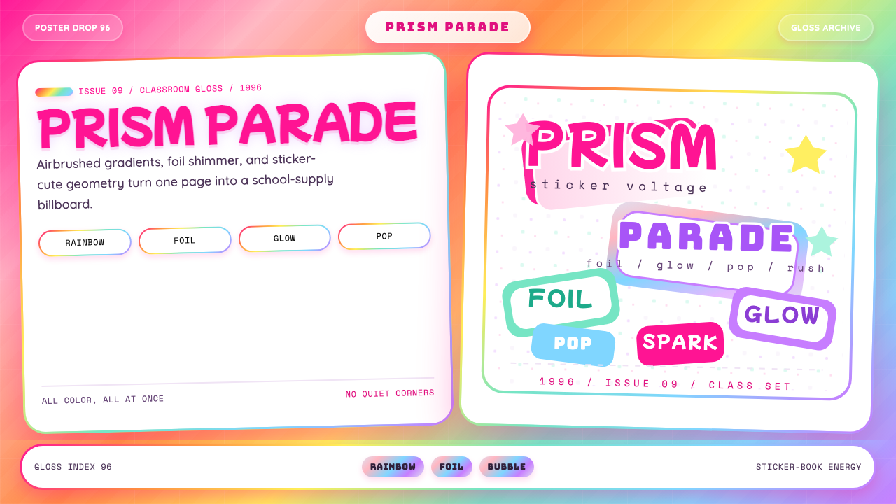 Lisa Frank Rainbow (90s)Pure sticker-saturation. Rainbow gradient, magenta glow, foil shimmer, bubbly…
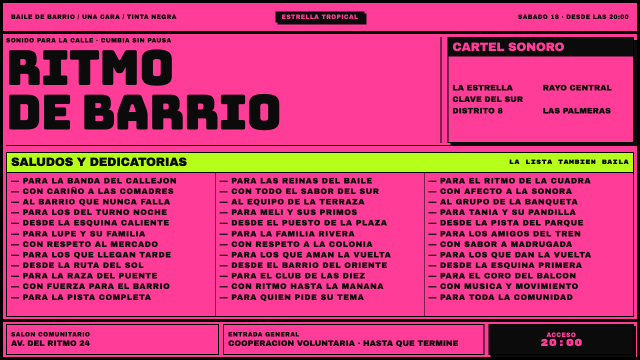 Sonidero FlyerNo quiet size survives here. Black Bungee type and ruled shout-out columns cr…
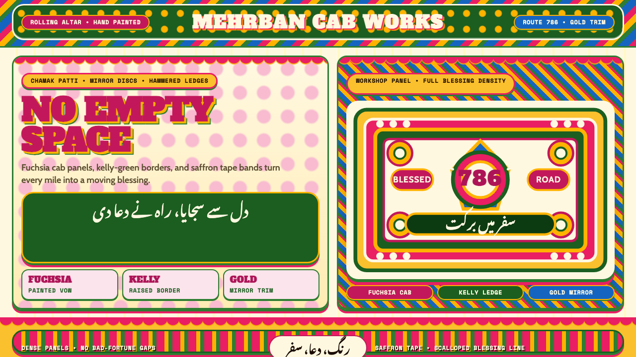 Pakistani Truck ArtBlessing crowds every inch. Fuchsia, kelly green, and gold stack into scallop…
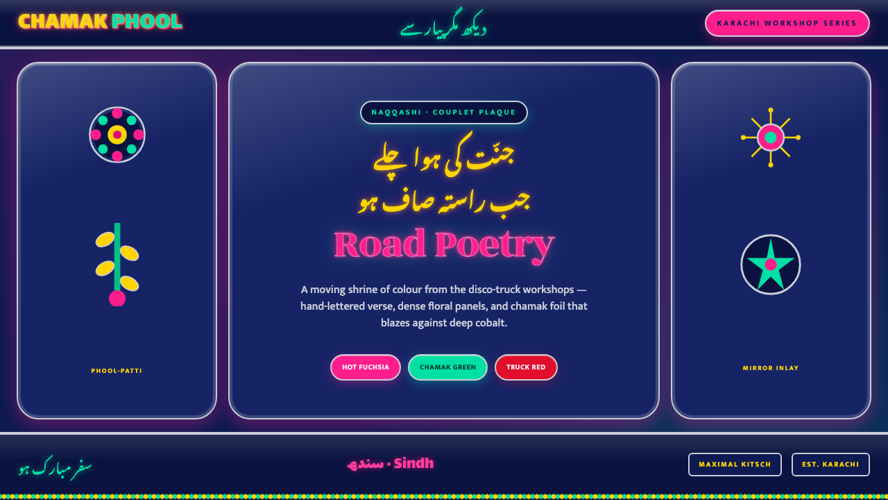 Sindhi Truck CalligraphyKarachi truck art, digitized. Hot fuchsia and chamak green blaze on deep coba…
 South Park Cutout (1997)Crude is the charm. Opaque paper shapes, marker-black seams, and snow-bright…
 Taarab Cassette SleevePrints at full volume. Violet ink, coarse halftone, and crooked slab letterin…