What is South Park Cutout (1997)?
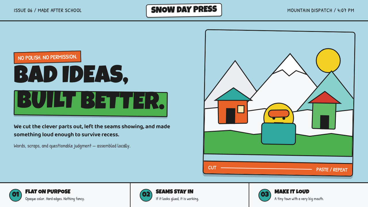
South Park Cutout makes roughness the point: opaque paper shapes, marker-black seams, and snow-bright color refuse every polished cartoon convention.
South Park Cutout (1997) in brief
South Park Cutout is the visual language associated with South Park from its 1997 series premiere onward: a construction-paper collage made to look visibly assembled rather than smoothly drawn. Heads read as circles, torsos as rectangles, and limbs as blunt, snap-jointed pieces. Every element appears as an opaque shape placed in front of another opaque shape, with no attempt to disguise the order of assembly.
Its setting gives the style much of its force. A snowbound Colorado town sits beneath a pale robin’s-egg sky, where white snow meets kelly-green grass along a hard, conspicuous seam. Mountains, homes, characters, and props share the same cutout logic. The world is not rendered as a continuous space; it is built as a stack of colored surfaces whose overlaps remain legible.
The result is deliberately and gleefully crude. Visible paper edges, slightly off registration, and marker-like black outlines turn apparent limitations into a visual attitude. The style is an anti-Disney proposition: rather than polishing away evidence of making, it keeps the evidence front and center. It has the directness of a child’s diorama, but its adult-animation context gives that handmade innocence a confrontational edge.
Where does South Park Cutout (1997) come from?
The supplied origin places the beginning in 1992, with the Spirit of Christmas shorts. That early cutout context matters because the eventual series did not begin from an ambition to simulate a seamless animated world. Its visual premise was construction-paper collage: torn or cut material, flat placement, and an image whose physical assembly could remain visible.
South Park premiered as a series in 1997 and continues as an ongoing work. The move from short-form origin to continuing series preserved the core visual joke instead of replacing it with conventional cartoon finish. Circle heads, rectangle bodies, segmented limbs, loud opaque color, and black seams stayed central because they are not incidental decoration; together, they establish the world’s rules.
The style belongs to several overlapping traditions named in the source material: cutout animation, DIY and lo-fi aesthetics, adult animation, and construction-paper collage. Cutout animation supplies the stacked, jointed silhouette. Construction-paper collage supplies the opaque colored planes and exposed edges. DIY and lo-fi aesthetics supply the refusal to make the result look expensive or frictionless. Adult animation supplies the tonal frame in which this childlike construction can carry sharp, profane, or unsettling material.
Its geography is split deliberately between story world and production world. South Park is set in Colorado, while production is associated with Los Angeles. That distinction helps explain why the snowbound town is not merely a backdrop. Snow, grass, sky, mountains, and simple buildings form a repeatable stage for cutout figures, each field broad enough to read as a separate paper layer. Trey Parker, Matt Stone, and Brian Graden are identified in the supplied origin as key figures connected to this history.
What defines the South Park Cutout (1997) look?
Opaque Paper Planes
The foundational unit is an opaque colored shape. A face, hat, sleeve, mountain, snowbank, or building front reads as a separate piece placed over a background, not as paint blended into a continuous image. This makes overlap the main source of depth: the viewer understands foreground and background by which paper edge covers which other shape.
Black Seams
Marker-black seams give the shapes their blunt clarity. They are not delicate contour drawing or polished ink work; they behave like emphatic boundaries between pieces of construction paper. The dark outline stabilizes loud color, makes simple features readable, and preserves a handmade edge even when the composition becomes visually busy.
Simple Character Construction
Characters are assembled from elementary silhouettes: circular heads, rectangular bodies, and limbs that look segmented rather than anatomically continuous. The construction is intentionally legible. A character does not need modeled volume, expressive shading, or natural movement to be recognizable; proportion, color blocking, facial placement, and clothing pieces do the work.
Snowbound Color Fields
The snowbound town relies on broad, clean fields of color: bright snow, green grass, a pale blue sky, and solid environmental shapes. The contrast is intentionally abrupt. When grass meets snow, the join should read as a physical boundary, not as a softly observed transition in nature. Color describes category and location before it describes atmosphere.
Visible Imperfection
Slightly off registration and exposed paper edges are part of the finish, not mistakes to erase. The image gains energy from looking assembled, copied, and a little wrong. This quality keeps the design from becoming merely geometric: the forms are simple, but their placement suggests hands, scissors, adhesive, and a willingness to let the process show.
Anti-Polish Comedy
The style’s crudity is comic because it is so unwavering. Nothing suddenly becomes lush, cinematic, or delicately rendered to prove technical sophistication. The crude cutout system applies equally to people, scenery, and props, creating an intentionally low-fi baseline against which adult-animation material can feel even more abrupt and mischievous.
Who shaped South Park Cutout (1997)?
Trey Parker is identified in the supplied origin as a key figure in the South Park Cutout history. His inclusion anchors the style in a named creative lineage rather than treating its rough paper construction as an anonymous visual trend. The relevant lesson for designers is that the look is inseparable from a deliberate commitment to visible assembly, blunt shape language, and comic wrongness.
Matt Stone is also named as a key figure in the supplied origin. Within this visual history, the association emphasizes that South Park Cutout is not simply a childlike craft reference. Its elementary geometry and lo-fi finish belong to adult animation, where an intentionally unsophisticated surface can sharpen tonal contrast rather than reduce expressive range.
Brian Graden appears among the key figures named in the supplied origin, alongside Parker and Stone. That concise origin record situates the style’s path between the 1992 Spirit of Christmas shorts and the 1997 series premiere. For the visual system, continuity is the important fact: the construction-paper premise remained strong enough to define an ongoing work rather than serving as a disposable early experiment.
How do you use South Park Cutout (1997) today?
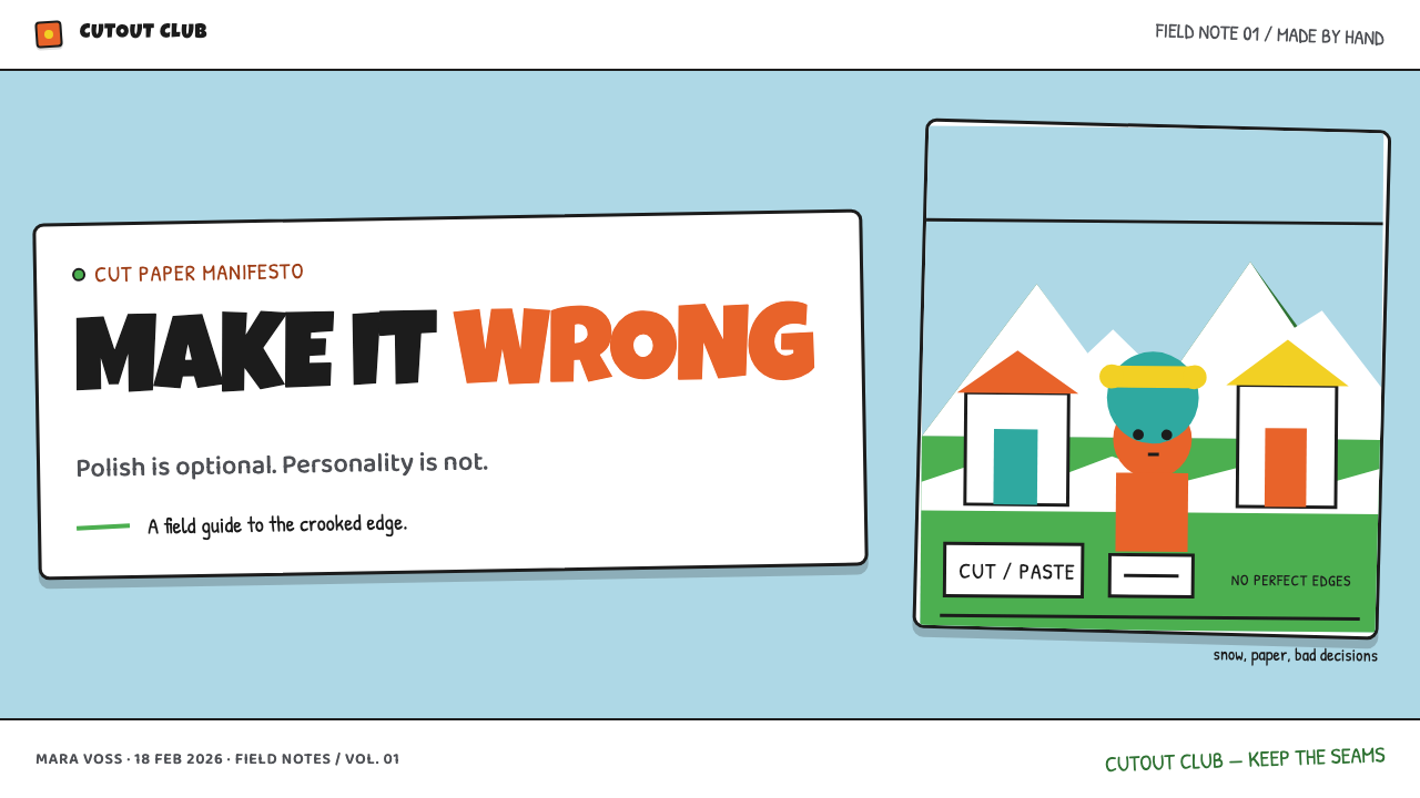
For presentation covers, use the cutout system as a blunt opening statement. Build one dominant opaque shape over a pale, snow-like field, then let a dark outlined title occupy a clearly separate paper layer. Keep the composition frontal and easy to decode. Content slides should retain the same assembly logic: headings, captions, illustrations, and section labels should look placed rather than blended into a seamless corporate template.
For content and data slides, simplify information into large categorical pieces. A chart can use solid bars, disks, or stacked fields with dark seams separating categories, while annotations behave like attached labels rather than floating interface chrome. Avoid polished dimensional charts, translucent overlays, and atmospheric imagery. The best result feels like a classroom diagram made intentionally loud, where each visual piece has a clear job and a visible edge.
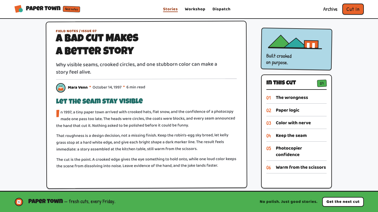
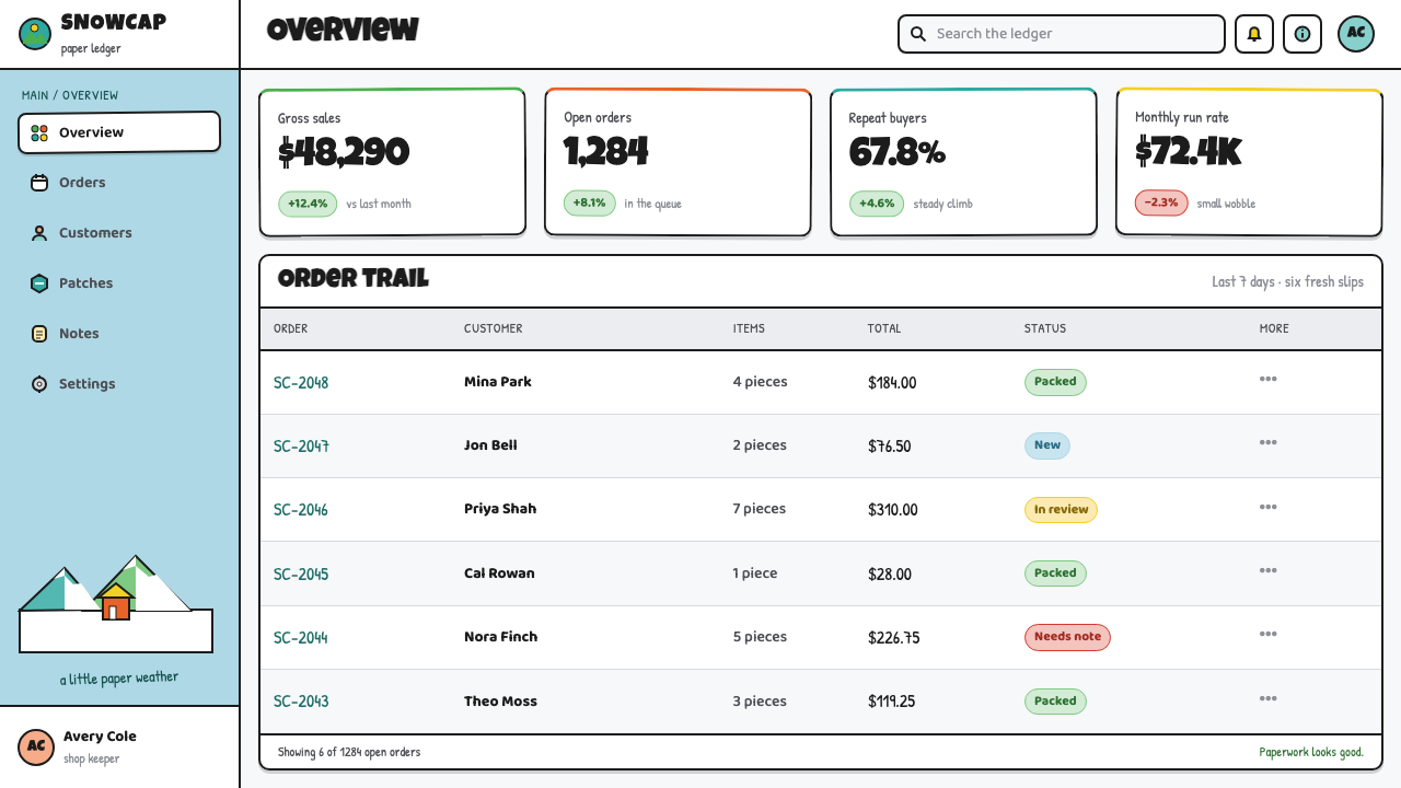
For web interfaces, this approach is strongest in dashboards, playful utilities, campaign pages, and compact pricing comparisons that benefit from immediate hierarchy. Use broad background fields, blunt cards or panels, high-contrast labels, and clearly separated controls. Interactive states can shift a paper-like piece forward or expose a stronger dark seam. The interface should feel assembled from modules, not softened into a premium glass surface.
For editorial and marketing work, use the style to make a page feel irreverent and unmistakably direct. A feature story can pair a large cutout headline with simple environmental silhouettes; a marketing page can alternate broad color fields, paper-edged callouts, and sparse blocks of copy. Leave room around the principal shapes so their crudeness reads as deliberate composition rather than accidental clutter. The snow-town palette works especially well when a pale sky and bright ground frame one loud object or message.
The common mistake is copying only the round heads, black outlines, and bright colors while smoothing away the seams. That produces generic cartoon nostalgia rather than South Park Cutout. Do not add soft gradients, glossy surfaces, realistic texture, naturalistic shadows, or highly detailed illustration to make the work more impressive. The visual authority comes from committing to opacity, hard joins, limited construction, and an almost defiant refusal to hide how the image was made.
South Park Cutout (1997) — FAQ
Is South Park Cutout just ordinary flat illustration?
No. Flatness is necessary but not sufficient. Ordinary flat illustration can still look polished, vector-clean, spatially smooth, or stylistically neutral. South Park Cutout depends on the implication of physical construction paper: opaque pieces overlap, edges remain visible, joints feel abrupt, and slight misregistration is welcomed. Its flatness is collage flatness, not merely a modern simplified illustration style.
Why are the seams and paper edges so important?
They explain the image’s construction and create its humor. A smooth outline says that an illustration has been perfected into a unified surface; a visible seam says that separate pieces were placed together and the maker chose not to conceal the join. In this style, that decision makes every character and landscape feel handmade, blunt, and slightly absurd. Removing the seams removes much of the attitude.
Can the style work without a snowy Colorado setting?
Yes, provided the construction rules remain intact. The snowbound town is central to South Park’s recognizable setting, especially its bright snow, green grass, pale sky, and hard environmental joins. But a different subject can still use the cutout language if it is built from broad opaque shapes, dark seams, simple assembled silhouettes, and deliberately visible overlap. Do not copy the setting when the structural visual logic is what the project needs.
Should a South Park Cutout-inspired interface imitate every character feature?
Usually not. The transferable parts are the visual principles: modular opaque layers, emphatic seams, restrained construction, blunt hierarchy, and deliberate imperfection. Reproducing distinctive character faces, costumes, or recognizable scene elements can make a project feel derivative instead of designed for its own purpose. Let the interface borrow the collage grammar while giving its information, icons, and illustrations their own subject matter.
What makes an application feel too polished for this style?
Anything that hides assembly or simulates expensive material finish can weaken it: seamless blends, glossy highlights, realistic lighting, delicate texture, or carefully modeled depth. The style does not require careless work; its crudity must be controlled. Shapes should still align according to a clear composition, labels must remain readable, and overlaps need purpose. The goal is not low quality. It is a confident, visible construction that treats roughness as part of the message.
Related design styles
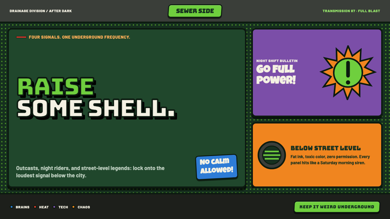 TMNT (1987 Saturday-Morning)Saturday-morning chaos, full blast. Sewer green, bandana brights and clogged…
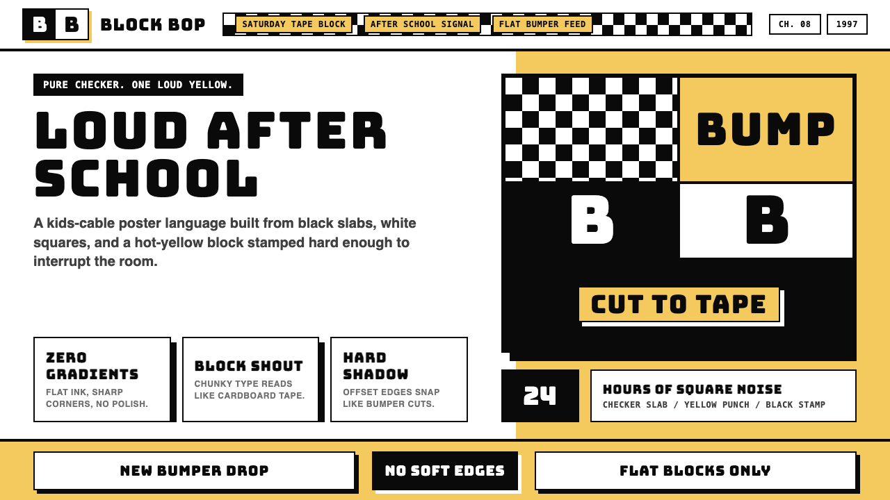 Cartoon Network 90s BlocksKids-cable noise, squared. Black-white checkerboards crash into hot-yellow Bu…
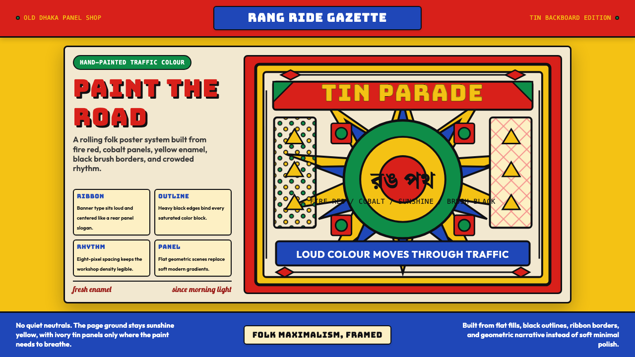 Bangladeshi Rickshaw Painting (Dhaka)Traffic shouts in color. Fire red, cobalt blue, and yellow panels lock into b…
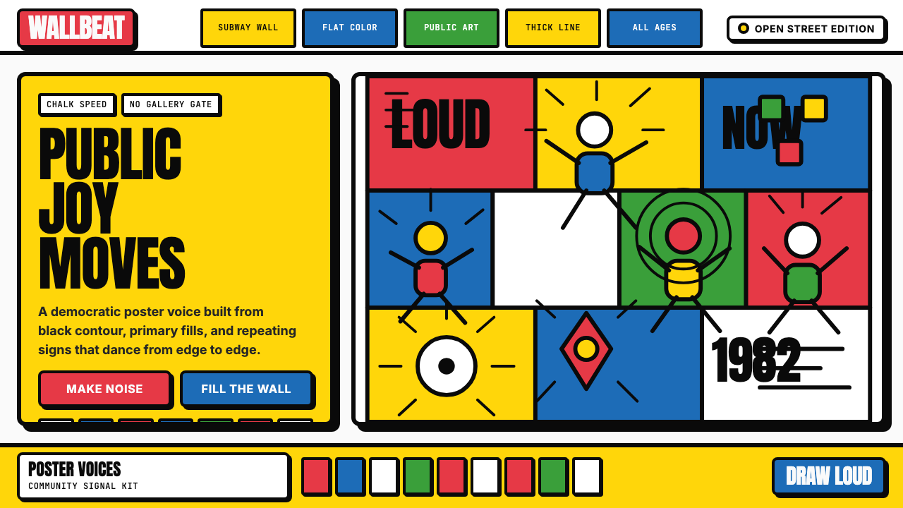 Keith Haring PopJoy refuses the gallery. Thick black contours pack primary color into a danci…
 Rick and MortyCartoon chaos goes nuclear. Acid green portals, cyan jolts, yellow panic, thi…
 Riot Grrrl Zine (1991)DIY fury, unpolished. Cream Xerox grain, black toner type, hot-pink marker co…