What is TMNT (1987 Saturday-Morning)?
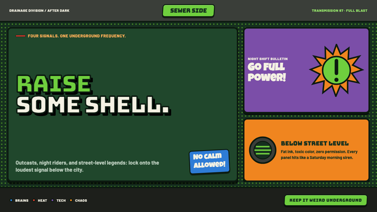
TMNT 1987 turns sewer grime, pizza grease, and Saturday-morning velocity into a loud graphic system built to hit like a screenprinted lunchbox.
TMNT (1987 Saturday-Morning) in brief
TMNT 1987 Saturday-Morning is the visual language associated with the animated world of four bandana-wearing turtles, pizza-fueled attitude, and relentless kid-media motion. Sewer green establishes the environment; blue, red, purple, and orange act as character-coded interruptions. The result is not a restrained comic-book system but a crowded, high-energy surface where every graphic device competes to be noticed.
Its defining image is a piece of franchise illustration that feels printed rather than polished. Thick black contours hold together bent figures, manhole covers, skateboards, pizza slices, and action poses. Benday-style halftone dots build texture and atmosphere, often pushed so densely that they feel clogged or imperfect. Bursts, speed lines, and hard cartoon shadows make the page feel as if it is always one frame away from impact.
The style belongs to 1980s Saturday-morning cartoon branding, where character identity had to travel quickly across television, toys, packaging, lunchboxes, and promotional graphics. The TMNT version combines comic-book reproduction cues with street-kid motifs and toyetic clarity. A pizza slice can become an emblem, a sewer lid can frame information, and a bandana color can identify a personality before the viewer reads a word.
Where does TMNT (1987 Saturday-Morning) come from?
The style emerged from TMNT's 1987–1996 animated era, beginning with the series debut in 1987 and reaching its strongest toy-and-television saturation from 1988 through 1991. Its origin record spans Mirage Studios in Massachusetts and Murakami-Wolf-Swenson animation in Los Angeles. That split matters visually: the system carries comic-derived marks while being organized for animated, repeatable, merchandise-ready recognition.
The approved origin material identifies Kevin Eastman, Peter Laird, Fred Wolf, David Wise, and Chuck Lorre as key figures in the theme's history. Their presence situates the style within a franchise-making process rather than a single isolated illustration practice. The visual language had to support characters, stories, action, jokes, logos, and commercial surfaces at once, which helps explain its willingness to make every familiar object visually perform.
Four movements converge in the result: 1980s Saturday-morning cartoon branding, toyetic character design, comic Benday and halftone illustration, and skate-and-street kid subculture. Each contributes a distinct pressure. Branding demands instant recognition; toyetic design favors silhouettes and repeatable accessories; halftone illustration creates a printed comic surface; street culture supplies skateboards, graffiti-like wordmarks, and urban sewer infrastructure.
The finished aesthetic is therefore maximalist by function, not merely by mood. A bandana must remain legible amid a crowded action scene. A wordmark must feel at home on subway tile, packaging, and a cartoon title screen. A sewer setting must remain playful rather than grim. TMNT resolves those demands with blunt contour, saturated accents, compressed texture, and a visual vocabulary that treats mess as evidence of momentum.
What defines the TMNT (1987 Saturday-Morning) look?
Sewer Green World
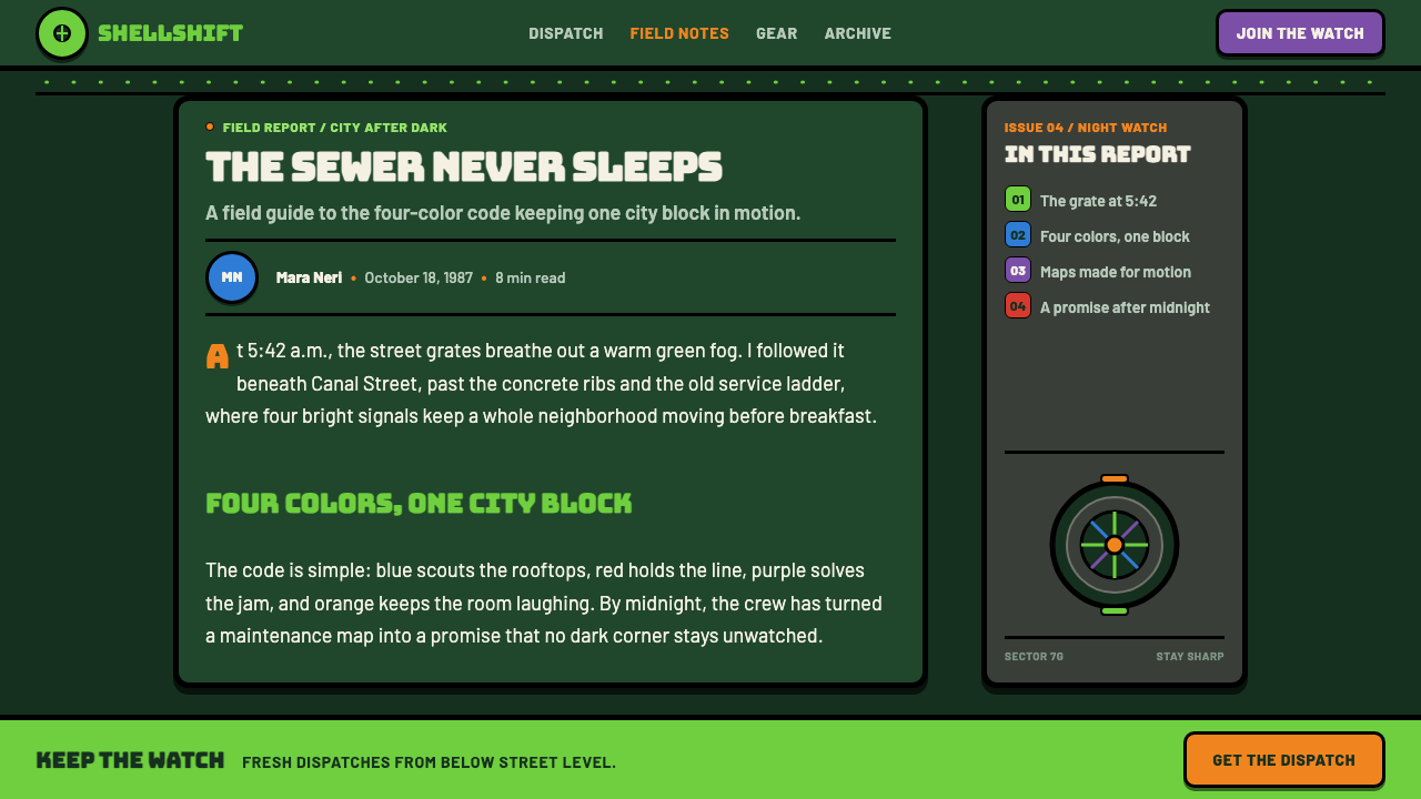
Sewer green is the dominant environmental field, not a polite accent. It establishes damp tunnels, tiles, sludge, and underground city infrastructure before any character enters. Because the world color is so assertive, brighter bandana hues read as immediate signals. Green should feel inhabited, scuffed, and graphic rather than botanical, luxurious, or serene.
Bandana Accent Logic
Blue, red, purple, and orange are the cast's essential accent colors. They work best as concentrated identifiers on masks, labels, bursts, controls, and small graphic interruptions. Their purpose is recognition and energy, not palette completeness. Let one accent lead a composition, then use the others as brief collisions rather than equal decorative coverage.
Fat Black Contours
Heavy black outlines are the structural skeleton of the style. They separate green sewer atmosphere from character color, preserve readable silhouettes, and make objects feel cut from printed stock. Lines should be confident, visibly cartooned, and willing to bulge around motion. Fine elegance works against the system; contour is supposed to carry force.
Clogged Halftone Texture
Benday-style dots bring comic reproduction into the foreground. In this treatment, the dots are not a delicate vintage filter; they are dense, visible, and sometimes almost overprinted. Use them to dirty empty fields, deepen shadows, separate bursts from backgrounds, or make a surface feel like mass media. The texture should add noise with intention.
Action Bursts and Speed Lines
Motion is drawn as a graphic event. Explosive starbursts, diagonal streaks, flying fragments, and exaggerated directional marks can surround a message or object even when nothing is literally moving. These devices create cartoon urgency and stop a dense layout from becoming static. They should point attention somewhere specific, not become background confetti.
Bulging Street Wordmark
Type and lettering should feel physical, loud, and slightly inflated, as if sprayed onto subway tile or pressed into packaging. The TMNT wordmark logic resists neutral corporate typography. Headlines can lean, swell, stack, or collide with graphic shapes, while supporting text remains sturdy and highly legible. The contrast is between exuberant display lettering and dependable information.
Who shaped TMNT (1987 Saturday-Morning)?
Kevin Eastman is listed among the key figures in the approved TMNT origin material. In the visual history of this theme, his name anchors the franchise's Mirage Studios origin and reminds designers that the polished cartoon system still draws power from comic-derived attitude, exaggerated marks, and unruly printed texture.
Peter Laird is another key figure named in the theme's origin record. His inclusion locates the style in the same Mirage Studios lineage and reinforces the connection between the turtle world and comic illustration. That connection is visible wherever thick contour, halftone texture, and oversized graphic gestures take priority over polished realism.
Fred Wolf appears among the theme's key figures and connects the style to its animated Saturday-morning form. The significance for designers is systemic: this is a language made to survive repetition, fast recognition, and constant action. Its shapes need to read instantly, even when the frame is crowded with jokes, props, and movement.
David Wise is identified as a key figure in the supplied origin material. Within this educational style frame, that listing helps position TMNT as a narrative world rather than only a logo package. The visual system needs room for humor, action, recurring settings, and character contrast, which is why it rewards expressive props and scene-building motifs.
Chuck Lorre is included in the approved list of key figures for the theme. His listing belongs to the broader creative history surrounding the 1987 Saturday-morning era. For the style itself, the useful lesson is tonal: TMNT must remain noisy, playful, and immediately readable, never so grim or intricate that its kid-media charge disappears.
How do you use TMNT (1987 Saturday-Morning) today?
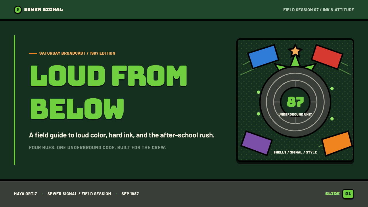
For presentation covers, use sewer green as the world and make one oversized object do the opening work: a manhole cover, pizza slice, turtle silhouette, or bulging headline. Let a single bandana accent take the lead, supported by thick contour and a small field of halftone texture. Content slides should keep the same attitude but assign information a cleaner path, using bold labels, comic dividers, and directional lines to move the eye between sections.
Data slides work best when charts are treated as action props rather than neutral office diagrams. Use the bandana colors to distinguish a limited set of categories, preserve black outlines around major forms, and place labels where they feel attached to the object. A burst can frame the main finding, while dots and sewer motifs remain peripheral. The data still needs to win; the cartoon language should amplify the takeaway, not obscure it.
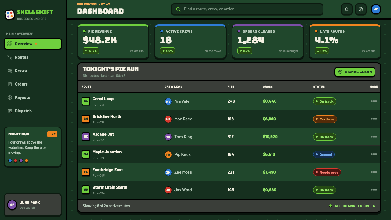
For web interfaces, the system suits dashboards, game-like utilities, youth-oriented product surfaces, and pricing pages that benefit from high scannability. Sewer green can carry the environment while panels, controls, and badges receive fat contours and hard cartoon depth. Use color-coded accents for alerts, plans, or states with discipline. A dense interface needs calm zones too, so reserve halftones and speed lines for moments that need emphasis.
Editorial and marketing work can use the style's print energy to make campaigns feel collectible. Build stories around graphic props, oversized headlines, section breaks that resemble comic action, and small recurring motifs such as pizza slices, tiles, skateboards, or manhole circles. The common mistake is applying every signal at once: all bandana colors, dots, bursts, outlines, and props on every surface. TMNT chaos works because the viewer can still identify the hero object and read the message.
TMNT (1987 Saturday-Morning) — FAQ
Is this style simply comic-book pop art?
Comic Benday and halftone illustration are central ingredients, but the TMNT 1987 system is more specific. It also depends on Saturday-morning animation, toyetic character recognition, sewer-world props, bandana-coded accents, and skate-and-street kid culture. Generic comic texture without those narrative and product cues can feel adjacent, but it will not carry the same franchise energy.
Can the visual system work without turtle characters?
Yes, provided the structural cues remain. Sewer green atmosphere, chunky black outlines, selected bandana-bright accents, halftone texture, urban infrastructure motifs, and action-driven composition can establish the language without direct character imagery. The important part is to retain the playful underground world and readable comic force rather than reducing the style to a green background.
How should color be controlled in a crowded layout?
Treat sewer green as the environmental constant, then choose one bandana hue as the main signal for the page or section. The remaining bright colors should identify secondary categories, small controls, or brief moments of impact. Black contour and halftone texture already create substantial visual density, so color needs to clarify the hierarchy instead of adding another layer of indiscriminate noise.
Where does TMNT 1987 styling become ineffective?
It becomes ineffective when the subject needs quiet authority, emotional delicacy, or long-form concentration without interruption. The style is built around saturated kid-media urgency and can make serious material feel unserious if every element behaves like an action cue. It is strongest when playful momentum, clear character coding, collectible print energy, and fast recognition support the message.
Related design styles
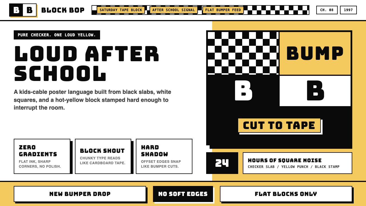 Cartoon Network 90s BlocksKids-cable noise, squared. Black-white checkerboards crash into hot-yellow Bu…
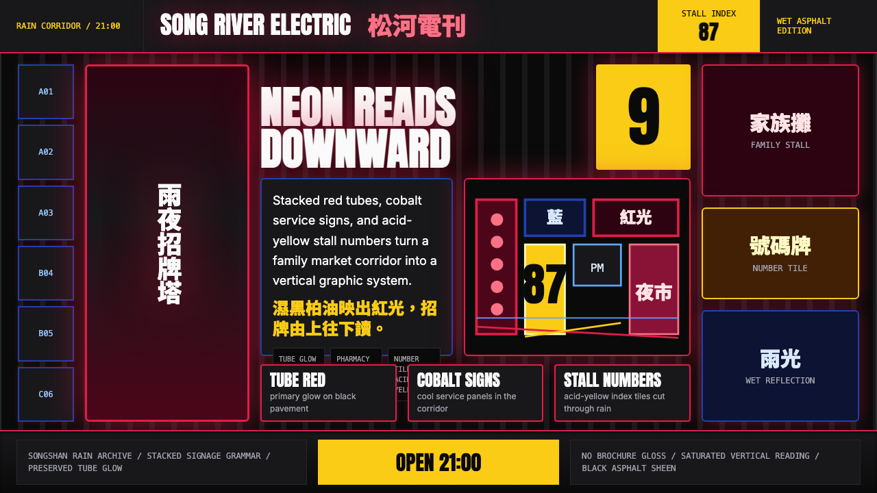 Taiwanese Raohe Night Market NeonTaipei night reads vertically. Neon red, cobalt panels, and acid-yellow numbe…
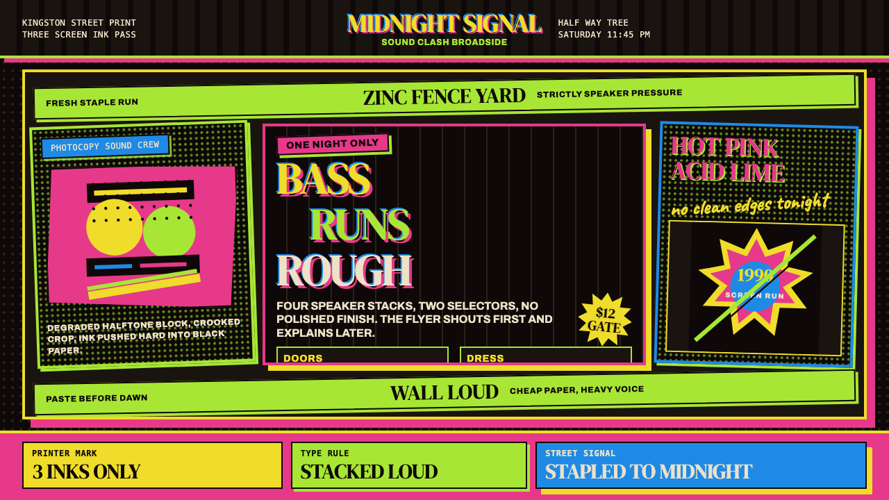 Jamaican Dancehall 1990 PosterMidnight volume. Acid lime and hot pink type stack like screenprint ink on bl…
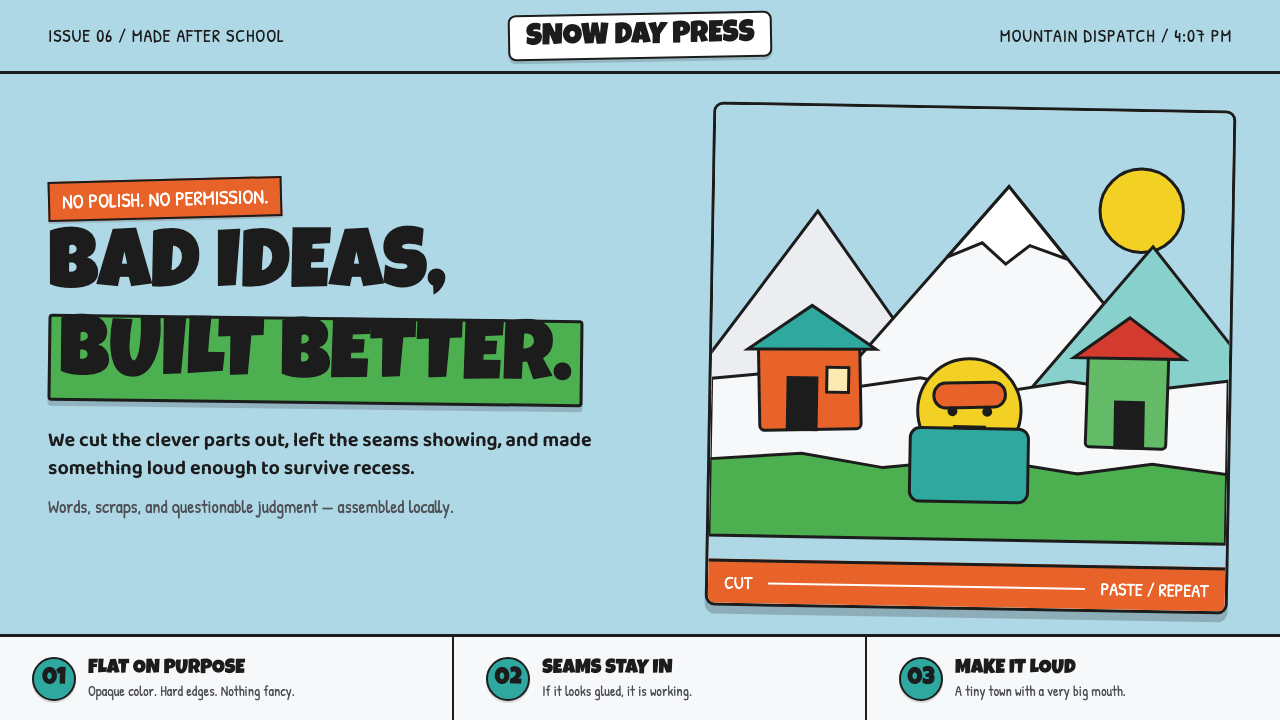 South Park Cutout (1997)Crude is the charm. Opaque paper shapes, marker-black seams, and snow-bright…
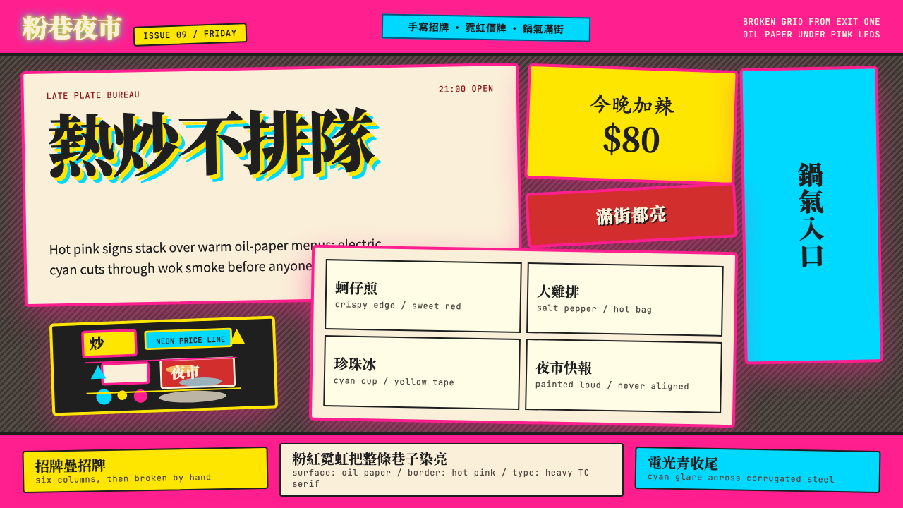 Taipei Shilin Night Market NeonLoud by design. Hot pink, neon yellow, and stacked TC serif signs break the g…
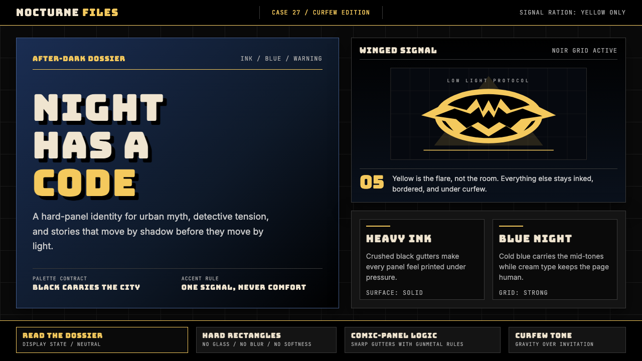 DC Comics Batman NoirGravity, not cheer. Black panels, Gotham blue, and one bat-yellow signal cut…