What is Gyaru?
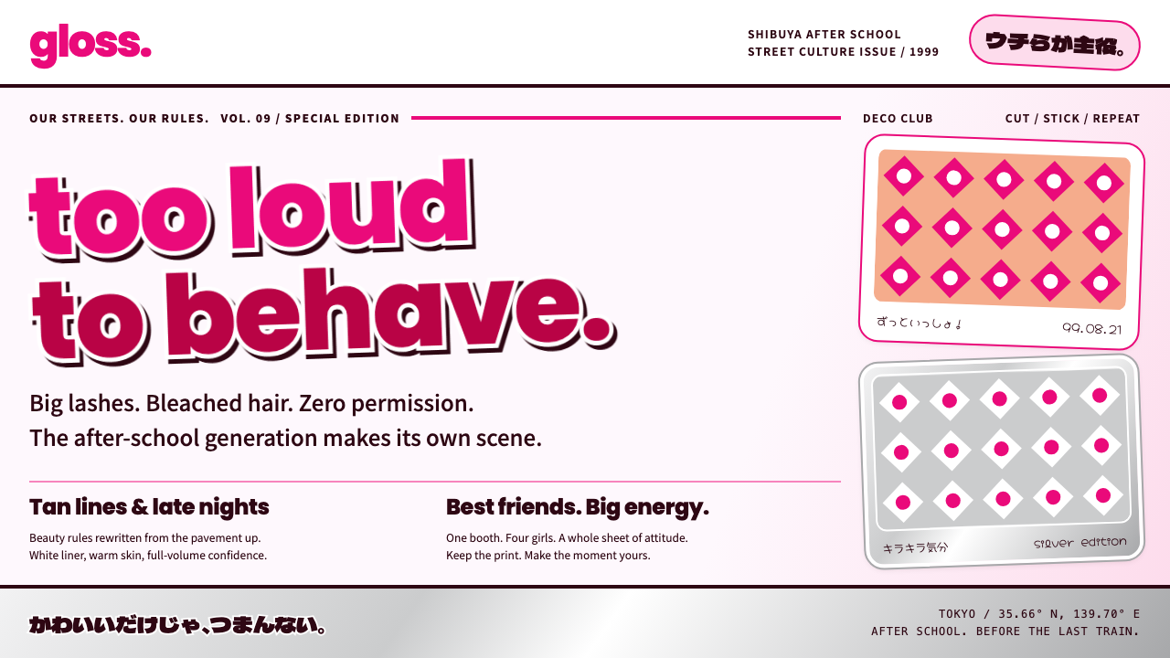
Gyaru is the Shibuya girls' answer to restraint: hot-pink outlined headlines, silver sticker grids, rhinestone frames and glossy white pages packed until they almost burst.
Gyaru in brief
Gyaru is the visual language of the girls of Shibuya who, in the late 1990s, turned the 109 department store into their headquarters. It was a street fashion first and a graphic style second, and its graphics came from the glossy covers of egg magazine: a fat, lowercase hot-pink masthead, headlines stacked at angles with thick white outlines, and models with tanned or bleached looks, white lips and pale eye makeup cut out and pasted against the page.
As a design style it carries all that noise into the browser. It uses purikura sticker grids, rhinestone-like frames, handwritten round lettering and the silver cylinder of the 109 building, laid over a glossy white surface. The result is loud, crowded and shiny, a surface where every inch is occupied and every element has a personality.
Where most modern interface design chases white space and quiet, gyaru does the opposite. It does not hide, it does not explain itself, and it does not apologize. Its core principle is presence: be seen, be loud and be unmistakably yours. It is a style for products that want to speak with confidence in a crowded room.

Where does Gyaru come from?
The culture behind the style peaked between about 1995 and 2000. The mid-1990s saw the Kogal and Amura boom, in which schoolgirls and young women set trends in fashion and slang around Shibuya, with singer Namie Amuro's look as a major reference. From 1998 to 2000 the more extreme ganguro and yamanba looks arrived, with deep tans, bleached or silver hair and pale makeup pushed as far as they could go.
Shibuya 109 was the physical center. The cylindrical department store, designed by architect Minoru Takeyama, held dozens of small boutiques aimed at young women, and its silver tower became both a shopping destination and a symbol. Girls dressed to be seen at 109, and the brands inside set the codes of the look. The building's silver cylinder later became a graphic motif of the style in its own right.
The printed record of the scene was the street-snap magazine. Egg was published in print from 1995 to 2014, and its covers and street-snap pages documented the girls themselves, with their names, dates and handwritten comments written in rounded lettering. The pages were deliberately full: there was no value in white space when every corner could carry another photograph, another slogan or another sticker. The magazine's graphic habits are the direct source of the style's layouts.
A parallel influence came from purikura and the keitai decoration culture of the Y2K period. Purikura photo-sticker booths produced small, glittery, annotated pictures that girls swapped and stuck on everything, while mobile phones were decorated with charms, rhinestones and stickers. The style's sticker grids and rhinestone frames come from this DIY, decorate-everything habit. Buriteri is named in the source material among the figures connected to the scene, alongside Takeyama and Amuro.
What defines the Gyaru look?
Hot-pink outlined headlines
Headlines are large, fat and pink, with thick white outlines around each character, and they are often stacked at slight angles. The outline makes them leap off any background, and the stacking turns text into a graphic mass. A lowercase, rounded masthead in hot pink anchors the identity, in the manner of the magazine covers the style grew from.
Glossy white ground
The base is a bright, glossy white that behaves like the coated paper of a magazine. It is not there to give quiet; it is there to make the colors and stickers on top of it look wet and shiny. The gloss provides a clean surface against which the crowding of elements reads as intentional rather than chaotic.
Silver sticker grids
Photos and labels are arranged in dense grids of small frames, like a sheet of purikura stickers, each with a metallic silver edge or a decorative border. The repetition gives rhythm, and the silver reminds viewers of the 109 tower. Grids are allowed to overlap and tilt, so they feel handmade rather than engineered.
Rhinestone frames
Frames and badges are edged with sparkling dots that imitate rhinestones, the way phones and accessories were decorated in the Y2K period. They add glitter without needing actual animation. Used on key elements such as profile frames and call-to-action buttons, they give the interface a jewelry-like detail.
Handwritten round lettering
Captions, dates and comments are written in a rounded, handwritten style, with hearts, stars and exclamation marks mixed into the text. This gives the page the intimate feeling of notes passed between friends. The handwriting contrasts with the bold headlines and keeps the system from feeling like an advertisement written by a committee.
Crowded on purpose
Layouts are intentionally full. Cut-out figures overlap headlines, stickers sit on top of photographs, and every corner holds another element. This is controlled maximalism: elements share a limited palette and consistent outlines, so the density reads as energy. The aim is abundance, not calm.

Who shaped Gyaru?
The architect of the Shibuya 109 building, named in the source material as a key figure. His cylindrical department store became the physical home of the culture, and its silver tower is a recurring graphic symbol in this style.
The singer whose look drove the Amura boom of the mid-1990s, when young women copied her fashion in large numbers. She stands for the mass, aspirational side of the scene and is one of the cultural touchstones that the style refers back to.
Named in the source material among the figures tied to the scene's later, more extreme phase. The name belongs to the culture of ganguro and yamanba looks, which pushed the style's boldness and loudness to its limit around 1998 to 2000.
The street-snap magazine, published in print from 1995 to 2014, whose glossy covers and crowded pages are the main graphic source of the style. It documented the girls themselves and gave the movement its lettering, layouts and its habit of filling every inch.
How do you use Gyaru today?
For slide decks, the style suits trend, beauty, fashion, entertainment and youth-culture presentations, where a bold, playful tone is welcome. A cover with a fat pink outlined title on a glossy white field makes an immediate statement. Content slides can use sticker-style frames for images and handwritten captions for quick notes, and data can be presented in chunky, colorful shapes with silver borders.
In web interfaces, it is best used for products with a social and expressive character: fashion shops, beauty and cosmetics, fan communities, photo-sharing and sticker apps, event pages and entertainment platforms. Profile frames, badges and buttons can carry the rhinestone and silver treatments, while the interface keeps the content blocks readable. Pricing pages can use bold outlined headings and sticker-like cards to make plans feel like collectible items.
For editorial and marketing work, it fits campaigns, magazine-like landing pages, limited drops and festival promotions that want to be loud and recognizable. Posters can stack outlined headlines at an angle over cut-out images, surrounded by small stickers and handwritten notes. It is an excellent match for nostalgia projects that revisit late-1990s and early-2000s Japanese youth culture.
The crowding needs structure beneath it. Keep a limited palette of hot pink, white and silver, keep outlines consistent and keep the main message large. Place body text on clean, bright panels so it remains legible, and decide which two or three elements should dominate. The style is maximalist, but good maximalism has a hierarchy.
The most common mistake is to be timid. A half-hearted version with a little pink and a few stickers looks like an error rather than a style, because the whole point is commitment. The opposite mistake is to let the crowding destroy legibility: if text cannot be read or the main action cannot be found, the style has failed. Finally, treat the culture with respect and use the visuals as design vocabulary rather than as a costume or a caricature of the girls who created it.

Gyaru — FAQ
What is the Gyaru design style?
It is a loud, glossy style drawn from the Shibuya girls' culture of the late 1990s and egg magazine. It uses a glossy white ground, hot-pink outlined headlines, silver sticker grids, rhinestone frames and handwritten round lettering, arranged in crowded, expressive layouts.
Where does the style come from?
It comes from Shibuya in Tokyo, centered on the 109 department store, with a peak between about 1995 and 2000. It draws on the Kogal and Amura boom of the mid-1990s, the ganguro and yamanba looks of 1998 to 2000, Japanese street-snap magazines, and purikura and keitai decoration culture.
Is it just maximalism?
It is a specific kind of maximalism with its own vocabulary: pink outlined headlines, silver grids, rhinestone details and handwritten lettering. General maximalism can use any ornament, but gyaru has recognizable cultural references, and it works best when those references are used consistently.
How do I keep it readable?
Limit the palette to hot pink, white and silver, keep outlines consistent, and place body text on clean, bright panels. Decide which two or three elements should dominate each screen. The crowding should feel intentional, with a clear main message that stays large and easy to find.
Which products suit it?
It suits fashion, beauty, entertainment, fan and photo-sharing products, event pages and nostalgia projects that want to be loud and recognizable. It is a poor fit for formal, medical or financial products, where its crowding and gloss would undermine trust.
Related design styles
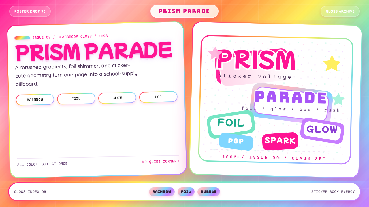 Lisa Frank Rainbow (90s)Pure sticker-saturation. Rainbow gradient, magenta glow, foil shimmer, bubbly…
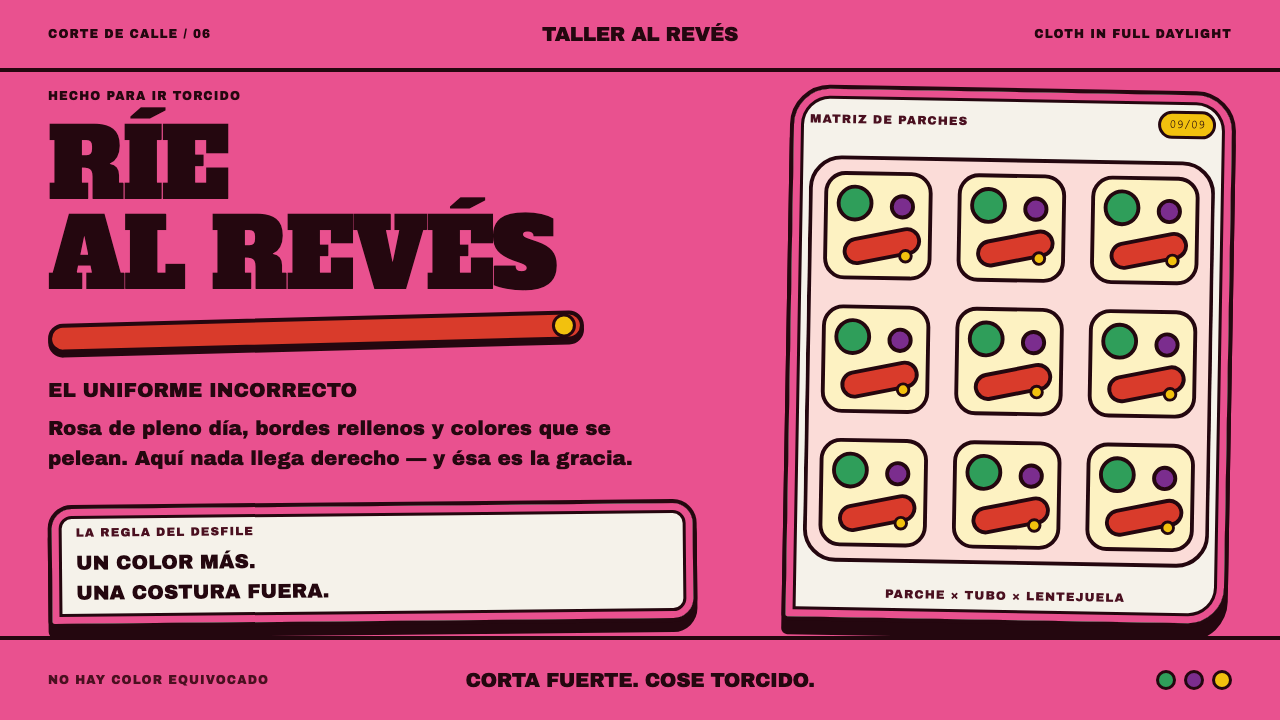 Marimonda MaskLoudness is the point. Rose cloth, padded black seams, and clashing red-yello…
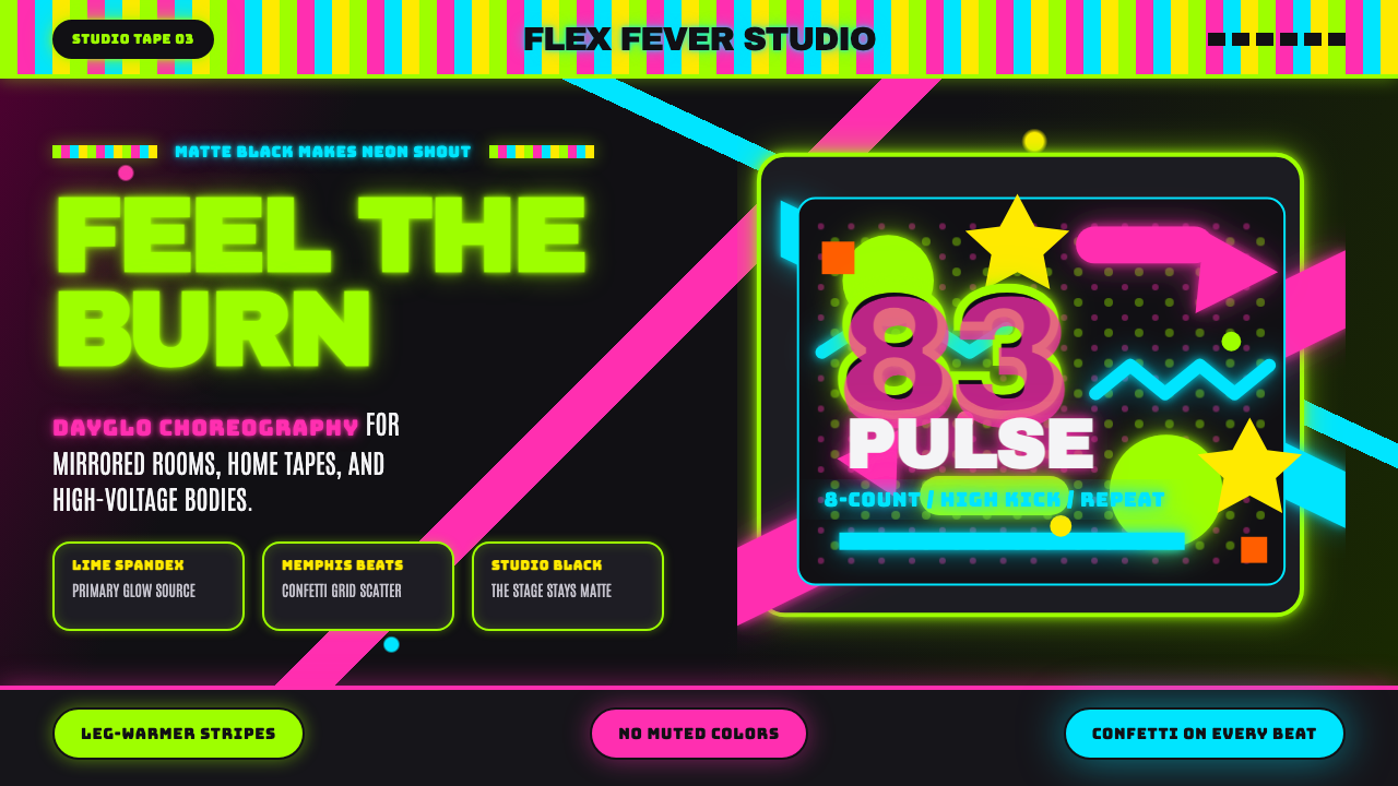 80s Aerobics Fluoro SpandexNeon refuses restraint. Lime spandex, pink-cyan confetti, and black-stage typ…
 Chicago HouseDarkness starts the track. Neon pink, yellow and cyan hit black like Xerox st…
 Memphis Web Pattern RevivalLoud is the point. Confetti dots, zigzags and Bacterio squiggles in hot magen…
 Studio Alchimia Anti-DesignModernism gets heckled. Coral, mint and mustard collide in dotted collage blo…