What is Sonidero Flyer?
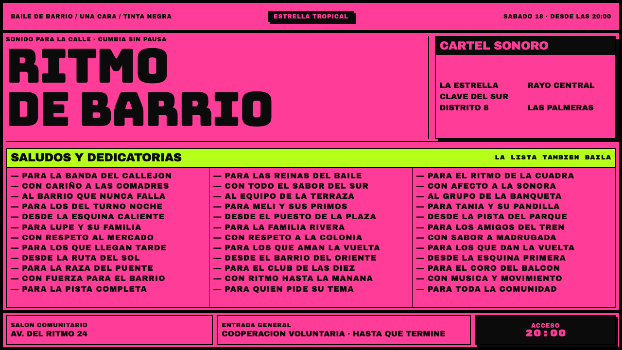
Sonidero Flyer is the design of a cheap, crowded sheet of fluorescent paper, printed in one black ink, where the shout-outs are the whole point and no size of type is allowed to be quiet.
Sonidero Flyer in brief
Sonidero Flyer is a light-ground design system modelled on the flyers of Mexico City's sonidero scene, the mobile sound systems that play cumbia at street and neighbourhood dances. A flyer costs almost nothing to make: one sheet of fluorescent paper, one pass of black ink on one side, a blank back, and a guillotine cut that is a little off-square. The design system takes those constraints as its whole palette and grammar.
What fills the sheet is people. A roster of sound systems and DJs is crammed into the page, followed by columns of saludos, the greetings, and dedicatorias, the dedications. The shout-outs are the reason anyone keeps the paper: to be named on the flyer is to be part of the night. So the layout is packed edge to edge, ruled into columns, and no size of lettering is left quiet. Venue, date and ticket price are squeezed into a band at the bottom.
The look is black, heavy, blocky lettering on saturated paper colour; ruled boxes and reversed blocks; columns that run to the trim; and a general sense of surplus. Where other styles use white space to signal quality, this one uses density to signal abundance, a night with so many names that the paper can barely hold them.
Where does Sonidero Flyer come from?
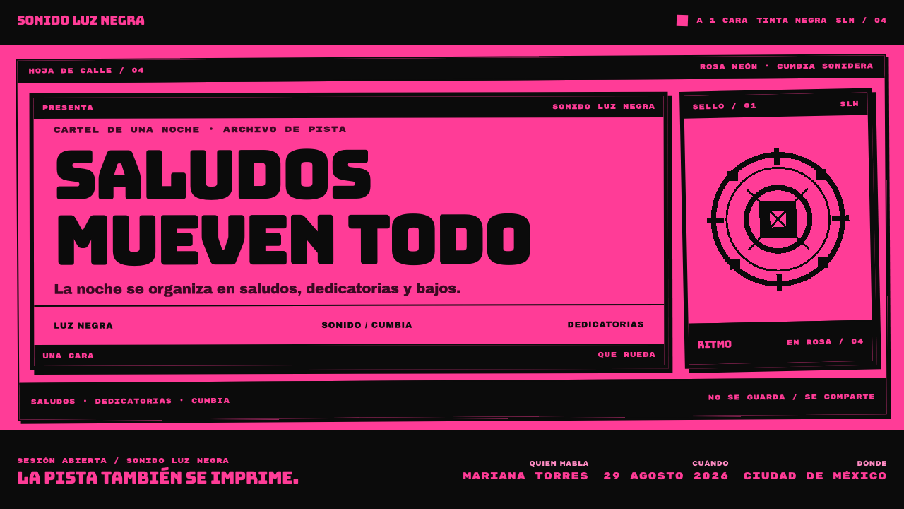
The look begins in the printing trade. Mexican poster shops sell four fluorescent stocks, yellow, orange, pink and neon green, and they quote a job in a phrase that sums up the economics: 'a 1 cara, tinta negra', one side, black ink. The back is left blank, and the guillotine is run a little off-square. Everything on the page is the single black of that one pass of ink: headlines, rules, reversed blocks and the smallest dedications. With only one ink, hierarchy has to come from size, weight, boxes and position rather than from colour. These constraints are not a pose; they are the budget.
The scene the flyers advertise is the sonidero, the sound-system dance culture of Mexico City. The source places it in the neighbourhoods of Tepito, Peñón de los Baños, Iztapalapa and Nezahualcóyotl, and ties it to cumbia, the dance music whose iconography fills the genre. At these dances the announcer reads out greetings and dedications over the music, and the flyer prints the same names on paper, which makes it the written version of the shout-out. That is why the names matter more than the artwork.
The source gives a print lineage from the 1980s, with a corpus of flyers running from 1990 to 2020. It names three strands: gráfica sonidera, the graphic idiom of the sonidero itself; Gráfica Popular, the wider Mexican tradition of popular printed graphics; and cumbia iconography, the shared stock of images and lettering that goes with the music. The design system sits where those three meet, a vernacular poster style made by people who print for the scene and belong to it.
Because flyers are ephemeral, handed out, pinned up and thrown away, the record of the style depends on people who collect and study it. Proyecto de Gráfica Sonidera, Jaime Ruelas and Polymarchs are the names listed as key figures in the source. For anyone using the design system this matters: the style has authors and archivists, and looking at the originals, and crediting the community, is part of using it well.
What defines the Sonidero Flyer look?
Fluorescent stock as the ground
The page colour is the paper: a flat, saturated fluorescent sheet. The shop sells yellow, orange, pink and neon green, and the system's signature version is pink. The ground is not a background layered under the design; it is the stock that the whole job was bought on. It must be flat and even, with no gradient and no texture added on top.
One black ink
Everything on the sheet is the same black: headlines, rules, boxes, reversed blocks and the finest print. There is no second colour, no tint and no soft grey. Variation comes from solid areas versus outlines, from large versus small, from letters knocked out of black blocks. This single-ink discipline is what keeps the sheet loud and legible at once.
No quiet size
There is no polite, small, airy type here. Display lettering is heavy, blocky and wide, like signage, and even the smaller levels are set dense and dark. Every size is meant to be heard. The hierarchy comes from steps between loud and louder, not from the contrast of a whisper against a shout.
Ruled shout-out columns
The saludos and dedicatorias are set in narrow columns separated by ruled lines, name after name, like a long roll call. The rules do the work that white space does elsewhere: they let the reader find a place in a crowded list. The columns are the heart of the sheet, because they are what people actually look for.
Crammed roster
The list of sound systems and DJs is packed together at the top, often in the largest and heaviest lettering. Names touch, overlap or butt against boxes, and the arrangement favours abundance over tidiness. The point is to show how many acts are on the night, and the crowding itself is the message.
The information band
Venue, date and ticket price are pushed into a strip at the bottom of the sheet. They are practical but secondary to the names, and the layout says so. This inversion, in which the logistics are small and the people are big, is one of the clearest signs that a design belongs to this style.
Off-square, made-cheap quality
The sheet is cut slightly off-square, printed on one side only, and left blank on the back. The system treats that as character. Small tilts, hard trims and slightly uneven alignment keep the layout from looking corporate, and remind the viewer that this is paper for handing out, not a finished product to be preserved.
Who shaped Sonidero Flyer?
The source lists Jaime Ruelas among the key figures for the sonidero flyer. This article does not add biography or dates beyond what the source gives. The name is a useful starting point for anyone who wants to look at the original flyers and the writing about them, and for crediting the people who documented the style.
As its name suggests, this is a project devoted to the graphic tradition of the sonidero. The source lists it as a key reference. For designers it points to the idea that these flyers deserve to be collected and read as a body of work, rather than treated as disposable ephemera or reduced to a font and a colour.
Polymarchs is the third name the source gives among key figures. As with the other two, the article keeps to what the source supports and does not invent details. It is a good name to follow if you want to see how the flyer idiom has been carried forward by designers who work with it today.
Mexican poster shops are the unnamed authors of the economics of the style. They sell four fluorescent stocks and quote jobs as one side, black ink. Their price list is, in effect, the design brief: one ink, four papers, off-square trim. Any serious use of the style should keep that practical, workshop origin in mind.
How do you use Sonidero Flyer today?
Sonidero Flyer suits work that wants energy, community and abundance, and that is happy to be loud. Its strength is that it makes long lists feel exciting instead of tedious. It is less suited to subjects that need calm, luxury or a lot of explanatory text, because the whole system is built to push density and volume.
On slides, make the cover a full-bleed fluorescent field with the title in the heaviest black lettering and a ruled box or reversed block behind the key phrase. Content slides can be built as packed columns of short items, such as team names, speakers or product lines, separated by rules. Data slides work as rosters and rankings: long lists of names with figures beside them, set in dense blocks, with a single reversed band for the highlight.
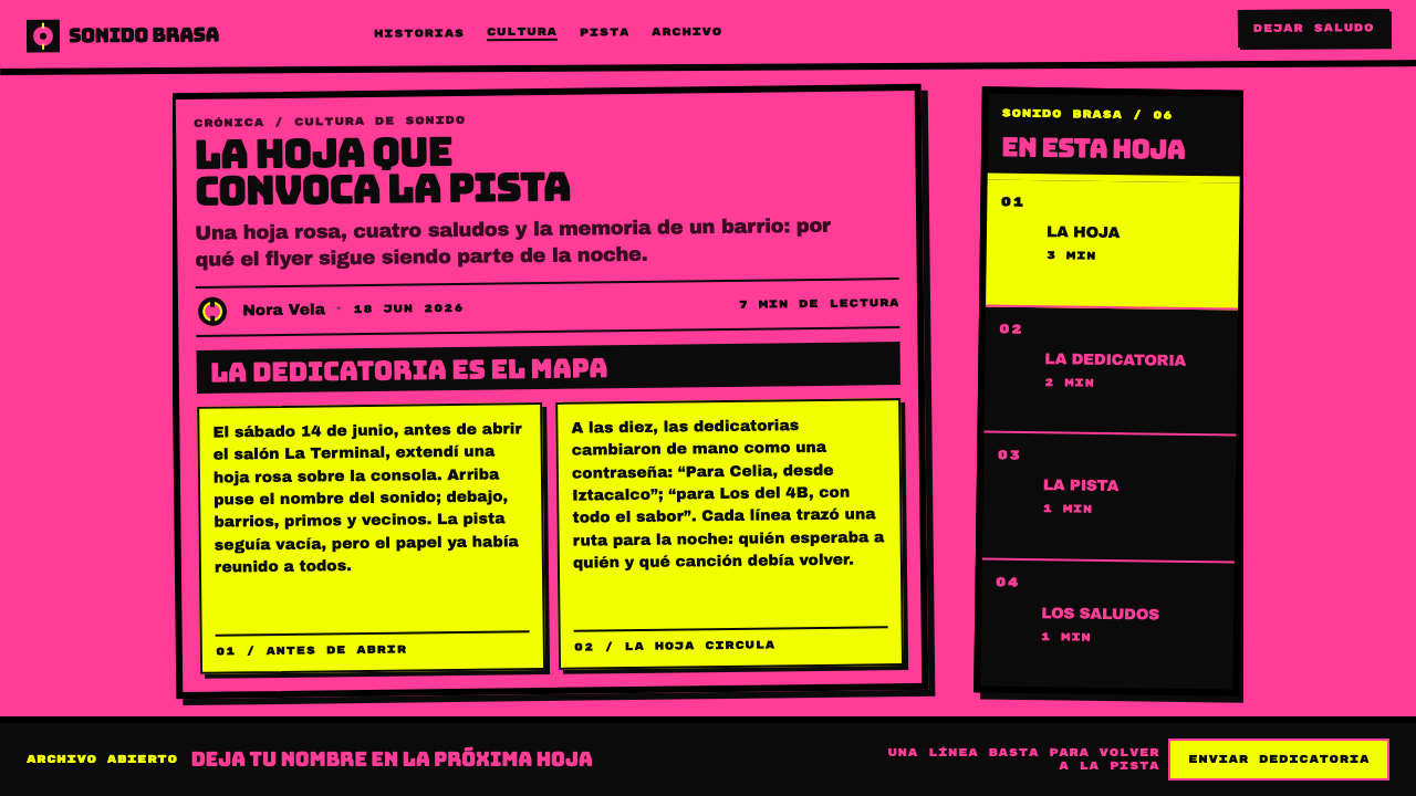
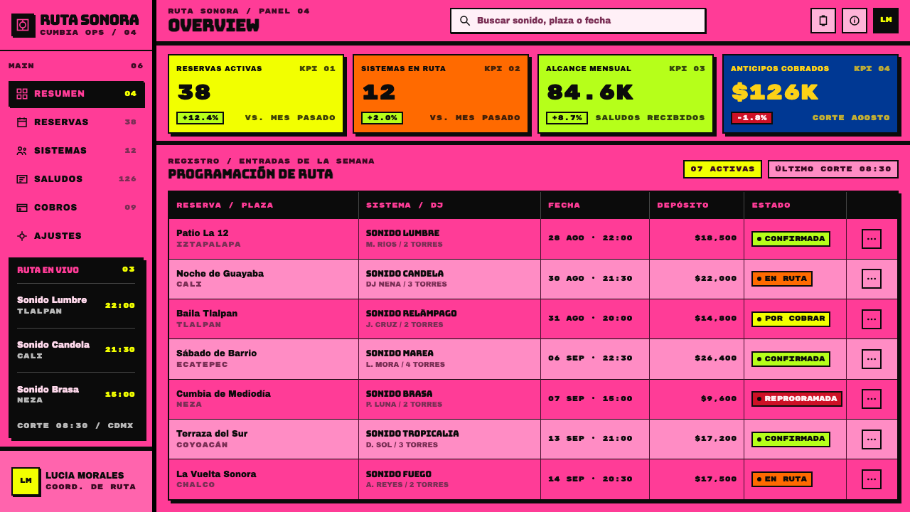
In web interfaces, the style fits event listings, line-up pages, community directories, local-music platforms and ticketing for nights out. A dashboard can borrow the roster logic for leaderboards and activity lists where many names must be visible at once. A pricing grid can behave like a flyer, with plan names loud at the top and the practical details, price and terms, squeezed into a bottom band. Interactions should be immediate and blunt, with no soft transitions.
In editorial and marketing work, the style suits festival and club promotion, community announcements, thank-you and credits pages, and campaigns that want to name as many supporters as possible. It is excellent for 'shout-out' content in general. Because black ink on fluorescent paper has strong contrast, it prints and photocopies well. When the reference to the sonidero is explicit, credit the scene and its graphic tradition.
The most common mistake is to calm the style down. Adding generous white space, a second ink colour, soft shadows, gradients or delicate small type removes exactly what makes it work. A second mistake is to put light type on the pink or yellow, which defeats the contrast; the lettering should be black. A third is to use the look ironically, as a joke about cheap printing, which ignores the fact that the names on the sheet are the point and the community behind them is real.
Sonidero Flyer — FAQ
What is a sonidero?
A sonidero is a mobile sound system and the dance culture built around it, strongly associated with cumbia in Mexico City. The source places it in neighbourhoods such as Tepito, Peñón de los Baños, Iztapalapa and Nezahualcóyotl. At the dances, greetings and dedications are read out over the music, and the printed flyer reproduces those names. The flyer style in this design system comes directly from that scene.
Why only one black ink?
Because that is how the flyers are bought. Poster shops quote a job as one side, black ink, and the fluorescent paper provides the colour. A single ink is cheap and prints cleanly, and it forces hierarchy to come from size, weight, boxes and position. The constraint is practical in origin, and it is what gives the style its blunt, high-contrast look.
Isn't it too crowded to read?
It is meant to be crowded, but it is structured. Ruled columns, boxes and reversed blocks give the reader places to land, and the hierarchy of loud, louder and loudest guides the eye. The content that matters most to the audience, the names, is also the largest. What would fail is the same density without those structures, which would simply be noise.
Which colours does the style use?
The paper comes in four fluorescent shades, yellow, orange, pink and neon green, and the ink is always black. The system's featured version uses pink, but the logic works on any of the four. What matters is that one flat fluorescent stock is the ground and that nothing else is added to it.
Can I use it on a white background?
You can, but you lose much of the identity. The fluorescent stock is a defining part of the style, and a white page makes the same layout feel like a plain black-and-white photocopy. If a white page is unavoidable, keep the density, the heavy lettering and the ruled columns, and consider one saturated block of fluorescent colour to stand in for the paper.
Related design styles
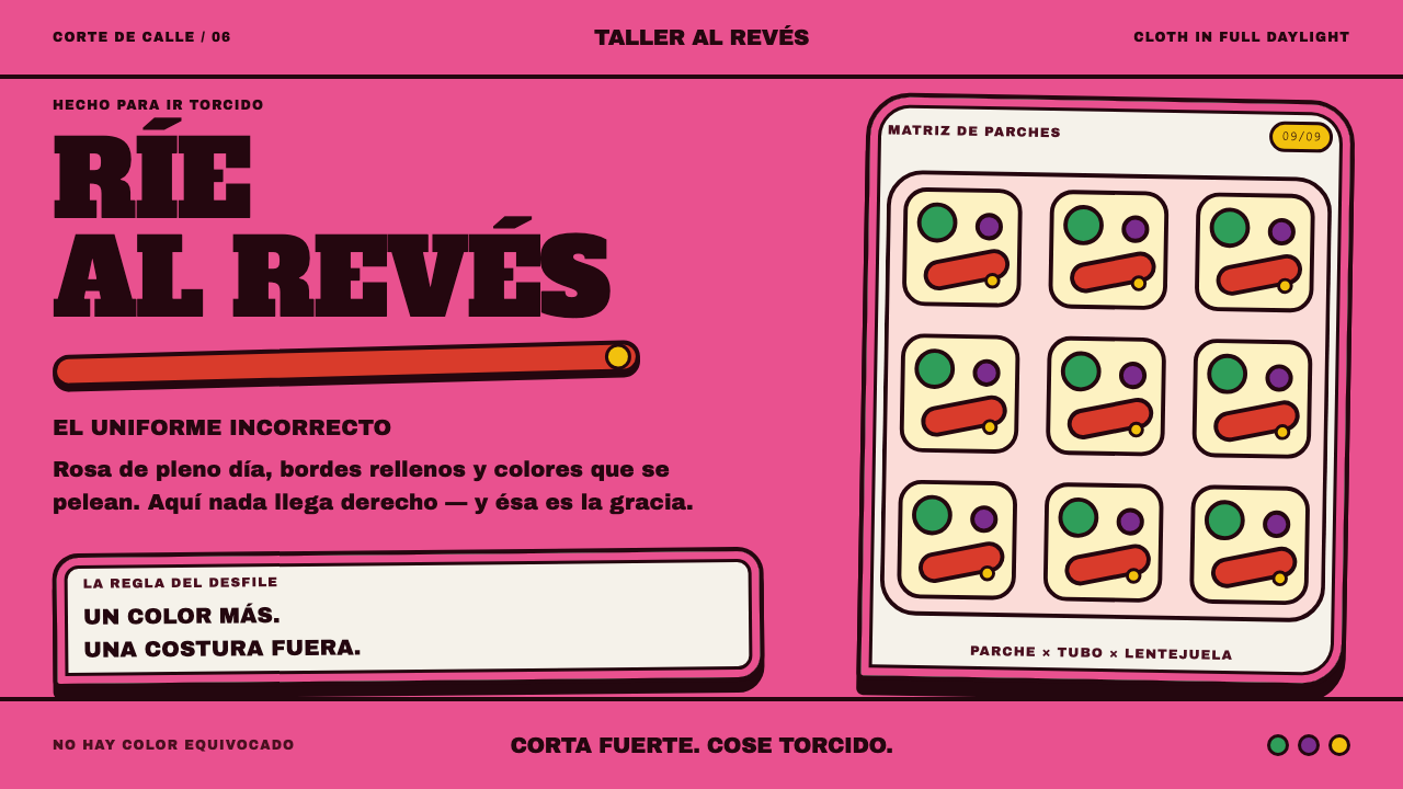 Marimonda MaskLoudness is the point. Rose cloth, padded black seams, and clashing red-yello…
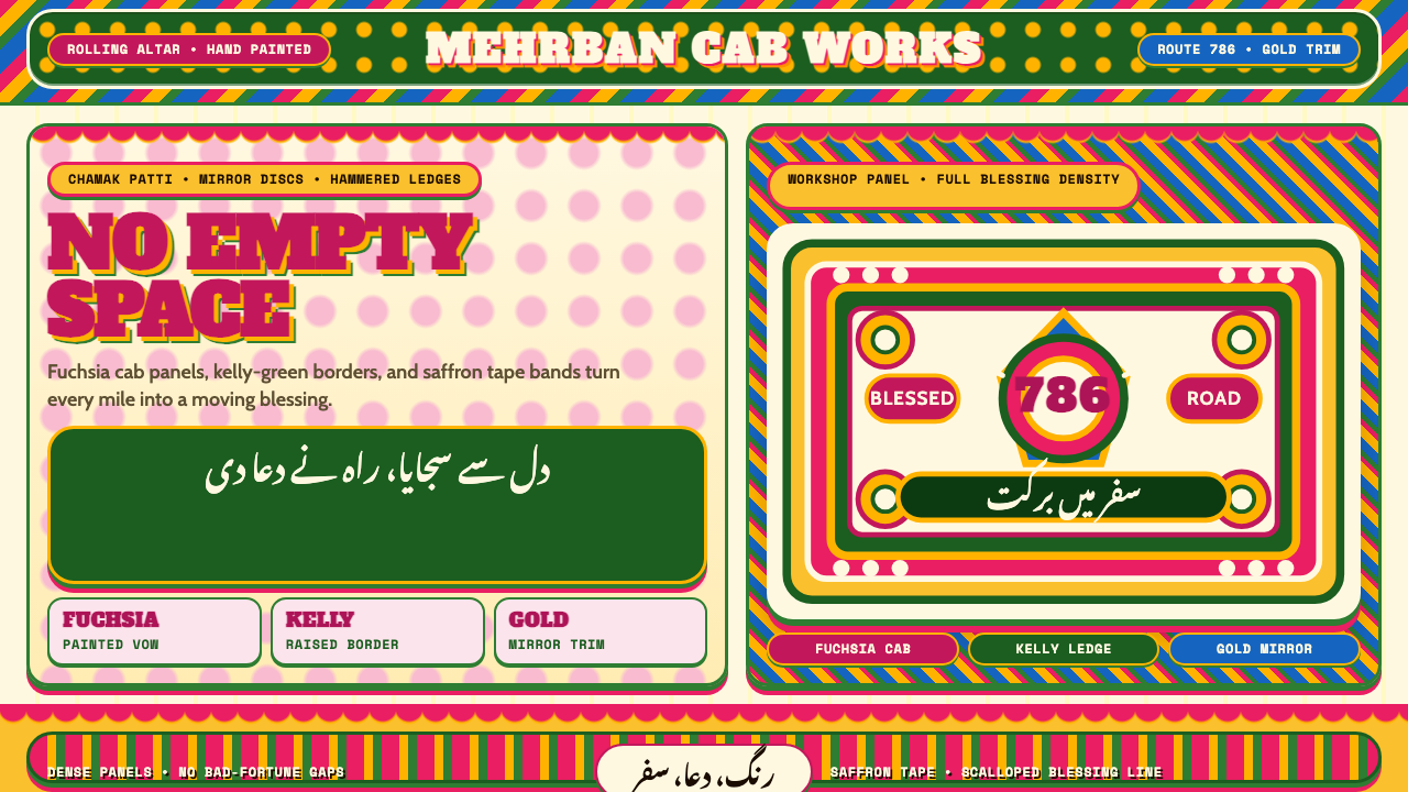 Pakistani Truck ArtBlessing crowds every inch. Fuchsia, kelly green, and gold stack into scallop…
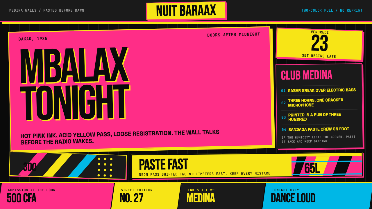 Senegalese Mbalax Poster (Dakar 1985)Street urgency, screen-printed loud. Hot pink and acid yellow drift over blac…
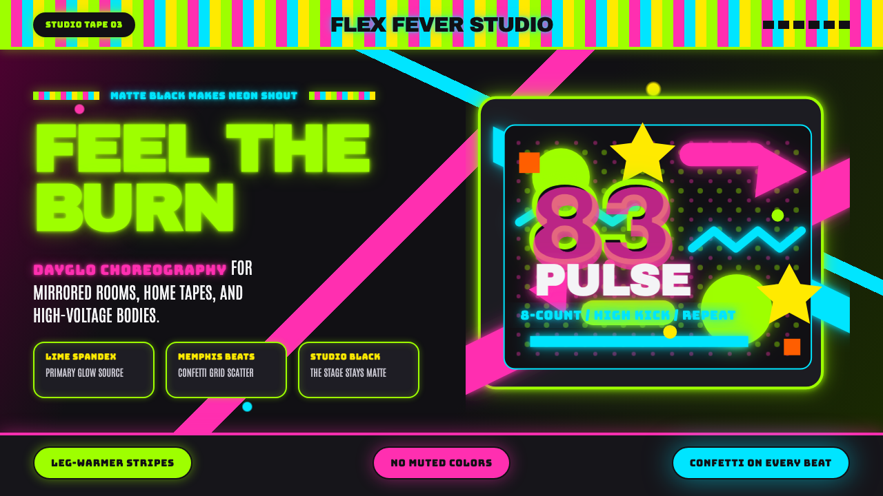 80s Aerobics Fluoro SpandexNeon refuses restraint. Lime spandex, pink-cyan confetti, and black-stage typ…
 Chicago HouseDarkness starts the track. Neon pink, yellow and cyan hit black like Xerox st…
 Funk Baile MixtapeNight refuses subtlety. Neon pink/yellow flyer plates cram chrome type on bla…