What is Funk Baile Mixtape?
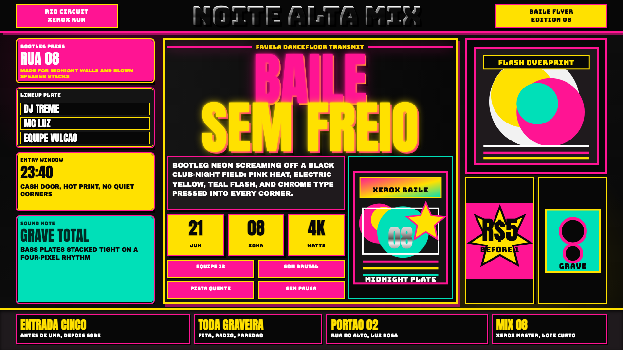
Funk Baile Mixtape blasts neon pink and electric yellow across pitch-black flyers and chrome-embossed type, the visual sound of a favela dance party that never asked permission to be loud.
Funk Baile Mixtape in brief
Funk Baile Mixtape is a design language built from the bootleg mixtape covers and photocopied party flyers of Rio de Janeiro's funk carioca scene — the music and dance culture that grew out of the city's favela bailes, or block-party-style dances. Its two defining ingredients are color and print: hot neon pink and electric yellow pushed to maximum saturation against a near-black ground, applied through the visual grammar of cheap, fast, informal printing rather than polished commercial design.
Typography borrows heavily from the chrome bevel-and-emboss lettering and lens-flare effects that defined late-1990s and early-2000s digital graphics — the Y2K toolkit — because that was the era's default software aesthetic for anyone making flyers on a home computer with limited design tools. The result reads as maximalist and unapologetically loud: crowded plates announcing dates, lineups, and locations crammed into every available inch, blown-out flash photography, and drop shadows harsh enough to look xeroxed rather than rendered.
None of this loudness is accidental sloppiness — it is the visual signature of a genuinely underground, self-produced culture making flyers on tight budgets and tighter deadlines, where getting the party's information out fast and impossible to ignore mattered more than restraint or polish. Every visual decision serves the same goal: stop a scroll, stop a walk past a wall of competing flyers, and make sure the date and the name of the baile land before the eye moves on.
Where does Funk Baile Mixtape come from?
Funk carioca — often called baile funk internationally — took shape in Rio de Janeiro from the late 1970s and 1980s onward, when Miami bass and freestyle records reaching the city's favela sound-system parties were slowed down, chopped up, and eventually replaced by original Portuguese-language production built around a distinctive, insistent electronic beat pattern known as the tamborzão. The genre grew almost entirely from the ground up, produced and performed inside the communities it soundtracked rather than through a conventional music-industry pipeline.
The baile itself — the party, typically held in a favela community space or street, with sound systems, MCs, and dancers — was and remains the genre's true stage, and the flyers and mixtape covers advertising it were made fast, cheap, and locally, by whoever had access to a photocopier or a home computer rather than a professional design studio. That production reality is why the visual language leans on blown-out flash photos and crammed information rather than considered composition.
Funk carioca produced its own generation of defining voices: MC Marcinho helped popularize the genre's romantic, melodic strand in the 1990s; Tati Quebra Barraco became one of its most prominent female MCs, known for direct, unapologetic lyrics that pushed back against the genre's male-dominated space; and Bonde do Tigrão carried baile funk's dance culture to an international audience. Around these and countless other local MCs and DJs, the flyer and mixtape-cover culture flourished as the genre's primary form of self-advertisement.
The 2008 anchor point this design system draws from sits in the middle of funk carioca's transition from a strictly local, physical mixtape-and-flyer economy toward wider national and eventual international recognition — still rooted in the cheap-print, maximum-volume visual habits of the baile circuit, but on the cusp of the genre's broader crossover into Brazilian mainstream culture and, later, global pop and internet virality. The bootleg CD stall and the photocopied flyer wall were, at that moment, still the genre's primary distribution channel, which is why the aesthetic still reads as physical, tactile, and slightly degraded rather than born-digital.
What defines the Funk Baile Mixtape look?
Neon Overload
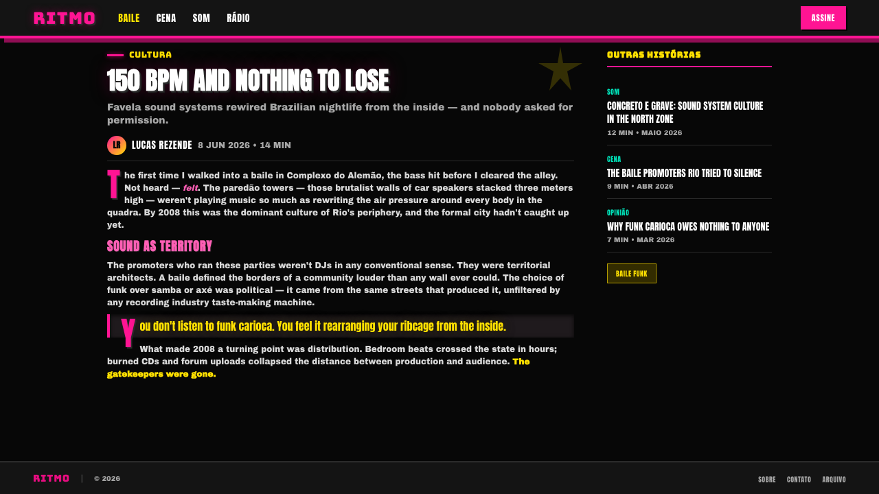
Hot pink and electric yellow are pushed to full saturation and placed directly against a near-black ground, with almost no midtones or muted colors used as relief. The palette is intentionally aggressive — it is built to be seen in low light and to compete with dozens of other flyers pinned to the same wall, not to sit quietly in a refined layout.
Chrome Bevel Type
Lettering carries the metallic bevel-and-emboss treatment common to late-1990s and early-2000s digital design software — letters that appear to have physical depth and a reflective, chrome-like surface rather than flat ink. This treatment turns the type itself into a visual event rather than a neutral carrier of information.
Blown-Out Flash
Photographic elements are treated with harsh, direct flash that overexposes skin tones and washes out shadow detail — the signature look of point-and-shoot cameras used inside dark, crowded party spaces. This is used deliberately rather than corrected, because it signals authenticity and immediacy over polish.
Crammed Plates
Information — dates, lineups, venue names, sponsor logos — is packed edge to edge with almost no breathing room, prioritizing the sheer quantity of what a flyer can announce over any single element's legibility in isolation. Negative space is treated as wasted space.
Lens Flare and Harsh Shadow
Lens flare streaks and hard, offset drop shadows appear throughout as period-accurate digital effects rather than realistic lighting simulation — signature tools of the Y2K graphic toolkit, applied liberally and without subtlety to add visual energy to flat compositions.
Xerox Degradation
Edges carry a slight roughness reminiscent of low-quality photocopying and cheap print runs — a texture that reads as bootleg and self-produced rather than commercially printed. This imperfection is a feature, not a flaw to be smoothed away.
Who shaped Funk Baile Mixtape?
One of the artists who helped popularize funk carioca's more romantic, melodic strand in the 1990s, MC Marcinho's rise helped carry the genre beyond a purely local audience and into wider recognition — part of the broader story that made mixtapes and flyers documenting the scene worth collecting and copying in the first place.
One of the most prominent female MCs to emerge from the funk carioca scene, known for lyrics that spoke directly and without apology about sex and power dynamics, pushing back against a genre that had been dominated by male voices. Her prominence is part of why baile flyers and mixtape covers carried images of assertive, larger-than-life performers front and center.
A group credited with carrying baile funk's dance culture to audiences well beyond Rio de Janeiro, including international attention, helping the scene's visual and performance culture circulate more widely and feeding the demand for the mixtapes and flyers that documented its parties.
Beyond any single named star, the scene's flyer and mixtape culture was sustained by a much larger, largely uncredited network of local DJs and MCs producing and performing at bailes across Rio's favelas week after week — the true volume behind the genre's self-made, self-advertised visual output.
How do you use Funk Baile Mixtape today?
Funk Baile Mixtape communicates maximum energy, informality, and nocturnal party culture, which makes it powerful for anything that wants to feel loud, underground, or unapologetically fun — and a poor match for anything that needs to feel calm, premium, or corporate. Its central discipline is refusing restraint: negative space, muted color, and quiet typography all work against the style's entire point.
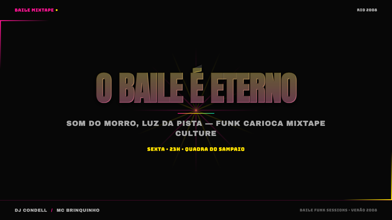
On presentation slides, the style is strongest for cover slides and section breaks meant to inject energy — a single chrome-bevel headline over a neon shape on black announces a shift in tone immediately. It struggles on dense data slides, where the style's crammed, high-contrast habits fight against clarity; a lighter touch — one neon accent color, one chrome headline, otherwise plain — keeps a data slide legible while still nodding to the aesthetic.
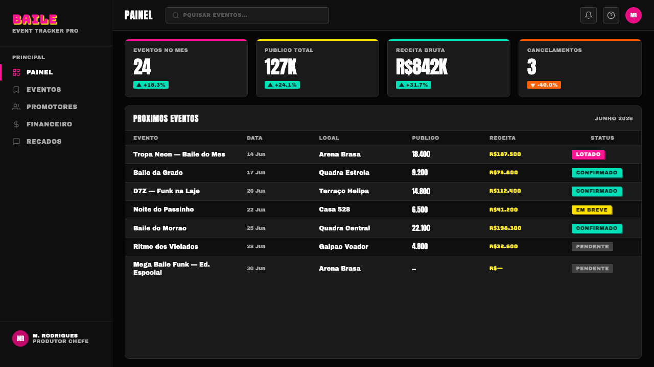
For web interfaces, the style suits event pages, music or nightlife platforms, and youth-oriented entertainment products where energy and immediacy matter more than conventional usability polish. It is a poor fit for dashboards, enterprise tools, or any interface where a user needs to scan calmly and repeatedly — the intentional visual noise that makes a flyer exciting for one glance becomes fatiguing across a screen someone returns to daily.
In editorial and marketing work, the style is best reserved for content specifically about nightlife, music culture, or Y2K-era digital nostalgia, where the neon-on-black, chrome-type visual grammar signals the subject matter honestly. Using it as generic 'fun' or 'youthful' branding without that specific cultural grounding risks flattening a distinct regional music culture into decoration.
A common mistake is toning the palette down to a single soft accent color for the sake of 'good taste,' which erases the style entirely — its whole identity depends on the aggressive, maximal saturation and crowded density that a restrained version simply does not have. A second common mistake is applying the aesthetic without any connection to its source culture at all, treating it as a generic '2000s meme' look rather than the specific, still-living music scene it documents.
Funk Baile Mixtape — FAQ
Is it appropriate to use a style rooted in funk carioca culture for unrelated commercial products?
It works best when the connection to nightlife, music culture, or the specific Y2K print aesthetic it draws from is honest and clear rather than incidental — content about parties, music platforms, or explicitly retro digital design can use it with integrity. Applying it purely as decorative 'edginess' on a product with no relationship to that culture risks flattening a specific, still-active regional music scene into a generic visual trend, which is worth being deliberate about.
How does this differ from a generic Y2K or vaporwave aesthetic?
Vaporwave typically draws on pastel gradients, retro computing and mall-culture imagery, and a dreamy, nostalgic mood. Funk Baile Mixtape shares the Y2K-era chrome and lens-flare toolkit but applies it to an entirely different source: real, specific, still-active party flyers and mixtape covers from Rio de Janeiro's favela dance scene, with a hot pink and yellow palette on black rather than pastel gradients, and an energy that is aggressive and immediate rather than dreamy or ironic.
Does this style translate well to a light background?
Not naturally — the near-black ground is what allows the neon pink and yellow to hit their full intensity, the way a black-lit club makes fluorescent colors glow. On a light background the same colors read as merely bright rather than neon, and the chrome-bevel type loses the high-contrast drama that makes it pop. If a light version is required, keeping the neon colors confined to small, saturated accent blocks against a still-dark panel preserves more of the effect than converting the whole background.
Why does the style deliberately keep the 'cheap print' imperfections instead of cleaning them up?
Because those imperfections are the visual proof of the culture it comes from — self-produced, community-made materials created fast and cheap rather than commissioned from professional studios. A cleaned-up, high-production version would look like a corporate imitation of a party flyer rather than the real thing, losing the authenticity that gives the style its energy and credibility.
How dense should a layout using this style actually be — is there such a thing as too crowded?
The source flyers were dense but not random — every element still had a job, whether announcing a date, a lineup, or a location, and the crowding came from real information competing for space rather than decoration for its own sake. A well-executed version of this style should feel packed with content, not packed with ornament; if elements are added purely to fill space without carrying information, the density stops feeling authentic and starts feeling like noise for its own sake.
Related design styles
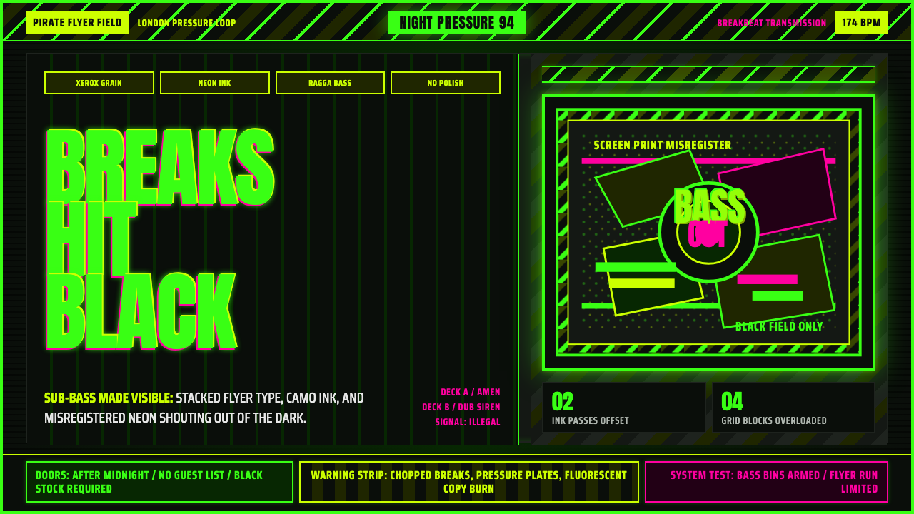 Jungle / Drum & BassRaw rave voltage. Neon green Anton, camo strips, and xerox grain hit black.
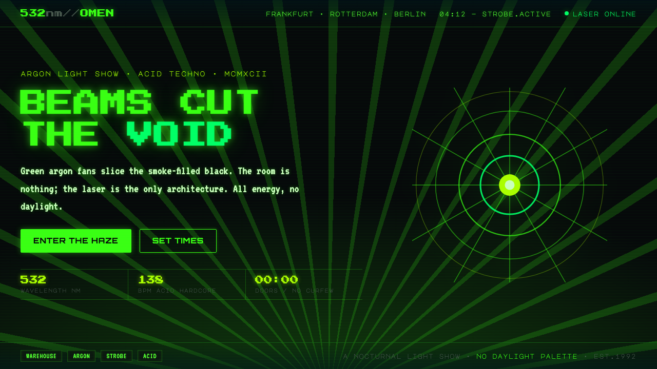 Acid Rave Laser Show 1992Beams cut the void. Argon green on pitch-black smoke, pixel marquee type, add…
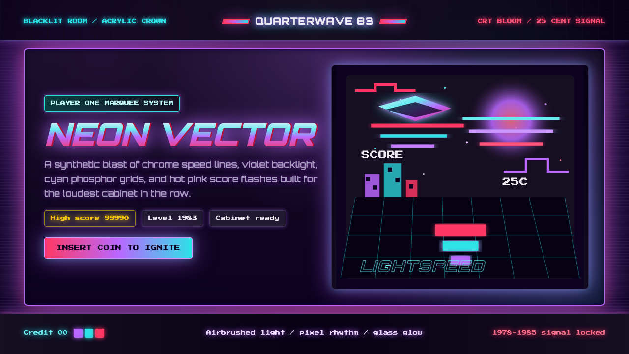 Arcade Cabinet MarqueeToo loud to ignore. Black-indigo glass, violet glow, cyan grids, hot-pink arc…
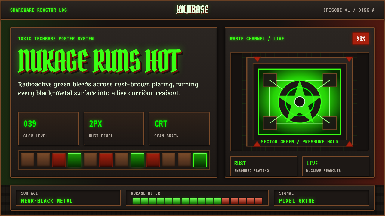 Doom 1993 Toxic GreenRadioactive metal bites. Toxic green readouts glow over rust bevels and CRT g…
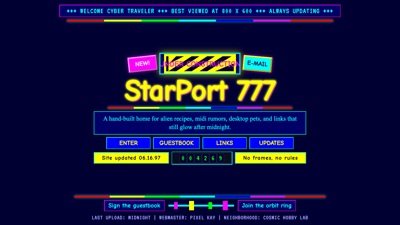 GeoCities Personal WebClutter is celebration. Starfield tiles, cartoon headings, rainbow rules, and…
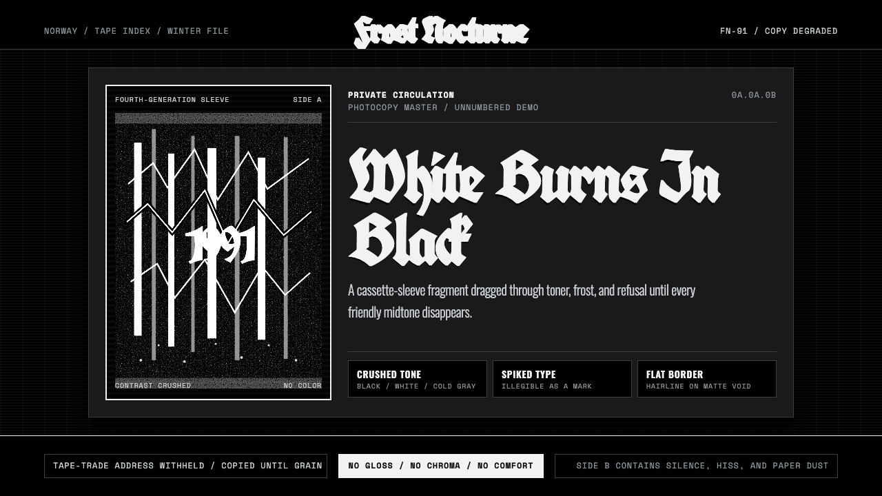 Nordic Black MetalUncompromising monochrome. Blackletter, hairline frames, and xerox grain crus…