What is GeoCities Personal Web?
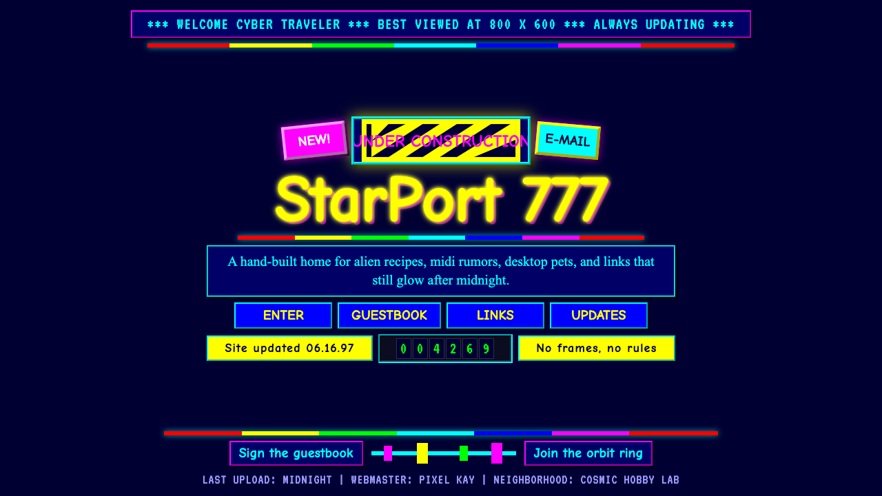
GeoCities Personal Web turned the homepage into a glowing digital bedroom wall, where starfields, cartoons, rainbow rules, counters, and unfinished experiments made clutter feel like proof of life.
GeoCities Personal Web in brief
GeoCities Personal Web is the vernacular visual language associated with the free personal homepages built by millions of amateur web authors during the classic GeoCities era. Its pages were organized within themed neighborhoods, but each homesteader treated an individual plot as a personal territory. The resulting aesthetic combined dark tiled starfield wallpapers, intensely saturated text, cartoon-like headings, animated under-construction graphics, rainbow dividers, pixel accents, and visitor counters into pages that felt handmade, crowded, and unmistakably inhabited.
The style treats ornament as communication rather than excess. A blinking construction image announces that the page is alive and changing; a counter turns anonymous traffic into a visible event; a rainbow rule marks a transition with more enthusiasm than a restrained line ever could. Repetition, animation, and competing colors produce density, yet that density carries social meaning. Every badge, heading, divider, and decorative tile says that someone chose to place it there.
Contemporary interpretations distill this unruly language into a reusable system without making it polite. A near-black navy ground evokes the original starfield wallpaper, while pure saturated primaries illuminate links, labels, rules, and announcements. Comic-style display lettering supplies personality, and pixel-mono accents evoke the screen-native texture of the early personal web. The essential principle remains maximalist: content does not wait for ornament to step aside, because ornament is part of the content.
Where does GeoCities Personal Web come from?
The style emerged from the free personal-web culture of the 1990s, when GeoCities offered amateur homesteaders a plot of online space for a personal homepage. The metaphor mattered. Authors were not merely filling a standardized profile; they were building a home and arranging it in public. Themed neighborhoods supplied a broad context, but the individual page remained a place for self-description, interests, collections, announcements, and experimentation. Because the builders were amateurs rather than a unified professional design class, the visual language developed through use, imitation, and personal enthusiasm instead of formal doctrine.
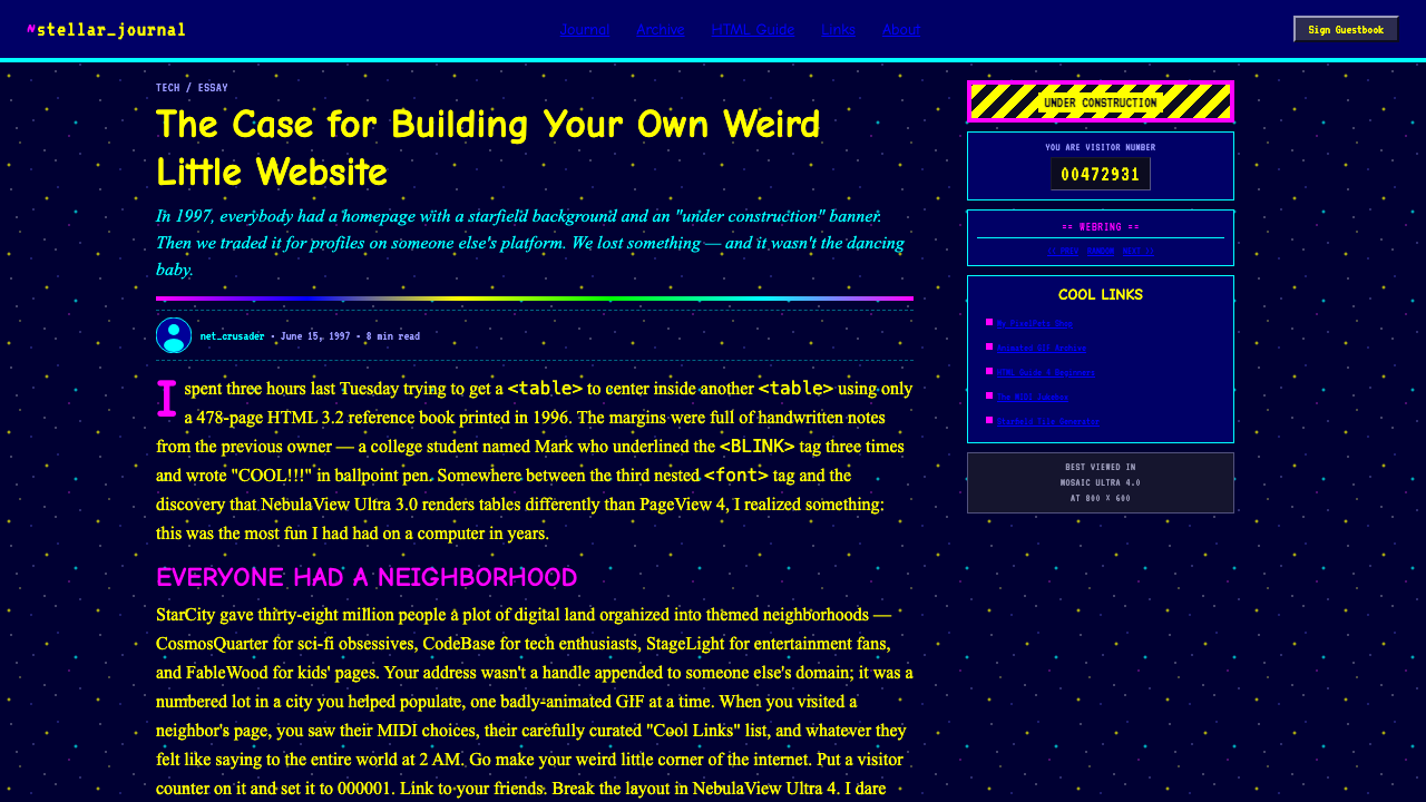
Classic GeoCities stretched from the 1990s to 2010, with its most recognizable period concentrated around 1995–1999. During that peak, small repeating background tiles were a practical and expressive way to cover a page. The starfield became especially emblematic: a tiny patch of night could repeat indefinitely, making even a modest homepage feel as if it floated in cosmic space. Against that darkness, saturated web-safe colors appeared electrically bright. Text did not need subtle modulation; it could arrive in cyan, yellow, red, green, or a rainbow sequence and announce itself immediately.
Page builders assembled meaning from readily recognizable fragments. Cartoon headings established an informal voice. Rainbow rules separated sections with spectacle. Animated under-construction graphics framed incompleteness as a public state rather than a failure, allowing a homepage to remain permanently open to revision. Visitor counters supplied a small measure of audience presence. Pixel-mono accents complemented the machine-like appearance of those counters and reinforced the sense that the page belonged specifically to the screen, not to print or conventional publishing.
Because the personal web was global, no single author or region owned this aesthetic. Its key figures were collective: amateur homesteaders making individual spaces and themed-neighborhood builders giving those spaces a loose civic structure. Their pages produced an early vernacular web design whose authority came from participation. The style did not require professional consistency to become recognizable. Its recurring materials and habits created coherence from below, while the differences among pages preserved the feeling that every address led to another person’s handmade corner of the internet.
What defines the GeoCities Personal Web look?
Color
The palette begins with a near-black navy field and places pure, saturated primaries above it. Cyan, yellow, red, green, and rainbow sequences behave like emitted light rather than printed pigment. Colors frequently compete instead of harmonizing, so a heading, link list, warning, and divider may each demand attention in a different hue. The effect should feel exuberant and screen-native, not softly coordinated. Muted accents weaken the style because they turn its celebratory noise into ordinary dark-mode polish.
Typography
Headings favor comic, cartoon-like display lettering whose friendliness feels closer to a hand-drawn sign than to institutional typography. Pixel-mono forms suit counters, labels, status notices, and small technical fragments. Body copy may remain straightforward, but hierarchy is intentionally emphatic: titles shout, announcements interrupt, and links advertise their clickability. Mixing voices is acceptable when each one performs a recognizable role. The aim is not typographic neutrality but the sensation that the author is speaking in several excited registers.
Tiled Backgrounds
A tiny starfield tile repeats across the entire ground, turning limited source imagery into an apparently endless environment. Visible repetition is part of the charm: the background need not disguise its modular construction. Stars can feel evenly scattered, quaintly artificial, and slightly hypnotic. The wallpaper establishes atmosphere before any content appears, while its persistent visual activity ensures that no region becomes completely empty. Contemporary versions should preserve the sense of a repeated digital material rather than replacing it with a smooth cinematic night sky.
Animated Ornament
The under-construction image is the style’s signature emblem of motion and incompleteness. Animation operates as a notice, decoration, and declaration that the page remains active. It may blink, cycle, or repeat without waiting for interaction. Multiple moving elements create restless peripheral activity, but each should still carry a simple idea: new material is coming, a section deserves attention, or the author is celebrating the page’s existence. Motion is repetitive and graphic rather than physically realistic.
Dividers and Counters
Rainbow dividers transform section breaks into events, while visitor counters make audience activity visible and collectible. Both elements give abstract page structure a tangible object. The divider says that one chamber of the homepage has ended and another is beginning; the counter says that previous visitors have left a numerical trace. Their visual treatment is unapologetically conspicuous. Rather than disappearing into the layout, they act as miniature attractions placed between larger blocks of content.
Maximalist Density
Clutter is not an accidental failure of organization; it is the style’s central expression of abundance. Text, badges, headings, rules, counters, and animations occupy the page together, often with only irregular pockets of breathing room. Alignment may be loose and emphasis may occur repeatedly. What holds the composition together is recurrence: the same starfield, the same family of saturated colors, and the same screen-native ornaments return across sections. Density should feel personal and enthusiastic, never like a professionally optimized content feed.
Who shaped GeoCities Personal Web?
The amateur homesteaders were the collective authors of the GeoCities look. Given free online plots, they built personal homepages without waiting for professional design permission or a unified visual standard. Their choices made the web autobiographical: a tiled background could establish a private universe, a cartoon heading could announce temperament, and a counter could turn every visit into recognition. The importance of these authors lies not in individual fame but in the scale of their participation, which allowed repeated habits to become a shared vernacular.
Themed-neighborhood builders gave personal pages a broader organizing metaphor. A homepage belonged to an individual, yet it also occupied a named district shaped by a common subject or interest. This arrangement made browsing feel spatial and communal rather than purely indexical. Visually, it encouraged variation within recognition: neighboring pages might share a topic while displaying radically different colors, wallpapers, headings, and ornaments. Their contribution was a loose civic framework capable of holding millions of highly personal constructions without requiring them to look alike.
Personal homepage makers converted ordinary acts of self-presentation into public web design. They assembled introductions, interests, updates, and collections beside decorative graphics and visible signs of ongoing work. This authorial role joined writing, collecting, arranging, and decorating; the maker was simultaneously editor, designer, curator, and resident. The resulting pages demonstrate why GeoCities Personal Web cannot be reduced to a palette or a set of nostalgic graphics. Its defining figure is the person who treats publication as continuous homemaking.
How do you use GeoCities Personal Web today?
For presentation slides, GeoCities Personal Web works best when the deck embraces the homepage metaphor. A cover can open on a repeating starfield with a large cartoon-like title, a bright welcome message, and one conspicuous decorative divider. Content slides may resemble separate rooms within the same homestead: repeated wallpaper provides continuity while headings, pixel labels, badges, and animated-looking illustrations give each section its own personality. The structure should remain readable, but polished uniformity is less important than the sensation of moving through a proudly handmade site.
Data slides should translate information into counters, labeled blocks, bright rules, and screen-native status displays. A visitor-counter treatment can frame a headline metric, while colored segments can separate categories without adopting the restrained language of conventional business charts. Use strong contrast and direct labels because the background is already active. Decorative elements may surround the data, but they should reinforce its meaning: stars can suggest scale, repeated badges can represent accumulation, and rainbow dividers can distinguish phases or groups.
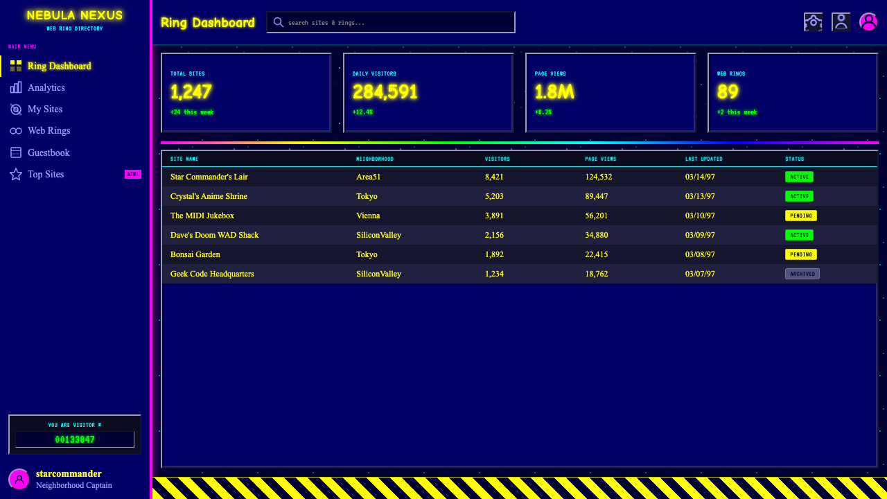
For web interfaces, the style suits dashboards and pricing pages that want to feel playful, personal, or deliberately anti-corporate. A dashboard can place modules over the dark tiled ground, distinguish states with saturated text, and treat counters as featured objects rather than quiet metadata. Pricing can become a row of homemade offer boards, each with an emphatic heading, bright rule, descriptive copy, and visibly clickable action. The interface still needs clear grouping and predictable navigation; vernacular exuberance should change its voice, not conceal essential controls.
Editorial and marketing applications benefit from the style’s ability to make every section feel announced. An article can begin with a welcome banner, use rainbow rules between chapters, and place notes or updates in pixel-mono callouts. A campaign page can present its offer as a personal recommendation from an enthusiastic host rather than a neutral corporate proposition. Repetition strengthens identity: the same starfield, headline voice, counter motif, and saturated accent family should recur often enough that the page feels like one inhabited world rather than a collage of unrelated retro references.
The common mistake is to reproduce surface nostalgia while removing the participatory spirit that gave the style meaning. A dark background, a pixel font, and a construction graphic are not sufficient if the composition remains sparse, perfectly standardized, and emotionally anonymous. The opposite error is uncontrolled accumulation that makes reading impossible. Authentic application requires purposeful clutter: every badge, rule, counter, and color should reveal enthusiasm, status, authorship, or navigation. The page may be loud, but it should sound like a person, not like a random-effects generator.
GeoCities Personal Web — FAQ
Is GeoCities Personal Web simply bad web design?
No. Its pages often reject the restraint and consistency expected from professional interface design, but they operate according to a different set of values. Personal authorship, abundance, experimentation, and visible incompleteness matter more than institutional polish. The tiled wallpaper, competing colors, animated ornaments, and counters make the author’s presence tangible. The style can certainly become unreadable when contrast or grouping collapses, yet dismissing all density as incompetence overlooks the social purpose of a homepage built as a personal place.
Why is the starfield background so important?
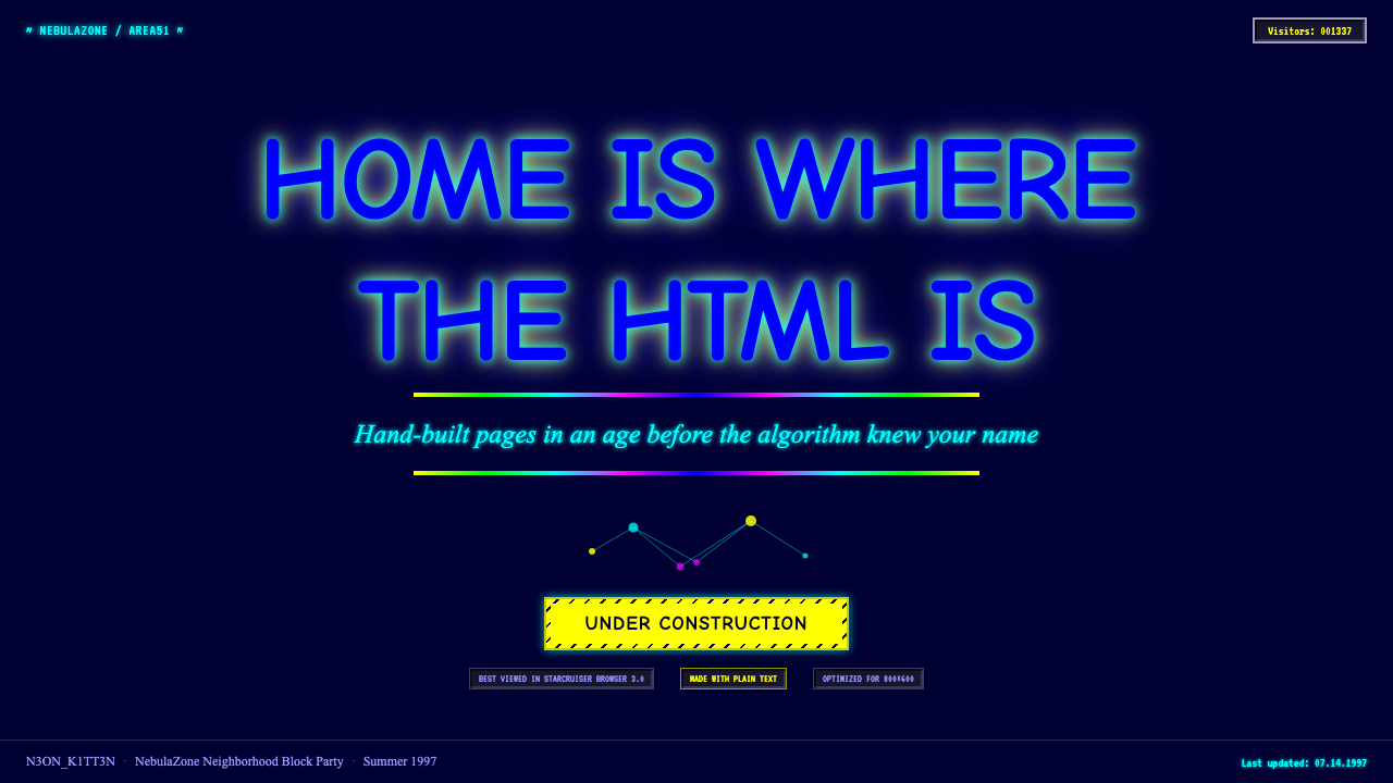
The starfield captures several defining qualities at once. It uses a tiny repeating tile to create an apparently limitless environment, it makes saturated text glow by contrast, and it turns an ordinary document into a personal universe. Its artificial repetition also reveals the construction of the page rather than hiding it. A smooth photographic sky may preserve the subject of stars, but it loses the modular, handmade, screen-specific character that makes the GeoCities wallpaper recognizable.
Can the style remain usable on a modern interface?
Yes, if functional hierarchy remains stable beneath the decoration. Navigation should stay predictable, important actions should remain visually distinct, text must contrast clearly with the active background, and related information should still be grouped. Ornament can then occupy headers, dividers, status areas, counters, and peripheral regions without obscuring the main task. The goal is not to sterilize the style, but to give its noise a legible rhythm so users can enjoy the personality while understanding where to look and what to do.
Does every element need to animate or use a different color?
No. Maximalism depends on accumulation, but accumulation still needs contrast between active and resting elements. Animation is most effective when attached to announcements, construction states, or celebratory ornaments. Saturated colors can divide roles among headings, links, warnings, and rules, while ordinary body copy remains comparatively steady. If everything flashes and every sentence changes color, no signal remains exceptional. GeoCities exuberance works through repeated bursts of emphasis distributed across a readable page, not through total visual equality at maximum intensity.
How is this different from a generic retro-computing aesthetic?
Generic retro computing may focus on monochrome terminals, technical interfaces, or restrained pixel graphics. GeoCities Personal Web is more domestic, colorful, and socially expressive. Its defining artifacts are not merely old-screen textures but personal-homepage conventions: themed neighborhoods, starfield wallpaper, cartoon headings, rainbow dividers, under-construction animations, and visible visitor counts. It evokes people decorating public online homes, not operators working inside a machine. The emotional register is welcoming, boastful, unfinished, and celebratory rather than purely technical.
Related design styles
 Funk Baile MixtapeNight refuses subtlety. Neon pink/yellow flyer plates cram chrome type on bla…
 Jungle / Drum & BassRaw rave voltage. Neon green Anton, camo strips, and xerox grain hit black.
 Slimer Ghostbusters GreenBlacklight goo shouts. Ecto-green Bungee type, drips, and proton streaks hit…
 The Mask 1994 Green FaceLoud, theatrical, ssssmokin'. Lawn-green and canary-yellow scream against dec…
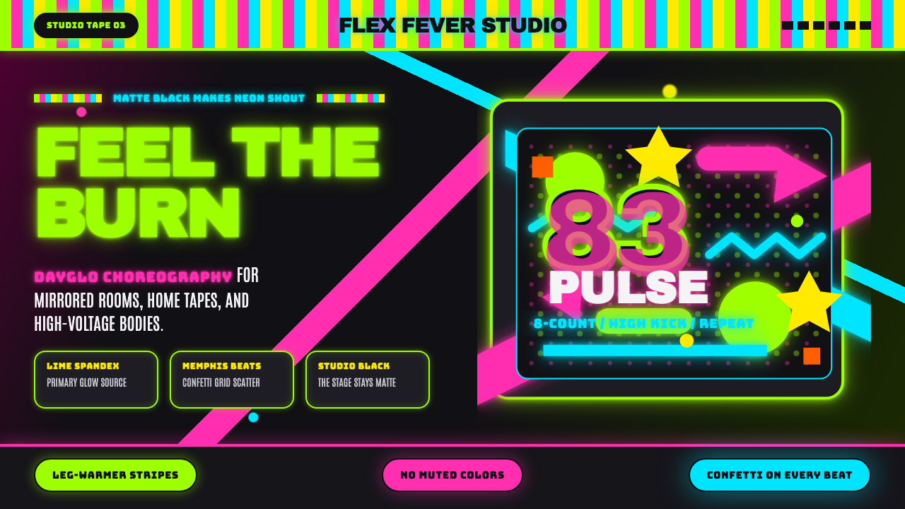 80s Aerobics Fluoro SpandexNeon refuses restraint. Lime spandex, pink-cyan confetti, and black-stage typ…
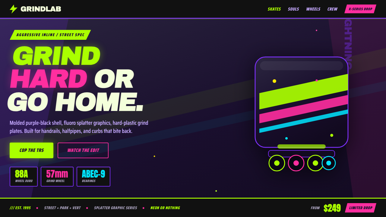 90s Aggressive Inline SkateX-Games attitude in plastic and paint. Fluoro lime and magenta slash across m…