What is Muay Thai Camp Banner?
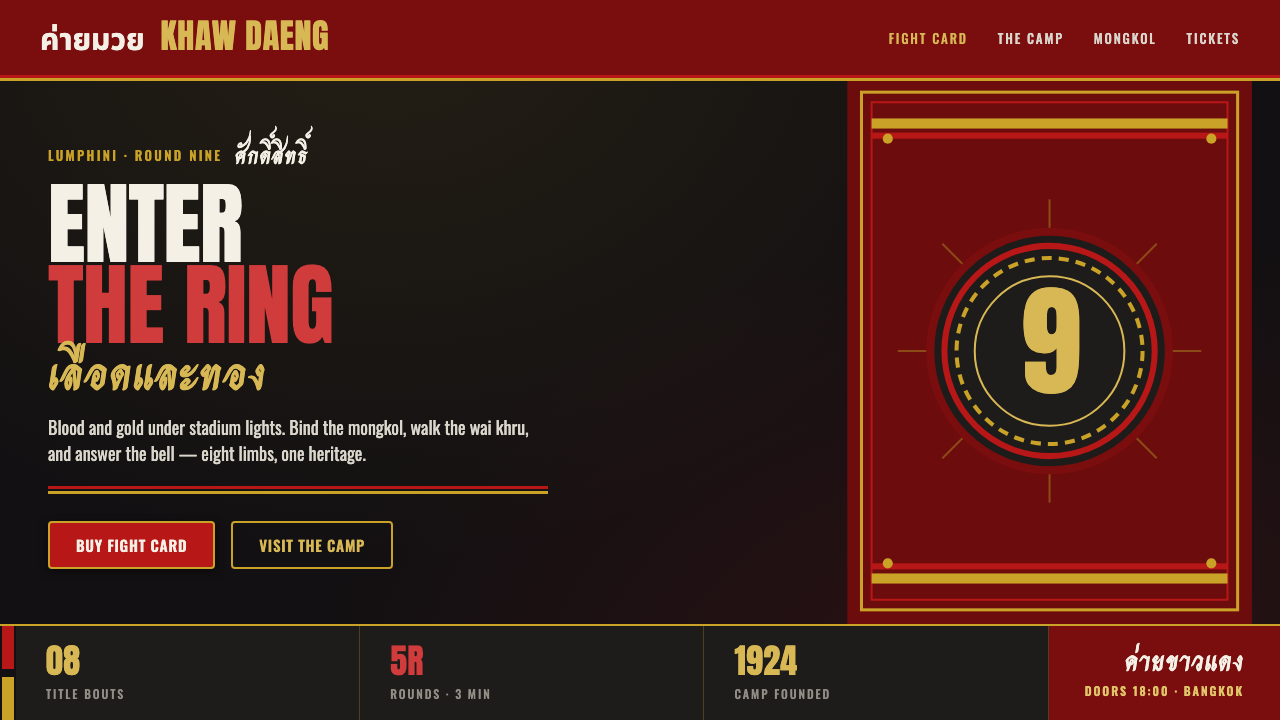
Muay Thai Camp Banner turns fight-night cloth, satin shorts, and stadium-poster force into a dark digital style built to land like a clean strike.
Muay Thai Camp Banner in brief
Muay Thai Camp Banner is a contemporary style drawn from the promotional-poster and camp-branding culture surrounding Muay Thai in Thailand from the 1990s through 2010. Its visual setting is the fight camp, the stadium, the training banner, and the bout announcement: near-black cloth-like grounds, blood-red fields, bright gold trim, off-white Thai brush titling, and heavy condensed Latin lettering stacked with the authority of a stadium sign. It does not try to make combat elegant. It makes combat legible, ceremonial, and physically present.
The style takes its cues from a small set of recurring material symbols. The mongkol headband introduces sacred significance; dual-colour satin shorts bring shine, contrast, and gold-and-black leg designs; gym banners establish a broad, screen-printed field for names and announcements. Together these references create a visual system in which lettering feels applied to fabric rather than placed on a neutral interface, and in which colour works like fight gear: a declaration of allegiance, intensity, and rank.
In digital use, Muay Thai Camp Banner translates poster energy rather than literally reproducing a ring-side wall. Dark oxblood and near-black surfaces carry a restrained satin sheen and screen-print grain. Gold acts as trim and edge definition, while off-white brush lettering supplies the expressive high note. Dense condensed type handles practical information. The resulting mood is forceful and imperfect by design: closer to a banner pulled tight before a bout than to a polished luxury campaign.
Where does Muay Thai Camp Banner come from?
The style belongs to the promotional-poster and camp-branding period of the 1990s through 2010, rooted in Thailand’s Muay Thai camps and stadiums across Bangkok, Isan, and Chiang Mai. It emerged from a practical communication environment where a fight night needed to announce itself quickly and visibly. Camp identity, fighter presentation, venue atmosphere, and event information met on banners, posters, clothing, and dark printed surfaces. The graphic language was shaped by that shared environment rather than by a single named studio or author.
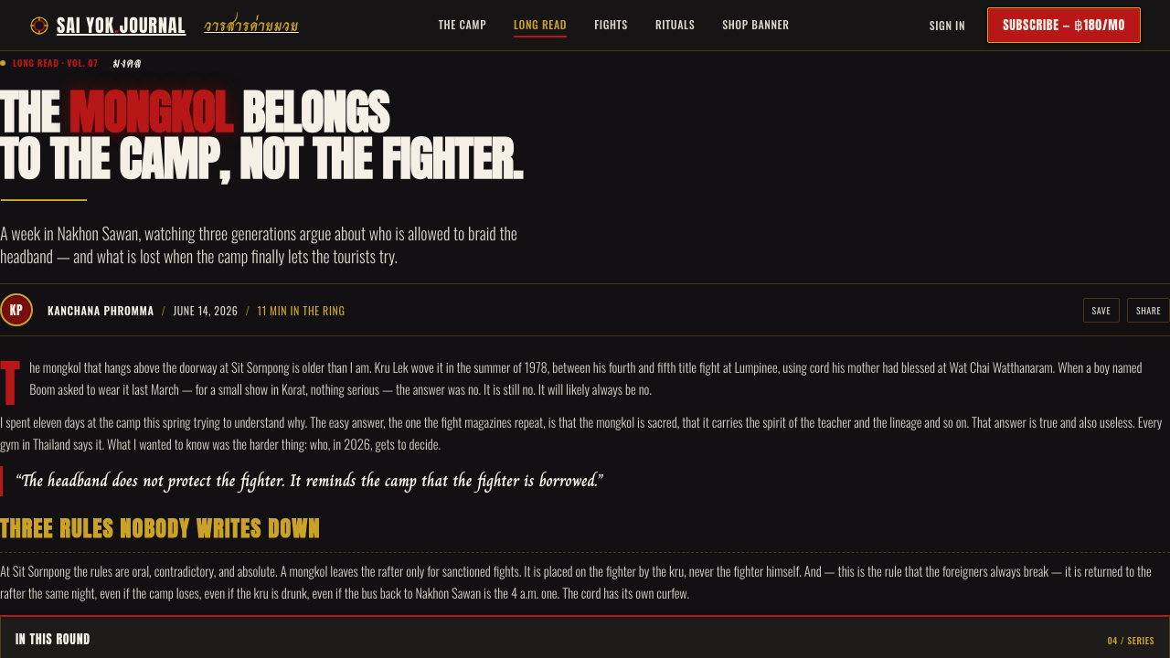
Muay Thai gym branding supplied the central visual logic. A camp banner had to carry a name with enough weight to register as an emblem, not merely a label. Heavy condensed lettering answered that need: it could stack into a compact block, read at a glance, and resemble the broad authority of stadium signage. Thai brush script added a second register. Where the condensed type is blunt and declarative, the brush title brings sweep, speed, and a human mark across the composition.
Thai sports-poster graphic design supplied the fight-night intensity. Blood-red and gold-satin accents against a near-black ground create a dramatic contrast without requiring elaborate illustration. Gold reads as trim, shine, and ceremonial value; red reads as pressure and impact; dark ground gives both colours a stage. The result is not a quiet corporate system. It is an announcement system designed to make a camp, a match, or a fighter feel imminent.
Physical objects remain essential to understanding the style. Mongkol makers contribute the sacred headband associated with the fighter’s presentation. Satin-short outfitters contribute dual-colour garments with gold-and-black leg designs, turning athletic clothing into a moving graphic surface. Fight-camp branders and Thai fight-poster designers bring names, titles, and event messaging into the same field. The digital style inherits this overlap of cloth, print, ceremonial gear, and loud public identification; it should preserve their tension rather than smoothing them into generic sports branding.
What defines the Muay Thai Camp Banner look?
Dark Cloth Ground
The ground is near-black, satin-dark, and deliberately physical in feeling. It should suggest a gym banner or dark stock carrying ink, not an empty digital void. A slight screen-print grain and restrained sheen give the surface pressure and texture, but the background remains subordinate to the title and event hierarchy. Its job is to absorb surrounding noise and make red, gold, and off-white hit with clarity.
Blood Red and Gold Trim
Red and gold are not interchangeable decoration. Red supplies impact, urgency, and the force of the poster field; gold supplies trim, satin association, and a sharper ceremonial edge. They work best when one carries the main emotional charge and the other frames or punctuates it. Used everywhere at once, they lose their authority and turn the composition into noise.
Condensed Stadium Type
Heavy condensed lettering is stacked like a stadium banner. It is practical typography with a physical stance: names and event phrases become blocks of pressure rather than polite lines of copy. Use it for the information that must be recognized first, especially camp names, fight titles, match labels, and direct calls to action. Its force comes from compression, repetition, and strong vertical stacking, not from ornamental effects.
Thai Brush Titling
Off-white Thai brush script cuts across the top or the central field as the expressive counterweight to condensed type. It should feel slashed, gestural, and immediate, preserving the contrast between a human brush mark and a hard typographic block. Because it carries such visual force, it belongs to a small number of decisive moments: the headline, a camp name, or a focal announcement rather than every label on the page.
Satin and Screen Print
The style’s material character comes from the meeting of satin sheen and screen-print grain. Satin suggests the dual-colour shorts and gold trim of fight attire; grain suggests banners and poster stock made for direct public visibility. Neither should become a glossy product-render effect. The surface should remain tough, printed, and slightly worn in spirit, so that the style retains ringside credibility rather than drifting into entertainment glamour.
Ceremonial Emblems
The mongkol, satin shorts, and gym banner are meaningful references, not loose decoration. They anchor the style in Muay Thai camp culture and give visual choices a sense of ritual, preparation, and identity. When used, they should be clear, purposeful, and limited. A composition does not need to display every emblem to communicate the style; one controlled reference can do more than a crowded collage of fighting imagery.
Who shaped Muay Thai Camp Banner?
Fight-camp branders shaped the identity layer of the style: the camp name, banner presence, and visual force required to make a gym recognizable in a crowded fight-night environment. Their contribution is structural rather than decorative. They establish how a name can behave as a public emblem across dark cloth, promotional material, and athletic presentation.
Mongkol makers represent the sacred and ceremonial reference within the visual system. The mongkol headband prevents the style from being reduced to generic combat graphics: it points to preparation, symbolic presentation, and the cultural weight carried into the ring. In design work, this reference calls for restraint and respect rather than indiscriminate motif use.
Satin-short outfitters supply one of the style’s strongest material cues. Dual-colour satin shorts with gold-and-black leg designs demonstrate how clothing can carry shine, contrast, trim, and camp identity at once. Their work informs the digital use of satin-dark fields and gold edge accents, while reminding designers that the reference is athletic equipment with real physical presence.
Thai fight-poster designers shaped the announcement logic behind the look. They brought together dark grounds, red and gold accents, Thai brush titling, and stacked condensed lettering so that an event could feel immediate before its details were fully read. Their contribution explains why hierarchy matters more than polish: the poster must first announce pressure, then deliver information.
How do you use Muay Thai Camp Banner today?
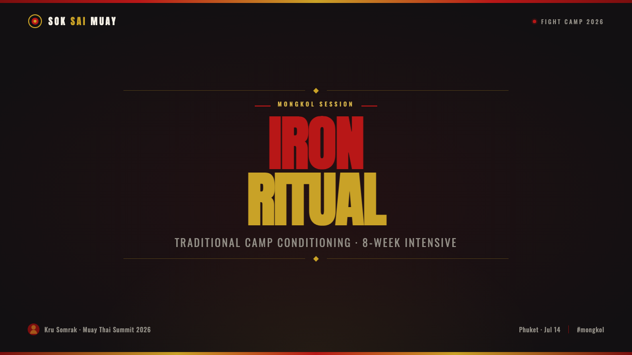
For presentation slides, use the style most forcefully on the cover. Let a near-black satin-like field carry one dominant title block, with off-white Thai brush script or a brush-like title treatment creating the expressive sweep. Red can establish the main field or focal hit, while gold frames a key word, edge, or mark. Keep secondary material quiet. The cover should feel like a bout announcement, not an illustrated inventory of Muay Thai references.
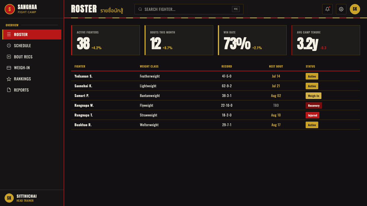
Content slides should shift from spectacle to controlled hierarchy. Retain the dark ground and condensed headline system, then use off-white body text for explanation and gold rules or small markers for navigation. A strong vertical stack works well for agendas, phases, training themes, or event categories. For data slides, treat bars, comparisons, and labels as elements of a fight poster: red carries the primary comparison, gold highlights the decisive point, and the rest recedes into the dark field. The information must remain easier to read than the texture is to notice.
For web interfaces, the style is especially effective for camp profiles, fight-event pages, athletic programs, membership offerings, and dashboards that need a strong identity. Navigation should be direct and typographic. Cards can resemble sections of printed banner cloth, with a restrained grain and a clear hierarchy between title, status, and action. On pricing or membership pages, give each tier a disciplined information block and reserve red or gold for the difference that matters. The goal is confidence and scanability, not visual aggression on every surface.
For editorial and marketing work, use the style to frame a story with public-event energy. A feature article can begin with a broad brush title, then settle into quieter reading columns against the dark ground. Pull quotes, names, and match details can be treated as poster fragments rather than ornamental decorations. Campaign pages can alternate intense announcement panels with calmer explanatory sections, preserving the sense that the reader is moving from the gate banner to the practical details of attendance, training, or membership.
The common mistake is confusing roughness with indiscriminate clutter. Filling every area with red, gold, grain, brush lettering, shorts imagery, and sacred symbols makes the style less physical and less credible. Another mistake is making the surface too glossy, which turns satin into luxury packaging and screen print into a decorative filter. Choose a clear primary title, a limited set of structural accents, and one or two meaningful references. The style works when it feels disciplined enough to carry a real camp name and loud enough to announce a real night of fighting.
Muay Thai Camp Banner — FAQ
Is Muay Thai Camp Banner simply a general combat-sports style?
No. Its specific identity comes from Muay Thai camp branding and Thai fight-poster design, along with material references including the mongkol, dual-colour satin shorts, and dark screen-printed gym banners. A generic combat treatment may use loud type and dark contrast, but this style depends on the particular meeting of ceremonial reference, fabric-like surface, Thai brush titling, and gold-trimmed fight-night presentation.
Should every design include Thai brush script?
No. Thai brush script is the expressive peak of the system, so using it everywhere weakens its impact. It is most useful for a primary headline, camp identifier, or focal announcement, while heavy condensed lettering handles the broader information hierarchy. The style can still read clearly through its dark cloth ground, red-and-gold structure, and stadium-banner typography when brush titling is used sparingly.
How should gold be used without making the work look luxurious?
Treat gold as trim, edge definition, and a reference to satin fight attire rather than as a broad premium finish. It is strongest around a title, emblem, divider, or decisive data point, where it gives the composition a ceremonial sharpness. Keep the dark surface tough and screen-printed in character. When gold is paired with too much gloss, smoothness, or decorative layering, it stops reading as fight-night trim and begins reading as luxury packaging.
Can this style support information-heavy dashboards and pricing pages?
Yes, provided the poster language is used to establish hierarchy rather than to decorate every component. Condensed type can organize labels and sections, off-white text can carry detailed reading, and red or gold can identify the primary status, comparison, or action. Keep grain and sheen quiet behind the information. A successful interface preserves the force of a camp banner while making the user’s next decision easier, not harder.
What is the fastest way to make the style feel inauthentic?
The fastest route is to treat sacred and material references as a pile of decorative props. Repeating mongkol imagery, brush marks, red splashes, gold effects, and fight gear without a clear hierarchy replaces camp identity with spectacle. The style needs a reason for each element: a title must announce, gold must define, texture must support the cloth-like ground, and ceremonial references must remain purposeful. Its authority comes from selection, not accumulation.
Related design styles
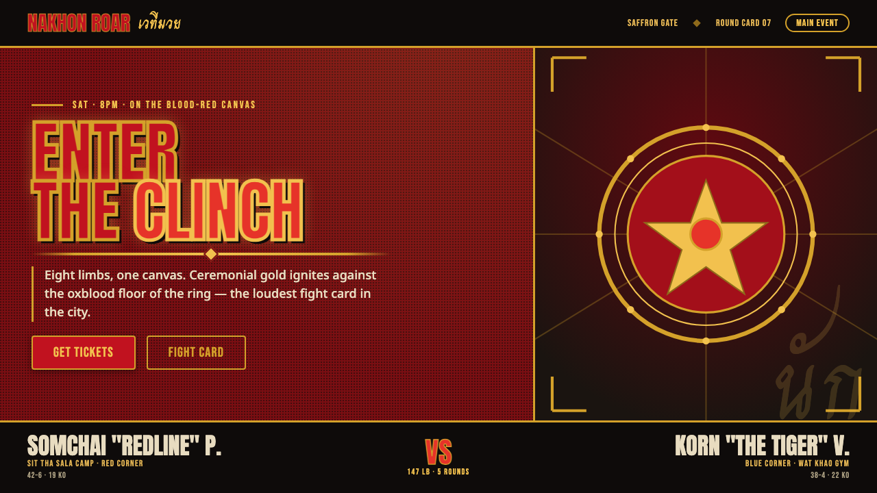 Muay Thai Stadium PosterBangkok's fight night, made loud. Ceremonial gold blazes on oxblood red under…
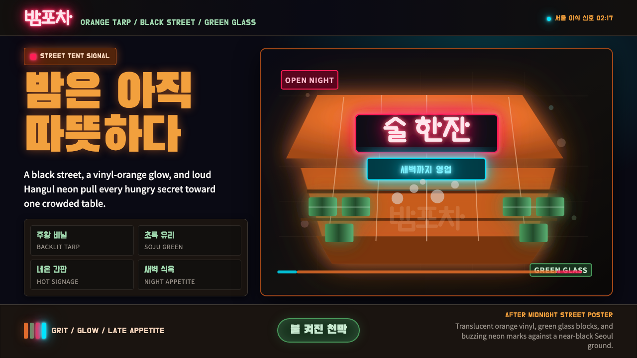 Pojangmacha Soju TentNight appetite glows. Orange tarp panels burn over black, cut by Hangul neon…
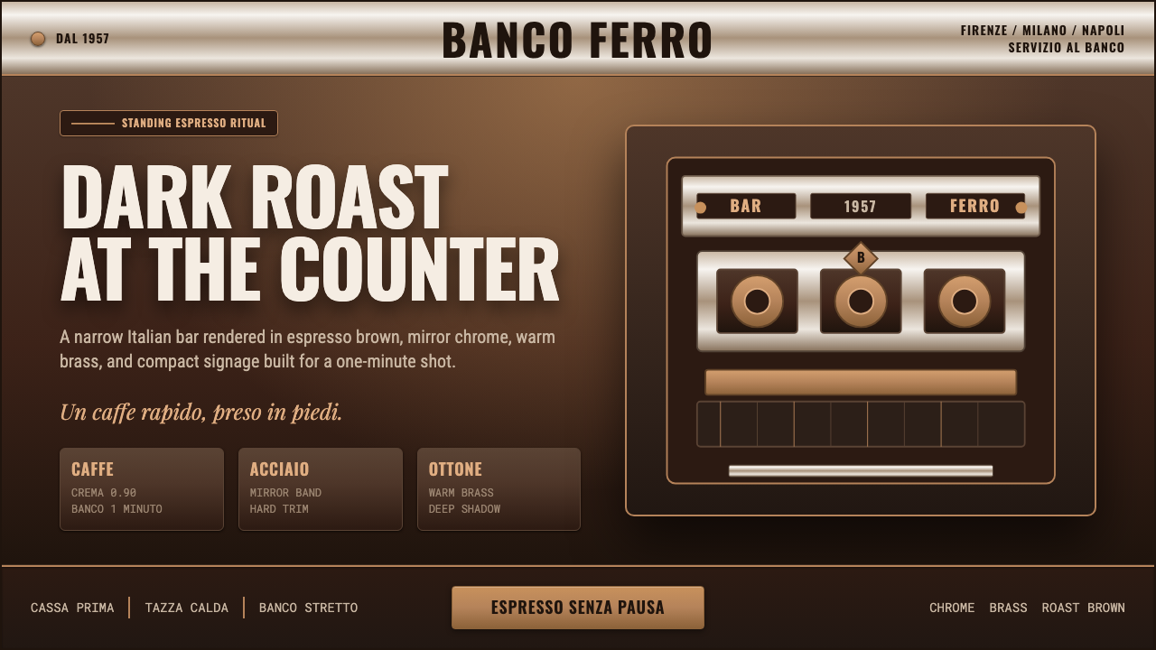 Italian Espresso BarDark roast, hard metal. Brass lines and Oswald signage slice a deep espresso…
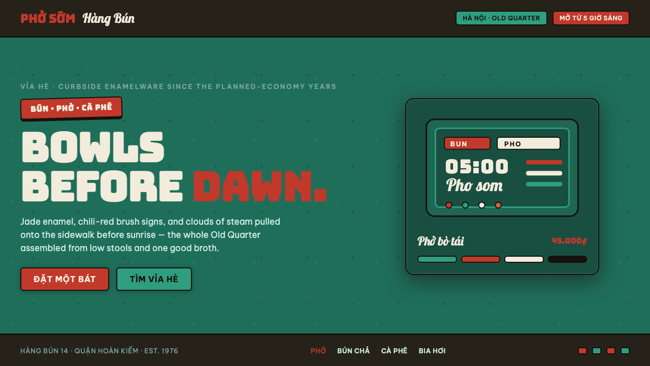 Phở Street-Stall EnamelHanoi's curbside noodle stall, systematized. Jade enamel ground, chili-red br…
 Shenzhen HuaqiangbeiDensely practical. PCB-blue panels, mono part numbers, and copper grid lines.
 Concrete SkateparkRaw concrete detonates. Grey slab blocks carry red, green, and warning-yellow…